
Choose a Ready-Made Checkout Design
Checkout Builder lets you select a checkout layout without building a custom page in the block editor. FluentCart still supplies the live customer fields, order summary, payment methods and checkout processing.
Your default checkout stays unchanged until you choose a design. Enabling the module, opening a preview or saving appearance settings doesn’t activate a layout by itself.
Checkout Builder needs FluentCart 1.6.4 or newer. Enable it in FluentCart → GT Extensions before you open the design library.

Compare the Designs
Open FluentCart → Checkout Builder and choose Preview design. From version 2.22.0 the library has 13 designs: the 5 original layouts and 8 new ones.
- Classic: customer details on the left and order summary on the right.
- Split: order summary on the left and checkout form on the right.
- Warm Split: a warm summary panel beside a white form and a bold purchase button.
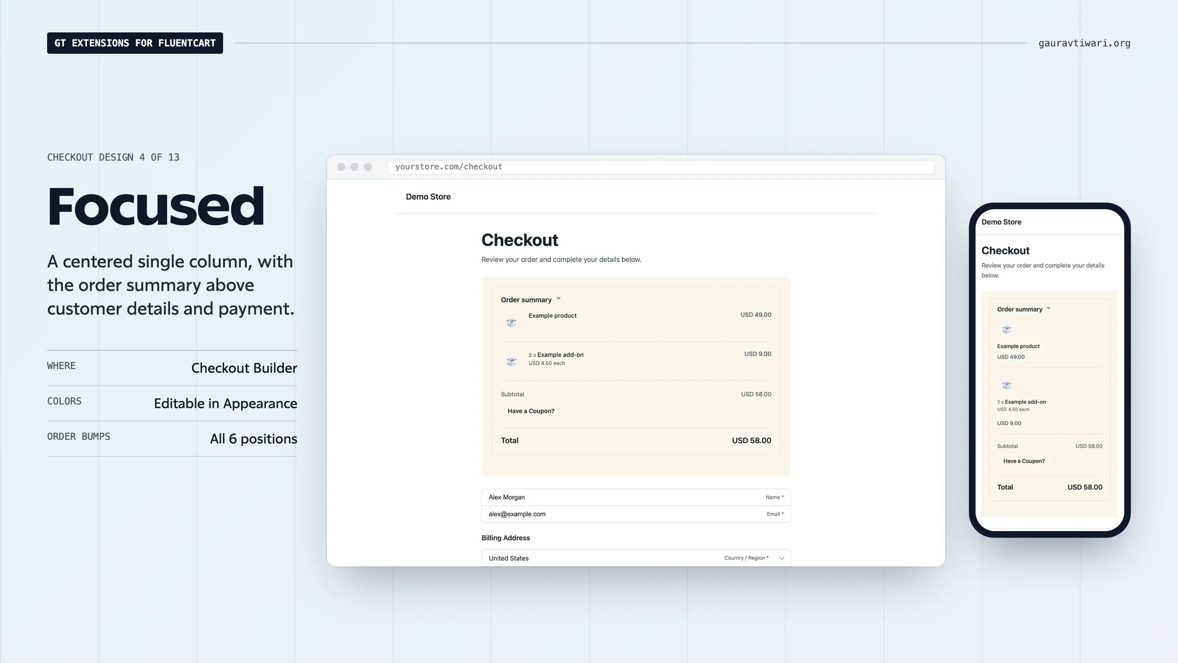
- Focused: a centered single column, with the summary above the form.
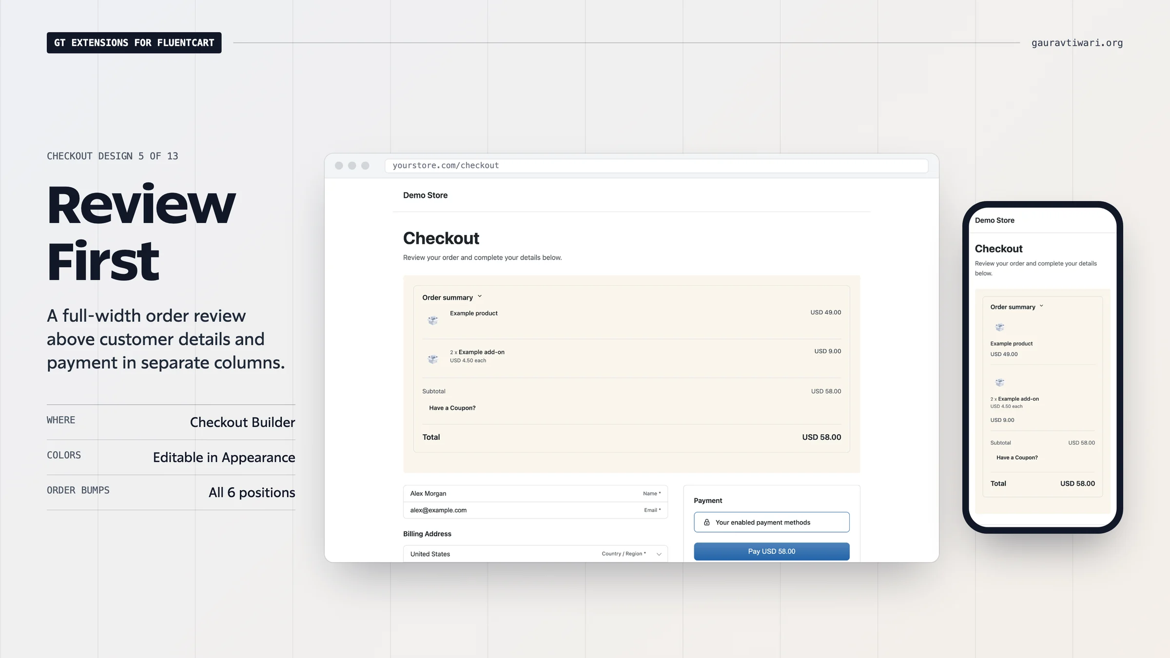
- Review First: a full-width order review, followed by customer details beside payment.
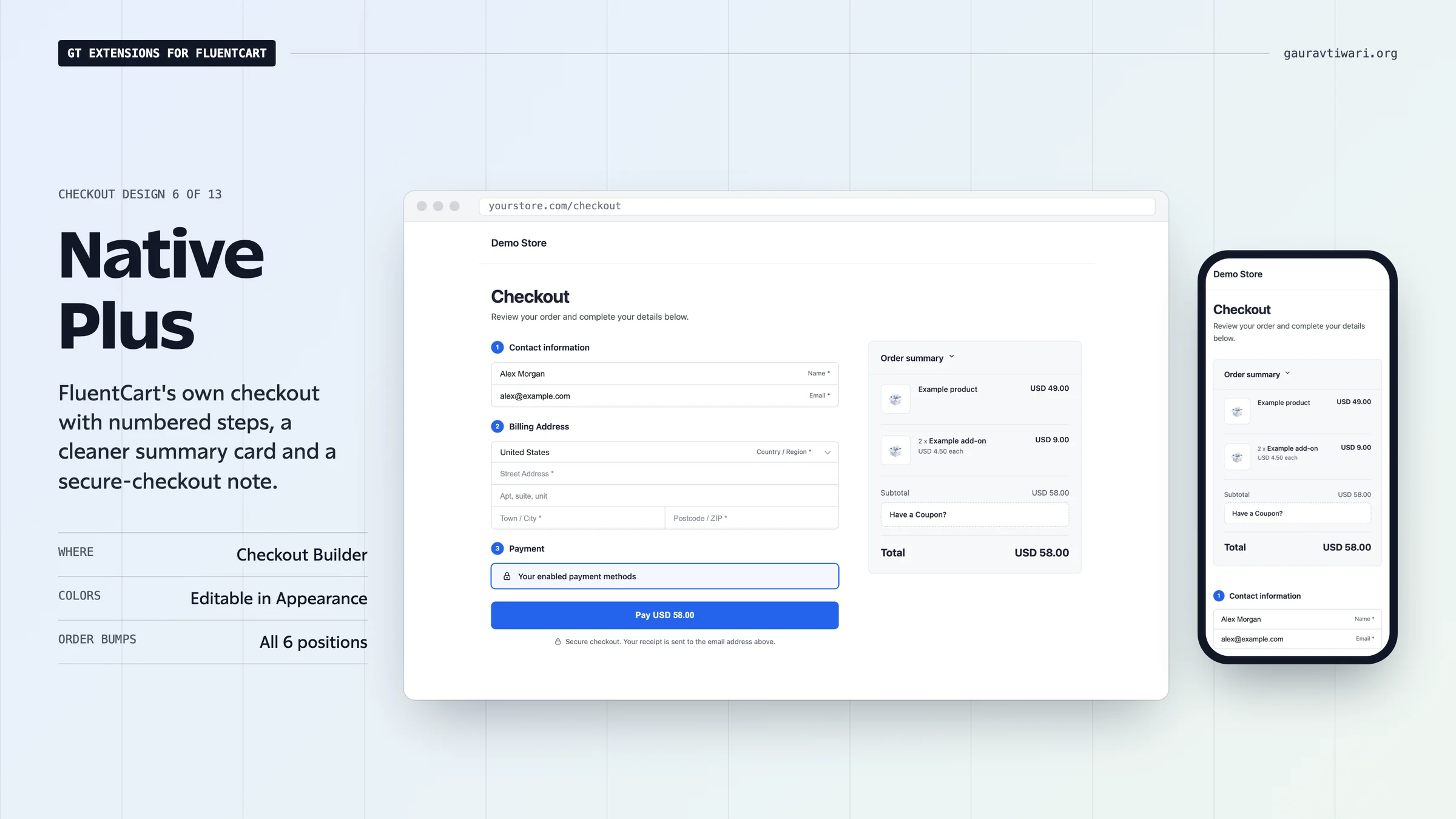
- Native Plus: FluentCart’s own checkout with numbered steps, a tidier summary card and a secure-checkout note.
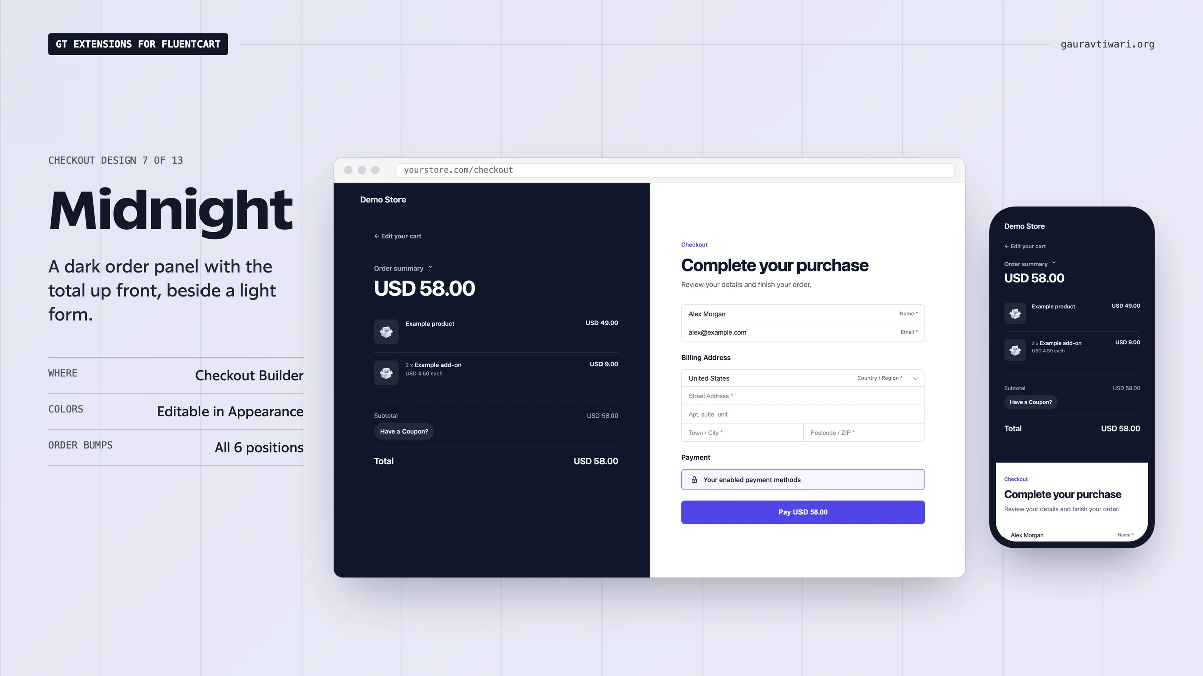
- Midnight: a dark order panel with the total up front, beside a bright, roomy form.
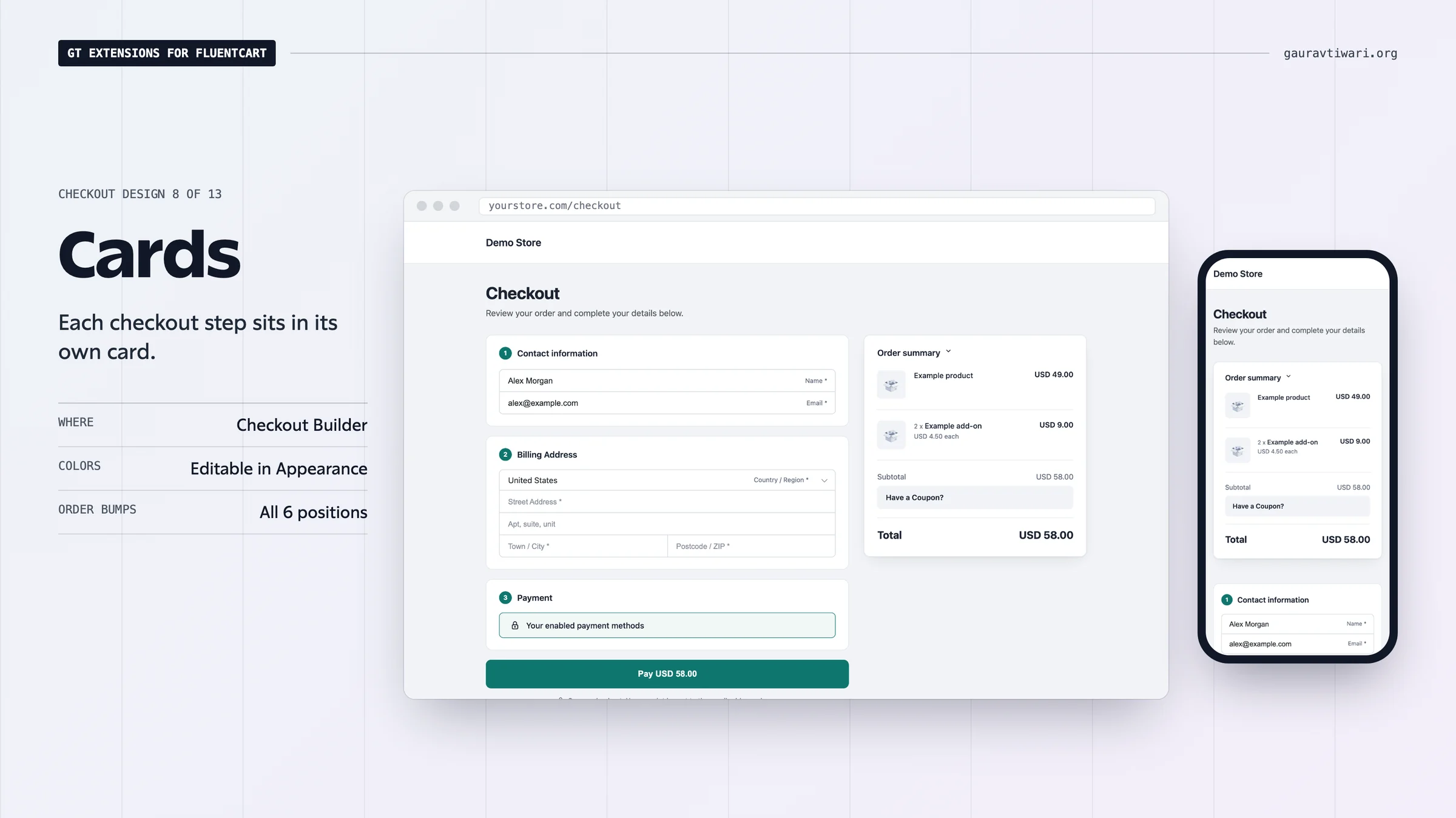
- Cards: each step in its own white card on a soft gray page, with a sticky summary card.
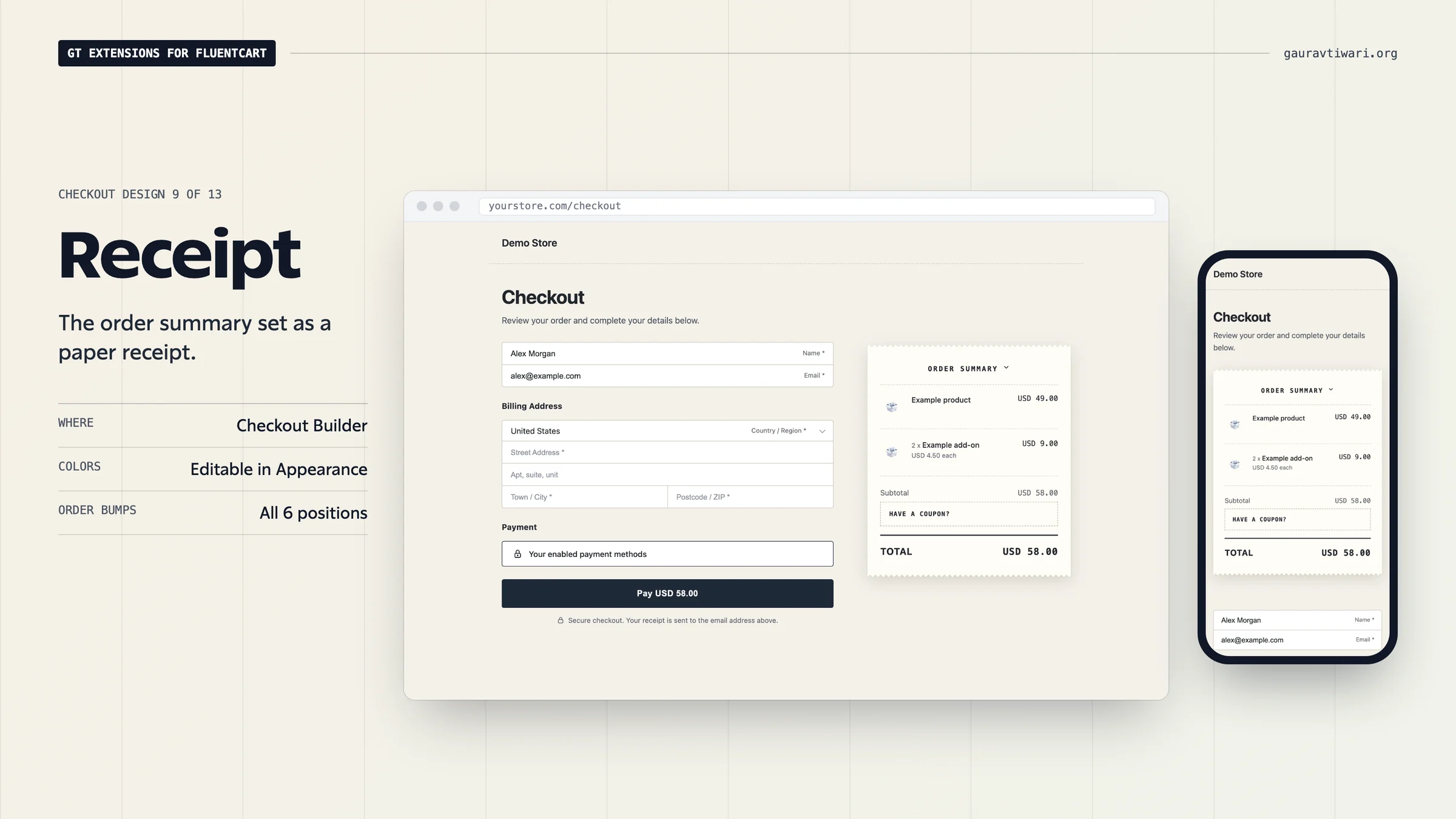
- Receipt: the order summary printed like a paper receipt, beside a clean form.
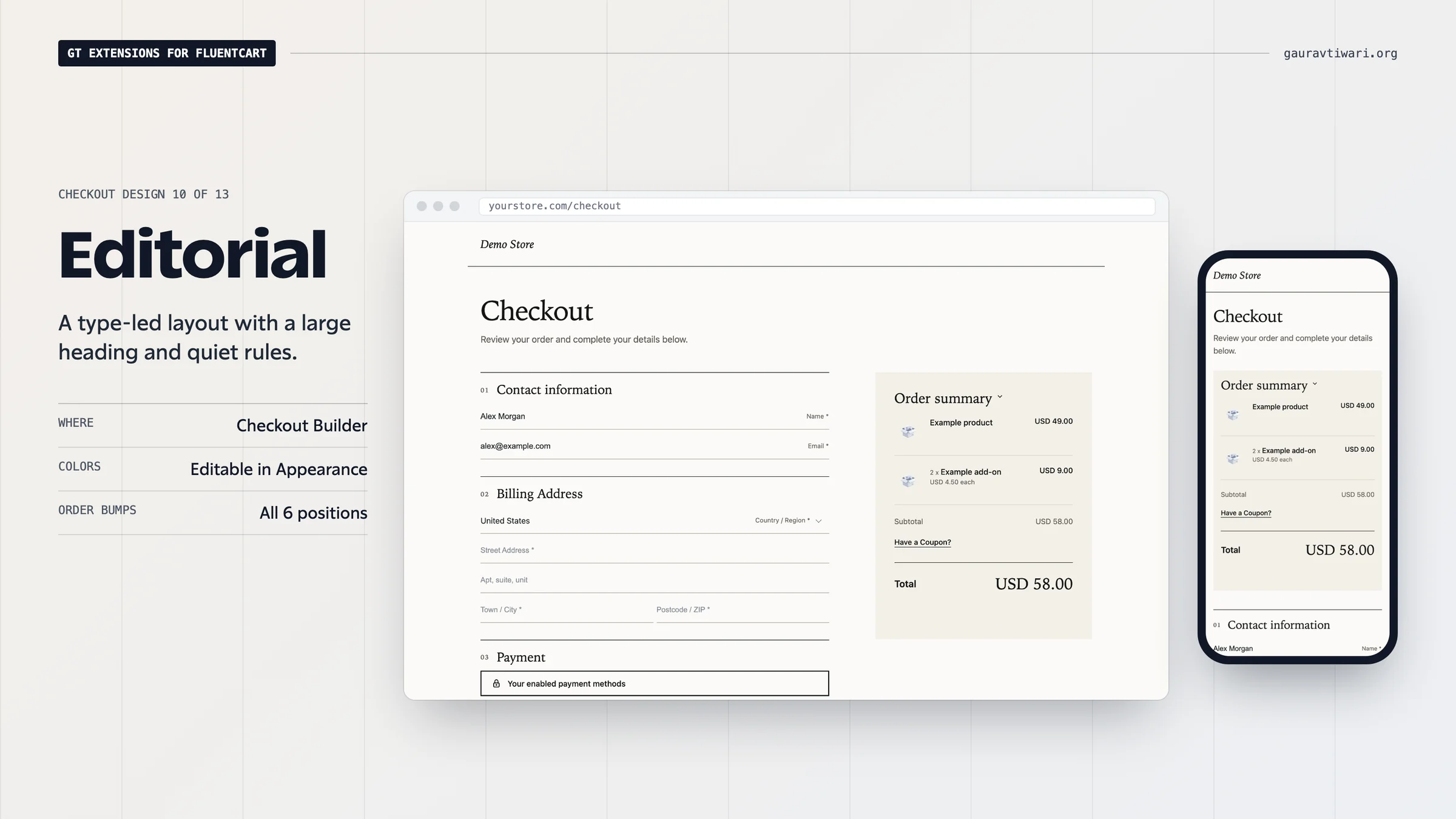
- Editorial: airy and type-led, with a serif headline, underline fields and no boxes.
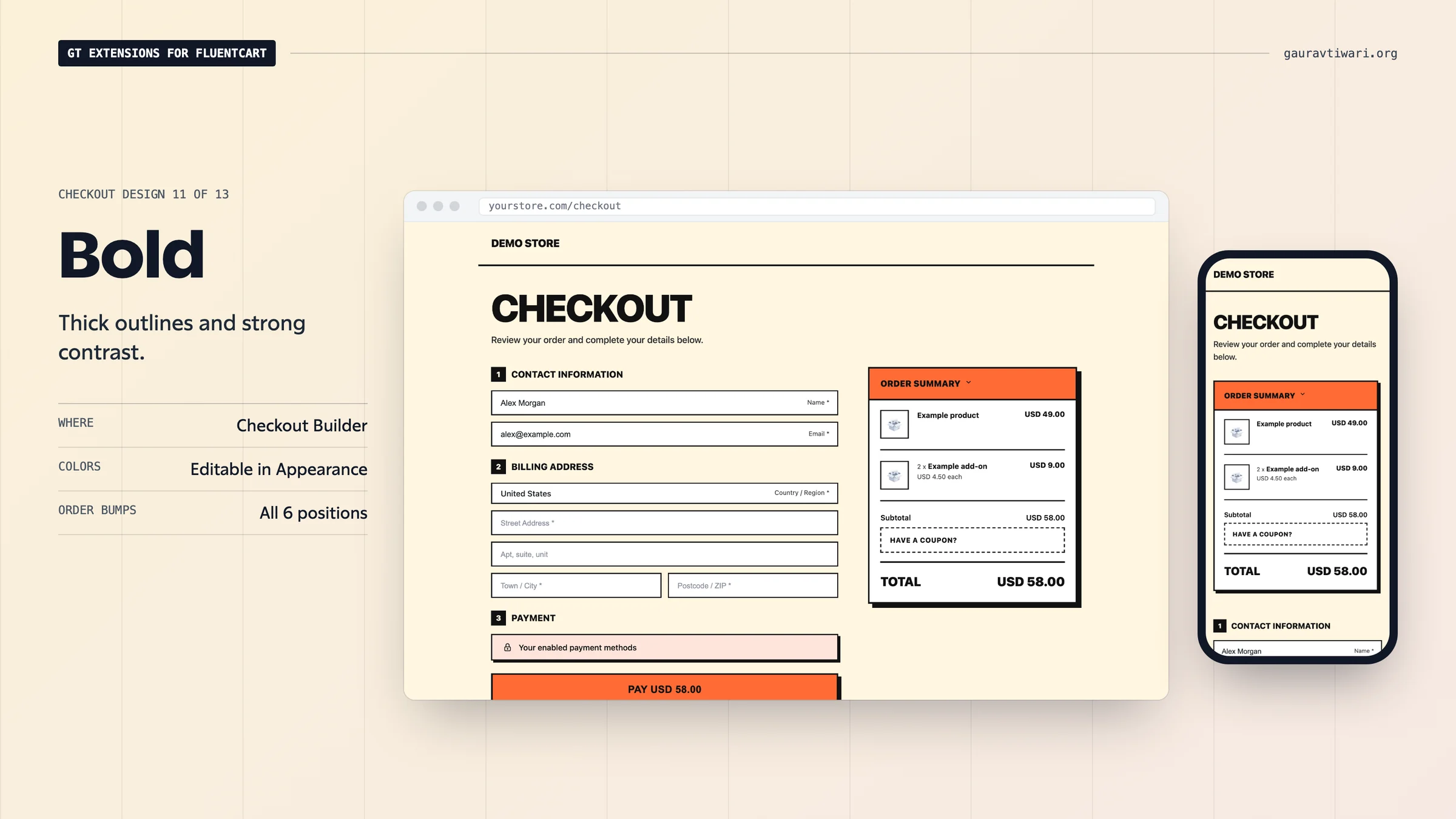
- Bold: thick outlines, hard shadows and a loud buy button for creator stores.
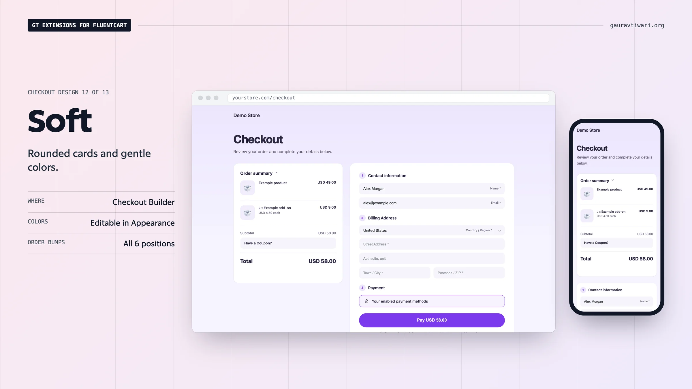
- Soft: rounded cards on a soft tint of your accent color, with a pill-shaped button.
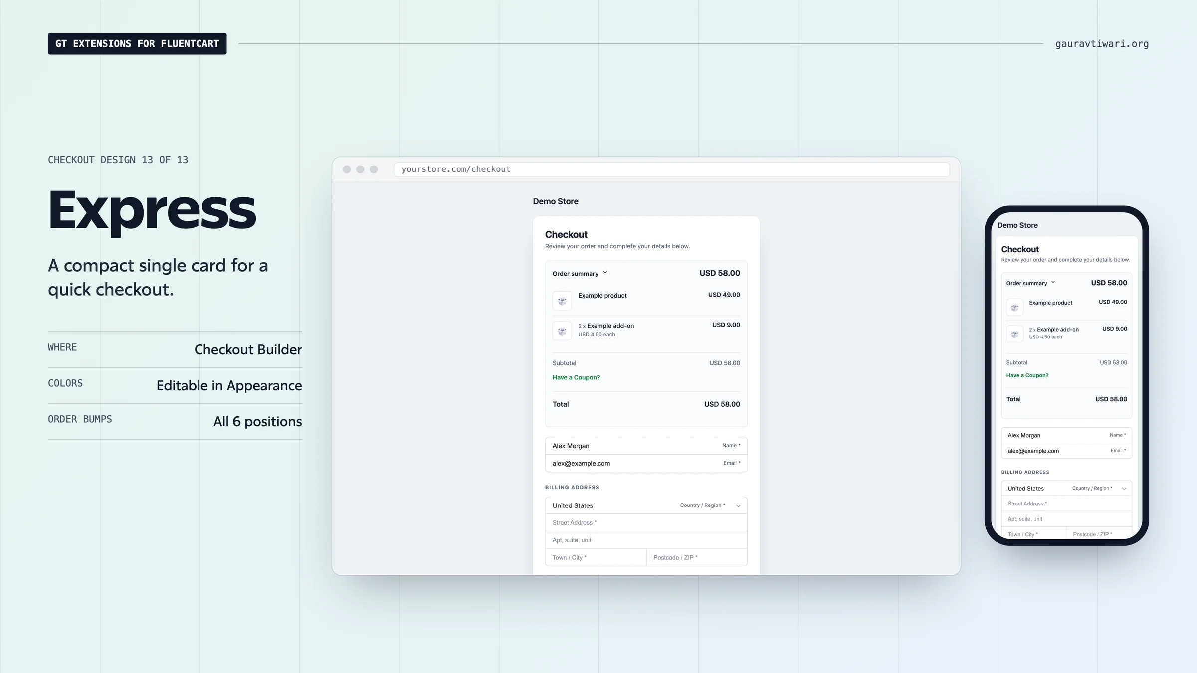
- Express: one compact card for quick single-product purchases, total first.
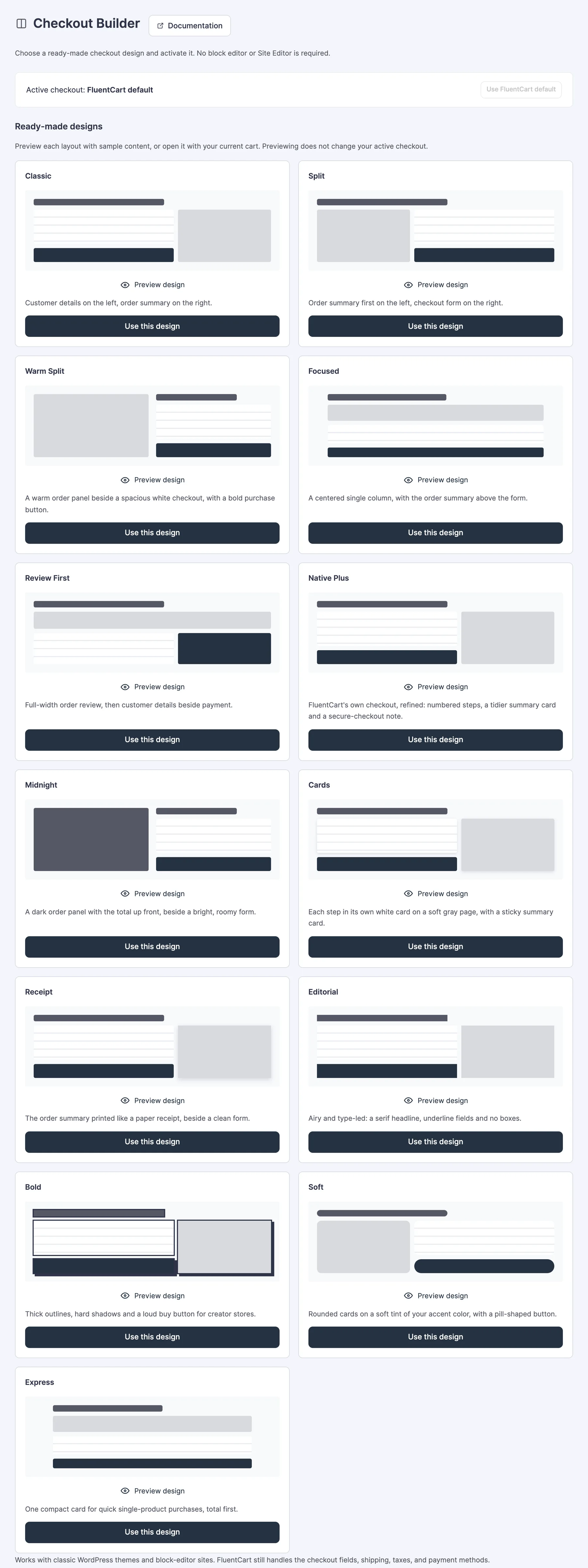
Native Plus, Midnight, Cards, Receipt, Editorial, Bold, Soft and Express were added in 2.22.0. Each of them starts with its own colors, which you can change under Appearance after you select the design.
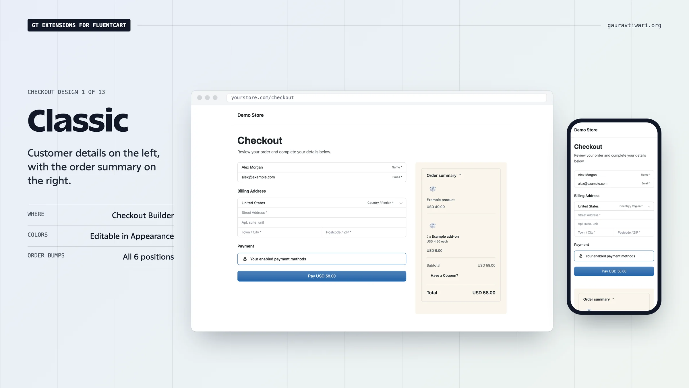
Classic
Customer details on the left, with the order summary on the right.
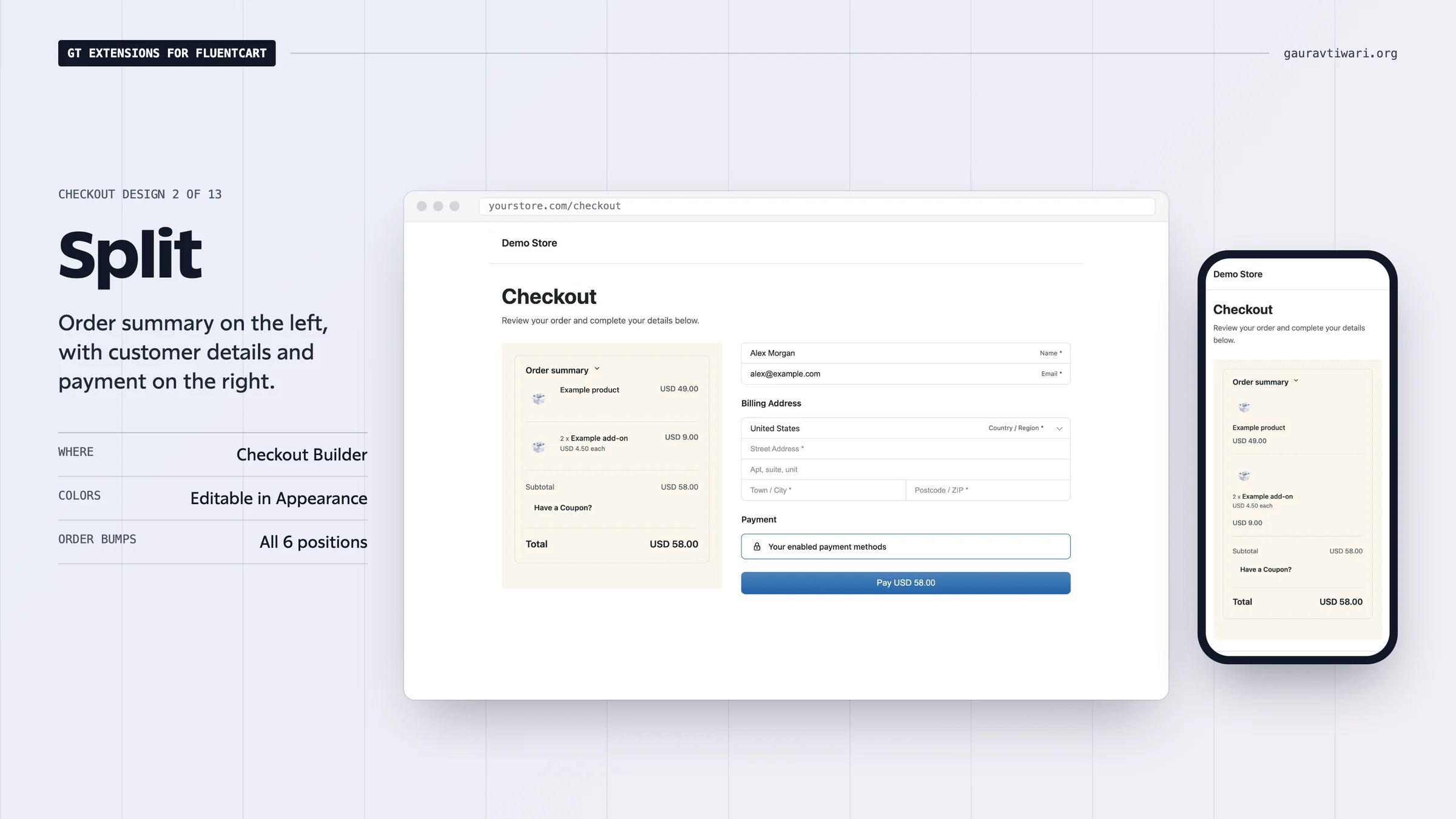
Split
Order summary on the left, with customer details and payment on the right.
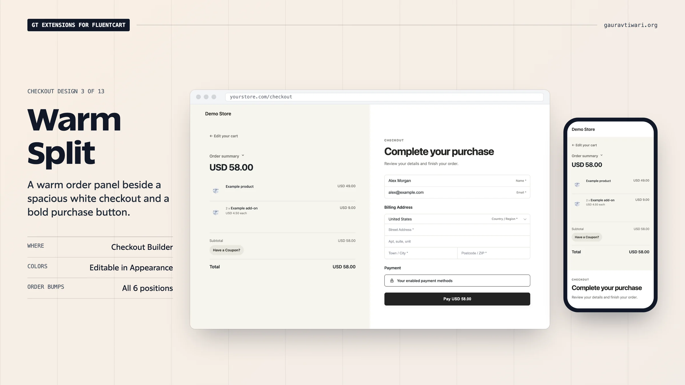
Warm Split
A warm order panel beside a spacious white checkout and a bold purchase button.
Focused
A centered single column, with the order summary above customer details and payment.
Review First
A full-width order review above customer details and payment in separate columns.
Native Plus
FluentCart’s own checkout, refined: numbered steps for contact information, billing address and payment, a tidier summary card, and a secure-checkout note under the pay button.
Midnight
A dark order panel with the order total in large type, beside a bright, roomy form.
Cards
Each step sits in its own white card on a soft gray page, with the order summary in a sticky card beside them.
Receipt
The order summary is printed like a paper receipt, with torn edges and dashed rules, beside a clean form.
Editorial
Airy and type-led: a serif headline, numbered sections separated by rules, and underline-only fields.
Bold
Thick black outlines, hard shadows, square corners and a loud buy button.
Soft
Rounded cards on a soft tint of your accent color, with filled fields and a pill-shaped button.
Express
One compact card with the order summary first, for quick single-product purchases.
Preview on Desktop and Mobile
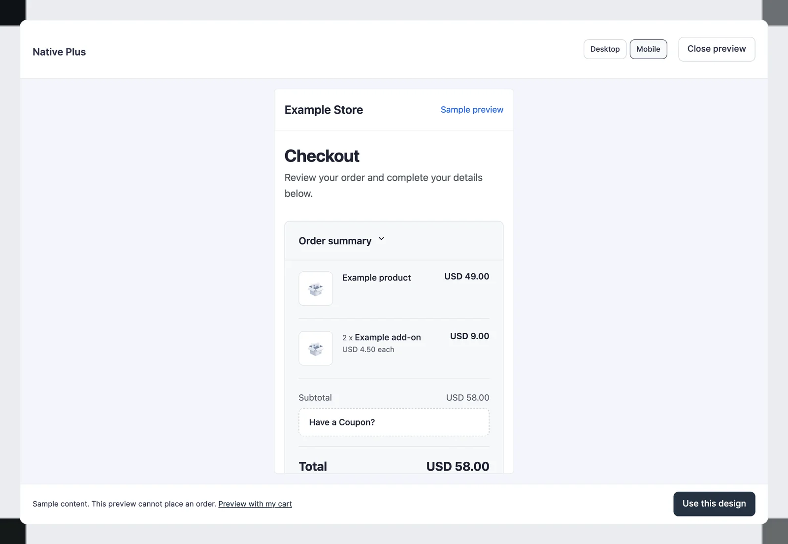
The sample preview has desktop and mobile controls and cannot place an order. Preview with my cart lets a signed-in store manager inspect the design using the current cart without changing what other customers see.
Activate and Adjust
Click Use this design when you have chosen the layout. The active design is identified in the library.
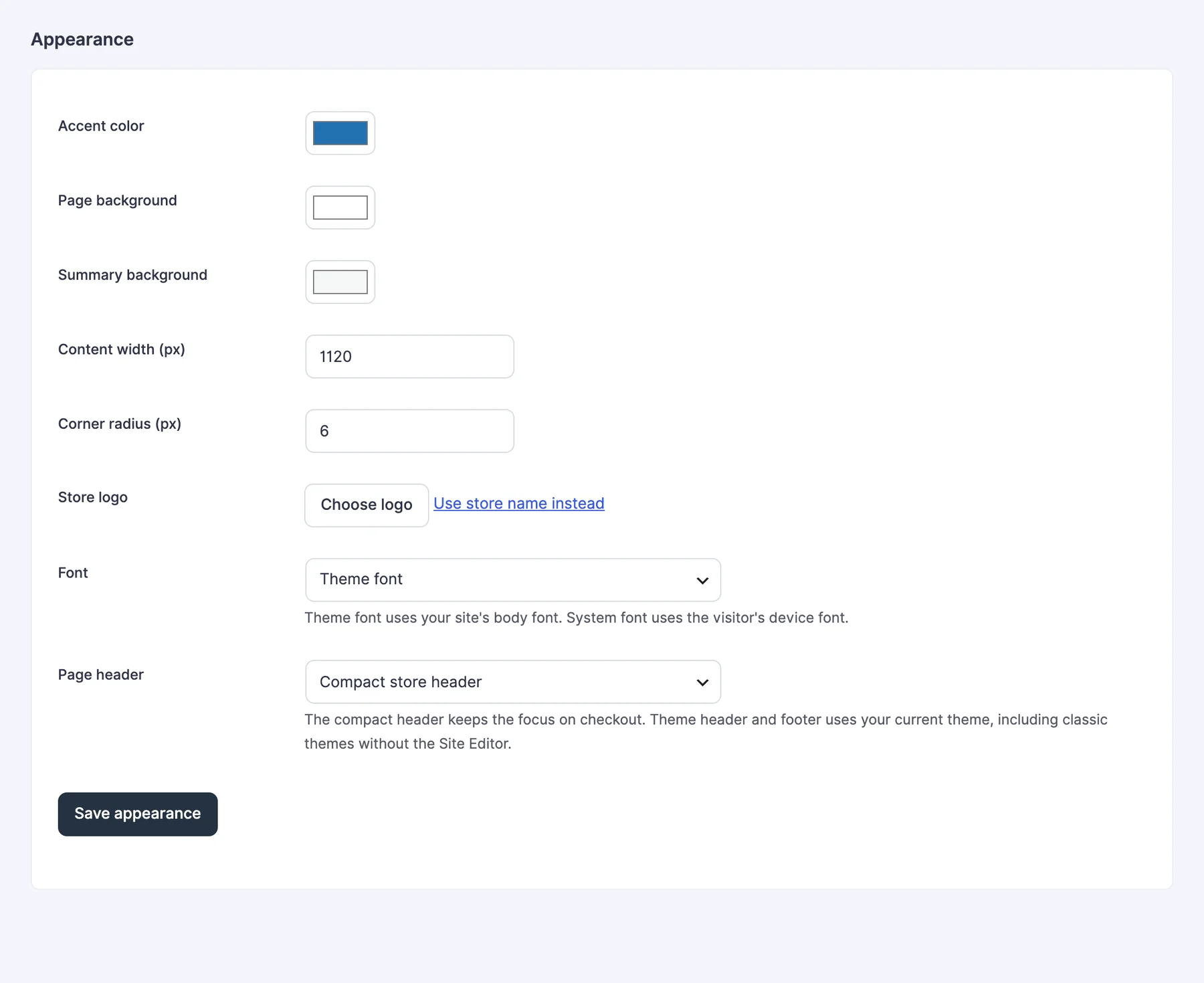
Appearance settings let you match the selected design to your store.
- Accent color: the primary action color.
- Page background: the checkout canvas color.
- Summary background: the order review panel color.
- Content width: 720 to 1,400 pixels.
- Corner radius: 0 to 24 pixels.
- Store logo: select a media-library image, or use the store name instead.
- Font: Theme font, the default, uses your site’s body font. System font uses the visitor’s device font.
- Page header: choose the compact store header or your theme header and footer.
Click Save appearance to keep these choices. Warm Split and the 8 designs added in 2.22.0 apply their own colors when selected; adjust appearance afterward if needed.
The layouts work with classic themes and with the block editor enabled or disabled. They don’t require a Full Site Editing theme. There is no separate custom checkout-design editor to manage: use FluentCart’s page selector and your normal checkout page when you want to author your own layout.
Example: Make the Order Easy to Review
Review First is useful when customers need to examine several items before paying. The order review sits above the two form columns instead of competing for space in a narrow sidebar.
Check your real product names, addresses, currencies, add-ons, delivery options and payment methods at desktop and mobile widths. The design arranges these controls; it doesn’t replace their settings or validation.
Order Bumps in Every Design
If you use FluentCart Pro 2.3.1 order bumps, they fit every Checkout Builder design. You don’t need to restyle them per design.
- Bumps work at all 6 positions: above or below customer details, above or below the order summary, and above or below payment methods.
- The order bump block is covered too.
- Bump cards take the design’s colors, corner radius and accent color.
- They stay readable on Midnight’s dark order panel and stay compact in narrow summary columns.
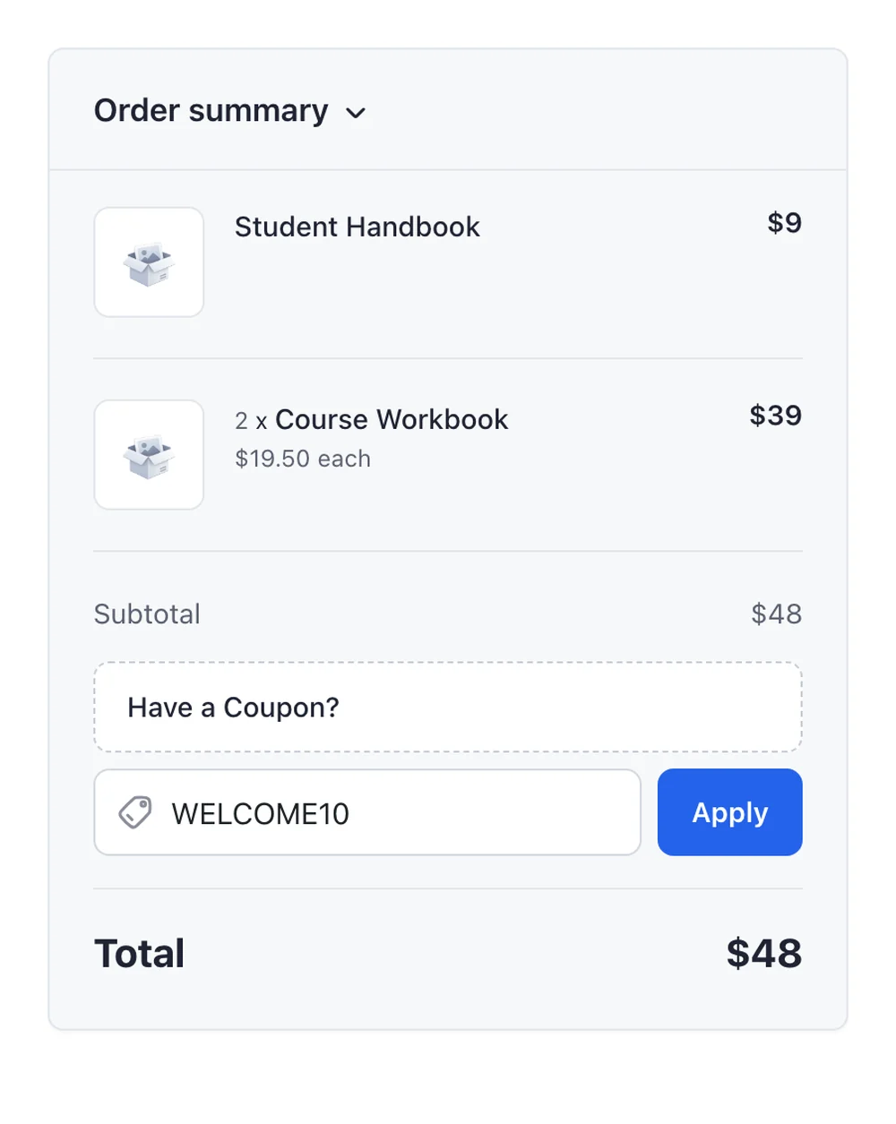
Coupon Field
Every design styles FluentCart’s coupon field the same way, in the design’s own colors.
- Have a Coupon? opens the code field right below it, lined up with its edges.
- Apply sits beside the code as a button in the design’s accent color.
- The tag icon stays inside the field.
Always in Light Mode
Checkout designs stay light when your theme or the visitor’s device uses dark mode. The form, order summary, saved address and payment methods keep the design’s colors, so every customer sees the checkout you previewed.
Sample previews stay light inside a dark WordPress admin too.
Use a Design on Other Pages
The same designs can sit under the plan cards of On-page Checkout, on a pricing page, a landing page or a product template. Leave its Checkout design on Active Checkout Builder design to follow this page, or pick a different design for that page. The colors, width and corner radius you set here apply there too.
Return to the Default
Choose Use FluentCart default to restore the native checkout presentation. The plugin doesn’t overwrite the configured checkout page’s original content. Design assets load only when a valid design is selected on that checkout page.
See checkout fields and delivery scheduling for the optional controls that can appear alongside payment.
If you’re still deciding between FluentCart’s native checkout and a ready-made design, the FluentCart checkout customization guide compares both approaches.