
Use On-page Checkout in Bricks Builder
Bricks pages, product templates and query loops can sell plans with On-page Checkout. The element puts plan cards and a FluentCart checkout on the page, in the checkout design you picked in Checkout Builder, so buyers pay without going to a separate checkout page.
This guide covers the Bricks side. For how the checkout itself works, carts, coupons and what buyers see, read Sell Plans on Any Page with On-page Checkout.
Before You Start
- Turn on On-page Checkout under FluentCart → GT Extensions. The element only appears in Bricks while the module is on.
- To use a checkout design, turn on Checkout Builder too and pick a design there. Without it, the element uses FluentCart’s compact checkout form.
- Bricks must be your active theme, or the parent of your active child theme.
Add the Element
- Open the page or template in Bricks.
- Click + to open the elements panel and search for checkout.
- Drag On-page Checkout into a section or container.
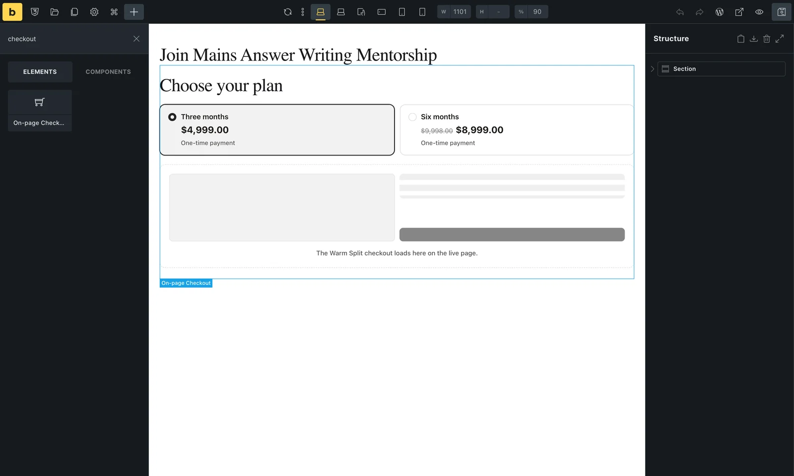
The element fills the width of its container, including inside flex rows, so you don’t need to set a width. Put it in a narrower container to make it narrower.
Choose the Product and Plans
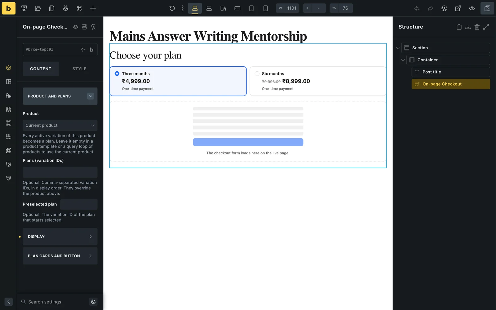
Select the element and open Product and plans. The link at the top opens the full On-page Checkout guide.
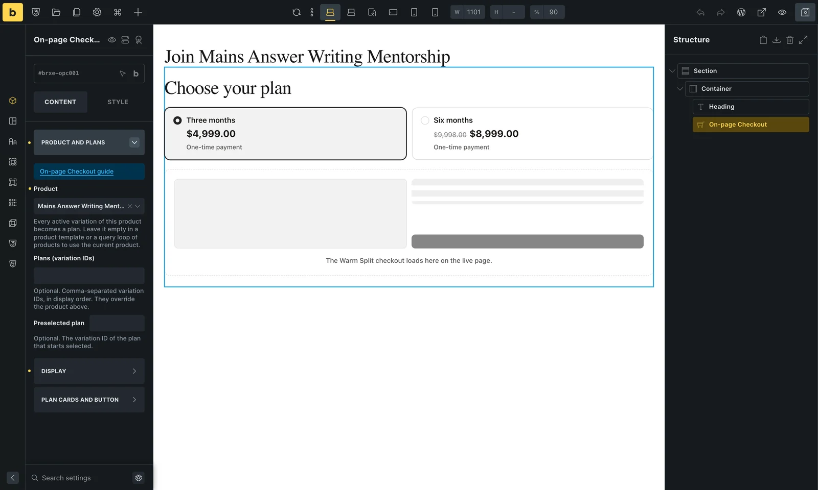
| Control | What it does |
|---|---|
| Product | A searchable list of your published FluentCart products. Every active variation becomes a plan card. Leave it empty in templates and loops (see below). |
| Plans (variation IDs) | Optional. Variation IDs separated by commas, in the order you want them shown. They replace the product’s own plans, so you can mix plans from different products. |
| Preselected plan | Optional. The variation ID of the plan that starts selected. Without it, the first available plan is selected. |
Pick the Design and Layout
The Display group controls what sits under the plan cards and how it opens.
| Control | What it does |
|---|---|
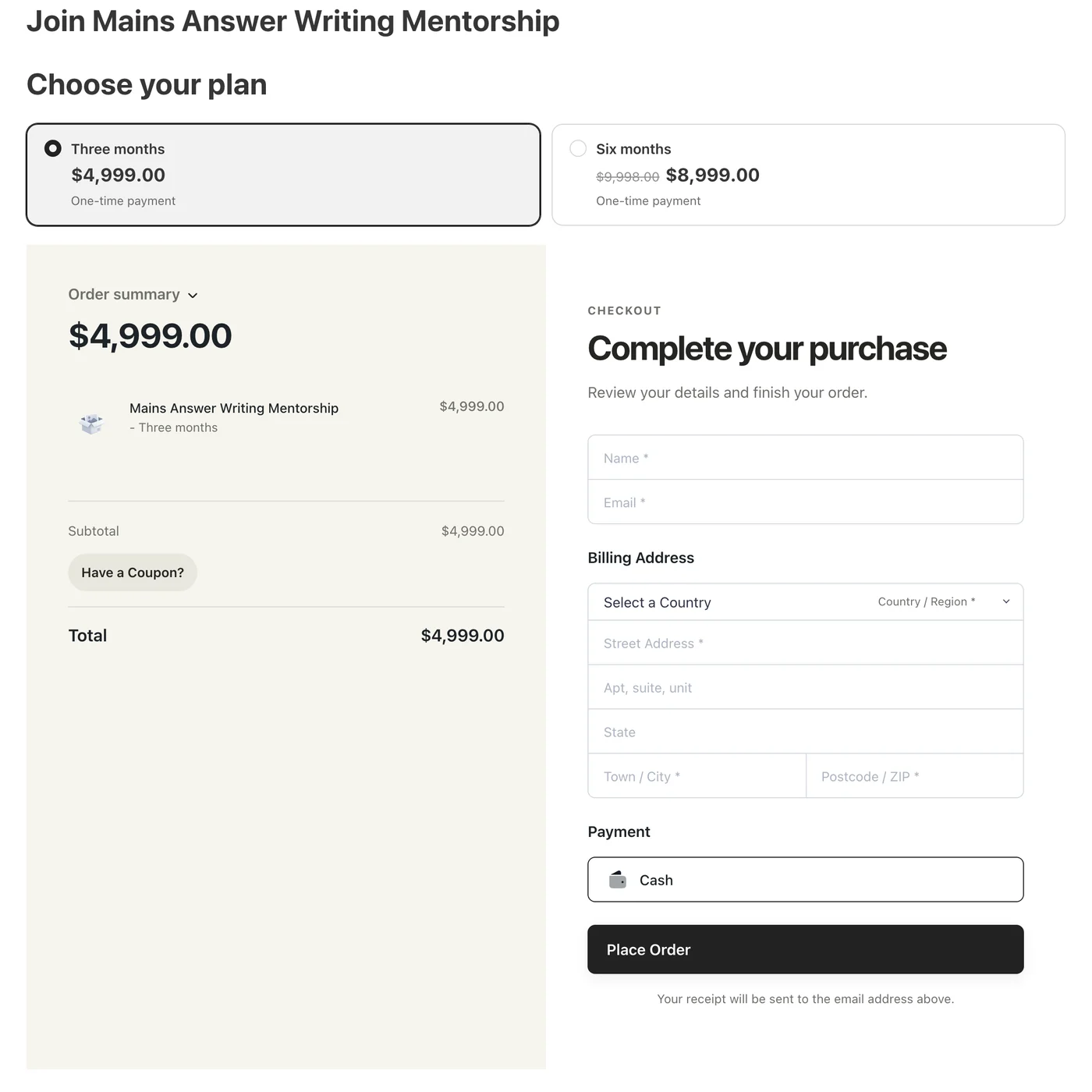
| Checkout design | Active Checkout Builder design (the default), Compact form, Classic, Split, Warm Split, Focused or Review First. Designs take their colors, width and corner radius from Checkout Builder. Compact form suits narrow columns. |
| Heading | Text above the plan cards, such as “Choose your plan”. Leave it empty for no heading. |
| Layout | Checkout form shown on the page loads the checkout as it scrolls into view. Button that opens the form in place shows the plans with a button, and the checkout opens under them when clicked. |
| Button text | The button’s label, “Buy now” by default. Only shown for the button layout. |
| Let buyers choose a quantity | Adds a quantity field for one-time products that are not sold individually. |
| Coupon to apply | A coupon code applied to the checkout. When it is empty, a ?coupon= code in the page address is used instead. |
In the builder, the element shows your plan cards and an outline of the chosen design where the checkout goes. It never loads a real checkout while you edit, so editing creates no carts. Preview the page to see the real checkout.
Style the Plan Cards and Button
Plan cards and button holds the element’s own styling. Bricks writes these as normal element styles, so they work with your global classes and breakpoints.
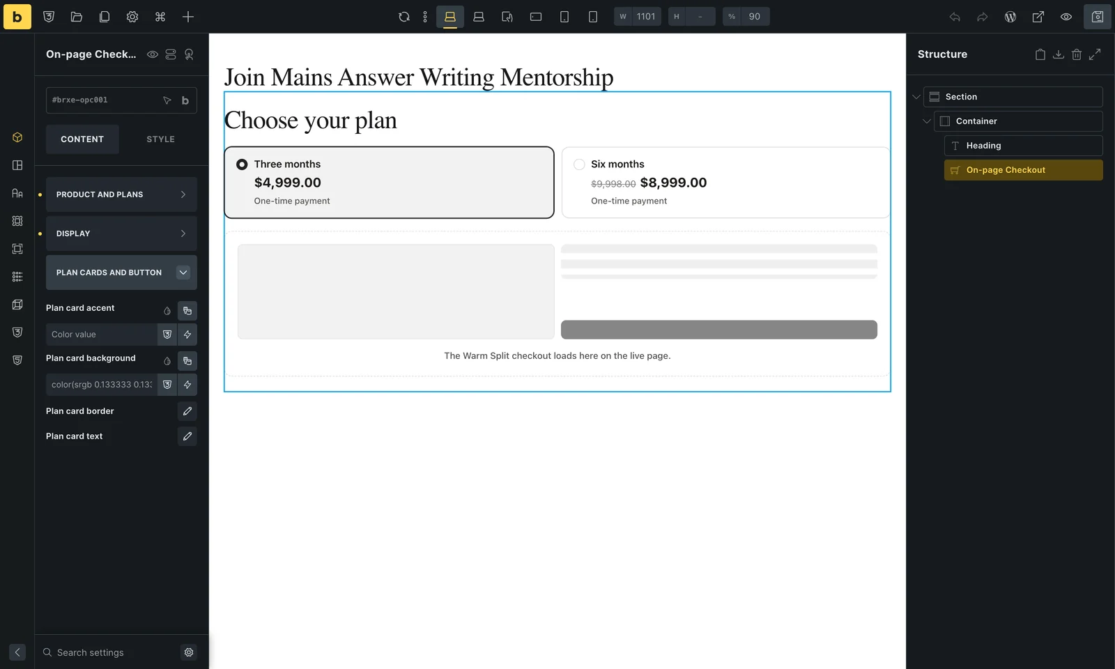
- Plan card accent: the color of the selected card’s border, radio mark and tint. It wins over the design’s accent.
- Plan card background, Plan card border and Plan card text: the cards’ fill, border and typography.
- Button background, Button text and Button border: shown only with the button layout.
The checkout form itself follows the design you picked. Change its colors in Checkout Builder so every checkout on the site matches.
Use It in Product Templates and Query Loops
Leave Product empty and the element sells the product it is shown for. One template then sells every product with its own plans.
- Single product templates: create a Bricks template of type Single, set its condition to FluentCart products, and add the element. In the builder it previews the product chosen under Populate content in the template settings.
- Query loops: inside a query loop of FluentCart products, each item gets its own plan cards and its own checkout. The button layout keeps long lists short.
- Product content: in a product’s own Bricks content, an empty Product sells that product.
On a page that is not a product, an empty Product shows a short note to editors and nothing to visitors.
Good to Know
- The checkout loads in an embedded frame with its own cart, so the visitor’s store cart is left alone and the page itself stays cacheable.
- A theme’s fixed bars, such as a sticky header or a mobile bottom menu, are hidden inside the embedded checkout.
- Templates that print product descriptions through
wp_kses_post()still work. The plan cards carry their own plan data. - To open checkout in a pop-up from any Bricks button instead, use Modal Checkout.