
 by
by
FluentCart checkout customization can start with the native checkout block or shortcode. If you want a ready-made layout you can preview and activate, GT Extensions offers 5 checkout designs with appearance controls, without requiring the Site Editor.
I’d start with the native checkout if you want to arrange the page yourself. A preset gives you a ready-made arrangement to adjust. Either way, preview it with a cart that resembles what your customers buy before choosing a layout.
This video shows how to change your FluentCart checkout layout with the GT Extensions Checkout module:
Choose Your Checkout Approach
FluentCart provides a native Checkout Page block and a checkout shortcode. You can use these on the page assigned in its settings. Since version 1.6.5, a native Appearance tab takes FluentCart’s colors from its own palette, your theme or a custom palette. Checkout Fields settings let you show, hide or require the name, company, phone, address and terms fields. Existing theme and builder integrations may also provide the controls you need.
I’d choose the approach that fits the change you need:
- You need a page arranged around custom content: Start with the native checkout tools and your page editor.
- You want a supplied layout with appearance controls: Consider Checkout Builder in GT Extensions for FluentCart, my add-on.
- You only need to show, hide or require standard fields: Use FluentCart’s native Checkout Fields settings before changing the layout.
- A price or payment method is wrong: Diagnose the commerce settings before changing the design. A different arrangement won’t correct an unsupported currency.
Checkout design is also separate from FluentCart product-page customization. Price labels and catalog buttons help before the buyer reaches checkout; they don’t determine how the checkout form and order summary are arranged.
Compare the Checkout Layouts
Checkout Builder offers 5 arrangements. I recommend choosing where the buyer should review the order in relation to the form, then checking that arrangement with your own cart.
| Layout | Arrangement | What to Check With Your Cart |
|---|---|---|
| Classic | Customer details on the left, order summary on the right | Whether long item names and totals fit comfortably beside the form |
| Split | Order summary on the left, checkout form on the right | Whether showing the order first helps the buyer understand the purchase |
| Warm Split | A warm order panel beside a white checkout form | Whether the palette and summary treatment fit your store |
| Focused | A centered single column with the summary above the form | How far the buyer scrolls when the basket or address form grows |
| Review First | Full-width order review, followed by customer details beside payment | Whether reviewing the items first is useful for your typical order |
A single digital item and a physical basket with several variations put different demands on the same page. You’ll need your own purchase data to compare conversion rates.
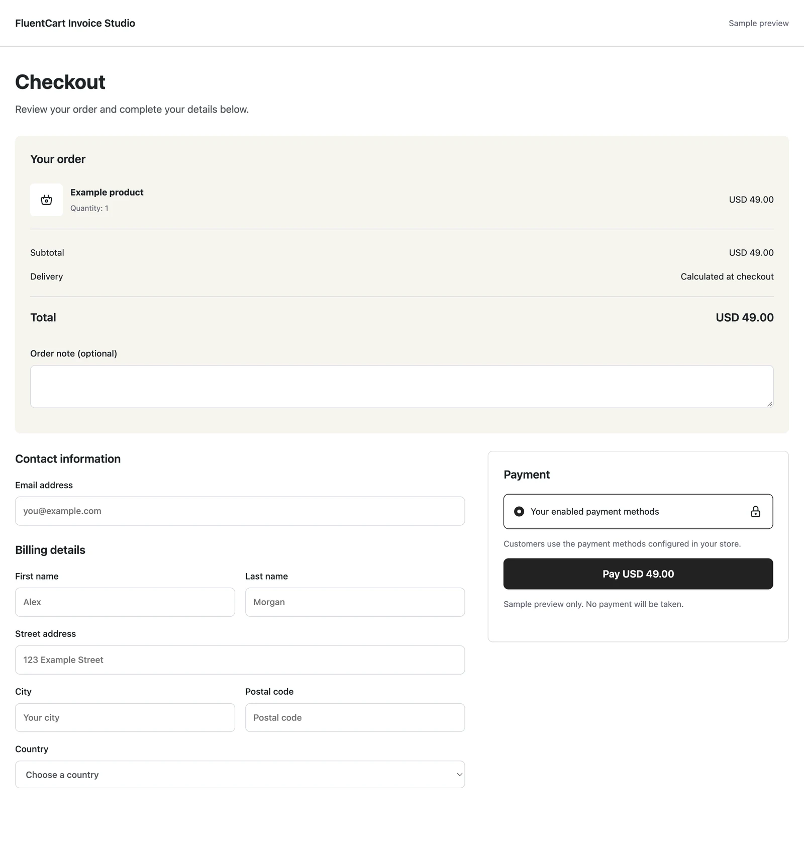
For example, a short summary can make Focused feel straightforward, while a long basket may push the form further down. I’d preview the items your customers commonly buy together.
Preview Before Activating
The module requires FluentCart 1.6.4 or newer. Enabling it doesn’t replace the current checkout by itself, so you can review the designs before making a selection.
To compare them:
- Open FluentCart > GT Extensions.
- Enable Checkout Builder and save the module settings.
- Open the Checkout Builder workspace.
- Preview a design at desktop and mobile widths.
- Use Preview with my cart to inspect it with your current cart while signed in as a store manager.
- Click Use this design when you want that layout to become active.
The 2 previews have different purposes:
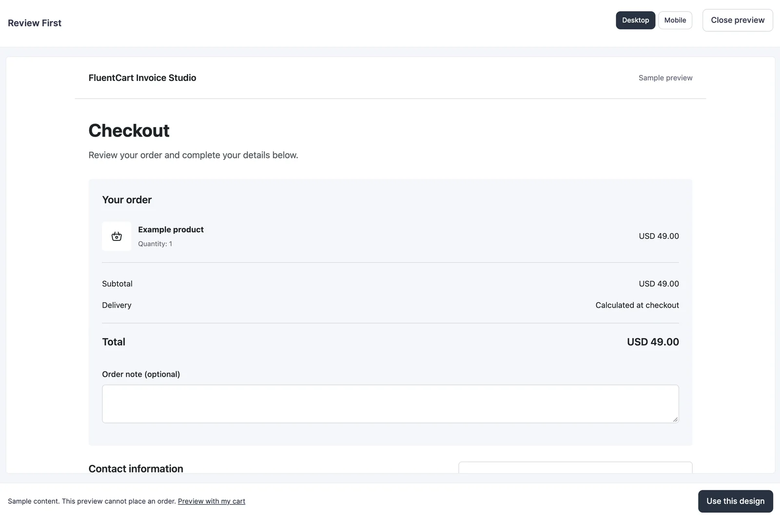
- Sample preview: Shows the arrangement even when your cart is empty. It cannot place an order.
- Real-cart preview: Shows the checkout using your cart for a signed-in store manager, without changing the active design for customers.
A sample preview helps you choose an arrangement. It doesn’t prove that your payment method, shipping rules or complete purchase path works.
Adjust Appearance and Headers
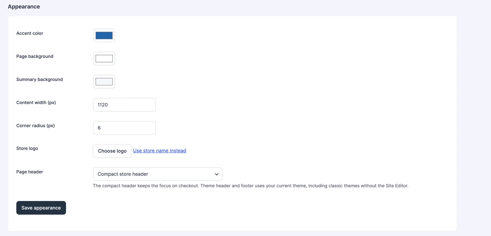
Appearance controls let you make the selected layout fit the store without editing a checkout template.
The available adjustments include:
- Logo and colors.
- Layout width and corner radius.
- A compact store header or the theme’s header and footer.
Save appearance saves these settings without activating a design. If you’ve adjusted the colors and the customer checkout still looks unchanged, check whether you’ve selected a layout using Use this design.
Warm Split applies its matching palette when activated. You can adjust Appearance afterward if the starting colors need to change.
The theme-header option uses the normal header and footer on classic themes. The built-in layouts don’t require Full Site Editing, and they can be used with the block editor enabled or disabled. You don’t need to change the site’s theme just to select one.
Check the Buying Task
I’d start with one representative order, then check the cases that change your form. Your buyer should be able to review the order and finish the purchase without confusion.
For your own store, check:
- Product identification: The selected variation and quantity are recognizable, including longer item names.
- Totals: The buyer can find the subtotal and final amount, with relevant charges clearly shown.
- Payment: The intended payment methods appear and the selected method’s interface is usable.
- Mobile reading: The summary and form don’t require horizontal scrolling or hide essential controls.
- Corrections: Validation messages are readable when a required value is missing or invalid.
- Physical orders: Address and shipping selections remain understandable when the cart requires them.
If you offer multiple currencies, compare the amount and payment options after a currency switch as a separate check. Layout styling shouldn’t be used to hide a pricing or gateway problem.
If you want to compare conversion rates, use purchase data from your own traffic and allow for differences in products, pricing and visitors. A layout preview can’t establish which preset will sell better.
Restore the Default Checkout
Checkout Builder preserves the original content of your configured checkout page. The supplied layouts don’t create a new WordPress post for each design.
To return to your normal page:
- Open Checkout Builder.
- Select Use FluentCart default.
- Manage your checkout page through FluentCart’s page selector and your normal editing workflow.
FluentCart’s Pages Setup documentation explains the checkout-page assignment. Keeping that assignment clear matters when a site has several old checkout pages or a landing page with an embedded purchase button.
The Limits
Checkout Builder supplies layouts around FluentCart’s checkout. FluentCart still handles the commerce behavior, so the choice of layout has a specific scope.
It doesn’t provide:
- A guarantee of higher sales or less abandonment.
- New payment-gateway eligibility or currency approval.
- A remedy for wrong product data or unsuitable shipping rules.
- A reason to cache customer-specific cart and checkout pages.
If your existing page works well and matches the store, I’d keep it. A supplied design is worth trying when it saves you rebuilding a form-and-summary arrangement you already need.
Choose With a Representative Cart
Pick the arrangement that makes the order easiest to understand and the form easiest to complete. The GT Extensions training course is the setup reference if you need the module instructions beside you.
Keep the native page assignment and default-restoration option clear before making changes. You should be able to explain why the new layout helps your buyer, and return to the previous route if it doesn’t.
Tell Google you want more of this.
Add Gaurav Tiwari as a preferred sourceOne tap, and this site shows up more often in your own Top Stories, AI Overviews and AI Mode. Remove it any time.
Disclaimer: This site is reader-supported. If you buy through some links, I may earn a small commission at no extra cost to you. I only recommend tools I trust and would use myself. Your support helps keep gauravtiwari.org free and focused on real-world advice. Thanks. - Gaurav Tiwari