
Form Theme Customizer
Use Core Forms → Form Theme Customizer to set the default appearance of forms that load the built-in Core Forms theme. The preview uses the same stylesheet and token set as the frontend, so desktop and mobile checks reflect the saved result.
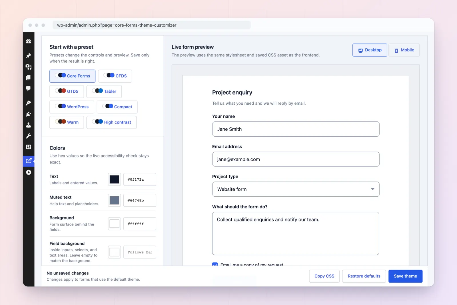
Start from a preset
Under Start with a preset, pick one of eight starting points. Hover over a preset to see its description.
| Preset | What it sets |
|---|---|
| Core Forms | The built-in default. |
| CFDS | Core Forms Design System: Inter, slate ink, a deeper brand-blue button, 6px corners, medium labels, flat depth. |
| GTDS | GT Design System: coral action color, warm neutrals, 4px squared corners and buttons, 16px field text, 48px fields, flat depth, and the font left to your theme. |
| Tabler | Tabler dashboard UI: neutral grays, 14px controls, 40px fields, medium labels, system font. |
| WordPress | Native WordPress components: 2px corners, 40px controls, admin blue, 13px text, system font, flat depth. |
| Compact | A tighter rhythm for long forms and sidebars: smaller spacing, padding and text, 36px fields. |
| Warm | A cream surface with a rust accent and 6px corners. |
| High contrast | Darker text and borders, 2px field borders and square corners. |
Each preset is a complete set of values, so switching from one preset to another never leaves settings behind from the first. Every preset passes the customizer’s own contrast check.
A preset updates the controls and preview immediately. It does not affect visitors until you select Save theme. You can still change any control after picking a preset.
Developers can add or change presets with the cf_form_theme_presets filter. Each preset needs a label, a description and a tokens map. Tokens a preset leaves out use the stylesheet defaults.
Available controls
The controls are grouped into four sections.
Colors
- Text: labels and entered values.
- Muted text: help text and placeholders.
- Background: the form surface behind the fields.
- Field background: inside inputs, selects and text areas. Leave it empty to match the background.
- Field border and Soft border: the input outline, and dividers and quiet boundaries.
- Primary and focus: checked controls, links and keyboard focus.
- Error and Success: validation and confirmation states.
Buttons
- Button: the submit button fill. Leave it empty to use the primary color.
- Button text: the label on the submit button.
- Button radius: leave it empty to match the field corner radius.
- Button padding: vertical and horizontal space inside the button. Default
12px 22px. - Button width: Fit the label (default) or Full width, which suits narrow and mobile-first forms.
- Depth: Soft shadows (default) under fields and the submit button, or Flat.
Typography
- Font stack:
inherit(default) follows the surrounding site, or enter an explicit stack. - Field text size: entered values and the button label. Default
15px. Use 16px or more to stop iOS zooming into fields. - Label size: field labels and fieldset legends. Default
14px. - Label weight: Regular, Medium, Semibold (default) or Bold.
Spacing and shape
- Form width: the maximum width. Default
640px. Use100%ornoneto fill the container. - Wrapper padding: space inside the form boundary, with a 10px default.
- Field spacing: vertical space between fields. Default
20px. - Corner radius: fields and messages. Default
8px. Use0for square corners. - Border width: field outline thickness. Default
1px. - Input padding: vertical and horizontal field padding. Default
11px 14px. - Minimum field height: default
44px. Keep at least 44px for comfortable touch targets.
Controls that follow another value, such as Field background or Button, show which control they follow while they’re empty. Values that aren’t valid CSS for their control are dropped when you save, and the default applies instead.
Use the Desktop and Mobile switch to inspect narrow layouts before saving. The Accessibility check panel tests the important color pairs: text, focus, field border, error and success on the background, text on the field background, and button text on the button. A real keyboard and screen-reader pass is still recommended for the finished page.
Wrapper padding controls the space inside the form boundary. Enter 0 to remove it, 10px for equal padding, or 10px 20px for different vertical and horizontal padding. The saved value also applies to the form builder’s preview and themed frontend forms. It is separate from the padding inside individual inputs.
Which forms use the theme
When the default form theme is enabled in Core Forms > Settings, saved values apply to every form that uses the built-in theme. When it’s disabled, they apply only to forms that turn the theme on themselves, in the form’s settings or in the Core Forms block’s style options. The customizer’s header shows which of these is in effect.
Generated frontend CSS
Saving the theme sanitizes the tokens and writes a generated file to:
wp-content/uploads/core-forms/form-theme-custom.cssThe filename stays stable while its content hash changes. Core Forms enqueues the new hash, so browser and CDN caches receive the current design after every save. Restoring defaults regenerates the asset as well.
If WordPress cannot write to the uploads directory, Core Forms keeps the saved values but falls back to an inline generated override. Fix uploads permissions and save again to restore the file-backed asset.
The Copy CSS button copies the current token override for a child theme or design-system reference. Continue using the customizer as the source of truth unless you deliberately take ownership of those values in code.
Per-form and custom CSS
The customizer supplies site defaults. A form may still:
- disable the default theme;
- add its own scoped CSS in the Fields editor;
- inherit additional typography or spacing from the host theme.
Core Forms explicitly styles labels, inputs, select controls, help text, checkboxes, buttons, validation, and focus states. Keep custom overrides scoped under .cf-form to avoid leaking them into the rest of the page.