
 by
by
You search “wordpress website examples” and get the same list 30 times. TechCrunch. The White House. Rolling Stone. All true, all running custom enterprise builds, and none of it helps you design your own site.
This guide works differently. Every site below is verifiably WordPress right now, through the official WordPress.org showcase, WooCommerce’s showcase, or the page source itself. And every entry names the one pattern you can adapt with a theme and plugins you can actually afford.
Every example covers what the site does well, how its WordPress use is verified, and the specific pattern worth taking home. Not just “look how pretty.” Look what you can do too.
How I Picked and Verified These Examples
Most WordPress website examples articles grab the same Fortune 500 list and call it a day. Those articles prove WordPress scales. They don’t help you design anything.
So the bar for this list has 5 parts:
- Verifiably WordPress, today. Each site is confirmed through the WordPress.org showcase, the official WooCommerce showcase, a first-party statement, or wp-content signals in its live page source, checked in August 2026.
- One pattern worth adapting. Every entry names something specific you can rebuild with commercially available themes and plugins.
- A real mix of budgets. A bakery and a dairy farm sit next to TechCrunch, because you should see every tier, not only the one you can’t afford.
- Transferable lessons. Where a feature needs a custom enterprise platform, I say so instead of pretending a plugin gets you there.
- Named stacks only when detectable. If a theme or builder can’t be verified publicly, it stays unnamed here.
That first rule earns its place. Beardbrand, Oura Ring, and Roberto Coin, 3 stores that still headline competing example lists, have all moved to Shopify. Checking first is the difference between a guide and a rumor.
The scale itself was never in question. WordPress powers 40.7% of all websites and 58.9% of sites with a detectable CMS, per W3Techs. The open question is which of its design decisions are worth copying, and that’s what the rest of this page answers.
Quick Comparisons
All 14 examples at a glance, with how each site’s WordPress status is verified and how hard the build is to approximate.
| Website | Type | Verified through | Build tier |
|---|---|---|---|
| Lamanna’s Bakery | Small business | WordPress.org showcase | Easy |
| Hartzler Family Dairy | Small business | WordPress.org showcase | Intermediate |
| Pinch of Yum | Food blog | Page source + first-party | Custom |
| Rolling Stone | Publisher | WordPress.org showcase | Enterprise |
| TechCrunch | Publisher | WordPress.org showcase | Enterprise |
| Nalgene | WooCommerce store | Woo showcase + page source | Intermediate |
| Yumi | WooCommerce store | Woo showcase + page source | Intermediate |
| Landyachtz | WooCommerce store | Woo showcase + page source | Intermediate |
| Steffie de Leeuw | Portfolio + shop | WordPress.org showcase | Custom |
| PichiAvo | Portfolio | WordPress.org showcase | Custom |
| Microsoft Source | Corporate news | WordPress.org showcase | Enterprise |
| Meta Newsroom | Corporate news | WordPress.org showcase | Enterprise |
| NerdWallet | Headless content | Hosting case study | Enterprise |
| Georgia State University | Education multisite | WordPress.org showcase | Custom |
Small Business WordPress Examples
This is the tier most example lists skip, and it’s the tier most readers are actually building in. Both sites here sit in the official WordPress.org showcase under its small business tag.
Lamanna’s Bakery

Lamanna’s Bakery in Toronto commits completely: the entire viewport is one loud typographic poster, “Home of the Big Slice,” in brand orange and yellow. Navigation collapses to 2 actions, order online and shop merch. WordPress.org’s showcase write-up calls the design choices intentionally outrageous, and that’s the point.
Adapt the focus, not the palette. Pick the one thing your business is known for and let it fill the screen. Any modern theme handles oversized headings and 2 buttons; the hard part is resisting the urge to add 6 more sections.
Hartzler Family Dairy
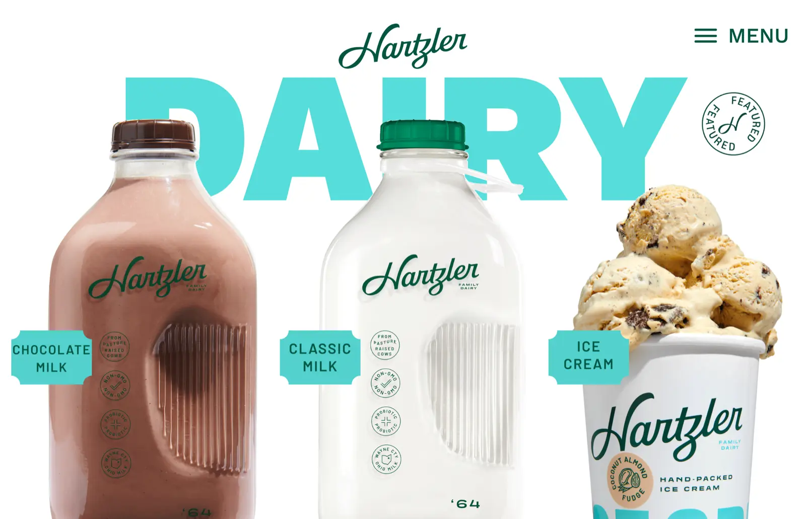
Hartzler Family Dairy bottles milk in glass in Ohio, and its homepage is built from studio-quality cutouts of the actual products, each with a small label, set against a giant DAIRY wordmark. It reads like a design agency got hold of a farm stand, in the best way.
The adaptable pattern is product photography on clean white with consistent labeling. A phone, a light tent, and a background remover get a small shop most of this look. The typography does the rest.
WordPress Blog and Publication Examples
Content sites are where WordPress started. These 3 span a solo food blog to 2 enterprise newsrooms, and the lessons scale down better than you’d expect.
Pinch of Yum
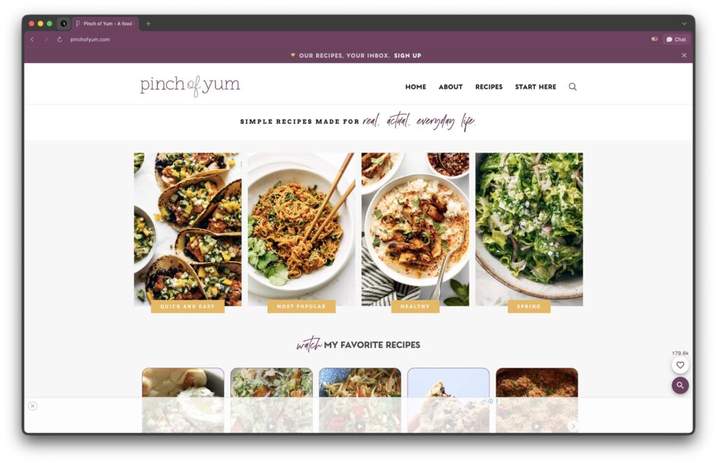
Pinch of Yum is one of the most successful food blogs running, and still WordPress: the page source says so outright, and the team states publicly that its theme is a custom build. The design is photography first, with recipes indexed every way a hungry reader might think, by ingredient, by meal, by time.
The card grid is the part you can take. A Query Loop block or Kadence Blocks post grid reproduces it without custom code. What you supply is disciplined photography, one style, one crop, every card.
Rolling Stone
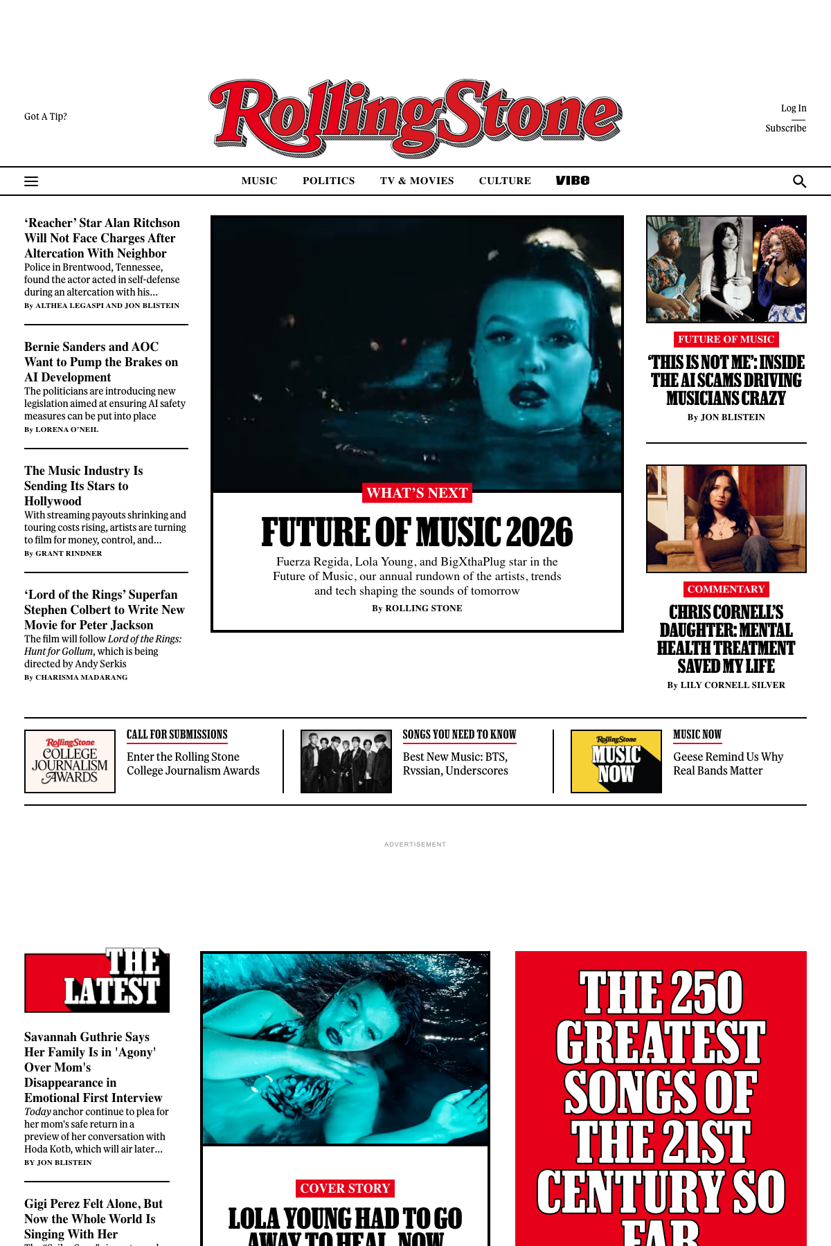
Rolling Stone is listed in the WordPress.org showcase as a WordPress Enterprise build, published by Penske Media. Every feature story opens with a cinematic full-width image and an overlay headline, and the magazine’s hierarchy survives on screen: features up top, streams below.
A cover block gives you the same hero treatment in 5 minutes. What Rolling Stone adds is restraint. 1 story gets the cinema treatment, not 10.
TechCrunch
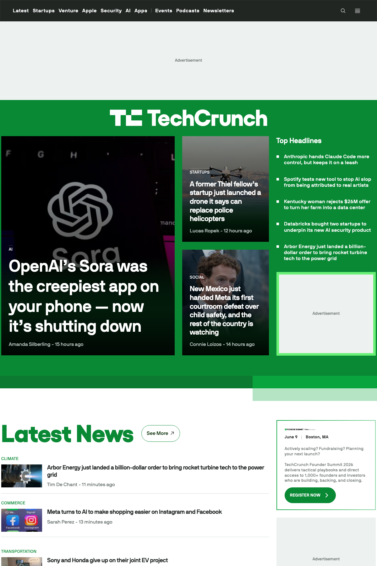
TechCrunch is the other WordPress Enterprise regular in the showcase, and the sharper lesson in information hierarchy: breaking story at the top, category streams under it, trending rail at the side. Nothing decorative survives unless it routes a reader somewhere.
You can’t buy their infrastructure, but the layout logic costs nothing: lead with your best content and make everything else a scannable stream. GeneratePress with GenerateBlocks or Kadence with its header builder will frame that skeleton on a normal budget.
WooCommerce Website Examples
WooCommerce accounts for 48.1% of the ecommerce systems W3Techs can detect, which works out to 8.1% of all websites. The 3 stores here appear in WooCommerce’s official showcase, and each one’s live page source confirms the stack.
If you’re building at this tier, my WooCommerce themes roundup covers the theme side of the decision.
Nalgene
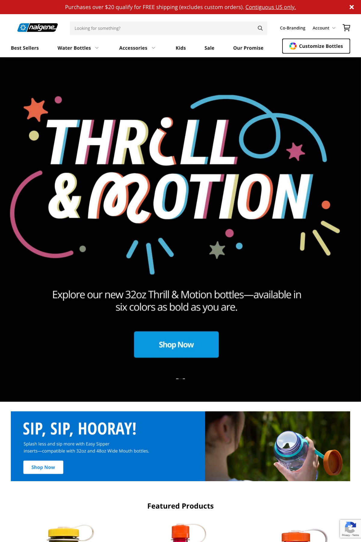
Nalgene sells its water bottles direct on WooCommerce. The part worth studying is catalog navigation: you can shop by bottle shape, by size in ounces, by collection, or by use case, instead of being forced through one product grid. There’s a bottle customizer for people who know exactly what they want.
This is WooCommerce attributes and categories doing their actual job, wired into a structured mega menu. No custom platform required, just taxonomy discipline before you upload the first product.
Yumi
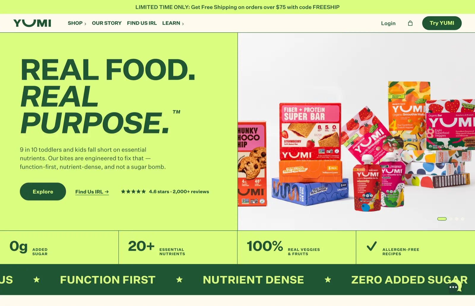
Yumi is a kids’ nutrition brand that leads with the claim, not the catalog. The hero pairs “Real food. Real purpose.” with the stat that 9 in 10 toddlers fall short on essential nutrients, then stacks the evidence: 4.6 stars across 2,000+ reviews, a band of nutrition facts, press logos. Products come after the argument.
Steal the order: claim, evidence, then products. Any block theme can build that stat band. Most stores just never decide what their one claim is.
Landyachtz
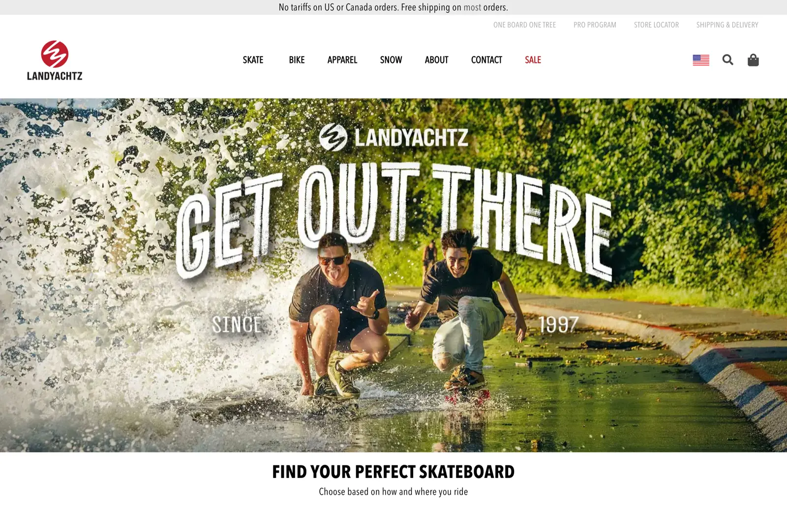
Landyachtz, a Vancouver skateboard maker featured in WooCommerce’s showcase, does guided selling properly: “Find your perfect skateboard, choose based on how and where you ride” sits ahead of any raw catalog browsing.
A guided path beats a wall of near-identical products whenever the buyer isn’t an expert. You can approximate it with well-curated category landing pages long before you need a quiz plugin.
WordPress Portfolio and Creative Examples
Both picks come from the showcase’s creative category, and both make the same argument: the work should be the interface.
Steffie de Leeuw

Steffie de Leeuw is an Amsterdam artist and designer whose site opens on a full-bleed botanical artwork with “Wallpapers & Wall Art” set in editorial serif over it. It’s a portfolio that quietly became a store: the same WordPress install runs a WooCommerce shop for her wallpaper designs, and the shop never upstages the art.
For any visual creator, that’s the model: lead with one piece at full width, keep the chrome nearly invisible, and let commerce hang off the work instead of the other way around.
PichiAvo
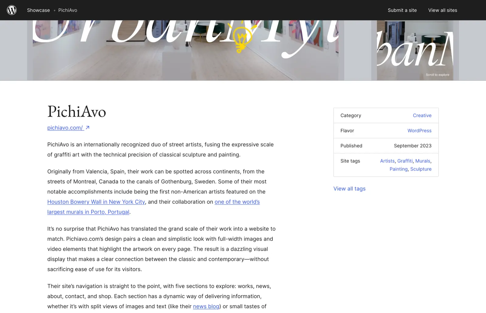
PichiAvo is a Valencia street-art duo fusing graffiti with classical painting, and their site translates that scale: full-width images and video on every page, and just 5 sections in total, works, news, about, contact, shop. The showcase entry credits it for pairing the visual spectacle with plain ease of use, which is exactly the balance most artist sites miss.
The adaptable idea is the 5-section sitemap. Portfolio sites die from 12-item menus.
Corporate and Headless WordPress Examples
3 different answers to the same question: how does a large organization use WordPress without the site collapsing under process?
Microsoft Source
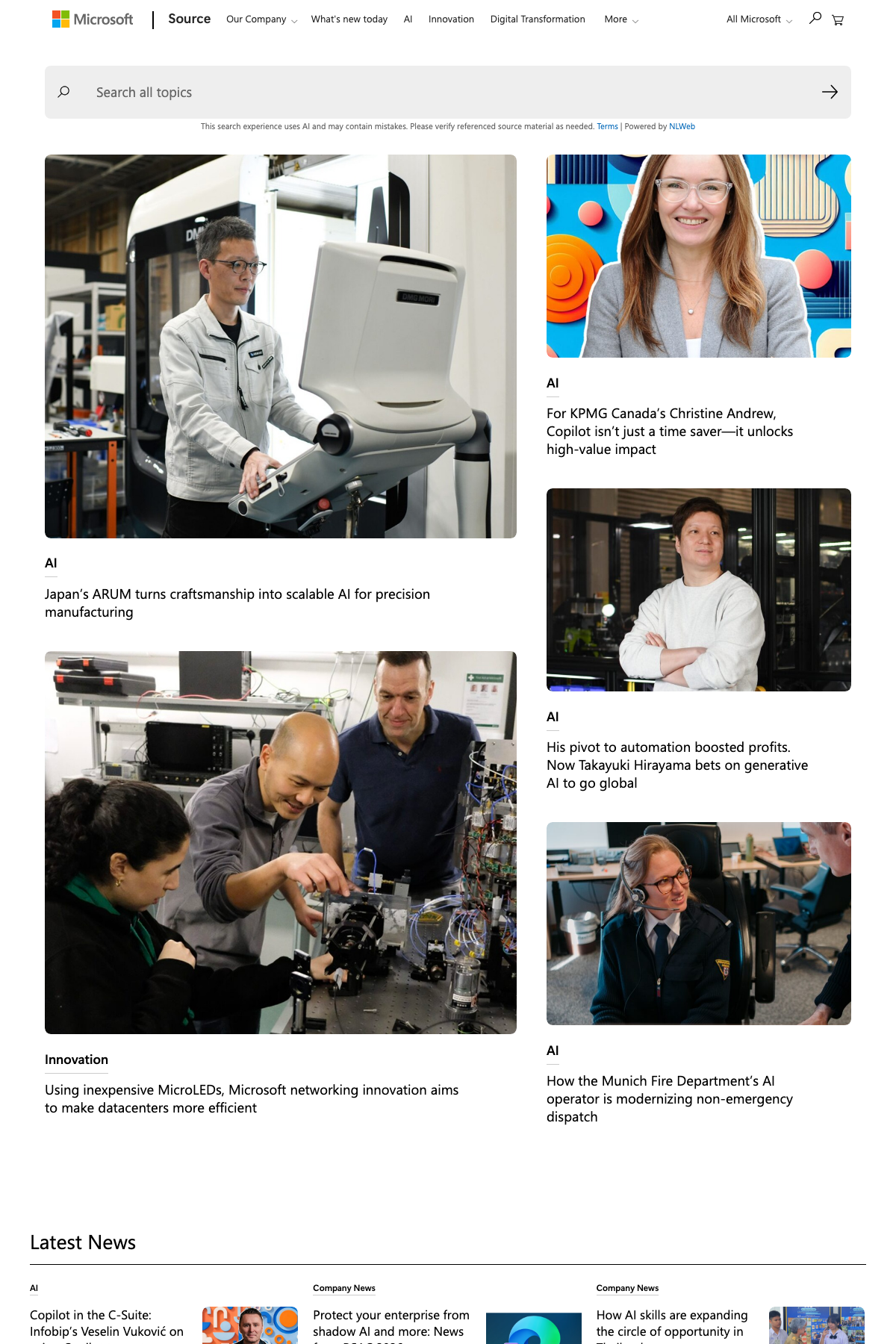
Microsoft Source is Microsoft’s news hub, listed in the WordPress.org showcase as Source (Microsoft). The design is unglamorous on purpose: card grids, a clean category system, fast pages despite the volume. It gives visual weight to featured stories while everything else stays scannable.
Card and masonry grids like these are reproducible with GenerateBlocks or Kadence Blocks on any mid-size company blog. The grid isn’t the hard part; publishing enough to fill it is.
Meta Newsroom
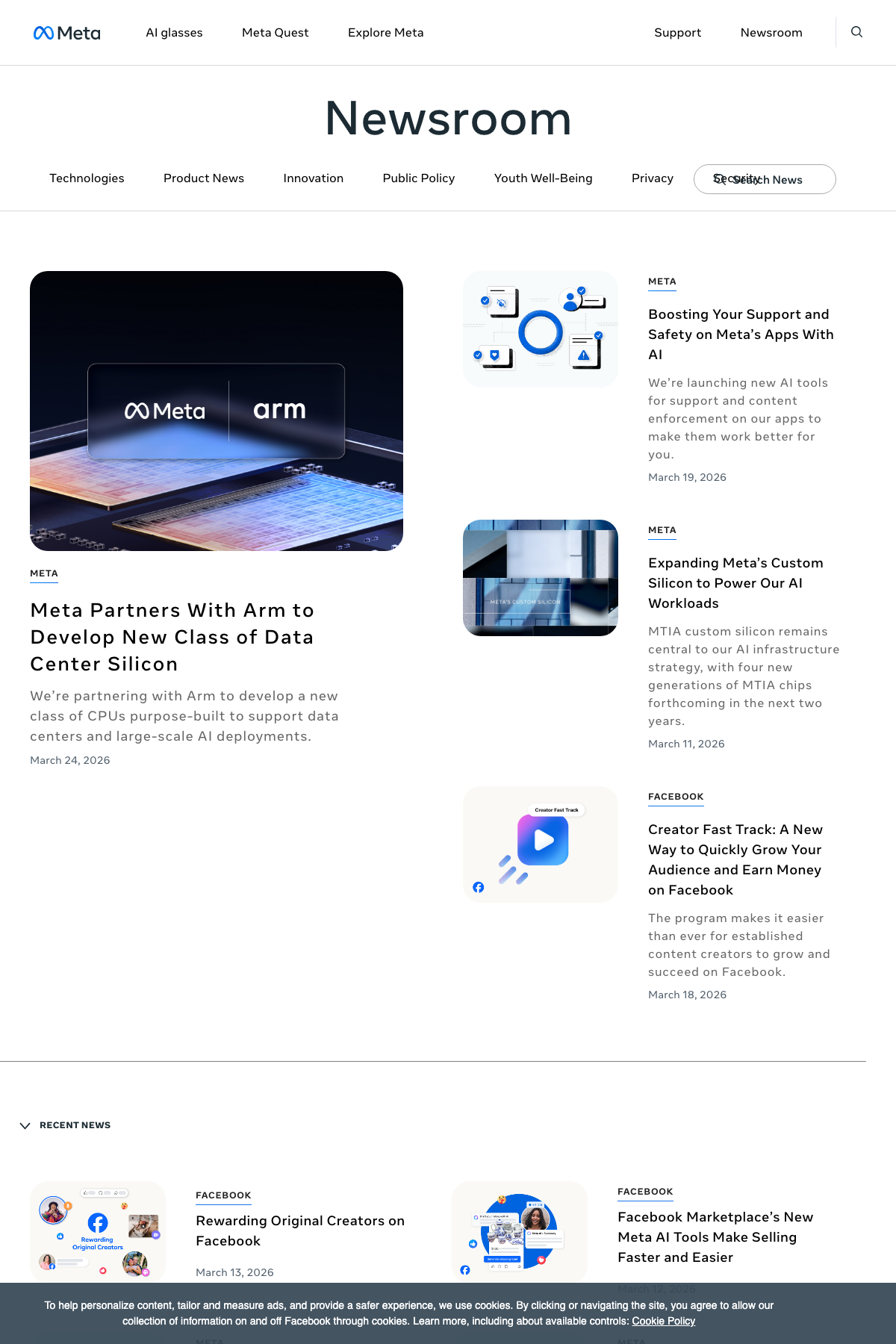
Meta Newsroom is Meta’s official announcements hub, verified in the showcase. The interesting part is category architecture: clearly separated sections with visual differentiation, so a reader always knows which kind of news they’re inside. WordPress’s built-in taxonomy plus a theme with category templates covers the whole mechanic.
It’s the least flashy site in this guide, and the easiest one to learn from.
NerdWallet

Finance publisher NerdWallet runs WordPress as a headless CMS: WordPress manages the content, a JavaScript frontend renders the pages, and the two talk over APIs. Its hosting partner Altis documents the architecture, and NerdWallet’s own engineering job listings describe the same setup.
The lesson is definitional. “Uses WordPress” doesn’t always mean WordPress renders the frontend. Headless is why some WordPress sites show none of the usual signals, and why it’s the wrong architecture for almost everyone who doesn’t employ an engineering team.
WordPress for Education
Georgia State University
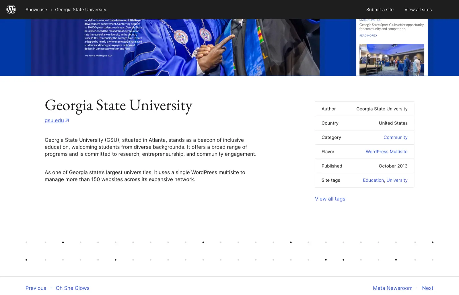
Georgia State runs its web presence on a single WordPress multisite managing more than 150 websites across its network, per its WordPress.org showcase entry. One install, one update cycle, one design system, and 150+ department sites that can’t drift off-brand.
If you run a school, a franchise, or anything with sub-brands, multisite is the pattern to study before you buy 12 separate hosting plans.
What These WordPress Websites Have in Common
Strip the budgets away and the same handful of decisions shows up on every site in this guide.
Content width stays readable. Body text sits in a measured column with real margins, on the food blog and the enterprise newsroom alike, because a wide wall of text costs comprehension no matter how good the writing is.
Navigation matches how people decide, not how the company is organized. Nalgene sorts by shape and size because that’s how bottle buyers think. Menus that mirror internal departments make visitors do the translation, and they won’t.
One hero, one message. Lamanna’s, Yumi, and Rolling Stone all commit to a single claim above the fold. 3 competing calls to action is how heroes die.
Typography carries the branding. Hartzler and Steffie de Leeuw are held together by type choices more than by any plugin. 2 typefaces, an obvious size hierarchy, and consistent spacing beat a page builder full of effects.
Cards do the browsing. Recipes, press releases, products, artworks: every browsing surface in this guide is a scannable card grid, because cards work on a phone and a widescreen alike.
My web design guide goes deeper on each of these decisions.
What You Can Realistically Recreate
The honest way to read this guide is by budget tier, because a pattern you can’t afford to maintain isn’t a pattern, it’s a souvenir.
With a free theme and the block editor. Lamanna’s single-message homepage, Hartzler’s labeled product cards, Meta-style category architecture. Weekend work, honestly.
With a premium theme and block plugins. Nalgene’s attribute-driven navigation, Yumi’s claim-evidence-product order, Microsoft-style card grids. This is the tier most business sites should target, and where most of my client work lives.
With custom development. Pinch of Yum’s bespoke theme, Steffie de Leeuw’s and PichiAvo’s immersive presentation. Worth paying for when the design itself is the product.
Enterprise and headless. TechCrunch, Rolling Stone, NerdWallet, Georgia State. WordPress VIP starts at $25,000 a year before a line of custom code is written, and headless adds an engineering team to the invoice. Study their hierarchy, navigation, and article templates instead of their stack.
The lesson from a $25,000-a-year WordPress site is never the infrastructure. It’s a design decision you can copy for the price of a theme.
Free Themes That Can Recreate These Patterns
The old promise of this genre, “just install the same theme,” doesn’t survive contact with custom builds. What a free theme gives you is the toolkit for the patterns above. 4 are worth starting with.
GeneratePress
gauravtiwari.org ran on GeneratePress with GenerateBlocks for years, and I loved that stack before moving the site to my own theme. WordPress.org lists 500,000+ active installs, and the theme’s performance claim is unusually precise: a fresh install adds less than 10KB gzipped to page size. GP Premium is $59/year, and GeneratePress One at $149/year bundles Premium with GenerateBlocks Pro.
Best for content sites where speed is revenue. It assumes you’ll design sections yourself; if you want 100 prebuilt starter sites instead, that’s the next theme down.
Astra
Astra shows 1 million+ active installs on WordPress.org and carries the largest starter-template library of the free themes, with support for every major page builder. It’s the fastest route from blank install to live business site.
The catch is sameness: a starter template looks like a starter template until you replace the fonts and imagery with your own.
Kadence
Kadence sits at 500,000+ installs and gives away features others charge for, including a header/footer builder and serious WooCommerce controls. My Kadence review covers the full free-versus-pro split.
Best for WooCommerce on a budget. Nalgene-style category navigation is buildable on the free tier.
Blocksy
Blocksy is the newest of the 4 at 300,000+ installs, with a more contemporary default look and strong WooCommerce integration. Best for builders who found the other 3 visually conservative out of the box.
What Makes These Sites Fast
Don’t judge any site in this guide by a single PageSpeed number. PageSpeed Insights mixes 2 different things, simulated Lighthouse lab runs and real-user Chrome data, and the 2 routinely disagree. A green lab score doesn’t guarantee real visitors pass Core Web Vitals.
The thresholds that matter are Google’s Core Web Vitals, measured at the 75th percentile of real visits:
- LCP (largest contentful paint): 2.5 seconds or less
- INP (interaction to next paint): 200 milliseconds or less
- CLS (cumulative layout shift): 0.1 or less
And there’s no plugin-count rule worth repeating. A backend-only plugin can add zero frontend weight while 1 badly built slider outweighs 30 of them. Audit what the theme, plugins, fonts, images, and third-party scripts actually load on the page, not how many rows the plugins screen has.
Right-size your images, cache properly, match hosting to traffic, and add a CDN when your audience is genuinely global. My WordPress speed guide and Core Web Vitals guide cover the implementation.
How to Check if a Website Uses WordPress
Adding /wp-admin/ to a URL is the folk method, and it’s unreliable: login routes get moved, blocked, or proxied. Use signals that are harder to hide.
- View the page source and search for wp-content or wp-includes. A path like /wp-content/themes/name/ also hands you the theme’s directory name.
- Try the REST API. Many WordPress sites answer at /wp-json/ with a machine-readable index.
- Look for a generator meta tag. Some sites strip it, but plenty don’t. Pinch of Yum’s, for instance, names WordPress outright.
- Use BuiltWith or WPDetector as supporting evidence, never as the only proof.
None of this proves a negative. NerdWallet renders through a JavaScript frontend and shows almost none of these signals while running WordPress underneath. Multiple signals, or a first-party statement, is the standard worth holding yourself to.
The Limits
This guide can’t keep other companies from re-platforming. Beardbrand was the standard WordPress store example for years, right up until its store moved to Shopify. Every verification here dates to August 2026, so treat “runs WordPress” as a statement about now, not forever.
A screenshot also can’t show you operations. TechCrunch’s real advantage is editorial staffing and workflow, and no theme purchase transfers that.
And patterns don’t transplant brand fit. Lamanna’s poster homepage works because a bakery with one famous product can shout. A law firm can’t, and shouldn’t. Every “adapt this” note above still assumes your product, voice, and audience get a vote.
This site ran on GeneratePress and GenerateBlocks for years before I moved it to a theme I built myself. Everything recommended here comes from running that stack in production, not from reading spec sheets.
FAQs on WordPress Website Examples
What are the best WordPress website examples?
TechCrunch, Rolling Stone, Microsoft Source, Meta Newsroom and Georgia State University are all verified in the official WordPress.org showcase, and stores like Nalgene, Yumi and Landyachtz run WooCommerce in production. The best example to study is the one closest to what you are building; the WordPress.org showcase currently curates 151 verified sites across business, creative, publication and community categories.
How can I tell if a website uses WordPress?
Check the page source for wp-content or wp-includes paths, test whether the site answers at /wp-json/, and use detection tools like BuiltWith or WPDetector as supporting evidence. No single method is conclusive, because custom and headless WordPress builds can hide every usual signal.
What percentage of websites use WordPress?
WordPress powers 40.7 percent of all websites and 58.9 percent of websites whose content management system can be identified, according to W3Techs data from August 2026. No other CMS comes close, and WooCommerce alone appears on 8.1 percent of all websites.
Can WordPress handle ecommerce?
Yes. WooCommerce accounts for 48.1 percent of the ecommerce systems W3Techs detects, and verified stores like Nalgene, Yumi and Landyachtz run it in production. As the catalog grows, hosting, caching, search and checkout architecture matter more than the platform label.
What is a headless WordPress website?
A headless site uses WordPress to manage content while a separate frontend, usually JavaScript, renders the pages through APIs. NerdWallet is a current example. Headless buys frontend flexibility at the cost of an engineering team, which is why traditional themes remain the right default for most sites.
Can a free WordPress theme look professional?
Yes. GeneratePress, Astra, Kadence and Blocksy all ship capable free versions. The finished result depends far more on typography, spacing, imagery and restraint than on the price of the theme.
Which WordPress website design should I copy?
Copy patterns, not brands. Adapt a navigation structure, card grid, product filter or hero hierarchy to your own content and identity. Cloning another company’s design, copy or photography damages trust and can create legal problems.
Can WordPress handle high-traffic websites?
Yes. TechCrunch and Rolling Stone are classified as WordPress Enterprise builds in the official showcase. At that scale the work shifts to architecture: caching, CDN or edge delivery, database performance and editorial workflow, typically on platforms like WordPress VIP that start at 25,000 dollars a year.
Final Remarks
Don’t pick your favorite site in this guide and clone it. Pick the one solving your problem and take the principle: Nalgene’s product discovery, Rolling Stone’s editorial hierarchy, Steffie de Leeuw’s work-first layout, Georgia State’s one-install governance.
A well-designed WordPress site was never about finding the magical theme. It’s a small number of deliberate decisions, applied consistently, on tooling you can afford to keep running.
Recreate the decision, not the design. Your colors, type, photography, and copy should still be yours.
Best of luck.
Tell Google you want more of this.
Add Gaurav Tiwari as a preferred sourceOne tap, and this site shows up more often in your own Top Stories, AI Overviews and AI Mode. Remove it any time.
Disclaimer: This site is reader-supported. If you buy through some links, I may earn a small commission at no extra cost to you. I only recommend tools I trust and would use myself. Your support helps keep gauravtiwari.org free and focused on real-world advice. Thanks. - Gaurav Tiwari