
 by
byIf you’re publishing reviews of regulated services, a WordPress review framework should help readers check the important facts before they follow a recommendation. That means putting the evidence beside the verdict and keeping the restrictions visible, even when those restrictions make the service less appealing.
A polished layout helps, but it can’t make an unsupported claim reliable. The useful middle ground is a repeatable page structure with room for a reviewer to explain what they know, what they couldn’t establish and who should think twice. This framework gives you that structure and a checklist you can apply to a draft. It doesn’t replace the legal or sector-specific judgment a regulated subject may need.
Start With the Reader’s Questions
Someone searching for a provider review may be checking whether they can use the service at all. A page that leads with benefits and postpones eligibility until the footer makes them do that work twice.
The opening summary should answer the questions that could change their decision:
- What is the service? Name the service and the kind of customer it serves.
- Where is it available? State the relevant territory without treating neighboring jurisdictions as interchangeable.
- What could rule it out? Bring material eligibility restrictions and limitations forward.
- What supports the assessment? Distinguish published terms from features the reviewer actually used.
- What is the commercial relationship? Make advertising recognizable before readers engage with it.
A review should be willing to lose an outbound click when the service isn’t suitable for that reader. Otherwise the verdict is serving the publisher’s conversion goal more than the reader’s decision.
Different questions also deserve different pages. An explanation of how a service works doesn’t become a review because you’ve added a score. If the reader needs help judging the assessment itself, the checklist for a trustworthy software review provides a useful second perspective.
Build the WordPress Review Framework
The WordPress block editor is enough to establish a consistent review layout. A small publisher can start with ordinary blocks and a pattern; a larger team may need structured fields and an approval workflow once keeping many reviews current becomes difficult.
I want to separate those jobs before going further. A pattern gives the writer a place to put evidence. It doesn’t check whether the evidence exists.
The page structure
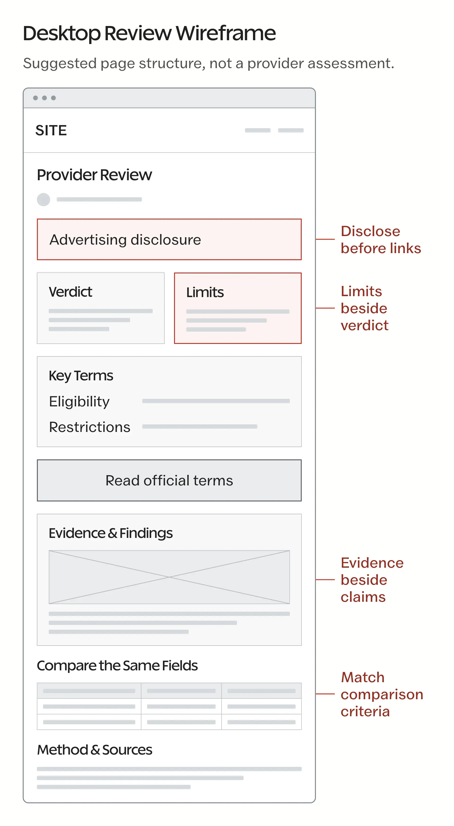
The framework should put decision-changing information ahead of the invitation to visit the provider. This is a sensible starting order:
- Summary and suitability: the assessment, its main reason and the reader it doesn’t suit.
- Essential facts: availability and material terms, with the relevant official sources.
- Evidence: observations and their limits, with provider claims clearly attributed.
- Restrictions and risks: conditions that could change the reader’s decision.
- Comparison: meaningful alternatives assessed on the same basis, when a comparison helps.
- Accountability: a named author and access to the editorial policy or corrections contact.
Any advertising label belongs before the advertising it identifies. Sector-specific age or responsible-use information should sit where readers need it, rather than waiting for a generic section at the bottom.
Shared text and separate findings
WordPress synced patterns update every instance when you edit the shared pattern. That is useful for a common editorial-policy link. It’s a poor default for a provider’s verdict, which should belong to that review.
- Shared content: a common explanation of your assessment method or a correction-contact link, provided the wording genuinely applies everywhere it appears.
- Review-specific content: the provider’s terms and eligibility, the reviewer’s observations and the resulting judgment. These should stay with the individual post.
- Independent starting layouts: an unsynced pattern, or a detached copy of a synced pattern, lets writers reuse the structure without sharing all the wording.
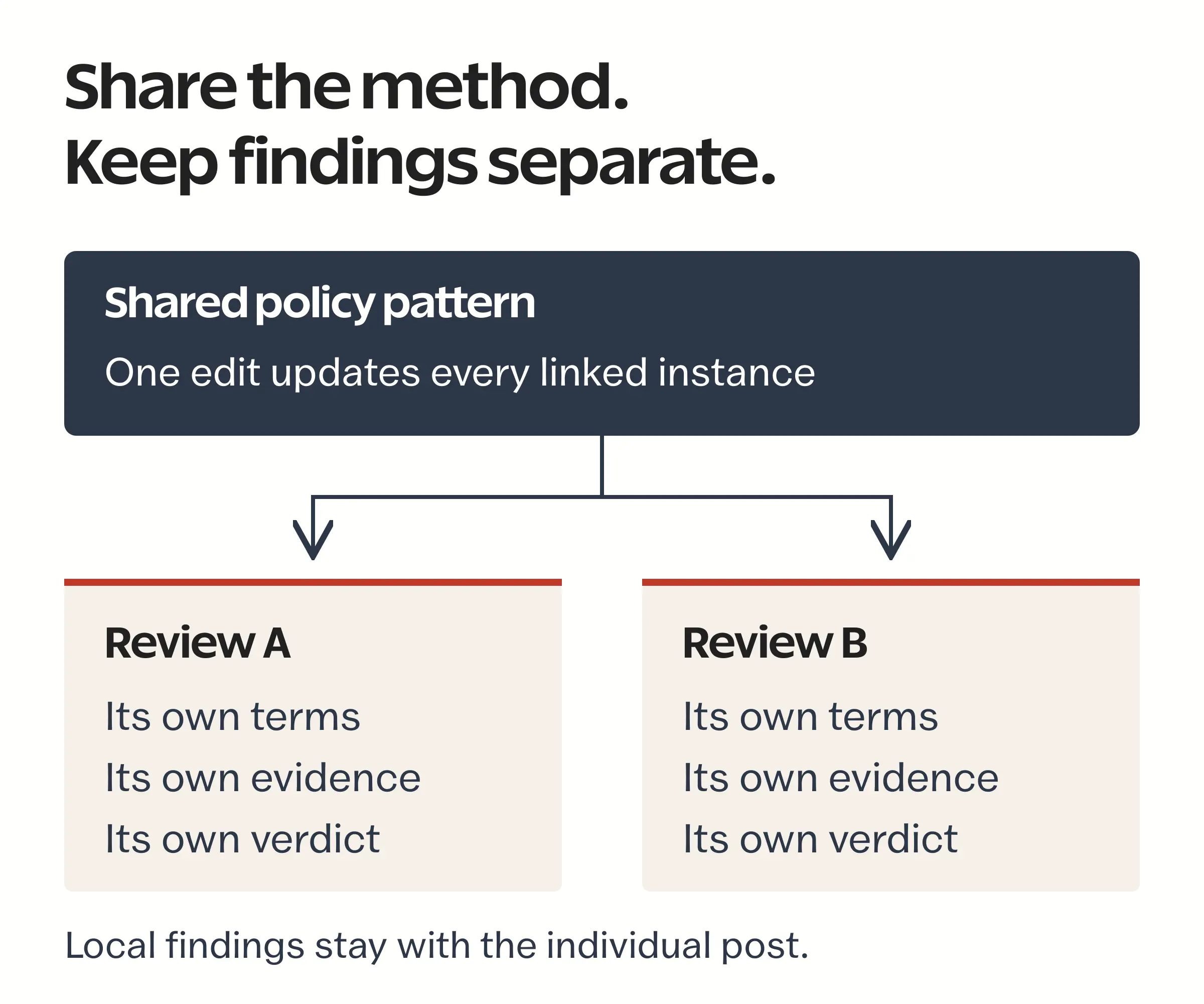
Consider 2 reviews with different withdrawal conditions. If both conditions live in the same synced text block, an editor correcting one could change the other as well. A consistent design should never require a shared factual answer.
Block locking can reduce accidental movement or removal of important sections. It doesn’t establish whether a claim is true, and a locked disclosure block can still contain the wrong disclosure. Editorial approval needs a separate owner.
Make Comparisons Easy to Read
A comparison table should help readers compare the same fact across services. Promotional descriptions don’t become comparable just because you put them in adjacent cells.
For example, a provider’s advertised response time and another provider’s measured response time should not share a column labeled “Support Speed” without explaining the difference. One is a promise; the other is an observation under particular conditions.
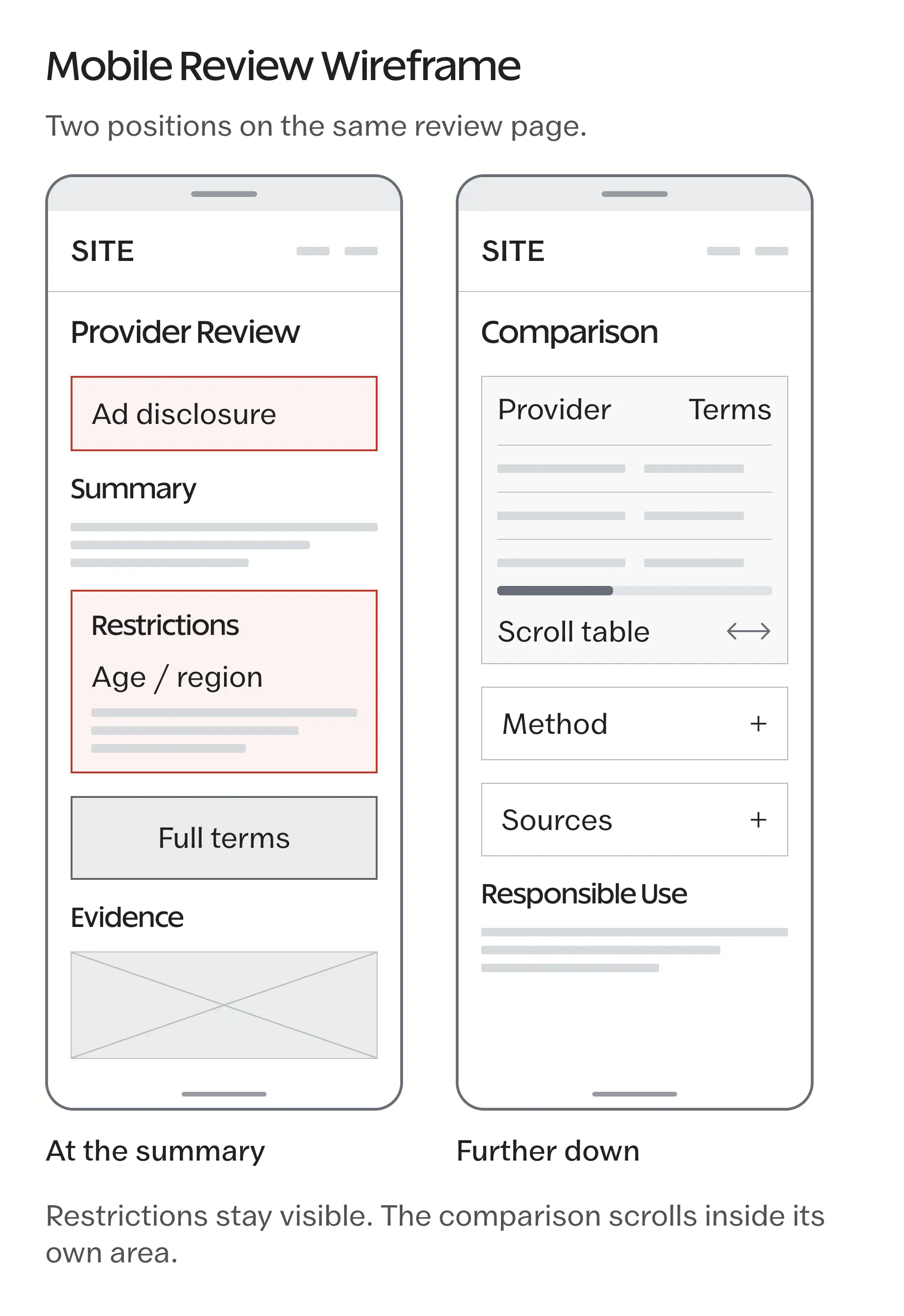
The table should remain usable when someone reads it on a phone or with assistive technology. W3C’s table guidance explains why structural relationships matter:
- Use proper header cells and associate them with the relevant data. For simple tables, column and row headers with appropriate
scopevalues make those relationships explicit. - Keep the compared fields narrow enough to understand without a long legend.
- Explain important qualifications in text, rather than relying on a colored tick or cross.
- Check keyboard access if the table uses filters or a horizontal scrolling region.
- Keep essential restrictions outside interactions that a reader might never open.
If a table needs tiny text to fit, reducing its columns is usually a better decision than reducing its font size. The WordPress accessibility guide goes further into the site-wide work behind that choice.
Mobile performance
A review page should let readers reach the terms without fighting a shifting layout. Large decorative images between comparison rows and third-party widgets that move the page can make careful information difficult to use.
The current Core Web Vitals cover different parts of that experience:
- Largest Contentful Paint (LCP): loading performance.
- Interaction to Next Paint (INP): responsiveness to user interaction.
- Cumulative Layout Shift (CLS): visual stability.
These measurements don’t prove that readers trust a review. They help identify usability problems that interfere with reading it. The WordPress speed optimization guide is a better place for the detailed performance work; the review framework’s job is to avoid creating unnecessary work in the first place.
Keep Evidence Behind the Assessment
The editorial record should let another person follow a material claim back to its source. “Our experts checked this” isn’t enough when nobody can say what they checked.
Google’s review guidance encourages evidence and original research, alongside useful comparisons. That doesn’t mean every service review needs an invented benchmark or a photograph of somebody using a laptop. Evidence should match the claim.
For each important claim, the reviewer should retain:
- The exact claim and its source URL or document.
- The relevant wording, including conditions that change its meaning.
- The date of the observation and the territory it applies to.
- Whether it came from the provider, an independent authority or direct use.
- The reviewer’s name and any unresolved question.
Keep personal information out of public evidence and restrict access to internal records that contain it. A screenshot can support what a page displayed, but it cannot establish that the service performed as advertised.
For a hypothetical support example, finding a live-chat link supports “the provider offers a live-chat route.” It doesn’t support “support resolves problems quickly.” That second claim needs evidence of actual support interactions, and even then the review should describe the limits of the sample.
Dates and corrections
A check date only helps if somebody actually checked the relevant information. Changing the post’s date while leaving the terms untouched gives readers the wrong impression of how current the assessment is.
The internal record should keep a change history and a named owner. Public copy should show a date or correction where it changes how a reader interprets a claim, without exposing the team’s entire editing log.
Reviews should return to an editor when material terms change or a credible correction arrives. If a licensing claim becomes uncertain, the team should reassess the affected recommendation immediately rather than wait for the next routine content refresh.
Use SEO Without Inflating the Claims
Headings should reflect the questions readers need answered. A clear terms section is more useful than a heading that repeats “best” when the assessment hasn’t established a winner.
Structured data needs the same discipline. Google’s structured data policies require markup to represent the page’s content, and meeting the guidelines doesn’t guarantee a rich result.
- Don’t add ratings that the visible assessment doesn’t support.
- Don’t invent a reviewer identity to fill a plugin field.
- Check eligibility for the specific structured-data feature before assuming that any regulated service qualifies for review stars.
- Keep the title and search description within the same claim boundaries as the article.
A WordPress review plugin can organize an assessment. It can’t supply the judgment behind the score.
Measure more than clicks
Outbound clicks tell you that somebody followed a link. They don’t tell you whether that person understood the restrictions, or whether the page helped them make a suitable decision.
Useful diagnostic events may include:
- Opening a terms or assessment-method section.
- Following an editorial-policy or corrections link.
- Using comparison controls.
- Following a provider’s official terms link.
These events need interpretation. Frequent visits to the terms may mean the section is useful, or that the summary left something unclear. Scroll depth alone can’t establish comprehension. A sensible response is to inspect the information order and wording before treating the event as a conversion success.
Check the Draft Before Publication
A publishing checklist should stop an unsupported recommendation, even when the design is finished. The checks below are editorial controls; the relevant sector and jurisdiction may require more.
Terms and jurisdiction
The editor should be able to connect every material term to an official source and state where it applies.
- Match the service’s trading name to the relevant legal entity.
- Check the applicable regulator’s register when a licensing claim matters.
- Preserve conditions that qualify a benefit or restriction.
- Make unresolved information explicit instead of filling the gap with an assumption.
For gambling content, the Gambling Commission’s public register is a verification starting point. Its regulatory remit also makes the territorial distinction important: Great Britain and the United Kingdom are not interchangeable descriptions of its remote-gambling remit.
Age and responsible use
A review of an age-restricted service should address the intended audience clearly and avoid pressure to participate. The provider’s controls and the publisher’s presentation need separate consideration.
- State the applicable age and eligibility restrictions from the relevant source.
- Make appropriate responsible-use and support information easy to find.
- Avoid language that presents gambling as a solution to financial or personal problems.
- Don’t describe an age notice on a review page as proof that the provider’s age-verification system works.
Commercial relationships
Readers should understand when they’re looking at advertising before they act on it. ASA guidance on affiliate marketing explains why the commercial nature of relevant content needs to be recognizable before engagement.
- Identify sponsored or affiliate content clearly at the appropriate point.
- Keep paid placement separate from the editorial assessment.
- Check that the disclosure remains visible on mobile and wherever the recommendation is repeated.
- Avoid claims of independence that the commercial arrangement cannot support.
A footer disclosure cannot be relied on to explain a recommendation the reader has already acted on. The better design gives them that context before the decision.
An Online-Bingo Example
An online-bingo page gives you a concrete way to think about this framework because the terms and responsible-use information affect how a review should read. The example here concerns editorial layout, not a recommendation to gamble.
The online-bingo page from Double Bubble Bingo can serve as a source for a draft review exercise. The reviewer would need to follow the relevant terms and responsible-gambling information, then establish which claims the available evidence actually supports.
The exercise should answer these questions before anyone assigns a verdict:
- Does the summary make the applicable eligibility restrictions clear before an outbound recommendation?
- Can the reader reach the relevant official terms without searching through promotional copy?
- Does the licensing description match the legal entity and relevant jurisdiction?
- Does the page distinguish published claims from things the reviewer actually tested?
- Is any commercial relationship apparent before the reader follows the link?
This is a proposed assessment exercise, not a completed review of the operator. No conclusion about its performance or suitability follows from including the link.
The Limits
WordPress can make a review consistent and easier to maintain. It can’t decide whether a service is lawful for a particular person or whether an advertising arrangement meets every applicable rule. Those questions need the relevant evidence and, where necessary, qualified advice.
The same limitation applies to automation. A required field can stop a writer leaving the source URL blank, but it can’t establish that the linked page supports the sentence beside it. Human review remains necessary wherever a mistaken claim could change somebody’s decision.
Final Remarks
A useful review framework makes it easier to question a recommendation before publishing it. That is the standard to keep as the site grows, even when a simpler promotional layout would produce more clicks.
Start with one draft and use the checklist above to trace its most important claim back to the evidence. Then ask whether a reader can find the restriction that would change the verdict. If either answer is unclear, fix that before turning the layout into a reusable pattern.
You can build the rest of the review system from there.
Tell Google you want more of this.
Add Gaurav Tiwari as a preferred sourceOne tap, and this site shows up more often in your own Top Stories, AI Overviews and AI Mode. Remove it any time.