
 by
by
The best portfolio website examples for students all do one boring thing well: they let a stranger inspect the work in under a minute. A recruiter, professor, editor, or admissions reviewer should be able to see what you made, why you made it, and which part was actually yours, without decoding a cinematic homepage first.
So the ten sites below are sorted by the job the portfolio has to do, not by visual trend. Several of them started as student portfolios and have since grown into professional sites, which is the point. A student portfolio should survive graduation instead of becoming a semester project you abandon along with the login.
Find your career goal in the table, then jump to that example. Copy the information architecture. Ignore the colors.
| Career goal | Example | What a reviewer can actually inspect |
|---|---|---|
| Product design | Devansh Gandhi | Named case studies with role, constraint, and shipped outcome |
| Writing | Kabel Mishka Ligot | Published clips in named journals, sorted by kind of writing |
| Software engineering | Holden Casey | Shipped apps, coursework, and the target job stated up front |
| Academic research | Cristina Clerici | Research agenda, paper status, downloadable CV |
| Research, informally | Kantwon Rogers | Publications as cards, with Google Scholar kept as the live list |
| UX research | Mary Grace Reich | The question each project asked, the method, the outcome |
| Science and data | Carleen Markey | Two research tracks, each with visible artifacts and code |
| Graphic design | Cassie Myers | Finished artifacts shown in their real format |
| Design career arc | Justin McKissick | Student hackathon work sitting beside professional case studies |
| Business or generalist | Kayla Padilla | A coherent story across finance, sport, media, and tech |
What a student portfolio has to prove
A portfolio is evidence arranged for one decision: should this person get the interview. The first screen answers who you are, what you want, and which project deserves the first click. The project page then has to carry the proof, because that is where a reviewer decides whether you can think or only arrange rectangles.
Five things do almost all of the work, and none of them are visual.
- Name the target. “Computer science student looking for machine learning internships” gives a visitor a frame in four seconds. “Welcome to my corner of the internet” gives them nothing to hold.
- Pick three to five projects. A small set gives you room to explain decisions. Ten shallow thumbnails read as unfinished thinking, and reviewers open two of them at most.
- State the context. The problem, the audience, the constraint, how long you had, who else was involved, and exactly what you owned.
- Show the middle. Research, rejected options, calculations, drafts, code, test results. The gap between the brief and the final screen is where your judgment is visible.
- Make the next step obvious. A current resume, a contact route that works, and a URL that will still resolve next year.
That last one sounds like housekeeping. It turns out to be the thing most student portfolios eventually fail.
Portfolio website examples for students, by career goal
These are not a beauty contest. The strongest portfolio websites for students give a specific reviewer a short route from claim to evidence. Watch what sits in the navigation, how projects are named, and whether the structure can survive the owner changing careers.
Best for product design case studies: Devansh Gandhi
Devansh Gandhi’s portfolio opens with one sentence that does four jobs: “I’m Dev! Designer at Toast. Previously at Duolingo, DoorDash, and Meta. I care about education, small businesses, and immigration.” Role, track record, and values, before a single image loads.
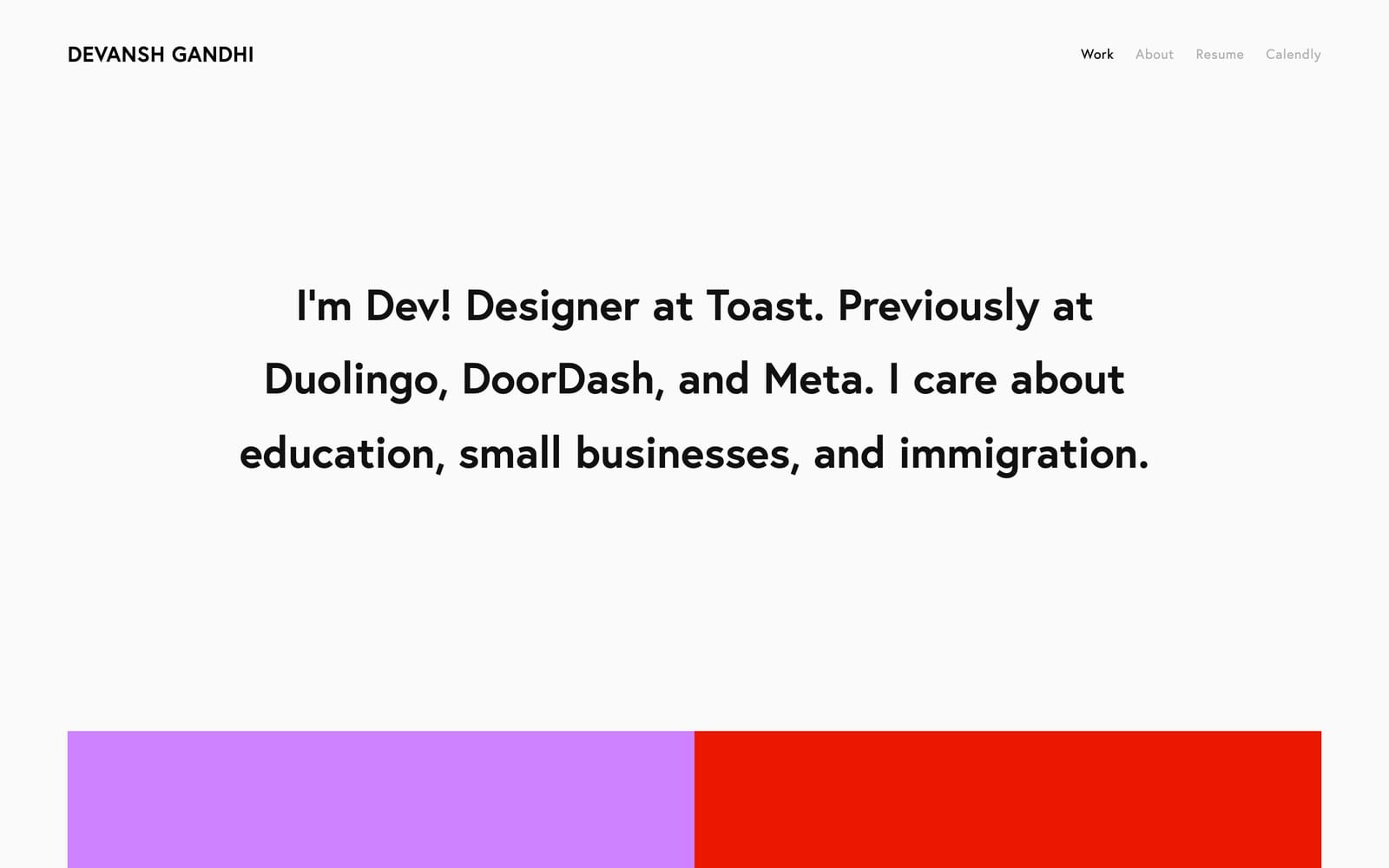
The brand names are not the lesson. The lesson is that his student-era work, a product design internship at Unacademy and a game design project, sits in the same index as the Duolingo and DoorDash case studies and is written to the same standard: problem, contribution, decision trail. He also puts a Calendly link in the top navigation, which quietly moves the site from portfolio to booking page.
- Best for: product, interaction, and UX design students.
- What to copy: the one-sentence role statement, and writing your internship work with the same rigor as a full-time project.
- Honest catch: a famous client logo can’t rescue a vague case study. Without your specific role and the result, the logo just borrows someone else’s credibility.
If you don’t have a recognizable client yet, the next example shows how published work does the same job.
Best for a writing portfolio: Kabel Mishka Ligot
Kabel Mishka Ligot’s site treats writing as the product instead of describing writing ability in a bio. The navigation is the interesting part: Work (Verb) and Work (Noun), splitting the practice from the artifacts. It is a small joke that also happens to be the clearest information architecture on this list.
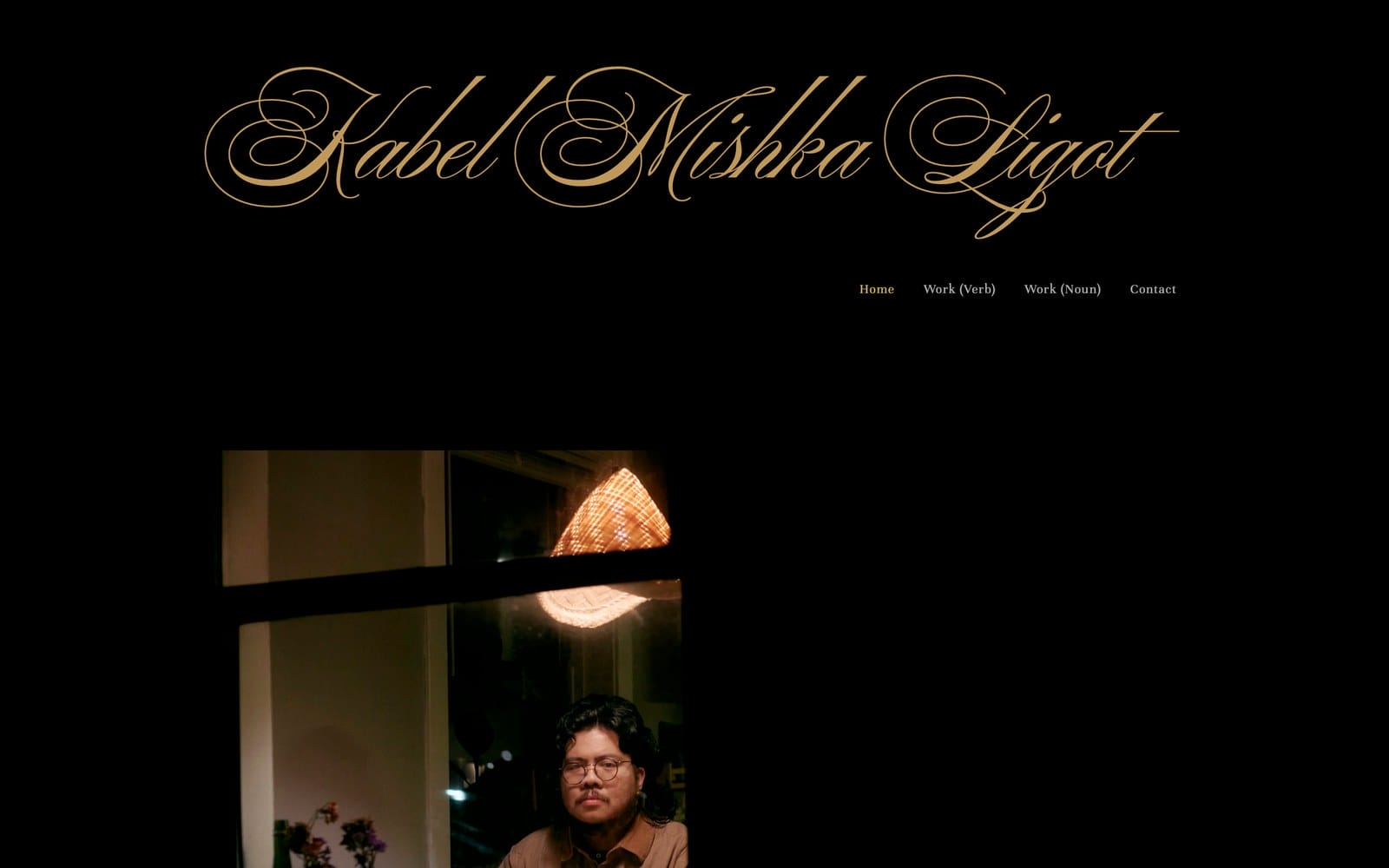
The proof is publication. Poetry in POETRY Magazine, The Iowa Review, and Shenandoah, plus a Luminarts Cultural Foundation fellowship. An editor can judge the voice in thirty seconds because the clips are one click away, not summarized.
- Best for: journalism, creative writing, criticism, and communications students.
- What to copy: clip categories that match how editors think, publication credits attached to each piece, and direct links to readable work.
- Honest catch: a distinctive identity only pays off after the clips load fast and stay legible on a phone. Style before substance reads as avoidance.
Writers get to point at published work. Engineers usually can’t, which is the problem the next site solves.
Best for software engineering internships: Holden Casey
Holden Casey’s portfolio is the most directly useful template here for a student who wants an entry-level engineering job, because it states the target out loud: a software engineer at IXL Learning with interests in sports analytics, finance, and mobile development, looking for an entry-level role.
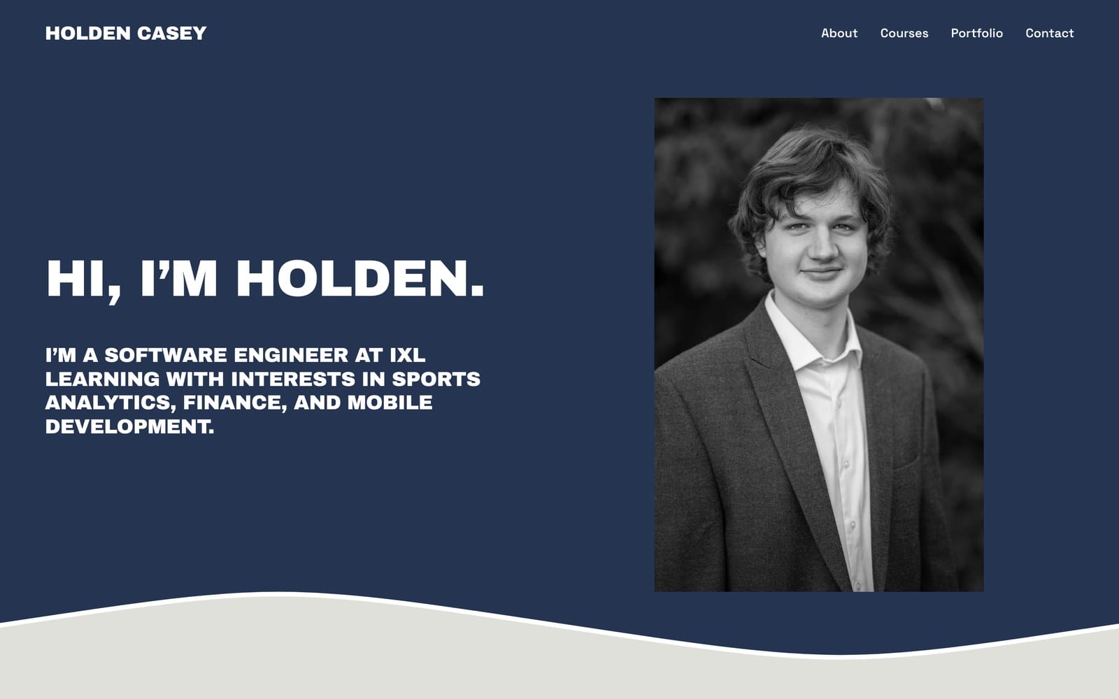
The projects are specific enough to interview against. A migraine tracking iOS app that surfaces a user’s most common triggers and most effective treatments is a real product decision, not a CRUD demo. A recruiter can ask “why did you choose that insight” and get a real answer.
- Best for: computer science and software engineering students chasing internships or a first role.
- What to copy: naming the job you want on the homepage, and describing each project by the user problem rather than the framework.
- Honest catch: a Courses section in the main navigation is a student-shaped choice. It helps while your coursework is the strongest evidence you have, and it should be the first thing you demote once you’ve shipped two real projects.
Coursework as proof works differently in academia, where the record itself is the credential.
Best for academic research: Cristina Clerici
Cristina Clerici’s site is deliberately plain: research, contacts, CV. That restraint is the feature. A hiring committee wants to verify a record, not navigate an experience.
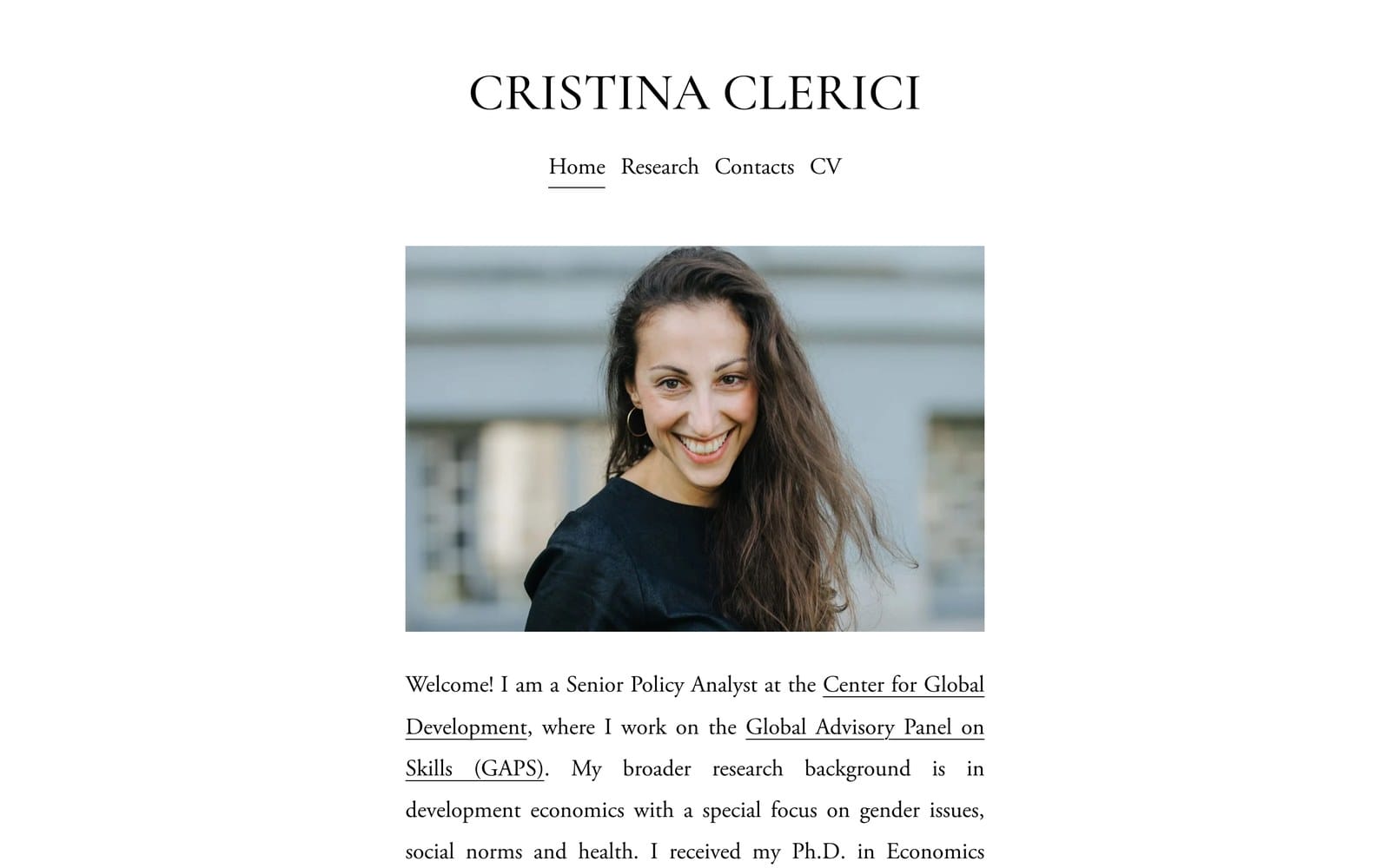
It is also proof of the survival argument. The site was built during a PhD in Economics at the Stockholm School of Economics and now introduces a Senior Policy Analyst at the Center for Global Development. Same domain, same structure, new job title. Nothing had to be rebuilt.
- Best for: economics, social science, and graduate research portfolios.
- What to copy: a stated research agenda, paper status including work in progress, coauthors, and a CV that is dated and current.
- Honest catch: academic visitors care more about a current document than a clever interaction. A stale CV does more damage here than an ugly template.
Clerici’s site is deliberately impersonal. The next one proves that formality isn’t the price of being taken seriously.
Best for research with a personality: Kantwon Rogers
Kantwon Rogers’ website is one page, and it opens with “Who is this guy?” before explaining that he’s an AI and robotics researcher doing a postdoc at the MIT Media Lab, previously a computer science PhD student and instructor at Georgia Tech. He describes his own research as doing experiments and writing down what he did, and notes that some folks call that research.
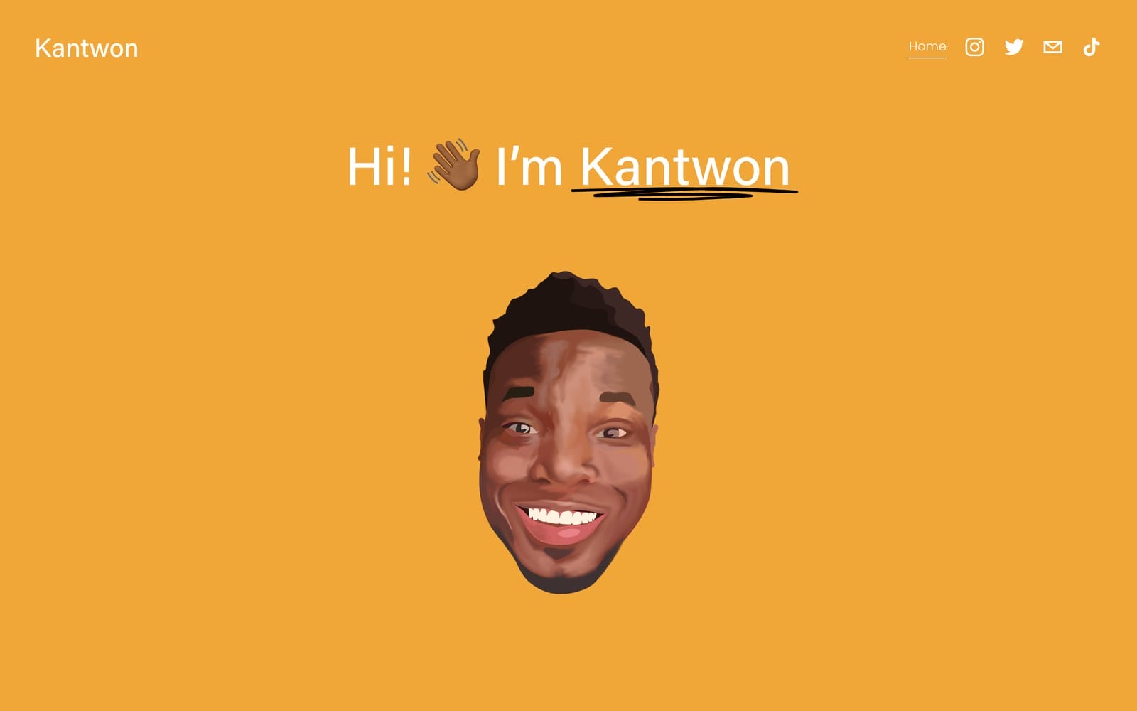
The tone is a genuine strategic choice, not a lack of seriousness. Publications on robot gendering and trust, smartphone eye tracking, and STEM textbook redesign sit below as clickable cards, and the canonical list is handed off to Google Scholar. That handoff is the smartest thing on the page, because a Google Scholar link updates itself and a hand-maintained publication list starts rotting the week you get busy.
- Best for: computer science, robotics, AI, and HCI students who don’t want to sound like a department directory.
- What to copy: pointing the authoritative list at Google Scholar or ORCID instead of maintaining it by hand, and letting one page carry the whole story.
- Honest catch: two of the project cards still read “It all begins with an idea,” which is Squarespace’s default placeholder text. It has survived on a live academic site through a PhD and into a postdoc. Read your own pages on a phone before you send the link anywhere.
Rogers leads with personality. The next portfolio leads with the question, which is the sharper move for a research role.
Best for UX research: Mary Grace Reich
Mary Grace Reich’s portfolio leads each project with the research question rather than the deliverable. Fairness in machine learning, gamification, the global gig economy, privacy on Japanese Wikipedia. That framing lets a hiring manager judge whether your questions resemble their questions, which is the actual hiring decision in research roles.
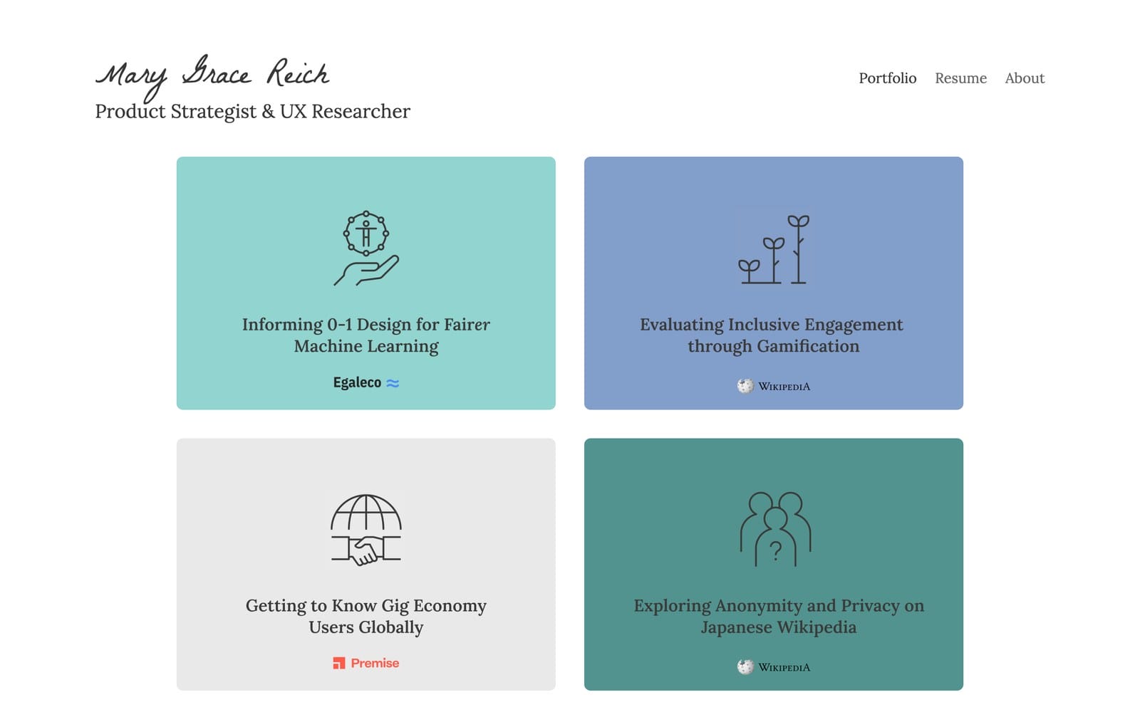
A deliverable-led card says “I made a report.” A question-led card says “I can find out things you don’t know.” Only one of those is a reason to hire a researcher. The client marks sitting under each card, Wikipedia among them, do the credibility work without a single sentence of self-description.
- Best for: UX research, product strategy, service design, and human-computer interaction students.
- What to copy: project cards built on question, method, audience, and outcome, in that order.
- Honest catch: confidential participants and employer data have to be protected. Redact properly instead of replacing the evidence with a vague summary, or the project stops proving anything.
If your field produces data rather than interviews, the next one is the closer model.
Best for science with a data side project: Carleen Markey
Carleen Markey’s site describes a Carnegie Mellon physics PhD student and women’s hockey data scientist, then gives each of those a front door: Astrophysics and Hockey, side by side, each with its own visible artifact and a GitHub link.
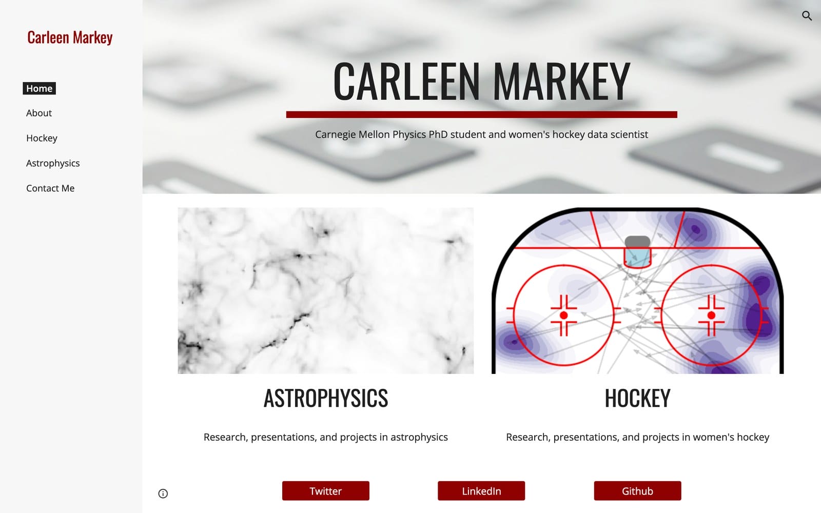
This is the best answer on the page to “my degree and my interest don’t match.” Instead of hiding the hockey analytics, she gives it equal billing, and it becomes the thing that distinguishes her from every other physics PhD. It is also built on Google Sites, which matters more than it looks: a plain builder holding real research beats a beautiful custom build holding nothing.
- Best for: physics, astronomy, statistics, and data science students with a serious side interest.
- What to copy: giving a genuine side project its own equal entry point instead of burying it under “personal projects.”
- Honest catch: two tracks only work when both have finished artifacts. One strong track plus one empty section reads worse than a single focused site.
Scientists show analysis. Designers have to show craft, which changes what a project page is for.
Best for graphic design: Cassie Myers
Cassie Myers’ portfolio shows each project as the finished artifact in its real format: a website on a monitor, frosting tubs as actual packaging, a landing page on a phone and desktop together. For visual work, that is the fastest possible proof, because the reviewer evaluates the output directly instead of reading about it.
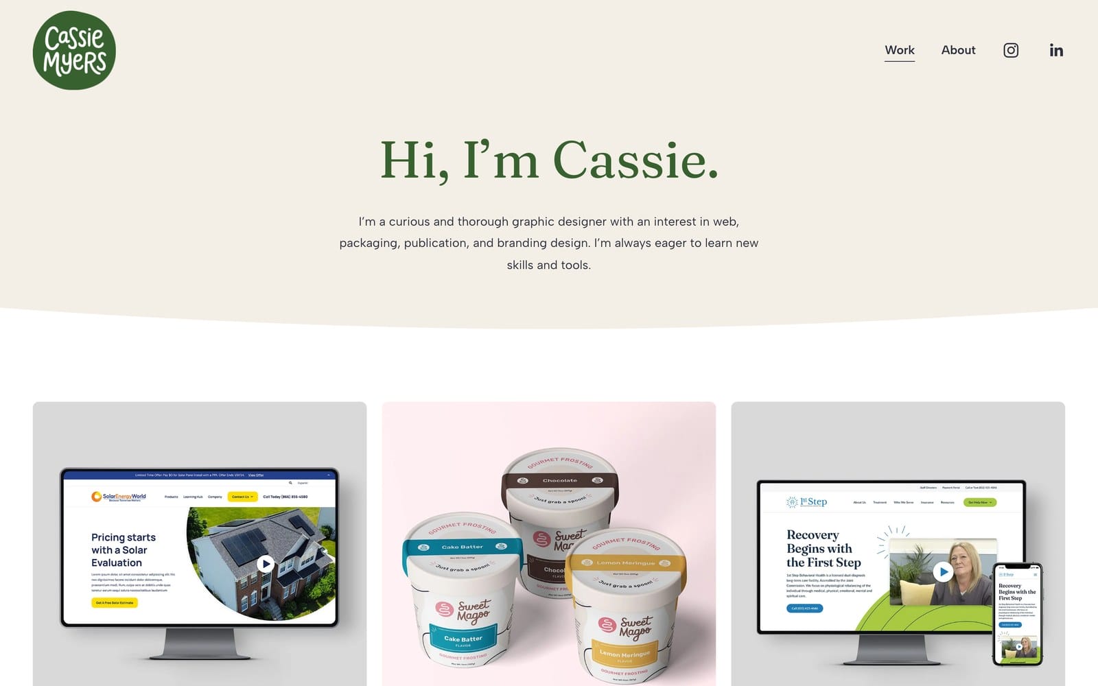
The range is doing quiet work too. Web, packaging, publication, and branding in one grid tells a studio she can be staffed on more than one kind of job, which is how junior designers actually get hired.
- Best for: graphic design, branding, packaging, and visual communication students.
- What to copy: presenting work in the format the client receives, and showing enough range to be staffable.
- Honest catch: there is no resume link in the main navigation and contact sits below the fold. A mockup grid proves craft, but a hiring manager still needs a document and an email address without hunting.
Craft gets you the first job. The next portfolio is about what happens to the site after that.
Best for a portfolio that outlives the degree: Justin McKissick
Justin McKissick’s site is the clearest picture of what a student portfolio becomes if you keep it. University of Washington coursework, Dubhacks hackathon projects, and Interaction 19 still sit on the same site as case studies from Able, Meta, and Moody’s.
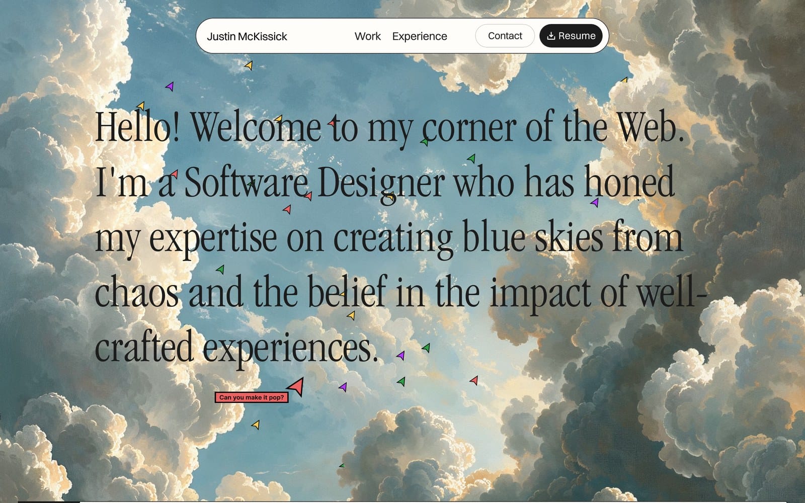
Now the awkward part, and it is worth being straight about it. His homepage opens with “Hello! Welcome to my corner of the Web,” which is close to the phrase I used earlier as the example of a wasted first line. It works here anyway, for two reasons: the role lands in the very same sentence, and a Resume button sits in fixed navigation with a download icon on it. The rule was never about the greeting. It is about how many seconds pass before a visitor learns what you do and how to hire you. He spends about two.
- Best for: design and front-end students who want one site to carry them from first internship to senior role.
- What to copy: keeping student work visible instead of deleting it, and putting the resume in persistent navigation rather than on a separate page.
- Honest catch: a heavy illustrated background is a real load cost on a phone. Personality is fine. Make sure it renders before the reviewer’s patience runs out.
One site, one career, ten years. The last example stretches that idea across fields instead of time.
Best for a broad business profile: Kayla Padilla
Kayla Padilla’s website pulls finance, technology, sport, music, and entrepreneurship into one narrative: a Wharton economics degree, a USC Marshall master’s in entrepreneurship and innovation, four years of Penn basketball as a two-time captain, and a USC championship season at point guard.
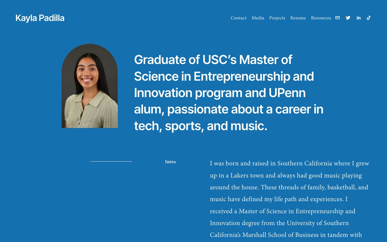
That combination could easily read as a list of unrelated facts. It doesn’t, because the site keeps a Resources section with internship guidance, which turns the biography into something a visitor can use. Usefulness is what converts a personal story into a reason to stay.
- Best for: business, entrepreneurship, finance, media, and multidisciplinary students.
- What to copy: a resources or writing section that gives visitors a reason to return, plus a headline that explains why your interests belong together.
- Honest catch: a broad identity slides into a biography with no decision path. Choose one featured proof item per audience, or every visitor leaves impressed and unclear.
Ten sites, ten different jobs. Now the part that decides whether any of this still exists in three years.
Nearly half of student portfolios stop loading
Link rot is the biggest threat to a student portfolio website, and it is not close. Open any portfolio roundup from a few years ago and start clicking. Nearly half of the sites are already gone.
And gone takes two forms. Most addresses simply stop resolving. The rest get picked up by domain parkers, so a URL that used to be someone’s name now serves a for-sale page.
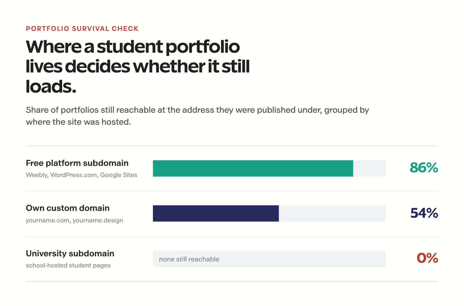
The split by hosting choice is the part that changes what you should do, and it runs opposite to the standard advice.
- Free platform subdomains survive best. Old Weebly, WordPress.com, and Google Sites portfolios almost all still load. Nobody has to remember to renew them.
- Custom domains are a coin flip. A domain is a subscription, and a subscription dies quietly when a student card expires or the renewal email lands in a university inbox nobody checks anymore.
- University-hosted pages disappear on schedule. Your access ends when your enrollment does, and the page goes with it.
The usual advice is “get a custom domain, it looks professional.” That’s still right, and it’s incomplete in a way that costs people their work. A domain is professional and rented. A free subdomain is plainer and permanent. What actually protects you is neither of those, it’s owning the files, so any address can be pointed at them later.
Two habits cover most of the risk, and they take about ten minutes.
- Keep the source somewhere you control. A GitHub repository or a folder in cloud storage means a dead host costs you an afternoon instead of your portfolio.
- Move the domain off your school email now. Registrar, hosting, and analytics accounts should use a personal address you’ll still read in five years, with auto-renew on and a card that won’t expire with your student account.
- Check both www and the bare domain. One of the ten sites here answers on www but not on the apex. Half your links will use the wrong one, and a visitor who hits a dead address does not try the other spelling.
Where a portfolio and a resume divide the work is a separate decision, and I’ve laid out how a portfolio and a resume split the job of getting you hired if you’re building both this month.
Publish it free on Cloudflare Pages
If the hosting bill is what’s stopping you, it shouldn’t be. Cloudflare Pages hosts a student portfolio for free, permanently, with no trial clock and no ads injected into your work. On the free plan you get unlimited sites and unlimited bandwidth, SSL provisioned automatically, 500 builds a month, up to 20,000 files per site, and a free yourname.pages.dev address that never needs renewing.
That last detail is the one that matters given the survival numbers. A .pages.dev address has no expiry date attached to a payment method, so it behaves like the free-platform subdomains that outlasted everything else, while still letting you attach a real domain whenever you want one. Pages allows up to 100 custom domains per project, so pointing yourname.com at it later costs you a DNS record, not a migration.
The practical route takes an evening.
- Put the site in a Git repository. Plain HTML and CSS is fine. So is Astro, Hugo, Next.js, or a template you bought. The repository is the thing you actually own.
- Connect the repository to Cloudflare Pages. It builds and deploys on every push, so updating a case study means committing a file instead of dragging assets into an FTP client.
- Publish on the free subdomain first. Get real work in front of real people before you spend anything.
- Add a custom domain when you have a reason. Applying for jobs is a reason. Wanting the site to feel official is not, yet.
The tradeoff is honest: Pages serves static sites, so a database-backed blog with comments needs a different setup, and the free tier allows one build at a time, which you notice only if you deploy constantly. For a portfolio, neither is a real constraint. If you’d rather run WordPress and still keep the bill near zero, my walkthrough of a full-stack Cloudflare setup for WordPress on the free plan covers the DNS, caching, and storage side. And if you’d rather not touch code at all, compare the limits in my guide to free website builders and their honest free-tier traps before you commit to one.
If you want it built for you
Most students should build the first version themselves. You learn what your own work looks like from the outside, and a rough site that exists beats a perfect site you’re still planning in March.
Some don’t have that evening. If you’re finishing a thesis, applying to twelve programs at once, or you simply want the thing done properly on a domain that won’t embarrass you, I build portfolio sites at a student rate, and it stays affordable because a student portfolio is a small, well-understood job: four page types, a structure that survives graduation, fast pages, and a deployment you can keep updating yourself afterward. No page builder bloat, no monthly subscription attached to a platform you’ll want to leave.
What that usually means in practice:
- The structure decided before the design. Which audience, which three projects, and what each project page has to prove.
- A build you can maintain. Adding a project should take you ten minutes and no invoice.
- Deployed where it will still be in five years, with the domain and registrar in your own name and your own email, not mine.
- Accessible and fast on a phone, because a reviewer opening your link between meetings is the normal case, not the edge case.
Tell me your field, your deadline, and whether you already have work to show, and I’ll tell you honestly whether you need me or just need a weekend. Start at my web development services page and mention that you’re a student so I can quote the student rate.
The four-page structure that works
Most student portfolios need four page types, not a miniature agency website. This is enough for a reviewer to get from identity to proof and then to your inbox.
| Page | Its job | Minimum useful content |
|---|---|---|
| Home | Set the frame | Target role, strongest proof, short project index, contact action |
| Work | Make evidence scannable | Three to five projects with descriptive titles and your role on each |
| Project | Show judgment | Context, constraint, process, your contribution, result, what you’d change |
| About and resume | Verify the person | Short biography, current resume, skills in context, working contact route |
A project page does not need every screenshot or every line of code. It needs enough for your contribution to be believable. When a result is confidential, say so and show an equivalent artifact you are allowed to share. “Under NDA, here is the redacted research plan” is credible. Silence is not.
Mistakes that make good work hard to trust
The common failure is not an ugly color palette. It is a broken evidence chain. Reviewers leave when the site makes them guess what happened or who did what.
- Opening with a quote or animation instead of a role. Say what you do before you ask for attention.
- Showing final screens without the problem. Nobody can judge a decision when the constraint is missing.
- Using group work without naming your contribution. List the team, your role, and the parts you owned. Ambiguity here reads as a claim you can’t defend in an interview.
- Writing a process diary. Keep the steps that changed the outcome. Cut the rest.
- Publishing class exercises as client work. Label the context. A rigorous student project is credible when it is presented as one, and fatal when it isn’t.
- Letting the links rot. Stable domain, exported files, and school-hosted assets replaced before your access ends.
- Ignoring accessibility. Readable type, keyboard navigation, descriptive alt text, real contrast. Some of the people reading your portfolio need this, and every one of them can tell whether you thought about it.
Build the first version this weekend
Don’t wait for six polished case studies. Publish something small that carries your strongest work, then improve it after real applications expose what’s missing.
- Friday: pick one audience, gather three proof items, and write the one-sentence position.
- Saturday morning: write one complete case study before choosing a theme. If the case study is boring, no theme will save it.
- Saturday afternoon: build Home, Work, Project, and About with plain navigation.
- Sunday morning: test every link, compress the images, write the alt text, and read the whole thing on your phone.
- Sunday evening: send it to one person in your target field and ask what they still can’t verify about you.
That last question is the entire quality check. Everything a reviewer can’t verify is decoration.
Frequently asked questions
What should a student portfolio website include?
A one-sentence target role, three to five projects, a clear statement of your contribution to each, a current resume or CV, and a contact route that works. Each project should show the problem, the constraints, the decisions you made, the outcome, and what you would change.
How many projects should a student portfolio have?
Three to five well-explained projects beat ten thumbnails. Reviewers open two at most, so the depth matters more than the count. Choose work that demonstrates different relevant skills and give the strongest project the clearest position on the homepage.
Can I build a portfolio with no professional experience?
Yes. Rigorous class projects, research, volunteer work, open-source contributions, competitions, and self-initiated briefs all work. Holden Casey’s migraine tracking app and Carleen Markey’s hockey analytics are both self-directed. Label the context honestly and show the decisions behind the result.
Do I need a custom domain for a student portfolio?
Not for the first version. A custom domain is a subscription, and student portfolio domains lapse at roughly a coin-flip rate once the renewal card or email dies. Free platform subdomains keep loading because nothing has to be renewed. Publish on a free address such as yourname.pages.dev, then attach a custom domain when you are actively applying.
How can a student get a portfolio website for free?
Cloudflare Pages hosts static portfolios free with unlimited bandwidth, automatic SSL, 500 builds a month, and a free yourname.pages.dev address. Connect a Git repository and it deploys on every push. GitHub Pages, WordPress.com, and Google Sites are also viable, and all of them beat a paid domain you forget to renew.
Should I put my school-hosted page on my resume?
No. University-hosted student pages disappear when enrollment ends, reliably enough that the address should be treated as temporary from day one. Host the portfolio somewhere you control, keep the source files, and use a personal email on the registrar and hosting accounts.
Can I include group projects in my portfolio?
Yes, if you name the team and your exact contribution. Explain which research, design, code, analysis, or writing you owned. Implying that a whole team’s result was yours is the fastest way to lose an interview you had already won.
What is the biggest student portfolio mistake?
Showing an attractive output without enough context to verify your judgment. A reviewer needs to know what problem existed, what constraints mattered, what you personally did, and what changed because of the work.
If you take one thing from these ten portfolio websites for students, make it this: every one of them is easy to verify. That is the whole trick. The design differences between them are almost irrelevant next to the fact that a stranger can land on any of them and confirm, in under a minute, that the person is real and the work is theirs.
So build the small version this weekend, publish it on an address that won’t expire, and put one complete case study on it. You can make it beautiful in October. If you’re building the portfolio to win freelance work, the next useful step is my guide to getting clients and building a writing portfolio. For everything else in the student toolkit, start from the list of most useful websites for students.
Tell Google you want more of this.
Add Gaurav Tiwari as a preferred sourceOne tap, and this site shows up more often in your own Top Stories, AI Overviews and AI Mode. Remove it any time.