
Use On-page Checkout in Bricks Builder
On-page Checkout is a Bricks element as well as a block and a shortcode. Drop it into any Bricks page, product template or query loop and it shows plan cards for a product with your checkout right below them, so buyers pick a plan and pay without leaving the page.
Everything the block can do, the element can do. This guide covers the Bricks side: where the element lives, what each control does, and how to use it in templates so one design sells every product. For how plans, carts and payments work, see Put Checkout on Any Page.
Before You Start
- The Bricks theme, or a Bricks child theme, is active.
- The On-page Checkout module is on in the Stackless dashboard.
- To use a checkout design, the Checkout Builder module is on too. Without it, the element uses the store checkout. See Choose a Checkout Layout.
Add the Element
- Open a page in the Bricks builder.
- In the elements panel, search for checkout, or find On-page Checkout in the WooCommerce group.
- Drag it into a section or container.
- In the Product and plans group, pick a product, or list the plans you want to offer.
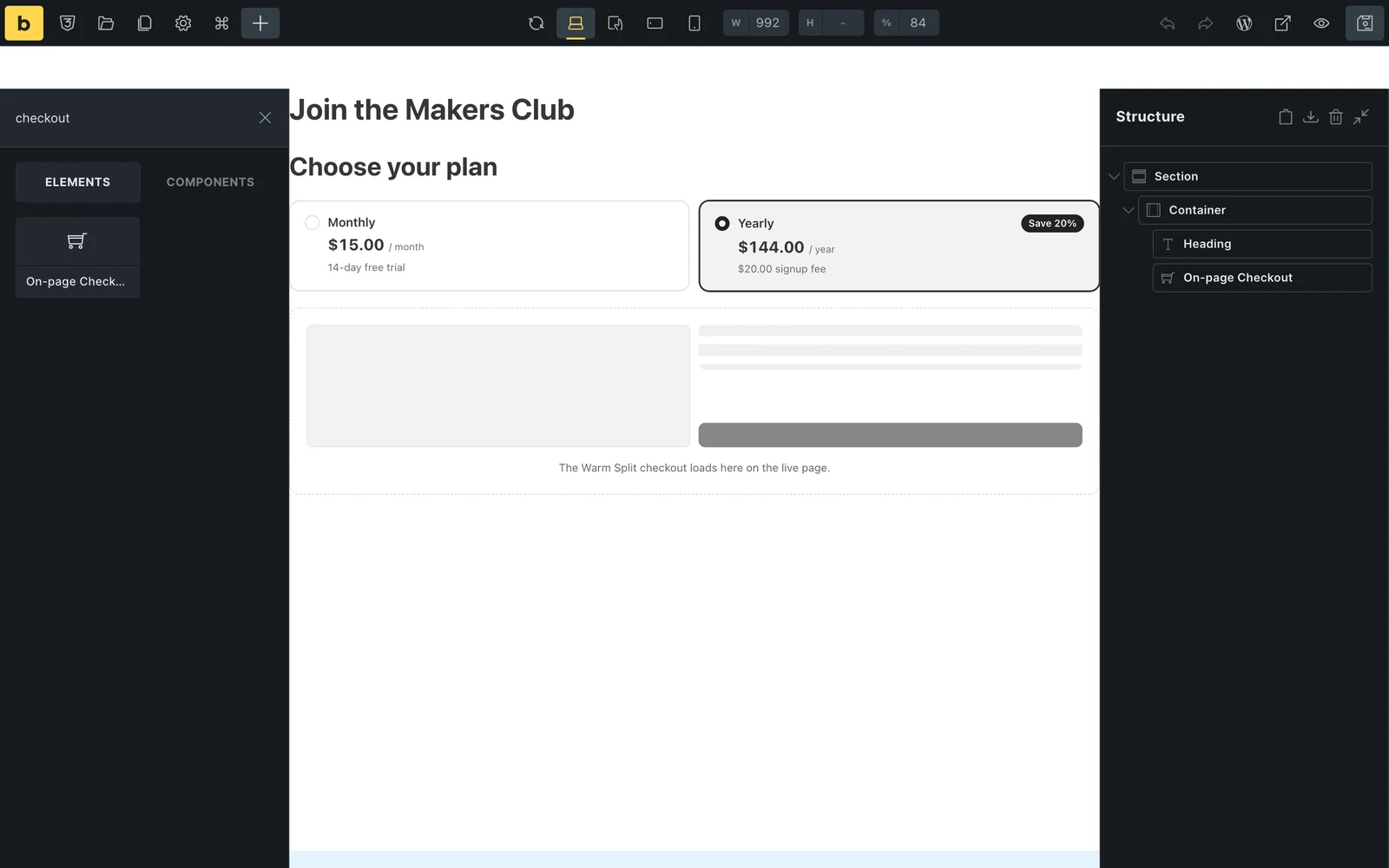
The builder shows the plan cards and an outline of the chosen design. The real checkout loads on the live page, so you can edit without creating carts.
Controls
The element has three groups on its Content tab. Bricks’ own Style tab still sets the element’s spacing, size and position.
| Group | Control | What it does |
|---|---|---|
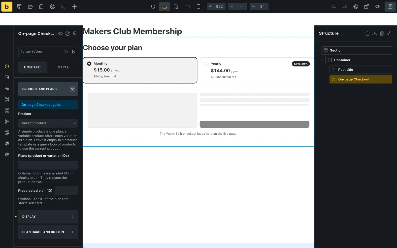
| Product and plans | Product | The product to sell. A simple product is one plan. A variable product offers each variation as a plan. Leave it empty in a product template or a query loop of products to use the current product. |
| Product and plans | Plans (product or variation IDs) | Optional. Product or variation IDs, comma-separated, in the order the cards should show. They replace the product above. |
| Product and plans | Preselected plan (ID) | Optional. The product or variation ID of the plan that starts selected. |
| Display | Checkout design | Active Checkout Builder layout, Store checkout with no layout, or a fixed layout: Classic, Split, Warm Split, Focused or Review First. |
| Display | Heading | Optional text above the plan cards. |
| Display | Layout | Checkout form shown on the page, or a button that opens the form in place. |
| Display | Button text | Shown with the button layout. Defaults to “Buy now”. |
| Display | Let buyers choose a quantity | Adds a quantity box. Hidden for products sold individually. |
| Display | Coupon to apply | Optional code applied to the checkout. When it is empty, a ?coupon= code in the page address is used. |
| Plan cards and button | Plan card accent, background, border and text | The selected card’s accent color, the card fill, its border and its font. |
| Plan cards and button | Button background, text and border | Shown with the button layout. |
Pick a Checkout Design
The Checkout design list in the Display group decides what loads under the plan cards. Leave it on Active Checkout Builder layout to follow the store checkout, or pin a layout for this page only.
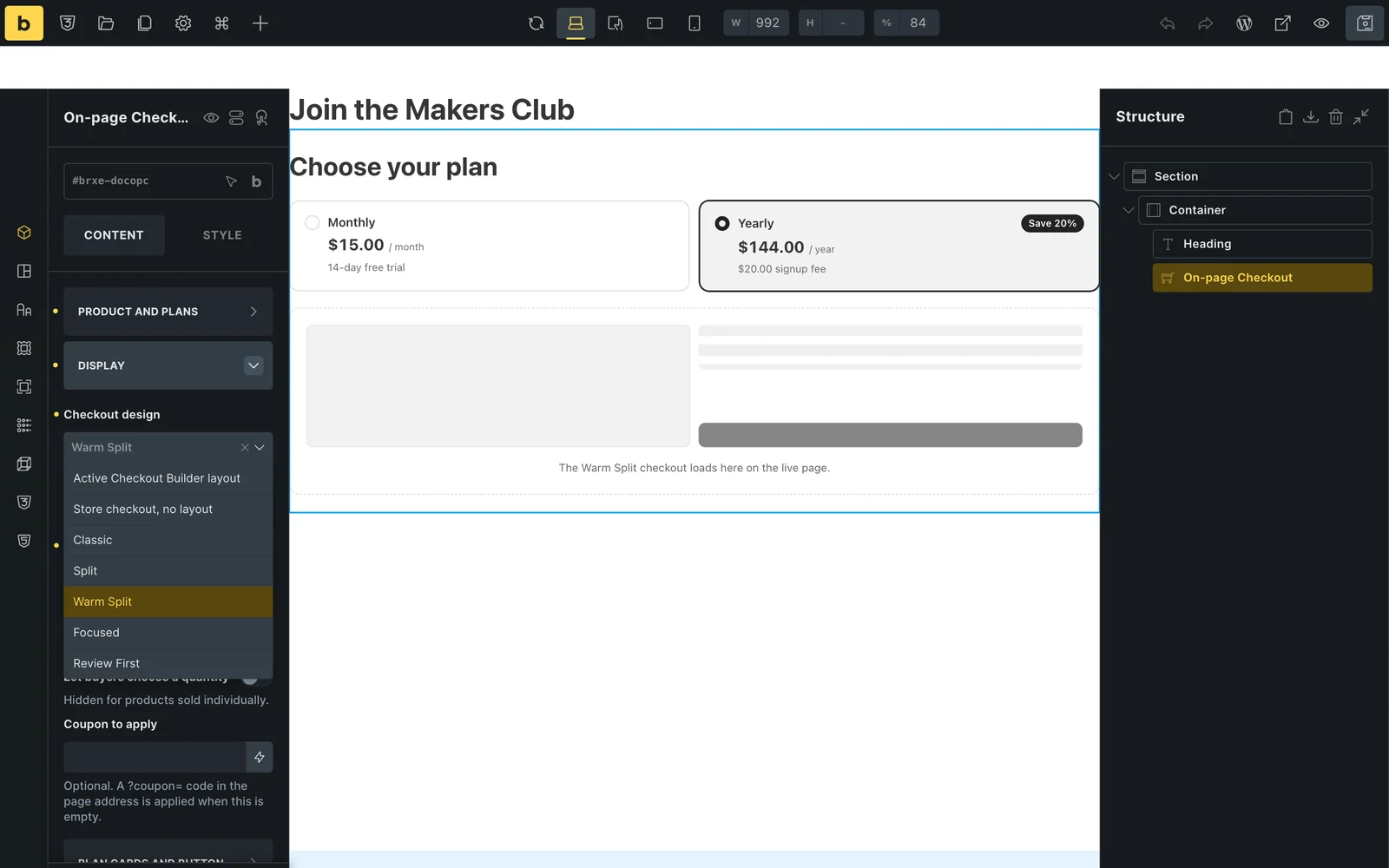
- The layout’s colors come from Checkout Builder, so the embedded checkout matches your checkout page. The plan cards take its accent color too.
- Store checkout, no layout fits narrow columns and sidebars.
- Warm Split, Split and Review First need room. Give them a full-width row on desktop.
Use It in Product Templates
Leave the product empty and the element sells whichever product is being shown. One template then gives every product page its own plans and checkout.
- Go to Bricks → Templates and add a template of type Single product.
- Add the On-page Checkout element and leave Product empty. Its placeholder reads Current product.
- Open the template settings, set Populate content to one of your products, and the builder previews that product’s plans.
- Set the template conditions to the products it should apply to, then save.
Use It in Query Loops
Put the element inside a query loop of products and leave its product empty. Each loop item shows the plans of its own product. The button layout keeps a grid of products compact: each card shows its plans and a button, and the checkout opens in place only for the one a buyer clicks.
Style the Plan Cards and Button
The Plan cards and button group styles the parts the element draws itself. The button controls show up when Layout is set to the button.
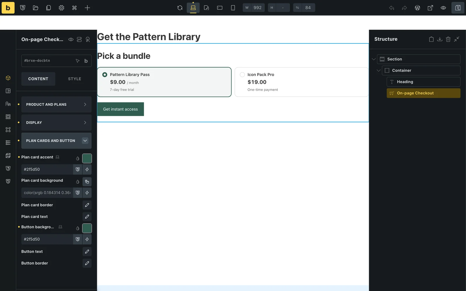
A Bricks class or the element ID also works for anything these controls don’t cover. The plan cards use the .stackless-opc__plan class and the button uses .stackless-opc__reveal.
What Buyers See
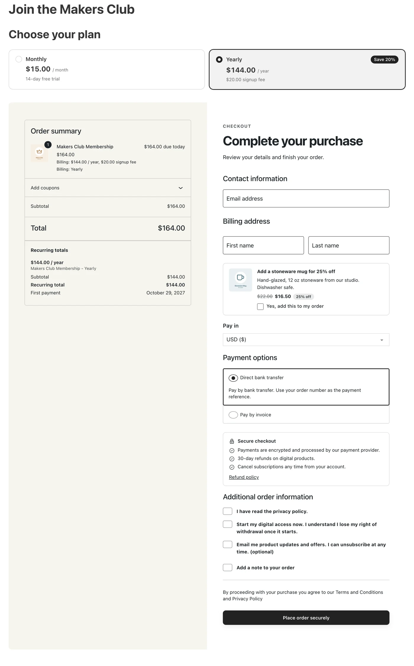
With the form shown on the page, the plan cards sit above the checkout. Switching plans updates the checkout in place.
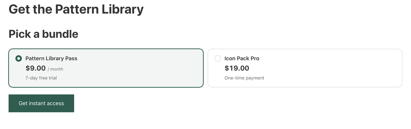
With the button layout, buyers see the plans and a button. The checkout opens below the cards when they click it.
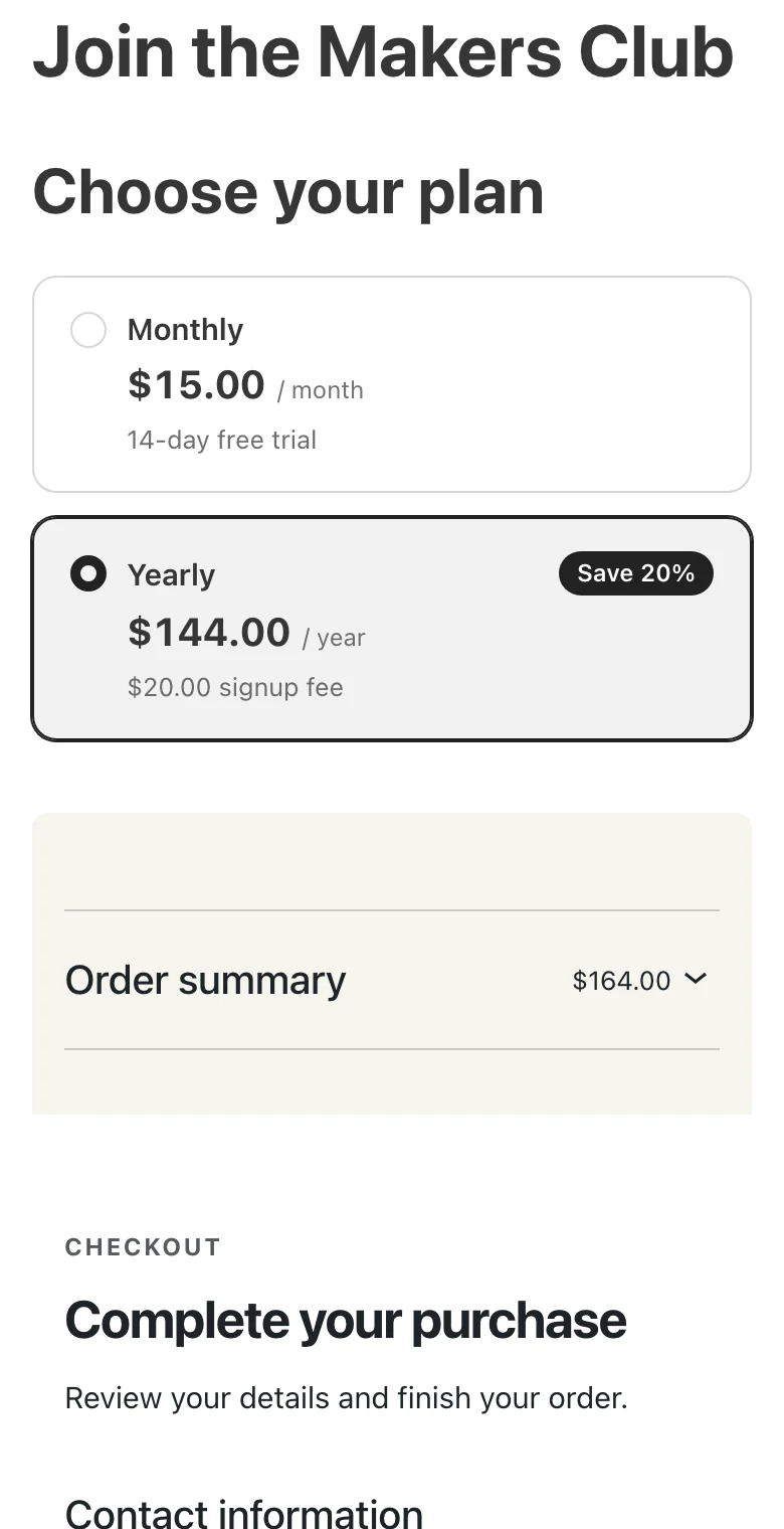
On a phone, the cards and the checkout stack into one column.
Good to Know
- The checkout never loads inside the builder. Check payments and coupons on the live page.
- The element fills the width of a flex row or column, so it doesn’t shrink inside Bricks containers.
- If the element has nothing to sell, editors see a note asking for a published product, and visitors see nothing.
- In a template, the preview needs Populate content set to a product. Without it, the builder shows that note instead of plans.
- The plan list and the preselected plan take fixed values. Bricks dynamic data isn’t available in those fields.