
 by
by
Most contact form design advice is decoration advice: round the corners, brighten the button, place a testimonial beside the form. The redesign ships and the submissions graph stays flat, because a form can look expensive and still ask the wrong questions, hide what happens next, collapse under a phone keyboard or deliver every lead into an inbox nobody checks.
Teams get this wrong in 2 opposite directions. One camp treats the form as a styling exercise and spends a sprint on shadows while the notification email silently bounces. The other camp treats it as data intake, asks 11 questions because the CRM has 11 columns and then wonders why serious inquiries stopped. Both camps are polishing 1 part of a system that has 5.
The form is the workflow. The page is only where it surfaces.
That belief is why I built Core Forms: one WordPress form plugin where I control the HTML, route submissions, inspect delivery, measure drop-off and connect campaign tools without buying a separate add-on for every job. The plugin comes later in this article. First, the form needs a job.
Use the shortest form that gives your team enough information to take the next useful action. Then make storage, routing, spam control, accessibility and measurement part of the same build.
The Five Parts of Contact Form Design
Good contact form design connects intent, inputs, validation, delivery and measurement. Almost every weak form obsesses over inputs, because inputs are the visible part. The invisible parts decide whether a submission becomes a conversation or disappears.

| Owner | Question they must answer | Failure I see most |
|---|---|---|
| Builder | Can a person understand and complete this form on a phone? | Pretty inputs with weak labels, poor spacing, and no visible state changes |
| Developer | Will every valid submission be stored, protected, delivered, and recoverable? | Email treated as the database, with no logs or retry path |
| Marketer | Does each question improve qualification, routing, or follow-up? | Fields collected because the CRM has columns for them |
I use this ownership table because it ends the usual blame game. Marketing can’t fix a broken webhook with better copy. Development can’t fix a vague offer with cleaner PHP. A builder can’t style away a 7-day response time. The page works when those responsibilities meet, and it fails at whichever seam nobody owns.
Fields Worth Asking For
The right field count is not a number, it is a test. The W3C forms tutorial gives the safe default: ask only for information the process needs. I hold every field to a stricter version of that.
If a field does not change your reply, your routing, your price estimate or your eligibility decision, it does not go on the form.
Run your current form through that sentence once. Most forms lose 2 fields immediately, and nobody downstream ever misses them.
| Form job | Useful starting fields | What happens next |
|---|---|---|
| General contact | Name, email, message | Notify the owner and save the submission |
| Project inquiry | Name, work email, website, goal, budget band | Route by service or budget and start qualification |
| Support request | Email, account/site, issue type, message, optional file | Create a support trail and route by severity |
| Application or intake | Only the first decision fields, then progressive steps | Save progress, validate each stage, allow a return link |
For a 3-field contact form, multi-step UI is theatre. It creates more clicks without reducing the decision load. For a 20-field intake form, one giant page is worse: break it into logical stages, show progress, preserve answers and let the person resume later.
Budget is the field people argue about most. Include it when it changes the service, the team or the next step; leave it out when every lead receives the same reply. The phone field deserves the same suspicion. People know exactly what happens after they hand a stranger their phone number, so the field makes them hesitate even when it is optional. If you won’t call, don’t ask.

This is the same discipline I apply in conversion rate optimization: remove effort that produces no better decision.
One Column, Visible Labels
A single-column form is the safest default in contact form UX. It gives the eye one reading path, survives narrow screens and makes error placement predictable. Two-column rows are fine for tightly related pairs such as city and postal code. Splitting name and email to save vertical space saves nothing worth having.
Placeholders are the argument I keep having. A placeholder is a label written in disappearing ink: the moment someone types, the instruction is gone, and the person filling 6 fields from memory is exactly the person the design was supposed to help. The WordPress Theme Handbook treats placeholders as examples, not label replacements, and that is the correct reading. Floating labels are the compromise everyone reaches for, and they still shrink the label to a whisper at the moment the person wants to double-check what they typed.
Labels stay visible. Always.
- Associate every label and field. The label’s
forvalue must match the control’sid. That helps screen readers, speech input, and anyone who benefits from a larger click target. - Use native input types.
email,tel,url, anddategive browsers and mobile keyboards useful context. - Group related choices. Radio buttons and checkboxes belong inside
fieldsetandlegend, not a pile of styleddivelements. - Explain errors beside the field. Preserve the person’s input, state what went wrong in text, and connect the message with
aria-describedby.
The standards have caught up with this thinking too. WCAG 2.2, a W3C Recommendation since October 2023, added Redundant Entry at Level A, which expects information already entered in a process to be prefilled or selectable rather than retyped, and a 24 by 24 pixel minimum target size at Level AA. Cramped checkboxes are no longer just annoying. They are a documented failure with a number on it.
If accessibility is new territory, my guide to building accessible forms in WordPress is the companion checklist. The shift that matters is to stop treating accessibility as a scan you run after the design is frozen. The markup has to start correct.
Validation That Forgives
Validation has a temper problem. A field that turns red on the first keystroke is punishing someone for not having finished typing. Judge completed fields, not keystrokes: validating when the person leaves the field is early enough, validating on submit is fine, validating while they type is hostile.
The message matters as much as the timing. What most forms say:
Invalid email address.
What works better:
This email address is missing the part after the @. A full address looks like name@company.com.
Same rule, same trigger. The first message assigns blame and leaves the person to guess. The second names the problem and shows the way out, which is the entire job of an error message.

And never make a disabled submit button your error strategy. A dead button announces that something is wrong somewhere, then makes the person hunt for it. Let them submit, then show exactly what needs fixing, with the input they typed still in place.
Client-side validation is a courtesy, not a defense. It catches a typo before a round trip, and it is trivially bypassed. Validate and sanitize again on the server, because requests can skip the browser entirely. The W3C validation guidance draws the same line.
Contact Form Design on Mobile
Mobile is where forms go to fail. A desktop form that shrinks to 360 pixels is not a mobile form; the field order, keyboard, help text, upload control and error behavior all have to survive a thumb and a small screen. 2 attributes do most of the invisible work:
<input type="email" name="email" autocomplete="email">
<input type="tel" name="phone" autocomplete="tel" inputmode="tel">
<input type="text" name="company" autocomplete="organization">
<input type="url" name="website" autocomplete="url" inputmode="url">
Correct autocomplete tokens let the browser fill most of a lead form in 1 tap, and the matching type and inputmode summon the right keyboard. That single edit removes more typing than any layout trick on this page.
- Give controls room. Tiny checkboxes, cramped radio labels, and buttons pressed against the screen edge create errors that have nothing to do with intent.
- Keep errors near the active field. Do not jump the user to a red message at the top while leaving the broken control off-screen.
- Explain uploads before selection. State the accepted file types and size limit beside the control. If an upload fails, keep the rest of the form intact.
I test a form with one hand on an actual phone, not only in responsive mode. Autofill on, every validation error triggered, screen rotated, page zoomed, a file attached, a submission sent on a slow connection. The awkward moments show up in the first minute. A button hidden behind the on-screen keyboard is the classic.
Long forms need one extra decision: can the person safely stop? Save-and-resume is worth building for applications, onboarding and detailed intake, because losing 15 minutes of answers hurts. For a name-email-message form it is furniture. Skip it.
Buttons and Status Messages
Submit describes what the browser does, not what the person gets. Name the action instead: Send Message, Request a Quote, Apply for the Program. And put the promise before the click: who replies, roughly when, and what happens to the information. A plain line such as “I usually reply within 1 business day” outworks a row of trust badges.
After submission, replace uncertainty with a complete answer. “Message sent” is technically adequate and emotionally useless. A status message that finishes the job looks like this:
Thanks, your message is in. I reply within 1 business day, usually faster. If this is urgent, email hello@yourdomain.com and mention this form.
3 sentences: confirmation, expectation, escape hatch. Most status messages stop after the first, and announce none of it through an accessible live region, so a screen-reader user submits into silence. Announce the same result to everyone.
Qualification That Changes the Workflow
Marketers add fields to improve lead quality, then judge the form by submission count. That measures the wrong thing. A shorter form can produce more leads and waste the sales team’s week. A longer form can cut volume and improve the number of conversations worth having.
You are thinking longer forms scare away real buyers too. When the extra questions are decoration, they do. When each question visibly shapes the response, serious people answer them, because serious people have the answers ready. The field that filtered out a genuine project was almost always a field that changed nothing downstream.
Track qualified submissions, not submissions. A field earns its place when it assigns the right service, rejects work you don’t offer or routes the inquiry to the correct person. A field that exists because “sales might want it someday” can be collected after the first reply.
- Use conditional fields so a support visitor doesn’t see sales questions and a project lead doesn’t see account-recovery fields.
- Use ranges for budget, team size, and launch date when an exact value adds pressure but no precision.
- Route by intent instead of sending sales, support, partnerships, and guest-post pitches to one inbox.
- Keep hidden attribution fields quiet. UTM source, referrer, landing page, and campaign data shouldn’t become questions the visitor has to answer.
If your site gets traffic but weak inquiries, the form may not be the problem at all. My diagnosis of why websites fail to generate leads covers the offer, proof, and page sequence around it. A form can’t rescue unclear positioning.
The Page Around the Form
The contact page should answer the doubts that stop someone from opening the form. Put the useful context beside the decision: who should contact you, what you can help with, when you reply and what will make the first response better. On desktop I prefer 2 parts, the form and that context. On mobile, 1 calm reading column.
- Show people where people matter. A named contact or small team photo can reduce uncertainty. A wall of logos beside a simple support form usually distracts.
- Use a map only for a place visitors can visit. A heavy embedded map on a remote business contact page adds loading work and no decision value.
- Separate sales and support. Existing customers should not have to pretend they are new leads to receive help.
- Place privacy context beside sensitive fields. Explain why you need a phone number, budget, file, or account identifier at the point of collection.
Do not force every inquiry through 1 universal form. Sales, support, partnerships, speaking requests and job applications carry different fields and different owners. Separate forms also produce cleaner analytics, because a high-intent project request no longer sits beside a password-reset message in the same conversion report.
The visual treatment should still feel like the site: the same type scale, border language, focus styles, button system and spacing, not a plugin’s default skin dropped onto the page. That consistency is part of the broader web design system I use on production sites.
Delivery, Storage and Spam
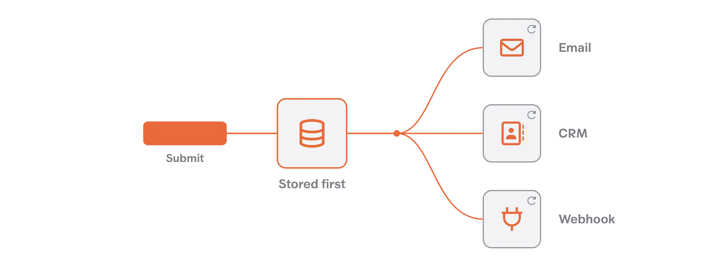
A form is not done when the browser says success. A production form needs storage, delivery logs, spam controls, routing and a failure path. Email alone is not submission storage: messages bounce, hosting mail queues stall and an innocent SPF or DMARC change can make a working form look broken for weeks. The person who discovers the outage is usually the lead you never answered.
- Save every valid submission before running external actions.
- Log notifications and webhooks with status, response, and a retry option.
- Layer spam protection with a honeypot, rate limits, and a challenge such as Cloudflare Turnstile when risk warrants it.
- Cap duplicates and abuse without blocking a real person who corrects a mistake.
- Test the failure path, including a rejected file, invalid email, timeout, blocked webhook, and disabled JavaScript.
Return success to the user only after the submission is safely stored. External email, CRM, Slack, or webhook actions can run after that and retry independently.
An aside on CAPTCHA.
A CAPTCHA outsources your spam problem to every legitimate visitor. The bots solved the traffic-light puzzles years ago, so the challenge now reliably filters 1 group: tired humans on phones, which is where your leads live. Start with a honeypot and rate limits, add a silent challenge such as Turnstile when pressure rises and treat a visible puzzle as the last resort, never the first setting. Your spam problem should cost you effort, not your reader.
Back to the pipeline.
Why I Built Core Forms
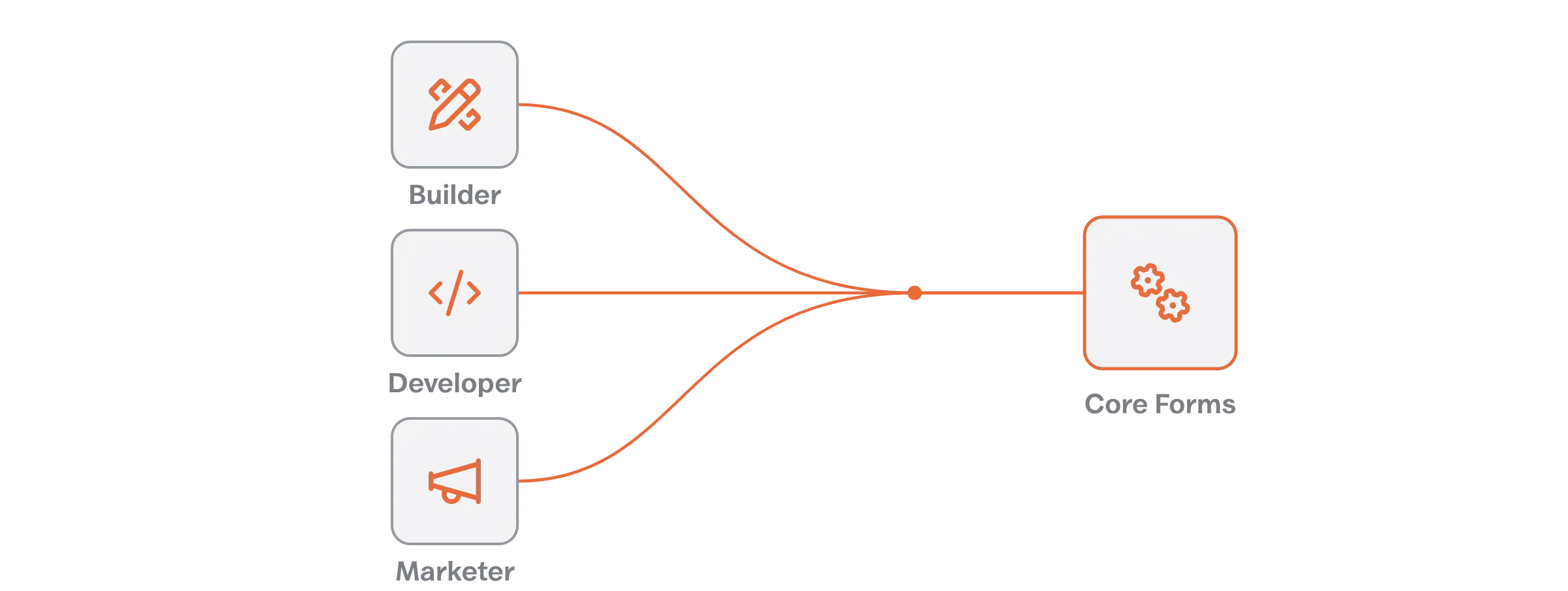
I built Core Forms because I kept solving the same form problem in 3 different places. The builder needed layout control. The developer needed clean markup and dependable actions. The marketer needed attribution and field-level evidence. Buying 3 tools for 1 handoff made no sense.
Core Forms is currently at version 4.10.2, released on September 17, 2026. The changelog shows 13 releases between July 12 and August 15 alone, covering per-form CSS control, double opt-in flows for FluentCRM and MailerPress, licensing resilience and a steady run of admin fixes. The 4.10 releases in September added service and event products, customer accounts and a clearer submissions inbox. That is the release rhythm of a plugin its developer depends on daily.
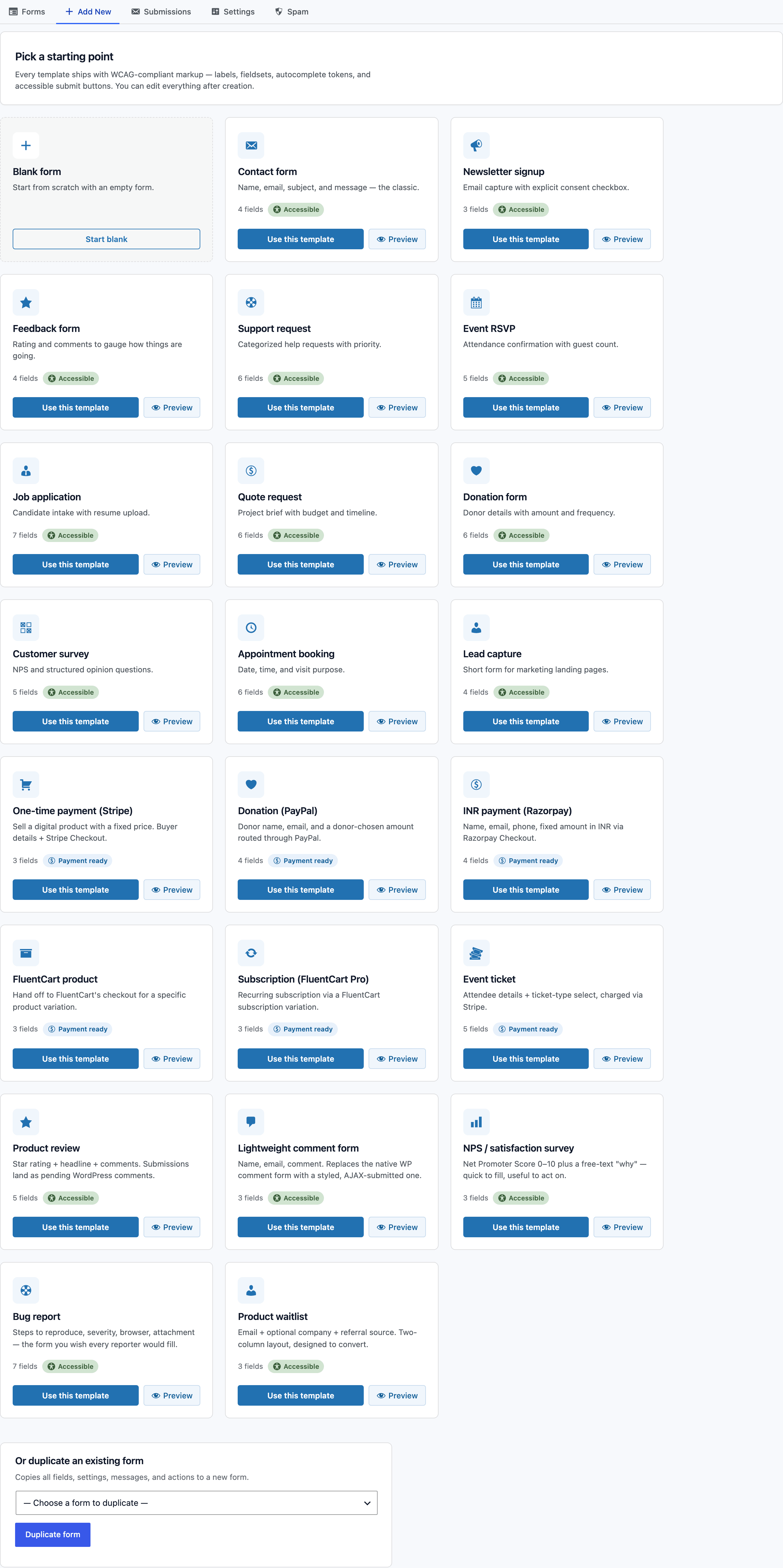
For Builders
You get a visual field builder, raw HTML control, 18 accessible starter templates, a native Gutenberg block, a shortcode and fullscreen forms. The HTML option is the one I care about, because some client forms need a precise structure that no generic drag-and-drop canvas expresses cleanly.
For Developers
Forms, fields, submissions, analytics, action logs and retries are all exposed through the REST API. Webhooks, headless submissions for Astro and Next.js, post and user creation, ACF/SCF mapping and conditional actions ride along. Use the visual editor for the common case and treat the form like application infrastructure when the project grows.
For Marketers
Core Forms tracks views, starts, submissions, abandonment, field drop-off, UTM and referrer attribution, and spam trends. Its 72 built-in integrations across 13 categories cover email, CRM, messaging, payments and developer workflows, while conditional actions route by field value. That upgrades the question from “did submissions go up?” to “where do people stop, and are the resulting leads any good?”
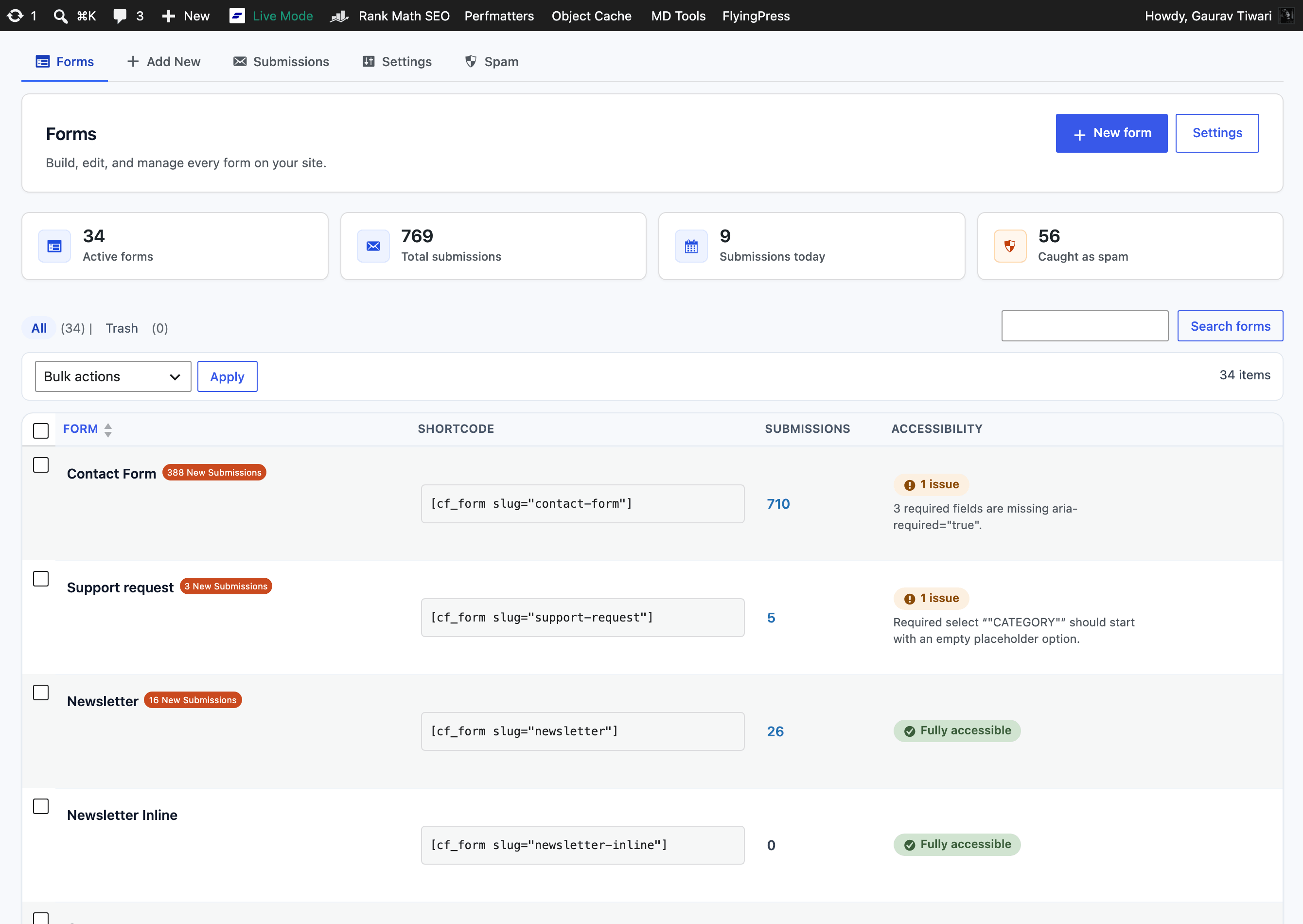
The accessibility column in that screenshot is deliberate. It flags missing aria-required, placeholder problems, and other issues beside the form instead of waiting for an audit months later. I wrote more about that decision in why I built Core Forms.
Core Forms Pricing
Core Forms costs $59 per year or $249 once. Both plans cover unlimited personal and client sites, include every feature and integration, and come with a 14-day refund period. The launch code CFLAUNCH takes 20% off, bringing the current checkout prices to $47 per year or $199 once.
| Plan | Price | Best fit |
|---|---|---|
| Yearly | $59/year, or $47 with CFLAUNCH | Try it on live projects with a lower upfront cost |
| Lifetime | $249 once, or $199 with CFLAUNCH | Agencies, freelancers, and builders with a multi-site portfolio |
The current release requires WordPress 6.4 or newer and PHP 8.1 or newer. That is a sensible baseline for new builds, but it rules out neglected client sites that haven’t been upgraded. Fix the platform before changing the form plugin.
I also wouldn’t migrate a stable Gravity Forms, WPForms, or Fluent Forms implementation merely for novelty. If a business has tested automations, custom add-ons, staff training, and years of clean submissions, migration has a cost. Use my WordPress contact form plugin comparison if you need to compare those workflows first.
Core Forms is the stronger fit when you build many WordPress sites and want raw HTML, a visual builder, analytics, accessibility checks, payments, integrations, and developer APIs under one license. It isn’t free, and it doesn’t pretend to be. The value is predictable tooling across unlimited sites without an add-on ladder.
The Pre-Launch Checklist
I run this check before a contact page goes live. It takes less time than debugging 1 lost inquiry.
- The heading says who the form is for and what happens after submission.
- Every field changes qualification, routing, or the next response.
- Labels stay visible; placeholders are examples only.
- The form works by keyboard, at 200% zoom, and on a narrow phone screen.
- Required states and errors are visible and announced to assistive technology.
- Client-side and server-side validation reject malformed or unsafe input.
- A valid submission is stored before email, CRM, or webhook actions run.
- Notification and webhook failures are logged and retryable.
- Spam protection has been tested without turning the form into a puzzle.
- The success message confirms the response time and a useful next step.
- Analytics distinguish form views, starts, submissions, qualified leads, and field drop-off.
- A real submission reaches the right person, not merely the admin email configured years ago.
The surrounding page still matters. Clear hierarchy, readable type, useful proof, and a calm mobile layout make the form easier to trust. My guide to designing a user-friendly website covers those page-level decisions.
Measure the Conversation
Submission rate is 1 metric. Form starts, field drop-off, qualified-lead rate, spam rate, delivery failures, first-response time and the source that brought the visitor complete the picture. A form with fewer submissions can be the better form when those submissions fit the work you want.
Field drop-off is the sharpest instrument in that list. When people repeatedly leave at the phone field, the budget question or the file upload, you have a suspect, not a mystery. Remove the field, explain it, make it optional or move it later. Don’t redesign the entire page because 1 control creates doubt.
And measure response time. A form that converts at 10% and gets replies 4 days later is a broken lead system wearing a good conversion rate. The dashboard won’t show it unless the workflow records when the submission arrived and when someone acted on it.
The Limits
Form design has a ceiling, and it is worth naming plainly.
It cannot fix positioning. When the offer is vague, the shortest form in the world collects vague inquiries, because the visitor doesn’t know what to ask for. The offer, proof and page sequence around the form set the quality of what arrives in it.
It cannot fix reply behavior. Storage, logs and routing guarantee the message reaches a human. No field arrangement makes that human answer within 1 day. The response promise on the page is a commitment the team keeps or breaks off the page.
And analytics tell you where, never why. Drop-off data points at the suspect field, but the reason still needs a hypothesis: fear, confusion, effort or plain irrelevance. The number starts the investigation. It doesn’t close it.
What Quietly Ruins a Good Form
Restyling the form every quarter and never sending a test submission. The redesign feels like progress, but the lead lost to a bounced notification never comes back to tell you.
Copying the 9-field form of a SaaS you admire. Their fields feed a sales team with response targets; yours feed an inbox. The imported friction arrives without the imported follow-up.
Marking every field required because the plugin’s toggle was on. Each unnecessary asterisk trades a little completion for data nobody reads, and the trade compounds field by field.
Routing everything to info@. 3 people each assume the other replied, which the visitor experiences as nobody replying.
Celebrating submission volume. It rewards the vaguest possible form, floods qualification with noise and slowly turns the sales team against the marketing report.
My Recommendation
Design the workflow before the form. Give the builder a clear interface rule, give the developer a recoverable delivery path and give the marketer measurements tied to lead quality. That is the contact form design system I ship, in that order.
For WordPress builders, developers, and marketers who want that system in one plugin, use Core Forms. Start with the annual plan if you want to prove it on client work. Buy lifetime if you manage enough sites that renewals become another line in an operations spreadsheet. Use CFLAUNCH for 20% off either plan.
Visitors haven’t stopped filling contact forms. They have stopped trusting pages that demand effort and promise nothing back. Fix the promise, the delivery and the follow-through, and the prettiest thing about your form becomes its reply time. The next serious lead is already on your page. Give them a form worth 40 seconds.
Frequently Asked Questions
What makes good contact form design?
Good contact form design asks only for information that changes the next action, uses visible labels, explains errors beside each field, works by keyboard and on mobile, stores every valid submission, and tells the user what happens next. The interface, delivery workflow, and measurement plan should be designed together.
How many fields should a contact form have?
A general contact form usually needs name, email, and message. Project, support, or application forms can ask more when each field changes qualification or routing. For long forms, split questions into logical steps and let users save progress rather than placing every field on one page.
Can placeholder text replace a form label?
No. Placeholder text disappears as a user types and may not provide a dependable accessible name. Keep a visible label associated with the field through matching label-for and input-id values. Use a placeholder only as a short example of the expected format.
What should happen after someone submits a contact form?
Store the valid submission first, then run email, CRM, Slack, payment, or webhook actions. Show an accessible success message with the expected response time. Log delivery failures and make external actions retryable so a temporary API or email problem does not erase the inquiry.
Is Core Forms free?
No. Core Forms costs $59 per year or $249 once, with unlimited sites and every feature included. The CFLAUNCH code currently reduces those prices by 20% to $47 per year or $199 once. Both plans include updates, priority email support, and a 14-day refund period.
Can Core Forms work with headless WordPress?
Yes. Core Forms supports headless and cross-origin submissions for front ends built with Astro, Next.js, or another framework. Its REST API also covers forms, field schemas, submissions, analytics, and action logs, while the server-side WordPress workflow keeps validation and downstream actions in one place.
Tell Google you want more of this.
Add Gaurav Tiwari as a preferred sourceOne tap, and this site shows up more often in your own Top Stories, AI Overviews and AI Mode. Remove it any time.
Disclaimer: This site is reader-supported. If you buy through some links, I may earn a small commission at no extra cost to you. I only recommend tools I trust and would use myself. Your support helps keep gauravtiwari.org free and focused on real-world advice. Thanks. - Gaurav Tiwari