How to Create Accessible Forms in WordPress: The Easy Way
Most WordPress forms ship inaccessible by default, and the plugin you’re using probably isn’t telling you. WCAG 2.2 AA is the practical compliance target on US ADA case law and the EU Accessibility Act, and it’s the bar every enterprise procurement checklist now expects your forms to clear.
I’ve run accessibility audits on 40+ client WordPress sites in the last three years. The contact form fails more often than the navigation does. Always the same patterns. Radio groups dropped onto a page without a <fieldset>. Error messages that flash on screen but never reach a screen reader. “Pretty” date pickers that trap keyboard focus inside a JavaScript widget. Required asterisks rendered as red styled text that no assistive tech ever announces.
This is the setup I use on every client site that has to pass an audit. One plugin. No add-ons. Skip the consultant and create accessible forms in WordPress easily and reliably.
What “Accessible” Actually Means For a Form
Before recommending anything to create accessible forms in WordPress, here’s the vocabulary so we’re talking about the same thing. WCAG 2.2 AA is the standard. It’s what the published Department of Justice ADA guidance leans on, what the EU Accessibility Act expects (enforcement started June 28, 2025), and what every enterprise compliance checklist in my inbox names by version.
Read: WordPress Accessibility & ADA Compliance in 2026: The Complete WCAG 2.2 Implementation Guide
For a form, the criteria that matter most are short:
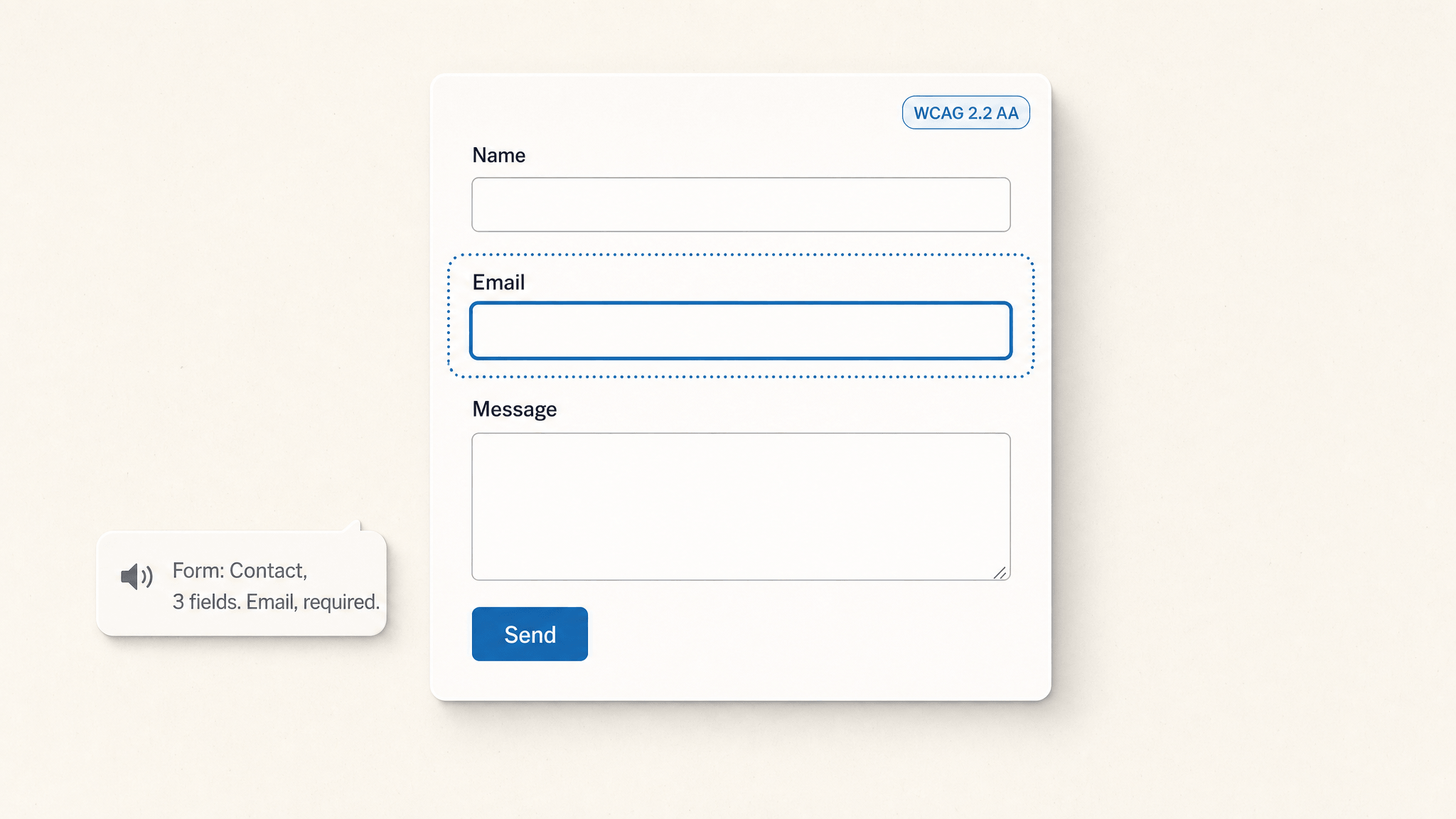
- Every input has a label, and the label is programmatically associated (WCAG 1.3.1). A
<label for="...">matched to an input id. Not a<p>floating above an input. Not a placeholder pretending to be a label. - Grouped inputs get a
<fieldset>and a<legend>(1.3.1 again). Radio buttons asking “How did you hear about us?” need a wrapper that tells assistive tech these five choices belong together. - Focus stays visible (2.4.7). The default browser focus ring is fine. Don’t
outline: noneit without a replacement. - Errors are identified in text, not color alone (3.3.1), and they’re announced to screen readers via a live region (4.1.3). Red text isn’t enough.
- Custom controls expose name, role, value (4.1.2). If you build a custom dropdown, it has to behave like a
<select>to a screen reader. - Required fields are flagged in a way assistive tech can read (3.3.2). HTML5
requiredplusaria-required="true"is the safe combo. - The form is keyboard-reachable end to end (2.1.1). Tab from the address bar, hit submit, done. No mouse.
- Color contrast meets 4.5:1 for normal text (1.4.3) and motion respects
prefers-reduced-motion(2.3.3). - Common fields advertise their purpose to autofill (1.3.5). Email gets
autocomplete="email", name getsautocomplete="name", phone getsautocomplete="tel". This is the criterion most forms forget exists.
That’s the floor. Hit those nine items and a third-party audit firm will sign off most contact-style forms.
Why Most Form Plugins Fail an Audit
I’m not going to name names because the patterns matter more than the brands. After running enough audits you start seeing the same five failures regardless of the plugin:
1. Radio and checkbox groups without a fieldset. The single biggest one. Plugins emit <label><input type="radio">Option A</label> five times in a row with no wrapper. Sighted users read it as a group. Screen readers read it as five disconnected questions.
2. No aria-live region for errors. “Email is required” appears in red. The screen reader has already moved on. The user fills the form again and gets the same error they never heard the first time. Frustrating becomes hostile fast.
3. Custom dropdowns and date pickers built as <div> soup. Someone wanted the dropdown to look on-brand, so they replaced the native <select> with a styled <div> that listens for clicks. It looks great. It doesn’t open with the spacebar. Arrow keys don’t navigate options. Screen readers announce it as “group” with no role, no state, nothing useful.
4. Required asterisks that exist only visually. Red asterisk after the label is fine as well as the aria-required attribute and required attribute. As the only signal? Useless.
5. Focus that never returns after AJAX submit. Form submits. Success message appears. Focus stays on the now-disabled submit button. The user has no idea anything happened. The screen-reader user has even less idea.
Show me a form plugin and I’ll show you which of those five it ships with by default. Some have two. Some have all five.
The Core Forms Way
I built Core Forms partly because I was tired of patching the above on client sites. The accessibility behavior isn’t a bolt-on. It’s the default render.
Plain HTML is the source of truth
When you build a form in Core Forms, you write actual HTML. Not a JSON config. Not a drag-and-drop abstraction that compiles to something resembling HTML.
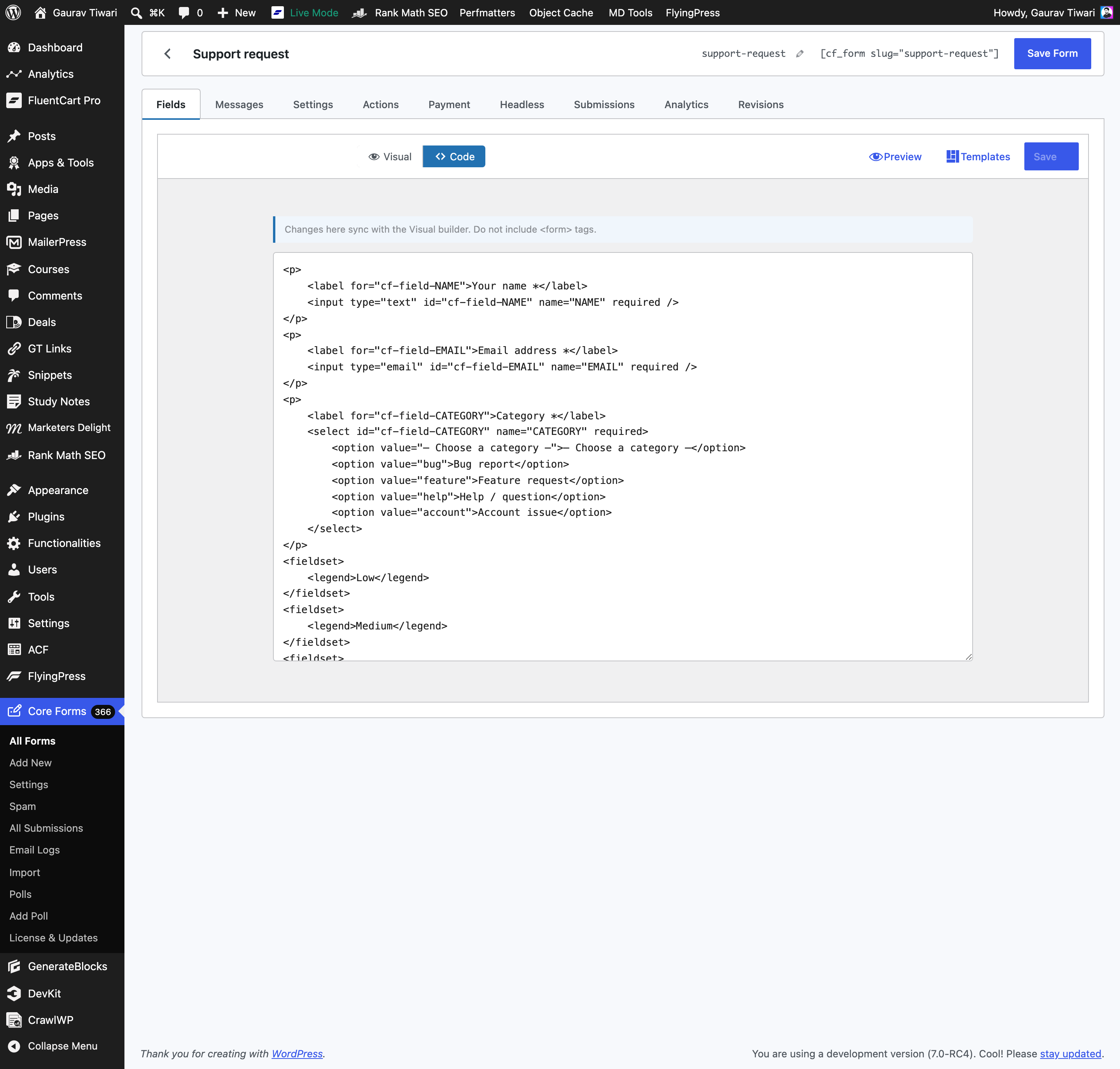
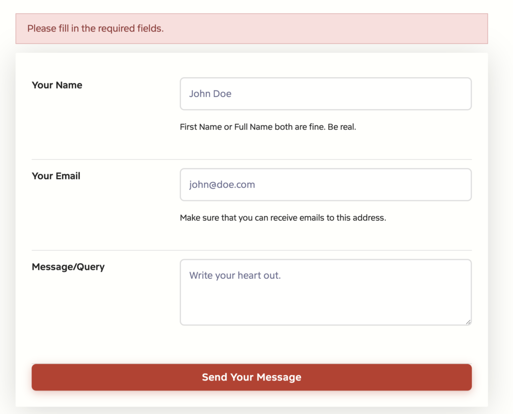
That’s the editor. Here’s what comes out the other end when the form renders on the front-end. This is the actual response body of my contact form, copied verbatim from the rendered DOM:
<form method="post"
      class="cf-form cf-form-1093166"
      data-id="1093166"
      novalidate
      aria-label="Contact Form">

  <!-- Honeypot — hidden visually and from assistive tech. -->
  <div style="display:none" aria-hidden="true">
    <input type="text" name="_cf_h1093166" tabindex="-1" autocomplete="off">
  </div>

  <!-- Live region. role="status" + aria-live="polite" + aria-atomic. -->
  <div class="cf-messages" role="status" aria-live="polite" aria-atomic="true"></div>

  <div class="cf-fields-wrap">
    <label for="id_first_name">Your Name</label>
    <input type="text"
           name="first_name"
           id="id_first_name"
           placeholder="John Doe"
           autocomplete="name"
           required
           aria-required="true">
    <span class="small">First Name or Full Name both are fine. Be real.</span>

    <label for="id_email">Your Email</label>
    <input type="email"
           name="email"
           id="id_email"
           placeholder="john@doe.com"
           autocomplete="email"
           required
           aria-required="true">
    <span class="small">Make sure that you can receive emails to this address.</span>

    <label for="id_message">Message/Query</label>
    <textarea name="MESSAGE"
              id="id_message"
              placeholder="Write your heart out."
              required
              aria-required="true"></textarea>

    <input type="submit" value="Send Your Message" class="button button-submit">
  </div>

  <noscript>
    <p role="alert">Please enable JavaScript for this form to work.</p>
  </noscript>
</form>
Look at what’s already baked into the output: aria-label on the form, aria-required on every required input, autocomplete="name"/autocomplete="email" (the WCAG 1.3.5 criterion most plugins forget), labels associated by for/id, a live region with role="status" + aria-atomic="true", and a no-JS fallback that announces itself with role="alert". The honeypot anti-spam field is wrapped in aria-hidden="true" so screen readers ignore it entirely.
That’s the default. I wrote zero accessibility code to get there.
cf_enhance_accessibility runs on every form output
There’s a filter called cf_enhance_accessibility that walks every form’s markup before it renders and quietly fixes the common omissions. The cases it covers:
- Required fields that have
requiredbut notaria-required="true"— adds the aria attribute. - Orphan
<label>elements that don’t have a matchingforattribute — pairs them with the nearest input. - Help text that exists but isn’t linked from the input via
aria-describedby— adds the link. - Error containers without a live region role — promotes them.
You don’t write that code. The plugin does it. Even if a client edits the raw HTML and forgets an attribute, the enhancement layer catches it on the way out.
Inline validation that screen readers can actually hear
Open the rendered form. Tab to the email field. Type notanemail. Tab away. Three things happen:
- The input gets
aria-invalid="true" - An error message appears next to the field
- The input’s
aria-describedbynow points at that error’s id
On submit, every field is checked. If anything’s missing, the live region content updates to the error message, the message wrapper carries aria-live="polite" plus a <p role="alert"> inside it, and the screen reader reads the message immediately.
I tested this on my contact form. Submitted it empty. The DOM came back with this live-region content:
<div class="cf-messages" role="status" aria-live="polite" aria-atomic="true">
  <p class="cf-message cf-message-error" role="alert">
    Please fill in the required fields.
  </p>
</div>
role="status" + aria-live="polite" lets assistive tech finish whatever sentence it’s mid-way through, then announce the error. role="alert" inside it bumps the priority for the error specifically. aria-atomic="true" makes sure the whole message is announced, not just the diff from the previous state.
That’s the WCAG 4.1.3 “Status Messages” criterion done right. Most form plugins skip it because it’s invisible to sighted users. Skipping it is why a screen-reader user fills out your form twice and rage-quits before they ever submit.
Conditional fields that hide cleanly
Conditional logic is one of the easiest ways to break accessibility. Most plugins keep the hidden field in the DOM with style="display:none" and the required attribute still set. The user can’t see the field. The browser still blocks submission demanding they fill it in. Screen readers may or may not announce it depending on the day.
When Core Forms hides a field via data-show-if, the JS lifts the required attribute, adds aria-hidden="true", and stores the original required state in data-was-required. When the rule re-shows the field, both attributes come back. The user can submit. The screen reader doesn’t announce an invisible field. The validation never gets stuck on something the user can’t see.
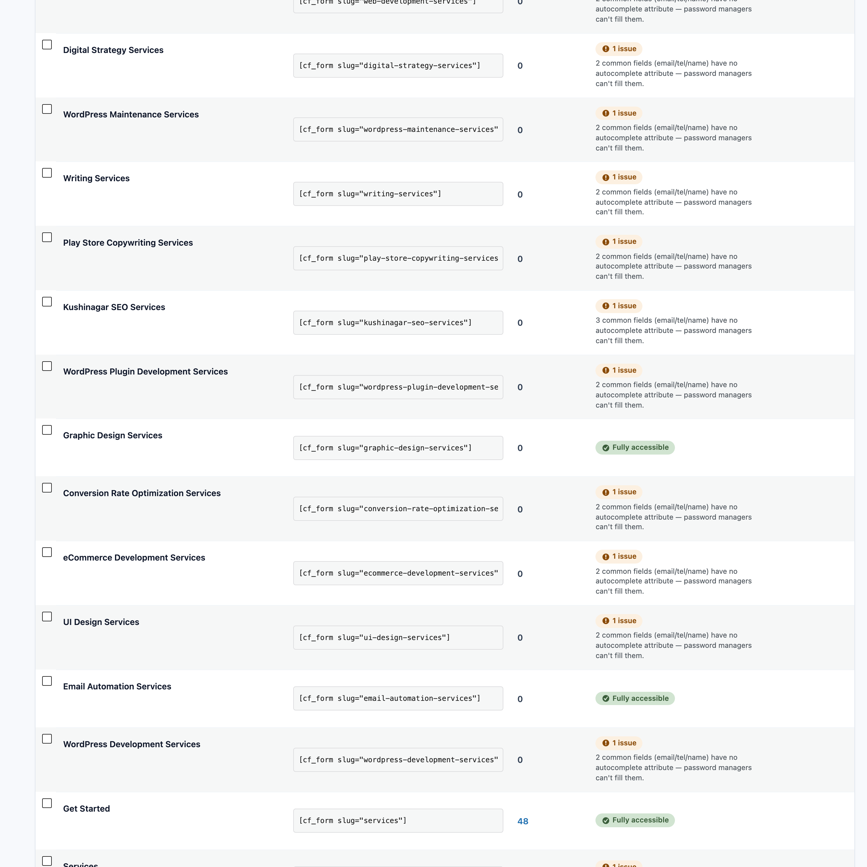
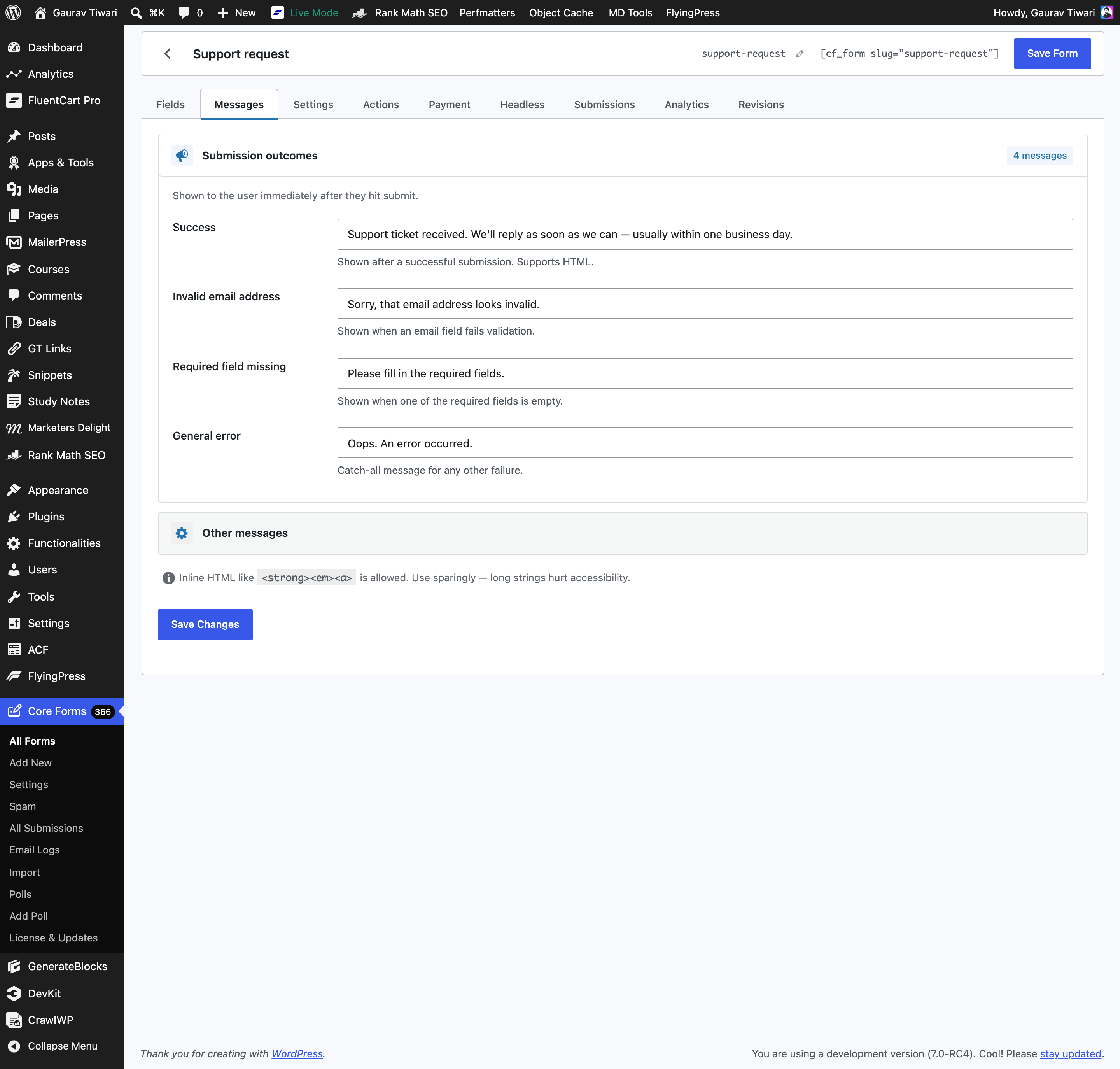
Per-form accessibility auditor, built in
This is the part I’m proudest of. Forms list → Accessibility column. Every time you save a form, Core Forms runs an AccessibilityTester class against the markup and shows the result inline. Green badge if it passes, amber with a specific finding if not.

The checks the auditor runs (verified against the source in class-accessibility-tester.php):
- Every input has an accessible name. Either a
<label for="...">match,aria-label, oraria-labelledby. No name → fail. - Radio and checkbox groups are wrapped in
<fieldset>with<legend>. The auditor walks up from each radio/checkbox input. If it doesn’t hit a fieldset before leaving the form, that group fails. - Required fields carry
aria-required="true". The HTML5requiredattribute isn’t always announced consistently across screen readers; the aria version is the belt-and-braces fix. - Selects start with an empty placeholder option. A
<select>whose first<option>already has a real value silently auto-selects it, which is why users submit forms with “United States” in a country field they never touched. The auditor flags this. - Buttons have non-empty accessible text. A
<button></button>or an<input type="submit">without a value is the classic VoiceOver disaster. aria-describedbyreferences point at elements that actually exist. Dangling references break screen-reader announcements silently. The auditor resolves every id and warns on misses.- Images have
altattributes. Even decorative images needalt=""to be skipped intentionally. - Iframes have
titleattributes. Embedded calendars, video players, maps — they all need a title. - Common fields advertise autocomplete. Name, email, phone, address, country. Missing → amber.
langattributes are consistent. Mixed-language forms get checked for explicitlangannotations.
You don’t have to learn the checks. You just have to keep the column green.
Polls and surveys get the same treatment
The 4.3.0 release rebuilt the polls module from scratch. Every poll renders inside a <fieldset> with the question as the <legend>. Each result bar carries role="progressbar" with aria-valuenow, aria-valuemin="0", aria-valuemax="100", and an aria-label summarising the option plus its percentage. The status message region is role="status" aria-live="polite". After a successful vote, focus moves to the result heading so a screen-reader user hears “Thanks, your vote was recorded” instead of being stranded on a disabled submit button.
The bar fill animation respects prefers-reduced-motion: reduce. If the user has that set in their OS, the bars snap to position instead of animating.
It’s not a list of features the marketing page is selling you. It’s the actual rendered output. Open the DOM and read it.
Every Accessibility Feature Core Forms Ships
Here’s the complete list, grouped by what they cover. Use it as a procurement checklist when you have to answer “does this plugin do X?”
Markup and structure
- Plain semantic HTML for every field (no
<div>-soup controls) aria-labelon every<form>(uses the form’s title)<label for="...">paired with input id (auto-fixed by the enhancer)<fieldset>+<legend>wrapping for radio and checkbox groups (auto-emitted by the field renderer for those types)aria-required="true"on everyrequiredinput (auto-added)autocomplete="email|name|tel|address-*"on the common fields (built into the starter templates and the auditor flags missing ones)aria-describedbylinking inputs to help text and to error messages (auto-added by the enhancer + the JS at validation time)
Validation and status messaging
- Live region (
role="status" aria-live="polite" aria-atomic="true") on every form by default role="alert"on error message paragraphs inside the live region for higher-priority announcementaria-invalid="true"toggled on fields when their value fails native validationaria-busy="true"set on the submit button while the form is processing- “Touched” tracking so an empty required field doesn’t get yelled about on first focus (only after the user has actually interacted with it)
- No-JS fallback message wrapped in
<p role="alert">
Conditional logic
data-show-ifrules togglearia-hidden="true"on hidden fieldsrequiredattribute is lifted off hidden fields and restored on re-show- Original required state preserved in
data-was-requiredso visibility flips never lose information
Polls (4.3.0+)
<fieldset>+<legend>wraps every poll questionrole="progressbar"+aria-valuenowon every result bararia-labelon each bar summarising option + percentage- Focus moves to the result heading after a successful vote
prefers-reduced-motion: reducehonored on bar animations
Spam protection that doesn’t hurt accessibility
- Honeypot field wrapped in
aria-hidden="true"andtabindex="-1"(invisible to keyboard and screen readers) - Cloudflare Turnstile and a built-in Math Captcha as alternatives to reCAPTCHA (which has well-documented audio-challenge accessibility issues)
Auditor and feedback loop
AccessibilityTesterclass runs on every form save- Per-form accessibility column in the admin list with green / amber / specific-finding badges
- Findings are written in human language (“Required select ‘X’ should start with an empty placeholder option”) so non-developer clients can act on them
- An accessibility warning under the Messages tab nudges editors away from long inline HTML blobs that hurt screen-reader readability
Theme + motion
- Default stylesheet hits AA 4.5:1 contrast on inputs, labels, help text, errors, and buttons
- Focus styles use the browser default ring; not removed by the bundled CSS
- All bar / progress animations gated behind
prefers-reduced-motion: no-preference
Walkthrough: Ship an Accessible Contact Form in 10 Minutes
The shortest version of the workflow. Eight steps, every one verifiable.
1. Install Core Forms. Upload the plugin, activate. The forms admin lives at Core Forms in the WP sidebar.
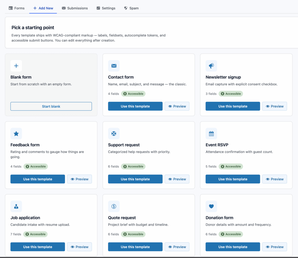
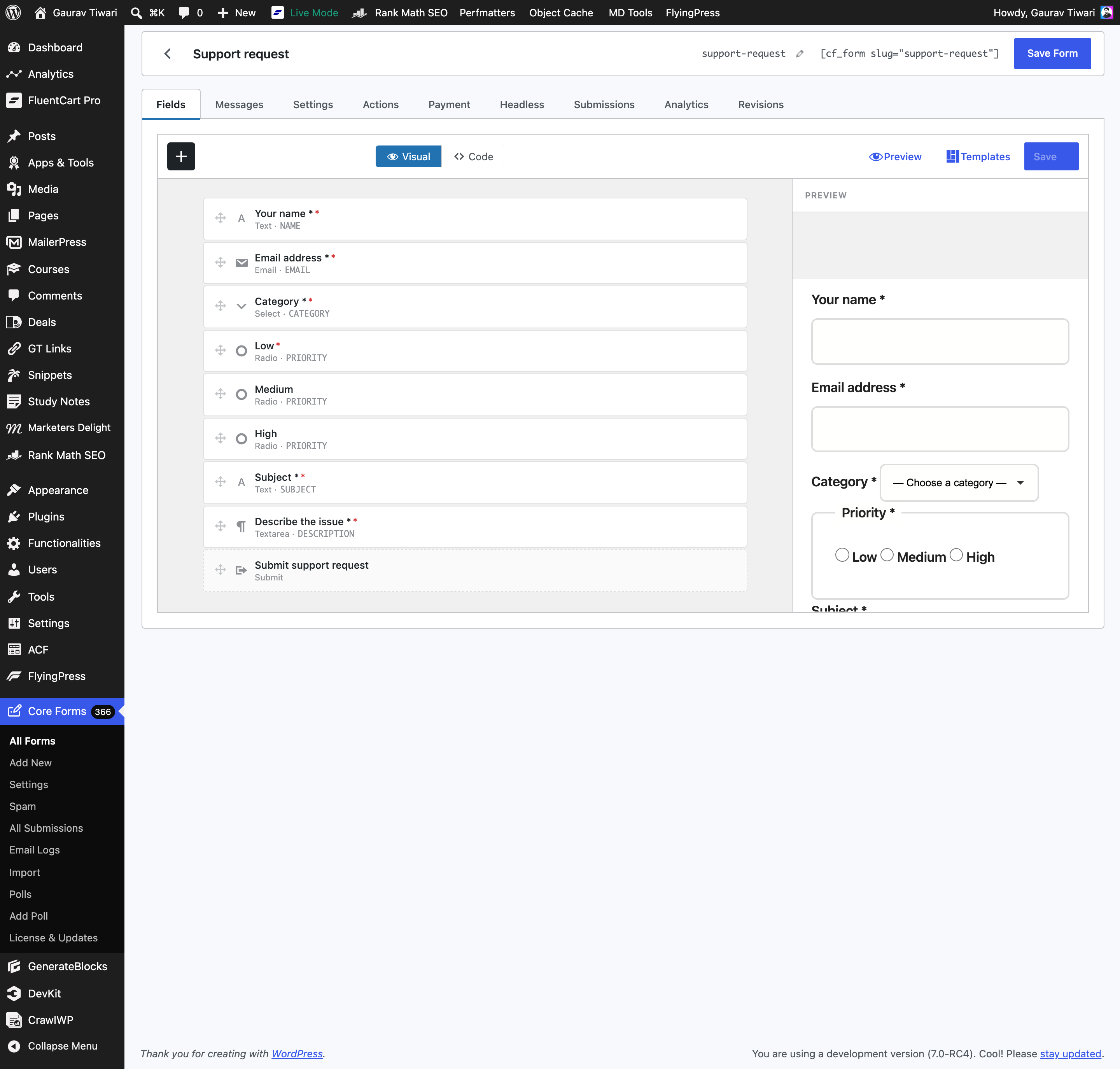
2. Add new → pick the Contact starter template. The template includes a name field, an email field, a subject radio group, a message textarea, and a submit button. The radio group is already wrapped in a <fieldset>.
3. Open the form on the front of the site and view source. You should see the markup pattern from earlier in this article: paired label/input by id, aria-required on required fields, the live-region container on the form.
4. Add help text. If a field needs an instruction, add a <small> with an id and link it from the input’s aria-describedby. The auditor will warn you if the id doesn’t resolve.
5. Enable spam protection that doesn’t hurt accessibility. Go to Core Forms → Settings → Spam Protection. Pick Cloudflare Turnstile or the built-in Math Captcha. Skip reCAPTCHA if you can — v3 makes opaque score-based decisions that block users for reasons they’re never told, and v2 has documented audio-challenge issues for screen-reader users.
6. Set a meaningful success message. Go to the Messages tab. Replace the default “Thanks!” with something a screen reader can read cleanly: “Your message has been sent. We typically reply within one business day.” No emojis. No checkmark glyphs. Actual words.
7. Check the Accessibility column on the forms list. It should be green. If anything’s amber, click into the cell and the finding will tell you exactly what to fix.
8. Run an external audit. Three tools, free, ten minutes total:
- Install WAVE extension in Chrome. Open the form, click axe, run a scan. Should be zero issues.
- Run Lighthouse → Accessibility on the page. Target ≥95.
- Close your eyes. Tab from the address bar. Submit the form with the keyboard only. You should be able to do it without ever reaching for the mouse.
If all three pass, you’ve shipped a form that meets WCAG 2.2 AA on the contact-form pattern. That’s the realistic target.
The Hard Cases
Three patterns that come up after you’ve got a basic contact form working.
Multi-step forms and focus management
When a multi-step form advances to the next step, focus needs to move with it. Otherwise, the keyboard user tabs from the now-hidden previous-step button into nothing, and the screen-reader user has no idea the form just changed.
Core Forms’ smart-forms module moves focus to the new step’s heading on step change and announces the step transition via the same aria-live region. Step indicators carry aria-current="step" so assistive tech knows where the user is in the flow.
File uploads
Skip every custom drop-zone widget you’ve ever seen. Use native <input type="file">. It’s accessible by default. Drag-and-drop and click-to-browse both work. The file name is announced after selection. Validation messages route through the same aria-live region as the rest of the form.
If you need to show upload progress, add the progress bar with role="progressbar" and aria-valuenow updating as the upload runs. Same pattern as the polls bars.
Date and time inputs
Native <input type="date"> and <input type="time">. Every time. Modern Chrome, Safari, Firefox, and Edge all ship accessible date pickers. They work with keyboard. They work with screen readers. They use the user’s locale automatically.
“Pretty” JavaScript date pickers are an accessibility liability. They cost months of audit-driven rework on every project I’ve seen them on. The native one is fine, looks acceptable, and you’ll never have to apologise for it.
My Pre-Ship Audit Kit
Before I tell a client a form is done, this is the checklist I run. Twenty minutes per form.
- WAVE browser extension: zero errors, contrast warnings reviewed
- Lighthouse → Accessibility: ≥95
- Keyboard-only walkthrough: complete the form from address bar to submit without touching the mouse
- VoiceOver (macOS) or NVDA (Windows) spot-check: 15 minutes listening to labels, errors, success
- Core Forms Accessibility column: green
If all six pass, the form meets WCAG 2.2 AA. That’s a different sentence from “perfectly accessible to all users in all situations” — the WCAG standard itself is a floor, not a ceiling. But it’s the same floor every audit firm, every government contract, and every enterprise procurement RFP cares about.
Where Core Forms Can’t Help
Every honest recommendation needs a limitation, so here are three things this plugin won’t do for you:
- It can’t fix bad label wording. “Click here” is technically a label. It’s also useless. “Submit” without context is fine for a contact form, ambiguous for anything else. The plugin makes the labels announceable. You still have to write good ones.
- It won’t fix theme-level contrast. If your theme paints input borders at
#dddon#fff, that’s the theme. Core Forms ships a default stylesheet that hits AA contrast, but the moment a theme override takes over, you’re on your own. The Accessibility column doesn’t measure contrast. Run WAVE for that. - Real-time per-keystroke validation isn’t announced yet. Inline validation messages do reach the live region, but only after the field has been touched and blurred — not on every keystroke. For most forms that’s the correct behavior anyway (announcing on every key would be exhausting), but if you have an unusual case that needs as-you-type announcement, you’ll need to extend the JS yourself. That’s noted on the roadmap.
What This Means For Your Next Form
If you’re shipping a contact form or a survey on a client site that has any compliance pressure, the workflow is short:
- Install Core Forms
- Use the Contact or Survey starter template
- Check the Accessibility column stays green as you edit
- Run WAVE extension and a keyboard walkthrough before publishing
That’s it. No add-ons. No separate accessibility plugin. No quarterly audit fee from a consultancy.
If you’re not sure whether your existing form passes, try the Core Forms demo with the same field set and compare the rendered markup. Or grab a license at core-forms.com/pricing and use the launch coupon for 20% off either plan. If you want a free pair of eyes on a specific form before you go live, send the URL to gaurav@gauravtiwari.org and I’ll run the same six-step audit on it for you.
WCAG 2.2 AA isn’t optional anymore for most production WordPress sites. It’s also not as hard as the consultancies make it sound. Pick a form plugin that takes the work seriously. Run the audit kit. Ship.