
 by
by
A product roundup in WordPress is only useful when readers can narrow the list quickly. Long entries written as matching paragraphs make them do the sorting themselves.
They scroll back and forth between picks, lose track of who each one suits and leave without deciding. Bigger cards on some entries make it worse, because the layout starts ranking products the text never ranked.
The fix is a shortlist table at the top, one honest entry per pick and a consistent card or list entry where it makes the next step easier. I’ll build the table with core blocks and the cards with the Product Cards and Product List blocks in GT ACF Blocks.
I built GT ACF Blocks, a free plugin that adds 29 ACF blocks to the editor. Product Cards and Product List are display tools; the research and the recommendation still come from you.
The examples use three fictional products, Demo Task Planner, Demo Team Board and Demo Notes, so none of them is a recommendation.
Decide What the Roundup Helps Readers Choose
Write the reader’s job before selecting products. A list for a solo writer and one for a remote team can reasonably reach different conclusions.
Keep a record of:
- the inclusion criteria
- important exclusions
- sources and the dates you checked them
- whether each claim comes from your own testing or the vendor
Separate a measured result from a specification. Don’t rank by commission or invent an award just to give every entry a badge.
There is no required number of products. Keep the options that add a meaningful choice and explain why obvious alternatives were excluded when readers would expect them.
Build the Shortlist With Core Blocks
A compact core Table is enough for a simple shortlist. Its job is navigation and a quick decision, so it stays small.
- Add a Table after the introduction or method explanation. Start with Product, Best fit and Main limitation; add another column only when it changes the decision.
- Enable the header section in the Table settings and use meaningful column names. Add a caption that states the scope and date when appropriate.
- Give each detailed entry a stable HTML anchor on its Heading, then link the product name in the table to that entry.
- Keep the table order consistent with the article. Don’t add prices you won’t maintain.
- Preview before choosing fixed-width cells or wide alignment. A header row doesn’t make the table sticky, and fixed layout doesn’t guarantee a readable phone view.
- Check keyboard navigation, row and column meaning, wrapping and horizontal overflow on your theme.
The core Table documentation covers the available controls.
| Fictional example | Best fit in this exercise | Main limitation in this exercise |
|---|---|---|
| Demo Task Planner | Simple solo task tracking | No team permissions |
| Demo Team Board | Shared project coordination | More setup than the solo option |
| Demo Notes | Lightweight notes and checklists | No project workflow |
All three products in this table are fictional, so it shows the layout, not a recommendation.
Write One Useful Entry per Pick
Each entry should answer who the product fits, what separates it from the neighboring options and what could make it the wrong choice. Link to a published full review when you have one, rather than repeating the entire review.
Use a heading level that fits the outline. Under an H2 covering the picks, H3 entries make sense. Don’t add a duplicate heading inside the card simply to increase its visual size.
You can build the entire entry with core Group, Heading, Image, Paragraph, List and Button blocks. Save the layout as an unsynced pattern and verify two copies edit independently. A dedicated product block is optional at any list length.
Add a Compact Product Cards Block
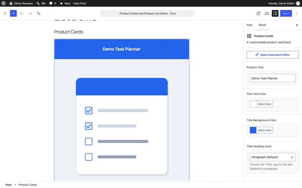
Product Cards suits an entry that needs an image, a short description, a main action and a quieter secondary link. Get the plugin from the GT ACF Blocks product page; it needs ACF Pro or Secure Custom Fields active, so check that before looking for the block.
Search the inserter for Product Cards and select the matching ACF block. Then fill the card title, local image, concise description and the button and text link.
The current template renders one card per block. Its description is escaped as plain text, so don’t paste HTML lists into that field and expect rich formatting. Put longer reasoning in ordinary blocks outside the card.
Include the actual product name in the card title. The template also uses that title as the image’s alt text, so an award-only title such as “Best choice” can make the image description unhelpful. Put an award like that in the text near the card instead.
A paid link needs nofollow sponsored in its rel field. Use a secondary link for an existing review only when that page is published. Don’t invent a destination for the sake of filling the second action.
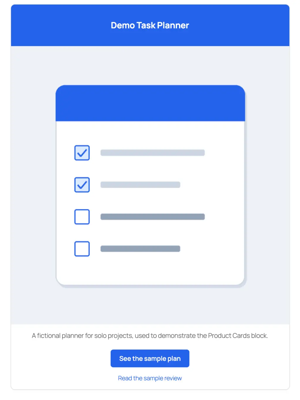
Demo Task Planner

A fictional planner for solo projects. It's here to show the card layout, so it has no price or store link.
Demo Task Planner is fictional, so the card above carries no price, button or store link. Leave both link fields empty and the block leaves the actions out.
Arrange Cards Without Assuming an Automatic Grid
For a short grid, put one Product Cards block in each core Column, or use a Group block set to the Grid layout. The block doesn’t arrange separate cards into a grid by itself.
Two columns are a safe start. Check the stacking and reading order at phone width, and don’t squeeze in a third card just to keep the desktop row even.
Use Product List for a More Detailed Entry
Product List is registered as acf/pl-block. It suits an entry that needs:
- a rank or label
- the product’s name and logo
- a rich-text description
- several pricing rows
- coupon text
- more than one action
The render template uses separate repeaters for pricing, coupons and buttons. Its pricing area is a styled list of labels and values, not an HTML comparison table. Use the core Table when readers need row-and-column relationships across products.
Enter the rank only when the ordering has a reason. Pick an image you’re allowed to use from the media library and leave Or Image URL empty. Keep the product name recognizable and its heading level consistent with the surrounding entry.
For pricing, identify the plan and the complete billing basis. An introductory monthly equivalent isn’t the same as the amount billed annually or the renewal charge. Omit rows when those details aren’t verified.
Coupon rows display code and offer text; they aren’t the standalone click-to-copy Coupon Code block and don’t verify or expire the offer.
Check the Product URL as well as button URLs. The title link doesn’t inherit a button’s rel setting. Point it at your own review or a page that pays you nothing.
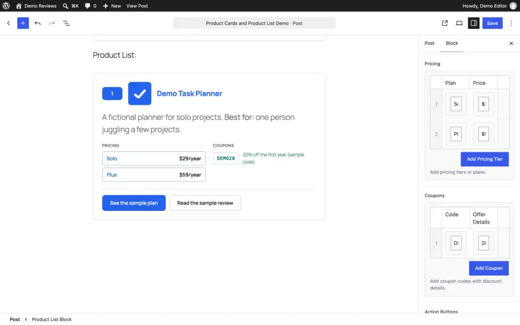
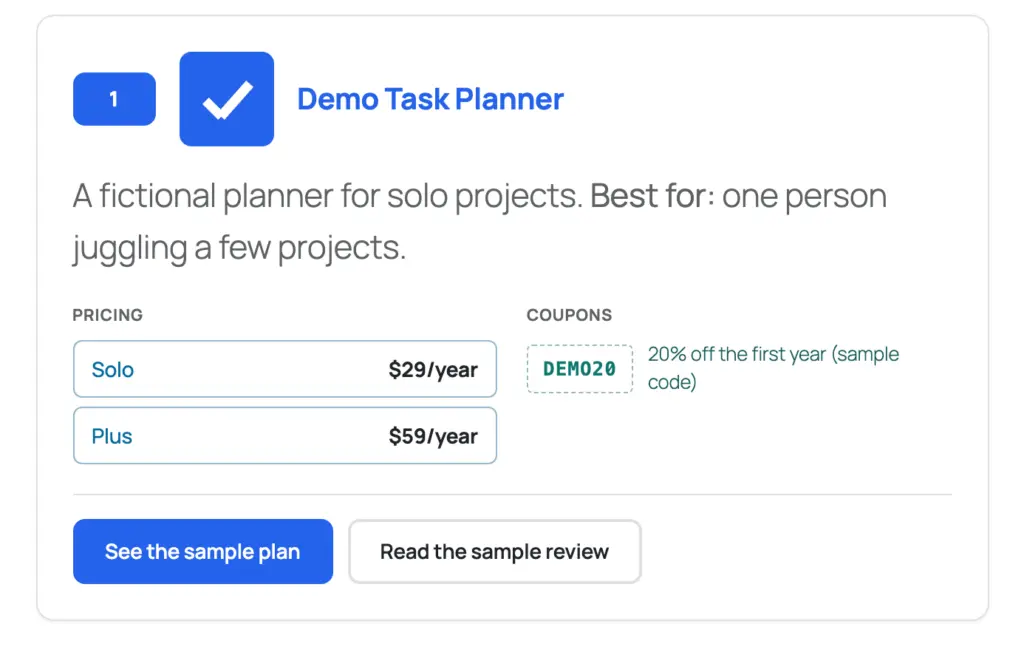

Demo Task Planner
A fictional planner for solo projects. Best for: one person juggling a few projects.
The same fictional product as a Product List entry, with one sample coupon row and no prices or buttons.
Choose a Card Style You Can Maintain
Product Cards is the compact option. Product List carries more plan and action information. The Product Box block offers a fuller recommendation card with extra presentation fields.
Use a consistent format across comparable picks. Mixing styles can be reasonable when one entry genuinely needs different information, but it shouldn’t make favored products look better simply because they use a larger card.
A Product Review block with schema switched off also works in a roundup when scored criteria help.
Keep Structured Data Separate From the Card Count
The Product Cards and Product List templates emit no product-review JSON-LD. Keep the Article and breadcrumb data your SEO plugin already adds. An ItemList can describe a real list, but it doesn’t promise anything in search.
Product snippets are for pages about a single product, so a roundup of several picks doesn’t qualify for them. The star-ratings guide covers that question in detail.
Check the Roundup After Saving
Reopen the editor and confirm repeater rows, links, image choices and ordering persisted. Preview at desktop, 768, 390 and 320 CSS pixels. Check the HTML for link relationships, headings, image descriptions and unexpected structured data.
Then test the maintenance workflow: change one entry’s title or price in a temporary copy and identify every other place that needs updating, including the shortlist. The blocks don’t synchronize independent price mentions for you.
Before removing the plugin or its field framework, back up the content and test a conversion to core blocks on staging. Field data left in the post doesn’t render on its own once the plugin is gone.
Questions About Product Roundups
Do I need product blocks for a roundup?
No. A core Table, clear entries and ordinary links can be enough. Dedicated cards improve editing consistency when their fields fit the job.
Do several Product Cards automatically form a grid?
The template renders one card per block. Use a suitable parent layout and verify it on the actual theme.
Does Product List automatically copy or expire coupons?
No. Its coupon rows display text. Click-to-copy needs the Coupon Code block, and expiry needs a coupon plugin.
How many products should I include?
Include the options that create meaningful choices for the reader. There is no requirement to reach five, ten or another round number.
Make the Choice Easier, Then Make It Actionable
Build the shortlist from evidence, write an honest fit and limitation for each pick and use the smallest card that makes the next action clear. Keep prices and links only when you can maintain them.
Tell Google you want more of this.
Add Gaurav Tiwari as a preferred sourceOne tap, and this site shows up more often in your own Top Stories, AI Overviews and AI Mode. Remove it any time.