
 by
by
A buying guide can make a strong case for a product and still bury the next step. The reader who has already decided scrolls back through paragraphs looking for the price and the link, and the one still comparing has nothing short to scan.
Pasting a hand-made card into every post fixes the layout and starts a maintenance job. Each copy is another place to forget the sponsored rel on a paid link, keep a price from a sale that ended or leave a badge that stopped being true.
A product box in WordPress puts the image, key details and next action in one consistent card. I’ll build one with core blocks first, then with the Product Box block in GT ACF Blocks, and cover the price and link checks that keep either version honest.
I built GT ACF Blocks, a free plugin that adds 29 ACF blocks to the editor. Product Box is one of them, and it’s a display block: the price, rating and discount show exactly what you type, and it adds no review schema.
A good box can be as small as a title, one honest limitation and a clear link. An image, score or price earns its place only when you can keep it accurate.
What a Product Box Does
A product box is a card inside the post that lets a reader act on a recommendation without reading the whole section. It sits beside the review as the summary a buyer skims after deciding to trust you.
The 6 parts a product box generally carries:
- a product image, ideally the official one and not a marketplace thumbnail
- the product name, linked to the product page
- a rating and, when it means something, the number of ratings behind it
- 3 to 6 features, the ones a buyer compares and not the ones the vendor lists
- a price line, with the original price and discount when a real one exists
- 1 to 4 buttons, each to a different place a reader might want to go
Label a score explicitly: “My editorial score: 4.5 out of 5” or an authorized, dated retailer aggregate with its source. A count alone doesn’t establish whose rating it is. The template provides a numeric accessibility label but not a separate visible numeric score, so add a readable score and source in the description when needed. Don’t invent a count or copy third-party ratings without permission.
The Product Box template itself emits no Product or Review JSON-LD, so any schema on the page has to come from another source. The product review tutorial covers the scored-verdict workflow and its schema checks.
Before You Start
Settle these first, because they change which fields you fill:
- you are on the block editor
- you know whether the reader needs a compact recommendation or a detailed scored verdict; choose the layout separately from schema
- you have permission or a suitable license for the product image. A vendor’s public product page isn’t an automatic reuse license; import authorized media locally rather than hotlinking
- you know which links pay you a commission, because those buttons need
nofollow sponsored - for an Amazon recommendation, you leave retail prices out of the card; showing them needs an integration that follows Amazon’s current rules
- for the plugin route, the site has ACF Pro 6.0 or newer or the free Secure Custom Fields. GT ACF Blocks attempts to install Secure Custom Fields when neither supported framework is installed; confirm that one of them is active
Add a Product Box With Core Blocks Only
Core blocks can build a decent product card, and it is worth doing once so the plugin fields make sense later. The layout below is the one I would use, because it degrades well on phones.
- Add a Media & Text block. Put the product image on the left and set the media width to about 35 percent. Keep Stack on mobile turned on, then check the image and text order in the preview.
- Inside the text side, add a Heading at the level that fits the outline, with the product name linked to its page. Then a Paragraph block for the rating written out, “4.5 out of 5”, and a 1 line description.
- Below that, a List block with 3 to 6 features. Keep the lines short, because a feature that needs a second sentence is a paragraph in the review, not a bullet in the box.
- A Paragraph block for the price line. If there is a genuine discount, write the original price with strikethrough formatting from the toolbar, then the current price.
- A Buttons block with 1 or 2 buttons. Open each button’s Advanced panel and set the link rel to
nofollow sponsoredon any link that pays you. - Wrap the whole thing in a Group block, give it a background color and some padding from the Styles tab, then save it as an unsynced pattern named “Product box”. Insert it twice in a test draft and change one title to confirm the copies are independent.
That box works, and it has 3 problems that grow with the number of products. Every box is hand-built, so 10 products in a guide is 10 chances to forget the rel attribute. The rating is text, so there are no stars unless you paste characters into a paragraph, and pasted stars look like pasted stars. And the price line has no structure, which means nothing reminds you to update it when the discount ends.
The core pattern is enough while it covers the layout comfortably. The dedicated block pays off once its structured fields save you more editing than they cost.
Add a Product Box With GT ACF Blocks
GT ACF Blocks is free and GPL. Its Product Box block renders the card above from a set of fields and adds:
- 3 styles
- star ratings that draw themselves
- a badge
- separate price and discount display fields
- up to 4 buttons with styles and rel attributes built in
You can get it from the GT ACF Blocks product page and install it like any other plugin. It needs ACF Pro or Secure Custom Fields active; the plugin tries to install Secure Custom Fields when neither is present, so check that the install worked.
Once the plugin is active, the inserter has an ACF Blocks category. Product Box is in it, and /product box in an empty paragraph finds it too.
Fill the Image and Title
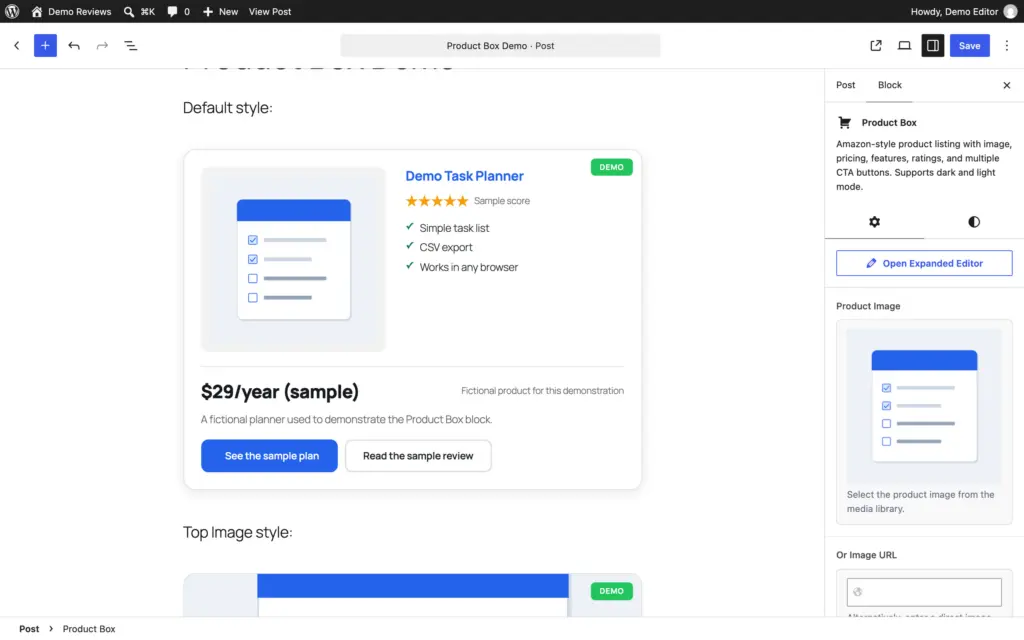
- Product Image takes a media library image. Or Image URL takes a direct link and wins when both are set. For your own uploads, the block serves a 550 by 550 crop in the default style and an 800 by 450 crop in the top-image style. Upload an image you’re allowed to use and leave Or Image URL empty.
- Sale Badge Text and Badge Background Color draw the small label in the corner. “SAVE 15%”, “BEST VALUE”, “FREE”. Use it when the label is true this week. A badge is the first thing a reader sees and the first thing that dates.
- Product Title and Title Link URL are the name and where it goes. Title Heading Level defaults to a paragraph. Set it to H3 only when you want the product in the table of contents, and then remove the H3 you wrote above the box, or the name appears twice.
Set the Rating and Features
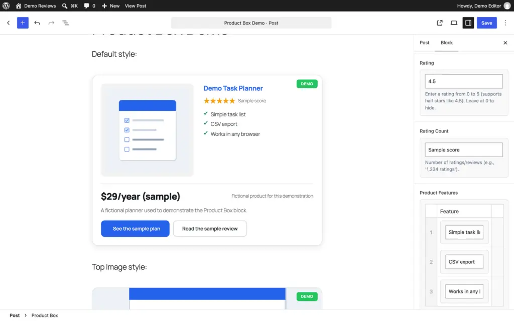
- Rating accepts half-point steps; leave it at zero to hide the stars. Rating Count is display text, not a voting system. Leave it empty for an editorial score and explain the score’s source in visible text.
- Product Features is a repeater with up to 10 rows, 1 line per row. Write the buyer’s features: “Runs on 1 site, renews at $79”, not “Powerful and flexible”.
Fill the Price Fields
- Original Price, Discount Percentage and Current Price are separate display fields. The block doesn’t calculate or verify the saving. Enter only a supported comparison, with matching billing periods and eligibility. The coupon and deal box tutorial shows these fields set up for a sale.
- Price Note can explain billing or eligibility, but the block renders it only when Original Price or Current Price is filled. Put essential conditions in Description when prices are omitted, and check the preview.
- For the static Amazon card in this tutorial, leave retail price and discount fields empty and use an approved product link. Check the program agreement and current policies for your marketplace before adopting a separate authorized price integration.
Add the Buttons
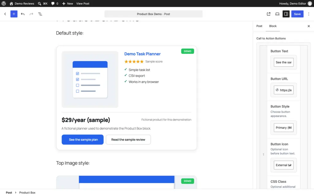
The Buttons repeater takes up to 4 rows. Each row has:
- Button Text and Button URL
- Button Style: Primary (Filled), Secondary (Outline), Amazon Style or Custom (use CSS class)
- Button Icon: None, Shopping Cart, Amazon, External Link or Checkmark
- CSS Class for a theme icon class when the icon options aren’t enough
- Rel Attribute, which should read
nofollow noopener sponsoredon any link that pays you
Two actions are often enough: an approved vendor or retailer link with the appropriate paid-link relationship, and a link to your existing published review.
Check every rendered link, not just the buttons. In the Product Box template, the Title Link also supplies the default image link, and neither anchor inherits the button’s rel setting. Point both at your own review or a page that pays you nothing. A button class or an Amazon icon doesn’t mark a link as sponsored. A third button earns its place when the product sells in 2 regions, “Check on Amazon.in” beside “Check Price on Amazon”, each with its own affiliate tag. A fourth is rare.
Pick a Style
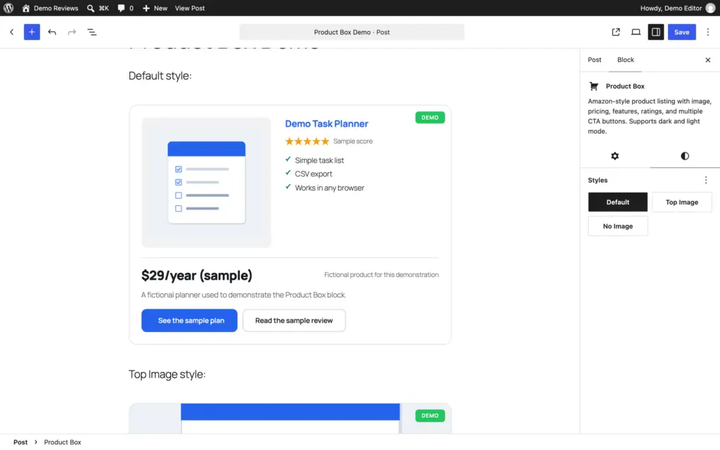
The block has 3 styles in the Styles panel:
- Default puts the image on the left and the title, rating and features on the right, with the price and buttons in a full-width row underneath. Best for physical products with a square image.
- Top Image puts a 16:9 image above everything. Best for software, courses and anything whose “image” is a screenshot.
- No Image drops the image row entirely. Best for services, plans and products without a usable picture, and for a fast box in a long list.
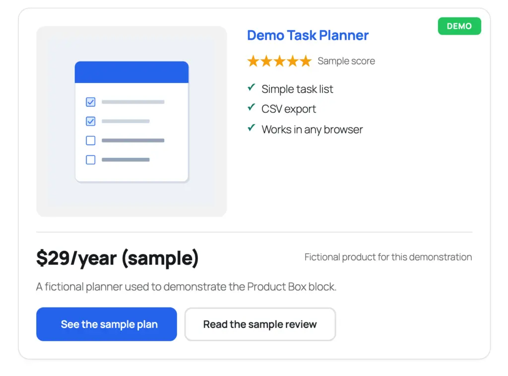
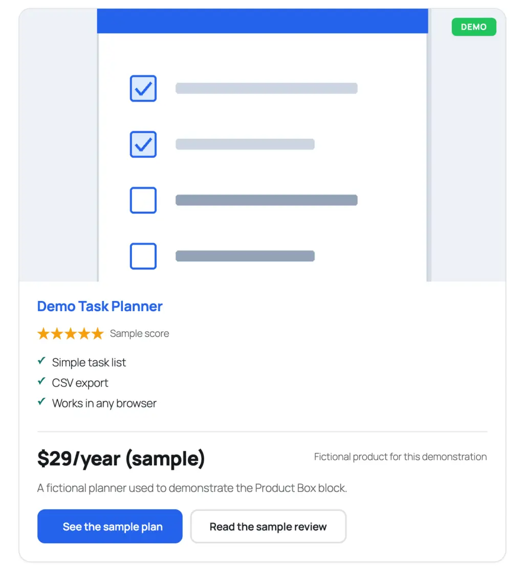
That is the same content in 2 styles. The top-image style loses the side-by-side but gains a wider picture, which is the trade that decides it for most software boxes.

- 29 blocks in their own inserter category
- Runs on ACF Pro 6.0+ or Secure Custom Fields
- Product, review, coupon and layout blocks
- Free and GPL-licensed
The block plugin behind this tutorial, including the Product Box you’re looking at.
The box above is the block rendering itself: a free product, so the price fields carry the word Free and the badge says the same thing.
Where Product Boxes Go in a Buying Guide
Position matters more than styling. A box placed before the reader knows why they should care is an advert. The same box placed after the reasoning is a convenience.
In a buying guide with several picks, the shape that works is 1 box per product, placed at the end of that product’s section, after the verdict sentence and the tradeoffs. The reader arrives at the box already convinced or already moving on, and either way the box isn’t doing the persuading.
In a single review, the box goes near the top, right after the summary, because a review reader wants the “where do I get it” answer early. A review block may already provide the summary and action you need. Add another card only when it serves a distinct purpose; there is no technical ban on using both layouts.
For the comparison table at the top of a guide, don’t use boxes. A table with product, best for and a link column scans in a way 8 stacked cards never will, and the boxes come later, one per section, when the reader has narrowed the choice. The product roundup tutorial builds that table and the cards that follow it.
Prices, Images and Links
These are the places a product box goes wrong quietly, months after you publish.
- Prices rot, and a discount badge and a strikethrough price from March are still there in September, and a reader who clicks through and finds a different price stops trusting the rest of the page. Fill the price fields only for prices you will maintain, and leave them empty for anything you won’t.
- This static tutorial omits Amazon retail prices. Check the current marketplace-specific program and content-license rules before adding an authorized pricing integration. The Amazon affiliate-plugin guide covers that separate tool-selection task.
- Use images whose license or permission covers your publication. Record the source and import authorized assets into the Media Library. Preview the actual crop rather than assuming every product image fits a square.
- Check paid links in the saved front-end HTML.
sponsoredidentifies the paid relationship;nofollow sponsoredis also acceptable.noopenerserves a different purpose and isn’t an advertising disclosure. Add a reader-facing affiliate disclosure as well.
The Limits
The Product Box template emits no review schema. It can still be used on an eligible page with a separate, accurate schema integration.
It doesn’t fetch anything. The price, the rating count and the image are what you typed, and they stay that way until you change them. A separately authorized live-pricing integration has its own access, licensing and maintenance requirements; this block doesn’t supply them.
It holds 4 buttons, and the fourth is nearly always 1 too many. The layout stays clean at 2.
And it depends on ACF Pro or Secure Custom Fields. Remove the field plugin and the box stops rendering until it is back. The content stays in the post.
What Quietly Ruins It
Copying a retailer’s price or image without checking the applicable license, freshness requirements and permission. A current-looking card isn’t proof of authorized use.
Leaving “SAVE 20%” in the badge after the sale ended. The badge is the first thing a reader sees and the first thing a returning reader catches out.
Copying 8 features from the vendor page. The box now reads like the vendor’s page, and the reader came to you to get away from the vendor’s page.
Assigning scores to make the cards look complete. Identical scores can be legitimate, but each should follow the stated method and evidence rather than a template default.
Repeating the same verdict and CTA in two cards without a useful reason. Keep both only when they serve distinct reader needs.
Deleting the rel attribute so the link “passes value”. A paid link marked as an ordinary link is the one thing about affiliate sites Google’s guidelines call out by name.
Checklist Before a Buying Guide Goes Live
- every box has an image you are allowed to use, sized for its style
- the rating count is filled for store scores and empty for your own scores
- the price fields are filled only where you will maintain them, and empty for Amazon items
- no badge promises a discount that has ended
- every paid button carries
nofollow noopener sponsored - no product repeats the same verdict and button in both a product box and a review block
- the title and image links point to pages that don’t pay you, since they don’t take the button’s rel attribute
- the comparison table at the top uses the Table block, not a stack of boxes
- the box sits after the section’s verdict, not before it
FAQs on Product Boxes in WordPress
Does the Product Box block add schema markup?
No, the Product Box is a display card. Product and Review schema come from the Product Review block, which is meant for single-product review pages.
Can I show live Amazon prices in a product box?
Not with this block. Amazon’s Associates policies restrict how you show prices, and a price you type in goes stale. Leave the price fields empty for Amazon products and let the button carry the reader to the live price, or use a dedicated Amazon plugin that pulls prices through Amazon’s API.
How many buttons should a product box have?
Usually 2: one to the store or vendor and one to your own review. A third makes sense when the product sells in 2 regions with separate affiliate tags.
Which style should I use?
Default for physical products with a square image, Top Image for software and anything whose picture is a screenshot, No Image for services and plans.
Final Remarks
The box comes after the reasoning, never before it, because a card that arrives before the reader trusts you is just an advert with better formatting.
Three habits keep product boxes honest over time. Leave price fields empty unless you will maintain them, because an old price costs more trust than no price. Say in visible text whose score it is, so a reader always knows whether they are looking at your judgment or a store’s. And review the badges on your top 10 posts every quarter, since those are the words a returning reader sees first.
Tell Google you want more of this.
Add Gaurav Tiwari as a preferred sourceOne tap, and this site shows up more often in your own Top Stories, AI Overviews and AI Mode. Remove it any time.