
Design Systems Your AI Agent Can Follow
The Design Systems Library holds complete design systems for Claude Code, Codex and Cursor. Each one ships with design tokens, a DESIGN.md rulebook, copy-paste components, open-license fonts and a skill that tells your agent how to use them, so the pages it builds stop looking like every other AI page. One membership covers every system and every update.
$39 a year · every system and update · works with Claude Code, Codex, Cursor
15 design systems are live today, from product sites and dashboards to stores, magazines and council services.
-
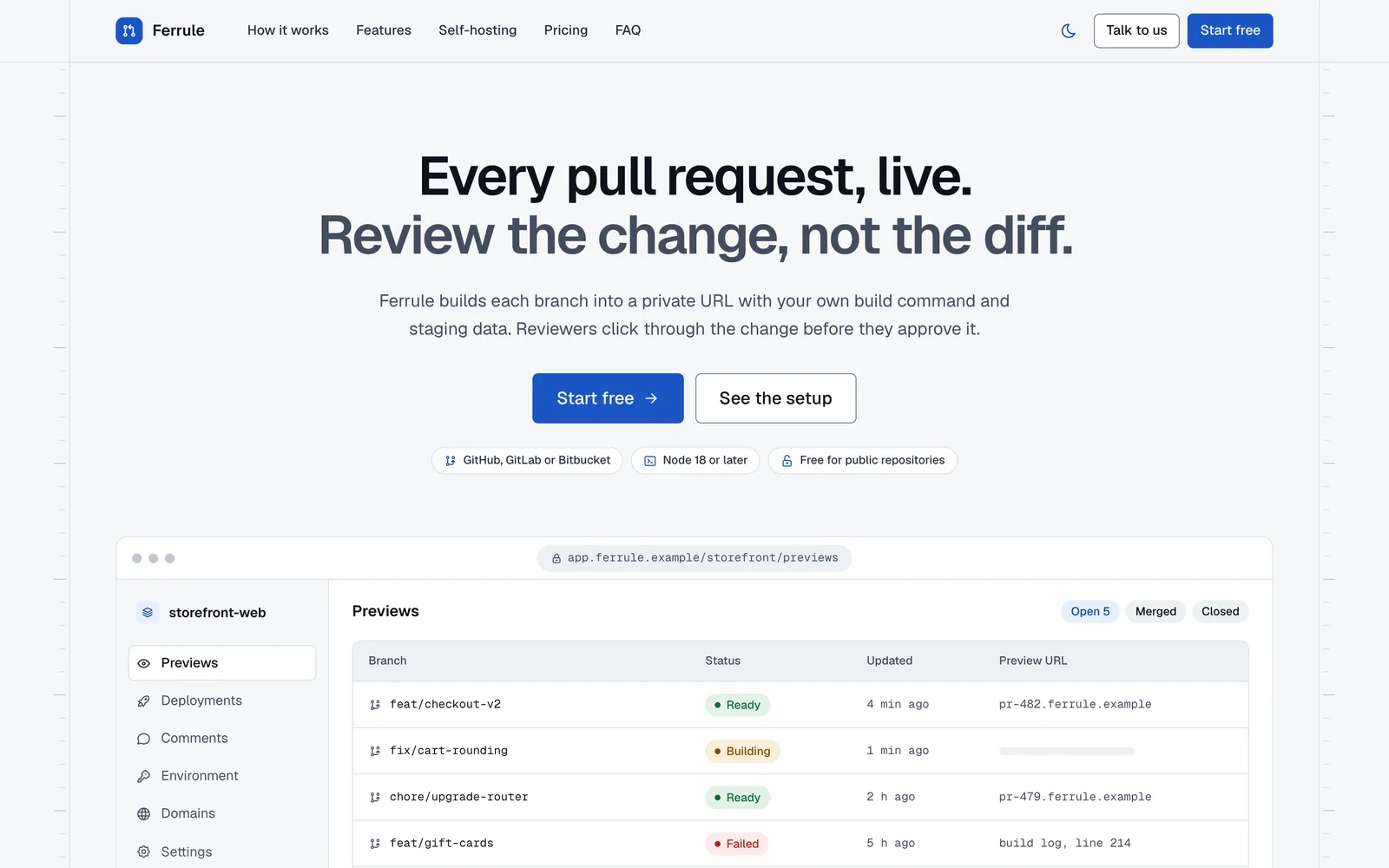
Rail Product sites and developer tools -
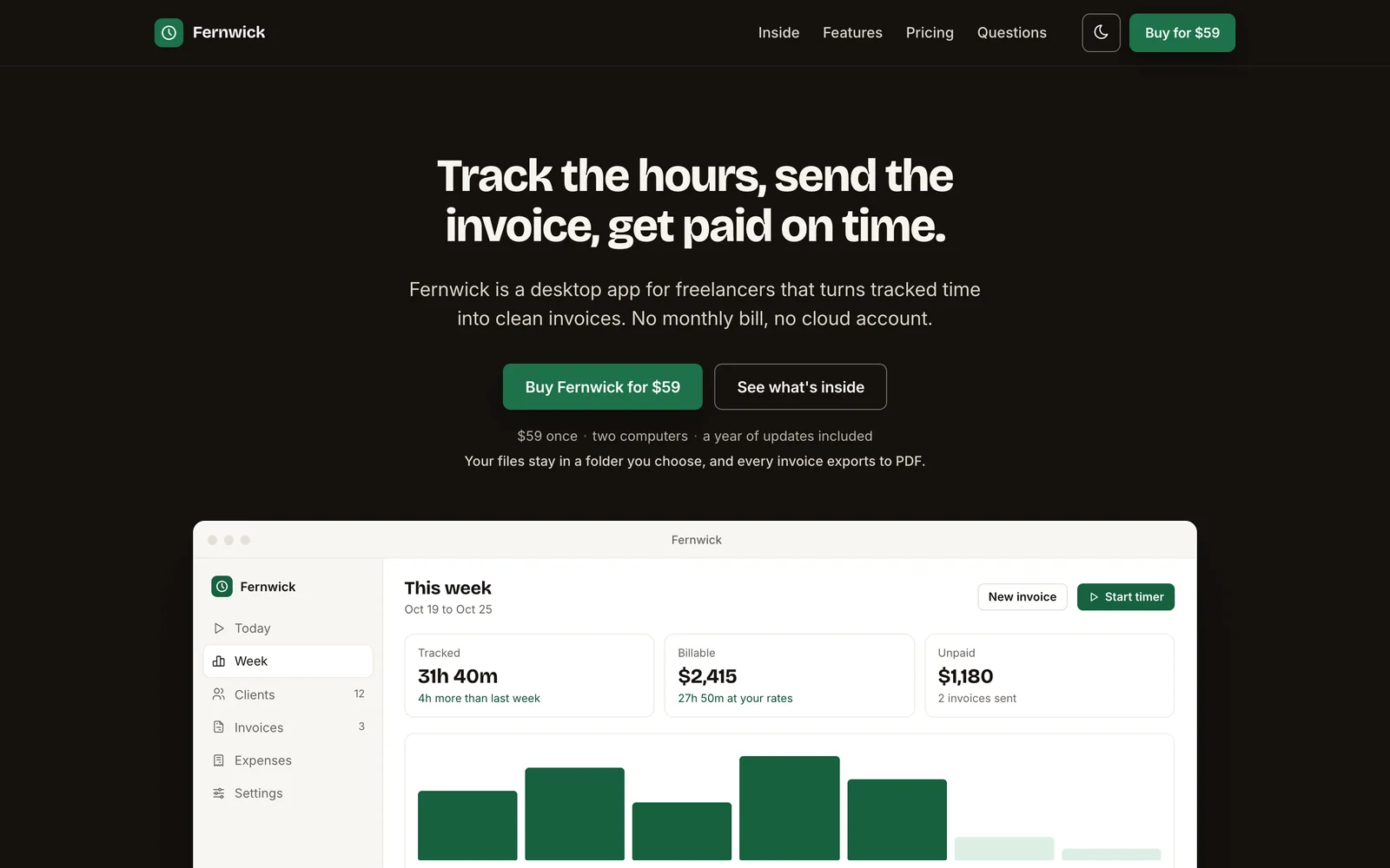
Quiet Launch and sales pages -
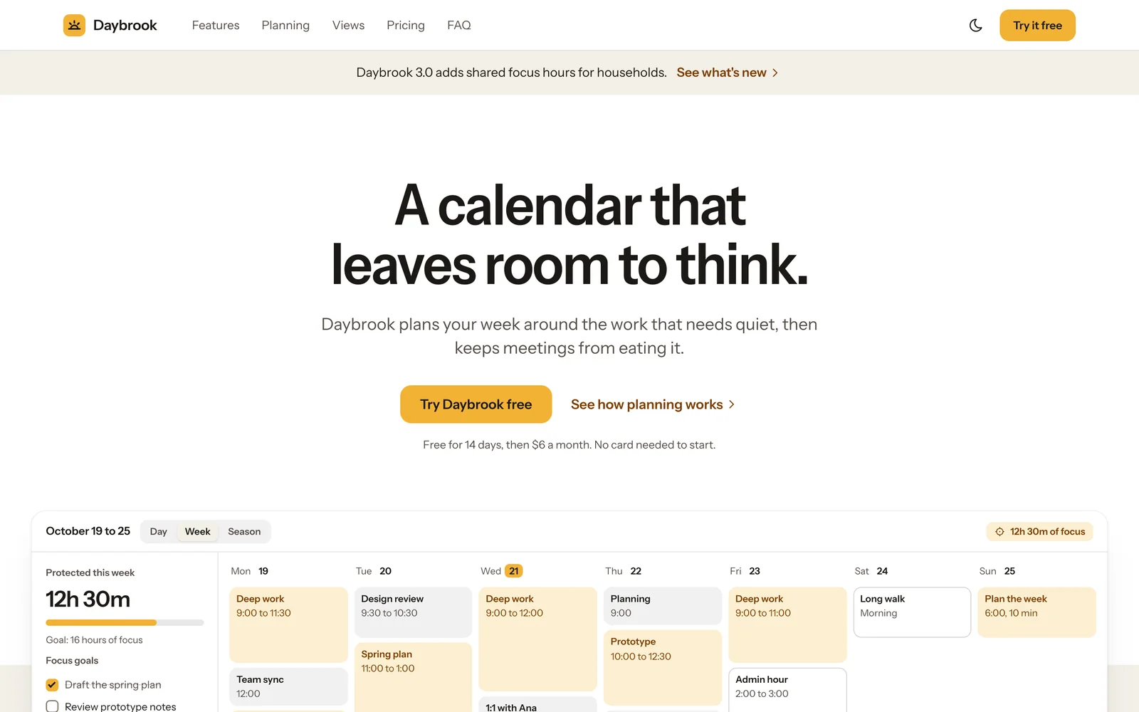
Canvas Product marketing pages
Every System in the Library
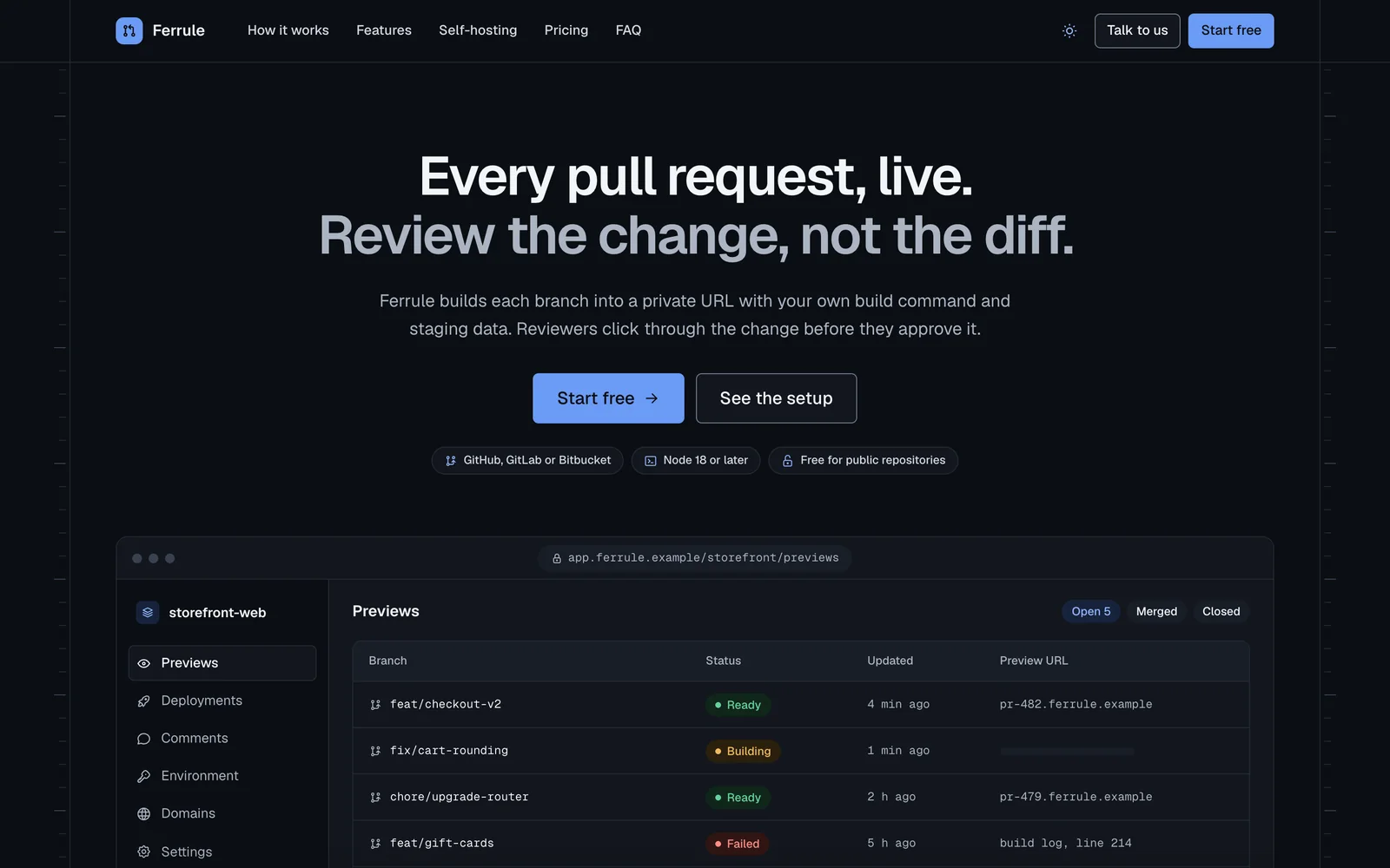
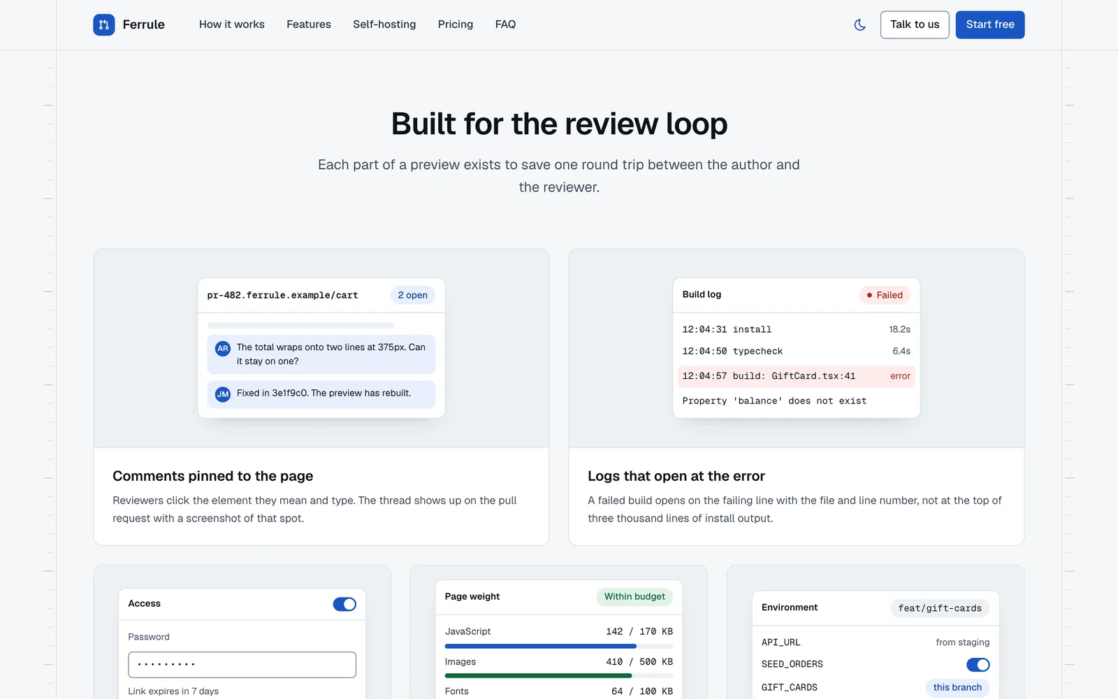
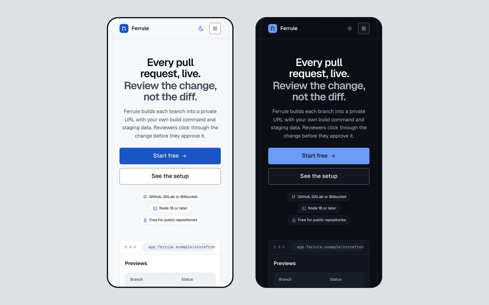
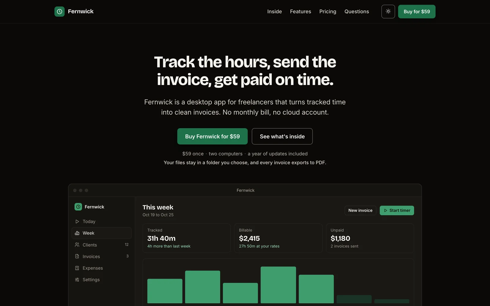
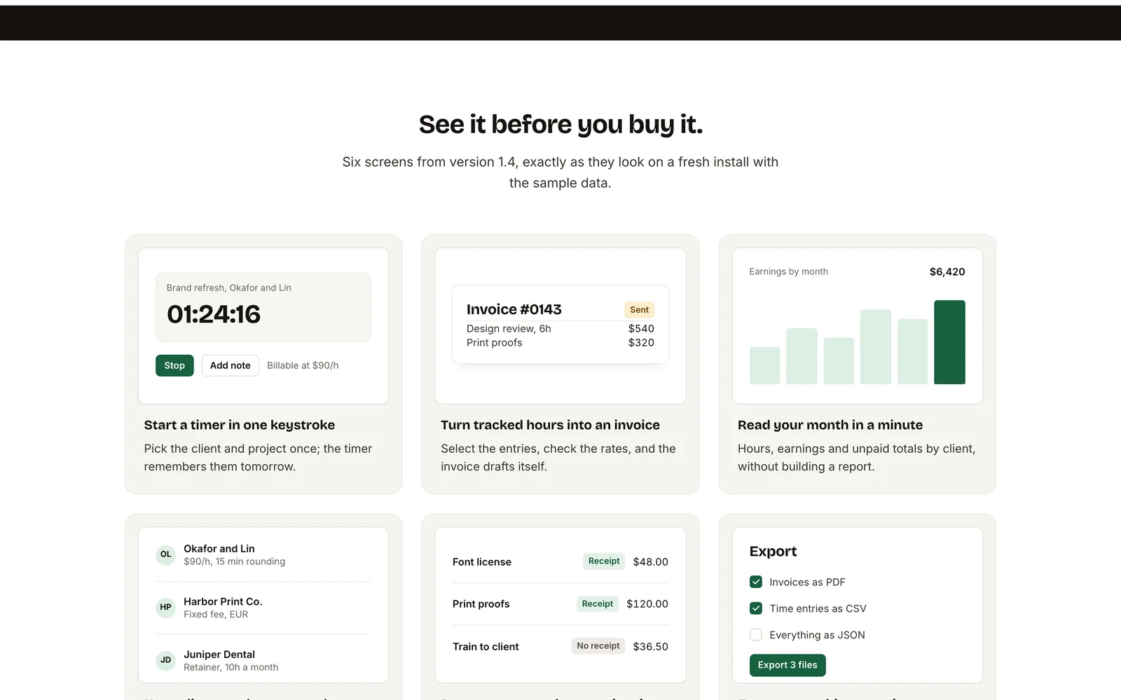
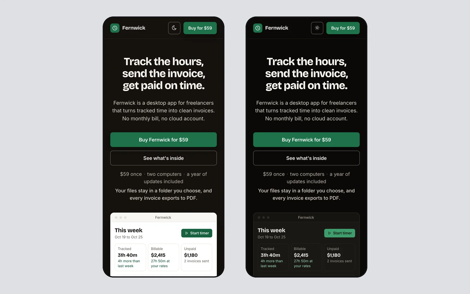
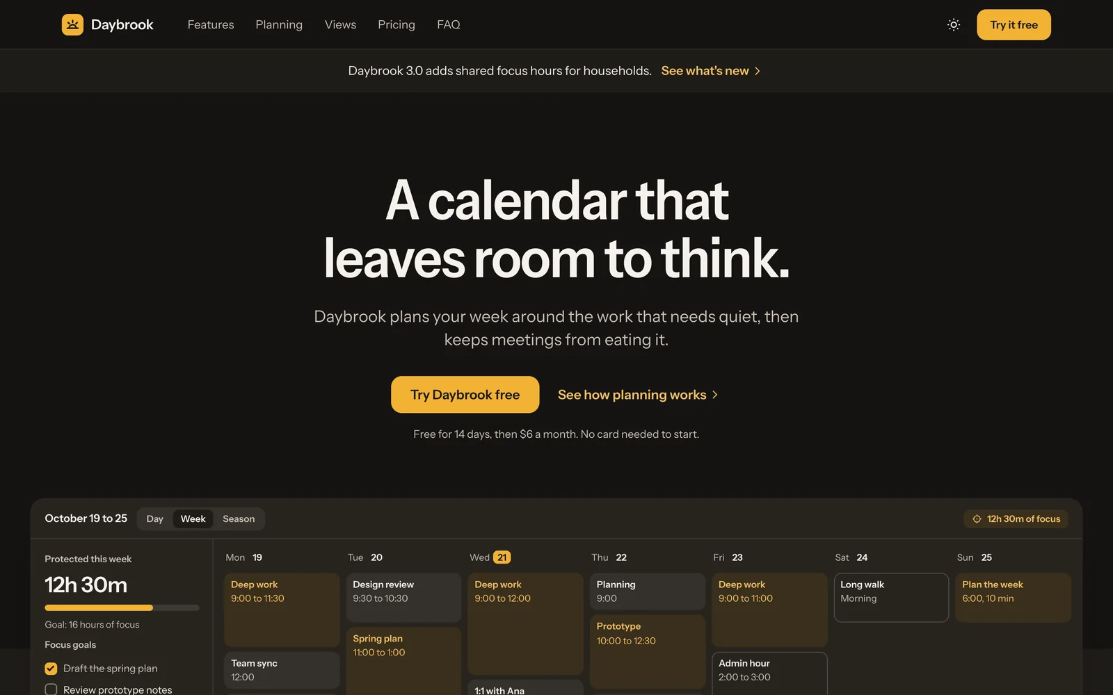
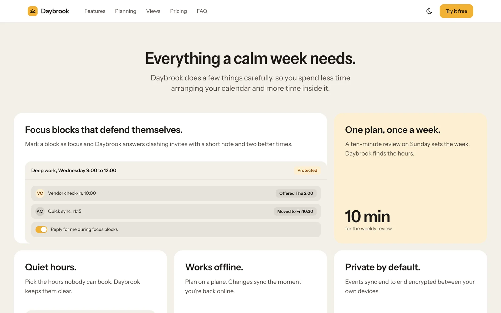
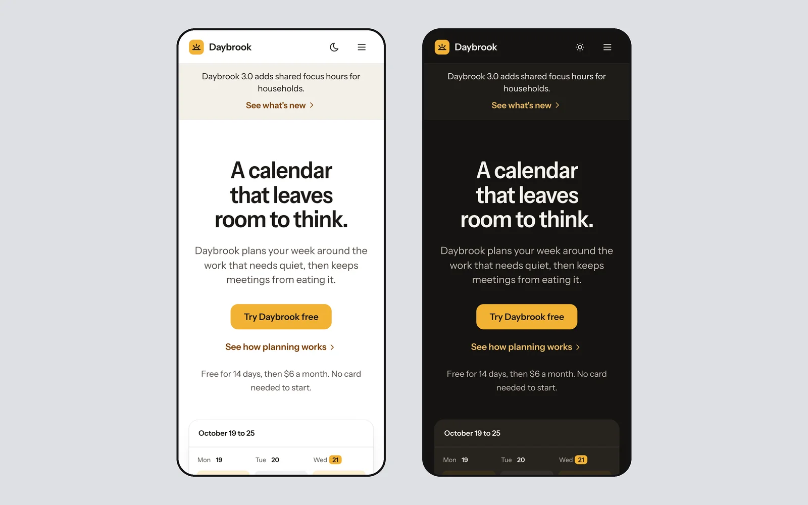
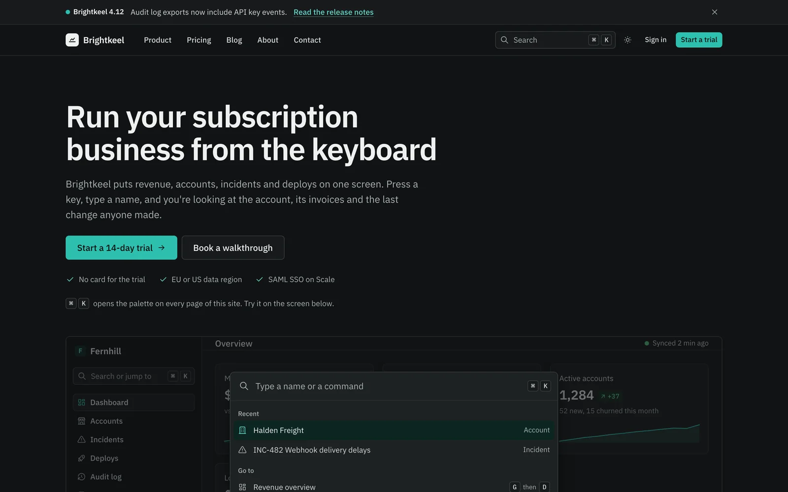
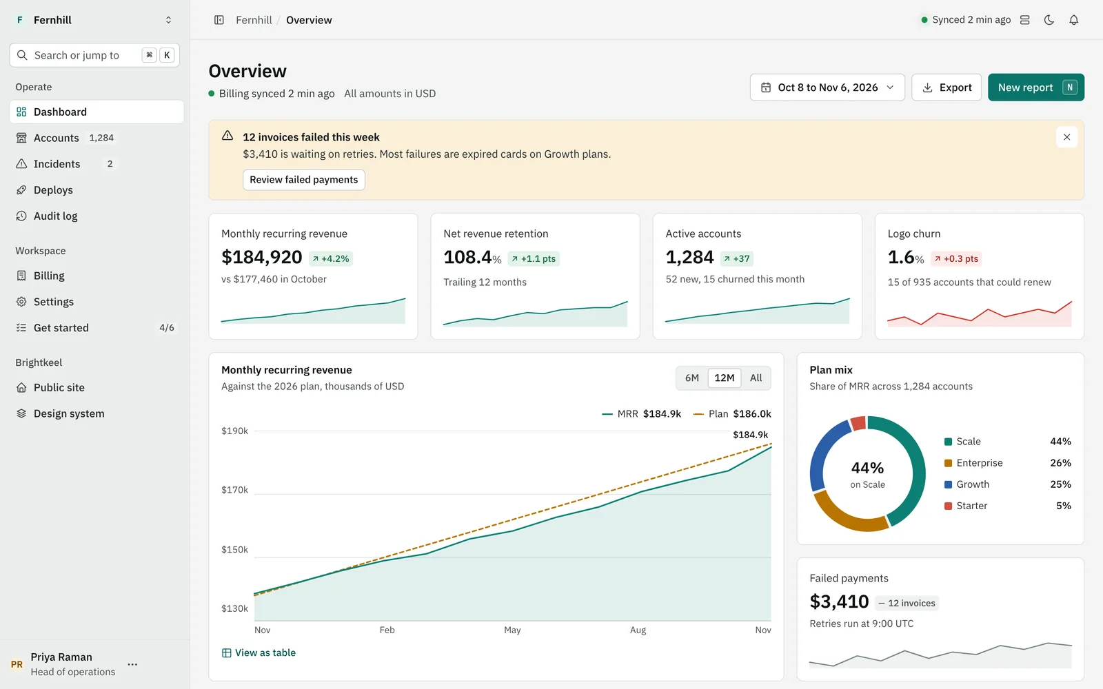
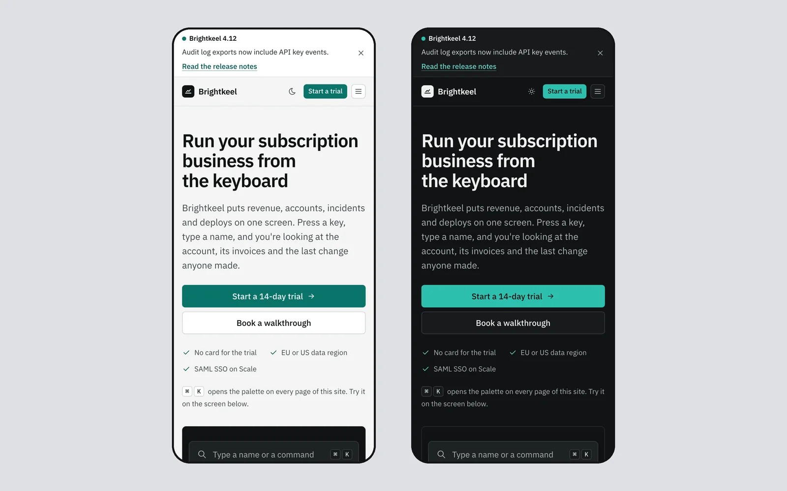
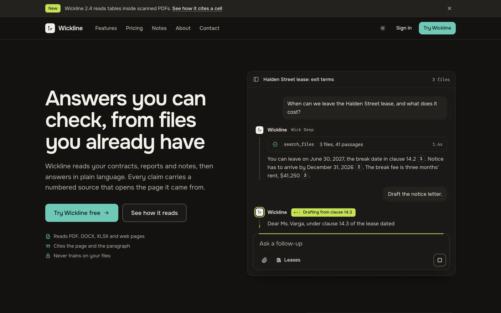
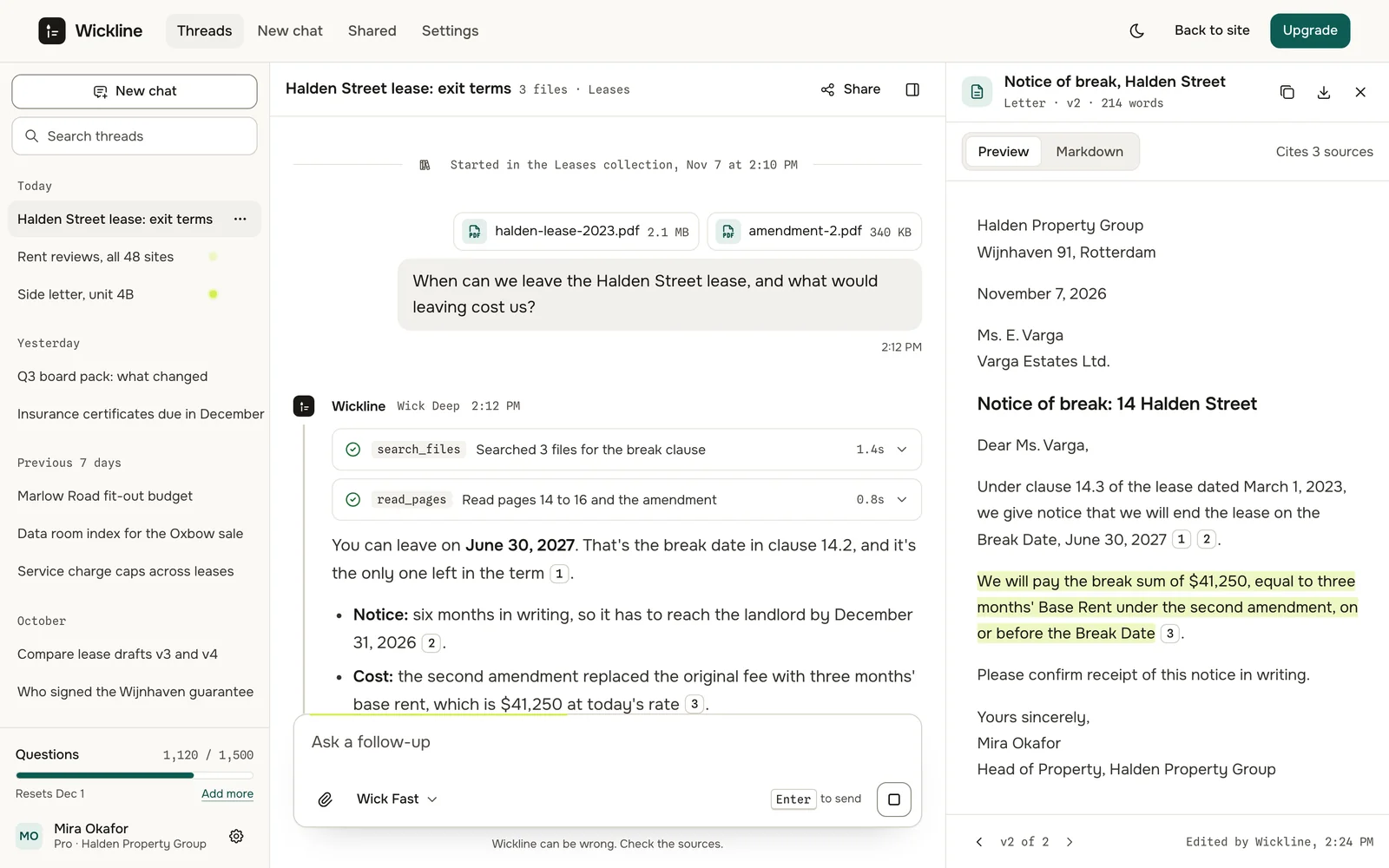
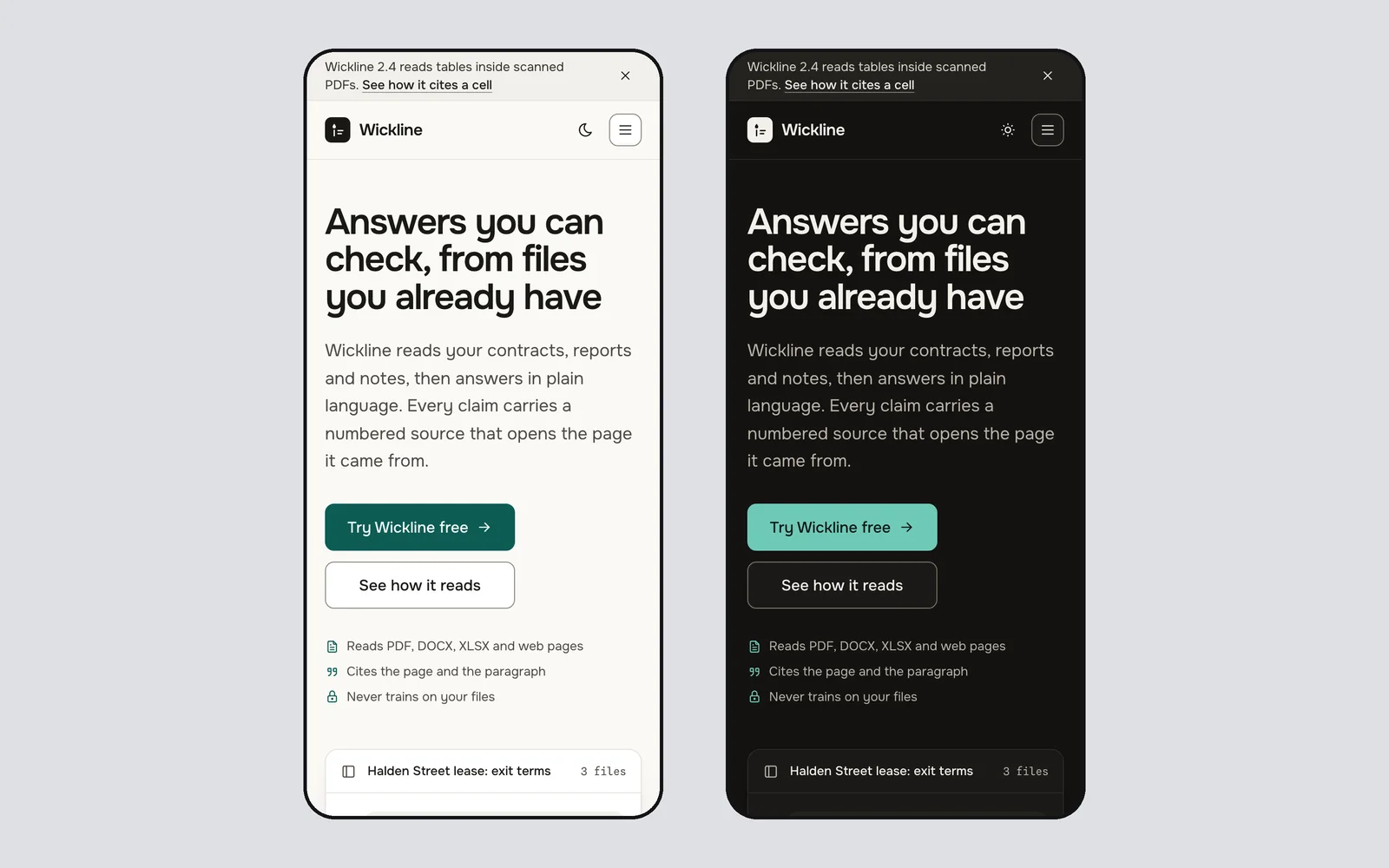
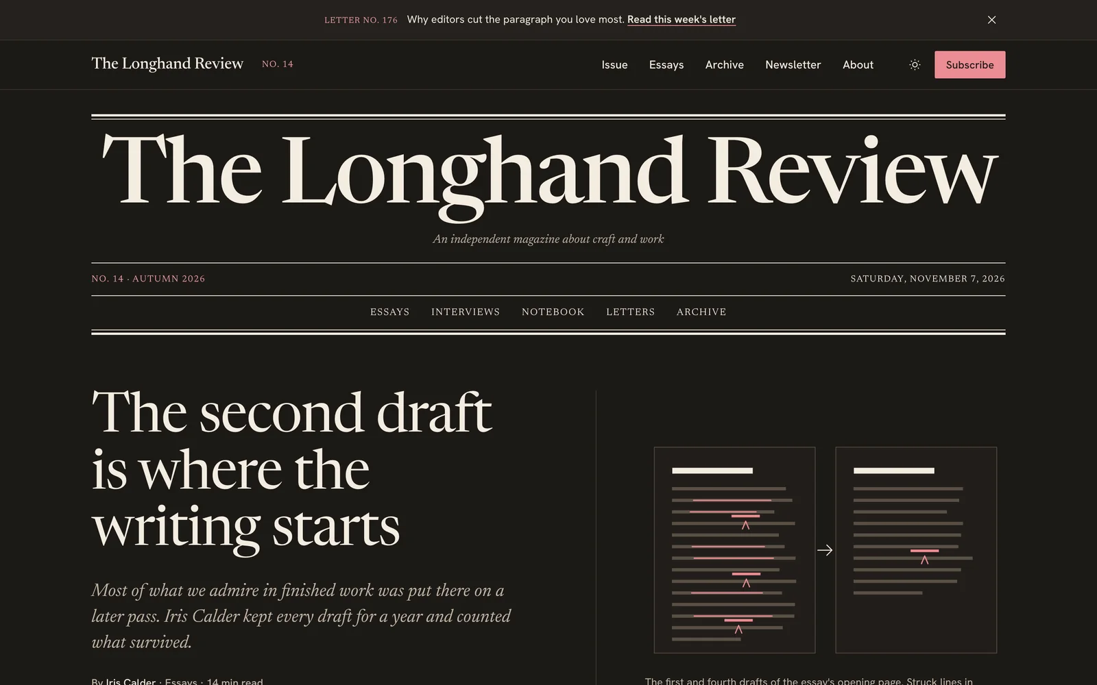
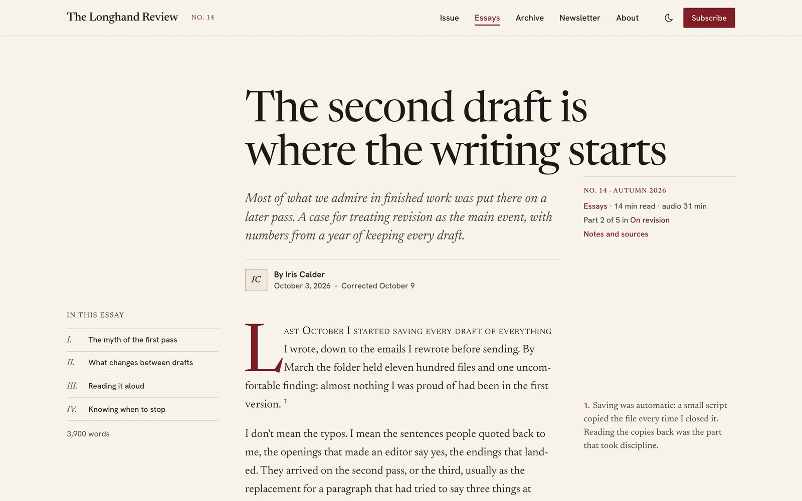
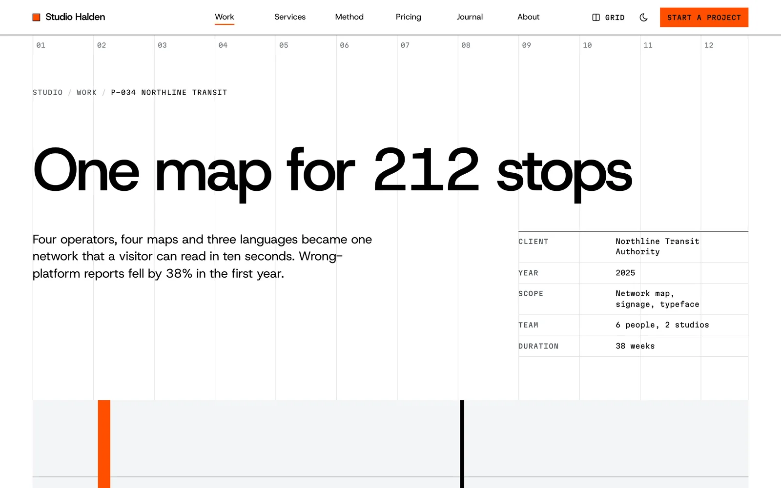
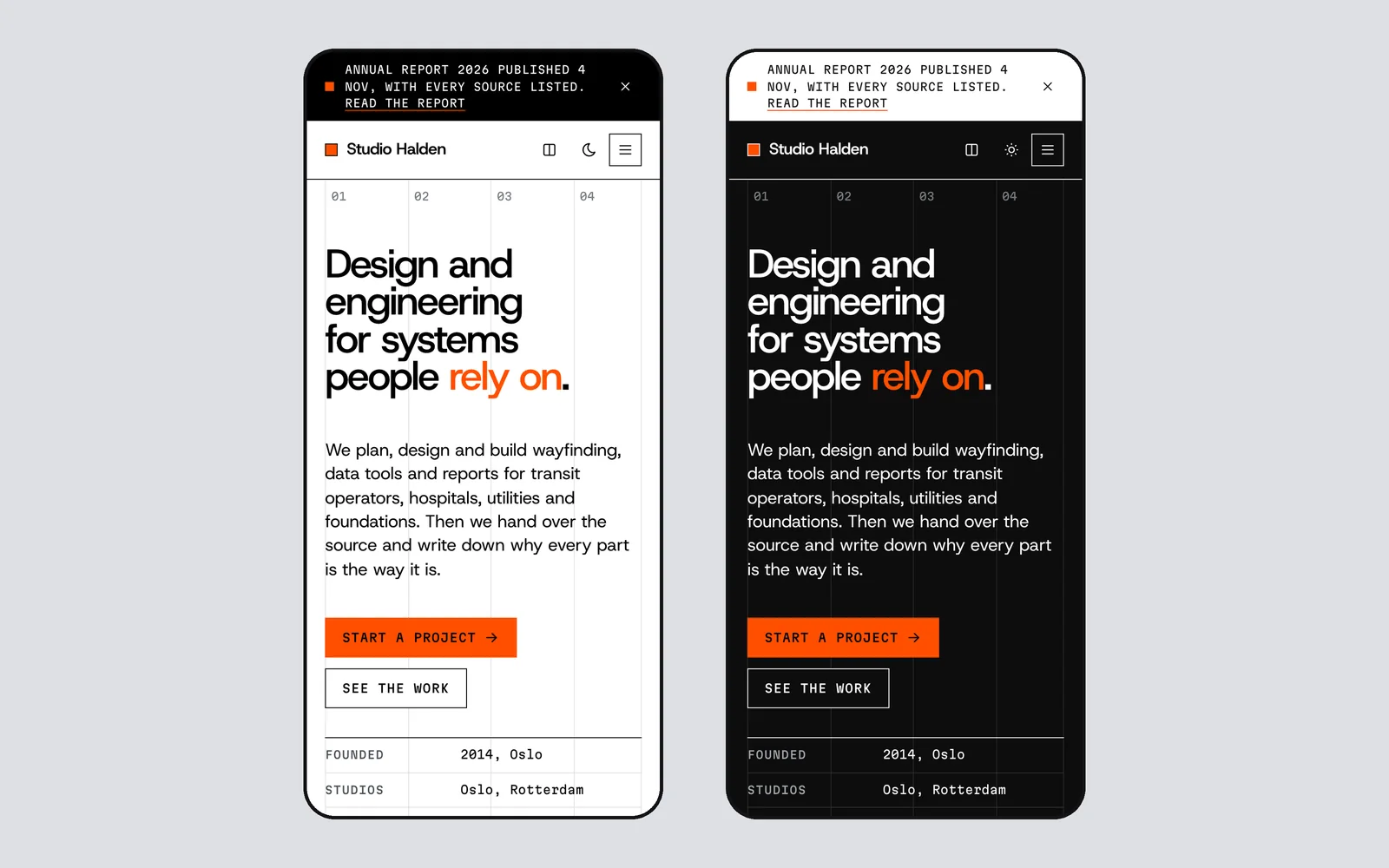
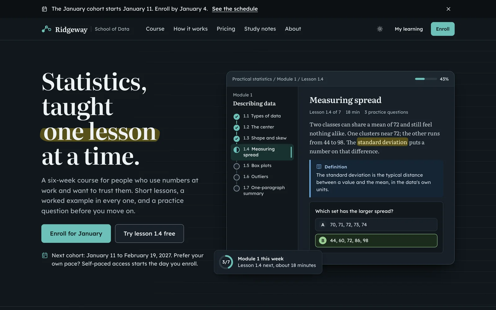
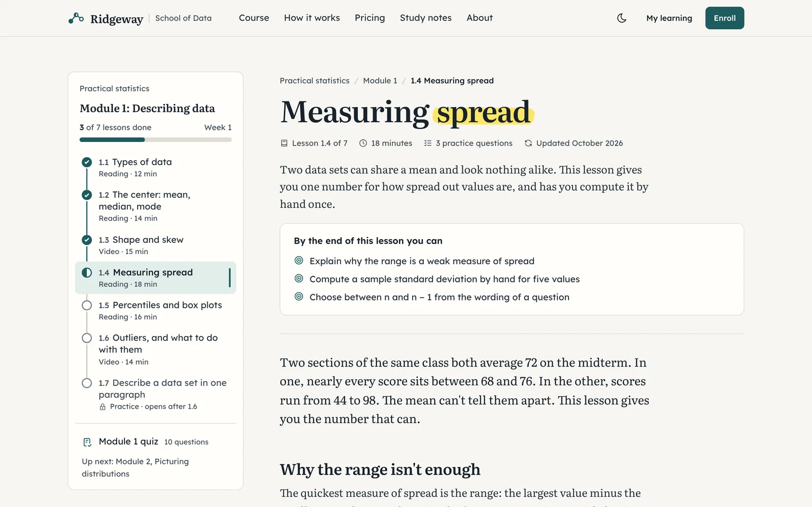
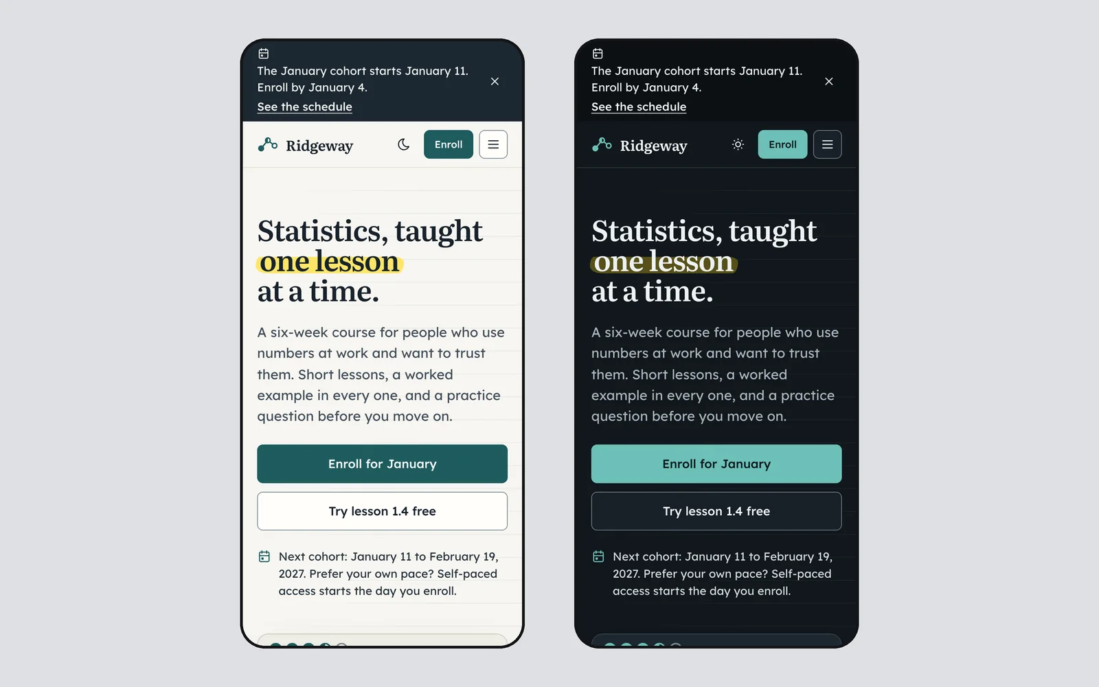
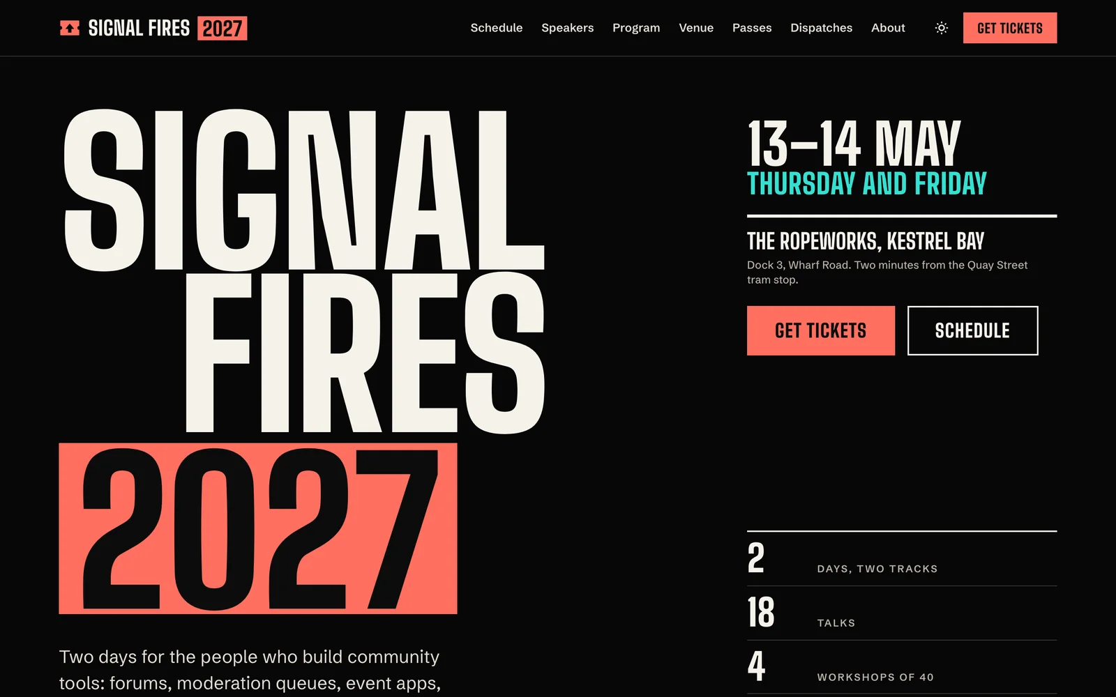
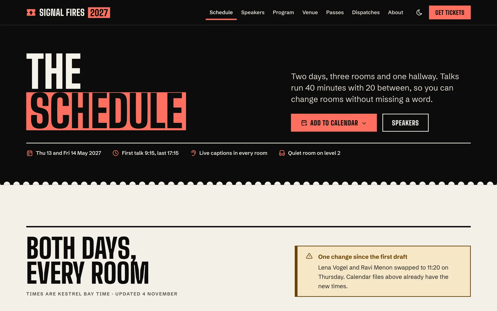
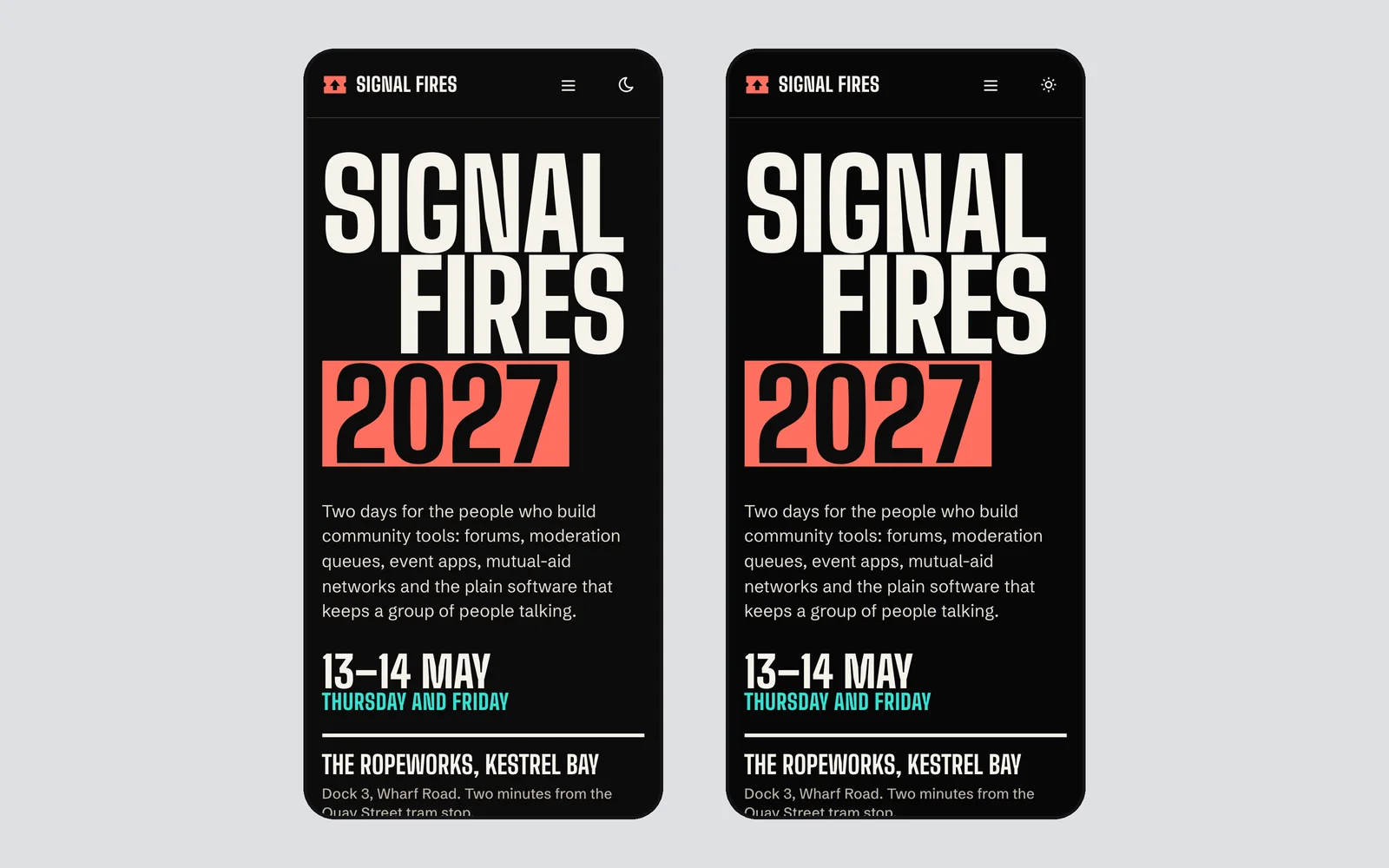
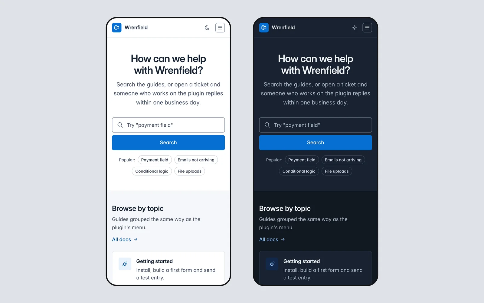
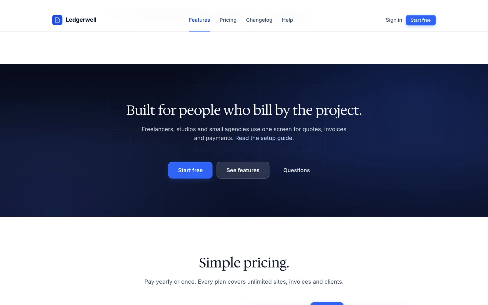
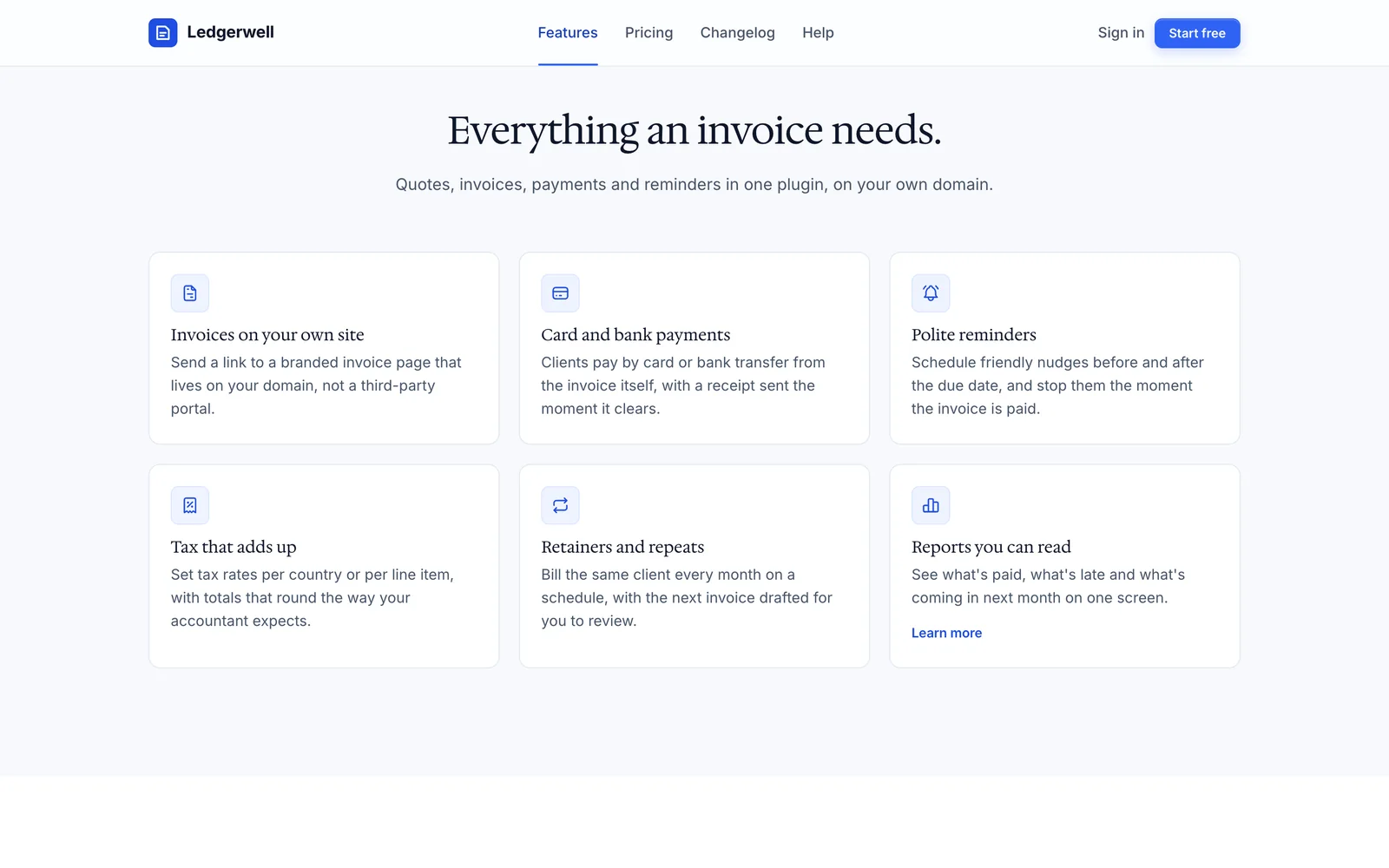
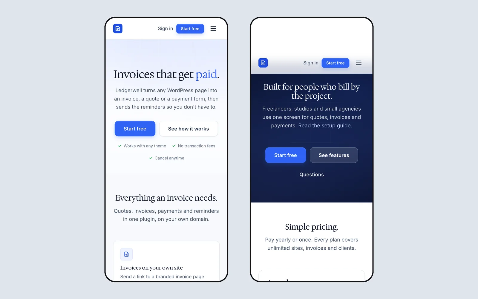
Each system has its own type, accent, corner radius and way of separating sections, so they look clearly different side by side. These screenshots are the demo pages that ship inside each download, built only from that system, and every system has a live demo you can open now.
- design systems
- 15
- components across them
- 788
- open-license font families
- 26
- a year for all of them
- $39
-
Rail
LiveProduct sites and developer tools
A ruled-page system for product sites, developer tools and docs. Hairline rails with section nodes, a hero with a coded product window, bento cards with small working interfaces, chip tabs and code blocks with a copy button, in cobalt on cool paper.
- 51 components
- Light + dark
- Geist and Geist Mono
-
Quiet
LiveLaunch and sales pages
A launch-page system for selling one product at one price. Two dark bookends, a real screenshot under the hero, an always-open catalog, one calm pricing panel, a straight-talk card and a buy bar on phones, with a forest green buy button.
- 51 components
- Light + dark
- Bricolage Grotesque and Inter
-
Canvas
LiveProduct marketing pages
A product-marketing system for app home pages, pricing pages and feature launches. White and warm stone sections instead of borders, borderless cards, big two-weight type, coded product mocks and one marigold-to-coral gradient moment per page.
- 51 components
- Light + dark
- Instrument Sans
-
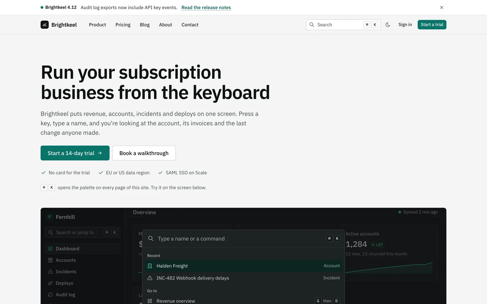
Console
LiveDashboards and internal tools
A keyboard-first system for the screens behind the login: dashboards, admin panels and internal tools. A command palette on every page, sortable data tables with bulk actions, split panes, stat tiles with sparklines and a density switch, set in IBM Plex.
- 56 components
- Light + dark
- IBM Plex Sans and IBM Plex Mono
-
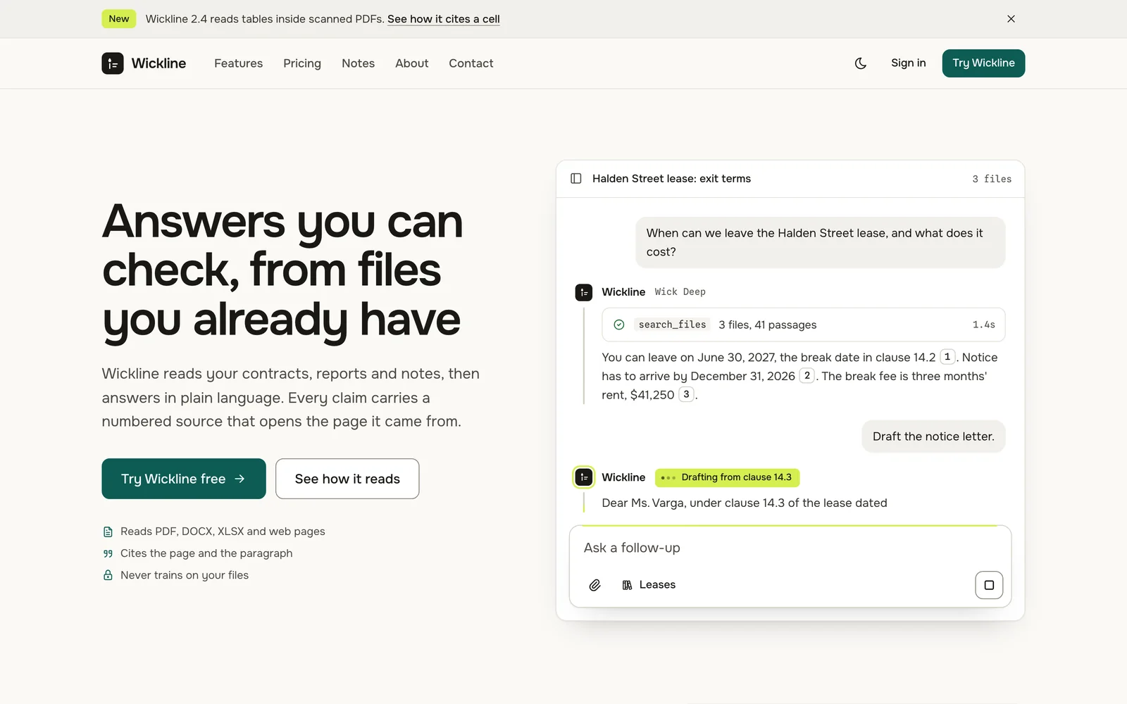
Relay
LiveAI products and chat apps
A conversation-first system for AI products: chat apps, agents, copilots and the site that sells them. Message turns, streaming states, tool-call cards, numbered citations, an artifact panel and a composer with a model picker, set in Onest.
- 58 components
- Light + dark
- Onest and Spline Sans Mono
-
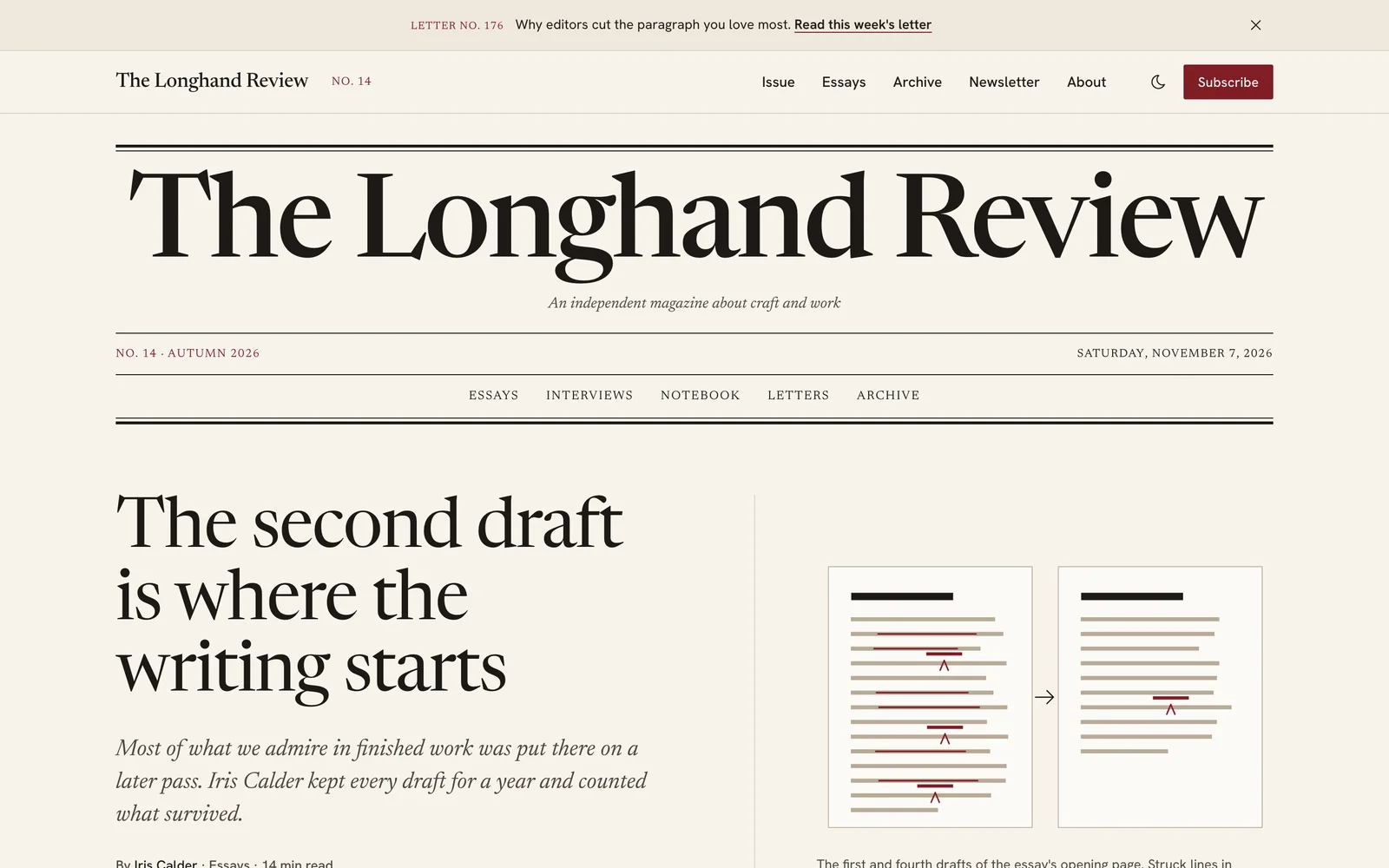
Folio
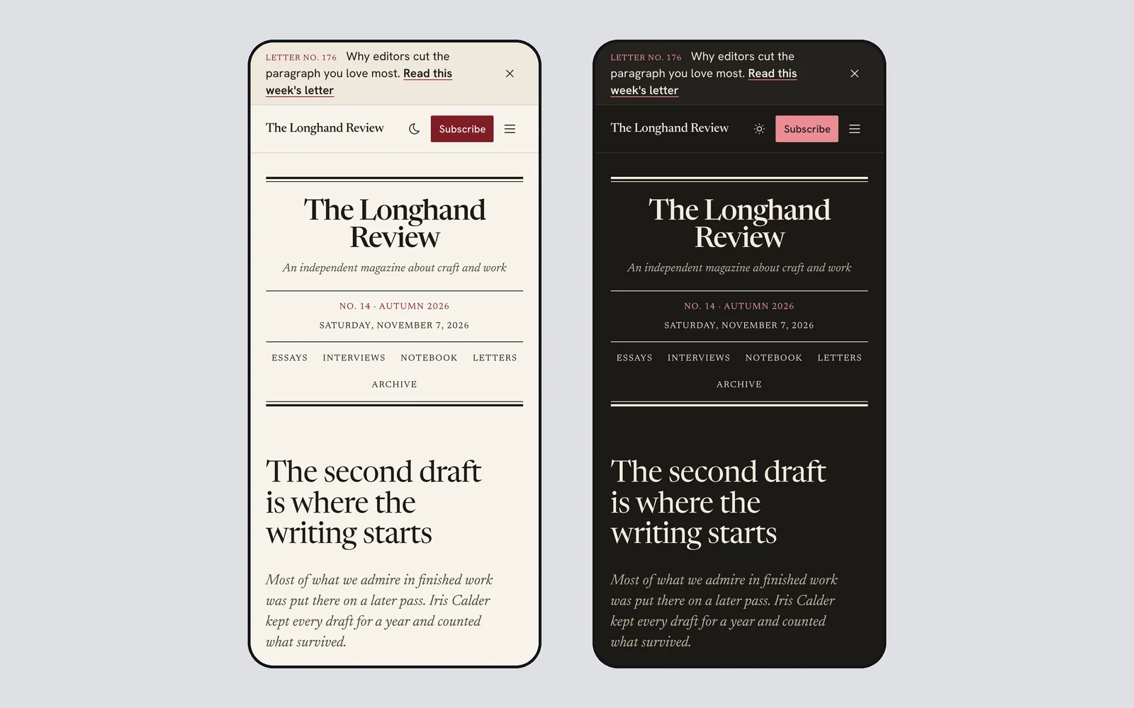
LiveMagazines, blogs and newsletters
A reading-first system for magazines, blogs, newsletters and writers. A masthead with issue numbers, a reading column with sidenotes in the margin, drop caps, pull quotes, series navigation and archives, set in Newsreader with Hanken Grotesk.
- 56 components
- Light + dark
- Newsreader and Hanken Grotesk
-
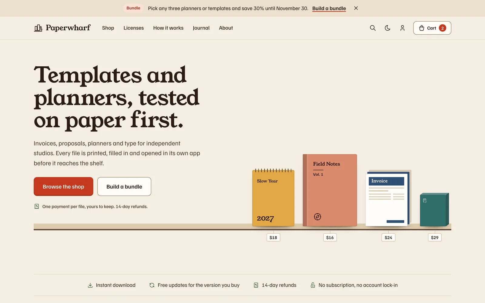
Shelf
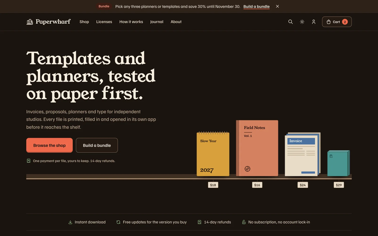
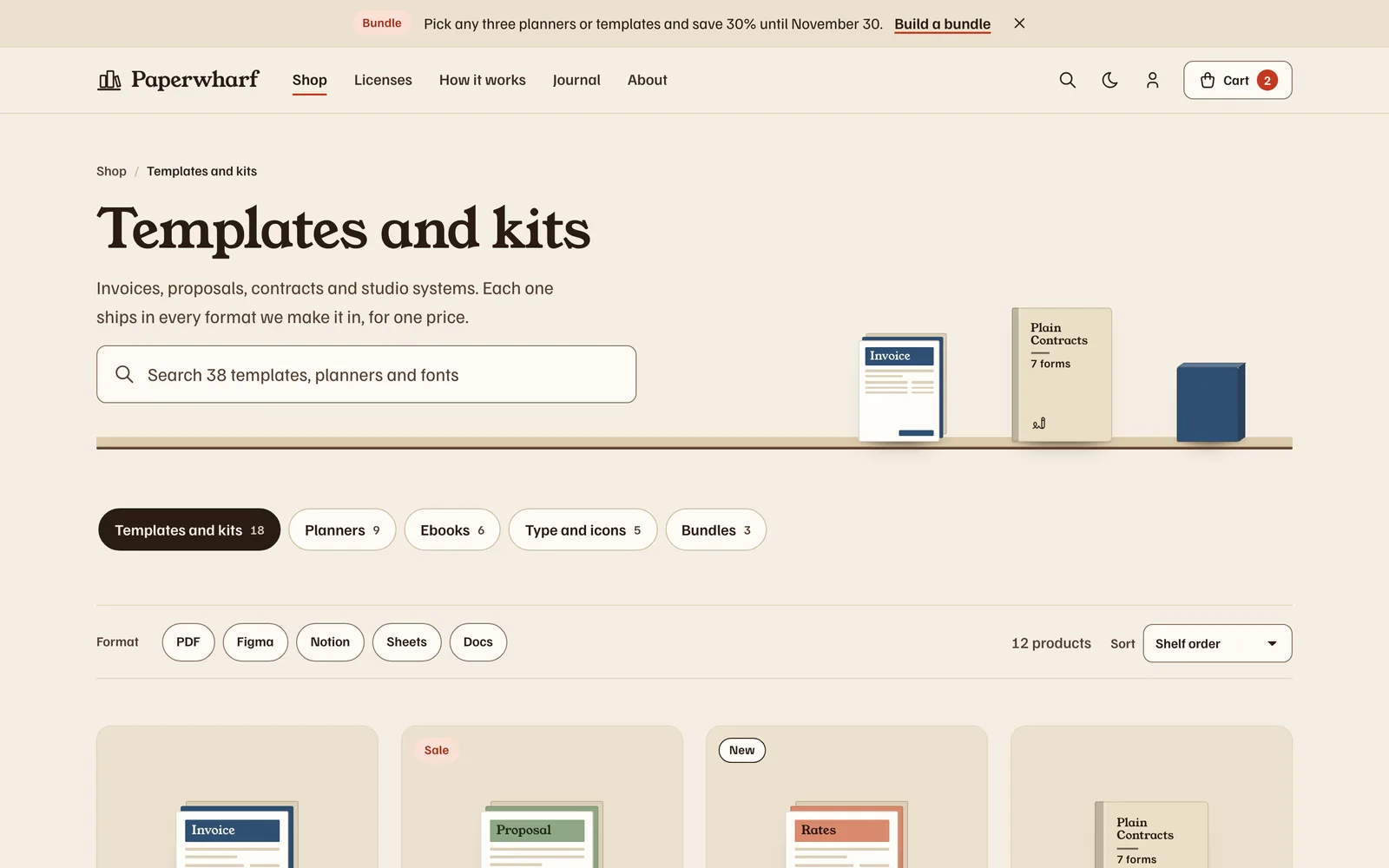
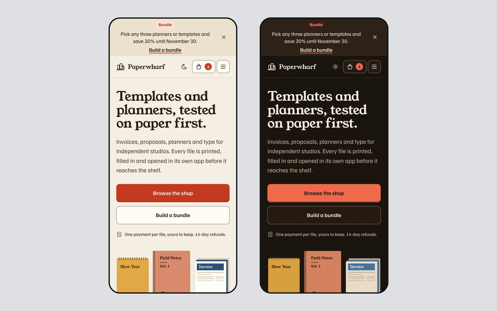
LiveStores for digital products
A shop-shelf system for stores that sell templates, plugins, ebooks and courses. Products stand on shelves as coded covers, with a license picker, a file tree of what is inside, a bundle builder, a cart drawer, checkout and a downloads page.
- 58 components
- Light + dark
- Familjen Grotesk and Young Serif
-
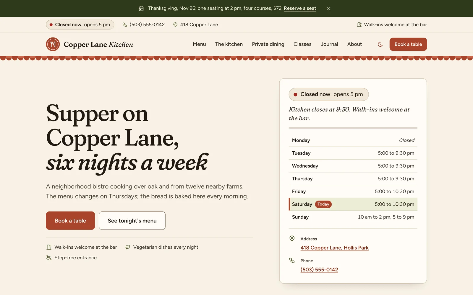
Main Street
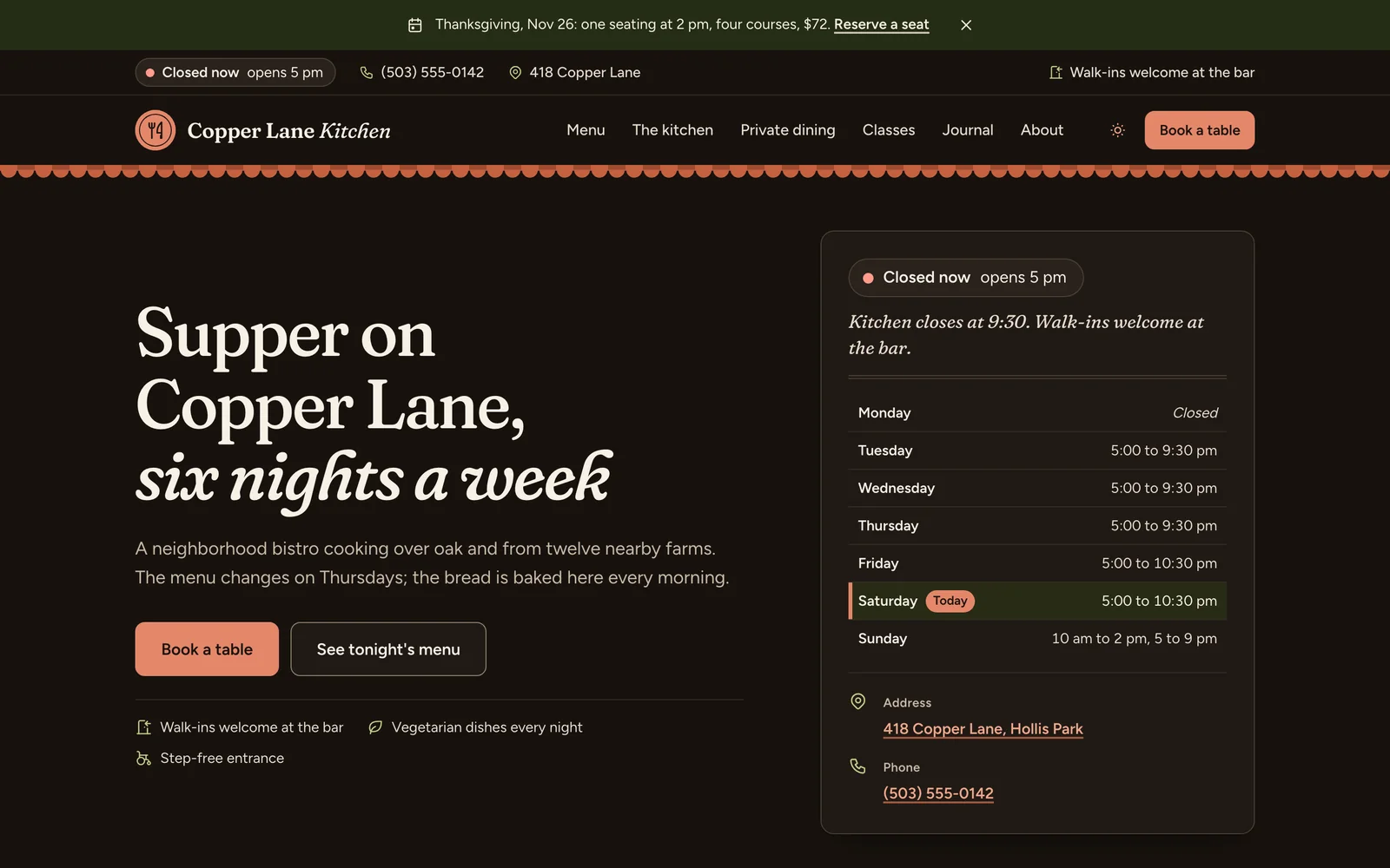
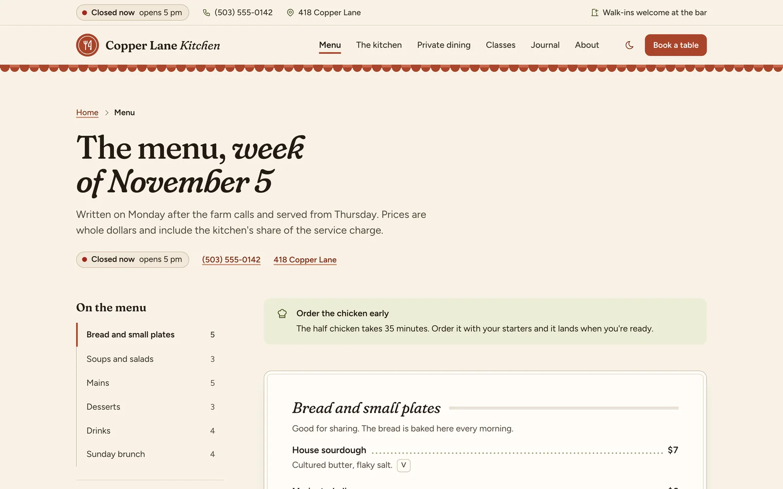
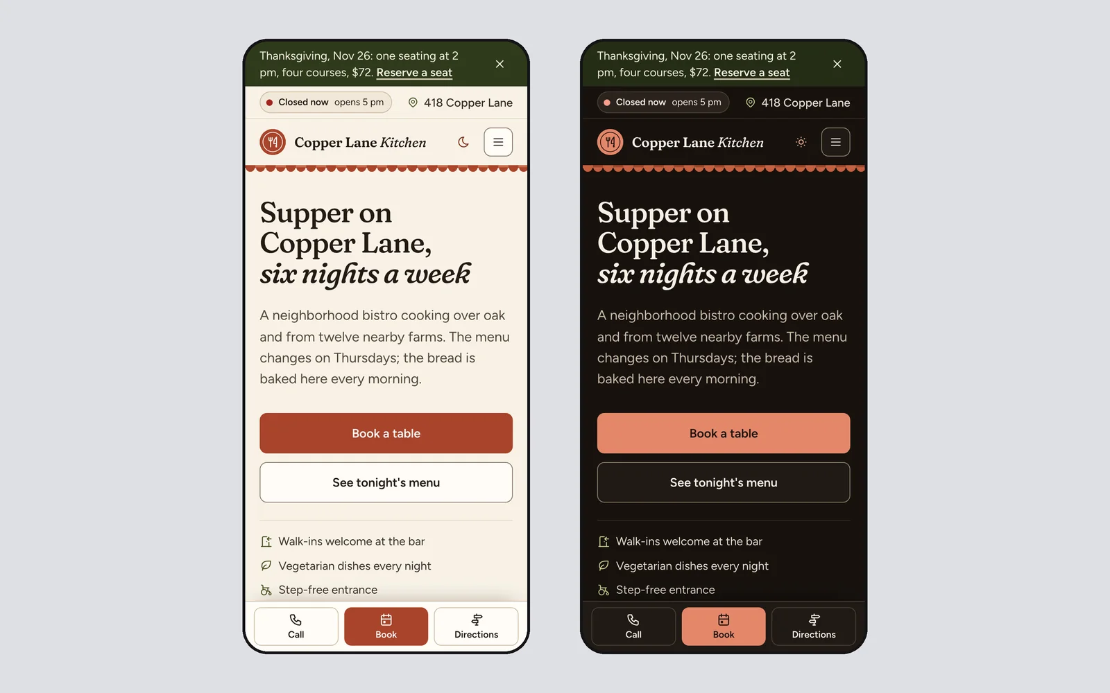
LiveLocal business sites
A facts-first system for restaurants, clinics, salons, gyms and trades. An open-now badge from the real hours, a Call, Book and Directions bar on phones, printed-menu price lists, a booking panel and a location card. Presets switch it between kitchen, clinic and trades.
- 55 components
- Light + dark
- Fraunces and Figtree
-
Spec
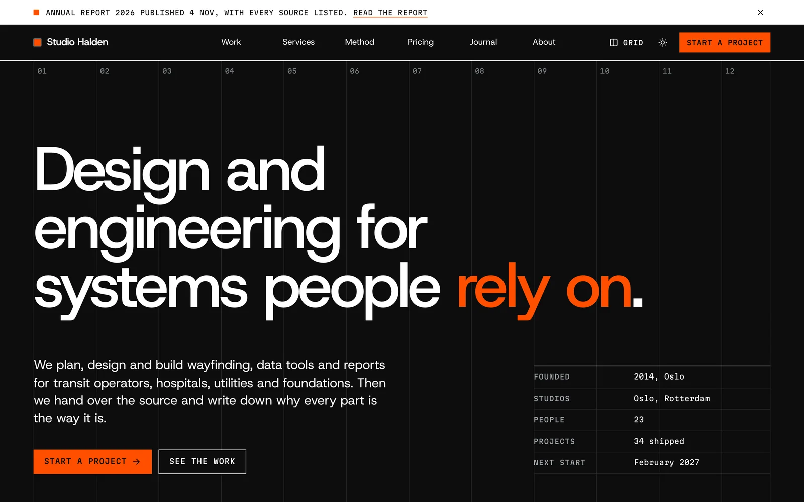
LiveStudios, agencies and reports
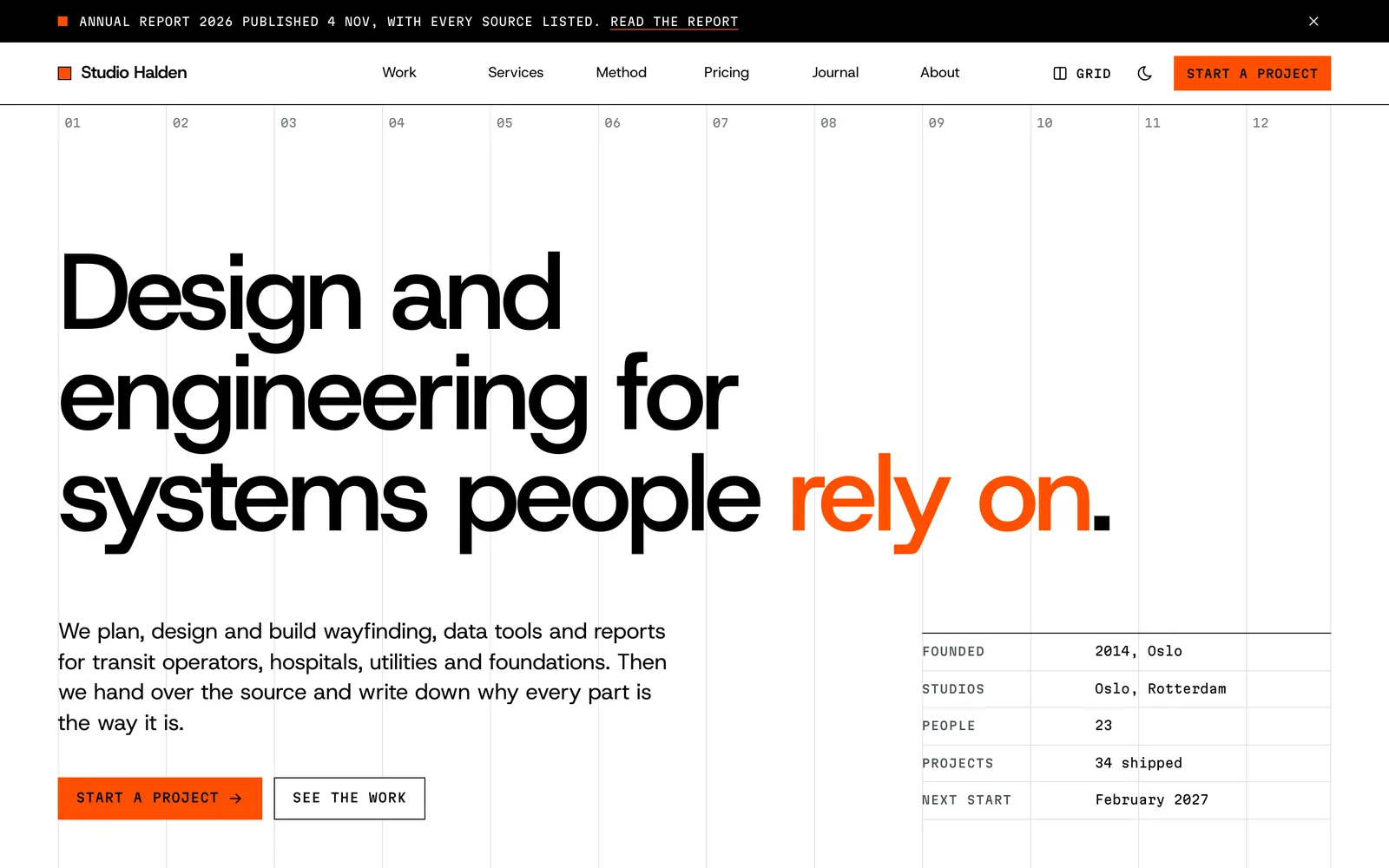
A Swiss-grid system for studios, consultancies and reports that sell on rigor. A visible 12-column grid, numbered sections, giant figures with sources, mono spec rows, case studies and a project index, set in Host Grotesk with Martian Mono.
- 52 components
- Light + dark
- Host Grotesk and Martian Mono
-
Syllabus
LiveCourses and learning sites
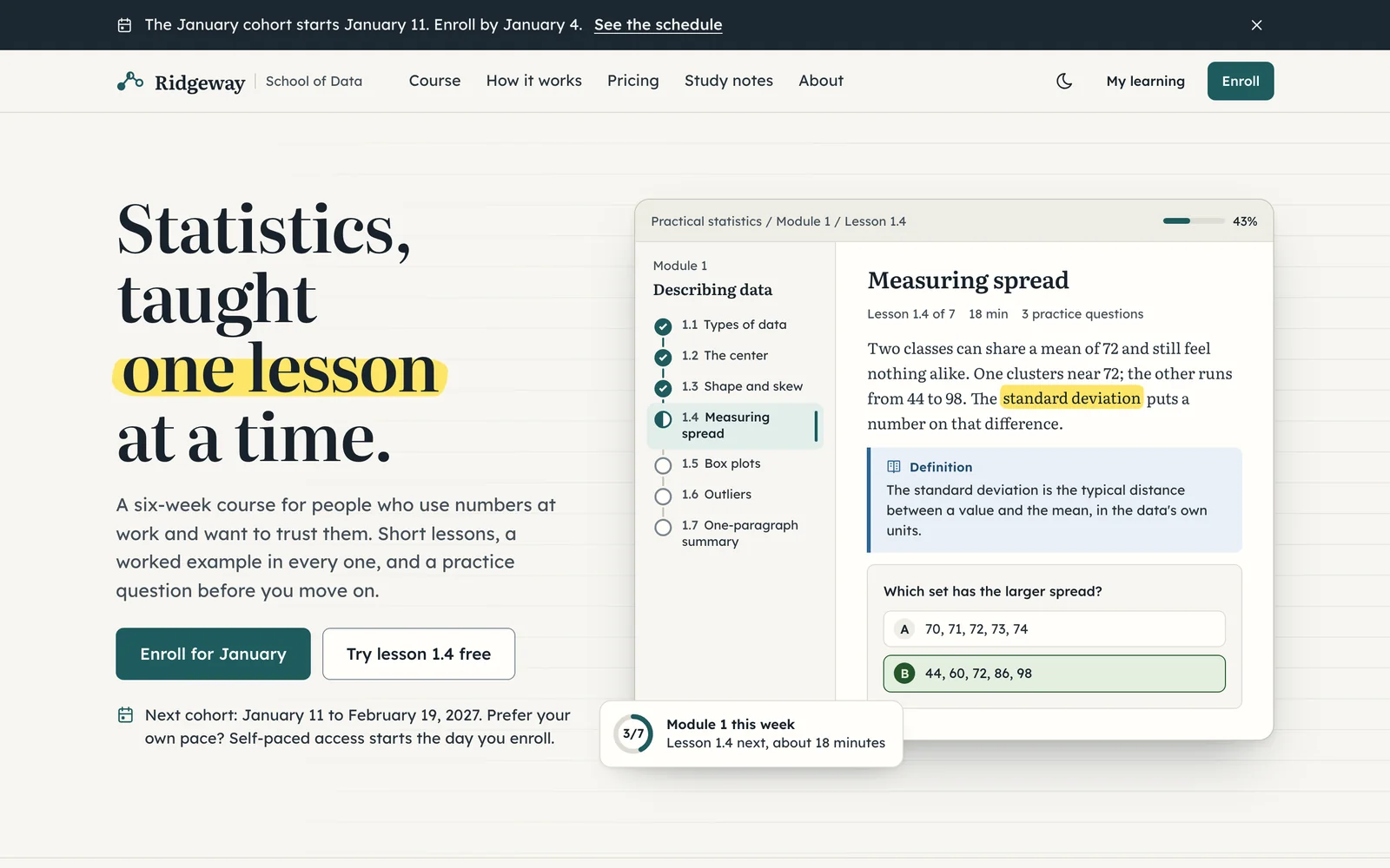
A classroom system for courses, cohorts, exam prep and study notes. A lesson rail with progress, callouts for definitions, worked examples and exam tips, practice questions with explanations, flashcards and a printable certificate, set in Literata and Lexend.
- 55 components
- Light + dark
- Literata and Lexend
-
Marquee
LiveEvents and conferences
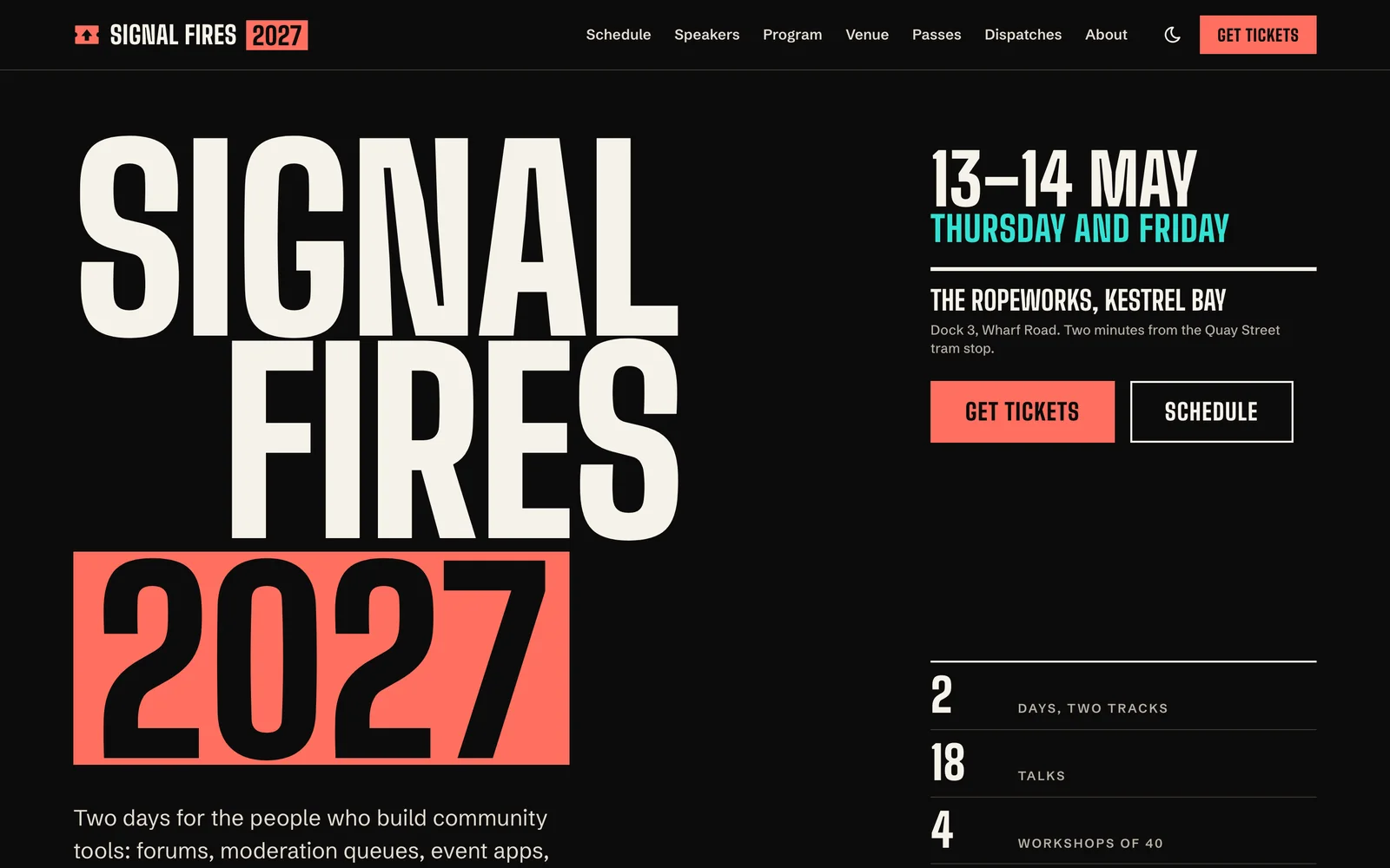
A poster-and-ticket system for conferences, meetups, festivals and launch events. Condensed poster type, ticket-stub price tiers with seats left, a multi-track timetable, speaker cards, a venue card and a countdown, set in Big Shoulders and Schibsted Grotesk.
- 54 components
- Light + dark
- Big Shoulders and Schibsted Grotesk
-
Civic
LivePublic services and nonprofits
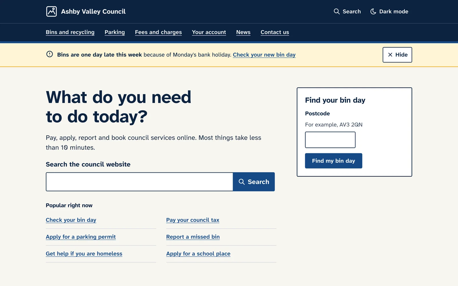
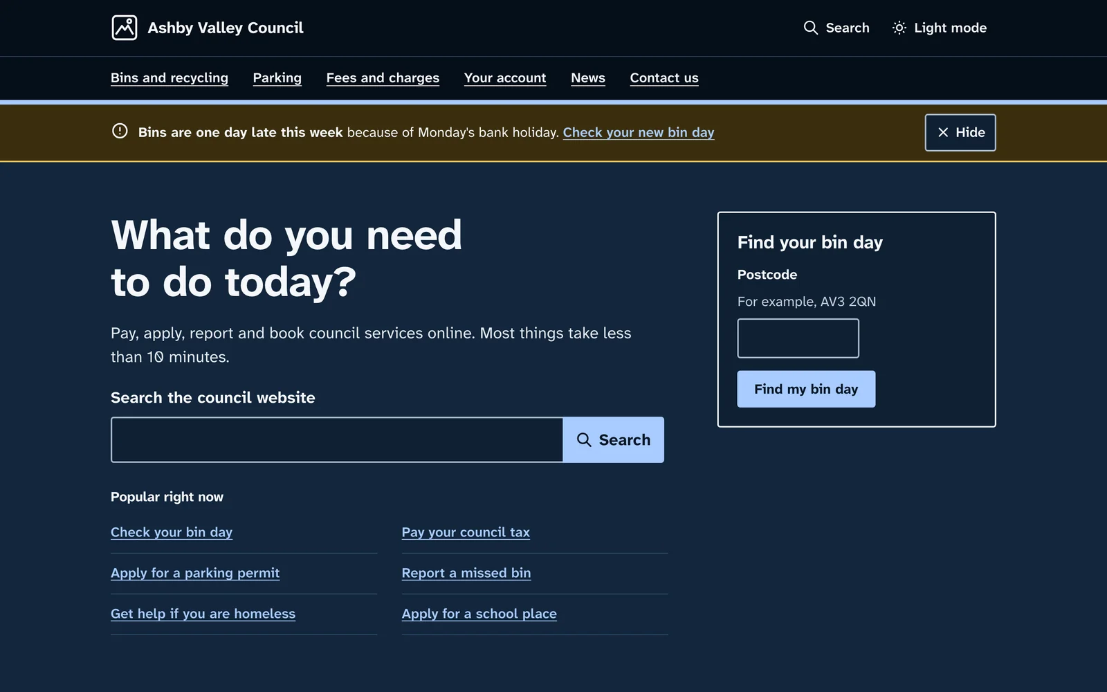
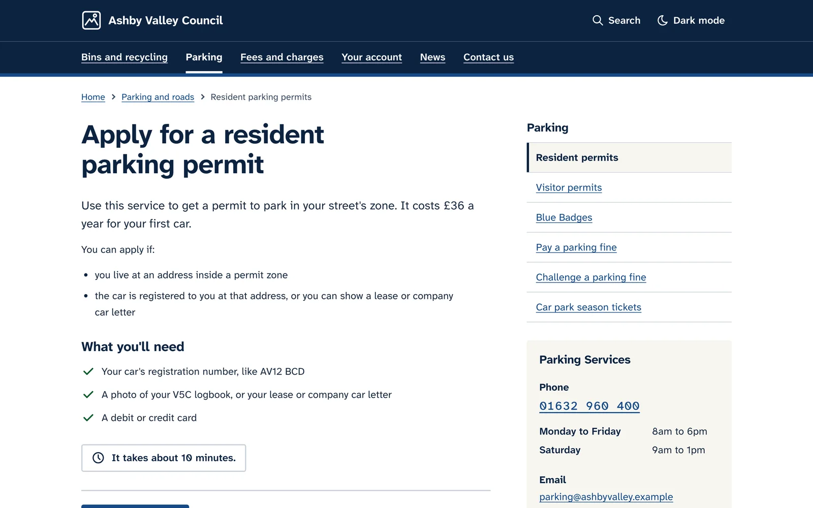
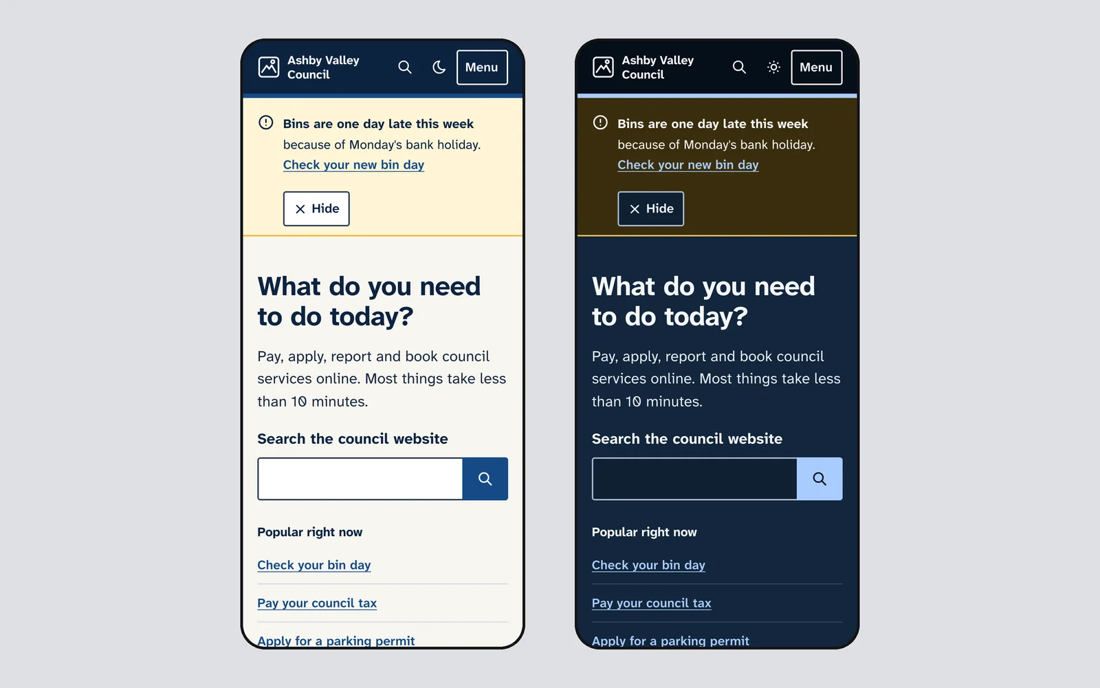
An accessible-by-default system for councils, public services, nonprofits and health sites. Every text pair at 7:1, 18px body text, 48px targets, underlined links, service start pages, eligibility checks and error summaries, set in Atkinson Hyperlegible.
- 54 components
- Light + dark
- Atkinson Hyperlegible Next and Atkinson Hyperlegible Mono
-
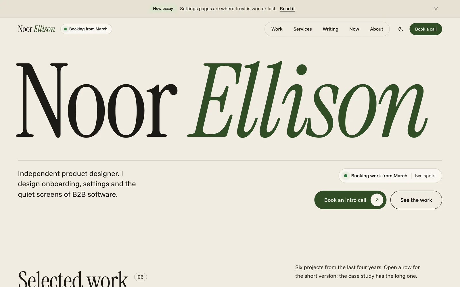
Atelier
LivePortfolios and personal sites
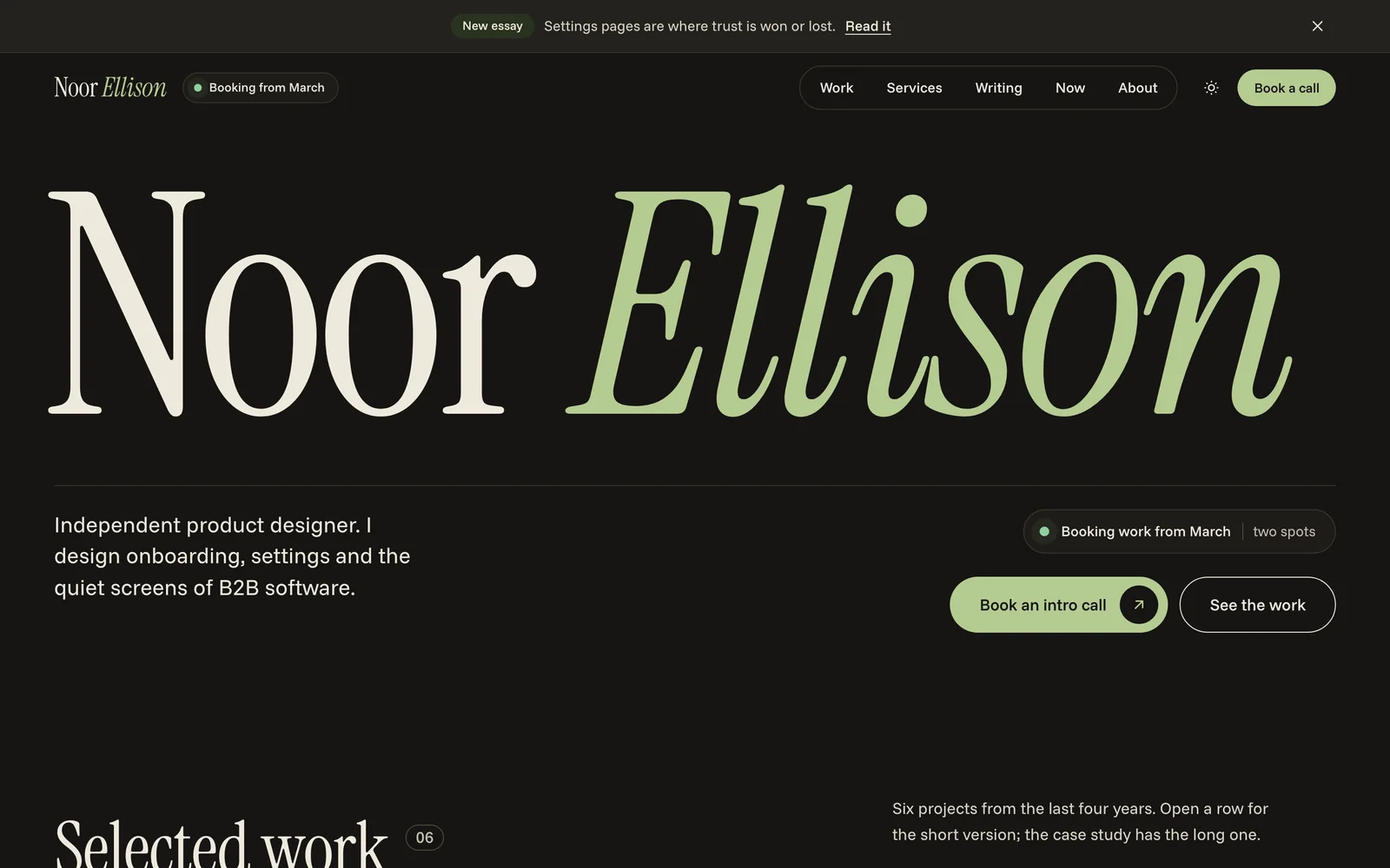
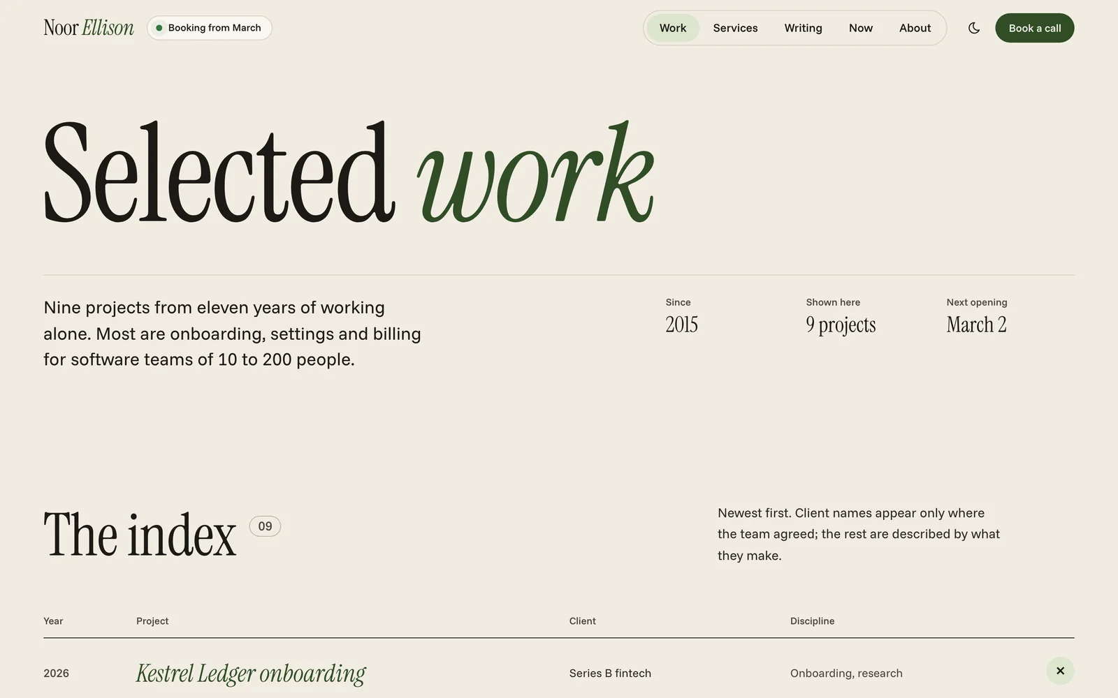
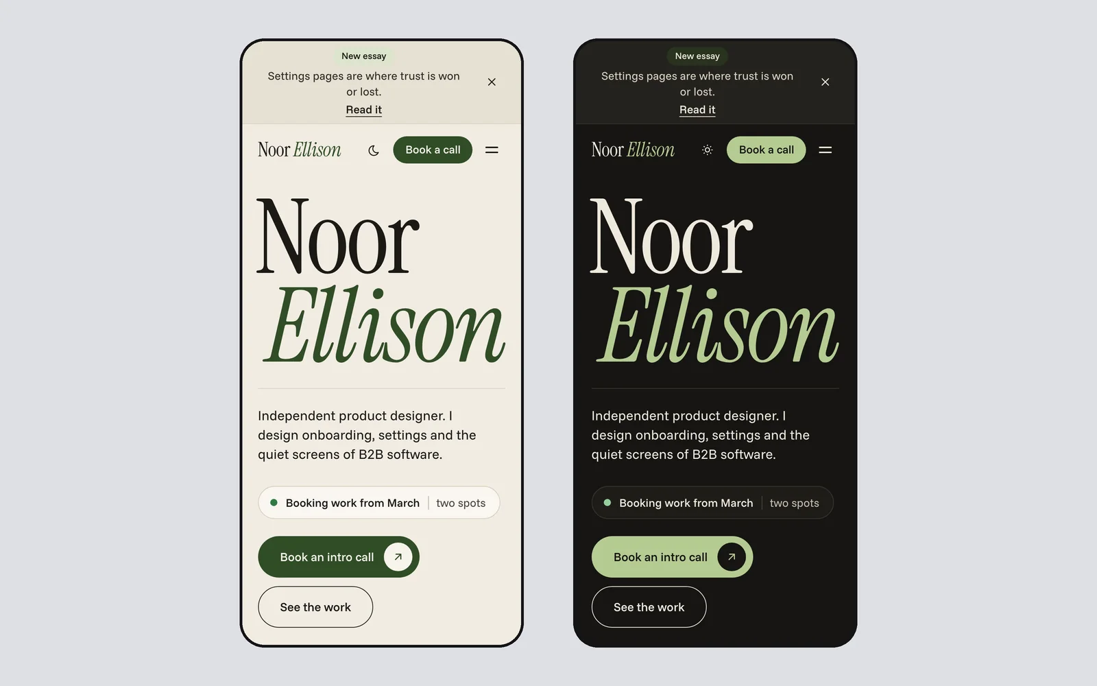
A personal system for freelancers, designers, consultants and creators. Your name set huge across the first screen, an availability badge, a project index that opens into previews, services with rates, a now page and booking, set in Instrument Serif and Funnel Sans.
- 52 components
- Light + dark
- Instrument Serif and Funnel Sans
-
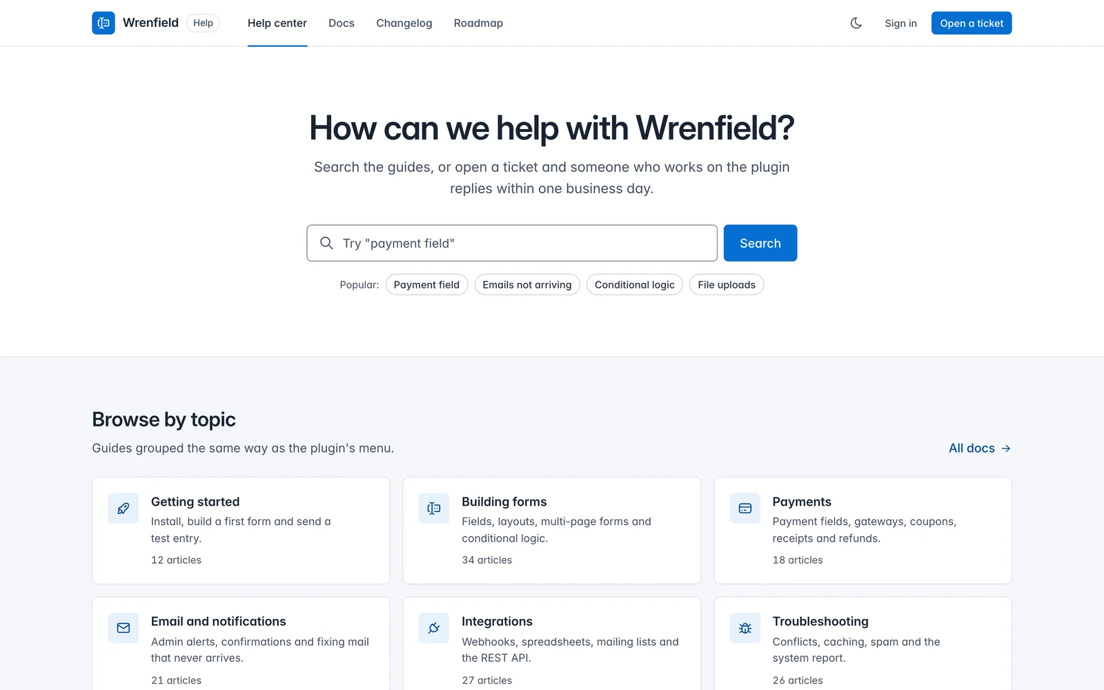
Core Support
LivePlugin admin and support sites
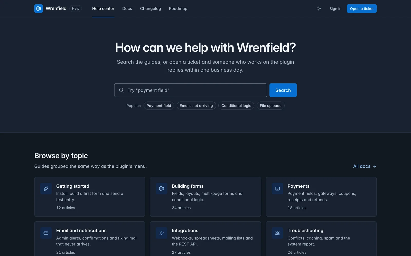
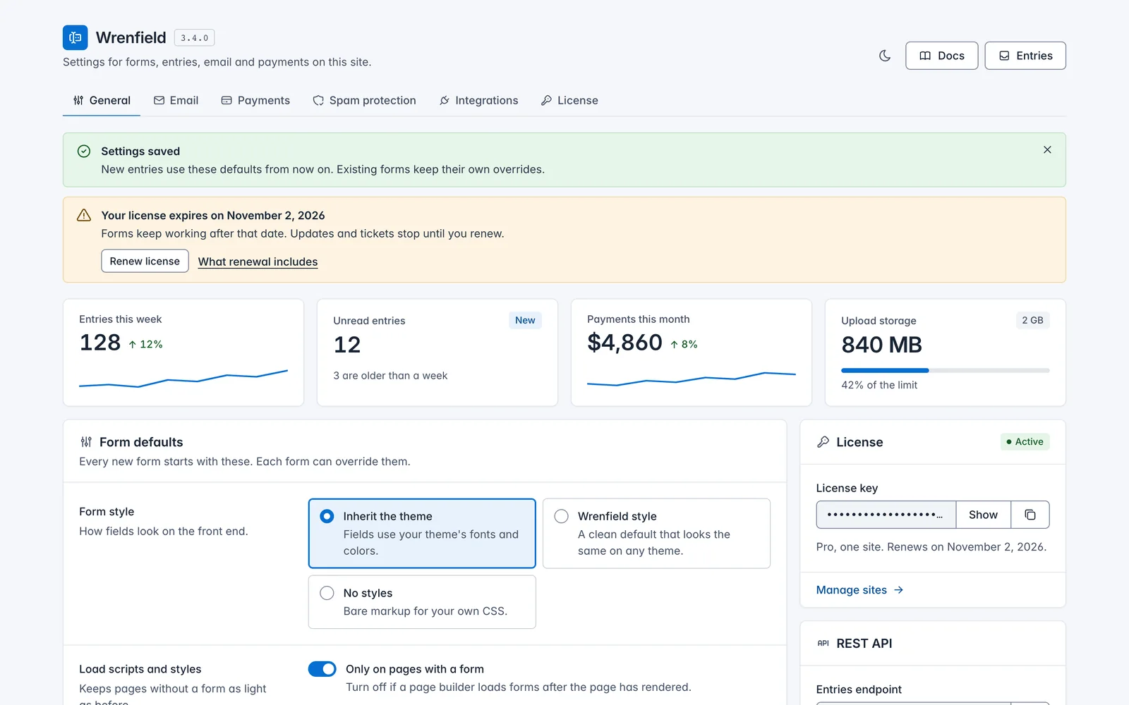
A design system based on Tabler UI and tailored for WordPress plugins. It covers the wp-admin settings screen, with form rows, switches, choice cards, copy fields, notices and list tables, and the support site around it: help center, docs, changelog and roadmap.
- 52 components
- Light + dark
- Inter
-
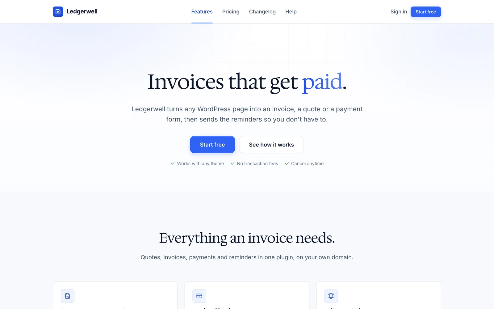
Core Forms
LiveFree, MITPlugin and product sites
The open-source system behind Core Forms: one stylesheet, Inter body text, Hedvig Letters Serif headings, blue actions, tinted and dark bands, pricing, FAQ, changelog and roadmap. Free and MIT licensed on GitHub; this is the agent-ready edition with a rulebook, components and demo pages.
- 33 components
- Light, with dark bands
- Inter and Hedvig Letters Serif
Pick the One That Fits the Page
Pick by the page you’re building, not by color. You can change colors and fonts later through tokens, but the layout logic is what each system is for.
| System | Best for | Look | Shape | Sections | Fonts |
|---|---|---|---|---|---|
| Rail | Product sites and developer tools | Cobalt blue on cool paper | 6px buttons, 12px cards, pill chips | Hairline rails and ruled full-width sections | Geist and Geist Mono |
| Quiet | Launch and sales pages | Forest green on white, near-black bookends | 8px buttons, 16px cards | A white canvas between two dark bookends | Bricolage Grotesque and Inter |
| Canvas | Product marketing pages | Marigold on white and warm stone | 14px buttons, 24px cards | Tonal sections that alternate white and stone | Instrument Sans |
| Console | Dashboards and internal tools | Signal teal on graphite | 6px buttons and inputs, 8px cards and panels | An app shell with a sidebar, plus roomier marketing pages | IBM Plex Sans and IBM Plex Mono |
| Relay | AI products and chat apps | Ink teal on warm white, a lime working mark | 10px buttons, 14px cards and composer, pill chips | Conversation turns with a gutter mark, and an artifact panel | Onest and Spline Sans Mono |
| Folio | Magazines, blogs and newsletters | Ink and oxblood on newsprint ivory | 2px controls, square figures, hairline rules | A reading column with sidenotes in the margin | Newsreader and Hanken Grotesk |
| Shelf | Stores for digital products | Tomato red on cream | 10px buttons, 16px cards, pill tags | Coded product covers standing on shelf lines | Familjen Grotesk and Young Serif |
| Main Street | Local business sites | Terracotta on cream, with clinic and trades presets | 10px buttons, 14px cards | Hours, phone and directions first, then printed-menu sections | Fraunces and Figtree |
| Spec | Studios, agencies and reports | International orange on white paper | Square corners, 1px rules | A visible 12-column grid with numbered sections | Host Grotesk and Martian Mono |
| Syllabus | Courses and learning sites | Slate teal with highlighter yellow | 8px buttons, 12px cards, barred callouts | A lesson rail with progress beside a reading column | Literata and Lexend |
| Marquee | Events and conferences | Hot coral and black | Square buttons, ticket-notched cards | Black poster bands and a multi-track timetable | Big Shoulders and Schibsted Grotesk |
| Civic | Public services and nonprofits | Deep navy on white, gold focus | 4px corners, 2px input borders, 48px targets | One clear column and step-by-step service pages | Atkinson Hyperlegible Next and Atkinson Hyperlegible Mono |
| Atelier | Portfolios and personal sites | Moss green on bone | Pill buttons, 20px cards | A giant serif name over a project index table | Instrument Serif and Funnel Sans |
| Core Support | Plugin admin and support sites | Tabler blue on cool gray | 6px buttons and inputs, 8px cards, 4px badges | White hairline bands over a cool gray canvas | Inter |
| Core Forms | Plugin and product sites | Bright blue on white, serif headings | 8px buttons, 12px cards, 16px pricing cards | Tinted bands and one dark band | Inter and Hedvig Letters Serif |
What Comes in Every System
An AI agent left alone reaches for the same gradient hero, the same three cards and the same rounded everything. A design system template only helps if the agent can read the rules and check its own work, so every part below is written for that.
- A DESIGN.md rulebook
- Principles, the color roles with measured contrast, the type ladder, spacing, layout, a contract for every component, page recipes and a checklist the agent runs before it calls a page done.
- A SKILL.md your agent loads
- It tells Claude Code or Codex when to use the system, what to read first and the hard rules, plus a Cursor rule and an AGENTS.md snippet for project setups.
- Design tokens
- Every color, size, radius and motion value as a CSS custom property, with measured contrast for each text pair. Systems with a dark theme follow the visitor’s setting or a toggle.
- Copy-paste components
- Each one has an HTML contract with its classes, states and accessibility notes, the CSS it needs and, where it needs it, a small vanilla script.
- Fonts you can ship
- Open-license web fonts in the zip with their licenses, so client sites can use them without a font subscription.
- Real demo pages
- At least eight finished pages per system (home, pricing, features, about, blog, article, contact and 404), plus the pages that system exists for, like a dashboard, a lesson or a menu, and one page with every component. You can open each one live before you buy.
- A check your agent runs
check/check.mjsscans the pages your agent builds for off-system colors, fonts and classes, missing labels, broken heading order and the usual generic AI patterns. It needs Node and nothing else.- Tailwind, shadcn/ui and WordPress files
- Generated from the same tokens: a Tailwind CSS v4 theme, a shadcn/ui
globals.cssthat v0 and Lovable also read, atheme.jsonfor block themes and DTCG token files for token tools. - Presets, emails and prompts
- Two tested accent presets per system, transactional and newsletter email templates, a social card and favicon in the system’s style, and ten starter prompts to paste into your agent.
One Price for the Whole Library
$39
Per year · renews yearly · cancel anytime from your account
- All 15 design systems in the library, as single zips or one bundle
- New systems and new versions while your membership runs
- Works with Claude Code, Codex, Cursor or plain HTML
- Open-license fonts you can ship on client sites
- Use on your own projects and client work
Want the Notion templates and AI skills too? All-Access opens all three libraries for $79 a year.
Secure checkout · pay in USD, EUR, GBP or INR
| Plan | Per year |
|---|---|
| Design Systems Library | $39 |
| All three libraries bought separately | $117 |
| All-Access, all three libraries | $79 |
From Checkout to Your First Page
There’s no license key to paste. Your account opens the library page, and every download is there.
-
Check out
Pay $39 for the year. Checkout creates your customer account, or uses the one you already have.
-
Open My pages
Sign in and open My pages. The Design Systems Library is listed there with every download.
-
Unzip one system
Put the folder in
~/.claude/skills/or~/.codex/skills/, or inside your project for Cursor. -
Ask for a page
“Build a pricing page in the Quiet design system.” The agent reads the rulebook and builds from the components.
Straight Talk Before You Buy
The library opened in October 2026, so it doesn’t have a long track record yet. These are code design systems: HTML, CSS custom properties and a little vanilla JavaScript. There are no Figma files and no React or Vue component package. Each system does ship Tailwind v4, shadcn/ui and WordPress theme.json files generated from its tokens, so a framework project gets the same colors, type and radii while your agent ports the markup.
A system gives your agent rules and parts, not taste on autopilot. You still pick the system that fits the page, write real copy and check the result in both themes. If all you want is a check for generic AI design patterns, the free design-slop skill on GitHub is enough.
Questions Before You Buy
What is a Claude design system?
It’s a design system packaged so an AI agent can use it: tokens, components and a written rulebook, plus a SKILL.md that Claude Code loads when you ask for a page. The same folder works in Codex and Cursor. A plain design system template gives you parts. This one also tells the agent how to put them together and how to check the result.
Which tools do the systems work in?
Claude Code and Codex load each system as a skill from their skills folder. Cursor reads the included rule file. Any other agent can follow DESIGN.md, and you can link the CSS and JavaScript in a plain HTML page by hand.
Can I use it as a Tailwind design system?
Yes. Every system ships a Tailwind CSS v4 theme file in adapters/tailwind/, generated from its tokens, so utilities like bg-primary, text-muted and rounded-card match the system and keep working in dark mode. It clears Tailwind’s default palette, so off-system colors don’t slip in. The components themselves stay plain CSS with prefixed classes, so they sit next to Tailwind utilities without clashing. The Core Forms system uses plain class names like .btn, so check those against your own component classes.
Can I use the systems for client work?
Yes. The license covers one person building any number of sites, apps and pages for themselves and their clients, including the CSS, JavaScript and fonts inside the finished site. Please don’t share or resell the system files, or publish a design system or theme made from them. Team members each need their own membership. The Core Forms Design System is the exception: it’s MIT licensed, so its own license applies.
How do updates arrive?
New systems and new versions appear on your library page with a version number and date. Download the new zip and replace the old folder. Class names only change in a major version, and each CHANGELOG.md lists what changed.
What happens if I cancel?
Canceling stops the next renewal. Your library page stays open to the end of the year you paid for, and the projects you built while your membership was active keep their license.
Can I get a refund?
The systems are instant digital downloads, so the download terms in my refund policy apply: I refund duplicate charges, defective files and orders where the library never opened for you. Change-of-mind refunds aren’t available once you have access.

Hey, I’m Gaurav
Every system in this library started from page layouts and plugin screens I build with. Before one goes in, I write the rulebook an agent can follow, package it with open-license fonts and measure its contrast.
The short version of the rest:
- 18 years building on the web, since 2008
- Free agent skills on GitHub for WordPress, GenerateBlocks, Bricks and Kadence
- WordPress plugins and themes built and supported on this site
Build Your Next Page on a Real System
Join, download the system that fits the page in front of you and install it in your agent. Your agent does the rest by the rulebook.
Downloads open from My pages as soon as checkout finishes · works with Claude Code, Codex and Cursor