
Checkout Builder lets you select a checkout layout without building a custom page in the block editor. FluentCart still supplies the live customer fields, order summary, payment methods and checkout processing.
Your default checkout stays unchanged until you choose a design. Enabling the module, opening a preview or saving appearance settings does not activate a layout by itself.
Compare the Designs
Open FluentCart → Checkout Builder and choose Preview design.
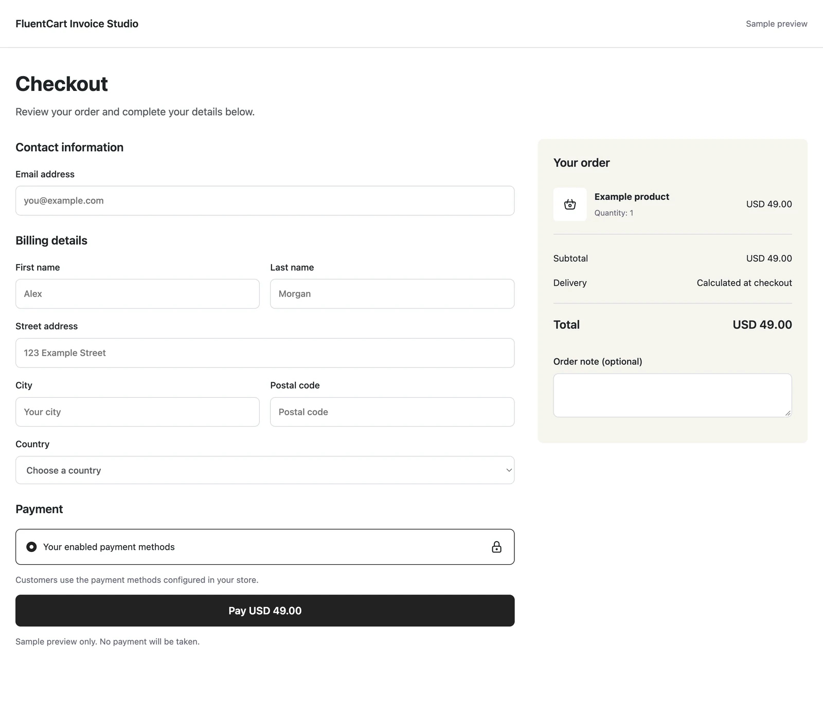
- Classic: customer details on the left and order summary on the right.
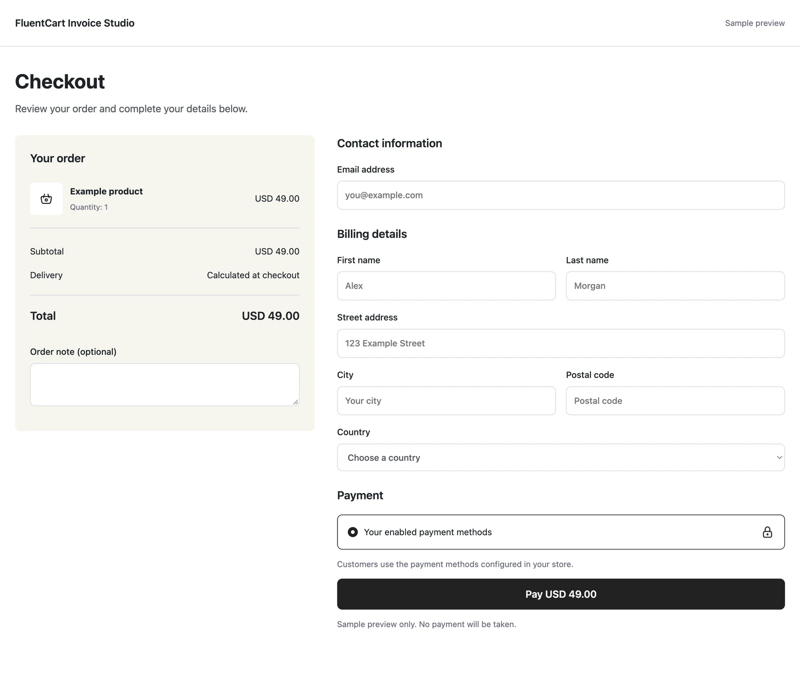
- Split: order summary on the left and checkout form on the right.
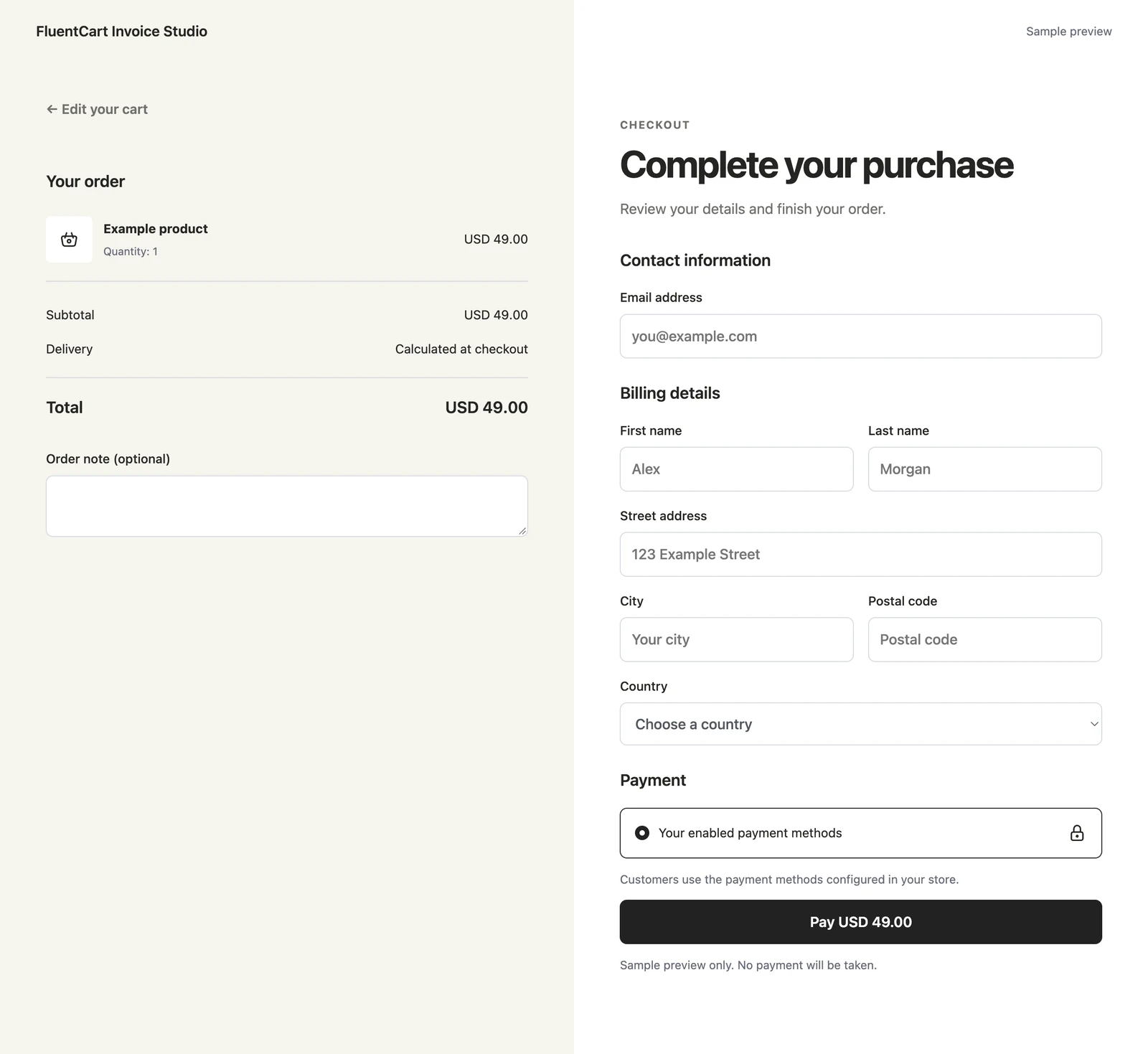
- Warm Split: a warm summary panel beside a white form and a bold purchase button.
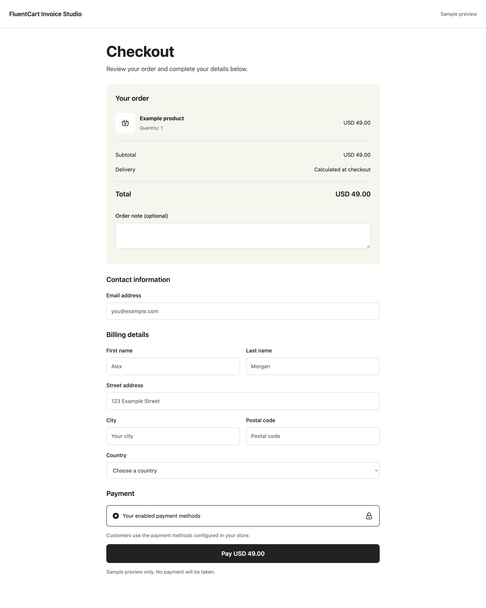
- Focused: a centered single column, with the summary above the form.
- Review First: a full-width order review, followed by customer details beside payment.
Classic
Customer details on the left, with the order summary on the right.
Split
Order summary on the left, with customer details and payment on the right.
Warm Split
A warm order panel beside a spacious white checkout and a bold purchase button.
Focused
A centered single column, with the order summary above customer details and payment.
Review First
A full-width order review above customer details and payment in separate columns.
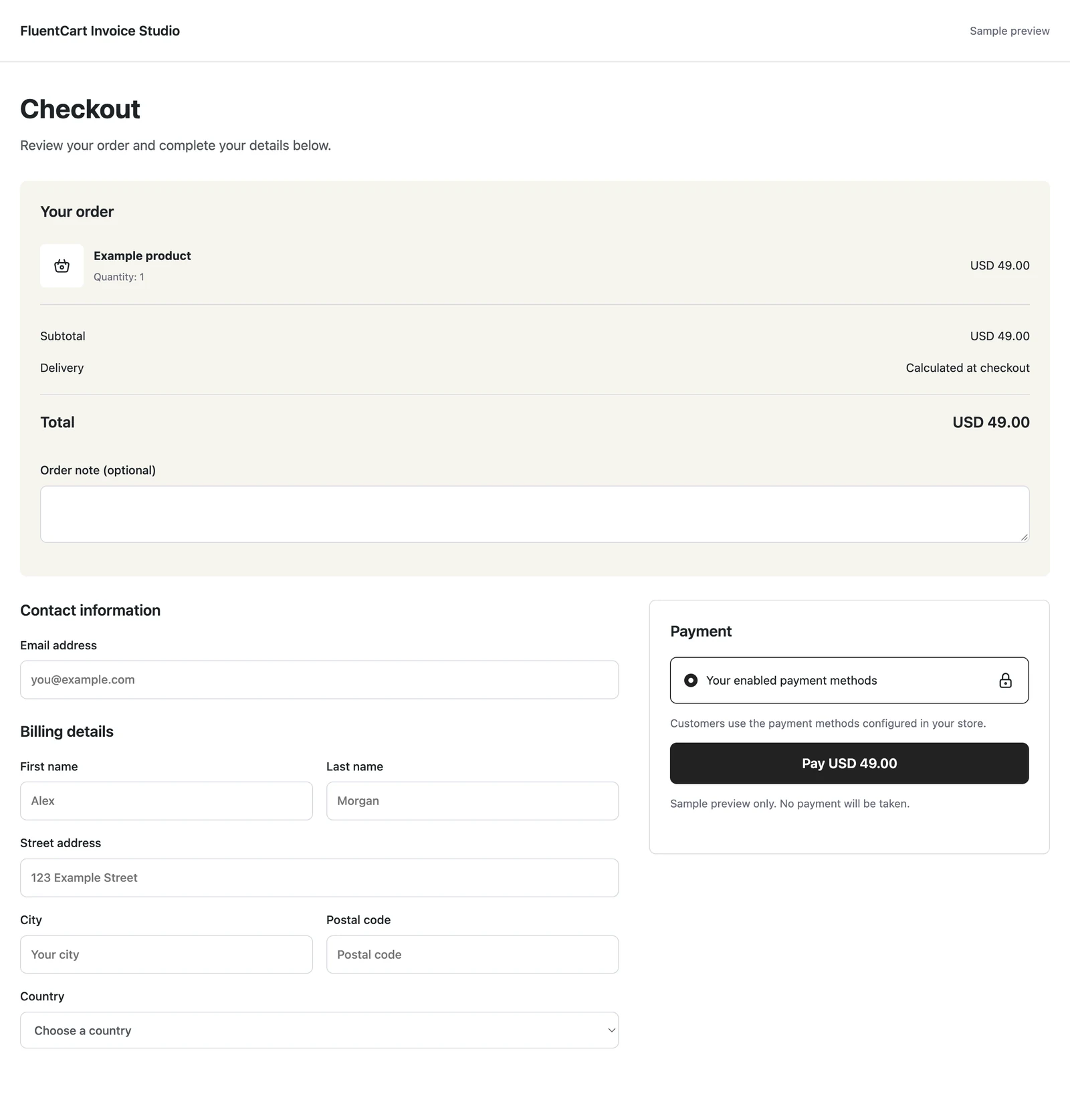
Preview on Desktop and Mobile
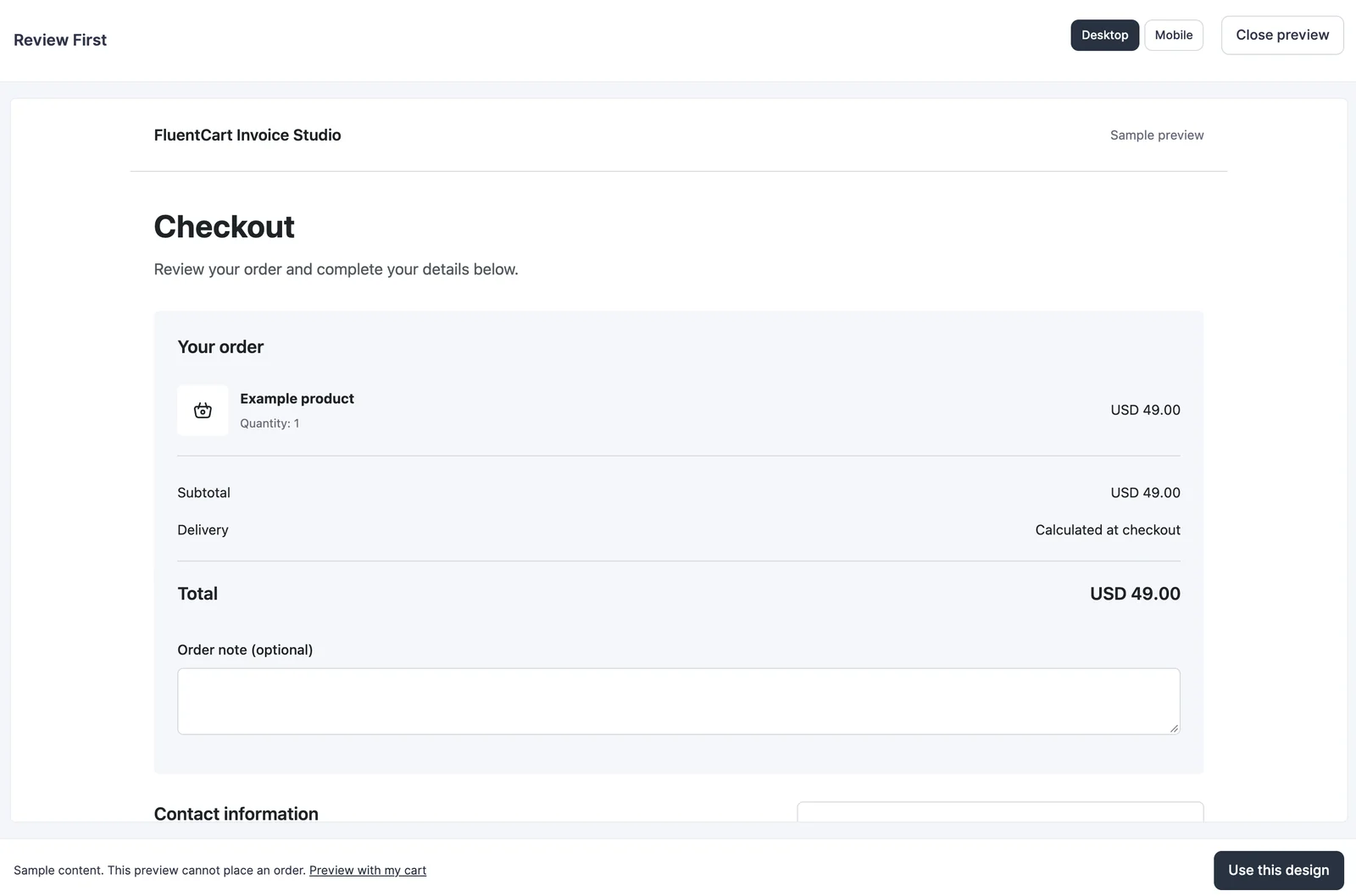
The sample preview has desktop and mobile controls and cannot place an order. Preview with my cart lets a signed-in store manager inspect the design using the current cart without changing what other customers see.
Activate and Adjust
Click Use this design when you have chosen the layout. The active design is identified in the library.
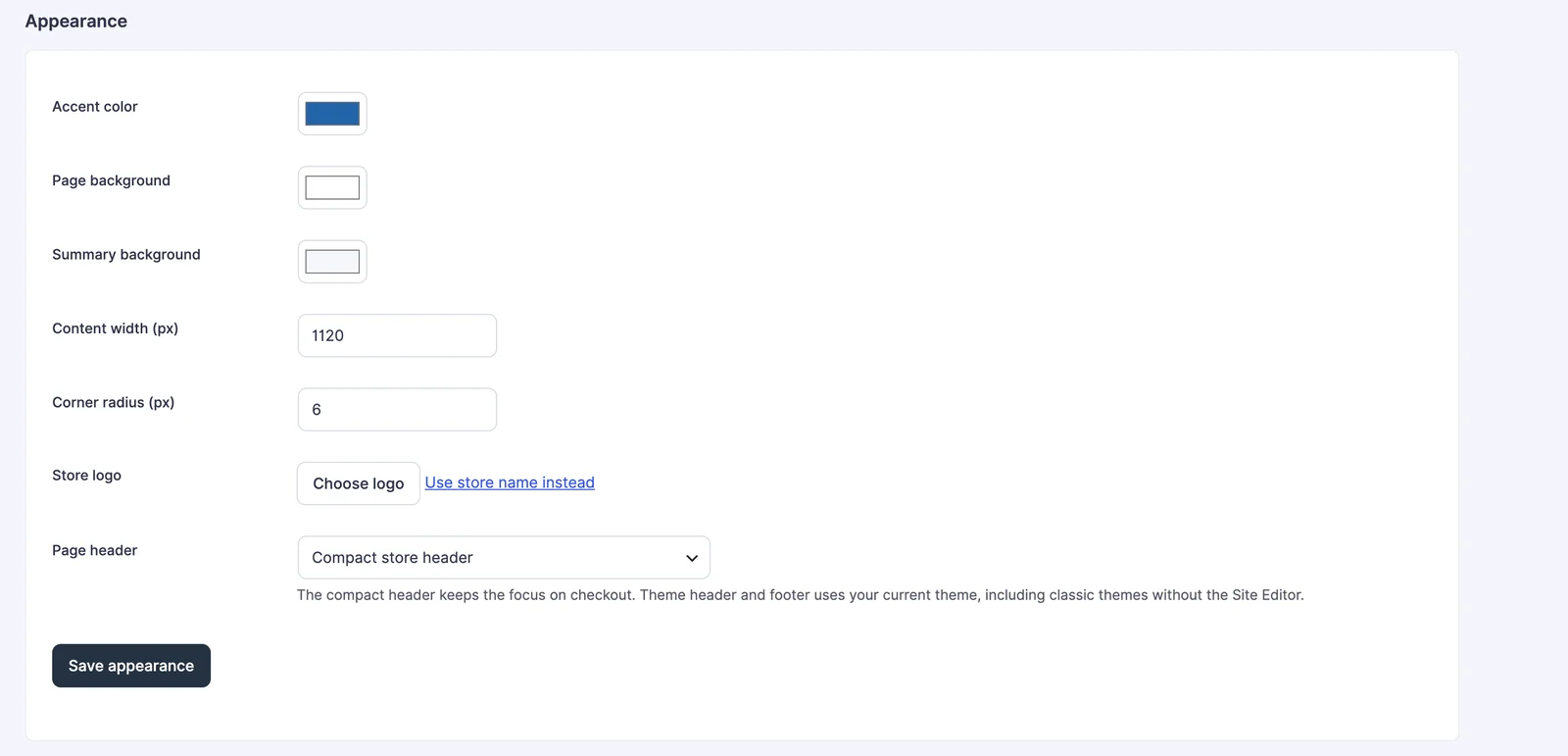
Appearance settings let you match the selected design to your store.
- Accent color: the primary action color.
- Page background: the checkout canvas color.
- Summary background: the order review panel color.
- Content width: 720 to 1,400 pixels.
- Corner radius: 0 to 24 pixels.
- Store logo: select a media-library image, or use the store name instead.
- Page header: choose the compact store header or your theme header and footer.
Click Save appearance to keep these choices. Warm Split applies its matching palette when selected; adjust appearance afterward if needed.
The layouts work with classic themes and with the block editor enabled or disabled. They do not require a Full Site Editing theme. There is no separate custom checkout-design editor to manage: use FluentCart’s page selector and your normal checkout page when you want to author your own layout.
Example: Make the Order Easy to Review
Review First is useful when customers need to examine several items before paying. The order review sits above the two form columns instead of competing for space in a narrow sidebar.
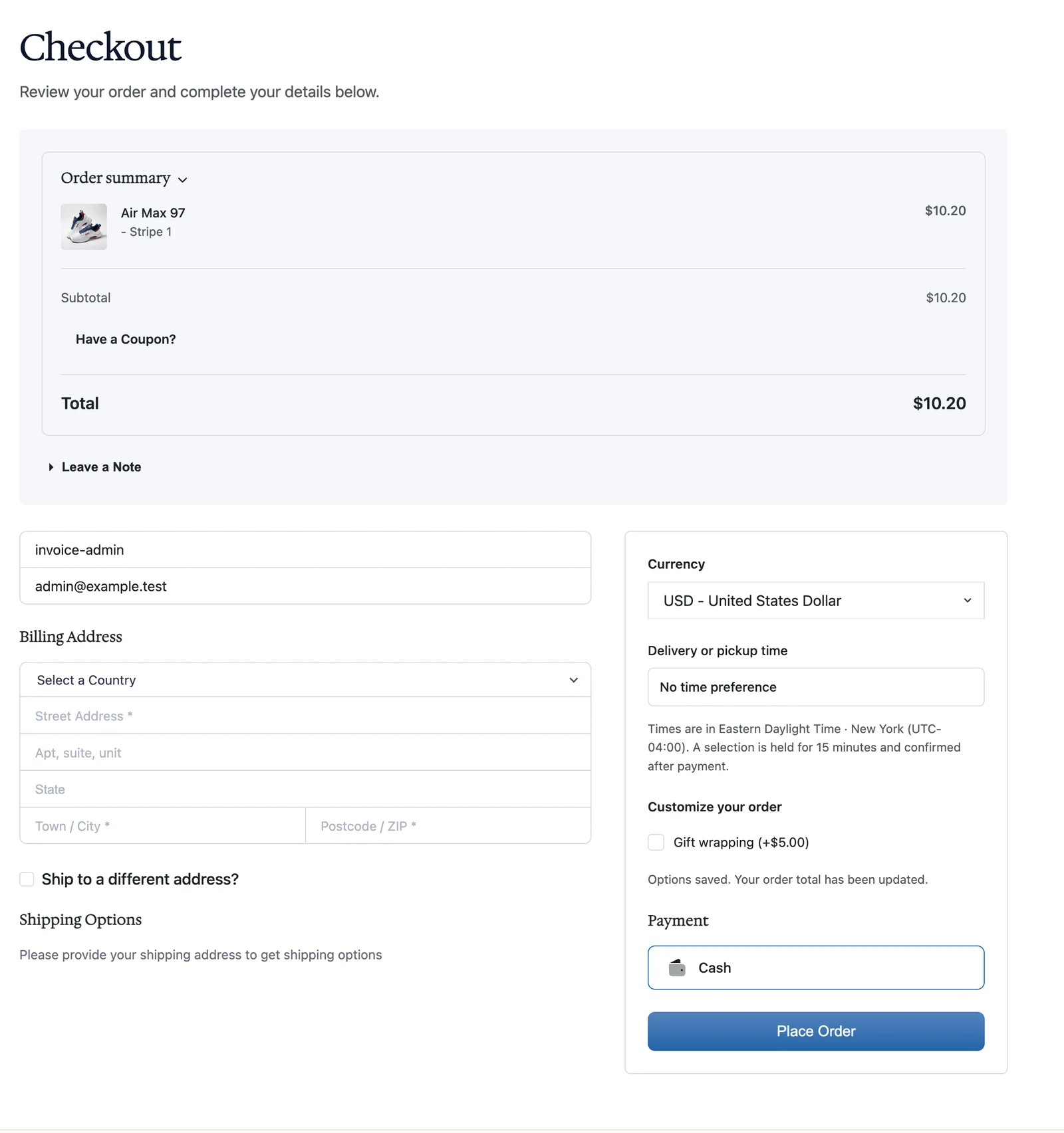
Check your real product names, addresses, currencies, add-ons, delivery options and payment methods at desktop and mobile widths. The design arranges these controls; it does not replace their settings or validation.
Return to the Default
Choose Use FluentCart default to restore the native checkout presentation. The plugin does not overwrite the configured checkout page’s original content. Design assets load only when a valid design is selected on that checkout page.
See checkout fields and delivery scheduling for the optional controls that can appear alongside payment.