Statistics for Entrepreneurs & Business Owners
You don’t need a statistics degree to run a business. But you need to understand enough to avoid expensive mistakes like this one. I’ve seen business owners draw conclusions from tiny samples, mistake random variation for real trends, and make terrible decisions because they misread their own data.
Statistics is the science of learning from data under uncertainty. Every business operates under uncertainty. Revenue fluctuates. Customers behave unpredictably. Marketing campaigns sometimes work and sometimes don’t. Understanding statistics helps you separate signal from noise and keep your money where it belongs.
This guide covers the concepts that actually matter for business decisions. Not academic theory. Practical tools you’ll use for analyzing sales data, evaluating marketing experiments, understanding customer behavior, and making better decisions with real money on the line.
The Basics: Mean, Median, and Mode
These three numbers describe what’s “typical” in your data. They sound similar but tell you very different things. Knowing when to use each one will save you from misleading yourself.
Mean (Average)
The mean is the sum of all values divided by the count:
$$\bar{x} = \frac{\sum_{i=1}^{n} x_i}{n} = \frac{x_1 + x_2 + … + x_n}{n}$$
Example: Your last 5 monthly revenues were $45,000, $52,000, $48,000, $51,000, and $49,000.
$$\bar{x} = \frac{45{,}000 + 52{,}000 + 48{,}000 + 51{,}000 + 49{,}000}{5} = \frac{245{,}000}{5} = \$49{,}000$$
Your average monthly revenue is $49,000. Simple enough.
The Problem with Means: Outliers Wreck Everything
Means get dragged around by extreme values. Add one unusual month, say $150,000 from a one-time big contract, and watch what happens:
$$\bar{x} = \frac{245{,}000 + 150{,}000}{6} = \frac{395{,}000}{6} = \$65{,}833$$
Your “average” jumped to $65,833, even though typical months are still around $49,000. If you used this number for forecasting, you’d be planning for revenue that isn’t coming. The mean no longer represents typical performance; it represents a mathematical artifact.
Median (Middle Value)
The median is the middle value when data is sorted. Half the values sit above it, half below.
For the original 5 months, sorted: $45,000, $48,000, $49,000, $51,000, $52,000. The median is $49,000 (the middle value).
Add the $150,000 month, sorted: $45,000, $48,000, $49,000, $51,000, $52,000, $150,000. With 6 values, the median is the average of positions 3 and 4:
$$\text{Median} = \frac{49{,}000 + 51{,}000}{2} = \$50{,}000$$
The median barely changed. It shrugged off that outlier. That’s why median is your friend when data gets weird.

When to use which:
- Use mean when data is roughly symmetric without extreme outliers
- Use median for skewed data, income distributions, or when outliers exist
- Report both when they differ significantly—the gap itself tells you something important about your data’s shape
Mode (Most Common Value)
The mode is the most frequently occurring value. It’s most useful for categorical data or when you care about what happens most often, not what happens on average.
Example: Customer ratings on a 1-5 scale: 1, 3, 4, 4, 4, 5, 5, 5, 5, 5
Mode = 5 (appears most often).
The mean rating is 4.1, but knowing “most customers rate us 5” is more actionable for your marketing copy.
Variability: Standard Deviation and Variance
Averages tell you where the center is. Variability tells you how spread out the data is around that center. Two businesses with identical average revenue can have completely different risk profiles based on variability alone.
Variance
Variance measures how far values typically stray from the mean:
$$\sigma^2 = \frac{\sum_{i=1}^{n} (x_i – \bar{x})^2}{n}$$
For samples (which is what you usually have in business), use \(n-1\) in the denominator. This is called Bessel’s correction:
$$s^2 = \frac{\sum_{i=1}^{n} (x_i – \bar{x})^2}{n-1}$$
Standard Deviation
Standard deviation is the square root of variance:
$$\sigma = \sqrt{\sigma^2} \quad \text{or} \quad s = \sqrt{s^2}$$
It’s in the same units as your data, making it far more interpretable than variance. When someone says “our revenue varies by about $15,000 per month,” that’s standard deviation talking.
Example: Two Sales Teams, Same Average, Different Reality
I worked with a company that had two sales teams. Both averaged $100K in monthly sales. The CEO treated them identically. That was a mistake.
Team A monthly sales: $100K, $100K, $100K, $100K, $100K
Team B monthly sales: $60K, $80K, $100K, $120K, $140K
Both have mean = $100K. But look at the standard deviations:
Team A standard deviation: $$s_A = \sqrt{\frac{(0)^2 + (0)^2 + (0)^2 + (0)^2 + (0)^2}{4}} = \$0$$
Team B standard deviation: $$s_B = \sqrt{\frac{(-40)^2 + (-20)^2 + (0)^2 + (20)^2 + (40)^2}{4}} = \sqrt{\frac{4{,}000}{4}} = \sqrt{1{,}000} \approx \$31{,}623$$

Team A is perfectly consistent. You can plan around their performance. Team B swings by $31,623 typically around the mean. Same average, completely different predictability. Team B needs different management, different forecasting, different expectations.
Coefficient of Variation: Comparing Apples to Oranges
To compare variability across different scales, use coefficient of variation:
$$CV = \frac{s}{\bar{x}} \times 100\%$$
A product with mean sales of $10,000 and standard deviation of $2,000 has CV = 20%. A product with mean sales of $100,000 and standard deviation of $15,000 has CV = 15%.
The second product has higher absolute variability ($15K vs $2K) but lower relative variability (15% vs 20%). It’s proportionally more stable. If you’re comparing products, channels, or teams of different sizes, CV is the metric that makes sense.
The Normal Distribution
Many business metrics approximately follow a normal (Gaussian) distribution, the familiar bell curve. Understanding this pattern gives you a powerful mental model for what’s “normal” versus what should raise eyebrows.
The formula:
$$f(x) = \frac{1}{\sigma\sqrt{2\pi}} e^{-\frac{(x-\mu)^2}{2\sigma^2}}$$
You don’t need to use this formula. You need to understand what it means in practice.
The 68-95-99.7 Rule

For normally distributed data:
- 68% of values fall within 1 standard deviation of the mean
- 95% fall within 2 standard deviations
- 99.7% fall within 3 standard deviations
Example: My website averages 10,000 daily visitors with a standard deviation of 1,500.
- 68% of days: 8,500 to 11,500 visitors
- 95% of days: 7,000 to 13,000 visitors
- 99.7% of days: 5,500 to 14,500 visitors
A day with 15,000 visitors is unusual, more than 3 standard deviations above mean. That happens less than 0.15% of the time by chance. Something’s going on. Maybe viral content. Maybe bot traffic. Either way, investigate.
A day with 9,200 visitors? That’s normal variation. Don’t call an emergency meeting.
When Data Isn’t Normal
Here’s the thing: many business metrics are skewed, not normal. The normal distribution rules don’t apply directly, and pretending they do leads to bad decisions.
Common skewed distributions in business:
- Income and revenue (right-skewed: a few big earners pull up the tail)
- Customer lifetime value (right-skewed: whale customers distort everything)
- Time on page (right-skewed: most people bounce, a few read everything)
- Defect rates (often left-skewed toward zero)
For skewed data, use percentiles instead of standard deviations. Or transform the data – log transformation often helps right-skewed data become more normal.
Sampling and Sample Size
You rarely have data on your entire population. You have a sample and you’re inferring something about the larger population. This is where most business statistics go wrong. People draw sweeping conclusions from tiny samples and wonder why their predictions fail.
Why Sample Size Matters
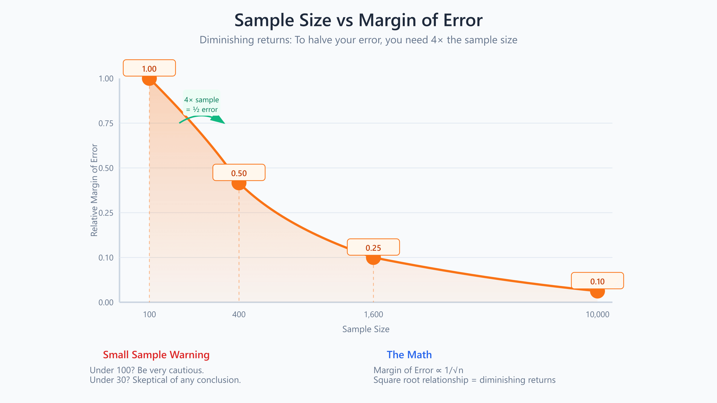
Larger samples give more reliable estimates. But the relationship isn’t linear, it follows a square root pattern:
$$\text{Margin of Error} \propto \frac{1}{\sqrt{n}}$$
To cut margin of error in half, you need 4× the sample size. This is why sample size requirements grow faster than you’d expect.
| Sample Size | Relative Margin of Error |
|---|---|
| 100 | 1.00 |
| 400 | 0.50 |
| 1,600 | 0.25 |
| 10,000 | 0.10 |
The Formula for Sample Size
For estimating a proportion (like conversion rate) with desired margin of error \(E\) at 95% confidence:
$$n = \frac{z^2 \cdot p(1-p)}{E^2}$$
Where \(z = 1.96\) for 95% confidence, \(p\) is estimated proportion (use 0.5 if unknown, this gives the most conservative estimate).
Example: You want to estimate conversion rate within ±2 percentage points at 95% confidence.
$$n = \frac{1.96^2 \times 0.5 \times 0.5}{0.02^2} = \frac{0.9604}{0.0004} = 2{,}401$$
You need about 2,400 visitors to estimate conversion rate within ±2%. That’s more than most people expect. If you’ve been drawing conclusions from 200 visitors, you’ve been guessing.
Small Samples Are Dangerous
With 10 customers, seeing 3 churns (30% churn rate) doesn’t mean your churn rate is 30%. It could easily be 10% or 40%, the sample is too small to tell. You’re not measuring your churn rate. You’re rolling dice.
Rule of thumb: Before making decisions based on percentages, ask “how many data points is this based on?” If it’s under 100, be very cautious. Under 30, be skeptical of any conclusion. Under 10, you’re basically guessing.
Confidence Intervals

A confidence interval gives you a range that likely contains the true value. Instead of saying “our conversion rate is 5%,” you say “our conversion rate is between 4.2% and 5.8%.” The second statement is more honest and more useful.
The Formula
For a mean with known standard deviation:
$$\text{CI} = \bar{x} \pm z \times \frac{s}{\sqrt{n}}$$
Where:
- \(\bar{x}\) = sample mean
- \(z\) = z-score for desired confidence level (1.96 for 95%)
- \(s\) = standard deviation
- \(n\) = sample size
Example: Average Order Value
You sample 100 orders and find mean = $75, standard deviation = $25.
$$\text{95\% CI} = 75 \pm 1.96 \times \frac{25}{\sqrt{100}} = 75 \pm 1.96 \times 2.5 = 75 \pm 4.9$$
The 95% confidence interval is [$70.10, $79.90].
You’re 95% confident the true average order value is between $70.10 and $79.90. If you’re planning inventory or cash flow based on a precise $75 AOV, you might be off by nearly $5 in either direction. That matters.
Interpreting Confidence Intervals Correctly
A common misconception: “There’s a 95% probability the true value is in this interval.”
Technically, the true value either is or isn’t in the interval. The correct interpretation: “If we repeated this sampling process many times, 95% of the intervals would contain the true value.”
For practical purposes, what you need to know: narrower intervals mean more precise estimates. To narrow the interval, increase sample size or accept lower confidence. There’s no free lunch.
Statistical Significance and P-Values
When comparing two groups, like conversion rates before and after a website change, you need to determine if the difference is real or just random noise. This is where statistical significance comes in, and where most business people get confused.
The Null Hypothesis
Statistical tests start by assuming the null hypothesis: there’s no real difference. The test then asks: “If there were truly no difference, how likely is it we’d see data this extreme?”
P-Values Explained

The p-value is the probability of observing your result (or more extreme) if the null hypothesis were true.
Example: You test a new email subject line. Old version: 20% open rate. New version: 24% open rate on 500 sends.
Is this 4 percentage point increase real, or could it be random variation?
A statistical test yields p = 0.03. This means: if the subject lines were equally effective, there’s only a 3% chance of seeing a difference this large by random chance.
Since 3% is pretty unlikely, you reject the null hypothesis. The difference is “statistically significant.” You can be reasonably confident the new subject line actually performs better.
The p < 0.05 Convention
By convention, p < 0.05 is considered “statistically significant.” This means less than 5% probability the result occurred by chance.
But here’s what nobody tells you: this threshold is arbitrary. P = 0.049 isn’t fundamentally different from p = 0.051. The universe doesn’t care about our conventions. Treat statistical significance as a sliding scale, not a magic line that separates truth from fiction.
What P-Values Don’t Tell You
P-values don’t measure effect size. A statistically significant but tiny effect (24.1% vs 24.0%) might not be practically meaningful. Who cares if it’s “real” if it doesn’t move the needle?
P-values don’t prove causation. They indicate an association unlikely to be random. The association could still be caused by something else entirely.
P-values aren’t the probability that your hypothesis is true. They’re the probability of the data under the null hypothesis. Subtle but important distinction.
Why Confidence Intervals Beat P-Values
Many statisticians prefer confidence intervals to p-values. A confidence interval shows both whether an effect exists (if the interval excludes zero) AND how large the effect might be.
Example: The 95% CI for conversion rate improvement is [1.2%, 6.8%]. This tells you:
- The effect is statistically significant (interval doesn’t include 0%)
- The effect is between 1.2 and 6.8 percentage points
- The uncertainty in your estimate
A p-value alone would only tell you significance, not magnitude. You need both pieces of information to make good decisions.
A/B Testing Fundamentals
A/B testing applies statistical concepts to business experiments. It’s probably the most practical application of statistics for online businesses, and also where I see the most expensive mistakes.
The Setup
- Split traffic randomly between Control (A) and Treatment (B)
- Run the test until you have enough data
- Compare outcomes using statistical tests
- Decide whether the difference is significant and meaningful
Sounds simple. In practice, most companies mess up at least one of these steps.
Sample Size for A/B Tests
Before running a test, calculate required sample size. This is non-negotiable. The formula for comparing two proportions:
$$n = \frac{2 \times p(1-p) \times (z_{\alpha/2} + z_{\beta})^2}{(\delta)^2}$$
Where:
- \(p\) = baseline conversion rate
- \(\delta\) = minimum detectable effect
- \(z_{\alpha/2}\) = z-score for significance level (1.96 for 95%)
- \(z_{\beta}\) = z-score for power (0.84 for 80% power)
Example: Baseline conversion = 5%, you want to detect a 1 percentage point lift (20% relative improvement), with 95% confidence and 80% power.
Using online calculators (easier than wrestling with the formula): you need about 3,100 visitors per variation, or 6,200 total.
If your site gets 1,000 visitors per day, that’s a 6-day test minimum. Plan accordingly.
Common A/B Testing Mistakes That Burn Money
- Ending tests early. “We have 500 visitors and variation B is winning by 30%!” That means nothing with small samples. Random variation dominates at low sample sizes. I’ve seen tests flip three times before settling at the required sample size.
- Not accounting for multiple comparisons. Testing 20 variations means one will likely show p < 0.05 by chance alone. That’s just math. Apply correction (Bonferroni: divide significance threshold by number of tests) or be very skeptical of “winning” variants when you’re running many tests.
- Ignoring practical significance. A 0.1% conversion improvement might be statistically significant with enough traffic but not worth the development effort to implement. Always calculate the dollar value of an improvement before celebrating.
- Changing the test mid-stream. Stopping when results look good, adding variations, or adjusting traffic splits all invalidate the statistics. Your p-values become meaningless. If you need to change something, start a new test.
Correlation and Causation
Perhaps the most misused statistical concept in business.
Understanding Correlation
Correlation measures the linear relationship between two variables. The correlation coefficient \(r\) ranges from -1 to +1:
$$r = \frac{\sum (x_i – \bar{x})(y_i – \bar{y})}{\sqrt{\sum(x_i – \bar{x})^2 \sum(y_i – \bar{y})^2}}$$
- \(r = 1\): perfect positive relationship
- \(r = -1\): perfect negative relationship
- \(r = 0\): no linear relationship
Interpreting Correlation Strength
| r value | Interpretation |
|---|---|
| 0.00 – 0.19 | Very weak |
| 0.20 – 0.39 | Weak |
| 0.40 – 0.59 | Moderate |
| 0.60 – 0.79 | Strong |
| 0.80 – 1.00 | Very strong |
The Causation Problem
Correlation does not imply causation. This isn’t just pedantry, it’s the source of countless bad business decisions and wasted budgets.
Example: You notice that customers who use live chat have 40% higher purchase rates than those who don’t. Correlation is strong. Your marketing team wants to invest heavily in live chat.
Possible interpretations:
- Live chat causes more purchases (causal, investing makes sense)
- People who are already likely to buy use live chat more (reverse causation, investing won’t help)
- Both chat usage and purchases are driven by a third factor like engagement level or purchase intent (confounding, investing won’t help)
If interpretation 2 or 3 is correct, investing heavily in live chat won’t increase sales. You’ll spend money improving a symptom, not a cause.
Establishing Causation
To establish causation, you need:
- Temporal precedence: The cause happens before the effect
- Correlation: The variables are related
- No confounding: Other explanations are ruled out
The gold standard is a randomized controlled experiment (like A/B testing). Random assignment eliminates confounding because both groups are statistically identical except for the thing you’re testing.
When experiments aren’t possible, use caution. Always ask: “What else could explain this relationship?”
Regression Basics
Regression quantifies relationships between variables and enables prediction. If you want to know how much revenue you’ll generate from a given ad spend, regression is your tool.
Simple Linear Regression
The simplest form models a linear relationship:
$$y = \beta_0 + \beta_1 x + \epsilon$$
Where:
- \(y\) = dependent variable (what you’re predicting)
- \(x\) = independent variable (the predictor)
- \(\beta_0\) = intercept (y when x = 0)
- \(\beta_1\) = slope (change in y for each unit change in x)
- \(\epsilon\) = error term (the stuff we can’t explain)
Example: Ad Spend and Revenue
You have data on monthly ad spend and revenue:
| Ad Spend ($K) | Revenue ($K) |
|---|---|
| 10 | 150 |
| 15 | 180 |
| 20 | 220 |
| 25 | 260 |
| 30 | 310 |
Running a regression yields:
$$\text{Revenue} = 80 + 7.6 \times \text{Ad Spend}$$
Interpretation:
- Intercept ($80K): Baseline revenue with zero ad spend
- Slope ($7.6): Each additional $1K in ad spend associates with $7.6K more revenue
With $35K ad spend: Revenue = $80 + $7.6 × 35 = $346K (predicted)
That $7.6 multiplier is your return on ad spend in this model. Every dollar you spend on ads generates $7.60 in revenue. That’s the kind of insight that drives budgeting decisions.
R-Squared: How Good Is the Model?
\(R^2\) measures what fraction of the variance in \(y\) is explained by the model:
$$R^2 = 1 – \frac{\sum(y_i – \hat{y}_i)^2}{\sum(y_i – \bar{y})^2}$$
- \(R^2 = 0\): The model explains nothing
- \(R^2 = 1\): The model explains all variation
In the ad spend example, if \(R^2 = 0.92\), the model explains 92% of revenue variance. Ad spend accounts for most of what’s happening with revenue. The remaining 8% is other factors, seasonality, random variation, competitive dynamics.
Multiple Regression
Real outcomes depend on multiple factors:
$$y = \beta_0 + \beta_1 x_1 + \beta_2 x_2 + … + \beta_k x_k + \epsilon$$
Example: Revenue might depend on ad spend, email list size, and seasonality.
$$\text{Revenue} = 50 + 6.2(\text{Ad Spend}) + 0.015(\text{Email List}) + 25(\text{Q4 Dummy})$$
This isolates each factor’s effect while controlling for others. Ad spend’s impact is 6.2× while holding email list and seasonality constant. You’re now seeing the independent contribution of each variable.
Regression Pitfalls
Extrapolation. The model describes relationships within your data range. Predicting outside that range (e.g., $100K ad spend when your data only goes to $30K) is unreliable. You’re assuming the relationship stays linear. It probably doesn’t. Ad spend has diminishing returns.
Correlation isn’t causation. Regression shows associations. Without experiments, you can’t conclude that changing \(x\) will change \(y\). The relationship might be driven by something else entirely.
Overfitting. Adding more variables improves fit on your data but may hurt predictions on new data. Keep models as simple as adequate. If your model has 15 variables and 20 data points, you’re not discovering truth, you’re memorizing noise.
Percentiles and Distributions
For skewed data, percentiles often tell you more than means. And business data is almost always skewed.
Understanding Percentiles
The nth percentile is the value below which n% of data falls.
- 50th percentile = median
- 25th percentile = first quartile (Q1)
- 75th percentile = third quartile (Q3)
Example: Customer Lifetime Value
Your CLV distribution:
- Mean: $500
- Median (50th percentile): $200
- 75th percentile: $450
- 90th percentile: $900
- 95th percentile: $2,000
The mean is $500, but half your customers are worth less than $200. A few high-value customers pull up the average massively. For targeting decisions, knowing the distribution matters more than the mean. You might have completely different acquisition strategies for the top 5% versus everyone else.
Interquartile Range (IQR)
IQR = Q3 – Q1, the range containing the middle 50% of data.
If Q1 = $100 and Q3 = $450, then IQR = $350.
IQR is useful for identifying outliers. Values more than 1.5 × IQR below Q1 or above Q3 are often considered outliers.
Lower bound: $100 – 1.5 × $350 = -$425 (no lower outliers possible)
Upper bound: $450 + 1.5 × $350 = $975
Customers worth more than $975 are statistical outliers, your whale customers. They deserve special attention, different treatment, and probably a personal phone call.
Statistical Fallacies to Avoid
These are the traps that catch smart people. Knowing they exist is half the battle.
Survivorship Bias
Analyzing only successes while ignoring failures. “All successful startups did X” ignores the question: “Did unsuccessful startups also do X?”
Business advice suffers from this constantly. Successful companies are visible; failed companies disappear. You’re studying a biased sample and drawing conclusions that don’t apply to the general case.
The Base Rate Fallacy
Ignoring prior probabilities. A test for a rare condition with 99% accuracy still produces many false positives if the condition is rare enough.
Business example: A fraud detection model with 95% accuracy sounds good. But if only 1% of transactions are fraudulent, the model flags many legitimate transactions. With 10,000 transactions: 100 are fraudulent (model catches 95), 9,900 are legitimate (model incorrectly flags 495). Most of your “fraud” alerts are false alarms.
Simpson’s Paradox
A trend appearing in several groups can reverse when groups are combined.
Example: Treatment A has higher success rate than Treatment B in both men and women. But when combined, Treatment B shows higher overall success rate. This happens due to unequal group sizes and differing baseline rates.
Always check if aggregation is hiding important subgroup differences. Segment your data before drawing conclusions.
Regression to the Mean
Extreme observations tend to be followed by less extreme ones, not because of any causal factor, just statistical tendency.
Example: Your worst-performing salesperson this quarter will probably improve next quarter, with or without intervention. Don’t assume your “improvement program” worked. Test it properly.
Similarly, your best performer may decline. That’s not necessarily a problem, it’s regression to the mean. Don’t punish someone for normal statistical behavior.
Cherry-Picking Time Periods
You can make almost any trend look good or bad by choosing the right start and end dates.
“Sales are up 50% since March!” might be true but misleading if March was an unusual low point. “We’ve grown every quarter this year!” means nothing if you started measuring after a big decline.
Always ask: “Would different time periods tell a different story?” If yes, you’re probably looking at noise, not signal.
Applying Statistics: A Framework
When facing a data-driven decision, work through these steps. They’ll save you from most statistical mistakes.
Step 1: Define the Question
What specifically are you trying to learn? Vague questions produce vague answers.
Not: “How’s the new product doing?”
But: “Is the new product’s repeat purchase rate different from our baseline of 25%?”
The second question is testable. The first is a conversation starter.
Step 2: Identify the Right Metric
What number best answers your question? Consider:
- Is it the right outcome (revenue vs. traffic)?
- Should it be mean, median, or percentile?
- What time period is appropriate?
Step 3: Assess Sample Size
Do you have enough data for reliable conclusions? Calculate sample sizes before drawing conclusions, not after.
If your sample is small, acknowledge the uncertainty. Wide confidence intervals mean you don’t know as much as you think.
Step 4: Check for Confounders
What else might explain the pattern? Before concluding A causes B, list everything else that could produce the same correlation. Then try to rule them out.
Step 5: Quantify Uncertainty
Don’t report single numbers. Report ranges (confidence intervals) or distributions. Communicate what you know AND what you don’t know.
“Conversion rate is between 4.2% and 5.8%” is more honest and more useful than “Conversion rate is 5%.”
Step 6: Consider Practical Significance
Statistical significance isn’t enough. Is the effect large enough to matter? Would acting on this finding be worth the cost?
A 0.2% conversion improvement might be statistically significant but too small to warrant the development effort to implement. Always translate effects into dollars before deciding.
Building Your Statistical Intuition
You don’t need to become a statistician. But you should develop intuition for four things:
When sample sizes are too small. Hundreds of data points for proportions. Dozens at minimum for means. Single digits tell you almost nothing. When someone shows you a percentage based on 15 responses, nod politely and ignore it.
When variation is normal. Day-to-day fluctuations usually aren’t meaningful. Week-to-week changes might be. Month-to-month trends with good sample sizes probably are. Don’t react to noise.
When to be skeptical. Surprisingly strong correlations, unusually precise predictions, stories that seem too clean, these warrant skepticism. Reality is messy. Clean results often mean someone’s hiding the mess.
When to ask for help. Complex analyses, high-stakes decisions, and situations where you’re unsure, these are worth consulting someone with statistical expertise. The cost of being wrong often exceeds the cost of getting expert input.
Statistics won’t give you certainty. Nothing does. But it converts uncertainty into quantified ranges, transforms hunches into hypotheses you can test, and separates signal from noise in a world of messy data.