
Add the Booking Form in Bricks Builder
Bricks pages and templates can take bookings with the Core Bookings element. It is the same booking form as the block, with the same options as Bricks controls, so visitors pick a time and book without leaving the page you designed.
For the form itself, its steps and what customers see, read Add the Booking Form, Service Directory and Popup Button.
Before You Start
- Turn on the Integrations module under Bookings → Settings → Modules. The element only appears in Bricks while it is on.
- Create at least one active service with staff hours. See Set Up Staff, a Service and Your First Booking Page.
- Bricks must be your active theme, or the parent of your active child theme.
Add the Element
- Open the page or template in Bricks.
- Click + and search for booking.
- Drag Core Bookings into a section or container.
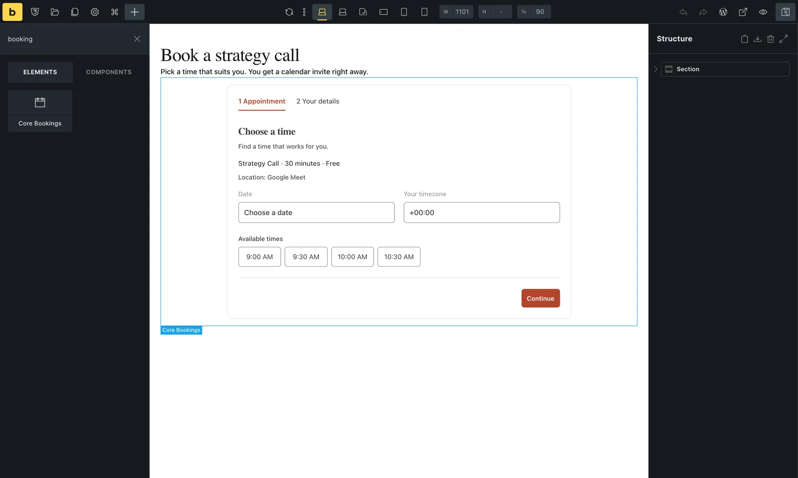
The element fills the width of its container, and the form centers itself up to its maximum width. Set a width on the element in Bricks to change that.
Choose the Service and Wording
Content and labels sets which service the form books and the words on each step.
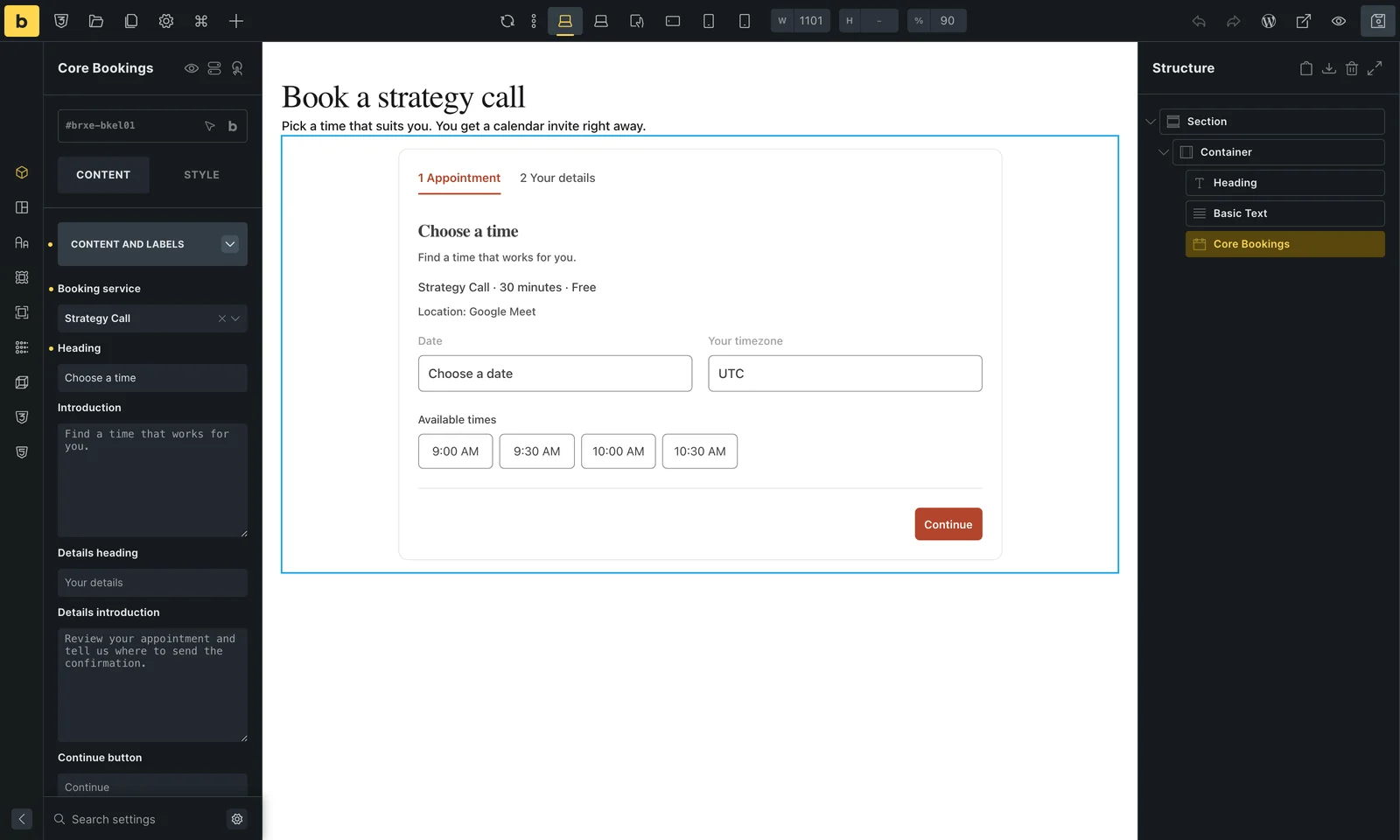
| Control | What it does |
|---|---|
| Booking service | One service, or All available services to let visitors choose. |
| Heading and Introduction | The title and text on the first step. |
| Details heading and Details introduction | The title and text on the step where visitors enter their name and email. |
| Continue button and Confirm button | Button labels. Leave Confirm empty to use the wording that matches the service, such as Request appointment for services that need approval. |
| Consent label | The checkbox text visitors tick before they book. |
| Confirmation heading and Confirmation message | What visitors see after booking. |
| No services message | Shown when there is nothing to book. |
Empty text fields use the default wording shown in grey. In the builder, the canvas shows a preview of the first step with your wording and colors. Times there are examples; the live page loads real availability.
Choose What the Form Shows
Display has four switches: the step indicator, the service summary (name, length and price), the service description and the service location. The first two are on by default.
Set Colors and Spacing
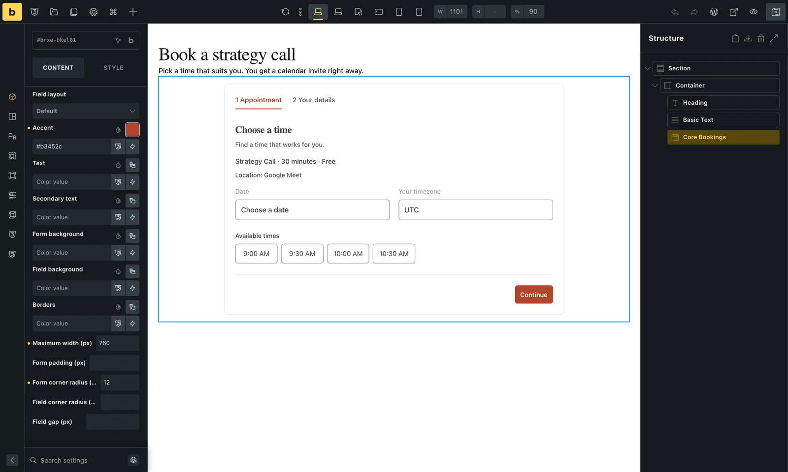
- Field layout: responsive columns, or a single column for narrow spaces.
- Accent, Text, Secondary text, Form background, Field background and Borders: the form’s colors. Button text switches between black and white to stay readable on the accent.
- Maximum width (280 to 1200px), Form padding, Form corner radius, Field corner radius and Field gap.
Pick colors as plain hex values. Bricks global colors and CSS variables are ignored by these controls. If you turned off the default form styles under Bookings → Settings, the form uses your theme’s styles and these controls have no effect.
What Visitors See
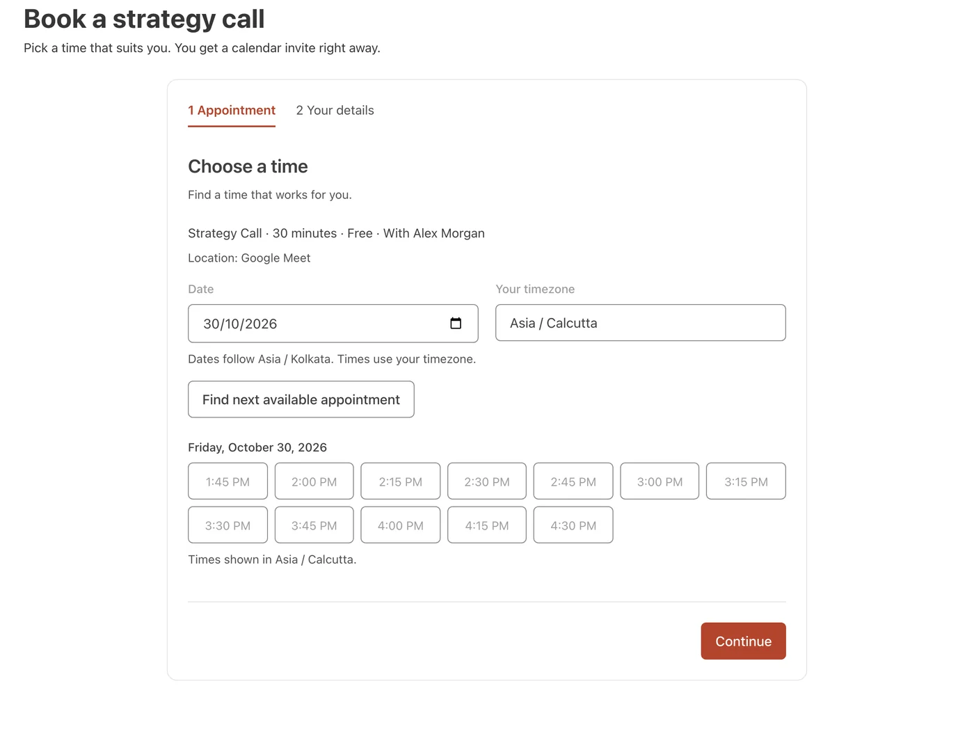
On the live page, the form loads available times for the chosen service in the visitor’s timezone, and the rest of the booking works exactly as it does with the block.
Good to Know
- The element works in Bricks templates, such as a header or a section template, as well as on pages.
- Elementor has the same element, as a Core Bookings widget in the General category.