126 Cool Tangible Loops & Logic Templates I Use in My Projects
I’ve spent years building WordPress sites. Hundreds of them. And the one plugin that changed how I approach layouts, dynamic content, and custom functionality is Tangible Loops & Logic. I’m not exaggerating when I say it’s become the backbone of almost every site I build.
If you’ve ever felt frustrated by WordPress limitations, if you’ve wished you could just write clean, readable templates without wrestling with PHP files, Tangible might be exactly what you need.
Here’s the thing. I use it for everything.
Service pages like this email automation services page.
Tools like HTML to GenerateBlocks converter and calculators.
Deal compilation pages, like the WordPress deals page.
Directory sites. (Not here but for my clients.)
Blog layouts.
You name it.
And today, I’m sharing some 126 templates I’ve built over the years that you can steal, modify, and use in your own projects.
What Is Tangible Loops & Logic?
Tangible Loops & Logic is a WordPress plugin that lets you create dynamic templates using a simple, HTML-like syntax. Think of it as a bridge between your content (stored in custom fields, posts, taxonomies) and your frontend design. Without writing PHP.
The syntax looks like this:
<Loop type=post count=6>
    <h2><Field title /></h2>
    <p><Field excerpt /></p>
</Loop>
That’s it. No WP_Query. No while have_posts(). Just clean, readable markup that pulls your content automatically.
How Tangible Fits Into Your WordPress Setup
If you’re already using ACF (Advanced Custom Fields) to structure your content, you know the frustration. You’ve got all this beautiful data sitting in custom fields, repeaters, and flexible content layouts. But displaying it? That usually means PHP templates, theme file edits, or yet another page builder.
Tangible is the missing piece. It reads your ACF fields, custom post types, and taxonomies directly. No PHP. No theme editing. Just clean template syntax that outputs exactly what you need.
Two Ways to Use Tangible
You’ve got options depending on how you work.
Option 1: The Template Block (Quick and Direct)
Tangible adds a block to the WordPress block editor called “Template.” Drop it into any page or post, and you get a code editor right there. Write your HTML, CSS (or SCSS if you prefer), and JavaScript. Use Tangible’s loop and logic tags to pull dynamic content.
This is great for one-off layouts. Need a custom hero section on just your homepage? Drop in a Template block, write the code, done. No extra files to manage.
Option 2: Reusable Templates (The Smarter Way)
For layouts you’ll use more than once, create a saved template. Go to Tangible → Templates and add a new template in your WordPress dashboard. Give it a name, write your code, and save.
Now you can use that template anywhere:
- As a Gutenberg block – Search for your saved template in the Tangible Template block. (See screenshot below)
- As a shortcode – Use
[template name=my-template]in classic editor, widgets, or anywhere shortcodes work - Inside other templates – Nest templates for modular, maintainable code
I use saved templates for everything. Headers, footers, blog grids, author bios, schema markup. Build once, use everywhere. When you need to update something, you change it in one place.
What You Can Pull Into Templates
Here’s where it gets powerful. Tangible can access:
- Post data – Title, content, excerpt, featured image, publish date, author
- Custom fields – Any ACF field type (text, image, repeater, flexible content, gallery, relationship, you name it)
- Custom post types – Portfolio items, testimonials, team members, products, whatever you’ve registered
- Taxonomies – Categories, tags, and any custom taxonomy you’ve created
- User data – Author info, avatars, bios, custom user fields
- Site data – Site name, URL, logo, tagline
- Menu data – Navigation menus registered in WordPress
- Query parameters – URL variables, search terms, pagination
Basically, if WordPress knows about it, Tangible can display it.
A Quick Example
Say you have a “testimonial” custom post type with ACF fields for client_name, company, quote, and client_photo. Here’s how you’d loop through and display them:
<Loop type=testimonial count=6 orderby=date order=desc>
  <div class="testimonial-card">
    <If field=client_photo>
      <img src="{Field client_photo size=thumbnail}" alt="{Field client_name}">
    </If>
    <blockquote>{Field quote}</blockquote>
    <p class="client-info">
      <strong>{Field client_name}</strong>
      <If field=company>, {Field company}</If>
    </p>
  </div>
</Loop>
Again, see? No PHP. No WP_Query. No get_field() calls. The syntax reads almost like plain English.
The <Loop> tag queries your testimonials. The <Field> tags pull the custom field values. The <If> tags handle conditional logic (only show the photo if one exists, only show the company if it’s filled in).
This is the pattern you’ll see in every template throughout this article series. Once it clicks, you can build almost anything.
Why I Switched to Tangible
Before Tangible, I had two choices for custom layouts:
- Write PHP templates (slow, error-prone, hard to maintain)
- Use page builders (bloated, slow, lock-in nightmare)
Tangible sits right in the middle at the point of bliss. You get the flexibility of custom code with the simplicity of templating. And because templates are stored in the WordPress database, you can version them, export them, and reuse them across projects.
I love that I can hand off a site to a client and they won’t accidentally break the template by editing PHP files. The templates live in their own admin area. Clean separation.
The Syntax Basics
Before we look at the templates, let’s cover the fundamentals. Tangible uses XML-style tags that WordPress interprets at runtime.
The Loop Tag
The <Loop> tag is where everything starts. It queries content from WordPress and iterates through results.
<Loop type=post count=6 orderby=date order=DESC>
    <!-- Your template for each post -->
</Loop>
You can loop through:
- Posts (
type=post) - Pages (
type=page) - Custom post types (
type=portfolio,type=product, etc.) - Users (
type=user) - ACF repeater fields (
field=team_members) - Taxonomy terms (
type=taxonomy taxonomy=category)
The Field Tag
The <Field> tag pulls data from the current item in the loop.
<Field title />
<Field excerpt words=20 />
<Field publish_date date_format="M j, Y" />
<Field image_url size=medium />
It works with native WordPress fields and ACF fields. If you have an ACF field called hero_subtitle, you just use <Field hero_subtitle />.
The If Tag
Conditional logic is dead simple:
<If field=featured_image>
    <img src="{Field featured_image size=large}" alt="">
<Else />
    <div class="placeholder">No image</div>
</If>
You can check if fields exist, compare values, and nest conditions.
Shortcode Integration
Tangible templates are called using shortcodes:
[template name=my-template]This means you can drop templates into any post, page, widget, or block. Flexibility is baked in.
My Template Library Structure
I organize templates into categories based on their purpose. Over the years, I’ve built up a library that covers almost every layout situation. From this library, I will be sharing 126 of the more common templates that you can easily copy-paste inside Tangible Loops & Logic plugin.
Let’s start with the ones I use most repeatedly.
Hero Section Templates
Hero sections make or break first impressions. I’ve built three variations that cover 90% of my projects.
Template 1: Centered Hero with CTA
This is my go-to for landing pages, product pages, and service pages. Clean, focused, and works on every screen size.
<!-- Hero: Centered with CTA

     Usage: [template name=hero-centered]

     BEM Block: .hero with --centered modifier

-->


<style>

/* Hero Block */

.hero {

    padding: 5rem 1.5rem;

    position: relative;

}


.hero--centered {

    text-align: center;

    background: linear-gradient(135deg, #f8fafc 0%, #e2e8f0 100%);

}


.hero__container {

    max-width: 800px;

    margin-inline: auto;

}


/* Badge Element */

.hero__badge {

    display: inline-flex;

    align-items: center;

    gap: 0.5rem;

    padding: 0.5rem 1rem;

    background: #fff;

    border-radius: 100px;

    font-size: 0.875rem;

    font-weight: 600;

    color: #6366f1;

    box-shadow: 0 1px 3px rgba(0,0,0,0.1);

    margin-bottom: 1.5rem;

}


.hero__badge-icon {

    width: 16px;

    height: 16px;

}


/* Title Element */

.hero__title {

    font-size: clamp(2.25rem, 5vw, 3.75rem);

    font-weight: 800;

    line-height: 1.1;

    letter-spacing: -0.02em;

    color: #0f172a;

    margin: 0 0 1.5rem;

}


/* Subtitle Element */

.hero__subtitle {

    font-size: clamp(1.125rem, 2vw, 1.375rem);

    line-height: 1.6;

    color: #475569;

    margin: 0 0 2rem;

    max-width: 600px;

    margin-inline: auto;

}


/* Actions Element */

.hero__actions {

    display: flex;

    flex-wrap: wrap;

    gap: 1rem;

    justify-content: center;

    margin-bottom: 2rem;

}


/* Button Element */

.hero__button {

    display: inline-flex;

    align-items: center;

    gap: 0.5rem;

    padding: 1rem 2rem;

    font-size: 1rem;

    font-weight: 600;

    text-decoration: none;

    border-radius: 8px;

    transition: all 0.2s ease;

    cursor: pointer;

    border: 2px solid transparent;

}


.hero__button--primary {

    background: #0f172a;

    color: #fff;

}


.hero__button--primary:hover {

    background: #1e293b;

    transform: translateY(-2px);

    box-shadow: 0 4px 12px rgba(15, 23, 42, 0.3);

}


.hero__button--outline {

    background: transparent;

    color: #0f172a;

    border-color: #cbd5e1;

}


.hero__button--outline:hover {

    border-color: #0f172a;

    background: #fff;

}


.hero__button-icon {

    width: 16px;

    height: 16px;

    transition: transform 0.2s ease;

}


.hero__button--primary:hover .hero__button-icon {

    transform: translateX(4px);

}


/* Note Element */

.hero__note {

    display: inline-flex;

    align-items: center;

    gap: 0.5rem;

    font-size: 0.875rem;

    color: #64748b;

    margin: 0;

}


.hero__note-icon {

    width: 14px;

    height: 14px;

    color: #22c55e;

}


/* Responsive */

@media (max-width: 640px) {

    .hero {

        padding: 3rem 1rem;

    }


    .hero__actions {

        flex-direction: column;

        align-items: center;

    }


    .hero__button {

        width: 100%;

        justify-content: center;

    }

}

</style>


<section class="hero hero--centered" aria-labelledby="hero-heading">

    <div class="hero__container">


        <span class="hero__badge">

            <svg class="hero__badge-icon" viewBox="0 0 24 24" fill="none" stroke="currentColor" stroke-width="2" aria-hidden="true">

                <polygon points="12 2 15.09 8.26 22 9.27 17 14.14 18.18 21.02 12 17.77 5.82 21.02 7 14.14 2 9.27 8.91 8.26 12 2"/>

            </svg>

            New Release

        </span>


        <h1 class="hero__title" id="hero-heading">

            Build Beautiful Websites Without Code

        </h1>


        <p class="hero__subtitle">

            Create stunning, responsive layouts using our intuitive template system.

            No coding required. Just drag, drop, and customize.

        </p>


        <div class="hero__actions">

            <a href="/get-started/" class="hero__button hero__button--primary">

                Get Started Free

                <svg class="hero__button-icon" viewBox="0 0 24 24" fill="none" stroke="currentColor" stroke-width="2.5" aria-hidden="true">

                    <path d="M5 12h14M12 5l7 7-7 7"/>

                </svg>

            </a>

            <a href="/demo/" class="hero__button hero__button--outline">

                Watch Demo

            </a>

        </div>


        <p class="hero__note">

            <svg class="hero__note-icon" viewBox="0 0 24 24" fill="none" stroke="currentColor" stroke-width="2" aria-hidden="true">

                <path d="M22 11.08V12a10 10 0 1 1-5.93-9.14"/>

                <polyline points="22 4 12 14.01 9 11.01"/>

            </svg>

            Free forever. No credit card required.

        </p>


    </div>

</section>
What makes this template work:
The BEM naming convention keeps CSS predictable. Every element is namespaced under .hero__, so there’s zero chance of style conflicts with other templates. The badge at the top grabs attention. The clamp() function handles responsive typography automatically. And the dual CTA (primary + outline) gives visitors a clear path forward.
I use this exact layout on service pages where I want to make a strong first impression and funnel people toward a conversion action.
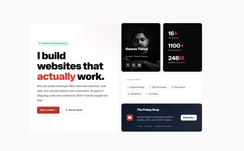
I have rather customized it to highest extent for gauravtiwari.org:
<section class="hero" id="top">

    <div class="hero__inner">


        <!-- Main Grid -->

        <div class="hero__grid">


            <!-- Primary Content - Large Left Block -->

            <div class="hero__primary">

                <div class="hero__badge">

                    <span class="hero__badge-dot"></span>

                    Available for projects from Jan '26

                </div>


                <h1 class="hero__headline">

                    I build websites that <em>actually</em> work.

                </h1>


                <p class="hero__lead">

                    Not just pretty mockups. Real sites that load fast, rank well, and convert visitors into customers.

                    16 years of shipping code and content for 800+ brands taught me that.

                </p>


                <div class="hero__cta-row">

                    <a href="/services/" class="hero__btn hero__btn--primary">

                        <span>Start a project</span>

                        <i class="md-icon-angle-right" aria-hidden="true"></i>

                    </a>

                    <a href="/work/" class="hero__btn hero__btn--ghost">

                        <i class="md-icon-eye" aria-hidden="true"></i>

                        <span>See my works</span>

                    </a>

                </div>

            </div>


            <!-- Profile Card with Photo Background -->

            <div class="hero__profile-card">

                <div class="hero__profile-image">

                    <img src="https://r2.gauravtiwari.org/wp-content/uploads/2025/12/gaurav-tiwari-gray-photo.jpeg"

                        alt="Gaurav Tiwari" loading="eager" width="280" height="350">

                </div>

                <div class="hero__profile-overlay">

                    <div class="hero__profile-info">

                        <p class="hero__profile-name">Gaurav Tiwari</p>

                        <p class="hero__profile-title">Developer · Educator · Marketer</p>

                    </div>

                    <div class="hero__profile-links">

                        <a href="https://x.com/wpgaurav" class="hero__social" aria-label="Follow on X (Twitter)">

                            <i class="md-icon-twitter" aria-hidden="true"></i>

                        </a>

                        <a href="https://github.com/wpgaurav" class="hero__social" aria-label="View GitHub profile">

                            <i class="md-icon-github" aria-hidden="true"></i>

                        </a>

                        <a href="https://linkedin.com/in/wpgaurav" class="hero__social" aria-label="Connect on LinkedIn">

                            <i class="md-icon-linkedin" aria-hidden="true"></i>

                        </a>

                    </div>

                </div>

            </div>


            <!-- Stats Block -->

            <div class="hero__stats-block">

                <div class="hero__stat">

                    <span class="hero__stat-num">16<span class="hero__stat-plus">+</span></span>

                    <span class="hero__stat-label">Years shipping</span>

                </div>

                <div class="hero__stat">

                    <span class="hero__stat-num">1100<span class="hero__stat-plus">+</span></span>

                    <span class="hero__stat-label">Projects delivered</span>

                </div>

                <div class="hero__stat">

                    <span class="hero__stat-num">248<span class="hero__stat-unit">M</span></span>

                    <span class="hero__stat-label">Aggregate impressions</span>

                </div>

            </div>


            <!-- Services Quick Links -->

            <div class="hero__services">

                <p class="hero__services-label">I can help with</p>

                <div class="hero__services-list">

                    <a href="#services" class="hero__service">

                        <i class="md-icon-bolt" aria-hidden="true"></i>

                        <span>Digital Strategy</span>

                    </a>

                    <a href="#services" class="hero__service">

                        <i class="md-icon-search" aria-hidden="true"></i>

                        <span>SEO & Content</span>

                    </a>

                    <a href="#services" class="hero__service">

                        <i class="md-icon-fire" aria-hidden="true"></i>

                        <span>Site Speed</span>

                    </a>

                    <a href="#services" class="hero__service">

                        <i class="md-icon-wordpress" aria-hidden="true"></i>

                        <span>WordPress</span>

                    </a>

                    <a href="#services" class="hero__service">

                        <i class="md-icon-star" aria-hidden="true"></i>

                        <span>And More</span>

                    </a>

                </div>

            </div>


            <!-- Newsletter Block -->

            <a href="https://gauravtiwari.substack.com" class="hero__newsletter">

                <div class="hero__newsletter-icon">

                    <i class="md-icon-mail-alt" aria-hidden="true"></i>

                </div>

                <div class="hero__newsletter-content">

                    <p class="hero__newsletter-title">The Friday Drop</p>

                    <p class="hero__newsletter-desc">Weekly insights on WordPress, SEO & building online. Join 5,000+ readers.</p>

                    <div class="hero__newsletter-features">

                        <span><i class="md-icon-ok" aria-hidden="true"></i> Free</span>

                        <span><i class="md-icon-ok" aria-hidden="true"></i> No spam</span>

                        <span><i class="md-icon-ok" aria-hidden="true"></i> Unsubscribe anytime</span>

                    </div>

                </div>

                <span class="hero__newsletter-cta">

                    Subscribe

                    <i class="md-icon-angle-right" aria-hidden="true"></i>

                </span>

            </a>


        </div>


    </div>

</section>
This uses MD-theme framework and some extra CSS code.
/* ==========================================================================
Hero Section - Modern Bento Grid
========================================================================== */
.hero {
background: #fafafa;
min-height: calc(100svh - var(--header-height));
display: flex;
align-items: center;
padding-block: var(--space-xl);
position: relative;
overflow: hidden;
}
/* Refined noise texture overlay */
.hero::before {
content: '';
position: absolute;
inset: 0;
background-image: url("data:image/svg+xml,%3Csvg viewBox='0 0 200 200' xmlns='http://www.w3.org/2000/svg'%3E%3Cfilter id='noise'%3E%3CfeTurbulence type='fractalNoise' baseFrequency='0.65' numOctaves='3' stitchTiles='stitch'/%3E%3C/filter%3E%3Crect width='100%25' height='100%25' filter='url(%23noise)'/%3E%3C/svg%3E");
opacity: 0.03;
pointer-events: none;
}
/* Inner container */
.hero__inner {
position: relative;
max-width: var(--max);
width: 100%;
margin-inline: auto;
padding-inline: var(--space-s);
}
/* ==========================================================================
Bento Grid Layout
========================================================================== */
.hero__grid {
display: grid;
grid-template-columns: 1fr 300px 300px;
grid-template-rows: auto auto auto;
gap: var(--space-s);
grid-template-areas:
"primary profile stats"
"primary services services"
"primary newsletter newsletter";
}
/* ==========================================================================
Primary Content Block
========================================================================== */
.hero__primary {
grid-area: primary;
background: white;
border: 1px solid rgba(0, 0, 0, 0.06);
border-radius: var(--radius-l);
padding: var(--space-xl);
display: flex;
flex-direction: column;
justify-content: center;
animation: heroFadeIn 0.6s ease-out both;
position: relative;
overflow: hidden;
}
/* Subtle gradient glow on primary card */
.hero__primary::after {
content: '';
position: absolute;
top: -50%;
right: -50%;
width: 100%;
height: 100%;
background: radial-gradient(circle, color-mix(in srgb, var(--accent-color-primary) 8%, transparent) 0%, transparent 70%);
pointer-events: none;
}
/* Availability Badge */
.hero__badge {
position: relative;
z-index: 1;
display: inline-flex;
align-items: center;
gap: 0.5rem;
width: fit-content;
padding: 0.5rem 1rem;
font-size: var(--fs-xs);
font-weight: 600;
color: #059669;
background: linear-gradient(135deg, #ecfdf5 0%, #d1fae5 100%);
border: 1px solid #a7f3d0;
border-radius: var(--radius-full);
margin-block-end: var(--space-l);
}
.hero__badge-dot {
width: 8px;
height: 8px;
background: #10b981;
border-radius: 50%;
animation: heroPulse 2s ease-in-out infinite;
box-shadow: 0 0 0 3px rgba(16, 185, 129, 0.2);
}
/* Headline */
.hero__headline {
position: relative;
z-index: 1;
font-size: var(--fs-4xl);
font-weight: 900;
line-height: 1.05;
letter-spacing: -0.035em;
color: #0a0a0a;
margin-block-end: var(--space-m);
max-width: 16ch;
text-wrap: balance;
}
.hero__headline em {
font-style: normal;
background: linear-gradient(135deg, var(--accent-color-primary) 0%, #e74c3c 100%);
-webkit-background-clip: text;
background-clip: text;
color: transparent;
position: relative;
}
/* Lead Text */
.hero__lead {
position: relative;
z-index: 1;
font-size: var(--fs-m);
line-height: 1.7;
color: #4b5563;
max-width: 44ch;
margin-block-end: var(--space-l);
}
/* CTA Row */
.hero__cta-row {
position: relative;
z-index: 1;
display: flex;
align-items: center;
flex-wrap: wrap;
gap: var(--space-s);
}
/* ==========================================================================
Buttons
========================================================================== */
.hero__btn {
display: inline-flex;
align-items: center;
justify-content: center;
gap: 0.5rem;
padding: 0.875rem 1.5rem;
font-size: var(--fs-s);
font-weight: 600;
text-decoration: none;
border-radius: var(--radius-m);
transition: all 0.2s ease;
cursor: pointer;
}
.hero__btn--primary {
color: #fff;
background: linear-gradient(135deg, var(--accent-color-primary) 0%, #a93226 100%);
border: none;
box-shadow:
var(--button-shadow),
0 4px 16px color-mix(in srgb, var(--accent-color-primary) 30%, transparent);
}
.hero__btn--primary:hover {
transform: translateY(-2px);
box-shadow:
var(--button-shadow),
0 8px 24px color-mix(in srgb, var(--accent-color-primary) 40%, transparent);
}
.hero__btn--primary:active {
transform: translateY(0);
}
.hero__btn--ghost {
color: #374151;
background: transparent;
border: 1.5px solid #d1d5db;
}
.hero__btn--ghost:hover {
color: var(--accent-color-primary);
border-color: var(--accent-color-primary);
background: color-mix(in srgb, var(--accent-color-primary) 5%, transparent);
}
.hero__btn:focus-visible {
outline: 2px solid var(--accent-color-primary);
outline-offset: 2px;
}
/* ==========================================================================
Profile Card with Photo
========================================================================== */
.hero__profile-card {
grid-area: profile;
border-radius: var(--radius-l);
overflow: hidden;
position: relative;
animation: heroFadeIn 0.6s ease-out 0.1s both;
aspect-ratio: 4/5;
}
.hero__profile-image {
position: absolute;
inset: 0;
}
.hero__profile-image img {
width: 100%;
height: 100%;
object-fit: cover;
object-position: center top;
filter: grayscale(100%);
transition: filter 0.4s ease;
}
.hero__profile-card:hover .hero__profile-image img {
filter: grayscale(30%);
}
.hero__profile-overlay {
position: absolute;
inset: 0;
background: linear-gradient(to top, rgba(0,0,0,0.85) 0%, rgba(0,0,0,0.4) 40%, transparent 70%);
display: flex;
flex-direction: column;
justify-content: flex-end;
padding: var(--space-m);
}
.hero__profile-info {
margin-bottom: var(--space-xs);
}
.hero__profile-name {
font-size: var(--fs-l);
font-weight: 800;
color: #fff;
margin: 0 0 0.25rem 0;
letter-spacing: -0.01em;
}
.hero__profile-title {
font-size: var(--fs-xs);
font-weight: 500;
color: rgba(255,255,255,0.7);
margin: 0;
}
.hero__profile-links {
display: flex;
gap: 0.5rem;
}
.hero__social {
display: flex;
align-items: center;
justify-content: center;
width: 36px;
height: 36px;
color: rgba(255,255,255,0.8);
background: rgba(255,255,255,0.1);
border-radius: var(--radius-s);
transition: all 0.2s ease;
backdrop-filter: blur(4px);
border: 1px solid rgba(255,255,255,0.1);
}
.hero__social:hover {
color: #fff;
background: var(--accent-color-primary);
transform: translateY(-2px);
}
.hero__social:focus-visible {
outline: 2px solid #fff;
outline-offset: 2px;
}
/* ==========================================================================
Stats Block
========================================================================== */
.hero__stats-block {
grid-area: stats;
background: #0a0a0a;
border-radius: var(--radius-l);
padding: var(--space-l);
display: flex;
flex-direction: column;
justify-content: center;
gap: var(--space-m);
animation: heroFadeIn 0.6s ease-out 0.15s both;
position: relative;
overflow: hidden;
}
/* Subtle accent line */
.hero__stats-block::before {
content: '';
position: absolute;
top: 0;
left: 0;
width: 4px;
height: 100%;
background: linear-gradient(to bottom, var(--accent-color-primary), transparent);
}
.hero__stat {
display: flex;
flex-direction: column;
gap: 0.125rem;
}
.hero__stat-num {
font-size: var(--fs-2xl);
font-weight: 700;
letter-spacing: -0.02em;
color: #fff;
line-height: 1;
font-variant-numeric: tabular-nums;
}
.hero__stat-plus,
.hero__stat-unit {
color: var(--accent-color-primary);
font-weight: 700;
}
.hero__stat-label {
font-size: var(--fs-xs);
font-weight: 500;
color: #9ca3af;
}
/* ==========================================================================
Services Block
========================================================================== */
.hero__services {
grid-area: services;
background: white;
border: 1px solid rgba(0, 0, 0, 0.06);
border-radius: var(--radius-l);
padding: var(--space-m);
animation: heroFadeIn 0.6s ease-out 0.2s both;
}
.hero__services-label {
font-size: var(--fs-xs);
font-weight: 700;
text-transform: uppercase;
letter-spacing: 0.06em;
color: #9ca3af;
margin-block-end: var(--space-s);
}
.hero__services-list {
display: flex;
flex-wrap: wrap;
gap: 0.5rem;
}
.hero__service {
display: inline-flex;
align-items: center;
gap: 0.5rem;
padding: 0.5rem 0.875rem;
font-size: var(--fs-s);
font-weight: 500;
color: #4b5563;
background: #f9fafb;
border: 1px solid #e5e7eb;
border-radius: var(--radius-full);
text-decoration: none;
transition: all 0.2s ease;
}
.hero__service [class*="md-icon"] {
font-size: 1rem;
color: #9ca3af;
transition: color 0.2s ease;
}
.hero__service:hover {
color: var(--accent-color-primary);
border-color: color-mix(in srgb, var(--accent-color-primary) 40%, transparent);
background: color-mix(in srgb, var(--accent-color-primary) 5%, white);
transform: translateY(-1px);
}
.hero__service:hover [class*="md-icon"] {
color: var(--accent-color-primary);
}
/* ==========================================================================
Newsletter Block
========================================================================== */
.hero__newsletter {
grid-area: newsletter;
background: linear-gradient(135deg, #0f172a 0%, #1e293b 100%);
border-radius: var(--radius-l);
padding: var(--space-m) var(--space-l);
display: flex;
align-items: center;
gap: var(--space-m);
text-decoration: none;
transition: all 0.2s ease;
animation: heroFadeIn 0.6s ease-out 0.25s both;
position: relative;
overflow: hidden;
}
.hero__newsletter::before {
content: '';
position: absolute;
top: -50%;
right: -20%;
width: 200px;
height: 200px;
background: radial-gradient(circle, rgba(192, 57, 43, 0.15) 0%, transparent 70%);
pointer-events: none;
}
.hero__newsletter:hover {
transform: translateY(-2px);
box-shadow: 0 12px 40px rgba(0, 0, 0, 0.25);
}
.hero__newsletter-icon {
display: flex;
align-items: center;
justify-content: center;
width: 48px;
height: 48px;
background: var(--accent-color-primary);
border-radius: var(--radius-m);
color: #fff;
font-size: var(--fs-l);
flex-shrink: 0;
}
.hero__newsletter-content {
flex: 1;
min-width: 0;
}
.hero__newsletter-title {
font-size: var(--fs-m);
font-weight: 800;
color: #fff;
margin: 0 0 0.25rem 0;
}
.hero__newsletter-desc {
font-size: var(--fs-s);
color: rgba(255, 255, 255, 0.6);
margin: 0 0 0.5rem 0;
line-height: 1.4;
}
.hero__newsletter-features {
display: flex;
flex-wrap: wrap;
gap: 0.75rem;
}
.hero__newsletter-features span {
display: inline-flex;
align-items: center;
gap: 0.25rem;
font-size: var(--fs-xs);
color: rgba(255, 255, 255, 0.5);
}
.hero__newsletter-features i {
color: #10b981;
font-size: 0.75rem;
}
.hero__newsletter-cta {
display: inline-flex;
align-items: center;
gap: 0.375rem;
padding: 0.625rem 1rem;
font-size: var(--fs-s);
font-weight: 700;
color: #0f172a;
background: #fff;
border-radius: var(--radius-m);
flex-shrink: 0;
transition: all 0.2s ease;
}
.hero__newsletter:hover .hero__newsletter-cta {
background: #f1f5f9;
}
.hero__newsletter-cta i {
font-size: 0.875rem;
transition: transform 0.2s ease;
}
.hero__newsletter:hover .hero__newsletter-cta i {
transform: translateX(2px);
}
/* ==========================================================================
Animations
========================================================================== */
@keyframes heroFadeIn {
from {
opacity: 0;
transform: translateY(20px);
}
to {
opacity: 1;
transform: translateY(0);
}
}
@keyframes heroPulse {
0%, 100% {
opacity: 1;
transform: scale(1);
}
50% {
opacity: 0.6;
transform: scale(1.15);
}
}
/* ==========================================================================
Responsive Styles
========================================================================== */
@media (max-width: 1200px) {
.hero__grid {
grid-template-columns: 1fr 1fr;
grid-template-areas:
"primary primary"
"profile stats"
"services services"
"newsletter newsletter";
}
.hero__profile-card {
aspect-ratio: 3/4;
}
.hero__stats-block {
flex-direction: row;
justify-content: space-around;
}
.hero__stats-block::before {
width: 100%;
height: 4px;
top: 0;
left: 0;
background: linear-gradient(to right, var(--accent-color-primary), transparent);
}
.hero__stat {
align-items: center;
text-align: center;
}
}
@media (max-width: 768px) {
.hero {
min-height: auto;
padding-block: var(--space-m);
}
.hero__inner {
padding-inline: var(--space-s);
}
.hero__grid {
grid-template-columns: 1fr;
grid-template-areas:
"profile"
"primary"
"stats"
"services"
"newsletter";
gap: 0.75rem;
}
/* Profile card - compact on mobile */
.hero__profile-card {
aspect-ratio: 2/1;
max-height: 200px;
border-radius: var(--radius-m);
}
.hero__profile-image img {
object-position: center 30%;
}
.hero__profile-overlay {
padding: var(--space-s);
flex-direction: row;
align-items: flex-end;
justify-content: space-between;
background: linear-gradient(to top, rgba(0,0,0,0.9) 0%, rgba(0,0,0,0.4) 60%, transparent 100%);
}
.hero__profile-info {
margin-bottom: 0;
}
.hero__profile-name {
font-size: var(--fs-m);
}
.hero__profile-title {
font-size: 0.6875rem;
}
.hero__profile-links {
gap: 0.375rem;
}
.hero__social {
width: 32px;
height: 32px;
font-size: 0.875rem;
}
/* Primary content */
.hero__primary {
padding: var(--space-m);
border-radius: var(--radius-m);
}
.hero__badge {
padding: 0.375rem 0.75rem;
margin-block-end: var(--space-s);
}
.hero__headline {
font-size: var(--fs-2xl);
margin-block-end: var(--space-s);
}
.hero__lead {
font-size: var(--fs-s);
margin-block-end: var(--space-m);
line-height: 1.6;
}
.hero__cta-row {
display: grid;
grid-template-columns: 1fr 1fr;
gap: 0.625rem;
}
.hero__btn {
padding: 0.75rem 1rem;
font-size: var(--fs-s);
}
.hero__btn--primary i {
display: none;
}
/* Stats - clean horizontal */
.hero__stats-block {
flex-direction: row;
justify-content: space-around;
padding: var(--space-s) var(--space-m);
border-radius: var(--radius-m);
gap: 0;
}
.hero__stats-block::before {
height: 3px;
}
.hero__stat {
align-items: center;
text-align: center;
flex: 1;
}
.hero__stat-num {
font-size: var(--fs-xl);
}
.hero__stat-label {
font-size: 0.625rem;
text-transform: uppercase;
letter-spacing: 0.02em;
}
/* Services - horizontal scroll */
.hero__services {
padding: var(--space-s);
border-radius: var(--radius-m);
overflow: hidden;
}
.hero__services-label {
margin-block-end: 0.5rem;
padding-inline: 0.25rem;
}
.hero__services-list {
display: flex;
flex-wrap: nowrap;
overflow-x: auto;
gap: 0.5rem;
padding-bottom: 0.25rem;
margin-inline: -0.25rem;
padding-inline: 0.25rem;
scrollbar-width: none;
-ms-overflow-style: none;
}
.hero__services-list::-webkit-scrollbar {
display: none;
}
.hero__service {
flex-shrink: 0;
padding: 0.375rem 0.625rem;
font-size: var(--fs-xs);
}
.hero__service [class*="md-icon"] {
font-size: 0.875rem;
}
/* Newsletter - stacked mobile layout */
.hero__newsletter {
flex-direction: column;
align-items: stretch;
padding: var(--space-m);
gap: var(--space-s);
border-radius: var(--radius-m);
}
.hero__newsletter-icon {
display: none;
}
.hero__newsletter-title {
font-size: var(--fs-l);
}
.hero__newsletter-title::before {
content: '';
display: inline-block;
width: 28px;
height: 28px;
background: var(--accent-color-primary);
border-radius: var(--radius-s);
margin-right: 0.5rem;
vertical-align: middle;
background-image: url("data:image/svg+xml,%3Csvg xmlns='http://www.w3.org/2000/svg' viewBox='0 0 24 24' fill='white'%3E%3Cpath d='M20 4H4c-1.1 0-2 .9-2 2v12c0 1.1.9 2 2 2h16c1.1 0 2-.9 2-2V6c0-1.1-.9-2-2-2zm0 4l-8 5-8-5V6l8 5 8-5v2z'/%3E%3C/svg%3E");
background-size: 16px;
background-repeat: no-repeat;
background-position: center;
}
.hero__newsletter-desc {
font-size: var(--fs-xs);
margin-bottom: 0.375rem;
}
.hero__newsletter-features {
gap: 0.5rem 1rem;
}
.hero__newsletter-features span {
font-size: 0.6875rem;
}
.hero__newsletter-cta {
width: 100%;
justify-content: center;
padding: 0.75rem 1rem;
margin-top: 0.25rem;
}
}
@media (max-width: 380px) {
.hero__inner {
padding-inline: 0.75rem;
}
.hero__headline {
font-size: var(--fs-xl);
}
.hero__cta-row {
grid-template-columns: 1fr;
}
.hero__profile-card {
aspect-ratio: 16/9;
}
}
/* ==========================================================================
Reduced Motion
========================================================================== */
@media (prefers-reduced-motion: reduce) {
.hero__primary,
.hero__profile-card,
.hero__stats-block,
.hero__services,
.hero__newsletter {
animation: none;
}
.hero__badge-dot {
animation: none;
}
}Template 2: Split Hero with Image
When you need a hero that shows off a product, dashboard, or screenshot, the split layout is your friend.
<!-- Hero: Split Layout with Image

     Usage: [template name=hero-split]

     BEM Block: .hero with --split modifier

-->


<style>

/* Hero Block - Split */

.hero--split {

    padding: 4rem 1.5rem;

    background: #fff;

}


.hero__grid {

    display: grid;

    grid-template-columns: 1fr 1fr;

    gap: 4rem;

    align-items: center;

    max-width: 1200px;

    margin-inline: auto;

}


.hero__content {

    max-width: 560px;

}


/* Eyebrow Element */

.hero__eyebrow {

    display: inline-block;

    font-size: 0.875rem;

    font-weight: 600;

    text-transform: uppercase;

    letter-spacing: 0.1em;

    color: #6366f1;

    margin-bottom: 1rem;

}


/* Title Element */

.hero__title {

    font-size: clamp(2rem, 4vw, 3rem);

    font-weight: 800;

    line-height: 1.15;

    letter-spacing: -0.02em;

    color: #0f172a;

    margin: 0 0 1.25rem;

}


/* Description Element */

.hero__description {

    font-size: 1.125rem;

    line-height: 1.7;

    color: #475569;

    margin: 0 0 1.5rem;

}


/* Features List */

.hero__features {

    list-style: none;

    padding: 0;

    margin: 0 0 2rem;

    display: flex;

    flex-direction: column;

    gap: 0.75rem;

}


.hero__feature {

    display: flex;

    align-items: center;

    gap: 0.75rem;

    font-size: 1rem;

    color: #334155;

}


.hero__feature-icon {

    width: 20px;

    height: 20px;

    color: #22c55e;

    flex-shrink: 0;

}


/* Actions Element */

.hero__actions {

    display: flex;

    flex-wrap: wrap;

    gap: 1rem;

}


/* Button Element */

.hero__button {

    display: inline-flex;

    align-items: center;

    gap: 0.5rem;

    padding: 0.875rem 1.75rem;

    font-size: 1rem;

    font-weight: 600;

    text-decoration: none;

    border-radius: 8px;

    transition: all 0.2s ease;

    cursor: pointer;

    border: 2px solid transparent;

}


.hero__button--primary {

    background: #6366f1;

    color: #fff;

}


.hero__button--primary:hover {

    background: #4f46e5;

    transform: translateY(-2px);

    box-shadow: 0 4px 12px rgba(99, 102, 241, 0.4);

}


.hero__button--ghost {

    background: transparent;

    color: #475569;

    padding-left: 0;

    padding-right: 0;

}


.hero__button--ghost:hover {

    color: #0f172a;

}


/* Media Element */

.hero__media {

    position: relative;

}


.hero__image-wrapper {

    margin: 0;

    border-radius: 16px;

    overflow: hidden;

    box-shadow: 0 25px 50px -12px rgba(0, 0, 0, 0.15);

}


.hero__image {

    display: block;

    width: 100%;

    height: auto;

}


/* Responsive */

@media (max-width: 900px) {

    .hero__grid {

        grid-template-columns: 1fr;

        gap: 3rem;

    }


    .hero__content {

        order: 2;

        max-width: 100%;

        text-align: center;

    }


    .hero__media {

        order: 1;

    }


    .hero__features {

        align-items: center;

    }


    .hero__actions {

        justify-content: center;

    }

}


@media (max-width: 640px) {

    .hero--split {

        padding: 3rem 1rem;

    }


    .hero__actions {

        flex-direction: column;

        width: 100%;

    }


    .hero__button {

        justify-content: center;

    }


    .hero__button--ghost {

        padding-left: 1.75rem;

        padding-right: 1.75rem;

    }

}

</style>


<section class="hero hero--split" aria-labelledby="hero-split-heading">

    <div class="hero__grid">


        <div class="hero__content">

            <span class="hero__eyebrow">Welcome to Our Platform</span>


            <h1 class="hero__title" id="hero-split-heading">

                Transform Your Digital Experience

            </h1>


            <p class="hero__description">

                Leverage cutting-edge technology to streamline your workflow,

                boost productivity, and achieve remarkable results.

            </p>


            <ul class="hero__features">

                <li class="hero__feature">

                    <svg class="hero__feature-icon" viewBox="0 0 24 24" fill="none" stroke="currentColor" stroke-width="2" aria-hidden="true">

                        <path d="M22 11.08V12a10 10 0 1 1-5.93-9.14"/>

                        <polyline points="22 4 12 14.01 9 11.01"/>

                    </svg>

                    Lightning-fast performance

                </li>

                <li class="hero__feature">

                    <svg class="hero__feature-icon" viewBox="0 0 24 24" fill="none" stroke="currentColor" stroke-width="2" aria-hidden="true">

                        <path d="M22 11.08V12a10 10 0 1 1-5.93-9.14"/>

                        <polyline points="22 4 12 14.01 9 11.01"/>

                    </svg>

                    Enterprise-grade security

                </li>

                <li class="hero__feature">

                    <svg class="hero__feature-icon" viewBox="0 0 24 24" fill="none" stroke="currentColor" stroke-width="2" aria-hidden="true">

                        <path d="M22 11.08V12a10 10 0 1 1-5.93-9.14"/>

                        <polyline points="22 4 12 14.01 9 11.01"/>

                    </svg>

                    24/7 dedicated support

                </li>

            </ul>


            <div class="hero__actions">

                <a href="/signup/" class="hero__button hero__button--primary">Start Free Trial</a>

                <a href="/pricing/" class="hero__button hero__button--ghost">View Pricing →</a>

            </div>

        </div>


        <div class="hero__media">

            <figure class="hero__image-wrapper">

                <img class="hero__image"

                     src="/assets/images/hero-dashboard.png"

                     alt="Platform dashboard preview"

                     loading="eager"

                     width="600"

                     height="450">

            </figure>

        </div>


    </div>

</section>
Why this works:
The two-column CSS Grid layout with grid-template-columns: 1fr 1fr creates a balanced visual weight. The checklist of features adds credibility without being overwhelming. And notice the responsive behavior: on mobile, the image stacks above the content (using order) because visuals hook attention before text.
I use this for SaaS product pages and tool landing pages where I need to show the actual interface alongside the value proposition.
Template 3: Video Background Hero
Sometimes you need something dramatic. Video background heroes work great for agencies, creative portfolios, and event sites.
<!-- Hero: Video Background

     Usage: [template name=hero-video-background]

     BEM Block: .hero with --video modifier

-->


<style>

/* Hero Block - Video Background */

.hero--video {

    position: relative;

    padding: 8rem 1.5rem;

    overflow: hidden;

    min-height: 100vh;

    display: flex;

    align-items: center;

    justify-content: center;

}


/* Video Background */

.hero__video-bg {

    position: absolute;

    inset: 0;

    z-index: 0;

}


.hero__video {

    width: 100%;

    height: 100%;

    object-fit: cover;

}


.hero__overlay {

    position: absolute;

    inset: 0;

    background: linear-gradient(135deg, rgba(15, 23, 42, 0.85) 0%, rgba(30, 41, 59, 0.75) 100%);

}


/* Content Container */

.hero__container {

    position: relative;

    z-index: 1;

    max-width: 900px;

    margin-inline: auto;

    text-align: center;

}


/* Title Element */

.hero__title {

    font-size: clamp(2.5rem, 6vw, 4.5rem);

    font-weight: 800;

    line-height: 1.05;

    letter-spacing: -0.03em;

    color: #fff;

    margin: 0 0 1.5rem;

    text-shadow: 0 2px 20px rgba(0, 0, 0, 0.3);

}


/* Subtitle Element */

.hero__subtitle {

    font-size: clamp(1.125rem, 2.5vw, 1.5rem);

    line-height: 1.6;

    color: rgba(255, 255, 255, 0.85);

    margin: 0 0 2.5rem;

    max-width: 700px;

    margin-inline: auto;

}


/* Actions Element */

.hero__actions {

    display: flex;

    flex-wrap: wrap;

    gap: 1rem;

    justify-content: center;

    margin-bottom: 4rem;

}


/* Button Element */

.hero__button {

    display: inline-flex;

    align-items: center;

    gap: 0.75rem;

    padding: 1rem 2rem;

    font-size: 1rem;

    font-weight: 600;

    text-decoration: none;

    border-radius: 8px;

    transition: all 0.2s ease;

    cursor: pointer;

    border: 2px solid transparent;

}


.hero__button--white {

    background: #fff;

    color: #0f172a;

}


.hero__button--white:hover {

    background: #f1f5f9;

    transform: translateY(-2px);

    box-shadow: 0 8px 25px rgba(0, 0, 0, 0.2);

}


.hero__button--ghost {

    background: transparent;

    color: #fff;

    border-color: rgba(255, 255, 255, 0.3);

}


.hero__button--ghost:hover {

    background: rgba(255, 255, 255, 0.1);

    border-color: rgba(255, 255, 255, 0.5);

}


.hero__button-icon {

    width: 24px;

    height: 24px;

}


/* Stats Element */

.hero__stats {

    display: grid;

    grid-template-columns: repeat(3, 1fr);

    gap: 2rem;

    max-width: 600px;

    margin-inline: auto;

}


.hero__stat {

    text-align: center;

}


.hero__stat-number {

    display: block;

    font-size: clamp(2rem, 4vw, 3rem);

    font-weight: 800;

    color: #fff;

    line-height: 1;

    margin-bottom: 0.5rem;

}


.hero__stat-label {

    font-size: 0.875rem;

    font-weight: 500;

    color: rgba(255, 255, 255, 0.7);

    text-transform: uppercase;

    letter-spacing: 0.1em;

}


/* Responsive */

@media (max-width: 768px) {

    .hero--video {

        padding: 5rem 1rem;

        min-height: auto;

    }


    .hero__actions {

        flex-direction: column;

        align-items: center;

    }


    .hero__button {

        width: 100%;

        max-width: 280px;

        justify-content: center;

    }


    .hero__stats {

        gap: 1.5rem;

    }

}


@media (max-width: 480px) {

    .hero__stats {

        grid-template-columns: 1fr;

        gap: 1.5rem;

    }

}

</style>


<section class="hero hero--video" aria-labelledby="hero-video-heading">


    <div class="hero__video-bg" aria-hidden="true">

        <video class="hero__video" autoplay muted loop playsinline>

            <source src="/assets/videos/hero-bg.mp4" type="video/mp4">

        </video>

        <div class="hero__overlay"></div>

    </div>


    <div class="hero__container">


        <h1 class="hero__title" id="hero-video-heading">

            Experience Innovation Like Never Before

        </h1>


        <p class="hero__subtitle">

            Join thousands of creators, developers, and visionaries who are

            shaping the future with our revolutionary platform.

        </p>


        <div class="hero__actions">

            <a href="/explore/" class="hero__button hero__button--white">

                Explore Now

            </a>

            <button type="button" class="hero__button hero__button--ghost js-video-modal" data-video="intro-video" aria-label="Play introduction video">

                <svg class="hero__button-icon" viewBox="0 0 24 24" fill="currentColor" aria-hidden="true">

                    <polygon points="5 3 19 12 5 21 5 3"/>

                </svg>

                Watch Video

            </button>

        </div>


        <div class="hero__stats">

            <div class="hero__stat">

                <span class="hero__stat-number">50K+</span>

                <span class="hero__stat-label">Active Users</span>

            </div>

            <div class="hero__stat">

                <span class="hero__stat-number">99.9%</span>

                <span class="hero__stat-label">Uptime</span>

            </div>

            <div class="hero__stat">

                <span class="hero__stat-number">150+</span>

                <span class="hero__stat-label">Countries</span>

            </div>

        </div>


    </div>


</section>


<script>

(function() {

    // Video Modal Trigger

    const videoButtons = document.querySelectorAll('.js-video-modal');


    videoButtons.forEach(button => {

        button.addEventListener('click', function() {

            const videoId = this.dataset.video;

            // Dispatch custom event for video modal

            window.dispatchEvent(new CustomEvent('openVideoModal', {

                detail: { videoId }

            }));

        });

    });


    // Pause video on reduced motion preference

    const prefersReducedMotion = window.matchMedia('(prefers-reduced-motion: reduce)');

    const heroVideo = document.querySelector('.hero__video');


    if (heroVideo && prefersReducedMotion.matches) {

        heroVideo.pause();

    }


    prefersReducedMotion.addEventListener('change', () => {

        if (heroVideo) {

            prefersReducedMotion.matches ? heroVideo.pause() : heroVideo.play();

        }

    });

})();

</script>
Key details:
The gradient overlay makes text readable regardless of video content. The prefers-reduced-motion media query respects accessibility preferences by pausing the video for users who have motion sensitivity. And the stats row at the bottom adds social proof without requiring additional scroll.
One thing I learned the hard way: always use playsinline for mobile Safari, or the video won’t autoplay.
Blog Layout Templates
Blog pages are where Tangible really shines. You’re pulling dynamic content, so manual layouts don’t make sense. Let me show you five layouts I rotate between depending on the project.
Template 4: Blog Grid Cards
The classic three-column grid. Clean, scannable, and works for most content-heavy sites.
<!-- Blog: Grid Cards Layout

     Usage: [template name=blog-grid-cards]

     BEM Block: .blog-grid

-->


<style>

/* Blog Grid Block */

.blog-grid {

    padding: 5rem 1.5rem;

    background: #f8fafc;

}


.blog-grid__container {

    max-width: 1200px;

    margin-inline: auto;

}


/* Header Element */

.blog-grid__header {

    text-align: center;

    margin-bottom: 3rem;

}


.blog-grid__label {

    display: inline-block;

    font-size: 0.875rem;

    font-weight: 600;

    text-transform: uppercase;

    letter-spacing: 0.1em;

    color: #6366f1;

    margin-bottom: 0.75rem;

}


.blog-grid__title {

    font-size: clamp(2rem, 4vw, 2.75rem);

    font-weight: 800;

    color: #0f172a;

    margin: 0 0 1rem;

    letter-spacing: -0.02em;

}


.blog-grid__subtitle {

    font-size: 1.125rem;

    color: #64748b;

    margin: 0;

    max-width: 500px;

    margin-inline: auto;

}


/* Cards Container */

.blog-grid__cards {

    display: grid;

    grid-template-columns: repeat(3, 1fr);

    gap: 2rem;

}


/* Card Element */

.blog-grid__card {

    background: #fff;

    border-radius: 12px;

    overflow: hidden;

    box-shadow: 0 1px 3px rgba(0, 0, 0, 0.08);

    transition: transform 0.2s ease, box-shadow 0.2s ease;

}


.blog-grid__card:hover {

    transform: translateY(-4px);

    box-shadow: 0 12px 24px rgba(0, 0, 0, 0.1);

}


.blog-grid__card-link {

    display: block;

    text-decoration: none;

    color: inherit;

}


/* Card Image */

.blog-grid__card-image {

    margin: 0;

    aspect-ratio: 16 / 10;

    overflow: hidden;

}


.blog-grid__card-image img {

    width: 100%;

    height: 100%;

    object-fit: cover;

    transition: transform 0.3s ease;

}


.blog-grid__card:hover .blog-grid__card-image img {

    transform: scale(1.05);

}


/* Card Content */

.blog-grid__card-content {

    padding: 1.5rem;

}


/* Card Meta */

.blog-grid__card-meta {

    display: flex;

    align-items: center;

    gap: 0.75rem;

    margin-bottom: 0.75rem;

    font-size: 0.813rem;

}


.blog-grid__card-category {

    color: #6366f1;

    font-weight: 600;

}


.blog-grid__card-date {

    color: #94a3b8;

}


/* Card Title */

.blog-grid__card-title {

    font-size: 1.125rem;

    font-weight: 700;

    line-height: 1.4;

    color: #0f172a;

    margin: 0 0 0.75rem;

}


/* Card Excerpt */

.blog-grid__card-excerpt {

    font-size: 0.938rem;

    line-height: 1.6;

    color: #64748b;

    margin: 0 0 1rem;

}


/* Card Footer */

.blog-grid__card-footer {

    display: flex;

    align-items: center;

    justify-content: space-between;

    padding-top: 1rem;

    border-top: 1px solid #f1f5f9;

}


.blog-grid__card-author {

    display: flex;

    align-items: center;

    gap: 0.5rem;

    font-size: 0.875rem;

    color: #475569;

}


.blog-grid__card-avatar {

    width: 32px;

    height: 32px;

    border-radius: 50%;

    object-fit: cover;

}


.blog-grid__card-read-time {

    font-size: 0.813rem;

    color: #94a3b8;

}


/* Footer Element */

.blog-grid__footer {

    text-align: center;

    margin-top: 3rem;

}


.blog-grid__button {

    display: inline-flex;

    align-items: center;

    gap: 0.5rem;

    padding: 0.875rem 1.75rem;

    font-size: 1rem;

    font-weight: 600;

    color: #0f172a;

    background: transparent;

    border: 2px solid #e2e8f0;

    border-radius: 8px;

    text-decoration: none;

    transition: all 0.2s ease;

}


.blog-grid__button:hover {

    border-color: #0f172a;

    background: #0f172a;

    color: #fff;

}


.blog-grid__button-icon {

    width: 16px;

    height: 16px;

    transition: transform 0.2s ease;

}


.blog-grid__button:hover .blog-grid__button-icon {

    transform: translateX(4px);

}


/* Responsive */

@media (max-width: 900px) {

    .blog-grid__cards {

        grid-template-columns: repeat(2, 1fr);

    }

}


@media (max-width: 640px) {

    .blog-grid {

        padding: 3rem 1rem;

    }


    .blog-grid__cards {

        grid-template-columns: 1fr;

        gap: 1.5rem;

    }

}

</style>


<section class="blog-grid" id="blog" aria-labelledby="blog-heading">

    <div class="blog-grid__container">


        <header class="blog-grid__header">

            <span class="blog-grid__label">Our Blog</span>

            <h2 class="blog-grid__title" id="blog-heading">Latest Articles</h2>

            <p class="blog-grid__subtitle">

                Discover insights, tutorials, and stories from our team

            </p>

        </header>


        <div class="blog-grid__cards">

            <Loop type=post count=9 orderby=date order=DESC>

                <article class="blog-grid__card">

                    <a href="{Field url}" class="blog-grid__card-link">


                        <figure class="blog-grid__card-image">

                            <If field=image_url>

                                <img src="{Field image_url size=medium}"

                                     alt="{Field image_alt}"

                                     loading="lazy"

                                     width="400"

                                     height="250">

                            <Else />

                                <img src="/assets/images/placeholder.jpg"

                                     alt=""

                                     loading="lazy"

                                     width="400"

                                     height="250">

                            </If>

                        </figure>


                        <div class="blog-grid__card-content">

                            <div class="blog-grid__card-meta">

                                <If field=terms taxonomy=category>

                                    <span class="blog-grid__card-category">

                                        <Field terms taxonomy=category count=1 />

                                    </span>

                                </If>

                                <span class="blog-grid__card-date">

                                    <time datetime="{Field publish_date date_format='Y-m-d'}">

                                        <Field publish_date date_format="M j, Y" />

                                    </time>

                                </span>

                            </div>


                            <h3 class="blog-grid__card-title">

                                <Field title />

                            </h3>


                            <p class="blog-grid__card-excerpt">

                                <Field excerpt words=20 />

                            </p>


                            <div class="blog-grid__card-footer">

                                <span class="blog-grid__card-author">

                                    <If field=author_avatar>

                                        <img src="{Field author_avatar size=thumbnail}"

                                             alt=""

                                             class="blog-grid__card-avatar"

                                             width="32"

                                             height="32">

                                    </If>

                                    <Field author_name />

                                </span>

                                <span class="blog-grid__card-read-time">

                                    <Field reading_time /> min read

                                </span>

                            </div>

                        </div>


                    </a>

                </article>

            </Loop>

        </div>


        <footer class="blog-grid__footer">

            <a href="/blog/" class="blog-grid__button">

                View All Articles

                <svg class="blog-grid__button-icon" viewBox="0 0 24 24" fill="none" stroke="currentColor" stroke-width="2" aria-hidden="true">

                    <path d="M5 12h14M12 5l7 7-7 7"/>

                </svg>

            </a>

        </footer>


    </div>

</section>
Here’s what Tangible is doing:
The <Loop type=post count=9 orderby=date order=DESC> grabs the 9 latest posts, ordered newest first. Inside the loop, <Field title /> pulls each post’s title, <Field excerpt words=20 /> truncates the excerpt to 20 words, and <Field publish_date date_format="M j, Y" /> formats the date nicely.
The <If field=image_url> conditional checks if a featured image exists before outputting the <img> tag. No broken images.
I pull category terms using <Field terms taxonomy=category count=1 />, which grabs just the first category. This keeps the card clean even if a post has multiple categories assigned.
This template is my workhorse for homepage blog sections and archive page layouts.
Here is the layout that I have customized for my homepage:
<section class="blog-posts block-double-tb nounderline" id="posts" aria-labelledby="blog-posts-heading">
<div class="inner" style="padding-inline: var(--space-s);">
<header class="grid-3-2 mb-single">
<div class="col">
<span class="blog-posts-label mb-half" aria-hidden="true">Fresh Content</span>
<h2 class="blog-posts-title mb-small" id="blog-posts-heading">Latest from the Blog</h2>
<p class="blog-posts-subtitle">
Dive into my world of insightful blog posts, practical tutorials, and comprehensive guides, all crafted to empower brands, businesses, and bloggers like you. I have <a href="/blog/">1750+ articles</a>, <a href="/deals/">300+ deals</a>, <a href="/code/">50+ code snippets & apps</a>, and <a href="/products/">200+ products</a> for you to explore.
</p>
</div>
<div class="col">
<a href="/blog/" class="blog-posts-link" aria-label="View all blog posts">
View all
<svg width="16" height="16" viewBox="0 0 24 24" fill="none" stroke="currentColor" stroke-width="2.5" aria-hidden="true"><path d="M5 12h14M12 5l7 7-7 7"/></svg>
</a>
</div>
</header>
<div class="blog-posts-layout grid-3-1">
<!-- Main Content -->
<div class="blog-posts-grid grid-3">
<Loop type=post,deal taxonomy=category terms=betting-casino taxonomy_compare=not count=12 orderby=date order=DESC>
<article class="post-card">
<a href="{Field url}">
<figure class="post-card-media mb-none">
<If field=image_url>
<img src="{Field image_url size=md-banner}" sizes="{Field image_sizes}" srcset="{Field image_srcset}" alt="{Field image_alt}" loading="lazy" width="600" height="250">
<Else />
<img src="https://r2.gauravtiwari.org/wp-content/uploads/2024/01/digital-education-6-600x250.webp" alt="" loading="lazy" width="600" height="250">
</If>
</figure>
<div class="post-card-body">
<div class="post-card-meta mb-half">
<If field=terms taxonomy=category>
<span class="post-card-cat"><Field terms taxonomy=category count=1 /></span>
</If>
<time class="post-card-date" datetime="{Field publish_date date_format='Y-m-d'}"><Field publish_date date_format="M j, Y" /></time>
</div>
<h3 class="post-card-title mb-small"><Field title /></h3>
<p class="post-card-excerpt mb-half"><Field excerpt words=14 /></p>
<footer class="post-card-footer">
<span class="post-card-read" aria-hidden="true">Read article →</span>
</footer>
</div>
</a>
</article>
</Loop>
</div>
<!-- Sidebar -->
<aside class="blog-posts-sidebar" aria-labelledby="sidebar-heading">
<div class="sidebar-section">
<h3 class="sidebar-title mb-half" id="sidebar-heading">
<svg width="16" height="16" viewBox="0 0 24 24" fill="none" stroke="currentColor" stroke-width="2" aria-hidden="true"><circle cx="12" cy="12" r="10"/><polyline points="12 6 12 12 16 14"/></svg>
Recently Updated
</h3>
<nav aria-label="Recently updated posts">
<ul class="sidebar-list">
<Loop type=post,deal count=10 orderby=modified order=DESC>
<li>
<a href="{Field url}">
<span class="sidebar-item-title"><Field title /></span>
<span class="sidebar-item-meta">
<If check="{Field type}" value=deal>
<span class="sidebar-item-type sidebar-item-type--deal">Deal</span>
<Else />
<span class="sidebar-item-type">Post</span>
</If>
<time class="sidebar-item-date" datetime="{Field modified_date date_format='Y-m-d'}"><Field modified_date date_format="M j" /></time>
</span>
</a>
</li>
</Loop>
</ul>
</nav>
</div>
</aside>
</div>
<footer class="text-center block-single">
<a href="/blog/" class="button">
Explore all articles →
</a>
</footer>
</div>
</section>
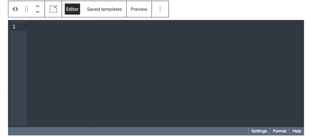
<section class="featured-guides block-double-tb block-half-lr nounderline" id="featured" aria-labelledby="featured-guides-heading">
<div class="inner">
<header class="grid-3-2 mb-single">
<div class="col">
<span class="featured-guides-label mb-half" aria-hidden="true">Curated Content</span>
<h2 class="featured-guides-title mb-small" id="featured-guides-heading">Featured Guides</h2>
<p class="featured-guides-subtitle">
New here? Start with my most-loved guides, carefully crafted for beginners.
Explore <a href="/blog/">comprehensive tutorials</a>, <a href="/deals/">exclusive deals</a>,
and <a href="/products/">premium resources</a> to accelerate your journey.
</p>
</div>
<div class="col">
<a href="/sitemap-archives/" class="featured-guides-link" aria-label="View all featured guides">
View all
<svg width="16" height="16" viewBox="0 0 24 24" fill="none" stroke="currentColor" stroke-width="2.5"
aria-hidden="true">
<path d="M5 12h14M12 5l7 7-7 7" />
</svg>
</a>
</div>
</header>
<!-- Hero Layout: Featured + Highlight -->
<div class="featured-hero grid-3-2 mb-double">
<!-- Left: Featured Cards -->
<div class="featured-cards">
<Loop type=post,deal tag=featured count=3 orderby=date order=DESC>
<article class="featured-card">
<a href="{Field url}">
<figure class="featured-card-media mb-none">
<If field=image_url>
<img src="{Field image_url size=thumbnail}" alt="{Field title}" loading="lazy">
</If>
</figure>
<div class="featured-card-body">
<div class="featured-card-meta mb-half">
<If field=terms taxonomy=category>
<span class="featured-card-cat">
<Field terms taxonomy=category count=1 />
</span>
</If>
<time class="featured-card-date"
datetime="{Field publish_date date_format='Y-m-d'}">
<Field publish_date date_format="M j, Y" />
</time>
</div>
<h3 class="featured-card-title mb-small">
<Field title />
</h3>
<p class="featured-card-excerpt mb-half">
<Field excerpt words=18 />
</p>
<footer class="featured-card-footer">
<span class="featured-card-read" aria-hidden="true">Read guide →</span>
</footer>
</div>
</a>
</article>
</Loop>
</div>
<!-- Right: Highlighted Post -->
<div class="highlight-section">
<Loop type=post,deal tag=featured count=1 offset=3 orderby=date order=DESC>
<article class="highlight-card">
<a href="{Field url}">
<figure class="highlight-card-media mb-none">
<If field=image_url>
<img src="{Field image_url size=md-retina}" alt="{Field title}" loading="lazy">
</If>
</figure>
<div class="highlight-card-body">
<div class="highlight-card-meta mb-half">
<span class="highlight-card-badge">Editor's Pick</span>
<time class="highlight-card-date"
datetime="{Field publish_date date_format='Y-m-d'}">
<Field publish_date date_format="M j, Y" />
</time>
</div>
<h3 class="highlight-card-title mb-small">
<Field title />
</h3>
<p class="highlight-card-excerpt mb-half">
<Field excerpt words=30 />
</p>
<footer class="highlight-card-footer">
<span class="highlight-card-read" aria-hidden="true">Read guide →</span>
</footer>
</div>
</a>
</article>
</Loop>
</div>
</div>
<!-- Thumbnail Posts Grid -->
<div class="thumb-posts-grid grid-3 mb-double">
<Loop type=post,deal tag=featured count=6 offset=4 orderby=date order=DESC>
<article class="post-card">
<a href="{Field url}">
<figure class="post-card-media mb-none">
<If field=image_url>
<img src="{Field image_url size=md-retina}" alt="{Field title}" loading="lazy"
width="600" height="250">
<Else />
<img src="https://r2.gauravtiwari.org/wp-content/uploads/2024/01/digital-education-6-600x250.webp"
alt="" loading="lazy" width="600" height="250">
</If>
</figure>
<div class="post-card-body">
<div class="post-card-meta mb-half">
<If field=terms taxonomy=category>
<span class="post-card-cat">
<Field terms taxonomy=category count=1 />
</span>
</If>
<time class="post-card-date" datetime="{Field publish_date date_format='Y-m-d'}">
<Field publish_date date_format="M j, Y" />
</time>
</div>
<h3 class="post-card-title mb-small">
<Field title />
</h3>
<p class="post-card-excerpt mb-half">
<Field excerpt words=14 />
</p>
<footer class="post-card-footer">
<span class="post-card-read" aria-hidden="true">Read guide →</span>
</footer>
</div>
</a>
</article>
</Loop>
</div>
<!-- Sidebar Section with Recent & Title Lists -->
<div class="featured-layout grid-3-1 mb-double">
<!-- List Posts -->
<div class="list-posts-section">
<h3 class="sidebar-title mb-half">
<svg width="16" height="16" viewBox="0 0 24 24" fill="none" stroke="currentColor" stroke-width="2"
aria-hidden="true">
<path d="M19 21l-7-5-7 5V5a2 2 0 0 1 2-2h10a2 2 0 0 1 2 2z" />
</svg>
More Featured Guides
</h3>
<nav aria-label="More featured guides">
<ul class="sidebar-list">
<Loop type=post,deal tag=featured count=12 offset=10 orderby=date order=DESC>
<li>
<a href="{Field url}">
<span class="sidebar-item-title">
<Field title />
</span>
<span class="sidebar-item-meta">
<If check="{Field type}" value=deal>
<span class="sidebar-item-type sidebar-item-type--deal">Deal</span>
<Else />
<span class="sidebar-item-type">Post</span>
</If>
<time class="sidebar-item-date"
datetime="{Field publish_date date_format='Y-m-d'}">
<Field publish_date date_format="M j" />
</time>
</span>
</a>
</li>
</Loop>
</ul>
</nav>
</div>
<!-- Quick Links Sidebar -->
<aside class="quick-links-sidebar" aria-labelledby="quick-links-heading">
<div class="sidebar-section">
<h3 class="sidebar-title mb-half" id="quick-links-heading">
<svg width="16" height="16" viewBox="0 0 24 24" fill="none" stroke="currentColor"
stroke-width="2" aria-hidden="true">
<polygon points="13 2 3 14 12 14 11 22 21 10 12 10 13 2" />
</svg>
Quick Links
</h3>
<nav aria-label="Quick links">
<ul class="sidebar-list">
<Loop type=post,deal tag=featured count=8 offset=22 orderby=date order=DESC>
<li>
<a href="{Field url}">
<span class="sidebar-item-title">
<Field title />
</span>
<span class="sidebar-item-meta">
<time class="sidebar-item-date"
datetime="{Field publish_date date_format='Y-m-d'}">
<Field publish_date date_format="M j" />
</time>
</span>
</a>
</li>
</Loop>
</ul>
</nav>
</div>
</aside>
</div>
<footer class="text-center block-single">
<a href="/sitemap-archives/" class="button">
View Complete Archives →
</a>
</footer>
</div>
</section>
Template 5: Featured Posts with Large Hero
When you have content worth highlighting, this layout puts your best stuff front and center. A large hero post dominates the top, with three secondary cards below.
<!-- Blog: Featured Posts with Large Hero
     Usage: [template name=blog-featured-posts]
     BEM Block: .featured
-->

<section class="featured" aria-labelledby="featured-heading">
    <div class="featured__container">

        <header class="featured__header">
            <h2 class="featured__title" id="featured-heading">Featured Stories</h2>
        </header>

        <!-- Hero Featured Post -->
        <Loop type=post count=1 custom_field=featured custom_field_value=1 orderby=date order=DESC>
            <article class="featured__hero">
                <a href="{Field url}" class="featured__hero-link">
                    <div class="featured__hero-grid">

                        <figure class="featured__hero-image">
                            <If field=image_url>
                                <img src="{Field image_url size=large}"
                                     alt="{Field image_alt}"
                                     loading="eager"
                                     width="700"
                                     height="450">
                            </If>
                        </figure>

                        <div class="featured__hero-content">
                            <span class="featured__badge">Featured</span>

                            <If field=terms taxonomy=category>
                                <span class="featured__category">
                                    <Field terms taxonomy=category count=1 />
                                </span>
                            </If>

                            <h3 class="featured__hero-title">
                                <Field title />
                            </h3>

                            <p class="featured__hero-excerpt">
                                <Field excerpt words=40 />
                            </p>

                            <div class="featured__hero-meta">
                                <span class="featured__author">
                                    <img src="{Field author_avatar size=thumbnail}"
                                         alt=""
                                         class="featured__avatar"
                                         width="44"
                                         height="44">
                                    <span class="featured__author-info">
                                        <strong class="featured__author-name"><Field author_name /></strong>
                                        <time class="featured__author-date" datetime="{Field publish_date date_format='Y-m-d'}">
                                            <Field publish_date date_format="M j, Y" />
                                        </time>
                                    </span>
                                </span>
                            </div>
                        </div>

                    </div>
                </a>
            </article>
        </Loop>

        <!-- Secondary Featured Posts -->
        <div class="featured__grid">
            <Loop type=post count=3 custom_field=featured custom_field_value=1 offset=1 orderby=date order=DESC>
                <article class="featured__card">
                    <a href="{Field url}" class="featured__card-link">

                        <figure class="featured__card-image">
                            <If field=image_url>
                                <img src="{Field image_url size=medium}"
                                     alt="{Field image_alt}"
                                     loading="lazy"
                                     width="400"
                                     height="250">
                            </If>
                            <span class="featured__card-badge">Featured</span>
                        </figure>

                        <div class="featured__card-content">
                            <If field=terms taxonomy=category>
                                <span class="featured__card-category">
                                    <Field terms taxonomy=category count=1 />
                                </span>
                            </If>

                            <h3 class="featured__card-title">
                                <Field title />
                            </h3>

                            <time class="featured__card-date" datetime="{Field publish_date date_format='Y-m-d'}">
                                <Field publish_date date_format="M j, Y" />
                            </time>
                        </div>

                    </a>
                </article>
            </Loop>
        </div>

    </div>
</section>
The key Tangible concepts here:
Notice custom_field=featured custom_field_value=1. This filters posts that have a custom field called “featured” set to 1 (true). I use this with an ACF toggle field to let editors mark posts as featured. The offset=1 on the secondary loop skips the first featured post since we already displayed it in the hero.
Template 6: List Layout with Sidebar
Traditional blog layout. Main content on the left, sidebar with widgets on the right. Perfect for content-heavy sites where readers browse multiple posts.
<!-- Blog: List Layout with Sidebar
     Usage: [template name=blog-list-sidebar]
     BEM Block: .blog-list
-->

<section class="blog-list" aria-labelledby="blog-list-heading">
    <div class="blog-list__container">

        <div class="blog-list__layout">

            <!-- Main Content -->
            <main class="blog-list__main">
                <header class="blog-list__header">
                    <h1 class="blog-list__title" id="blog-list-heading">All Articles</h1>
                    <p class="blog-list__count">
                        <Loop type=post><Field loop_total /></Loop> articles found
                    </p>
                </header>

                <div class="blog-list__items">
                    <Loop type=post count=10 paged=true orderby=date order=DESC>
                        <article class="blog-list__item">
                            <a href="{Field url}" class="blog-list__item-link">
                                <div class="blog-list__item-content">
                                    <div class="blog-list__item-meta">
                                        <If field=terms taxonomy=category>
                                            <span class="blog-list__item-category">
                                                <Field terms taxonomy=category count=1 />
                                            </span>
                                        </If>
                                        <time class="blog-list__item-date" datetime="{Field publish_date date_format='Y-m-d'}">
                                            <Field publish_date date_format="M j, Y" />
                                        </time>
                                    </div>

                                    <h2 class="blog-list__item-title">
                                        <Field title />
                                    </h2>

                                    <p class="blog-list__item-excerpt">
                                        <Field excerpt words=25 />
                                    </p>
                                </div>

                                <figure class="blog-list__item-image">
                                    <If field=image_url>
                                        <img src="{Field image_url size=thumbnail}"
                                             alt="{Field image_alt}"
                                             loading="lazy"
                                             width="140"
                                             height="93">
                                    </If>
                                </figure>
                            </a>
                        </article>
                    </Loop>
                </div>

                <nav class="blog-list__pagination" aria-label="Blog pagination">
                    <PaginateButtons />
                </nav>
            </main>

            <!-- Sidebar -->
            <aside class="blog-list__sidebar" aria-labelledby="sidebar-heading">

                <!-- Categories -->
                <div class="blog-list__widget">
                    <h3 class="blog-list__widget-title">Categories</h3>
                    <nav aria-label="Blog categories">
                        <ul class="blog-list__categories">
                            <Loop taxonomy=category orderby=count order=DESC count=8>
                                <li class="blog-list__category-item">
                                    <a href="{Field url}" class="blog-list__category-link">
                                        <Field title />
                                        <span class="blog-list__category-count">(<Field count />)</span>
                                    </a>
                                </li>
                            </Loop>
                        </ul>
                    </nav>
                </div>

                <!-- Popular Posts -->
                <div class="blog-list__widget">
                    <h3 class="blog-list__widget-title">Popular Articles</h3>
                    <ul class="blog-list__popular">
                        <Loop type=post count=5 orderby=comment_count order=DESC>
                            <li class="blog-list__popular-item">
                                <a href="{Field url}" class="blog-list__popular-link">
                                    <figure class="blog-list__popular-image">
                                        <If field=image_url>
                                            <img src="{Field image_url size=thumbnail}"
                                                 alt=""
                                                 loading="lazy"
                                                 width="60"
                                                 height="60">
                                        </If>
                                    </figure>
                                    <div class="blog-list__popular-content">
                                        <h4 class="blog-list__popular-title"><Field title /></h4>
                                        <time class="blog-list__popular-date" datetime="{Field publish_date date_format='Y-m-d'}">
                                            <Field publish_date date_format="M j" />
                                        </time>
                                    </div>
                                </a>
                            </li>
                        </Loop>
                    </ul>
                </div>

                <!-- Tags Cloud -->
                <div class="blog-list__widget">
                    <h3 class="blog-list__widget-title">Tags</h3>
                    <div class="blog-list__tags">
                        <Loop taxonomy=post_tag orderby=count order=DESC count=15>
                            <a href="{Field url}" class="blog-list__tag">
                                <Field title />
                            </a>
                        </Loop>
                    </div>
                </div>

            </aside>

        </div>

    </div>
</section>
Power features in this template:
The paged=true attribute enables WordPress pagination. Combined with <PaginateButtons />, you get automatic prev/next navigation. The sidebar uses <Loop taxonomy=category> to loop through taxonomy terms instead of posts. And orderby=comment_count in the Popular Posts widget sorts posts by engagement.
I use <Field loop_total /> to display the total number of posts found. This runs a separate count query before the main loop.
Template 7: Masonry Grid with Filters
Visual content needs visual layouts. The masonry grid with JavaScript filtering gives readers a Pinterest-style browsing experience.
<!-- Blog: Masonry Grid Layout
     Usage: [template name=blog-masonry]
     BEM Block: .masonry
-->

<section class="masonry" aria-labelledby="masonry-heading">
    <div class="masonry__container">

        <header class="masonry__header">
            <h2 class="masonry__title" id="masonry-heading">Explore Our Content</h2>
            <p class="masonry__subtitle">
                Stories, insights, and inspiration from around the world
            </p>
        </header>

        <!-- Category Filter -->
        <nav class="masonry__filter" aria-label="Filter by category">
            <button class="masonry__filter-btn masonry__filter-btn--active js-filter-btn" data-filter="all" type="button">All</button>
            <Loop taxonomy=category count=5 orderby=count order=DESC>
                <button class="masonry__filter-btn js-filter-btn" data-filter="{Field slug}" type="button">
                    <Field title />
                </button>
            </Loop>
        </nav>

        <!-- Masonry Grid -->
        <div class="masonry__grid js-masonry-grid">
            <Loop type=post count=12 orderby=date order=DESC>
                <article class="masonry__card js-masonry-item" data-category="{Field terms taxonomy=category field=slug}">
                    <a href="{Field url}" class="masonry__card-link">

                        <figure class="masonry__card-image">
                            <If field=image_url>
                                <img src="{Field image_url size=medium_large}"
                                     alt="{Field image_alt}"
                                     loading="lazy">
                            </If>
                            <div class="masonry__card-overlay">
                                <If field=terms taxonomy=category>
                                    <span class="masonry__card-category">
                                        <Field terms taxonomy=category count=1 />
                                    </span>
                                </If>
                            </div>
                        </figure>

                        <div class="masonry__card-content">
                            <h3 class="masonry__card-title">
                                <Field title />
                            </h3>

                            <p class="masonry__card-excerpt">
                                <Field excerpt words=15 />
                            </p>

                            <footer class="masonry__card-footer">
                                <span><Field author_name /></span>
                                <time datetime="{Field publish_date date_format='Y-m-d'}">
                                    <Field publish_date date_format="M j" />
                                </time>
                            </footer>
                        </div>

                    </a>
                </article>
            </Loop>

        </div>

        <footer class="masonry__footer">
            <button class="masonry__load-btn js-load-more" type="button">
                Load More
            </button>
        </footer>

    </div>
</section>
The clever bit: The filter buttons are generated dynamically using <Loop taxonomy=category>. Each post card has data-category="{Field terms taxonomy=category field=slug}" which stores the category slug for JavaScript filtering. When a user clicks a filter button, JavaScript shows/hides cards based on matching data attributes.
Template 8: Magazine Layout
News sites, magazines, and editorial blogs need something more complex. This template combines a lead story, secondary articles, and category-specific sections, plus a breaking news ticker.
<!-- Blog: Magazine Style Layout -->
<section class="magazine" aria-labelledby="magazine-heading">
<div class="magazine__container">
<header class="magazine__header">
<h2 class="magazine__title" id="magazine-heading">Today's Picks</h2>
<time class="magazine__date" datetime="{Date format='Y-m-d'}">
<Date format="l, F j, Y" />
</time>
</header>
<div class="magazine__top">
<!-- Lead Story -->
<div class="magazine__lead">
<Loop type=post count=1 orderby=date order=DESC>
<article>
<a href="{Field url}" class="magazine__lead-link">
<figure class="magazine__lead-image">
<If field=image_url>
<img src="{Field image_url size=large}"
alt="{Field image_alt}"
loading="eager"
width="800"
height="500">
</If>
</figure>
<div class="magazine__lead-content">
<If field=terms taxonomy=category>
<span class="magazine__category">
<Field terms taxonomy=category count=1 />
</span>
</If>
<h3 class="magazine__lead-title">
<Field title />
</h3>
<p class="magazine__lead-excerpt">
<Field excerpt words=30 />
</p>
<span class="magazine__byline">
By <Field author_name /> •
<Field reading_time /> min read
</span>
</div>
</a>
</article>
</Loop>
</div>
<!-- Secondary Stories -->
<div class="magazine__secondary">
<Loop type=post count=2 offset=1 orderby=date order=DESC>
<article class="magazine__secondary-article">
<a href="{Field url}" class="magazine__secondary-link">
<figure class="magazine__secondary-image">
<If field=image_url>
<img src="{Field image_url size=medium}"
alt="{Field image_alt}"
loading="lazy">
</If>
</figure>
<div class="magazine__secondary-content">
<h3 class="magazine__secondary-title">
<Field title />
</h3>
</div>
</a>
</article>
</Loop>
</div>
</div>
<!-- Category Sections -->
<div class="magazine__sections">
<Loop taxonomy=category count=4 orderby=count order=DESC>
<div class="magazine__section">
<h3 class="magazine__section-title">
<a href="{Field url}">
<Field title />
</a>
</h3>
<ul class="magazine__section-list">
<Loop type=post taxonomy=category terms="{Field slug}" count=4>
<li class="magazine__section-item">
<a href="{Field url}">
<span class="magazine__item-title">
<Field title />
</span>
<time class="magazine__item-date">
<Field publish_date date_format="M j" />
</time>
</a>
</li>
</Loop>
</ul>
</div>
</Loop>
</div>
</div>
</section>Nested loops are powerful: Look at the category sections. The outer loop iterates through categories. Inside each category, a nested loop pulls posts from that specific category using taxonomy=category terms="{Field slug}". The {Field slug} dynamically grabs the current category’s slug from the outer loop.
The <Date format="l, F j, Y" /> tag outputs the current date without needing a loop context. I use this for “Today’s Edition” type headers.
Feature and Service Templates
Moving beyond blog layouts, these templates handle service descriptions and feature showcases.
Template 9: Icon Grid Features
Six features in a clean grid. Each card has an icon, title, and description. This is my go-to for product feature sections.
<!-- Features: Icon Grid Layout -->

<section class="features" id="features" aria-labelledby="features-heading">
    <div class="features__container">

        <header class="features__header">
            <span class="features__label">Features</span>
            <h2 class="features__title" id="features-heading">Everything You Need</h2>
            <p class="features__subtitle">
                Powerful features designed to help you build, grow, and scale.
            </p>
        </header>

        <div class="features__grid">

            <div class="features__card">
                <div class="features__icon" aria-hidden="true">
                    <svg viewBox="0 0 24 24" fill="none" stroke="currentColor" stroke-width="2">
                        <path d="M13 2L3 14h9l-1 8 10-12h-9l1-8z"/>
                    </svg>
                </div>
                <h3 class="features__card-title">Lightning Fast</h3>
                <p class="features__card-desc">
                    Optimized for speed with sub-second load times. Your content delivered instantly.
                </p>
            </div>

            <div class="features__card">
                <div class="features__icon" aria-hidden="true">
                    <svg viewBox="0 0 24 24" fill="none" stroke="currentColor" stroke-width="2">
                        <rect x="3" y="11" width="18" height="11" rx="2" ry="2"/>
                        <path d="M7 11V7a5 5 0 0 1 10 0v4"/>
                    </svg>
                </div>
                <h3 class="features__card-title">Secure by Default</h3>
                <p class="features__card-desc">
                    Enterprise-grade security with end-to-end encryption and regular audits.
                </p>
            </div>

            <!-- Add more feature cards as needed -->

        </div>

    </div>
</section>
The CSS uses grid-template-columns: repeat(3, 1fr) for a three-column layout that collapses to two and then one on smaller screens. Each card has a subtle hover effect that lifts it up and adds a shadow.
Template 10: Alternating Services Layout
For services that need more explanation, this zigzag pattern alternates content and images. It creates visual rhythm and keeps readers engaged through longer sections.
<!-- Services: Alternating Layout -->

<section class="services" id="services" aria-labelledby="services-heading">
    <div class="services__container">

        <header class="services__header">
            <span class="services__label">Our Services</span>
            <h2 class="services__title" id="services-heading">What We Offer</h2>
        </header>

        <div class="services__list">

            <!-- Service 1 -->
            <div class="services__row">
                <div class="services__content">
                    <span class="services__number" aria-hidden="true">01</span>
                    <h3 class="services__item-title">Web Development</h3>
                    <p class="services__desc">
                        Custom web applications built with modern technologies.
                        From simple websites to complex enterprise solutions.
                    </p>
                    <ul class="services__features">
                        <li class="services__feature">
                            <svg class="services__feature-icon" viewBox="0 0 24 24" fill="none" stroke="currentColor" stroke-width="2">
                                <polyline points="20 6 9 17 4 12"/>
                            </svg>
                            Custom CMS Development
                        </li>
                        <li class="services__feature">
                            <svg class="services__feature-icon" viewBox="0 0 24 24" fill="none" stroke="currentColor" stroke-width="2">
                                <polyline points="20 6 9 17 4 12"/>
                            </svg>
                            E-commerce Solutions
                        </li>
                    </ul>
                    <a href="/services/web-development/" class="services__link">
                        Learn more →
                    </a>
                </div>
                <figure class="services__image">
                    <img src="/assets/images/service-web.jpg"
                         alt="Web development illustration"
                         loading="lazy"
                         width="550"
                         height="400">
                </figure>
            </div>

            <!-- Service 2 (Reversed) -->
            <div class="services__row services__row--reversed">
                <div class="services__content">
                    <span class="services__number" aria-hidden="true">02</span>
                    <h3 class="services__item-title">Mobile Development</h3>
                    <!-- Content continues... -->
                </div>
                <figure class="services__image">
                    <img src="/assets/images/service-mobile.jpg" alt="Mobile app development">
                </figure>
            </div>

        </div>

    </div>
</section>
The .services__row--reversed modifier uses direction: rtl to flip the layout. It’s a CSS-only solution that doesn’t require duplicate HTML or complex positioning.
Testimonial Template
Social proof sells. This carousel layout displays customer testimonials with ratings, quotes, and author info.
Template 11: Testimonials Carousel
<!-- Testimonials: Carousel Layout -->

<section class="testimonials" id="testimonials" aria-labelledby="testimonials-heading">
    <div class="testimonials__container">

        <header class="testimonials__header">
            <span class="testimonials__label">Testimonials</span>
            <h2 class="testimonials__title" id="testimonials-heading">What Our Customers Say</h2>
        </header>

        <div class="testimonials__slider js-testimonial-slider">
            <div class="testimonials__track js-slider-track">

                <Loop type=testimonial count=6 orderby=date order=DESC>
                    <article class="testimonials__card" role="group">

                        <div class="testimonials__rating" aria-label="5 star rating">
                            <svg viewBox="0 0 24 24" fill="currentColor"><polygon points="12 2 15.09 8.26 22 9.27 17 14.14 18.18 21.02 12 17.77 5.82 21.02 7 14.14 2 9.27 8.91 8.26 12 2"/></svg>
                            <svg viewBox="0 0 24 24" fill="currentColor"><polygon points="12 2 15.09 8.26 22 9.27 17 14.14 18.18 21.02 12 17.77 5.82 21.02 7 14.14 2 9.27 8.91 8.26 12 2"/></svg>
                            <svg viewBox="0 0 24 24" fill="currentColor"><polygon points="12 2 15.09 8.26 22 9.27 17 14.14 18.18 21.02 12 17.77 5.82 21.02 7 14.14 2 9.27 8.91 8.26 12 2"/></svg>
                            <svg viewBox="0 0 24 24" fill="currentColor"><polygon points="12 2 15.09 8.26 22 9.27 17 14.14 18.18 21.02 12 17.77 5.82 21.02 7 14.14 2 9.27 8.91 8.26 12 2"/></svg>
                            <svg viewBox="0 0 24 24" fill="currentColor"><polygon points="12 2 15.09 8.26 22 9.27 17 14.14 18.18 21.02 12 17.77 5.82 21.02 7 14.14 2 9.27 8.91 8.26 12 2"/></svg>
                        </div>

                        <blockquote class="testimonials__quote">
                            "<Field content />"
                        </blockquote>

                        <footer class="testimonials__author">
                            <If field=author_image>
                                <img src="{Field author_image size=thumbnail}"
                                     alt=""
                                     class="testimonials__avatar"
                                     width="52"
                                     height="52"
                                     loading="lazy">
                            </If>
                            <div class="testimonials__author-info">
                                <cite class="testimonials__name"><Field author_name /></cite>
                                <span class="testimonials__role"><Field author_title />, <Field company /></span>
                            </div>
                        </footer>

                    </article>
                </Loop>

            </div>
        </div>

    </div>
</section>
Custom post type in action: This template loops through a “testimonial” custom post type (type=testimonial). I create this CPT with ACF fields for author_name, author_title, company, and author_image. The testimonial content itself goes in the standard post content field, accessed via <Field content />.
The carousel uses CSS scroll-snap for smooth, accessible scrolling. JavaScript handles the prev/next buttons and dot indicators, but the core scrolling works without JS.
Pricing Template
Template 12: Pricing Cards with Toggle
Three-tier pricing with monthly/annual toggle. The featured plan pops out with a gradient background.
<!-- Pricing: Cards Layout -->

<section class="plans" id="pricing" aria-labelledby="pricing-heading">
    <div class="plans__container">

        <header class="plans__header">
            <span class="plans__label">Pricing</span>
            <h2 class="plans__title" id="pricing-heading">Simple, Transparent Pricing</h2>
            <p class="plans__subtitle">
                Choose the plan that's right for you. No hidden fees.
            </p>

            <!-- Billing Toggle -->
            <div class="plans__toggle">
                <span class="plans__toggle-label plans__toggle-label--active" data-period="monthly">Monthly</span>
                <label class="plans__toggle-switch">
                    <input type="checkbox" id="billing-toggle" class="plans__toggle-input">
                    <span class="plans__toggle-slider"></span>
                </label>
                <span class="plans__toggle-label" data-period="annual">
                    Annual
                    <span class="plans__toggle-badge">Save 20%</span>
                </span>
            </div>
        </header>

        <div class="plans__grid">

            <!-- Starter Plan -->
            <article class="plans__card">
                <header class="plans__card-header">
                    <h3 class="plans__name">Starter</h3>
                    <p class="plans__description">Perfect for individuals</p>
                </header>
                <div class="plans__price">
                    <span class="plans__price-option plans__price-option--active" data-period="monthly">
                        <span class="plans__price-currency">$</span>
                        <span class="plans__price-amount">0</span>
                        <span class="plans__price-period">/month</span>
                    </span>
                    <span class="plans__price-option" data-period="annual">
                        <span class="plans__price-currency">$</span>
                        <span class="plans__price-amount">0</span>
                        <span class="plans__price-period">/year</span>
                    </span>
                </div>
                <ul class="plans__features">
                    <li class="plans__feature">
                        <svg width="16" height="16" viewBox="0 0 24 24" fill="none" stroke="currentColor" stroke-width="2"><polyline points="20 6 9 17 4 12"/></svg>
                        Up to 3 projects
                    </li>
                    <!-- More features... -->
                </ul>
                <footer class="plans__card-footer">
                    <a href="/signup/?plan=starter" class="plans__button">
                        Get Started Free
                    </a>
                </footer>
            </article>

            <!-- Pro Plan (Featured) -->
            <article class="plans__card plans__card--featured">
                <div class="plans__badge">Most Popular</div>
                <header class="plans__card-header">
                    <h3 class="plans__name">Professional</h3>
                    <p class="plans__description">Best for growing teams</p>
                </header>
                <!-- Pricing and features... -->
            </article>

            <!-- Enterprise Plan -->
            <article class="plans__card">
                <!-- Enterprise content... -->
            </article>

        </div>

    </div>
</section>
JavaScript toggles between monthly and annual pricing by swapping the .plans__price-option--active class. The annual option shows a “Save 20%” badge to encourage longer commitments.
Stats Counter Template
Template 13: Animated Stats with Icons
Nothing builds credibility like big numbers. This template combines simple stat counters with icon cards and a logo cloud.
<!-- Stats: Counter Sections -->

<section class="stats" id="stats" aria-labelledby="stats-heading">
    <div class="stats__container">

        <!-- Simple Stats Row -->
        <div class="stats__row">
            <div class="stats__grid">
                <div class="stats__item">
                    <span class="stats__number" data-count="50000">0</span>
                    <span class="stats__label">Happy Customers</span>
                </div>
                <div class="stats__item">
                    <span class="stats__number" data-count="99.9">0</span>
                    <span class="stats__label">Uptime SLA</span>
                </div>
                <div class="stats__item">
                    <span class="stats__number" data-count="150">0</span>
                    <span class="stats__label">Countries Served</span>
                </div>
                <div class="stats__item">
                    <span class="stats__number">24/7</span>
                    <span class="stats__label">Support Available</span>
                </div>
            </div>
        </div>

        <!-- Logo Cloud -->
        <aside class="stats__logo-cloud" aria-label="Trusted by">
            <p class="stats__logo-label">Powering the world's best teams</p>
            <div class="stats__logo-grid">
                <Loop type=client count=8 orderby=menu_order order=ASC>
                    <div class="stats__logo-item">
                        <If field=logo>
                            <img src="{Field logo size=medium}"
                                 alt="{Field title}"
                                 loading="lazy"
                                 width="140"
                                 height="50">
                        </If>
                    </div>
                </Loop>
            </div>
        </aside>

    </div>
</section>
The data-count attribute stores the target number. JavaScript uses an Intersection Observer to trigger the counting animation when the section scrolls into view. Numbers animate from 0 to their target value over 2 seconds.
The logo cloud uses a “client” custom post type with a logo image field. Perfect for showcasing enterprise customers or integration partners.
Gallery and Portfolio Templates
When you need to showcase visual work (photography, design, illustrations), these templates make your content look stunning.
Template 14: Gallery Grid with Filters
A clean image gallery with category filtering. Each item reveals details on hover with a smooth overlay animation.
<!-- Gallery: Grid Layout -->

<section class="gallery" id="gallery" aria-labelledby="gallery-heading">
    <div class="gallery__container">

        <header class="gallery__header">
            <span class="gallery__label">Gallery</span>
            <h2 class="gallery__title" id="gallery-heading">Our Work</h2>
            <p class="gallery__subtitle">
                A showcase of our best projects and creative endeavors
            </p>
        </header>

        <!-- Filter Navigation -->
        <nav class="gallery__filters" aria-label="Gallery filters">
            <button class="gallery__filter gallery__filter--active" data-filter="all" aria-pressed="true">
                All
            </button>
            <Loop taxonomy=portfolio_category orderby=name order=ASC>
                <button class="gallery__filter" data-filter="{Field slug}" aria-pressed="false">
                    <Field title />
                </button>
            </Loop>
        </nav>

        <!-- Gallery Grid -->
        <div class="gallery__grid" role="list">
            <Loop type=portfolio count=12 orderby=date order=DESC>
                <article class="gallery__item" role="listitem" data-category="{Field terms taxonomy=portfolio_category field=slug}">
                    <a href="{Field url}" class="gallery__link">
                        <figure class="gallery__image">
                            <If field=featured_image>
                                <img src="{Field featured_image size=medium_large}"
                                     alt="{Field image_alt}"
                                     loading="lazy"
                                     width="400"
                                     height="300">
                            </If>
                            <figcaption class="gallery__overlay">
                                <div class="gallery__content">
                                    <If field=terms taxonomy=portfolio_category>
                                        <span class="gallery__category">
                                            <Field terms taxonomy=portfolio_category count=1 />
                                        </span>
                                    </If>
                                    <h3 class="gallery__item-title"><Field title /></h3>
                                    <span class="gallery__view" aria-hidden="true">
                                        View Project →
                                    </span>
                                </div>
                            </figcaption>
                        </figure>
                    </a>
                </article>
            </Loop>
        </div>

        <!-- Load More -->
        <footer class="gallery__footer">
            <button class="gallery__load-more" type="button" data-page="1">
                Load More Projects
            </button>
        </footer>

    </div>
</section>
Key implementation details:
The filter navigation is built dynamically from the portfolio_category taxonomy. Each gallery item stores its categories in a data-category attribute using {Field terms taxonomy=portfolio_category field=slug}. The field=slug modifier outputs the category slug (for matching) instead of the title (for display).
The overlay uses a CSS gradient that fades from transparent at the top to dark at the bottom. This ensures text is always readable regardless of image brightness.
The JavaScript filtering is simple: it toggles display: none on items that don’t match the selected category. No external libraries needed.
Template 15: Portfolio Case Studies
For agencies and consultants, case studies tell the story of your work. This template displays featured projects with results metrics and calls to action.
<!-- Portfolio: Case Studies Layout -->

<section class="cases" id="case-studies" aria-labelledby="cases-heading">
    <div class="cases__container">

        <header class="cases__header">
            <div>
                <span class="cases__label">Portfolio</span>
                <h2 class="cases__title" id="cases-heading">Case Studies</h2>
                <p class="cases__subtitle">
                    Explore how we've helped our clients achieve their goals
                </p>
            </div>
            <div class="cases__action">
                <a href="/portfolio/" class="cases__link">
                    View all projects →
                </a>
            </div>
        </header>

        <div class="cases__list">
            <Loop type=case_study count=4 custom_field=featured custom_field_value=1 orderby=date order=DESC>
                <article class="cases__card">
                    <a href="{Field url}" class="cases__card-link">

                        <figure class="cases__image">
                            <If field=cover_image>
                                <img src="{Field cover_image size=large}"
                                     alt="{Field image_alt}"
                                     loading="lazy"
                                     width="600"
                                     height="400">
                            </If>
                            <If field=client_logo>
                                <div class="cases__logo">
                                    <img src="{Field client_logo size=thumbnail}"
                                         alt="{Field client_name} logo"
                                         width="120"
                                         height="40">
                                </div>
                            </If>
                        </figure>

                        <div class="cases__content">
                            <div class="cases__meta">
                                <If field=terms taxonomy=industry>
                                    <span class="cases__industry">
                                        <Field terms taxonomy=industry count=1 />
                                    </span>
                                </If>
                                <If field=terms taxonomy=service_type>
                                    <span class="cases__service">
                                        <Field terms taxonomy=service_type count=1 />
                                    </span>
                                </If>
                            </div>

                            <h3 class="cases__card-title"><Field title /></h3>

                            <p class="cases__excerpt">
                                <Field excerpt words=30 />
                            </p>

                            <If field=results>
                                <div class="cases__results">
                                    <Loop field=results count=3>
                                        <div class="cases__result">
                                            <span class="cases__result-value"><Field value /></span>
                                            <span class="cases__result-label"><Field label /></span>
                                        </div>
                                    </Loop>
                                </div>
                            </If>

                            <span class="cases__cta">
                                Read case study →
                            </span>
                        </div>

                    </a>
                </article>
            </Loop>
        </div>

        <!-- Services Summary -->
        <aside class="cases__services">
            <h3 class="cases__services-title">What We Do</h3>
            <div class="cases__services-tags">
                <Loop taxonomy=service_type orderby=count order=DESC count=8>
                    <a href="{Field url}" class="cases__service-tag">
                        <Field title />
                        <span class="cases__tag-count">(<Field count />)</span>
                    </a>
                </Loop>
            </div>
        </aside>

    </div>
</section>
The results repeater is powerful:
Notice <Loop field=results count=3>. This loops through an ACF repeater field called “results” that has subfields for “value” (like “+150%”) and “label” (like “Conversion Rate”). It’s perfect for displaying quantifiable project outcomes.
The type=case_study uses a custom post type I’ve set up with fields for client logo, cover image, industry taxonomy, service type taxonomy, and the results repeater.
Products Template
For e-commerce or product-focused sites, this template handles everything: images, badges, ratings, pricing, and add-to-cart buttons.
Template 16: Product Grid with Actions
<!-- Products: E-commerce Grid -->

<section class="products" id="products" aria-labelledby="products-heading">
    <div class="products__container">

        <header class="products__header">
            <div>
                <span class="products__label">Shop</span>
                <h2 class="products__title" id="products-heading">Featured Products</h2>
            </div>
            <div class="products__controls">
                <select class="products__sort" aria-label="Sort products">
                    <option value="featured">Featured</option>
                    <option value="newest">Newest</option>
                    <option value="price-low">Price: Low to High</option>
                    <option value="price-high">Price: High to Low</option>
                </select>
            </div>
        </header>

        <!-- Products Grid -->
        <div class="products__grid">
            <Loop type=product count=8 custom_field=featured custom_field_value=1 orderby=date order=DESC>
                <article class="products__card">
                    <a href="{Field url}" class="products__link">

                        <figure class="products__image">
                            <If field=on_sale>
                                <span class="products__badge products__badge--sale">Sale</span>
                            </If>
                            <If field=is_new>
                                <span class="products__badge products__badge--new">New</span>
                            </If>
                            <If field=featured_image>
                                <img src="{Field featured_image size=medium}"
                                     alt="{Field image_alt}"
                                     loading="lazy"
                                     width="300"
                                     height="300">
                            </If>
                            <div class="products__actions">
                                <button type="button" class="products__action-btn" aria-label="Quick view">
                                    <svg width="20" height="20" viewBox="0 0 24 24" fill="none" stroke="currentColor" stroke-width="2"><path d="M1 12s4-8 11-8 11 8 11 8-4 8-11 8-11-8-11-8z"/><circle cx="12" cy="12" r="3"/></svg>
                                </button>
                                <button type="button" class="products__action-btn" aria-label="Add to wishlist">
                                    <svg width="20" height="20" viewBox="0 0 24 24" fill="none" stroke="currentColor" stroke-width="2"><path d="M20.84 4.61a5.5 5.5 0 0 0-7.78 0L12 5.67l-1.06-1.06a5.5 5.5 0 0 0-7.78 7.78l1.06 1.06L12 21.23l7.78-7.78 1.06-1.06a5.5 5.5 0 0 0 0-7.78z"/></svg>
                                </button>
                            </div>
                        </figure>

                        <div class="products__info">
                            <If field=terms taxonomy=product_cat>
                                <span class="products__category">
                                    <Field terms taxonomy=product_cat count=1 />
                                </span>
                            </If>

                            <h3 class="products__name"><Field title /></h3>

                            <If field=rating>
                                <div class="products__rating" aria-label="{Field rating} out of 5 stars">
                                    <div class="products__stars" aria-hidden="true">
                                        <!-- Star SVGs -->
                                    </div>
                                    <span class="products__review-count">(<Field review_count />)</span>
                                </div>
                            </If>

                            <div class="products__price">
                                <If field=sale_price>
                                    <span class="products__price-original"><Field regular_price format=currency /></span>
                                    <span class="products__price-current"><Field sale_price format=currency /></span>
                                <Else />
                                    <span class="products__price-current"><Field price format=currency /></span>
                                </If>
                            </div>
                        </div>

                    </a>

                    <button type="button" class="products__add-to-cart" data-product-id="{Field id}">
                        Add to Cart
                    </button>
                </article>
            </Loop>
        </div>

    </div>
</section>
Conditional pricing display:
The <If field=sale_price> check shows the sale price with a strikethrough on the regular price. Otherwise, it just shows the regular price. The format=currency modifier would need custom implementation to format numbers as currency strings.
Action buttons (quick view, wishlist) appear on hover. The data-product-id="{Field id}" attribute on the add-to-cart button passes the product ID to your cart JavaScript.
FAQ Accordion Template
Template 17: FAQ with Categories and Search
FAQs need good UX. This template includes category tabs, accordion animation, search functionality, and a help CTA for unanswered questions.
<!-- FAQ: Accordion Layout -->

<section class="faq" id="faq" aria-labelledby="faq-heading">
    <div class="faq__container">

        <header class="faq__header">
            <span class="faq__label">Support</span>
            <h2 class="faq__title" id="faq-heading">Frequently Asked Questions</h2>
            <p class="faq__subtitle">
                Find answers to common questions about our product and services
            </p>
        </header>

        <!-- FAQ Categories -->
        <nav class="faq__categories" aria-label="FAQ categories">
            <button class="faq__category-btn faq__category-btn--active" data-category="all">All</button>
            <Loop taxonomy=faq_category orderby=menu_order order=ASC>
                <button class="faq__category-btn" data-category="{Field slug}">
                    <Field title />
                </button>
            </Loop>
        </nav>

        <!-- FAQ Accordion -->
        <div class="faq__accordion" role="list">
            <Loop type=faq orderby=menu_order order=ASC>
                <article class="faq__item" role="listitem" data-category="{Field terms taxonomy=faq_category field=slug}">
                    <h3 class="faq__question">
                        <button type="button"
                                class="faq__toggle"
                                aria-expanded="false"
                                aria-controls="faq-answer-{Field id}"
                                id="faq-question-{Field id}">
                            <span class="faq__question-text"><Field title /></span>
                            <span class="faq__icon" aria-hidden="true">
                                <svg width="20" height="20" viewBox="0 0 24 24" fill="none" stroke="currentColor" stroke-width="2"><path d="M6 9l6 6 6-6"/></svg>
                            </span>
                        </button>
                    </h3>
                    <div class="faq__answer"
                         id="faq-answer-{Field id}"
                         role="region"
                         aria-labelledby="faq-question-{Field id}">
                        <div class="faq__answer-content">
                            <Field content />
                        </div>
                    </div>
                </article>
            </Loop>
        </div>

        <!-- Search FAQ -->
        <div class="faq__search">
            <form class="faq__search-form" action="/faq/" method="get" role="search">
                <input type="search"
                       id="faq-search"
                       name="q"
                       placeholder="Search for answers..."
                       class="faq__search-input"
                       aria-label="Search FAQ">
                <button type="submit" class="faq__search-btn">Search</button>
            </form>
        </div>

        <!-- Still Need Help -->
        <aside class="faq__help">
            <h3 class="faq__help-title">Still have questions?</h3>
            <p class="faq__help-text">
                Can't find the answer you're looking for? Our support team is here to help.
            </p>
            <div class="faq__help-actions">
                <a href="/contact/" class="faq__help-btn faq__help-btn--primary">
                    Contact Support
                </a>
                <a href="/docs/" class="faq__help-btn faq__help-btn--outline">
                    Browse Documentation
                </a>
            </div>
        </aside>

    </div>
</section>
ARIA accessibility is critical here:
Each question button has aria-expanded that toggles between “true” and “false”. The aria-controls attribute links to the answer’s ID. The answer div has role="region" and aria-labelledby pointing back to the question. This makes the accordion fully accessible for screen reader users.
The orderby=menu_order ensures FAQs display in the order you set in the WordPress admin. Drag-and-drop sorting works perfectly with this.
The JavaScript is straightforward:
When a toggle is clicked, it adds/removes .faq__item--active class. The answer’s max-height transitions from 0 to 500px. Only one FAQ can be open at a time (clicking a new one closes the previous).
Contact Form Template
Template 18: Contact Form with Sidebar Info
A two-column layout with contact information on the left and a form on the right.
<!-- Contact: Form Layout -->

<section class="contact" id="contact" aria-labelledby="contact-heading">
    <div class="contact__container">

        <header class="contact__header">
            <span class="contact__label">Get in Touch</span>
            <h2 class="contact__title" id="contact-heading">Contact Us</h2>
            <p class="contact__subtitle">
                Have a question or want to work together? We'd love to hear from you.
            </p>
        </header>

        <div class="contact__grid">

            <!-- Contact Info -->
            <aside class="contact__info">
                <h3 class="contact__info-title">Let's Talk</h3>

                <div class="contact__methods">
                    <div class="contact__method">
                        <div class="contact__method-icon" aria-hidden="true">
                            <svg width="24" height="24" viewBox="0 0 24 24" fill="none" stroke="currentColor" stroke-width="2"><path d="M4 4h16c1.1 0 2 .9 2 2v12c0 1.1-.9 2-2 2H4c-1.1 0-2-.9-2-2V6c0-1.1.9-2 2-2z"/><polyline points="22,6 12,13 2,6"/></svg>
                        </div>
                        <div class="contact__method-content">
                            <span class="contact__method-label">Email</span>
                            <span class="contact__method-value">
                                <a href="mailto:hello@example.com">hello@example.com</a>
                            </span>
                        </div>
                    </div>

                    <div class="contact__method">
                        <div class="contact__method-icon" aria-hidden="true">
                            <svg width="24" height="24" viewBox="0 0 24 24" fill="none" stroke="currentColor" stroke-width="2"><path d="M22 16.92v3a2 2 0 0 1-2.18 2 19.79 19.79 0 0 1-8.63-3.07 19.5 19.5 0 0 1-6-6 19.79 19.79 0 0 1-3.07-8.67A2 2 0 0 1 4.11 2h3a2 2 0 0 1 2 1.72 12.84 12.84 0 0 0 .7 2.81 2 2 0 0 1-.45 2.11L8.09 9.91a16 16 0 0 0 6 6l1.27-1.27a2 2 0 0 1 2.11-.45 12.84 12.84 0 0 0 2.81.7A2 2 0 0 1 22 16.92z"/></svg>
                        </div>
                        <div class="contact__method-content">
                            <span class="contact__method-label">Phone</span>
                            <span class="contact__method-value">
                                <a href="tel:+15551234567">+1 (555) 123-4567</a>
                            </span>
                        </div>
                    </div>

                    <div class="contact__method">
                        <div class="contact__method-icon" aria-hidden="true">
                            <svg width="24" height="24" viewBox="0 0 24 24" fill="none" stroke="currentColor" stroke-width="2"><path d="M21 10c0 7-9 13-9 13s-9-6-9-13a9 9 0 0 1 18 0z"/><circle cx="12" cy="10" r="3"/></svg>
                        </div>
                        <div class="contact__method-content">
                            <span class="contact__method-label">Office</span>
                            <span class="contact__method-value">
                                123 Business Ave<br>
                                San Francisco, CA 94103
                            </span>
                        </div>
                    </div>
                </div>

                <div class="contact__hours">
                    <h4 class="contact__hours-title">Business Hours</h4>
                    <div class="contact__hours-list">
                        <div class="contact__hours-item">
                            <span class="contact__hours-day">Monday - Friday</span>
                            <span class="contact__hours-time">9:00 AM - 6:00 PM</span>
                        </div>
                        <div class="contact__hours-item">
                            <span class="contact__hours-day">Saturday</span>
                            <span class="contact__hours-time">10:00 AM - 4:00 PM</span>
                        </div>
                        <div class="contact__hours-item">
                            <span class="contact__hours-day">Sunday</span>
                            <span class="contact__hours-time">Closed</span>
                        </div>
                    </div>
                </div>
            </aside>

            <!-- Contact Form -->
            <div class="contact__form-wrapper">
                <h3 class="contact__form-title">Send us a message</h3>

                <div class="contact__success" role="alert">
                    <strong>Thank you!</strong> Your message has been sent successfully.
                </div>

                <form class="contact__form" action="/contact/submit/" method="post" novalidate>

                    <div class="contact__form-group">
                        <label for="contact-name" class="contact__label-text contact__label-text--required">Name</label>
                        <input type="text"
                               id="contact-name"
                               name="name"
                               class="contact__input"
                               required
                               aria-required="true">
                        <span class="contact__error" role="alert"></span>
                    </div>

                    <div class="contact__form-group">
                        <label for="contact-email" class="contact__label-text contact__label-text--required">Email</label>
                        <input type="email"
                               id="contact-email"
                               name="email"
                               class="contact__input"
                               required
                               aria-required="true">
                        <span class="contact__error" role="alert"></span>
                    </div>

                    <div class="contact__form-group">
                        <label for="contact-subject" class="contact__label-text">Subject</label>
                        <select id="contact-subject" name="subject" class="contact__select">
                            <option value="">Select a subject</option>
                            <option value="general">General Inquiry</option>
                            <option value="support">Technical Support</option>
                            <option value="sales">Sales</option>
                            <option value="partnership">Partnership</option>
                        </select>
                    </div>

                    <div class="contact__form-group">
                        <label for="contact-message" class="contact__label-text contact__label-text--required">Message</label>
                        <textarea id="contact-message"
                                  name="message"
                                  class="contact__textarea"
                                  required
                                  aria-required="true"></textarea>
                        <span class="contact__error" role="alert"></span>
                    </div>

                    <div class="contact__form-group">
                        <div class="contact__checkbox-group">
                            <input type="checkbox"
                                   id="contact-consent"
                                   name="consent"
                                   class="contact__checkbox"
                                   required
                                   aria-required="true">
                            <label for="contact-consent" class="contact__checkbox-label">
                                I agree to the <a href="/privacy/">Privacy Policy</a>
                            </label>
                        </div>
                    </div>

                    <button type="submit" class="contact__submit">
                        Send Message
                    </button>

                </form>
            </div>

        </div>

    </div>
</section>
Form validation is built in:
The JavaScript handles client-side validation for name, email, message, and consent checkbox. Invalid fields get an .contact__input--error class that adds a red border. Error messages appear below each field in spans with role="alert" for screen readers.
On successful submission (in a real implementation, you’d POST to your server), a success message slides in and the form resets. After 5 seconds, the success message disappears.
The sidebar has a sticky position on desktop, so it stays visible as users scroll through the form.
Header Navigation Template
Every site needs a header. The tricky part is making it responsive without a JavaScript library the size of a small country. This template handles desktop and mobile with pure CSS and minimal JavaScript.
<!-- Header: Complete Navigation
     Usage: [template name=header-navigation]
     BEM Block: .header
-->

<style>
/* Header Block */
.header {
    position: sticky;
    top: 0;
    z-index: 1000;
    background: #fff;
    border-bottom: 1px solid #e2e8f0;
}

.header__container {
    max-width: 1400px;
    margin-inline: auto;
    padding: 1rem 1.5rem;
}

.header__nav {
    display: flex;
    align-items: center;
    gap: 3rem;
}

/* Logo */
.header__logo {
    display: inline-block;
}

.header__logo img {
    display: block;
    height: 32px;
    width: auto;
}

/* Menu */
.header__menu {
    flex: 1;
}

.header__list {
    display: flex;
    align-items: center;
    gap: 0.5rem;
    list-style: none;
    padding: 0;
    margin: 0;
}

.header__link {
    display: inline-flex;
    align-items: center;
    gap: 0.375rem;
    padding: 0.625rem 1rem;
    font-size: 0.9375rem;
    font-weight: 600;
    color: #475569;
    text-decoration: none;
    border-radius: 8px;
    transition: all 0.2s ease;
}

.header__link:hover,
.header__link--active {
    color: #0f172a;
    background: #f8fafc;
}

/* Actions */
.header__actions {
    display: flex;
    align-items: center;
    gap: 1rem;
}

.header__button {
    display: inline-flex;
    align-items: center;
    gap: 0.5rem;
    padding: 0.625rem 1.5rem;
    font-size: 0.9375rem;
    font-weight: 600;
    text-decoration: none;
    border-radius: 8px;
    transition: all 0.2s ease;
    border: 2px solid transparent;
}

.header__button--primary {
    background: #6366f1;
    color: #fff;
}

.header__button--primary:hover {
    background: #4f46e5;
}

/* Mobile Toggle */
.header__toggle {
    display: none;
    flex-direction: column;
    gap: 4px;
    width: 24px;
    height: 20px;
    background: none;
    border: none;
    cursor: pointer;
    padding: 0;
}

.header__toggle-bar {
    width: 100%;
    height: 2px;
    background: #0f172a;
    transition: all 0.3s ease;
}

.header__toggle--active .header__toggle-bar:nth-child(1) {
    transform: translateY(6px) rotate(45deg);
}

.header__toggle--active .header__toggle-bar:nth-child(2) {
    opacity: 0;
}

.header__toggle--active .header__toggle-bar:nth-child(3) {
    transform: translateY(-6px) rotate(-45deg);
}

/* Responsive */
@media (max-width: 900px) {
    .header__menu {
        position: fixed;
        top: 65px;
        left: 0;
        right: 0;
        background: #fff;
        border-bottom: 1px solid #e2e8f0;
        max-height: 0;
        overflow: hidden;
        transition: max-height 0.3s ease;
    }

    .header__menu--active {
        max-height: 500px;
    }

    .header__list {
        flex-direction: column;
        align-items: stretch;
        padding: 1rem;
    }

    .header__toggle {
        display: flex;
    }

    .header__actions {
        display: none;
    }
}
</style>

<header class="header" role="banner">
    <div class="header__container">
        <nav class="header__nav" aria-label="Main navigation">
            <a href="/" class="header__logo" aria-label="Home">
                <img src="/assets/logo.svg" alt="Company" width="120" height="32">
            </a>

            <div class="header__menu" id="main-menu">
                <ul class="header__list">
                    <li><a href="/products/" class="header__link">Products</a></li>
                    <li><a href="/pricing/" class="header__link">Pricing</a></li>
                    <li><a href="/docs/" class="header__link">Docs</a></li>
                    <li><a href="/blog/" class="header__link">Blog</a></li>
                    <li><a href="/about/" class="header__link">About</a></li>
                </ul>
            </div>

            <div class="header__actions">
                <a href="/login/" class="header__link">Log in</a>
                <a href="/signup/" class="header__button header__button--primary">Get Started</a>
            </div>

            <button type="button"
                    class="header__toggle"
                    aria-label="Toggle menu"
                    aria-expanded="false"
                    aria-controls="main-menu">
                <span class="header__toggle-bar"></span>
                <span class="header__toggle-bar"></span>
                <span class="header__toggle-bar"></span>
            </button>
        </nav>
    </div>
</header>

<script>
(function() {
    const toggle = document.querySelector('.header__toggle');
    const menu = document.querySelector('.header__menu');

    if (toggle && menu) {
        toggle.addEventListener('click', function() {
            const isExpanded = this.getAttribute('aria-expanded') === 'true';
            this.setAttribute('aria-expanded', !isExpanded);
            this.classList.toggle('header__toggle--active');
            menu.classList.toggle('header__menu--active');
        });
    }
})();
</script>
This template is intentionally static because headers don’t usually loop through posts. But you can easily make it dynamic by adding a <Loop type=menu name="primary"> to pull from a WordPress menu.
Key features:
- Sticky positioning keeps the header visible while scrolling
- Hamburger animation transforms the three bars into an X on mobile
- ARIA attributes for screen readers (aria-expanded, aria-controls)
- CSS-only mobile menu with max-height transition for smooth reveal
- Separate actions area for login and CTA buttons
You could enhance this by adding a Rank Math breadcrumb or pulling the logo dynamically with <Site logo />.
Complete Footer
Footers are where you dump all the links you couldn’t fit anywhere else. But a good footer is more than a link dump. It’s brand reinforcement, newsletter capture, and legal coverage all in one.
<!-- Footer: Complete Multi-Column Layout
Usage: [template name=footer-complete]
BEM Block: .footer
-->
<style>
/* Footer Block */
.footer {
background: #0f172a;
color: #e2e8f0;
}
.footer__container {
max-width: 1400px;
margin-inline: auto;
}
/* Main Section */
.footer__main {
padding: 5rem 1.5rem 4rem;
}
.footer__grid {
display: grid;
grid-template-columns: 2fr 1fr 1fr 1fr;
gap: 3rem;
margin-bottom: 3rem;
}
/* Brand */
.footer__brand-logo {
display: inline-block;
margin-bottom: 1rem;
}
.footer__tagline {
font-size: 1rem;
line-height: 1.6;
color: #94a3b8;
margin: 0 0 1.5rem;
max-width: 320px;
}
.footer__social {
display: flex;
gap: 0.75rem;
}
.footer__social-link {
display: flex;
align-items: center;
justify-content: center;
width: 40px;
height: 40px;
background: rgba(255,255,255,0.1);
color: #e2e8f0;
border-radius: 8px;
text-decoration: none;
transition: all 0.2s ease;
}
.footer__social-link:hover {
background: #6366f1;
color: #fff;
}
/* Column */
.footer__column-title {
font-size: 0.9375rem;
font-weight: 700;
color: #fff;
text-transform: uppercase;
letter-spacing: 0.05em;
margin: 0 0 1.5rem;
}
.footer__links {
list-style: none;
padding: 0;
margin: 0;
}
.footer__link {
font-size: 0.9375rem;
color: #94a3b8;
text-decoration: none;
transition: color 0.2s ease;
}
.footer__link:hover {
color: #fff;
}
.footer__badge {
display: inline-block;
padding: 0.125rem 0.5rem;
margin-left: 0.5rem;
background: #22c55e;
color: #fff;
font-size: 0.6875rem;
font-weight: 700;
border-radius: 4px;
}
/* Newsletter */
.footer__newsletter {
padding: 2rem;
background: rgba(255,255,255,0.05);
border-radius: 12px;
}
.footer__newsletter-grid {
display: grid;
grid-template-columns: 1fr 1fr;
gap: 2rem;
align-items: center;
}
.footer__newsletter-form {
display: flex;
gap: 0.75rem;
}
.footer__newsletter-input {
flex: 1;
padding: 0.875rem 1rem;
font-size: 1rem;
background: rgba(255,255,255,0.1);
border: 1px solid rgba(255,255,255,0.2);
border-radius: 8px;
color: #fff;
}
.footer__newsletter-button {
padding: 0.875rem 1.75rem;
font-size: 1rem;
font-weight: 600;
background: #6366f1;
color: #fff;
border: none;
border-radius: 8px;
cursor: pointer;
}
/* Bottom */
.footer__bottom {
padding: 2rem 1.5rem;
border-top: 1px solid rgba(255,255,255,0.1);
}
.footer__bottom-content {
display: flex;
align-items: center;
justify-content: space-between;
}
.footer__copyright {
font-size: 0.875rem;
color: #94a3b8;
}
/* Responsive */
@media (max-width: 900px) {
.footer__grid {
grid-template-columns: 1fr 1fr;
}
.footer__brand {
grid-column: 1 / -1;
}
}
@media (max-width: 640px) {
.footer__grid {
grid-template-columns: 1fr;
}
.footer__newsletter-form {
flex-direction: column;
}
}
</style>
<footer class="footer" role="contentinfo">
<div class="footer__container">
<div class="footer__main">
<div class="footer__grid">
<!-- Brand -->
<div class="footer__brand">
<a href="/" class="footer__brand-logo" aria-label="Home">
<img src="/assets/logo-light.svg" alt="Company Logo" width="150" height="40">
</a>
<p class="footer__tagline">
Building the future of web development, one template at a time.
</p>
<nav class="footer__social" aria-label="Social media">
<a href="#" class="footer__social-link" aria-label="Twitter">
<svg width="20" height="20" viewBox="0 0 24 24" fill="currentColor"><path d="M18.244 2.25h3.308l-7.227 8.26 8.502 11.24H16.17l-5.214-6.817L4.99 21.75H1.68l7.73-8.835L1.254 2.25H8.08l4.713 6.231zm-1.161 17.52h1.833L7.084 4.126H5.117z"/></svg>
</a>
<a href="#" class="footer__social-link" aria-label="LinkedIn">
<svg width="20" height="20" viewBox="0 0 24 24" fill="currentColor"><path d="M16 8a6 6 0 0 1 6 6v7h-4v-7a2 2 0 0 0-2-2 2 2 0 0 0-2 2v7h-4v-7a6 6 0 0 1 6-6z"/><rect x="2" y="9" width="4" height="12"/><circle cx="4" cy="4" r="2"/></svg>
</a>
<a href="#" class="footer__social-link" aria-label="GitHub">
<svg width="20" height="20" viewBox="0 0 24 24" fill="currentColor"><path d="M12 0c-6.626 0-12 5.373-12 12 0 5.302 3.438 9.8 8.207 11.387.599.111.793-.261.793-.577v-2.234c-3.338.726-4.033-1.416-4.033-1.416-.546-1.387-1.333-1.756-1.333-1.756-1.089-.745.083-.729.083-.729 1.205.084 1.839 1.237 1.839 1.237 1.07 1.834 2.807 1.304 3.492.997.107-.775.418-1.305.762-1.604-2.665-.305-5.467-1.334-5.467-5.931 0-1.311.469-2.381 1.236-3.221-.124-.303-.535-1.524.117-3.176 0 0 1.008-.322 3.301 1.23.957-.266 1.983-.399 3.003-.404 1.02.005 2.047.138 3.006.404 2.291-1.552 3.297-1.23 3.297-1.23.653 1.653.242 2.874.118 3.176.77.84 1.235 1.911 1.235 3.221 0 4.609-2.807 5.624-5.479 5.921.43.372.823 1.102.823 2.222v3.293c0 .319.192.694.801.576 4.765-1.589 8.199-6.086 8.199-11.386 0-6.627-5.373-12-12-12z"/></svg>
</a>
</nav>
</div>
<!-- Products Column -->
<div class="footer__column">
<h3 class="footer__column-title">Products</h3>
<ul class="footer__links">
<li><a href="/features/" class="footer__link">Features</a></li>
<li><a href="/pricing/" class="footer__link">Pricing</a></li>
<li><a href="/integrations/" class="footer__link">Integrations</a></li>
<li><a href="/changelog/" class="footer__link">Changelog</a></li>
</ul>
</div>
<!-- Resources Column -->
<div class="footer__column">
<h3 class="footer__column-title">Resources</h3>
<ul class="footer__links">
<li><a href="/docs/" class="footer__link">Documentation</a></li>
<li><a href="/blog/" class="footer__link">Blog</a></li>
<li><a href="/community/" class="footer__link">Community</a></li>
<li><a href="/support/" class="footer__link">Support</a></li>
</ul>
</div>
<!-- Company Column -->
<div class="footer__column">
<h3 class="footer__column-title">Company</h3>
<ul class="footer__links">
<li><a href="/about/" class="footer__link">About Us</a></li>
<li><a href="/careers/" class="footer__link">Careers<span class="footer__badge">Hiring</span></a></li>
<li><a href="/press/" class="footer__link">Press</a></li>
<li><a href="/contact/" class="footer__link">Contact</a></li>
</ul>
</div>
</div>
<!-- Newsletter -->
<div class="footer__newsletter">
<div class="footer__newsletter-grid">
<div class="footer__newsletter-content">
<h3 class="footer__newsletter-title">Subscribe to our newsletter</h3>
<p class="footer__newsletter-text">Get the latest news delivered to your inbox.</p>
</div>
<form class="footer__newsletter-form" action="/subscribe/" method="post">
<input type="email" name="email" placeholder="Enter your email" class="footer__newsletter-input" required aria-label="Email for newsletter">
<button type="submit" class="footer__newsletter-button">Subscribe</button>
</form>
</div>
</div>
</div>
<!-- Bottom -->
<div class="footer__bottom">
<div class="footer__bottom-content">
<p class="footer__copyright">
© <Date format="Y" /> Company Name. All rights reserved.
</p>
<nav class="footer__legal" aria-label="Legal">
<a href="/privacy/">Privacy Policy</a>
<a href="/terms/">Terms of Service</a>
<a href="/cookies/">Cookie Policy</a>
</nav>
</div>
</div>
</div>
</footer>Notice the <Date format="Y" /> tag in the copyright. That’s Tangible automatically outputting the current year. No more manually updating copyright dates every January.
Key features of this footer:
- Four-column grid that collapses gracefully on mobile
- Brand section with tagline and social icons
- Badge system for highlighting things like “Hiring” on the careers link
- Newsletter form integrated directly into the footer
- Legal links in the bottom bar
- Dark theme that works for most sites
If you wanted to make the navigation columns dynamic, you could loop through WordPress menus or use ACF repeater fields for complete control.
Author Bio Box
Author pages and bio boxes matter more than people realize. Google’s E-E-A-T (Experience, Expertise, Authoritativeness, Trustworthiness) guidelines specifically look at author credibility. A solid author bio template helps with that.
<!-- Author: Bio Box Layouts
     Usage: [template name=author-bio]
     BEM Block: .author
-->

<style>
/* Author Block */
.author {
    padding: 3rem 1.5rem;
}

.author__container {
    max-width: 900px;
    margin-inline: auto;
}

/* Inline Author Bio */
.author__card {
    display: flex;
    gap: 2rem;
    padding: 2rem;
    background: #f8fafc;
    border-radius: 12px;
    margin-bottom: 3rem;
}

.author__avatar {
    flex-shrink: 0;
    width: 80px;
    height: 80px;
    border-radius: 50%;
    overflow: hidden;
}

.author__avatar img {
    display: block;
    width: 100%;
    height: 100%;
    object-fit: cover;
}

.author__info {
    flex: 1;
}

.author__name {
    font-size: 1.25rem;
    font-weight: 700;
    color: #0f172a;
    margin: 0 0 0.5rem;
}

.author__name a {
    color: inherit;
    text-decoration: none;
    transition: color 0.2s ease;
}

.author__name a:hover {
    color: #6366f1;
}

.author__role {
    display: block;
    font-size: 0.9375rem;
    font-weight: 600;
    color: #6366f1;
    margin-bottom: 1rem;
}

.author__description {
    font-size: 1rem;
    line-height: 1.6;
    color: #475569;
    margin: 0 0 1rem;
}

.author__social {
    display: flex;
    gap: 0.75rem;
}

.author__social-link {
    display: flex;
    align-items: center;
    justify-content: center;
    width: 32px;
    height: 32px;
    color: #64748b;
    text-decoration: none;
    border-radius: 6px;
    transition: all 0.2s ease;
}

.author__social-link:hover {
    background: #e2e8f0;
    color: #0f172a;
}

/* Featured Card */
.author__featured {
    padding: 3rem;
    background: #fff;
    border-radius: 16px;
    box-shadow: 0 4px 12px rgba(0,0,0,0.08);
    text-align: center;
}

.author__featured .author__avatar {
    width: 120px;
    height: 120px;
    margin: 0 auto 1.5rem;
}

.author__label {
    display: inline-block;
    font-size: 0.8125rem;
    font-weight: 700;
    text-transform: uppercase;
    letter-spacing: 0.05em;
    color: #64748b;
    margin-bottom: 0.75rem;
}

.author__meta {
    display: flex;
    align-items: center;
    justify-content: center;
    gap: 1.5rem;
    margin: 1.5rem 0;
    padding: 1.5rem 0;
    border-top: 1px solid #e2e8f0;
    border-bottom: 1px solid #e2e8f0;
}

.author__button {
    display: inline-flex;
    align-items: center;
    gap: 0.5rem;
    padding: 0.875rem 1.75rem;
    font-size: 0.9375rem;
    font-weight: 600;
    background: transparent;
    color: #0f172a;
    text-decoration: none;
    border: 2px solid #e2e8f0;
    border-radius: 8px;
    transition: all 0.2s ease;
}

.author__button:hover {
    border-color: #0f172a;
    background: #0f172a;
    color: #fff;
}

/* Responsive */
@media (max-width: 640px) {
    .author__card {
        flex-direction: column;
        align-items: center;
        text-align: center;
    }
}
</style>

<section class="author">
    <div class="author__container">

        <!-- Inline Author Bio -->
        <article class="author__card">
            <Loop type=user id="{Field author_id}">
                <figure class="author__avatar">
                    <If field=avatar>
                        <img src="{Field avatar size=thumbnail}" alt="" width="80" height="80">
                    </If>
                </figure>
                <div class="author__info">
                    <h3 class="author__name">
                        <a href="{Field url}"><Field display_name /></a>
                    </h3>
                    <If field=role>
                        <span class="author__role"><Field role /></span>
                    </If>
                    <p class="author__description">
                        <Field description />
                    </p>
                    <nav class="author__social" aria-label="Author social links">
                        <If field=twitter>
                            <a href="{Field twitter}" class="author__social-link" aria-label="Twitter">
                                <svg width="16" height="16" viewBox="0 0 24 24" fill="currentColor"><path d="M18.244 2.25h3.308l-7.227 8.26 8.502 11.24H16.17l-5.214-6.817L4.99 21.75H1.68l7.73-8.835L1.254 2.25H8.08l4.713 6.231zm-1.161 17.52h1.833L7.084 4.126H5.117z"/></svg>
                            </a>
                        </If>
                        <If field=linkedin>
                            <a href="{Field linkedin}" class="author__social-link" aria-label="LinkedIn">
                                <svg width="16" height="16" viewBox="0 0 24 24" fill="currentColor"><path d="M16 8a6 6 0 0 1 6 6v7h-4v-7a2 2 0 0 0-2-2 2 2 0 0 0-2 2v7h-4v-7a6 6 0 0 1 6-6z"/><rect x="2" y="9" width="4" height="12"/><circle cx="4" cy="4" r="2"/></svg>
                            </a>
                        </If>
                    </nav>
                </div>
            </Loop>
        </article>

        <!-- Featured Author Card -->
        <article class="author__featured">
            <Loop type=user id="{Field author_id}">
                <span class="author__label">Written by</span>
                <figure class="author__avatar">
                    <If field=avatar>
                        <img src="{Field avatar size=medium}" alt="" width="120" height="120">
                    </If>
                </figure>
                <h3 class="author__name">
                    <a href="{Field url}"><Field display_name /></a>
                </h3>
                <If field=title>
                    <span class="author__role"><Field title /></span>
                </If>
                <p class="author__description">
                    <Field description />
                </p>
                <div class="author__meta">
                    <span class="author__meta-item">
                        <svg width="14" height="14" viewBox="0 0 24 24" fill="none" stroke="currentColor" stroke-width="2"><path d="M14 2H6a2 2 0 0 0-2 2v16a2 2 0 0 0 2 2h12a2 2 0 0 0 2-2V8z"/><polyline points="14 2 14 8 20 8"/></svg>
                        <Field post_count /> articles
                    </span>
                </div>
                <a href="{Field url}" class="author__button">
                    View all posts
                </a>
            </Loop>
        </article>

    </div>
</section>
The magic here is <Loop type=user id="{Field author_id}">. It pulls the author of the current post and gives you access to all their profile fields. You can display their avatar, bio, social links, and even a count of how many articles they’ve written.
Two layouts in one template:
- Inline bio for placing at the end of blog posts
- Featured card for author archive pages
If you’ve added custom fields to your user profiles using ACF (like Twitter handle, LinkedIn URL, or job title), those are all accessible here.
Related Posts
Related posts keep readers on your site. Simple as that. The trick is showing posts that are actually related, not just recent.
<!-- Related Posts: Multiple Layouts
     Usage: [template name=related-posts]
     BEM Block: .related
-->

<style>
/* Related Block */
.related {
    padding: 4rem 1.5rem;
    background: #f8fafc;
}

.related__container {
    max-width: 1200px;
    margin-inline: auto;
}

/* Header */
.related__header {
    display: flex;
    align-items: center;
    justify-content: space-between;
    margin-bottom: 2rem;
}

.related__title {
    font-size: clamp(1.5rem, 2.5vw, 1.875rem);
    font-weight: 800;
    color: #0f172a;
    margin: 0;
}

.related__link {
    display: inline-flex;
    align-items: center;
    gap: 0.5rem;
    font-size: 0.9375rem;
    font-weight: 600;
    color: #6366f1;
    text-decoration: none;
    transition: gap 0.2s ease;
}

.related__link:hover {
    gap: 0.75rem;
}

/* Grid */
.related__grid {
    display: grid;
    grid-template-columns: repeat(auto-fill, minmax(320px, 1fr));
    gap: 2rem;
}

/* Card */
.related__card {
    background: #fff;
    border-radius: 12px;
    overflow: hidden;
    box-shadow: 0 2px 8px rgba(0,0,0,0.06);
    transition: all 0.3s ease;
}

.related__card:hover {
    transform: translateY(-4px);
    box-shadow: 0 8px 16px rgba(0,0,0,0.1);
}

.related__image {
    aspect-ratio: 16 / 9;
    background: #e2e8f0;
    overflow: hidden;
    margin: 0;
}

.related__image img {
    display: block;
    width: 100%;
    height: 100%;
    object-fit: cover;
    transition: transform 0.3s ease;
}

.related__card:hover .related__image img {
    transform: scale(1.05);
}

.related__content {
    padding: 1.5rem;
}

.related__category {
    display: inline-block;
    font-size: 0.8125rem;
    font-weight: 700;
    text-transform: uppercase;
    letter-spacing: 0.05em;
    color: #6366f1;
    margin-bottom: 0.75rem;
}

.related__card-title {
    font-size: 1.125rem;
    font-weight: 700;
    line-height: 1.3;
    color: #0f172a;
    margin: 0 0 0.75rem;
}

.related__meta {
    display: flex;
    align-items: center;
    gap: 1rem;
    font-size: 0.875rem;
    color: #64748b;
}

/* Responsive */
@media (max-width: 640px) {
    .related__header {
        flex-direction: column;
        align-items: flex-start;
        gap: 1rem;
    }
    .related__grid {
        grid-template-columns: 1fr;
    }
}
</style>

<section class="related" aria-labelledby="related-heading">
    <div class="related__container">

        <header class="related__header">
            <h2 class="related__title" id="related-heading">You Might Also Like</h2>
            <a href="/blog/" class="related__link">
                View all posts
                <svg width="14" height="14" viewBox="0 0 24 24" fill="none" stroke="currentColor" stroke-width="2"><path d="M5 12h14M12 5l7 7-7 7"/></svg>
            </a>
        </header>

        <div class="related__grid">
            <Loop type=post taxonomy=category terms="{Field terms taxonomy=category field=slug}" count=3 exclude="{Field id}">
                <article class="related__card">
                    <a href="{Field url}" class="related__card-link">
                        <figure class="related__image">
                            <If field=image_url>
                                <img src="{Field image_url size=medium}" alt="{Field image_alt}" loading="lazy" width="350" height="200">
                            </If>
                        </figure>
                        <div class="related__content">
                            <If field=terms taxonomy=category>
                                <span class="related__category">
                                    <Field terms taxonomy=category count=1 />
                                </span>
                            </If>
                            <h3 class="related__card-title"><Field title /></h3>
                            <div class="related__meta">
                                <time class="related__date" datetime="{Field publish_date date_format='Y-m-d'}">
                                    <Field publish_date date_format="M j, Y" />
                                </time>
                                <span><Field reading_time /> min read</span>
                            </div>
                        </div>
                    </a>
                </article>
            </Loop>
        </div>

    </div>
</section>
Look at the Loop query:
<Loop type=post taxonomy=category terms="{Field terms taxonomy=category field=slug}" count=3 exclude="{Field id}">That’s doing a lot:
taxonomy=category terms="{Field terms taxonomy=category field=slug}"finds posts in the same category as the current postcount=3limits to three resultsexclude="{Field id}"excludes the current post so you don’t recommend the same article they’re already reading
You could also use tags instead of categories, or combine multiple taxonomies for more specific recommendations.
Archives Page
Archives pages are underrated. When someone wants to browse everything you’ve written, they shouldn’t have to click through paginated blog pages. Give them a clean, scannable list.
<div class="archives-wrapper">

  <!-- Search -->
  <div class="archives-search radius-s">
    <form role="search" method="get" action="/">
      <input type="text" name="s" placeholder="Search..." aria-label="Search" />
      <select name="post_type" aria-label="Content type">
        <option value="">All</option>
        <option value="post">Articles</option>
        <option value="deal">Deals</option>
        <option value="snippet">Snippets</option>
      </select>
      <button type="submit">Go</button>
    </form>
  </div>

  <!-- Articles -->
  <section class="archives-section">
    <h2 class="section-title">Articles <Loop type=post count=1><span><Field loop_total /></span></Loop></h2>
    <Loop type=post orderby=date order=desc count=-1>
      <div class="archive-item">
        <time class="item-date"><Field publish_date date_format="M j, Y" /></time>
        <div class="item-title"><a href="{Field url}"><Field title /></a></div>
        <Loop field=terms taxonomy=category count=1><span class="item-cat"><Field title /></span></Loop>
      </div>
    </Loop>
  </section>

  <!-- Deals -->
  <section class="archives-section">
    <h2 class="section-title">Deals <Loop type=deal count=1><span><Field loop_total /></span></Loop></h2>
    <Loop type=deal orderby=date order=desc count=-1>
      <div class="archive-item">
        <time class="item-date"><Field publish_date date_format="M j, Y" /></time>
        <div class="item-title"><a href="{Field url}"><Field title /></a></div>
        <Loop field=terms taxonomy=deal_type count=1><span class="item-cat"><Field title /></span></Loop>
      </div>
    </Loop>
  </section>

  <!-- Snippets -->
  <section class="archives-section">
    <h2 class="section-title">Snippets <Loop type=snippet count=1><span><Field loop_total /></span></Loop></h2>
    <Loop type=snippet orderby=date order=desc count=-1>
      <div class="archive-item">
        <time class="item-date"><Field publish_date date_format="M j, Y" /></time>
        <div class="item-title"><a href="{Field url}"><Field title /></a></div>
        <Loop field=terms taxonomy=programming_language count=1><span class="item-cat"><Field title /></span></Loop>
      </div>
    </Loop>
  </section>

</div>
This is one of my favorites because it’s so straightforward. Three sections for different post types, each with a total count in the heading.
The clever bit is how it gets the total count:
<Loop type=post count=1><span><Field loop_total /></span></Loop>You loop through with count=1 just to get access to loop_total, which tells you how many posts exist total. Then the main loop uses count=-1 to show all of them.
Each item shows the date, title, and first category. Simple and scannable. I use this exact pattern on my personal site.
Schema Markup Templates
Now for the SEO power tools. Schema markup (also called structured data) helps search engines understand your content. It’s what enables rich snippets, FAQ dropdowns, recipe cards, and event listings in Google search results.
Writing schema by hand is painful. There’s JSON to manage, escaping to worry about, and if you get the structure wrong, Google ignores it entirely. Tangible makes this actually manageable.
Template 24: Article Schema
Every blog post should have Article schema. It tells Google who wrote it, when it was published, and what it’s about.
<!-- Schema: Article
     Usage: [template name=schema-article]
     Works on: Single posts/articles
-->
<Loop type=post id=current>
<Raw><script type="application/ld+json"></Raw>
{
    "@context": "https://schema.org",
    "@type": "Article",
    "headline": "<Field title />",
    "description": "<Field excerpt />",
    "image": "<Field image_url />",
    "author": {
        "@type": "Person",
        "name": "<Field author_name />",
        "url": "<Field author_url />"
    },
    "publisher": {
        "@type": "Organization",
        "name": "<Site name />",
        "logo": {
            "@type": "ImageObject",
            "url": "<Site logo />"
        }
    },
    "datePublished": "<Field publish_date date_format='c' />",
    "dateModified": "<Field modified_date date_format='c' />",
    "mainEntityOfPage": {
        "@type": "WebPage",
        "@id": "<Field url />"
    },
    "articleSection": "<Field terms taxonomy=category />",
    "keywords": "<Field terms taxonomy=post_tag />"
}
<Raw></script></Raw>
</Loop>
The <Raw> tags are important. They tell Tangible not to process the content inside, which prevents the script tags from being escaped. The date_format='c' outputs dates in ISO 8601 format, which is what schema requires.
Template 25: Product Schema
If you’re reviewing products or running an e-commerce site, Product schema gets you those star ratings in search results.
<!-- Schema: Product with AggregateRating
     Usage: [template name=schema-product rating=4.5 rating_count=120 price=29.99 currency=USD]
     Works on: Product pages or any post with product data
-->
<If check="{Get rating}" is value=""><Set rating>5</Set></If>
<If check="{Get rating_count}" is value=""><Set rating_count>1</Set></If>
<If check="{Get price}" is value=""><Set price>0</Set></If>
<If check="{Get currency}" is value=""><Set currency>USD</Set></If>
<If check="{Get availability}" is value=""><Set availability>InStock</Set></If>

<Loop type=post id=current>
<Raw><script type="application/ld+json"></Raw>
{
    "@context": "https://schema.org",
    "@type": "Product",
    "name": "<Field title />",
    "description": "<Field excerpt />",
    "image": "<Field image_url />",
    "brand": {
        "@type": "Brand",
        "name": "<Site name />"
    },
    "offers": {
        "@type": "Offer",
        "price": "<Get price />",
        "priceCurrency": "<Get currency />",
        "availability": "https://schema.org/<Get availability />",
        "url": "<Field url />"
    },
    "aggregateRating": {
        "@type": "AggregateRating",
        "ratingValue": "<Get rating />",
        "bestRating": "5",
        "worstRating": "1",
        "ratingCount": "<Get rating_count />"
    }
}
<Raw></script></Raw>
</Loop>
See how it uses <Set> and <Get> for default values? If you don’t pass a rating when calling the template, it defaults to 5. Pass parameters like this: [template name=schema-product rating=4.5 rating_count=120 price=29.99]
Template 26: FAQ Schema
FAQ schema is one of the easiest ways to get extra real estate in search results. Those expandable questions and answers you see in Google? That’s FAQ schema.
<!-- Schema: FAQPage
     Usage: [template name=schema-faq]
     Works on: Pages/posts with FAQ custom field (repeater with question/answer)
     Expects: ACF repeater field 'faqs' with 'question' and 'answer' subfields
-->
<Loop type=post id=current>
<Raw><script type="application/ld+json"></Raw>
{
    "@context": "https://schema.org",
    "@type": "FAQPage",
    "mainEntity": [
        <Loop field=faqs><If field=question>
        {
            "@type": "Question",
            "name": "<Field question />",
            "acceptedAnswer": {
                "@type": "Answer",
                "text": "<Field answer />"
            }
        }<If not check="{Field loop_last}" value="true">,</If>
        </If></Loop>
    ]
}
<Raw></script></Raw>
</Loop>
This loops through an ACF repeater field called faqs. Each item needs a question and answer subfield. The tricky part is handling JSON array commas. That <If not check="{Field loop_last}" value="true">,</If> adds a comma after each item except the last one.
Template 27: HowTo Schema
Tutorial content benefits massively from HowTo schema. Google can show your steps directly in search results.
<!-- Schema: HowTo
     Usage: [template name=schema-howto total_time=PT30M]
     Works on: Tutorial/how-to posts
     Expects: ACF repeater field 'steps' with 'title', 'description', 'image' subfields
-->
<If check="{Get total_time}" is value=""><Set total_time>PT1H</Set></If>

<Loop type=post id=current>
<Raw><script type="application/ld+json"></Raw>
{
    "@context": "https://schema.org",
    "@type": "HowTo",
    "name": "<Field title />",
    "description": "<Field excerpt />",
    "image": "<Field image_url />",
    "totalTime": "<Get total_time />",
    "step": [
        <Loop field=steps>
        {
            "@type": "HowToStep",
            "position": "<Field loop_index />",
            "name": "<Field title />",
            "text": "<Field description />",
            "image": "<Field image />"
        }<If not check="{Field loop_last}" value="true">,</If>
        </Loop>
    ]
}
<Raw></script></Raw>
</Loop>
Time is in ISO 8601 duration format. PT30M means 30 minutes. PT1H means one hour. PT2H30M means two hours and thirty minutes.
Template 28: Recipe Schema
Food bloggers, this one’s for you. Recipe schema enables those beautiful recipe cards in search results with cook times, ratings, and ingredient counts.
<!-- Schema: Recipe
     Usage: [template name=schema-recipe prep_time=PT15M cook_time=PT30M rating=4.8 rating_count=256]
     Works on: Recipe posts
     Expects: ACF fields for ingredients (repeater), instructions (repeater)
-->
<If check="{Get prep_time}" is value=""><Set prep_time>PT15M</Set></If>
<If check="{Get cook_time}" is value=""><Set cook_time>PT30M</Set></If>
<If check="{Get total_time}" is value=""><Set total_time>PT45M</Set></If>
<If check="{Get servings}" is value=""><Set servings>4</Set></If>
<If check="{Get rating}" is value=""><Set rating>5</Set></If>
<If check="{Get rating_count}" is value=""><Set rating_count>1</Set></If>

<Loop type=post id=current>
<Raw><script type="application/ld+json"></Raw>
{
    "@context": "https://schema.org",
    "@type": "Recipe",
    "name": "<Field title />",
    "description": "<Field excerpt />",
    "image": "<Field image_url />",
    "author": {
        "@type": "Person",
        "name": "<Field author_name />"
    },
    "datePublished": "<Field publish_date date_format='Y-m-d' />",
    "prepTime": "<Get prep_time />",
    "cookTime": "<Get cook_time />",
    "totalTime": "<Get total_time />",
    "recipeYield": "<Get servings /> servings",
    "recipeIngredient": [
        <Loop field=ingredients>
        "<Field ingredient />"<If not check="{Field loop_last}" value="true">,</If>
        </Loop>
    ],
    "recipeInstructions": [
        <Loop field=instructions>
        {
            "@type": "HowToStep",
            "position": "<Field loop_index />",
            "text": "<Field step />"
        }<If not check="{Field loop_last}" value="true">,</If>
        </Loop>
    ],
    "aggregateRating": {
        "@type": "AggregateRating",
        "ratingValue": "<Get rating />",
        "ratingCount": "<Get rating_count />"
    }
}
<Raw></script></Raw>
</Loop>
This expects two ACF repeater fields: ingredients (with an ingredient subfield) and instructions (with a step subfield). The prep time, cook time, and rating can be passed as parameters or set in the post’s custom fields.
Template 29: Event Schema
Running events, webinars, or conferences? Event schema can get you into Google’s event listings.
<!-- Schema: Event
     Usage: [template name=schema-event]
     Works on: Event posts
     Expects: ACF fields for start_date, end_date, venue_name, etc.
-->
<If check="{Get status}" is value=""><Set status>EventScheduled</Set></If>
<If check="{Get mode}" is value=""><Set mode>OfflineEventAttendanceMode</Set></If>
<If check="{Get price}" is value=""><Set price>0</Set></If>
<If check="{Get currency}" is value=""><Set currency>USD</Set></If>
<If check="{Get availability}" is value=""><Set availability>InStock</Set></If>

<Loop type=post id=current>
<Raw><script type="application/ld+json"></Raw>
{
    "@context": "https://schema.org",
    "@type": "Event",
    "name": "<Field title />",
    "description": "<Field excerpt />",
    "image": "<Field image_url />",
    "startDate": "<Field start_date date_format='c' />",
    "endDate": "<Field end_date date_format='c' />",
    "eventStatus": "https://schema.org/<Get status />",
    "eventAttendanceMode": "https://schema.org/<Get mode />",
    "location": {
        "@type": "Place",
        "name": "<Field venue_name />",
        "address": {
            "@type": "PostalAddress",
            "streetAddress": "<Field street_address />",
            "addressLocality": "<Field city />",
            "addressRegion": "<Field state />",
            "postalCode": "<Field postal_code />",
            "addressCountry": "<Field country />"
        }
    },
    "organizer": {
        "@type": "Organization",
        "name": "<Field organizer_name />",
        "url": "<Field organizer_url />"
    },
    "offers": {
        "@type": "Offer",
        "price": "<Get price />",
        "priceCurrency": "<Get currency />",
        "availability": "https://schema.org/<Get availability />",
        "url": "<Field ticket_url />"
    }
}
<Raw></script></Raw>
</Loop>
Event status options: EventScheduled, EventCancelled, EventMovedOnline, EventPostponed, EventRescheduled. Attendance mode options: OfflineEventAttendanceMode, OnlineEventAttendanceMode, MixedEventAttendanceMode.
Template 30: LocalBusiness Schema
For local businesses, this schema helps you show up in local search results with hours, address, and ratings.
<!-- Schema: LocalBusiness
     Usage: [template name=schema-localbusiness business_name="My Biz" phone="+1234567890" rating=4.7 rating_count=89]
     Works on: Business pages or site-wide
-->
<If check="{Get business_type}" is value=""><Set business_type>LocalBusiness</Set></If>
<If check="{Get price_range}" is value=""><Set price_range>$$</Set></If>
<If check="{Get country}" is value=""><Set country>US</Set></If>
<If check="{Get rating}" is value=""><Set rating>5</Set></If>
<If check="{Get rating_count}" is value=""><Set rating_count>1</Set></If>
<If check="{Get weekday_opens}" is value=""><Set weekday_opens>09:00</Set></If>
<If check="{Get weekday_closes}" is value=""><Set weekday_closes>17:00</Set></If>

<Raw><script type="application/ld+json"></Raw>
{
    "@context": "https://schema.org",
    "@type": "<Get business_type />",
    "name": "<If check='{Get business_name}' is_not value=''><Get business_name /><Else /><Site name /></If>",
    "description": "<Site description />",
    "image": "<Site logo />",
    "logo": "<Site logo />",
    "@id": "<Site url />",
    "url": "<Site url />",
    "telephone": "<Get phone />",
    "email": "<Get email />",
    "priceRange": "<Get price_range />",
    "address": {
        "@type": "PostalAddress",
        "streetAddress": "<Get street />",
        "addressLocality": "<Get city />",
        "addressRegion": "<Get state />",
        "postalCode": "<Get postal_code />",
        "addressCountry": "<Get country />"
    },
    "openingHoursSpecification": [
        {
            "@type": "OpeningHoursSpecification",
            "dayOfWeek": ["Monday", "Tuesday", "Wednesday", "Thursday", "Friday"],
            "opens": "<Get weekday_opens />",
            "closes": "<Get weekday_closes />"
        }
    ],
    "aggregateRating": {
        "@type": "AggregateRating",
        "ratingValue": "<Get rating />",
        "bestRating": "5",
        "ratingCount": "<Get rating_count />"
    }
}
<Raw></script></Raw>
You can get more specific with the business type. Instead of LocalBusiness, use Restaurant, Dentist, LegalService, RealEstateAgent, etc. Check schema.org for the full list.
Template 31: Person Schema
For author pages, about pages, and team member profiles.
<!-- Schema: Person (Author/Profile)
     Usage: [template name=schema-person] on author pages
     Works on: Author archive or single post (uses post author)
-->
<Loop type=post id=current>
<Raw><script type="application/ld+json"></Raw>
{
    "@context": "https://schema.org",
    "@type": "Person",
    "name": "<Field author_name />",
    "url": "<Field author_url />",
    "sameAs": []
}
<Raw></script></Raw>
</Loop>
The sameAs array is where you’d add social profile URLs. In practice, you’d want to pull these from user meta fields and build the array dynamically.
Template 32: Video Schema
If you’re embedding videos, Video schema can get you those rich video thumbnails in search results.
<!-- Schema: VideoObject
     Usage: [template name=schema-video duration=PT5M30S]
     Works on: Posts with video content
     Expects: ACF fields for video_url, video_thumbnail
-->
<If check="{Get duration}" is value=""><Set duration>PT1M</Set></If>

<Loop type=post id=current>
<Raw><script type="application/ld+json"></Raw>
{
    "@context": "https://schema.org",
    "@type": "VideoObject",
    "name": "<Field title />",
    "description": "<Field excerpt />",
    "thumbnailUrl": "<Field image_url />",
    "uploadDate": "<Field publish_date date_format='c' />",
    "duration": "<Get duration />",
    "contentUrl": "<Field video_url />",
    "embedUrl": "<Field video_embed_url />",
    "author": {
        "@type": "Person",
        "name": "<Field author_name />"
    },
    "publisher": {
        "@type": "Organization",
        "name": "<Site name />",
        "logo": {
            "@type": "ImageObject",
            "url": "<Site logo />"
        }
    }
}
<Raw></script></Raw>
</Loop>
Duration uses the same ISO 8601 format as recipes. PT5M30S means 5 minutes 30 seconds.
Template 33: Breadcrumb Schema
Breadcrumbs help both users and search engines understand your site structure. This schema generates automatically based on the post’s category.
<!-- Schema: BreadcrumbList
     Usage: [template name=schema-breadcrumb]
     Works on: Any single post/page - auto-generates breadcrumb
-->
<Loop type=post id=current>
<Raw><script type="application/ld+json"></Raw>
{
    "@context": "https://schema.org",
    "@type": "BreadcrumbList",
    "itemListElement": [
        {
            "@type": "ListItem",
            "position": 1,
            "name": "Home",
            "item": "<Site url />"
        }<If field=terms taxonomy=category>,
        {
            "@type": "ListItem",
            "position": 2,
            "name": "<Field terms taxonomy=category count=1 />",
            "item": "<Field terms taxonomy=category count=1 field=url />"
        },
        {
            "@type": "ListItem",
            "position": 3,
            "name": "<Field title />",
            "item": "<Field url />"
        }<Else />,
        {
            "@type": "ListItem",
            "position": 2,
            "name": "<Field title />",
            "item": "<Field url />"
        }</If>
    ]
}
<Raw></script></Raw>
</Loop>
This generates a path like “Home > Category > Post Title” if the post has a category, or just “Home > Post Title” if it doesn’t.
Get the Complete Templates
Download First 40 Templates
Inside you’ll find:
- 40+ ready-to-use templates with full HTML and CSS
- Organized by category (hero, blog, features, testimonials, schema, etc.)
- BEM-structured CSS that won’t conflict with your existing styles
- Responsive breakpoints already built in
- Copy-paste ready for Tangible’s template editor
How to Use the Templates
- Download and extract the ZIP file
- Open any .html file in your code editor
- Copy the entire contents (both the
<style>block and the HTML) - Paste into Tangible’s template editor in WordPress (Templates > Add New)
- Customize the CSS to match your design
- Replace placeholder content with your actual field names
Each template file includes comments at the top explaining what custom fields or post types it expects. If you’re using ACF, set up those fields first. If you’re using a different custom fields plugin, adjust the field names accordingly.
86 Ready to Import Templates Directly from my Dashboard
These are the templates that I have created over time and use on gauravtiwari.org one way or another.
Download it, unzip and import the JSON file to Tangible inside your WordPress dashboard.
A Note on the CSS
The styles use a utility-first approach with BEM naming. That means:
.herois the block.hero__titleis an element inside the block.hero__button--primaryis a modifier variant
This keeps styles scoped to each template. You can use multiple templates on the same page without CSS conflicts. And when you want to customize, you know exactly where to look.
The colors, fonts, and spacing are intentionally generic. Swap #6366f1 for your brand color needs. Change font-weight: 700 to match your typography. The structure stays solid while the skin becomes yours.
What I’ve Learned Using These Templates
After building and using these templates across dozens of projects, a few things stand out:
- Start with the basics. You don’t need all 126 templates on day one. Start with a blog grid, maybe a hero section, and
Articleschema. Add more as you need them. - BEM naming is worth it. The
.block__element--modifierpattern feels verbose at first, but it prevents CSS conflicts and makes templates truly portable. I can drop any of these templates into any project without worrying about style collisions. - Schema markup matters more than people think. I’ve seen FAQ schema double click-through rates. Recipe schema turned a food blogger’s traffic around completely. It’s unglamorous work, but the ROI is real.
- ACF + Tangible is the combo. Advanced Custom Fields Pro for the data structure, Tangible for the templating. They complement each other perfectly.
- Keep templates modular. Notice how each template is self-contained with its own styles? That’s intentional. You can use any template in isolation without dependencies on others.
Where to Go From Here
If you made it through the guide, you now have a solid library of templates to start from. Here’s how I’d approach implementing them:
- Pick your stack. You need Tangible Loops & Logic (obviously), ACF Pro for custom fields, and a theme that gets out of your way. I use Marketers Delight, Blocksy, GeneratePress or Bricks Builder depending on the project.
- Set up your post types. Most of these templates assume you have custom post types like portfolio, testimonial, team_member, faq, and product. You can create these with ACF, SCF or a plugin like Custom Post Type UI.
- Create your fields. Each template has comments about what fields it expects. Map those out in ACF.
- Copy, paste, customize. Take the templates that fit your project. Adjust the CSS to match your design system. Replace placeholder content with your actual content.
- Test with Google’s Rich Results Test. For schema templates, always validate at Google’s Rich Results Test before going live.
The code in this article isn’t meant to be used exactly as-is. It’s meant to be a starting point. Take what works, throw out what doesn’t, and build something great.
That’s the whole point of Tangible. It gives you the building blocks. What you build with them is up to you.
Disclaimer: This site is reader-supported. If you buy through some links, I may earn a small commission at no extra cost to you. I only recommend tools I trust and would use myself. Your support helps keep gauravtiwari.org free and focused on real-world advice. Thanks. - Gaurav Tiwari