
Website Wins That Grow Trade School Enrollments
 by
by

If you want to grow trade school enrollments, the fastest win is rarely a bigger ad budget. It’s fixing the website that quietly turns interested students away before they ever fill out a form. I’ve spent 18 years building and optimizing sites, and on education sites the same handful of friction points show up every time: hidden tuition, buried outcomes, slow mobile pages, and a “Schedule a Tour” button nobody can find.
Here’s the verdict up front. The schools growing trade school enrollment in 2026 aren’t the ones with the prettiest homepage. They’re the ones that answer a prospective student’s three questions in seconds: what does it cost, how long does it take, and what job do I get after. This guide walks through the specific website fixes that move that needle, ordered by impact, with the 2026 data behind each one.
Proof and who this is for: Written for trade and vocational school marketers, admissions teams, and owners. I’m a WordPress developer and SEO consultant with 18 years of experience across 850+ clients, and I optimize conversion-focused sites for a living. The numbers cited here come from the National Student Clearinghouse, NCES, and 2026 higher-ed marketing benchmark reports. Trade school enrollment is growing, vocational-focused public two-year colleges hit roughly 871,000 students in spring 2025, and Validated Insights projects trade school enrollment will keep rising more than 6.5% a year. The demand is real. The question is whether your website captures it. Best for: schools getting traffic but few applications. Skip if: your problem is zero traffic, then start with getting your business to rank in search engines first.
What changed in 2026: 46% of high school students now use AI tools like ChatGPT in their college search, up from 26% a year earlier, and nearly 1 in 5 have removed a school from their list based on what AI surfaced. Meanwhile 62% of education site visits come from mobile. So your pages now have two audiences: a teenager on a phone, and an AI engine reading your page to answer that teenager. Both reward the same thing, clear, structured, answer-first content.
The Website Mistake That Quietly Loses Enrollments
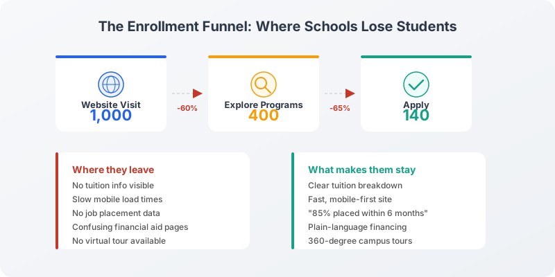
The single most expensive mistake I see on vocational school websites is making prospective students hunt. They land on a program page, can’t find the tuition, can’t tell how long the program runs, can’t see a job outcome, and they leave. No angry email, no bounce-rate alarm bell, just a quiet exit. Most enrollment problems are not marketing problems. They start on the page itself.
The math is brutal once you see it. The median education website converts visitors at 3.8%, while top performers hit 11.5%. That gap is rarely about traffic volume. It’s about friction. Across higher ed, schools that actually track their enrollment funnel convert inquiries to enrollment at 45 to 55%, versus 25 to 30% for schools that don’t. The winners measure where students drop off, then remove the drop-off point. Everything below is a drop-off point I’ve watched cost real applications.
Make Your Site Fast, Mobile, and Findable
Start here because 62% of education site visits come from mobile, and most of those are students researching on a phone between classes or at the kitchen table. If your mobile site takes five seconds to load, or forces three scrolls to find a program length, you’ve lost them before the content even matters. The average education site bounce rate is already 55.4%. A slow phone experience pushes that higher.
Two things to fix in order. First, speed and mobile usability: a student should see your program, its length, and a next step within a few seconds of landing, without pinch-zooming. Second, make search engines understand what you teach. When someone types “electrician certification near me,” your program page needs structured data so the search engine, and increasingly an AI answer engine, can read it cleanly. It isn’t flashy, but it lifts visibility and click-through in a crowded market. If you run on WordPress, I handle this with Rank Math for schema and on-page SEO, and I’ve written a full walkthrough on building an SEO-friendly website that applies directly to program pages.
This matters more in 2026 than it did even last year. With 46% of students using AI tools in their search, your structured, answer-first pages are what those tools quote back. A page that hides its facts in prose gets skipped. A page that states them plainly gets cited.
Show Tuition and Financing Without the Runaround
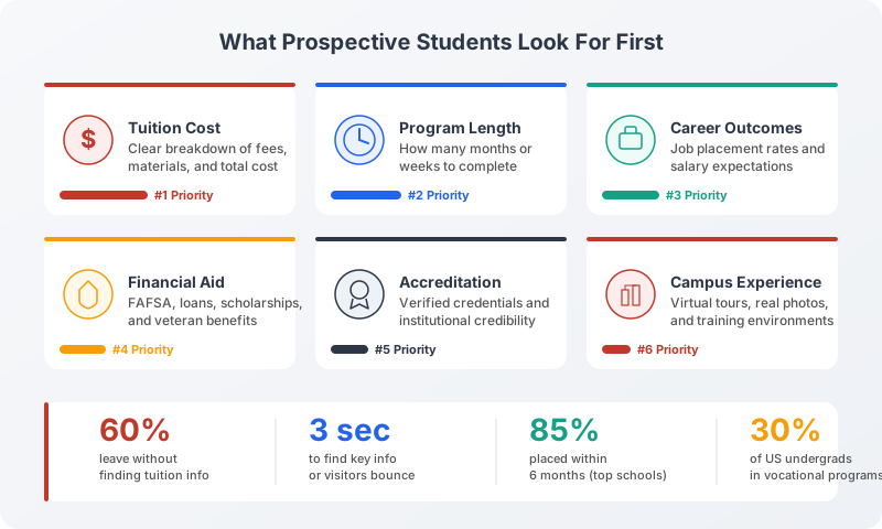
Cost anxiety kills applications before they start. When a prospective student can’t find tuition on the program page, they don’t assume it’s affordable, they assume the worst and leave. State the tuition plainly and say exactly what it includes: evaluation fees, tools, materials, anything bundled in. Transparency here does the opposite of what schools fear. It makes students comfortable enough to inquire, because they already know what to expect.
Pair the price with financing explained in plain language. Most financial aid pages read like a legal contract, and that scares people off. Walk a student through their real options in human terms: federal financial aid through FAFSA, student loans, scholarships, and veteran benefits. The goal is for someone to read that page and think “okay, I can actually pay for this.” When students can see a path to financing, they have the confidence to keep going. This is the same conversion principle I cover in my guide to optimizing web design for conversions, reduce uncertainty, and the action follows.
Lead With Outcomes and Visible Accreditation
Nobody enrolls for classes. They enroll for the job on the other side. So lead with outcomes: job placement rates, graduation rates, employer partners, and salary ranges. The more specific and statistical, the less uncertainty a student carries into the decision. Even a single line like “85% of graduates placed within six months” does more work than three paragraphs of program description. Numbers reduce risk, and reduced risk is what converts.
Accreditation belongs right next to those outcomes, not buried in the footer. Accreditation isn’t just a compliance checkbox, it’s a credibility signal, so put it on your admissions and program pages where students actually decide. Alongside it, state the program length, list the frequently asked questions, and note whether campus visits are available, the way strong vocational programs like AAI present their training. Transparency on these details builds the trust that turns a browser into an applicant.
Show the Real Training, Real Students, and Real Campus
Trade education is hands-on, and your website should feel that way too. Use real photos and video of your labs, equipment, and students actually working, so a visitor can picture themselves in that program. Authentic images beat stock photography every time, a prospective welder can tell the difference between a real shop and a stock-photo classroom in half a second.
Back the visuals with specific student stories. Testimonials work, but only when they’re concrete. “I switched from retail to HVAC and doubled my income in a year” beats “great program, highly recommend” by a mile. Career-change stories, income jumps, students who valued the flexible scheduling, those specifics are social proof generic praise can’t buy. And for the students who can’t visit yet, add a 360-degree or video campus tour. A virtual tour lets someone decide whether to make the trip before they ever set foot on campus, which keeps a warm lead warm.
Make the Campus Visit the Obvious Next Step
A campus visit is one of the strongest enrollment signals there is, so don’t make students dig for it. If your “Schedule a Tour” button sits at the bottom of the page, most visitors never see it. Move it up on key pages, repeat it mid-page, and make the booking process obvious and short. When a student clearly understands their next step, they take it. When they have to look for it, they don’t.
Remove the small frictions around the visit too. An interactive campus map with parking and the admissions office location stops a student from putting off a trip out of uncertainty. Live chat answers the quick questions, program length, evening classes, start dates, in the moment, before that student leaves to ask a competing school instead. Immediate answers keep people on your site and moving toward action.
Build One FAQ Hub That Answers Everything
Stop scattering answers across a dozen pages. Build one central FAQ hub where a prospective student finds every admission-related answer in a single place, including:
- Admission requirements and any age minimums
- Materials and supplies needed for each course
- Class schedules and program start dates
- Tuition, financing, and what’s included
A well-organized FAQ does double duty. It cuts the load on your admissions staff, and it gives applicants the confidence to apply. It’s also pure fuel for AI search: a clear question-and-answer page is exactly the format ChatGPT and Google’s AI answers pull from when a student asks “what do I need to enroll at a trade school.” That visibility feeds directly into trade school enrollment, because the AI answer often decides which schools make a student’s shortlist. Structure it with FAQ schema and you become the source those tools cite.
The Website Wins, Ranked by Impact
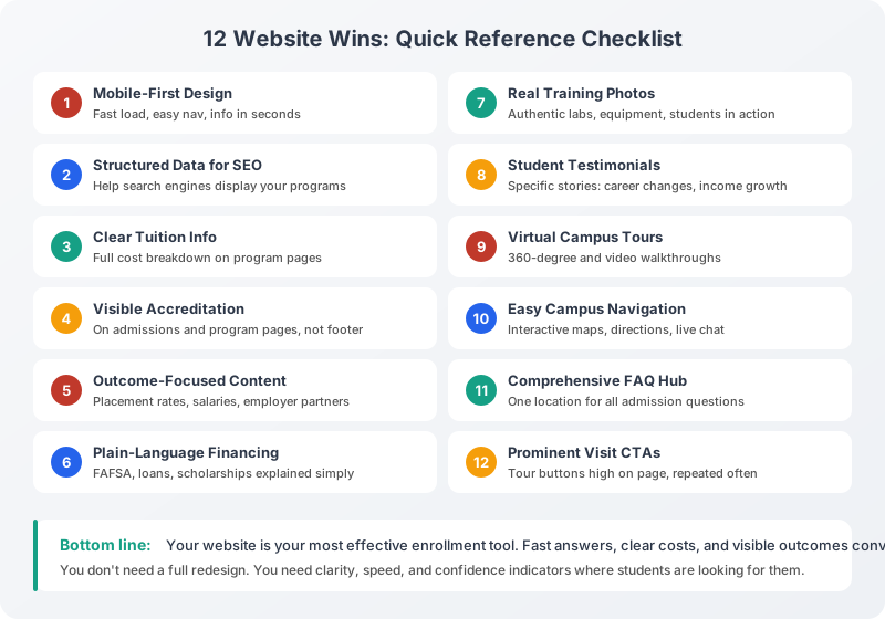
Here’s the whole playbook in one place. If you can’t do everything at once, work top to bottom, the fixes near the top remove the friction that loses the most applications.
| Website win | What it fixes | Why it grows enrollments |
|---|---|---|
| Fast, mobile-first pages | 62% mobile visits, 55% bounce | Students stay long enough to convert |
| Structured program data and SEO | Low search and AI visibility | Found in Google and quoted by AI search |
| Transparent tuition | Cost anxiety | Removes the top reason students leave |
| Plain-language financing | FAFSA and loan confusion | Shows a payable path forward |
| Outcomes and placement data | “What job do I get?” | One stat beats a page of description |
| Visible accreditation | Credibility doubt | Builds trust at the decision point |
| Real photos, video, and tours | Generic stock feel | Students picture themselves enrolled |
| Specific student stories | Weak social proof | Concrete results persuade |
| Prominent “Schedule a Tour” CTA | Hidden next step | Drives the strongest enrollment signal |
| Live chat and campus map | Unanswered quick questions | Keeps leads on your site |
| One central FAQ hub | Scattered answers | Confidence to apply, and AI-citable |
None of this is a redesign. It’s friction removal. Pick the two highest-traffic program pages, run them through this list, and watch the inquiry rate move before you touch anything else. Once the pages convert, then scale the traffic, the order matters. And if you want the content side of enrollment, the blog posts, program guides, and email that bring students in, I’ve covered that in depth in my guide to content marketing for educators.
Tell Google you want more of this.
Add Gaurav Tiwari as a preferred sourceOne tap, and this site shows up more often in your own Top Stories, AI Overviews and AI Mode. Remove it any time.