WordPress Accessibility & ADA Compliance in 2026: The Complete WCAG 2.2 Implementation Guide
April 24, 2026 is not a suggestion. It’s a federal deadline.
The Department of Justice published its final rule in April 2024 requiring all state and local government websites to meet WCAG 2.2 Level AA. Entities serving populations of 50,000 or more must comply by April 24, 2026. Smaller entities get until April 26, 2027. And if you think this only affects government sites, the private sector litigation numbers should make you uncomfortable.
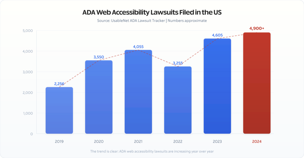
In 2023, there were over 4,600 web accessibility lawsuits filed in the US. In 2024, that number crossed 4,900. The trend line only goes one direction. The DOJ’s government mandate is raising the bar for everyone because courts increasingly reference WCAG 2.2 as the standard for what “accessible” means under the ADA — whether you’re a state agency or an ecommerce store.
I’ve been auditing and fixing WordPress sites for accessibility over the last decade. Most WordPress sites I audit fail between 15 and 40 WCAG 2.2 checkpoints. Not because the site owners don’t care. Because nobody showed them what to actually fix and how to fix it in WordPress specifically.
That’s what this guide does. No vague principles. No “just install a plugin.” Actual WordPress implementation for every WCAG 2.2 Level AA requirement that matters.
What Changed: The DOJ’s Final Rule on Web Accessibility

Before April 2024, web accessibility under the ADA existed in a legal grey area. The ADA (passed in 1990) never mentioned websites. Courts interpreted it differently — some said websites counted as “places of public accommodation,” others disagreed.
The DOJ’s final rule eliminated that ambiguity for government entities. Here’s what it requires:
- Standard: WCAG 2.2 Level AA (not 2.0, not 2.1 — the latest version)
- Who: All state and local government entities (Title II of the ADA)
- When: April 24, 2026 (populations 50,000+) or April 26, 2027 (smaller)
- What: Web content and mobile applications
- Enforcement: DOJ complaints, private lawsuits, and loss of federal funding
For private businesses (Title III of the ADA), there’s no explicit final rule yet. But here’s what matters: courts are already using WCAG 2.2 as the benchmark. The DOJ has entered settlement agreements with private companies referencing WCAG. And the legal trend is unmistakable.
If you build WordPress sites for clients — government, education, healthcare, ecommerce, really anyone — WCAG 2.2 Level AA is the standard you need to meet. Not because of one rule. Because it’s where all the legal momentum is pointing.
What’s New in WCAG 2.2 (Compared to 2.1)
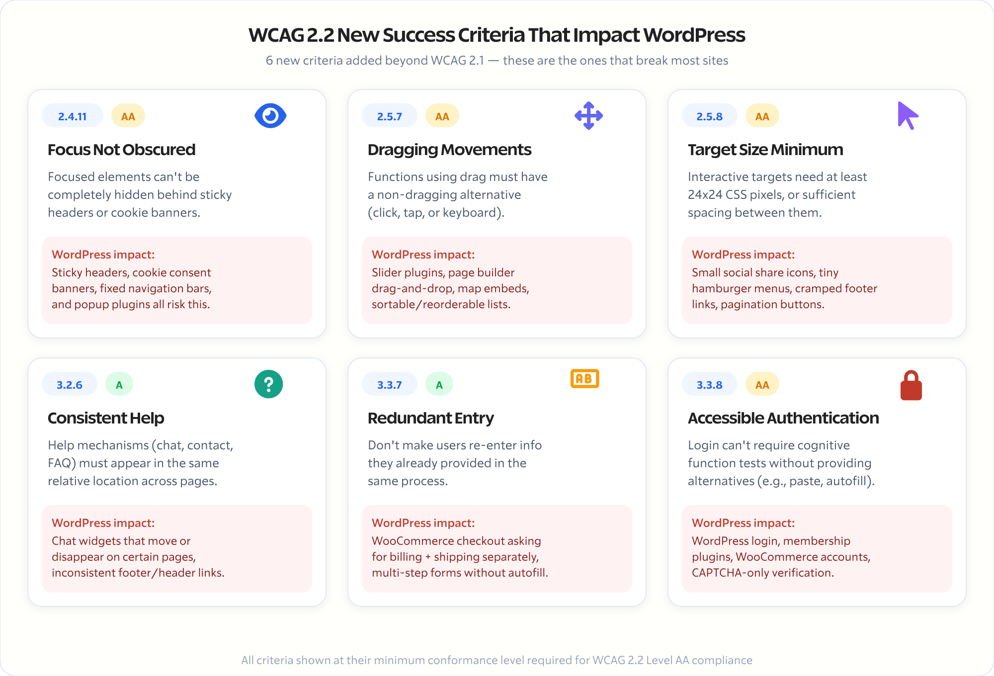
WCAG 2.2 added nine new success criteria. The ones that hit WordPress sites hardest:
- Focus Not Obscured (2.4.11): When an element gets keyboard focus, it can’t be completely hidden behind sticky headers, cookie banners, or fixed navigation. This is a huge issue on WordPress sites with sticky headers and popup plugins.
- Dragging Movements (2.5.7): Any function that uses dragging (sliders, drag-to-reorder, map controls) must have a non-dragging alternative. Think about every slider plugin and page builder drag-and-drop you’ve installed.
- Target Size Minimum (2.5.8): Interactive targets need to be at least 24×24 CSS pixels, or have sufficient spacing. Small social share icons, tiny hamburger menus, and cramped footer links all fail this.
- Consistent Help (3.2.6): If you have help mechanisms (chat widgets, contact links, FAQ links), they must appear in the same relative location across pages.
- Redundant Entry (3.3.7): Don’t make users re-enter information they’ve already provided in the same process. WooCommerce checkout flows and multi-step forms often violate this.
- Accessible Authentication (3.3.8): Login processes can’t require cognitive function tests (like remembering a password) without alternatives. This impacts every WordPress login form and membership site.
These aren’t theoretical concerns. They map directly to WordPress themes, plugins, and content patterns that millions of sites use every day.
The WordPress Accessibility Audit: Where to Start
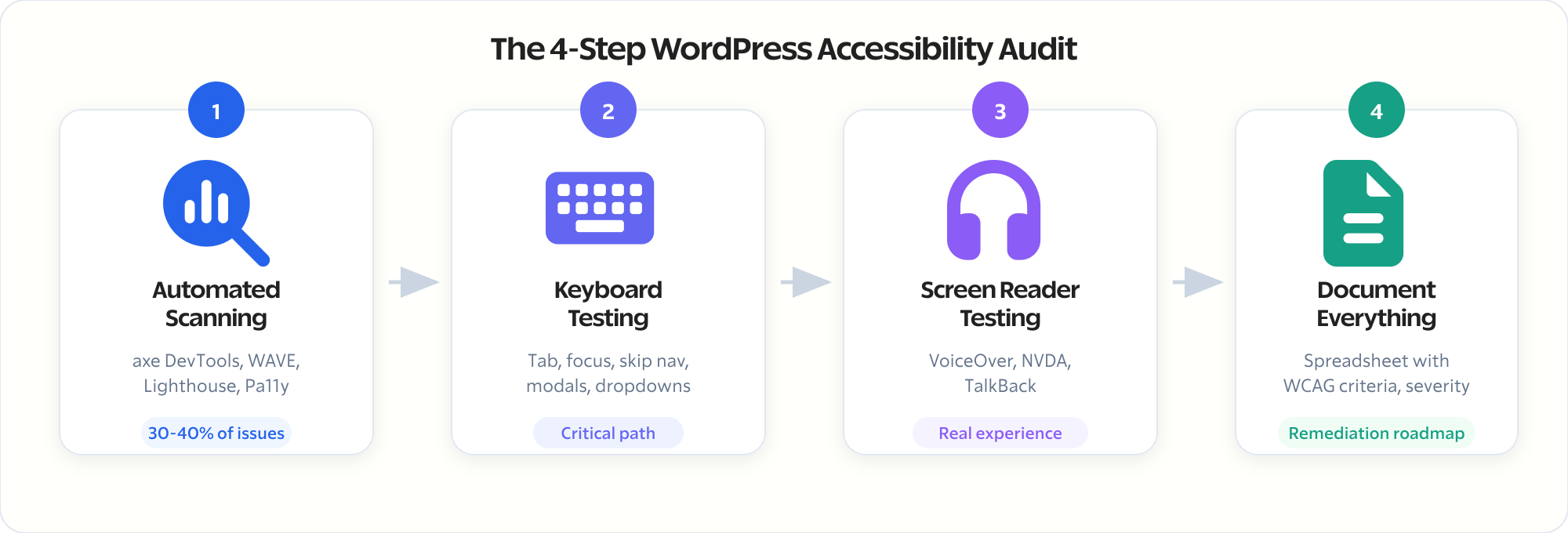
Before you fix anything, you need to know what’s broken. Here’s the audit process I run on every client site:
Step 1: Automated Scanning
Automated tools catch about 30-40% of accessibility issues. They’re fast, they’re consistent, and they’re where you start. But they’re not enough on their own.
Tools I use:
- axe DevTools (free Chrome extension): Run it on every major page template. It catches missing alt text, color contrast failures, missing form labels, and structural issues. Export the results as a CSV for tracking.
- WAVE (wave.webaim.org): Visual overlay showing exactly where errors occur on the page. Better for understanding spatial issues like reading order and heading hierarchy.
- Lighthouse Accessibility Audit (built into Chrome): Good for a quick score, but less detailed than axe. Use it as a sanity check, not your primary tool.
- Pa11y (command line): If you’re comfortable with the terminal, Pa11y lets you script accessibility checks across your entire site. I run it against sitemaps to test every URL automatically.
Run scans on at least these page types:
- Homepage
- A standard blog post
- A category/archive page
- Contact page (or any page with forms)
- Your most complex landing page
- WooCommerce product page, cart, and checkout (if applicable)
- Search results page
- 404 page
Step 2: Manual Keyboard Testing
This is where you catch the other 60-70%. Put your mouse away and navigate your entire site using only the keyboard.
Test these interactions:
- Tab through every page: Can you reach every interactive element? Links, buttons, form fields, dropdowns, modals, sliders? If your tab key skips something, it’s invisible to keyboard users.
- Focus visibility: Can you always see where you are? If there’s no visible focus indicator (outline, border change, background shift), keyboard users are navigating blind.
- Skip navigation: Press Tab on page load. Does a “Skip to content” link appear? Without it, keyboard users must tab through your entire header and navigation on every single page.
- Modal/popup behavior: Open a modal or popup. Does focus move into it? Can you close it with Escape? Does focus return to the trigger element when it closes? Most WordPress popup plugins get at least one of these wrong.
- Dropdown menus: Can you open, navigate, and close dropdown menus with keyboard alone? Arrow keys should work inside menus. Escape should close them.
- Sliders/carousels: Can you control slides with keyboard? Can you pause auto-playing carousels? If not, that’s a failure.
Step 3: Screen Reader Testing
Use an actual screen reader. On Mac, VoiceOver is built in (Cmd+F5). On Windows, NVDA is free. On mobile, TalkBack (Android) or VoiceOver (iOS).
Key things to check:
- Do images have meaningful alt text? (Not “image1.jpg” or “photo”)
- Are headings in the correct hierarchy? (H1 > H2 > H3, no skipping)
- Do form fields announce their labels?
- Are decorative images marked as such? (empty alt=”” attribute)
- Does the reading order make sense when the visual layout is stripped away?
- Are link texts descriptive? (“Read our pricing guide” not “click here”)
- Do ARIA landmarks exist? (banner, navigation, main, contentinfo)
Step 4: Document Everything
Create a spreadsheet with these columns:
- Page URL
- Issue description
- WCAG criterion violated (e.g., 1.1.1 Non-text Content)
- Severity (Critical / Major / Minor)
- Fix type (Theme / Plugin / Content / Code)
This becomes your remediation roadmap. Fix critical issues first, then major, then minor.
Choosing an Accessible WordPress Theme
Your theme is your foundation. A poorly-coded theme creates accessibility debt that no plugin can fix. Here’s what to look for:
Non-Negotiable Theme Requirements
- Semantic HTML structure: The theme should use
<header>,<nav>,<main>,<article>,<aside>,<footer>— not just<div>soup. Check the source code. If every section is a<div>with a class name, the theme is doing it wrong. - Proper heading hierarchy: The theme should output one
<h1>per page (the post/page title), with subsequent headings following a logical order. Some themes use<h3>for widget titles and<h4>for post titles. That’s a structural failure. - Skip navigation link: Built-in, not added via plugin. It should be the first focusable element on the page.
- Focus styles: Visible focus indicators on all interactive elements. Some themes strip focus outlines for aesthetics (
outline: nonewithout a replacement). That’s an automatic WCAG failure. - Responsive without breaking accessibility: The theme should remain navigable and readable from 320px viewport width up to any desktop resolution. Text should reflow. Nothing should require horizontal scrolling at 400% zoom.
- Color contrast in default configuration: The theme’s default color palette should meet WCAG AA contrast ratios (4.5:1 for normal text, 3:1 for large text and UI components).
Themes I Recommend for Accessibility

GeneratePress
GeneratePress is a lightweight WordPress theme built with a focus on speed and usability. Performance is important to us, which is why a fresh GeneratePress install adds less than 10kb (gzipped) to yo…
GeneratePress: Clean semantic markup, built-in skip navigation, excellent keyboard navigation, passes WCAG AA in default config. My go-to for client sites where accessibility matters.
Marketers Delight: Prioritizes accessibility from the ground up. Minimal, fast, semantic HTML by default.
Astra: Has an accessibility-focused mode, but you need to enable it explicitly. Default configuration misses a few things.
Kadence: Good accessibility defaults, proper heading structure, focus styles included. The free version handles most requirements.
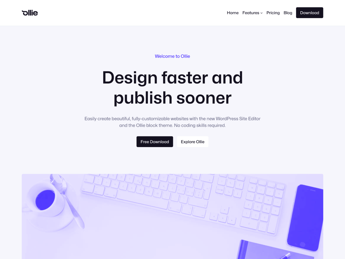
Ollie
Launch a blazing-fast, pixel-perfect website with the Ollie WordPress block theme! Ollie features over 50 beautiful pattern designs, 7 full-page pattern layouts, and a fully-customizable design system…
Block themes (Twenty Twenty-Five, Ollie): WordPress’s default block themes and generally most FSE themes are built with accessibility in mind. If you’re comfortable with Full Site Editing, these are solid starting points.
Themes to avoid for accessibility-critical projects: Any theme that relies heavily on JavaScript for layout rendering, themes with excessive CSS animations that can’t be disabled, and themes that override native browser focus behavior.
WordPress Accessibility Plugins: What Actually Helps
I’ve tested every major accessibility plugin. Here’s the honest breakdown. For a deeper dive, see my full roundup of the best accessibility plugins for WordPress.
Plugins That Solve Real Problems
WP Accessibility (free)
Joe Dolson’s plugin fixes common WordPress accessibility issues that core doesn’t handle. It adds skip navigation, fixes heading structure issues, removes title attributes from links, adds language attributes, and forces focus outlines. It’s not flashy. It just fixes things. Install it on every site.
OneTap Accessibility (free/premium)
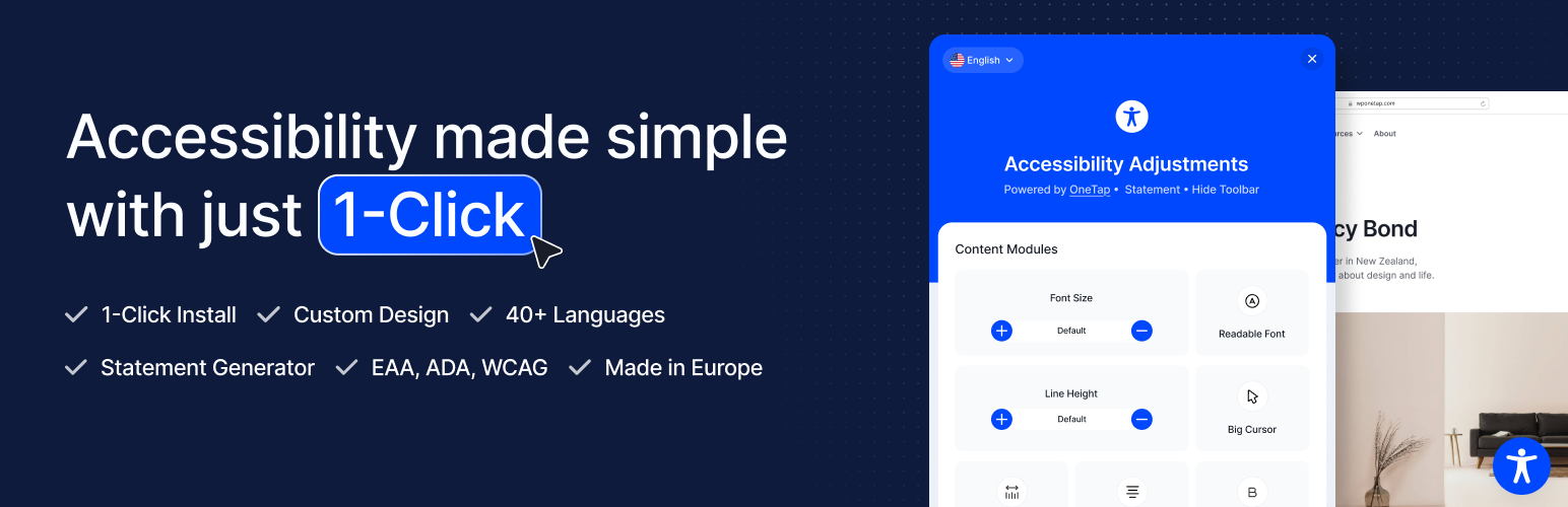
Accessibility Widget by OneTap – Easy One-Click Accessibility Toolbar
OneTap is a multilingual WordPress plugin designed for seamless website accessibility.
Adds an accessibility toolbar (font resizing, contrast modes, text spacing) and fixes common issues. The toolbar is controversial — some accessibility experts argue it’s performative rather than fixing root causes. I use it selectively: the toolbar is useful for sites that can’t do a full remediation immediately, but it’s not a substitute for proper implementation.
The Overlay Problem
Accessibility overlays — tools that add a JavaScript widget promising one-click ADA compliance — are problematic. Tools like accessiBe, UserWay, and AudioEye use AI to detect and “fix” accessibility issues in real-time.
The National Federation of the Blind has publicly opposed overlay products. Multiple lawsuits have been filed against companies using overlays. In some cases, having an overlay installed was used as evidence that the company was aware of accessibility issues but chose a shortcut instead of fixing them.
Overlays can’t fix:
- Bad heading structure in your content
- Missing alt text (they guess, often wrong)
- Broken keyboard navigation in third-party plugins
- Form fields without programmatic labels
- Complex interactive widgets built without ARIA
My stance: overlays are a band-aid that can actively make things worse. If you need a temporary stopgap while doing proper remediation, fine. But never treat an overlay as your accessibility solution. Read my detailed accessiBe review for more context.
Essential Plugin Accessibility Checks
Every plugin you install is a potential accessibility liability. Before adding any plugin, check:
- Does it add interactive elements? (Forms, sliders, popups, tabs, accordions) If yes, test them with keyboard-only navigation.
- Does it inject content? (Related posts, social sharing buttons, notification bars) Check that the injected content has proper ARIA labels and doesn’t break the heading hierarchy.
- Does it modify navigation? (Mega menus, mobile menu replacements) Test extensively with keyboard and screen reader.
- Does it add media? (Image galleries, video embeds, audio players) Verify alt text support, captions, and keyboard controls.
Content Accessibility: The Part Most People Skip
Your theme and plugins can be perfect. But if your content isn’t accessible, you still fail WCAG.
Images
- Every informative image needs alt text. Describe what the image shows and why it matters in context. “Screenshot of WordPress dashboard showing the Plugins page with WP Accessibility plugin activated” is better than “WordPress dashboard.”
- Decorative images need empty alt attributes.
alt=""tells screen readers to skip the image. If an image is purely decorative (background patterns, spacer graphics), don’t describe it. - Complex images need long descriptions. Charts, graphs, infographics — provide the data in text form below the image or in an expandable section.
- Don’t use images of text. If you put text in an image (quotes, pricing tables, process steps), screen readers can’t read it and users can’t resize it.
Headings
This is where WordPress content creators fail most often.
- Use headings for structure, not for styling. If you make something an H3 because you like how it looks, you’ve broken the document outline for screen reader users.
- Never skip heading levels. H1 > H2 > H3, always. Don’t jump from H2 to H4.
- One H1 per page. WordPress handles this automatically for posts and pages (the title). Don’t add another H1 in your content.
- Heading hierarchy should make sense as an outline. If you extracted just the headings from your page, would they tell a coherent story?
Links
- Link text must be descriptive. “Click here” and “Read more” are meaningless out of context. Screen reader users often navigate by links alone — they hear a list of link texts without surrounding content.
- If multiple links say “Read more,” they all sound identical to screen readers. Use the post title: “Read more about WordPress security hardening.”
- Links that open in new tabs need to indicate this. Add “(opens in a new tab)” to the link text or use
aria-label. - Don’t use URLs as link text. Use descriptive text instead: “Read our ADA compliance guide.”
Color and Contrast
- Text contrast ratio must be at least 4.5:1 against its background (3:1 for large text — 18px bold or 24px regular).
- Don’t use color alone to convey information. If your form shows errors in red, also add an error icon or text label. If your chart uses color-coded lines, also use different line styles (solid, dashed, dotted).
- Check contrast in all states: hover, focus, active, disabled. A button that meets contrast in its default state but fails on hover is still a violation.
- Tools: Use the WebAIM Contrast Checker or the built-in contrast checker in Chrome DevTools (inspect an element, look at the color swatch in the Styles panel).
Video and Audio
- Videos need captions. Not auto-generated — accurate, synchronized captions. YouTube’s auto-captions are a starting point, but they’re not sufficient for compliance.
- Videos need audio descriptions if visual information isn’t conveyed through the audio track. If a tutorial shows clicking on buttons without saying what you’re clicking, a blind user misses critical information.
- Audio-only content needs transcripts.
- Auto-playing media is a WCAG violation unless it stops within 3 seconds or has controls to pause/stop. WordPress video embeds and background video sections are common offenders.
Forms
Forms are accessibility minefields. Every form on your site needs:
- Visible labels for every input field. Placeholder text is not a label. When the user starts typing, the placeholder disappears and they lose context.
- Programmatic label association. The
<label>element must be connected to the input viaforandidattributes. Most WordPress form plugins handle this, but verify. - Error identification. When a form submission fails, errors must identify the specific field and describe the problem in text. “The email field is required” not just a red border.
- Error suggestion. If the error is detectable (wrong email format, password too short), suggest the correction.
- Required fields must be indicated both visually and programmatically. An asterisk alone isn’t sufficient — add text like “required” or use
aria-required="true".
Code-Level Fixes for WordPress Developers
If you’re comfortable editing theme files or building custom blocks, these code-level fixes address the most common WCAG failures I find on WordPress sites.
Add ARIA Landmarks
If your theme doesn’t use semantic HTML elements, add ARIA landmarks:
// In header.php or equivalent template part
<div role="banner">
    <!-- Site header content -->
</div>
<div role="navigation" aria-label="Main navigation">
    <!-- Primary menu -->
</div>

// In your main content template
<div role="main">
    <!-- Page content -->
</div>

// In sidebar.php
<div role="complementary" aria-label="Sidebar">
    <!-- Widget area -->
</div>

// In footer.php
<div role="contentinfo">
    <!-- Footer content -->
</div>
Better yet, switch to semantic elements (<header>, <nav>, <main>, <aside>, <footer>) and drop the role attributes — the semantic elements carry implicit ARIA roles.
Fix Skip Navigation
Add this as the first element inside <body>:
<a class="skip-link screen-reader-text" href="#primary">
    Skip to content
</a>
And the CSS:
.skip-link {
    position: absolute;
    top: -100%;
    left: 0;
    z-index: 999;
    padding: 0.5rem 1rem;
    background: #000;
    color: #fff;
    text-decoration: none;
    font-weight: 700;
}

.skip-link:focus {
    top: 0;
}
Make sure your main content area has id="primary" (or whatever ID you reference).
Fix Focus Styles
Never remove focus outlines without providing an alternative:
/* BAD - removes focus indication entirely */
*:focus {
    outline: none;
}

/* GOOD - custom focus style that's visible and attractive */
*:focus-visible {
    outline: 2px solid currentColor;
    outline-offset: 2px;
}

/* Even better - respects OS-level preferences */
@media (prefers-reduced-motion: no-preference) {
    *:focus-visible {
        transition: outline-offset 0.1s ease;
        outline: 2px solid var(--color-primary, #0073aa);
        outline-offset: 3px;
    }
}
Use :focus-visible instead of :focus so mouse users don’t see focus rings on click, but keyboard users always see them.
Accessible Mobile Menu Toggle
Most WordPress themes use a hamburger menu that fails keyboard and screen reader testing. Here’s a proper implementation:
<button
    class="menu-toggle"
    aria-expanded="false"
    aria-controls="primary-menu"
    aria-label="Menu"
>
    <span class="hamburger-icon" aria-hidden="true"></span>
    <span class="screen-reader-text">Menu</span>
</button>

<nav id="primary-menu" aria-label="Primary navigation">
    <!-- wp_nav_menu output -->
</nav>
const toggle = document.querySelector('.menu-toggle');
const menu = document.getElementById('primary-menu');
toggle.addEventListener('click', () => {
const expanded = toggle.getAttribute('aria-expanded') === 'true';
toggle.setAttribute('aria-expanded', !expanded);
menu.classList.toggle('is-active');
});
// Close on Escape
document.addEventListener('keydown', (e) => {
if (e.key === 'Escape' && toggle.getAttribute('aria-expanded') === 'true') {
toggle.setAttribute('aria-expanded', 'false');
menu.classList.remove('is-active');
toggle.focus();
}
});WordPress-Specific wp_nav_menu Accessibility
WordPress’s wp_nav_menu() function needs some help for full accessibility:
// In functions.php
function accessible_nav_menu_args($args) {
    // Add aria-label to navigation
    if ($args['theme_location'] === 'primary') {
        $args['container_aria_label'] = 'Primary navigation';
    }
    return $args;
}
add_filter('wp_nav_menu_args', 'accessible_nav_menu_args');

// Add aria-current to current menu items
function add_aria_current_to_nav($atts, $item) {
    if ($item->current) {
        $atts['aria-current'] = 'page';
    }
    return $atts;
}
add_filter('nav_menu_link_attributes', 'add_aria_current_to_nav', 10, 2);
Accessible WordPress Search Form
The default WordPress search form often lacks proper labeling:
// In functions.php or a template
function accessible_search_form($form) {
    $form = '<form role="search" method="get" class="search-form" action="' . esc_url(home_url('/')) . '">
        <label for="site-search" class="screen-reader-text">Search for:</label>
        <input type="search" id="site-search" class="search-field"
            placeholder="Search..."
            value="' . get_search_query() . '"
            name="s"
            aria-label="Search this website"
        />
        <button type="submit" class="search-submit">
            <span class="screen-reader-text">Search</span>
            <svg aria-hidden="true" ...><!-- search icon --></svg>
        </button>
    </form>';
    return $form;
}
add_filter('get_search_form', 'accessible_search_form');
Handling Third-Party Embeds
YouTube, Twitter, Instagram embeds often lack accessibility. Wrap them properly:
<!-- YouTube embed with accessible wrapper -->
<figure>
    <div class="responsive-embed" role="group" aria-label="Video: How to optimize WordPress performance">
        <iframe
            src="https://www.youtube.com/embed/VIDEO_ID"
            title="How to optimize WordPress performance"
            allow="accelerometer; autoplay; clipboard-write; encrypted-media; gyroscope"
            allowfullscreen
        ></iframe>
    </div>
    <figcaption>
        Video: How to optimize WordPress performance.
        <a href="/transcript-wordpress-performance/">Read the transcript</a>.
    </figcaption>
</figure>
Every iframe needs a title attribute describing its content.
Testing Tools and Workflow
Here’s the exact testing workflow I use before signing off on any accessibility project:
Automated Testing Stack
| Tool | What It Catches | Cost |
|---|---|---|
| axe DevTools | WCAG violations in rendered DOM | Free extension |
| WAVE | Visual error overlay, structural issues | Free |
| Pa11y CI | Full-site automated scanning | Free (open source) |
| Lighthouse | Quick score + performance overlap | Built into Chrome |
| Tenon | API-based testing for CI/CD pipelines | Paid |
Manual Testing Checklist
Run this on every major template after automated scans:
- Keyboard-only navigation: Tab, Shift+Tab, Enter, Space, Escape, Arrow keys
- Skip link: visible on first Tab press, jumps to main content
- Focus visible: every focusable element shows focus state
- Heading hierarchy: logical, no skips (use HeadingsMap extension)
- Zoom to 200%: content reflows, nothing overlaps or becomes hidden
- Zoom to 400%: still usable, text reflows into single column
- Screen reader: full page read, form interaction, navigation
- High contrast mode: content visible in Windows High Contrast Mode
- Reduced motion: animations respect
prefers-reduced-motion - Mobile: touch targets 44x44px minimum, no horizontal scroll
Integrating Accessibility into Development
Don’t treat accessibility as a post-launch audit. Bake it into your development process:
- Use an accessible starter theme. Fix problems before they exist.
- Run axe DevTools during development. Check after every component you build, not at the end.
- Add Pa11y to your CI/CD pipeline. Fail the build if new accessibility violations are introduced.
- Review content before publishing. Create an accessibility checklist for content editors: alt text, heading structure, link text, color-only information.
- Test with real assistive technology quarterly. Tools approximate but don’t replace the experience of actual screen reader users.
Ongoing Compliance: Accessibility Is Not a One-Time Fix
This is the part everyone gets wrong. They audit, they fix, they check the box. Six months later, the site is back to non-compliant because:
- New blog posts added without alt text
- A plugin update broke keyboard navigation in a form
- A new landing page was built without heading structure
- A redesign introduced low-contrast text on the new color palette
- A third-party widget was added with no accessibility testing
Maintenance Strategy
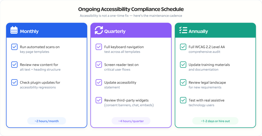
Monthly:
- Run automated scans on key pages
- Review newly published content for alt text and heading structure
- Check any new plugins or updates for accessibility regressions
Quarterly:
- Full keyboard navigation test across all templates
- Screen reader testing on critical user flows (contact, purchase, registration)
- Review and update accessibility statement
- Check third-party services (analytics consent banners, chat widgets, embedded content)
Annually:
- Full WCAG 2.2 Level AA audit
- Update documentation and training materials
- Review legal landscape for new requirements
- Test with actual users who rely on assistive technology
Create an Accessibility Statement
Every site should have a public accessibility statement. Include:
- Which standard you’re following (WCAG 2.2 Level AA)
- Current conformance status
- Known limitations and timeline for fixes
- How users can report accessibility issues
- Contact information for accessibility concerns
This isn’t just good practice — it’s evidence that you take accessibility seriously, which matters if you ever face legal action.
When to Hire Help
I’ll be direct: if your site serves a government entity, handles healthcare data, operates in education, or processes significant ecommerce transactions, you need professional help. An accessibility audit and remediation is specialized work.
Here’s when DIY makes sense:
- Personal blogs and small content sites
- Sites with minimal interactivity (no forms, no ecommerce)
- Sites using well-tested accessible themes with default configurations
Here’s when you need a professional:
- Government or government-adjacent sites (the deadline is real and the penalties are real)
- Ecommerce sites (checkout flows are accessibility nightmares)
- Membership or LMS sites (complex interactive patterns)
- Sites that have received accessibility complaints or legal demand letters
- Sites in healthcare, finance, or education (regulated industries)
- Any site with custom-developed interactive components
A proper accessibility audit covers automated scanning, manual testing, assistive technology testing, and a prioritized remediation plan. Budget around $2,000 – $8,000 depending on site complexity. Remediation work is additional, but at least you’ll know exactly what needs fixing and in what order.
If you need help with this, reach out through Gatilab. I’ve done accessibility audits and remediation across government, education, and enterprise WordPress sites. The work is technical, specific, and not something a generic “website audit” covers.
The Bottom Line
April 24, 2026 is 28 days away as I write this. If you manage a government WordPress site, you’re out of time for a leisurely approach. Start with the automated audit, fix the critical issues, and get professional help for the complex stuff.
If you manage a private sector site, you have a window — but that window is closing. Every year, more lawsuits are filed. Every year, the standard tightens. WCAG 2.2 Level AA is where the line is being drawn, and it’s not moving backwards.
The good news: WordPress can be fully accessible. The platform supports semantic HTML, proper ARIA, keyboard navigation, and every WCAG 2.2 requirement. The failures are almost always in implementation — themes, plugins, and content — not in WordPress itself.
Fix the foundation (theme). Audit the additions (plugins). Train the creators (content). Test continuously. That’s the entire strategy.
Accessibility isn’t a feature. It’s a quality attribute. The same way you wouldn’t ship a site that breaks on mobile, don’t ship a site that breaks for the 1.3 billion people worldwide who live with some form of disability.
Start today. The deadline doesn’t care about your timeline.
Related reading:
- How to Make Your Website ADA Compliant — Our broader ADA compliance overview
- Best Accessibility Plugins for WordPress — Detailed plugin comparison
- Top 10 Accessibility Features Every Website Should Include — Quick reference checklist
- accessiBe Review — Why overlays aren’t the answer
Disclaimer: This site is reader-supported. If you buy through some links, I may earn a small commission at no extra cost to you. I only recommend tools I trust and would use myself. Your support helps keep gauravtiwari.org free and focused on real-world advice. Thanks. - Gaurav Tiwari