
 by
by
These web design power tips focus on twelve decisions you can inspect: clarity, consistency, typography, media, whitespace, color, navigation, content hierarchy, performance, mobile behavior, accessibility, and conversion paths. A visitor does not arrive with a universal three-second timer. Your job is to make the offer, audience, and next action easy to identify without hunting.
My order is deliberate: remove decision friction first, establish a small visual system second, then test speed, mobile behavior, accessibility, and the conversion path. Visual simplicity is the best starting point because it exposes the real hierarchy. It is not a conversion guarantee. The page still needs a useful offer, credible proof, and measurement.
Evidence rule: Separate standards, controlled tests, and field results. The Core Web Vitals thresholds are standards-backed targets. The matrix below is a reproducible browser fixture. Your conversion rate still needs an experiment on your own traffic, offer, and audience.
The 2026 baseline: Core Web Vitals use LCP, INP, and CLS. WCAG 2.2 remains the W3C Recommendation. The WebAIM Million’s February 2026 scan found detectable WCAG failures on 95.9% of one million home pages, with 56.1 detected errors per page on average. Browser format support changes, so image decisions should come from an encode-and-render test, not a frozen percentage.
This guide is organized like a book, chapter by chapter, because web design isn’t a checklist you rush through. Each principle builds on the last. Read it straight through the first time, then bookmark the chapters you need to revisit. No fluff, no generic “make it pretty” advice. Just what I’ve learned from building sites that needed to actually do something.
Reproducible Browser Test Matrix
I ran five isolated baseline-and-fix cases in Chromium 149.0.7827.55, Playwright 1.61.1, Node v24.14.0, on darwin 27.0.0 (arm64). The mobile viewport was 390 by 844 CSS pixels. These are controlled browser fixtures, not claims about every production site.
| Check | Baseline | Measured result | Failure mode and rollback |
|---|---|---|---|
| Mobile overflow | 960px document on a 390px viewport | width:min(100%,960px) reduced overflow from 570px to 0px | Fixed-width content caused side-scrolling. If the responsive rule breaks a child component, restore it, isolate the child, and retest. |
| Pointer target | 22×22 CSS px | 44×44 CSS px; WCAG minimum is 24×24 with exceptions | The baseline missed the target-size test. Revert only if spacing or an equivalent control satisfies the criterion. |
| Normal-text contrast | #9a9a9a on white measured 2.81:1 | #595959 on white measured 7:1, above the 4.5:1 AA threshold | The baseline failed. If the replacement conflicts with the palette, select another token that still measures at least 4.5:1. |
| Keyboard focus | outline:none; computed style was none | A 3px solid focus indicator remained visible | The baseline hid focus. Remove the custom rule only after restoring a tested user-agent or two-color indicator. |
| Media space | Following text moved 180px when the image appeared | An accurate 16:9 reservation reduced the measured movement to 0px | If the ratio crops incorrectly, restore the old rule and use accurate width and height attributes. |
The standards behind the pass rules are explicit: 4.5:1 normal-text contrast, 24 by 24 CSS-pixel target size with exceptions, and visible keyboard focus. A production release still needs real content, real traffic, assistive-technology checks, and field performance data.
Visual Simplicity
I use the three-second check as a heuristic, not a law: show the page to someone unfamiliar with the project, then ask what it offers, who it serves, and what action appears primary. Record the answer instead of pretending a stopwatch predicts trust or conversion.
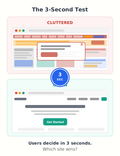
An elaborate mockup can still fail in production. Decorative layers increase the number of visual signals a visitor must sort, and animation can compete with the primary action. Remove elements until the hierarchy survives without explanation, then add back only what carries meaning.
The 3-Second Test
Pull up your website on a phone. Hand it to someone who’s never seen it. Count to three. Then take it back and ask two questions: What does this site do? What should I click first?
If they can’t answer both, your design is too complicated. The fix isn’t adding more explanatory text. It’s removing everything that isn’t directly answering those two questions.
Removing vs. Adding
Most design problems aren’t solved by adding things. They’re solved by removing them. That sidebar widget you added “just in case”? Remove it. The three different call-to-action buttons competing for attention? Pick one. The stock photo that fills space but says nothing? Delete it.
Element count alone does not predict conversion. The stronger test is whether every visible element has a job: explain the offer, establish proof, answer an objection, or move the visitor to the next step. If two elements compete for the same attention, choose one.
A Simple Design Audit
Open your homepage and ask yourself these questions about every single element:
Does this help the visitor understand what I offer?
If the element doesn’t communicate your value proposition, it’s noise.
Does this move them toward a specific action?
Every element should nudge the visitor closer to your primary CTA.
Would anyone miss this if I removed it?
If no, remove it. Compare the hierarchy before and after, and keep the simpler version when the primary action becomes easier to identify.
The clarity test is a heuristic, not a conversion statistic. Ask an unfamiliar reader to identify the offer, audience, and next action, then remove competing elements until those answers are obvious.
Design Consistency
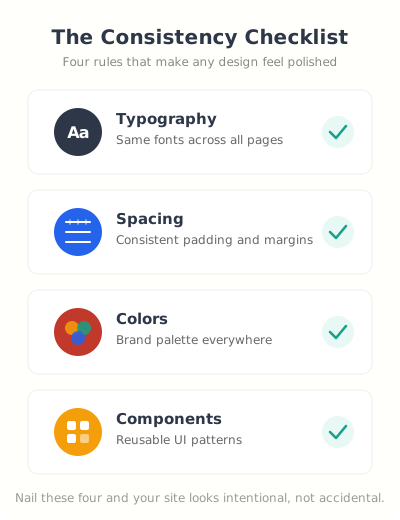
Consistency is the part of design that nobody notices when it’s done right and everybody notices when it’s wrong. You know that feeling when you click to a different page on a website and it looks like a completely different site? Different fonts, different spacing, different button styles. That’s a consistency failure, and it destroys trust faster than almost anything else.
Build a Typography System
Pick one font family. Two at the absolute maximum, one for headings, one for body. Then define exactly five sizes and stick to them across every page. I use a scale like this: page title, section heading, subsection, body text, and caption. That’s it. No “slightly bigger for this special section” exceptions.
GeneratePress makes this token-based approach practical: define a small type scale and spacing scale in one place, then reuse them. A system stack avoids a font download; a custom font can still be justified when its measured brand value exceeds its transfer and rendering cost.
Spacing Rhythm
Use a base spacing unit and multiply it. I use 8px as my base. So all spacing in a design is 8px, 16px, 24px, 32px, 48px, or 64px. Nothing in between. This creates a visual rhythm that makes everything feel intentional even if visitors can’t articulate why.
Random spacing is the number one tell that a site was built by someone without design training. Fix the spacing, and a mediocre design starts looking professional.
Component Reuse
Every button should look the same. Every card should have the same border radius, padding, and shadow. Every form field should have identical styling. When you reuse components consistently, your site feels like one cohesive product instead of a collection of random pages stitched together.
Typography That Works
Typography isn’t about picking a “cool” font. It’s about readability, hierarchy, and making sure people actually consume the content you worked so hard to create. I’ve seen gorgeous websites with unreadable text. Thin gray fonts on white backgrounds. Decorative scripts for body copy. Headings that are the same size as paragraphs.
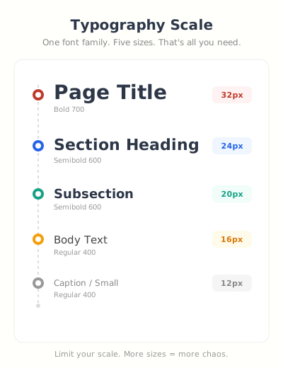
Good typography is invisible. The reader focuses on the words, not the font. If you notice the typeface, the designer failed.
Font Pairing That Works Every Time
If you’re not a designer, don’t try to get creative with font pairing. Use a system font stack: -apple-system, BlinkMacSystemFont, Segoe UI, Roboto, sans-serif. It’s already on every device, loads instantly (zero font files to download), and looks clean on every screen.
If you want a custom look, one display face for headings and a system font for body text is a sensible starting point. Then test language coverage, 200% zoom, narrow screens, font fallback, and actual transferred bytes. A restrained pairing is useful because it limits variables, not because two fonts are a universal maximum.
Size and Line Height
Start body text around 16px to 18px with a line height near 1.5, then test the actual typeface at 200% zoom and on a narrow viewport. A number that works for one font, language, and reading distance can fail for another. The pass condition is readable, reflowing text without clipped content or forced horizontal scrolling.
Line length matters too. Keep paragraphs between 50 and 75 characters wide. That’s about 600-700px on desktop. Wider than that and the eye loses its place jumping to the next line. This is why full-width text blocks on wide monitors are painful to read.
Web Font Performance
Custom-font cost depends on the file, subset, compression, weights, preload policy, and cache state. Inspect the transferred bytes and request waterfall in browser tools. Do not multiply a generic kilobyte estimate and call it a performance result.
If you must use custom fonts, use font-display: swap so text appears immediately in a fallback font while the custom font loads. Better yet, subset your fonts to include only the characters you actually use. A full Google Font file includes Cyrillic, Greek, Vietnamese, and other character sets you probably don’t need.
Visual Media
Images and videos are the heaviest elements on any webpage. They’re also the most important for engagement. Getting this balance right, using strong visuals without destroying your load time, is one of the core skills of modern web design.
Choosing the Right Images for Web Design
Stock photos of people shaking hands in front of a whiteboard don’t help anyone. Your visitors have seen those images a thousand times and their brains filter them out completely. Use original photos when possible. Screenshots of your actual product. Real team photos, even imperfect ones. Diagrams that explain your process.
If you must use stock photos, pick ones that feel candid rather than staged. Sites like Unsplash have decent options, but you need to scroll past the first page of results because everyone else uses those top photos too.
Image Formats in 2026
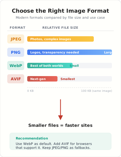
Do not choose an image format from a generic savings percentage. Encode the same source as JPEG, WebP, and AVIF at acceptable visual quality, then compare transferred bytes and render support. Keep dimensions in the markup and use <picture> when a fallback is needed. I keep a separate walkthrough on how to compress images for the web.
AVIF can win an encode test, especially for photographic assets, but it is not automatically smaller at the quality your image needs. Keep a WebP or JPEG fallback where required, verify the response selected by the browser, and compare visual quality at the rendered size.
For logos and icons, use SVG. They scale perfectly to any screen size, the files are tiny, and you can style them with CSS.
For creating custom graphics, diagrams, and social images without hiring a designer, Canva is hard to beat. I use it for blog graphics, comparison charts, and quick social media visuals. The free tier covers most needs, but Pro gives you background removal and brand kit features that save real time.
Video Strategy
Video delivery is a budget decision. A click-to-load third-party embed can protect initial rendering, while self-hosting may be appropriate for privacy, control, or a core product demo. Measure the poster, player, consent layer, media transfer, and playback behavior before choosing.
Better yet, use a facade pattern: show a static thumbnail image that looks like a video player. Only load the actual YouTube iframe when someone clicks on it. This alone can save 500KB-1MB of JavaScript on pages with embedded videos.
Whitespace and Layout
Whitespace isn’t wasted space. It’s the single most powerful design tool you have, and the one most people are afraid to use. Clients see whitespace and think “why is there nothing there? We’re paying for the whole page!” But whitespace is what makes the content that IS there actually visible.
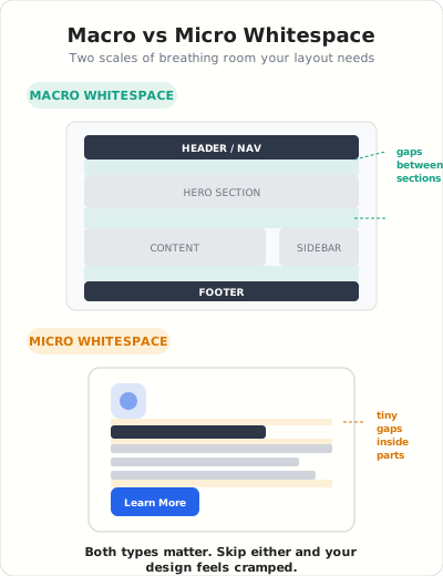
Macro vs. Micro Whitespace
Macro whitespace is the space between major sections. The gap between your header and your first content block. The margins around your main content area. The breathing room between your footer and the content above it. This should be generous, 48px to 96px typically.
Micro whitespace is the space within components. The padding inside a button. The gap between a heading and its paragraph. The space between list items. This should be consistent and proportional, usually 8px to 24px.
Most sites get macro whitespace somewhat right but completely botch micro whitespace. Text jammed right up against card borders. Buttons where the text is touching the edges. Headings that are closer to the paragraph above them than the content below. These small spacing failures make an otherwise decent design feel cheap.
Grid Systems
Use a consistent underlying grid, but choose the column count from the content. Twelve columns divide neatly for many editorial and commerce layouts; a single reading column or a four-column product grid may need less. The grid serves alignment, not convention.
CSS Grid makes this trivial now. A simple display: grid; grid-template-columns: repeat(12, 1fr); gives you a professional layout foundation in one line of code. I use this on every project.
Content Density Balance
Do not target a universal content-density percentage. Compare the page at representative widths and ask whether related items group clearly, headings remain scannable, and whitespace still separates decisions. A landing page and a documentation page should not share the same density budget.
Color Strategy
Color problems usually come from missing roles, not from one bad hex value. Define tokens for surfaces, text, borders, actions, and states, then measure every important pair. Three purposeful colors can be easier to govern than eight, but the number alone does not determine quality.
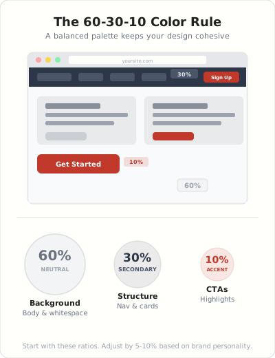
The 60-30-10 Rule
Treat 60-30-10 as a palette heuristic, not a measured law. Let the neutral color carry most surfaces, use the secondary color for structure, and reserve the accent for actions and state. The exact ratio matters less than contrast, consistency, and a clear semantic role for each token.
This ratio creates visual hierarchy automatically. The 10% color pops because it’s rare. If everything is your brand color, nothing stands out.
Contrast Ratios for Accessibility
WCAG 2.2 SC 1.4.3 requires at least 4.5:1 contrast for normal text and 3:1 for large text, with stated exceptions. Measure the rendered foreground and background pair instead of judging it by eye.
Light gray text on a white background fails this. That trendy thin font in a soft color? Fails. Use a contrast checker (WebAIM has a free one) and test every text/background combination on your site. You’ll be surprised how many “stylish” designs are actually unreadable for people with even mild visual impairments.
If you want to see the 60-30-10 rule done well, look at sites built with Webflow. Their showcase gallery is full of examples where designers nail this ratio. It’s also a solid visual builder if you’re not locked into WordPress.
Dark Mode Considerations
Dark mode isn’t just “invert the colors.” Pure white text on pure black backgrounds creates harsh contrast that causes eye strain. Use off-white (#E0E0E0 or similar) on dark gray (#1A1A2E or similar) instead. And make sure your images, especially logos and diagrams, have transparent backgrounds or dark-mode variants so they don’t look like bright rectangles floating in a dark sea.
Navigation and Intuitive UX
If your visitors can’t find what they’re looking for in two clicks, your navigation has failed. It doesn’t matter how beautiful your homepage is or how compelling your copy. A confused visitor is a gone visitor.
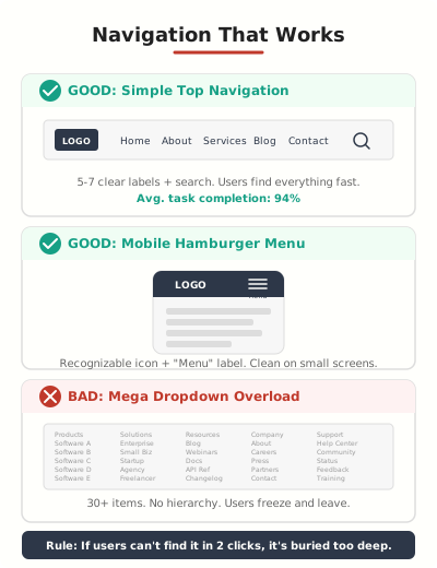
Menu Patterns That Work
Do not force every navigation into a five-to-seven-item rule. Start with the highest-value user tasks, group related destinations, and test whether people can predict the label before opening a menu. A large catalog may need search, filters, and a mega menu; a service site may need four links.
And please, label your menu items clearly. “Solutions” means nothing. “Products” means nothing. “Pricing,” “Features,” “Blog,” “Contact,” these tell me exactly what I’ll find when I click. Don’t sacrifice clarity for cleverness.
Search Placement
Add search when navigation and landing pages no longer cover the user’s retrieval tasks. The page count alone is not the trigger. Review internal search demand, zero-result queries, search exits, and the visibility of the control on narrow screens.
Mobile Navigation
A collapsed menu saves narrow-screen space, but the icon and its label still need a clear accessible name, visible focus, sufficient target size, and predictable open and close behavior. Keep a primary action outside the menu only when testing shows that the added header weight helps task completion without covering content.
A primary action hidden inside a collapsed menu may receive fewer opportunities to be seen, but a fixed header is not automatically better. Test a visible mobile action against the current control, track completed goals rather than clicks alone, and watch for content obstruction.
Breadcrumbs
For sites with more than two levels of hierarchy, use breadcrumbs. They help users understand where they are, give them a quick way to go back, and they’re great for SEO because they create logical internal link paths. WordPress with a good SEO plugin handles breadcrumb markup automatically.
Content Strategy for Websites
Design without content strategy is just decoration. Every visual decision should serve the content, and the content should be organized to guide visitors toward a specific action. Pretty pages with no clear purpose are just expensive business cards. The same discipline carries straight into search, which is why I treat structure as the bridge to building an SEO-friendly website rather than a separate job.
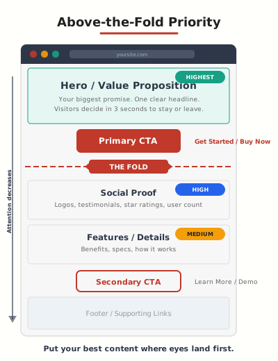
Above-the-Fold Hierarchy
“The fold” is the bottom of the initial viewport, and it changes with device, browser chrome, zoom, and orientation. Put the offer and primary next step early because they are prerequisites, not because every page receives a universal percentage of attention above the fold.
Your above-the-fold content should answer three questions: What is this? Who is it for? What should I do next? That means a clear headline, a one-sentence supporting statement, and a visible call-to-action button. Everything else can go below.
Scannable Content Patterns
Nobody reads web pages word by word. Eye-tracking studies from the Nielsen Norman Group show people scan in an F-pattern: across the top, down the left side, and across again for anything that catches their eye.
Design for this reality. Put your most important information in the first two lines. Use descriptive headings that communicate value even when skimmed. Break up text with bullet points, bold key phrases, and short paragraphs. A wall of text is the fastest way to lose a reader.
CTA Placement
You need one primary CTA per page. Not three. Not five. One clear action you want the visitor to take. Secondary actions are fine, but they should be visually subdued, a text link or a ghost button, not competing with your primary CTA for attention.
Place your primary CTA above the fold and repeat it at the bottom of the page. Long pages can have a mid-page CTA too. But the style, text, and destination should be consistent every time it appears.
Performance and Speed
Do not attach a universal conversion-loss percentage to one second of delay. Performance effects vary by page, device, traffic source, and task. Use field data at the 75th percentile, segment by device, and connect the metric to an actual outcome. If your WordPress site already feels sluggish, my walkthrough on how to fix a slow WordPress website covers the diagnostics to run before changing design.
Core Web Vitals Explained
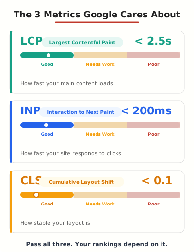
Three metrics matter:
LCP (Largest Contentful Paint) measures loading performance. The Core Web Vitals method classifies 2.5 seconds or less as good at the 75th percentile. Identify the actual LCP element before changing images, CSS, JavaScript, or server work.
INP (Interaction to Next Paint) measures interaction responsiveness. The good threshold is 200 milliseconds or less at the 75th percentile. Use browser tooling to identify the slow interaction and its input delay, processing duration, and presentation delay before removing code.
CLS (Cumulative Layout Shift) measures unexpected layout movement. The good threshold is 0.1 or less at the 75th percentile. Inspect the shift sources because media, ads, embeds, injected content, and font swaps require different fixes.
The Performance Stack I Use
These are practical tools to evaluate, not a universal stack. Choose one tool per responsibility, document its setting changes, and compare the same URLs and field metrics before and after deployment:
- FlyingPress for page caching, CSS/JS optimization, and image lazy loading. It handles more in one plugin than most sites need three plugins for.
- Cloudways managed hosting for server-level speed. Their Vultr High Frequency plan gives you NVMe storage and a fast TTFB right out of the box.
- Cloudflare free tier for CDN, DNS, and basic security. The free plan is genuinely good enough for most sites.
This is a shortlist of tools, not a performance guarantee. Record the baseline, change one layer at a time, verify field and lab metrics, and keep a rollback path. Two caching plugins or an unmeasured CDN change can make diagnosis harder.
On a budget, SiteGround is an option to evaluate for shared hosting with integrated caching and CDN controls. Check the renewal price, data-center location, resource limits, and measured server response for your own workload.
WP Rocket is the simpler starting point when you want fewer controls. FlyingPress uses a different optimization workflow, while my WP Rocket review covers the tradeoffs. Test one tool at a time on staging, record the same URLs and metrics, and do not run two page-cache plugins together.
Quick Wins
Start with three verifiable checks: reserve accurate image dimensions, set cache headers that match how often assets change, and delay JavaScript that is not required for initial interaction. Measure each change. Image dimensions reduce one source of layout movement; they do not guarantee a passing CLS score.
Mobile-First Design
Mobile share varies by site, country, acquisition channel, and task. Design from the narrow layout first because constraints expose hierarchy, then verify that the same primary content and structured data remain available. Google uses the mobile version for indexing and ranking.
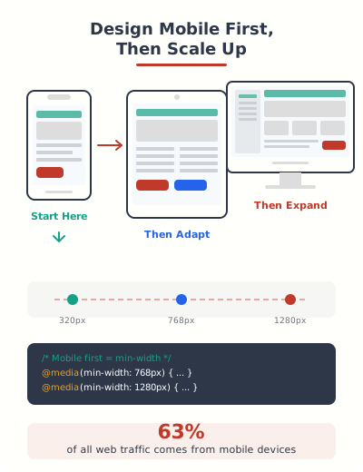
Mobile-first design means starting with the smallest screen and adding complexity as screen size increases. Not removing features from desktop to make it fit on mobile.
Touch Targets
WCAG 2.2 SC 2.5.8 sets a 24 by 24 CSS-pixel minimum with defined exceptions and spacing rules. Apple recommends a 44 by 44 point hit region for buttons. I use 44 as a comfortable target, then verify the actual box in the browser.
This applies to nav links, form labels, checkboxes, and any interactive element. I see sites all the time where the desktop nav links are 12px text with 5px padding. On mobile, those become impossible to tap accurately.
Mobile Typography
Do not copy one mobile type size into every design. Start with a readable body size, then test the actual typeface, language, line length, zoom, and narrow viewport. Use a fluid or breakpoint-based heading scale only when it preserves hierarchy without clipping or crowding.
Line height also depends on the typeface and measure. Inspect several real paragraphs at 200% zoom and keep enough spacing to track lines without turning each paragraph into disconnected strips.
Testing Across Devices
Chrome DevTools device emulation is a decent starting point, but it doesn’t catch everything. Real device testing catches touch interaction bugs, font rendering differences, and performance issues that emulators miss.
Choose devices from your analytics and support history. A useful minimum often includes a narrow iPhone-sized Safari viewport, a representative Android Chrome device, a tablet, keyboard-only navigation, 200% zoom, and one slower network and CPU profile. That is a coverage plan, not a claim about a universal audience percentage.
Reserve accurate image dimensions, set cache headers that fit the update cycle, defer non-critical JavaScript, test modern image encodes, and verify CDN behavior. Measure each change and keep a rollback path.
Accessibility
The 2026 WebAIM Million report found automatically detectable WCAG failures on 95.9% of one million home pages. It counted 56,114,377 errors, or 56.1 per page on average. Low-contrast text appeared on 83.9% of home pages, while 16.2% of images lacked alternative text. Automated absence of errors still does not prove conformance.
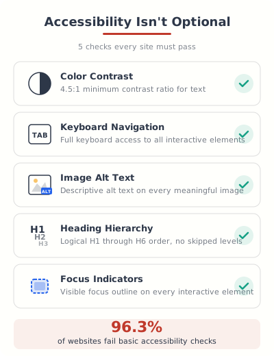
Accessibility belongs in the design requirements, acceptance criteria, and release tests. WCAG 2.2 gives technical success criteria, but legal obligations vary by jurisdiction, organization, product, and exception. Treat this chapter as an engineering baseline, not legal advice.
Color Contrast
WCAG 2.2 (the current W3C Recommendation, published October 2023 and now ISO/IEC 40500:2025) requires a minimum 4.5:1 contrast ratio for normal text and 3:1 for large text. Test every text and background combination. I mentioned this in the color chapter, but it’s worth repeating here because low contrast text is the most common accessibility failure on the web, hitting nearly 4 in 5 homepages.
Keyboard Navigation
Tab through your entire site without using a mouse. Can you reach every link, button, and form field? Can you tell where the focus is at all times? Can you open and close menus? Can you submit forms?
If the answer to any of those is no, fix it. Add visible focus indicators (a colored outline around the focused element), make sure your tab order follows the visual layout, and ensure all interactive elements are reachable.
Alt Text and Semantic HTML
Every image needs alt text. Not “image-1.jpg.” Not “photo.” A brief description of what the image shows and why it’s relevant. If it’s decorative and adds no information, use alt="" so screen readers skip it.
Use semantic HTML elements: <nav> for navigation, <main> for primary content, <article> for self-contained content, <aside> for supplementary content. Screen readers use these landmarks to help users jump to different sections of your page. A page built entirely with <div> elements is a wall of nothing to a screen reader.
Heading Hierarchy
Give every heading a meaningful level that reflects the document structure, and do not choose a level for its visual size. A single clear page title is a useful publishing convention; the accessibility test is whether the heading outline communicates relationships and supports navigation.
Conversion-Focused Design
Everything in the previous eleven chapters builds toward this one. A site that’s simple, consistent, fast, accessible, and mobile-friendly is a site that’s ready to convert visitors into customers. But there are a few specific design patterns that push conversion rates even higher, and I go deeper on the testing side in my guide to optimizing web design for conversions.
Trust Signals
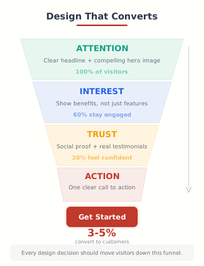
Trust evidence must be true, current, and relevant to the decision. Use client logos only with permission, testimonials only from identifiable customers, security marks only when the underlying control is active, and numbers only when you can define and reproduce the count. Decorative badges are not proof.
Place the most relevant proof near the claim or action it supports, then test whether it improves qualified completion. A testimonial can answer one objection; it cannot replace product detail, price, terms, or a clear post-click expectation.
Form Design
Every form field needs a reason. Remove fields that are not required to complete the current task, but do not promise a generic lift per field. Compare completion rate, qualified submissions, error rate, and follow-up cost. A shorter form can increase volume while reducing useful context.
Ask for the minimum you need to move the conversation forward. You can always collect more information later. The hardest part is getting that first submission.
CTA Psychology
CTA text should describe the action and expected result. “Download the Guide” is more informative than “Submit,” but there is no portable 20-30% win. Test the complete proposition: offer, placement, surrounding proof, button label, and post-click experience.
Make the primary action distinguishable through contrast, placement, label, and surrounding whitespace. A unique accent can help, but color alone must not carry meaning and every state still needs sufficient contrast.
CTA text should describe the action and result. Test the label with the offer, placement, proof, and post-click experience.
Landing Page Patterns
A useful landing-page starting structure is: benefit-led headline, specific proof, primary action, objections, product or service detail, pricing when relevant, and a final next step. Treat testimonials, video, feature grids, and repeated CTAs as optional components that must earn their space.
My guide to free builders comes from having built dozens of sites, but that does not make one landing-page template universal. Keep only the sections needed to explain this offer, resolve its real objections, and support its next action.
Design: Canva for graphics, Figma for prototypes
Theme: GeneratePress + GenerateBlocks
Performance: FlyingPress (primary) or WP Rocket (easier)
Hosting: Cloudways (advanced) or SiteGround (beginners)
Accessibility: WAVE browser extension + Lighthouse
Testing: Chrome DevTools + BrowserStack
The bottom line: Good web design isn’t about making things look pretty. It’s about making things work. Every chapter in this guide connects back to one question: does this design decision help the visitor accomplish what they came here to do? If the answer is yes, keep it. If the answer is no, cut it. That discipline is what separates professional sites from amateur ones.
Where to start: Don’t try to fix everything at once. Pick the three chapters where your site has the biggest gaps. Fix those first. Then come back for the next three. Incremental improvement beats a massive redesign that never ships.
Simplify your design. Use one font, three colors (60-30-10), and generous whitespace. Optimize for mobile first. Hit all three Core Web Vitals. Make it accessible. Test every CTA. These dozen decisions determine whether your site converts or just exists.
What is the most important web design principle?
Start with clarity. Ask whether a first-time visitor can identify the offer, audience, and primary next action without explanation. This is a diagnostic heuristic, not a universal three-second law.
How many fonts should I use on my website?
Start with one family because it reduces variables. Add a second only when it has a distinct role, then test transferred bytes, fallback, language coverage, zoom, and readability. WCAG does not set a maximum number of font families.
What image format should I use for my website in 2026?
Encode the same source as JPEG, WebP, and AVIF, compare transferred bytes at acceptable visual quality, and keep a fallback when the audience requires one. Use SVG for suitable logos, icons, and diagrams.
What is the 60-30-10 color rule in web design?
The 60-30-10 split is a palette heuristic, not a web standard. Assign semantic roles to surface, text, action, and state colors, then verify contrast and consistency. The exact percentage is secondary.
How fast should my website load?
Google’s good Core Web Vitals thresholds are LCP at 2.5 seconds or less, INP at 200 milliseconds or less, and CLS at 0.1 or less, evaluated at the 75th percentile. Use field data where available.
What is mobile-first design and why does it matter?
Mobile-first design starts with the narrow layout and adds capability as space increases. Google uses the mobile version of a site’s content for indexing and ranking, so primary content, metadata, and structured data must remain equivalent.
How do I check if my website is accessible?
Use keyboard-only navigation, 200% zoom, automated checks, and manual screen-reader testing. The 2026 WebAIM Million found detectable WCAG failures on 95.9% of one million home pages, but automated tools cannot prove conformance.
What makes a high-converting landing page?
A useful starting structure includes a benefit-led headline, specific proof, one primary action, objection handling, relevant detail, and a clear next step. Form length and CTA wording need tests on your own traffic; there is no portable lift per field or button label.
Tell Google you want more of this.
Add Gaurav Tiwari as a preferred sourceOne tap, and this site shows up more often in your own Top Stories, AI Overviews and AI Mode. Remove it any time.
Disclaimer: This site is reader-supported. If you buy through some links, I may earn a small commission at no extra cost to you. I only recommend tools I trust and would use myself. Your support helps keep gauravtiwari.org free and focused on real-world advice. Thanks. - Gaurav Tiwari