 by
byYou can design a logo yourself in an afternoon, for $0 to $30, with no formal design training. This guide shows the entire process on a real example: I take one brand from pencil sketches to a finished mark with lockups and packaging, then run the same brief through AI image tools with the exact prompts on the page. A self-designed logo is good enough for roughly 8 in 10 small businesses. The other 2, luxury brands, enterprise B2B, design-led companies, should hire a designer, and I say exactly when below.
I’ve been designing logos for my own projects, clients, and friends since 2013, and the biggest change in that time isn’t the tools getting cheaper. It’s that the sketching phase, the part that used to take the longest, can now be delegated to a machine while the judgment stays with you.
So this guide does something most logo tutorials don’t: instead of describing the process in the abstract, it runs one. Ember & Oat, a small-batch bakery I invented for this walkthrough, gets a complete identity in front of you, and every figure on this page was produced during the writing of it. Where AI did the drawing, the caption says so, and the prompt that produced it is right there for you to steal.
Table of Contents
What makes a logo work
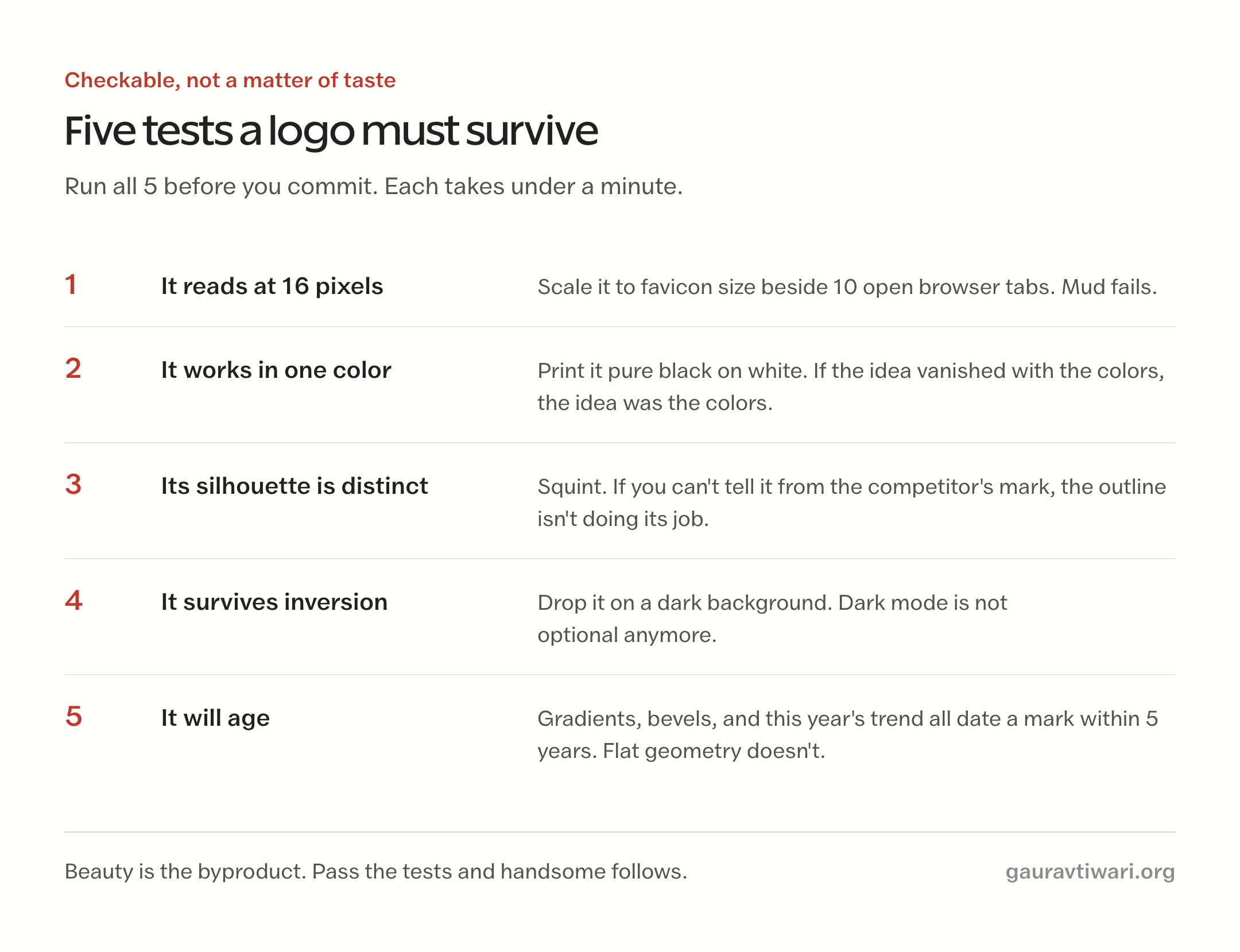
A logo works when it survives 5 tests, and every one of them is checkable, not a matter of taste:
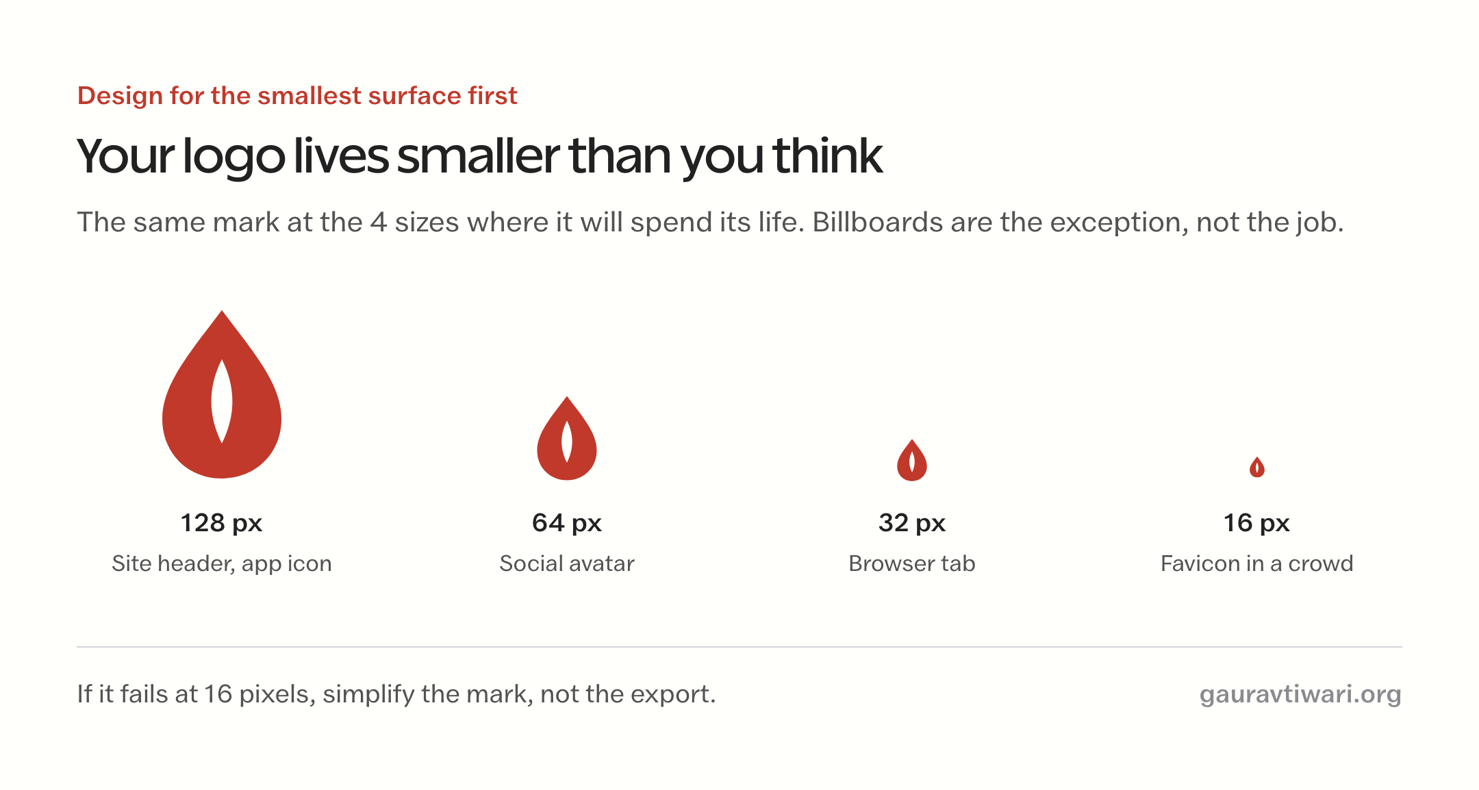
- It reads at 16 pixels. Your logo will spend most of its life as a favicon and an app icon, not a billboard. If the mark turns to mud at browser-tab size, it fails.
- It works in one color. Print it in pure black. If the idea disappears without its colors, the idea was the colors, and that’s not a logo.
- Its silhouette is distinct. Squint. Can you still tell it from the competitor’s mark? Distinctiveness lives in the outline, not the details.
- It survives inversion. Drop it on a dark background. A mark that only works on white will embarrass you the first time someone makes a dark-mode website.
- It will age. Gradients, bevels, and this year’s illustration trend all date a mark within 5 years. Flat geometry from the 1970s still looks current; glossy Web 2.0 logos from 2008 don’t.
Notice what’s missing from that list: “it looks amazing.” Beauty is the byproduct. Chase the 5 tests and the mark ends up handsome; chase handsome and you usually end up with decoration that fails at 16 pixels.
The tools worth using
You need exactly one vector editor, and in 2026 the honest shortlist is 4 tools:
| Tool | Cost | Best for | The catch |
|---|---|---|---|
| Figma | Free tier | Most people; runs in the browser | Vector tools are good, not deep |
| Inkscape | Free, open source | Full professional vector control | Dated interface, real learning curve |
| Affinity Designer | One-time purchase | Illustrator power without a subscription | Desktop only |
| Adobe Illustrator | Subscription | The industry standard | Priced for professionals, not one logo |
My own tool is Inkscape and has been for over a decade; most of the marks I’ve shipped were drawn in it, and my Inkscape color palettes are on GitHub if you go that route. But if you’re starting today with no habits, start with Figma. It’s free, it runs everywhere, and every tutorial you’ll ever need already exists.
For fonts, pull from Google Fonts and dafont (check each font’s license for commercial use; “free” on dafont often means free for personal use only), and grab weekly freebies from Creative Fabrica. For icons and vector parts, Vecteezy is my usual source. Template-first people can skip the editor entirely: Placeit generates a presentable logo from templates in minutes.
The walkthrough: one logo, start to finish
Meet Ember & Oat, a small-batch bakery that doesn’t exist. I invented it for this guide so I could show you every stage of a real logo project without a client’s confidentiality in the way. The process below is the one I use for real brands; the AI image generator inside ChatGPT played the role of sketch artist, and I played the role I always play: the one who decides.
Step 1: Write the brief
Before anything visual, one paragraph on paper. Not a mood board. A brief, with constraints, because constraints are what make every later decision easy:
Ember & Oat is a small-batch bakery. The mark must feel warm and handmade but not rustic-cliche, work on a kraft paper bag and a browser tab, use at most 2 colors, and avoid the 3 things every bakery logo already uses: a chef’s hat, a rolling pin, and a wheat sheaf as the main subject.
That last clause is the most valuable sentence in any logo brief: name the cliches of your industry and ban them. Every trade has 3. Plumbers get droplets and wrenches, lawyers get scales and columns, bakeries get wheat. Banning them forces the interesting answer.
Step 2: Sketch wide, judge silhouettes
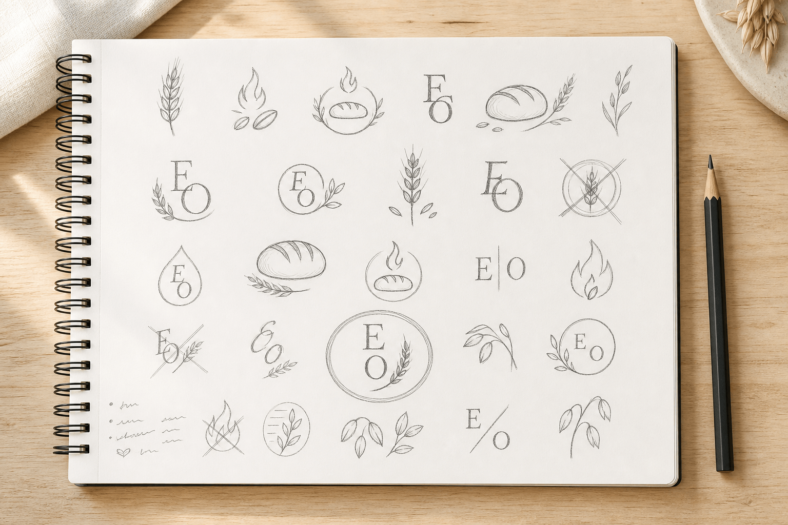
The first stage is volume: 20 or 30 thumbnails, drawn small on purpose. Small sketches force you to judge the silhouette instead of falling in love with details, and the crossed-out marks matter as much as the circled ones. On this sheet, the E and O monogram experiments died early (too close to a thousand other monograms) and 2 ideas earned circles: the oat stalk that reads as a flame, and the flame that carries a grain inside it.
Step 3: Take 6 directions seriously
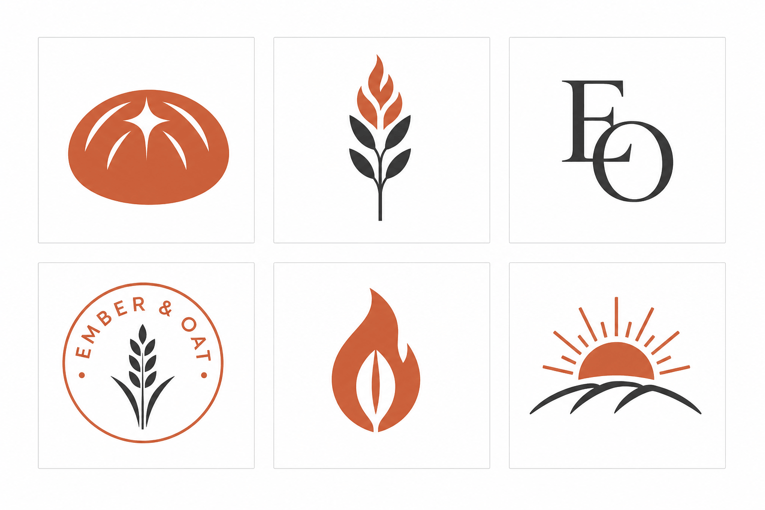
The circled sketches become 6 finished-looking directions, and this is where the 5 tests from earlier start eliminating candidates. The loaf (top left) has a weak silhouette; squinted, it’s an orange blob. The sunrise (bottom right) belongs to any brand in any industry, which means it belongs to none. The badge is handsome but dies at 16 pixels, where curved text becomes noise.
The winner is the flame with an oat grain living in its negative space. It says both halves of the name in one shape, it’s one solid color, and its silhouette survives a squint. Negative space is the cheapest sophistication available to a beginner: one shape doing 2 jobs always reads as cleverness, and it costs nothing to render.
Step 4: Refine one mark
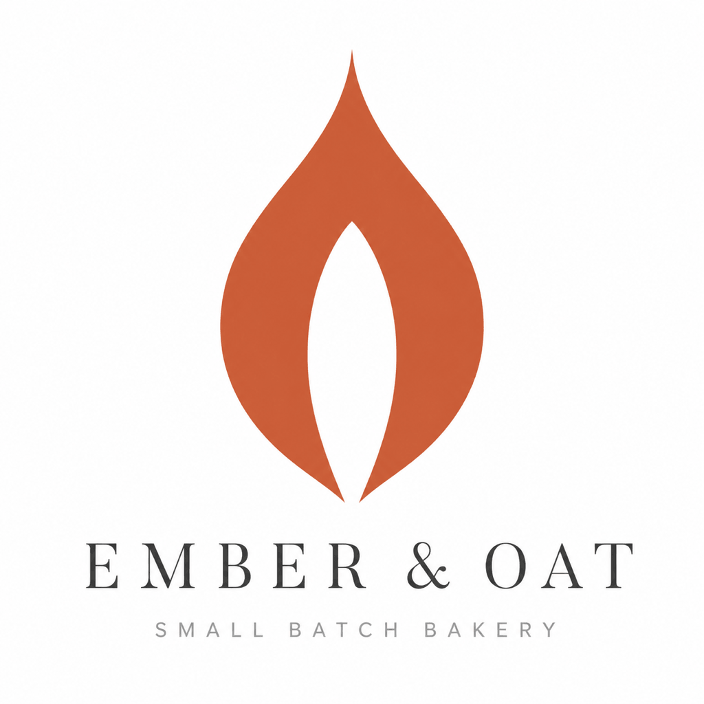
Refinement means fewer decisions, made harder: the flame’s curves get smoothed into symmetry, the grain gets centered, and the wordmark goes underneath in wide-tracked serif capitals with a quieter line below it. The mark dominates; the type supports. When a beginner’s logo looks amateurish, the culprit is usually this hierarchy running backward.
Step 5: Build the lockups
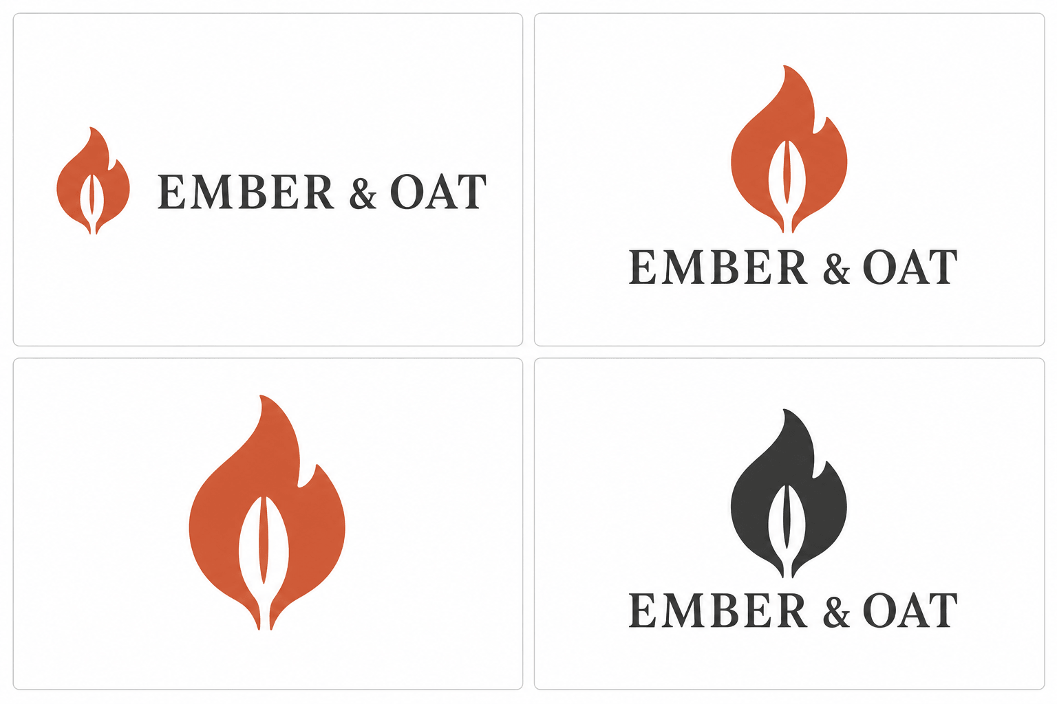
A logo isn’t one image; it’s a small system. The horizontal lockup goes in website headers, the stacked version on packaging and social avatars, the bare icon becomes the favicon, and the one-color version exists for stamps, invoices, and anywhere printing is cheap. Build all 4 the same day you finish the mark, while every proportion decision is still fresh.
Step 6: See it in the wild
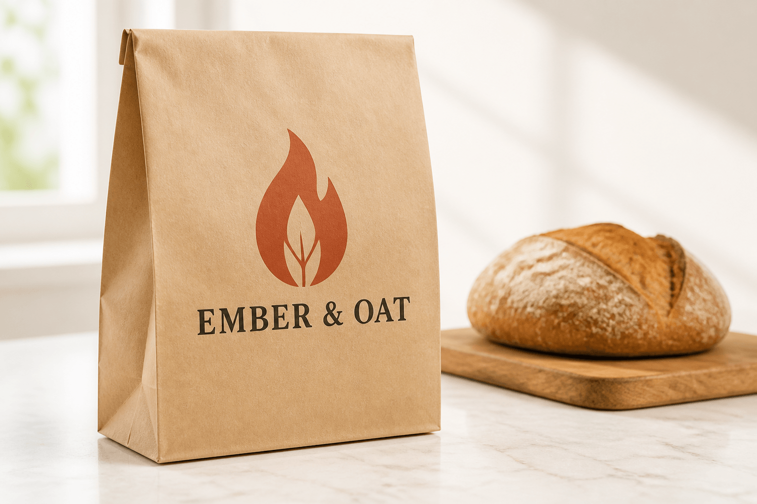
Mockups aren’t vanity; they’re the last test. A mark that looked balanced on a white artboard can suddenly feel top-heavy on a bag or invisible on a storefront. Put the logo on the 2 or 3 surfaces where it will actually spend its life before you declare it done.
The lesson the figures just taught without permission: look closely and the flame differs slightly between the concept grid, the lockup sheet, and the bag. That’s AI drift, and it’s the single most important thing to understand about AI logo work: the machine will not hold your mark steady between generations. The fix is the next section’s workflow, and it ends with you vectorizing one canonical version that never changes again.
Designing a logo with AI
AI is the best sketch artist you’ll ever hire and the worst finisher. It generates 20 concepts while your coffee is hot, and then it fails at exactly the things that make a logo shippable: consistency between versions, clean vector output, and typography you’d trust. Use it where it’s strong, and keep the judgment and the finishing for yourself.
The workflow that works
- Write the brief as constraints, exactly like Step 1 above. The banned-cliche clause matters even more for AI, because AI is a cliche engine by default.
- Generate wide. Ask for grids of 6, judge silhouettes only, and throw away most of everything.
- Iterate narrow. Take one direction and push variations of it: heavier, simpler, different negative space.
- Vectorize the winner. AI outputs pixels. Run the chosen mark through Vectorizer.AI or Inkscape’s Trace Bitmap, then clean the curves by hand. A logo you can’t scale is a JPEG with ambitions.
- Redo the lettering yourself. Even when AI spells correctly, its letterforms are approximations. Set the wordmark in a real font in your vector editor, next to the vectorized mark.
ChatGPT
ChatGPT’s image generation is the most beginner-friendly of the three, for one reason: you iterate by talking. “Make the flame narrower. Remove the third color. Show me the same mark as a badge.” It also renders short text more reliably than its rivals, which is why the Ember & Oat figures above, with their correctly spelled wordmarks, came from it.
What separates a usable result from clip art is the prompt’s structure. Here is what the lazy version gets you:
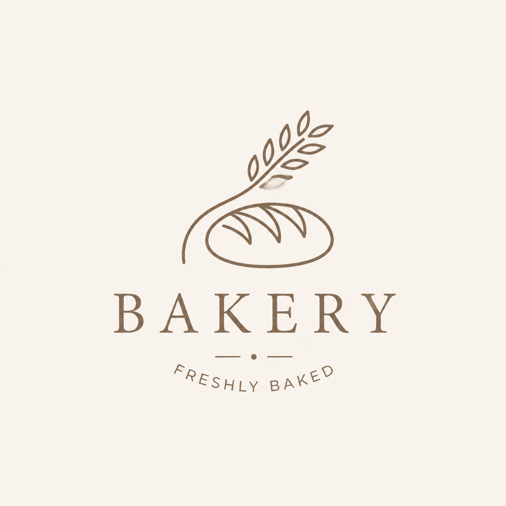
That’s not the model failing. That’s the model averaging, because the prompt asked for the average. Now the same model, with a constraint-stacked prompt, on a different fictional brand (a mobile bicycle repair service):
A presentation sheet of 6 distinct flat vector logo concepts for a mobile bicycle repair service called Spoke & Sprocket, in a 3×2 grid on white, each in a thin outlined tile: a chainring whose teeth become sun rays; a wrench and spoke crossed into an X; a wheel where 3 spokes form an S; a badge with a wrench inside a chainring; a hex bolt whose negative space forms a bicycle frame; a road curving into a chain link. Flat solid colors only, one deep teal accent with charcoal on white. Single-weight geometry. No gradients, no 3d, no shadows, no mockups, no text.

The prompt anatomy, reusable for any trade: role (a presentation sheet of N concepts), subject with the business named, concept list (describe each mark you want; this is where your sketching brain does its work), style vocabulary (flat, single-weight, negative space, one accent color), and the negative stack (no gradients, no 3d, no shadows, no mockups). Vague adjectives like “modern” and “professional” do nothing; the model can’t average its way to distinctive. Concrete named shapes can’t be averaged.
Midjourney
Midjourney produces the most striking raw aesthetics of the three, and it fights you the hardest about flatness. Left alone, it wants texture, drama, and glow, and logos die of drama. The taming kit, learned the annoying way:
--no gradient, photo, 3d, shadow, mockup, realisticon every logo prompt. This single parameter does more than any positive wording.--style rawto strip Midjourney’s house beautification, and a low stylize value like--s 50so it follows your words instead of its taste.- Prompt by logo type: “flat vector pictorial mark,” “geometric monogram,” “mascot head in 2 colors,” “abstract mark, negative space.” Naming the category constrains the form.
--seedto revisit a direction, and Vary Region to change one element without losing the mark. Consistency is still your job, not the model’s.- Never trust its lettering. Midjourney text is decoration that happens to resemble words. Generate the mark alone and set type yourself.
Gemini
Gemini’s image generation is the most accessible entry point: it’s in the free Gemini app, and its conversational editing is genuinely good at targeted changes, swap this color, remove that element, without regenerating the whole mark. The same constraint-stack prompt structure from the ChatGPT section transfers directly.
Its honest position in the toolkit: use it for fast, free exploration and quick edits; expect a narrower flat-vector style range than Midjourney and the same vectorization requirement as everything else. If your budget for this project is $0 and you already have a Google account, start here and upgrade your tooling only if the concepts feel samey.
The two warnings that matter
Ownership. Under current US Copyright Office guidance, purely AI-generated images aren’t eligible for copyright protection, because copyright requires human authorship. Trademark is a separate system, so a distinctive AI-assisted mark can still be registered and defended as a trademark, and your own vector rebuild adds the human authorship layer. The practical rule: modify meaningfully, keep your working files, and run a trademark search before you fall in love.
Similarity. Three businesses prompting “minimalist fox logo, flat vector” this week are receiving siblings of the same fox. Before committing to an AI-originated mark, reverse image search it and search your industry. The wheat-loaf figure above is what convergence looks like; don’t build a brand on the average.
Every prompt structure from this section as a 6-page swipe file: the constraint-stack skeleton, filled ChatGPT concept grids, the Midjourney taming kit, the Gemini edit ladder, and negative blocks sorted by failure mode.
Color, without the mysticism
Color psychology gets oversold, but the broad associations are real enough to use. The working rule: pick 1 color that fits the brand’s temperature, add neutrals, and stop. Two colors is a confident logo; 4 is a carnival.
- Black: power, simplicity, editorial weight. Skip true #000000; flat near-blacks like #222222, #333333, and #2c3e50 sit better on screens.
- Blue: corporate, technology, trust. Reliable variants: #3498db, #2980b9, #005c94, #0084c8.
- Green: nature, health, finance. Try #27ae60, #2ecc71, #009100.
- Red: energy, appetite, urgency. #c0392b, #e74c3c, #b50000. Red stimulates hunger, which is why food brands lean on it.
- Purple: luxury and quality. #ab37c8, #8800aa.
- Yellow/Orange: warmth, optimism, food again. #f1c40f, #f39c12, and the terracotta family Ember & Oat uses.
Steal palettes shamelessly at the start: my Inkscape palette collection is free, and any flat-color palette from the last decade will serve a first logo better than an hour of color-wheel agonizing.
Typography for non-designers
The wordmark decision is simpler than designers make it sound. Serif reads established and warm (Ember & Oat wears one for exactly that reason). Sans-serif reads modern and technical. Script reads personal and, at small sizes, reads as nothing, so treat it with suspicion. That’s 90% of the theory you need.
The rules that save beginners: use 1 font family, 2 at the absolute most. Add letter spacing to capitals; wide tracking is the cheapest way to make type look considered. Never stretch or squash a font. And buy or download the actual font file rather than trusting an AI render of lettering, because letterforms are precisely where approximation shows.
Test before you commit
Four tests, 10 minutes, before any logo ships:
- The favicon test: scale it to 16 pixels and look at it in a browser tab next to 10 open tabs.
- The squint test: blur your eyes; the silhouette should still be nameable.
- The photocopier test: one color, pure black on white. The idea must survive.
- The stranger test: show it to 3 people who owe you nothing, for 3 seconds each, and ask what they saw. If nobody saw the second meaning in your clever negative space, the cleverness isn’t there yet.
Feedback beats affection. Every designer, me included, has loved a mark that failed the stranger test. Let it go; the next sketch sheet is cheap.
When to skip DIY
Be honest about the 2-in-10 case. If the logo carries the brand promise (luxury goods, enterprise B2B, a design-led agency), if it will live at large physical scale where typographic detail matters (signage, vehicle wraps, packaging lines), or if brand guidelines are a contractual requirement, hire the professional. A designed identity system is a different product from a good mark.
The middle routes, fastest to slowest: an AI logo maker gets you a clean mark in minutes, and I’ve compared those in the best online logo makers roundup. 99designs runs contests where dozens of designers submit concepts against your brief, from about $299, which buys you the one thing DIY can’t: parallel human imaginations. And if you want the identity handled end to end, brand systems are part of what my studio does; the design and branding services page explains how that works.
Logo design FAQ
How much does it cost to design a logo yourself?
$0 to $30 for most people. Figma, Inkscape, and Gemini’s image generation are free; the spend, if any, goes to a font license, a vectorizer like Vectorizer.AI, or AI credits. Hiring out costs $300 to $5,000 depending on whether you buy a contest, a freelancer, or a studio identity system.
Can I trademark an AI-generated logo?
Generally yes. Trademark protects a distinctive source identifier in commerce, which is separate from copyright, and current US Copyright Office guidance denies copyright only to purely AI-generated work with no human authorship. Rebuilding the mark in vector form and modifying it adds your authorship. Run a trademark search first, and talk to a trademark attorney for anything you plan to defend.
Which AI tool makes the best logos?
ChatGPT is the best all-rounder for beginners because you iterate conversationally and its short text rendering is the most reliable. Midjourney produces the most striking marks once you tame it with style raw, low stylize, and a no-gradient negative prompt. Gemini is the best free entry point. All three produce pixels, so every route ends with vectorizing one canonical version.
Why does my AI logo look blurry when I scale it?
AI image tools output raster pixels, not vectors, so enlarging them stretches a fixed grid of dots. Convert the chosen mark to SVG with Vectorizer.AI or Inkscape’s Trace Bitmap, clean the curves, and export from the vector from then on. The vector file is the logo; the PNG is just one photograph of it.
What size should a logo be?
Design in vector so size stops mattering, then export the set every brand needs: an SVG master, PNGs at 512 and 1024 pixels, a 32 and 16 pixel favicon, and a one-color version. If the mark is illegible at 16 pixels, simplify the mark rather than sharpening the export.
Should a logo have the company name in it?
Build both and let context decide. A wordmark lockup carries the name for headers, packaging, and anywhere you’re still unknown; the bare icon serves as favicon and avatar where space is tight. Unknown brands lead with the lockup. Only famous marks get to drop their name entirely, and they all carried it for years first.
A logo is the smallest design object with the longest life. You’ll outgrow your website three times before you touch a good mark. Spend the afternoon, run the tests, ban your industry’s cliches, and make the machine sketch while you judge. The judging was always the design.
Now go draw the thing.
Tell Google you want more of this.
Add Gaurav Tiwari as a preferred sourceOne tap, and this site shows up more often in your own Top Stories, AI Overviews and AI Mode. Remove it any time.