History of Logo Design: Trends Over The Years
I’ve been designing logos since 2009 and have witnessed firsthand the remarkable transformation in this field. When I started graphic design, especially logo and identity design, the focus was on creating logos that were bold, distinctive, and visually striking, often for print media. The then-popular trends of gradients, intricate details, and 3D effects largely influenced the designs.
Brands wanted their logos to pop, using every visual trick in the book.
As the digital age gained momentum, the demands and expectations for logos began to shift. The rise of mobile technology and social media necessitated versatile and adaptable designs.
Logos had to look just as good on a small smartphone screen as on a billboard. This led to a resurgence of minimalism, emphasizing clean lines, simple shapes, and flat colors.
The goal was clarity and immediate recognizability, no matter the context, showcasing the adaptability and versatility of modern logo design.
Today, the trend has evolved further with the introduction of dynamic and interactive logos. These are not just static images but can adapt, animate, and respond to user interactions.
This development reflects a broader shift towards creating more engaging and immersive brand experiences, sparking excitement about the future of logo design. The integration of motion graphics and interactive elements allows logos to tell a story, enhancing user engagement and leaving a lasting impression.

Over the years, my approach to logo design has had to adapt to these changing trends and technologies.
I learned to balance creativity with functionality, ensuring that each logo I design is not only visually appealing but also practical and versatile.
This journey underscores the importance of staying abreast of industry developments and continually refining one’s skills to meet the evolving needs of brands and their audiences.
I tell my clients how logos are the cornerstone of brand identity, serving as a visual shorthand for a company’s values and ethos. They not only identify a company but also create an emotional connection with users. Think of Nike’s swoosh or Apple’s apple logo—these logos are instantly recognizable and evoke a sense of trust and quality. Iconic logos withstand the test of time, consistently representing the core values of their brands. These logos are not just symbols, they are powerful tools that can shape consumer perception and loyalty.
But to truly and really appreciate the significance of logos today, it’s essential to understand their evolution over time.
This understanding will enlighten you about the history of logo design and provide a deeper appreciation for the logos we see today.
Evolution of Logo Design Over the Decades: Trends
The history of logo design is a fascinating journey through various artistic movements, technological advancements, and cultural shifts. From the hand-drawn scripts of the early 1900s to the sleek, adaptive designs of the digital age, logos have continuously evolved to meet the needs of brands and their audiences.
Let’s explore the evolution of logo design over decades, highlighting key breakthroughs, influential designers, and iconic products that have shaped this essential aspect of branding.
Skip to:
1900s: The Dawn of Modern Logos
The early 1900s marked the beginning of modern logo design, where companies started recognizing the importance of a visual identity. Coca-Cola, introduced in 1886, solidified its presence with a distinctive script logo designed by Frank Mason Robinson. This era saw the rise of hand-drawn logos that emphasized uniqueness and memorability.

Standard Oil’s torch logo and the simplistic yet powerful, General Electric monogram are other prime examples. These early logos set the stage for the corporate identity, focusing on creating a lasting impression through unique typography and design simplicity.
1920s: The Rise of Modernism

The 1920s brought a significant shift in design philosophy with the influence of the Bauhaus movement, emphasizing functionality and simplicity. Walter Gropius and other Bauhaus designers promoted the use of geometric shapes and clean lines, which translated into logo design. Paul Rand, though more prominent later, began to introduce these modernist principles into his work. The iconic geometric logos of this era, like the London Underground roundel, highlighted a shift towards abstraction and minimalism, laying the groundwork for modern corporate logos.
1930s: The Art Deco Influence
The 1930s saw the Art Deco movement leave its mark on logo design. Characterized by sleek, symmetrical designs and bold colors, Art Deco brought a sense of luxury and sophistication. A.M. Cassandre’s work, known for its elegance and modernity, influenced many corporate identities.
This period emphasized visual appeal and grandeur, aligning with the economic and cultural shifts of the time.
1950s: The Golden Age of Advertising
The post-war economic boom of the 1950s led to the golden age of advertising, where corporate identity systems became crucial. Designers like Saul Bass and Paul Rand revolutionized logo design with their minimalist and conceptual approaches.

Bass’s logos for AT&T and United Airlines, and Rand’s iconic designs for IBM, ABC, and Westinghouse emphasized simplicity, functionality, and timelessness. This era saw logos becoming integral to brand identity, ensuring they were memorable and versatile across various media.
1960s: Psychedelic and Pop Art Influences
Cultural revolutions and significant artistic influences, such as psychedelic and pop art, marked the 1960s. This decade saw logos adopting more playful and unconventional styles.
Milton Glaser’s “I ❤️ NY” logo became a cultural icon, reflecting the era’s spirit with its bold and simple design. Logos during this time were characterized by vibrant colors, experimental typography, and a break from traditional design norms, capturing the dynamic and transformative energy of the 1960s.
1970s: The Digital Revolution Begins
The 1970s introduced computer-aided design, which began transforming the graphic design industry.
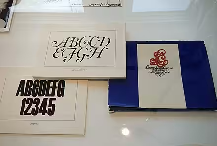
Designers like Herb Lubalin and Tom Geismar utilized emerging technologies to create more precise and intricate logos. The use of technology allowed for experimentation with shapes, lines, and textures, leading to more detailed and scalable designs. This period marked the beginning of the digital revolution in logo design, setting the stage for the technological advancements of the coming decades.
1980s: Bold and Brash
The 1980s reflected a vibrant, consumer-driven culture with logos that were bold, colorful, and dynamic. The era’s design was characterized by bright colors, striking typography, and an emphasis on being eye-catching. Neville Brody’s work exemplified this trend with his avant-garde and rebellious designs.
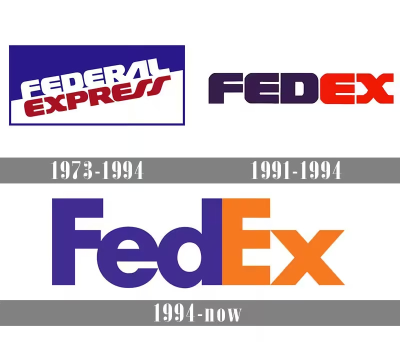
Logos from this decade, such as MTV and FedEx, showcased bold experimentation and a departure from the minimalism of previous decades, embracing a more expressive and impactful visual language.
1990s: The Internet Age
With the advent of the internet in the 1990s, logo design had to adapt to digital media. Logos needed to be versatile, scalable, and recognizable across various digital platforms. David Carson’s grunge typography and deconstructive style influenced the era’s aesthetics.
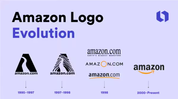
Companies like Google and Amazon emerged with logos that were simple yet effective in digital formats. This decade emphasized the importance of simplicity and scalability, ensuring logos were functional and recognizable on screens of all sizes.
2000s: The Minimalist Movement
The 2000s saw a return to minimalism in logo design, driven by the need for clarity and adaptability in an increasingly digital world. Flat design became a significant trend, characterized by the use of simple shapes, limited color palettes, and the absence of shadows and gradients.

Michael Bierut of Pentagram designed logos that were clean and functional, such as the redesign of Mastercard’s logo. This minimalist approach ensured that logos were versatile and easily recognizable across various media and devices.
2010s: Responsive and Adaptive Design
The rise of mobile technology in the 2010s necessitated logos that were flexible and responsive. Designers like Jessica Walsh and Paula Scher focused on creating logos that could adapt to different screen sizes and resolutions. The concept of responsive logos, which change in size and complexity depending on the medium, became popular. Brands like Spotify and Airbnb embraced these principles, ensuring their logos were effective in both digital and print formats. This era highlighted the importance of adaptability and versatility in logo design.
2020s: Dynamic and Interactive Logos
The 2020s are witnessing the emergence of dynamic and interactive logos, driven by advancements in technology such as motion graphics and augmented reality. For example, designers like Aaron Draplin and the team at Sagmeister & Walsh are exploring new ways to engage users with logos that are not just static symbols but dynamic experiences.
Brands are incorporating motion and interactivity into their logos to create more engaging and memorable brand identities.
The use of AR and VR in logo design is also starting to take shape, pointing towards a future where logos are immersive and interactive.
Today
Today, logo design is all about adaptability and engagement. With digital platforms dominating, logos must be versatile, scalable, and instantly recognizable across various media. Minimalism remains popular, focusing on clean lines and simplicity for a timeless appeal. Dynamic and interactive logos are on the rise, integrating motion graphics and interactivity to captivate audiences. The emphasis is on creating a visual identity that not only stands out but also tells a brand’s story in a compelling way. Modern logos are the perfect blend of art and technology, designed to connect with users on a deeper level.