Pure CSS Tooltip: Code Snippets for Every Use Case
A CSS tooltip needs zero JavaScript, zero dependencies, and zero milliseconds of init time. A small hint that appears when you hover or focus an element is just a styled pseudo-element. No Tippy.js, no positioning engine, no event listeners. The browser already does the work, so a pure CSS tooltip ships nothing extra to your users.
Here is the catch. Most CSS tooltip tutorials stop at “add a ::after and fade in opacity on :hover.” That gets you something that looks fine in a demo and then breaks in production. It fails for keyboard users, clips inside overflow:hidden cards, vanishes on touch screens, and quietly violates WCAG. Useful for a screenshot. Not useful for a real interface.
I’ve built tooltip systems for everything from plain blog interfaces to dense SaaS dashboards with hundreds of triggers on one screen. Every snippet below is live. Hover or tab into the demo, watch it work, then copy the exact code that produced it. We start with the classic pseudo-element pattern and end with the 2026 Popover API approach that finally kills the reasons you’d reach for a JavaScript library. For more on getting interface details like this right, my notes on web design that actually works cover the bigger picture.
The Fastest CSS Tooltip (The Foundation)
The quickest CSS tooltip is a data-tooltip attribute plus an ::after pseudo-element. You put the text in the attribute, CSS pulls it in with attr(), and the tooltip floats above the trigger. This pattern is right for static elements where you control the layout. Here it is running:
Tab with your keyboard too, not just the mouse.
<button class="tooltip-trigger" data-tooltip="Save your changes">
  Save
</button>.tooltip-trigger {
position: relative; /* the tooltip anchors to this */
}
.tooltip-trigger::after {
content: attr(data-tooltip); /* pull text from the attribute */
position: absolute;
bottom: calc(100% + 8px); /* sit just above the trigger */
left: 50%;
transform: translateX(-50%); /* center horizontally */
padding: 7px 12px;
background: #1f2937;
color: #fff;
font-size: 0.8125rem;
border-radius: 7px;
white-space: nowrap;
opacity: 0;
visibility: hidden;
transition: opacity .18s ease, visibility .18s ease;
pointer-events: none;
z-index: 10;
}
/* Show on mouse hover AND keyboard focus */
.tooltip-trigger:hover::after,
.tooltip-trigger:focus-visible::after {
opacity: 1;
visibility: visible;
}The one line everyone skips is :focus-visible. Drop it and your tooltip simply does not exist for keyboard users, which is most screen reader users and plenty of power users. pointer-events: none is the other quiet hero. Without it the tooltip becomes its own hover target and you get a flicker loop. Two properties, and you are already ahead of the average tutorial.
Adding the Arrow
A tooltip with a little arrow pointing at its trigger feels more connected. The classic border trick does it: a zero-size ::before with transparent borders on three sides and a colored border on the side facing the trigger.
/* Add to the base tooltip from above */
.tooltip-trigger::before {
  content: "";
  position: absolute;
  bottom: calc(100% + 2px);
  left: 50%;
  transform: translateX(-50%);
  border: 6px solid transparent;
  border-top-color: #1f2937;     /* matches the tooltip background */
  opacity: 0;
  visibility: hidden;
  transition: opacity .18s ease, visibility .18s ease;
  pointer-events: none;
}

.tooltip-trigger:hover::before,
.tooltip-trigger:focus-visible::before {
  opacity: 1;
  visibility: visible;
}
::after draws the body, ::before draws the arrow, and both toggle together. The arrow size is just the border width, so bump it to 8px for a chunkier point.
CSS Tooltip Directions: Top, Bottom, Left, Right
Control placement with a data-tooltip-position attribute and one rule per direction. Top is the default, but a tooltip near the top of the viewport reads better pointing down, and icons in a left rail want their hints on the right. All four are live below, each on its own button:
<span data-tooltip="I appear above"  data-tooltip-position="top">Top</span>
<span data-tooltip="I appear below"  data-tooltip-position="bottom">Bottom</span>
<span data-tooltip="On the left"     data-tooltip-position="left">Left</span>
<span data-tooltip="On the right" data-tooltip-position="right">Right</span>/* Top (default) */
[data-tooltip-position="top"]::after {
bottom: calc(100% + 8px);
left: 50%;
transform: translateX(-50%);
}
/* Bottom */
[data-tooltip-position="bottom"]::after {
top: calc(100% + 8px);
bottom: auto;
left: 50%;
transform: translateX(-50%);
}
/* Left */
[data-tooltip-position="left"]::after {
right: calc(100% + 8px);
top: 50%;
left: auto;
transform: translateY(-50%);
}
/* Right */
[data-tooltip-position="right"]::after {
left: calc(100% + 8px);
top: 50%;
bottom: auto;
transform: translateY(-50%);
}Flip the arrow to match: a bottom tooltip uses border-bottom-color, a left tooltip uses border-left-color, and so on. Mirror each direction and the arrow always points home.
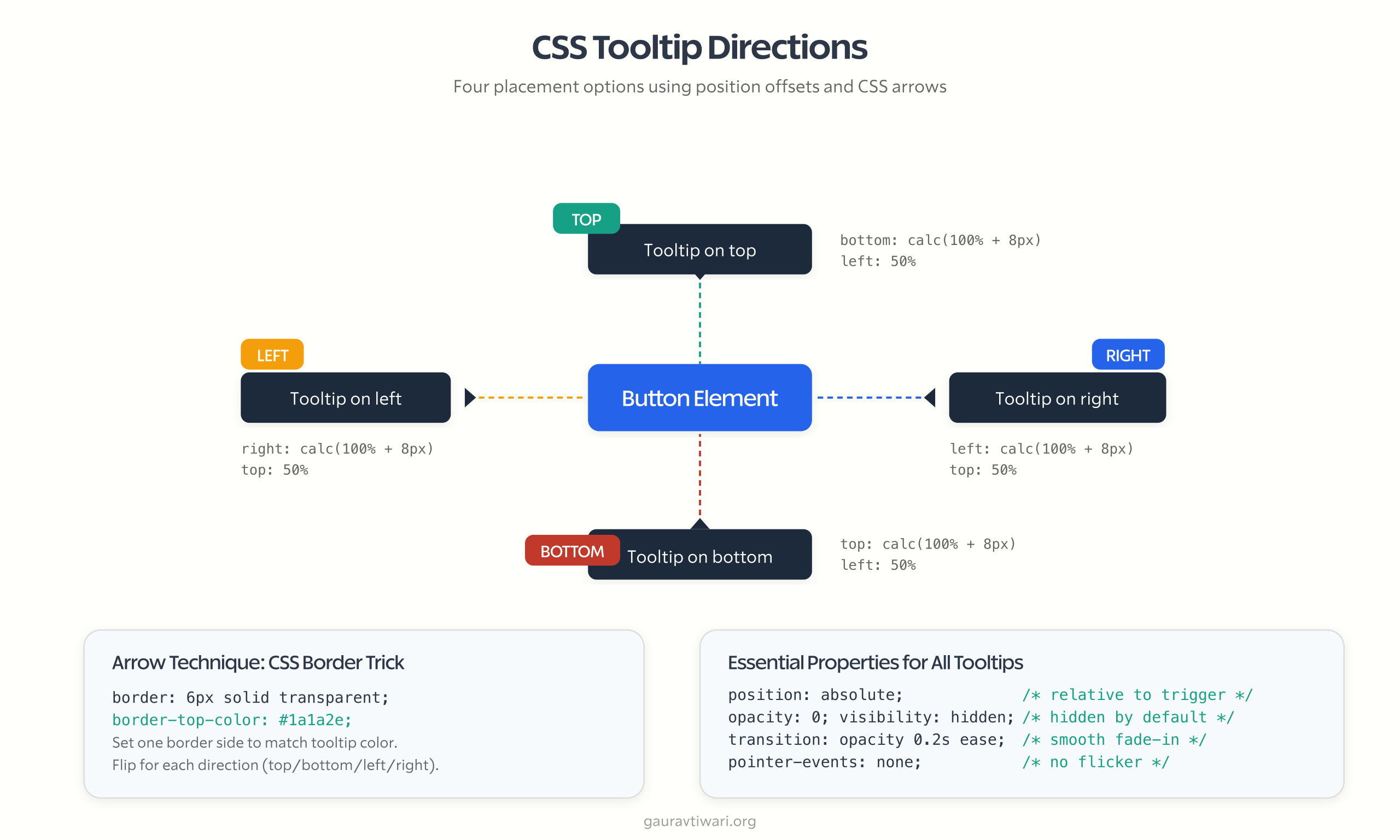
Here is the honest limit of this whole approach: it has no idea where the viewport edge is. A top tooltip on an element near the top of the screen will clip off the top. CSS alone cannot measure the viewport, so for edge-aware flipping you need either JavaScript or the CSS anchor positioning API further down. For a fixed layout you control, the four rules above are plenty.
Animated CSS Tooltips: Fade, Slide, and Scale
Three animations cover almost everything. Fade is the safe default. Slide adds a hint of physicality. Scale feels playful on small tooltips and heavy on big ones. All three are running here, side by side, so you can feel the difference:
/* Slide: nudge up 4px as it fades in */
.tooltip-slide::after {
  transform: translateX(-50%) translateY(4px);
  transition: opacity .2s ease, transform .2s ease;
}
.tooltip-slide:hover::after,
.tooltip-slide:focus-visible::after {
  transform: translateX(-50%) translateY(0);
}

/* Scale: grow from 0.8 to full size */
.tooltip-scale::after {
  transform: translateX(-50%) scale(.8);
  transform-origin: center bottom;
  transition: opacity .15s ease, transform .15s ease;
}
.tooltip-scale:hover::after,
.tooltip-scale:focus-visible::after {
  transform: translateX(-50%) scale(1);
}
One small kindness: wrap animated tooltips in @media (prefers-reduced-motion: reduce) and drop the transform for anyone who asked their OS to calm motion down. Keep the opacity fade, lose the movement.
Multi-Line and Rich Content Tooltips
The attr() trick is text only. Want bold words, a line break, or a keyboard shortcut styled inside the hint? Stop using a pseudo-element and use a real element you can fill with HTML. This is the version I reach for in app UIs:
Reformats the selected code block.
<span class="tooltip-wrap">
  <button aria-describedby="fmt-tip">Format</button>
  <span role="tooltip" id="fmt-tip" class="tooltip">
    <strong>Shortcut:</strong> Ctrl + Shift + F
    <br>Reformats the selected code block.
  </span>
</span>.tooltip-wrap {
position: relative;
display: inline-block;
}
.tooltip {
position: absolute;
bottom: calc(100% + 8px);
left: 50%;
transform: translateX(-50%);
width: max-content;
max-width: 250px; /* expands, but never too wide */
padding: 9px 12px;
background: #1f2937;
color: #fff;
font-size: 0.8125rem;
line-height: 1.5;
border-radius: 8px;
text-align: left;
opacity: 0;
visibility: hidden;
transition: opacity .2s ease;
pointer-events: none;
}
.tooltip-wrap:hover .tooltip,
.tooltip-wrap:focus-within .tooltip {
opacity: 1;
visibility: visible;
}The details that matter: width: max-content with a max-width lets the tooltip size to its text and then cap out. aria-describedby ties the hint to the trigger for screen readers. And :focus-within catches keyboard focus landing on anything inside the wrapper, so the keyboard path still works.
Themeable Tooltips With CSS Variables
Define your tooltip look once as custom properties and every tooltip on the site inherits it. Change one value, update everywhere. This is how a tooltip becomes part of a design system instead of a one-off. The demo below uses the variables straight from the snippet:
The toggle flips the tooltip color variables, nothing else.
:root {
  --tooltip-bg: #1f2937;
  --tooltip-color: #ffffff;
  --tooltip-radius: 7px;
  --tooltip-padding: 7px 12px;
  --tooltip-font-size: 0.8125rem;
  --tooltip-offset: 8px;
  --tooltip-shadow: 0 8px 22px rgba(16, 24, 40, .22);
}

.tooltip-trigger::after {
  content: attr(data-tooltip);
  background: var(--tooltip-bg);
  color: var(--tooltip-color);
  padding: var(--tooltip-padding);
  border-radius: var(--tooltip-radius);
  font-size: var(--tooltip-font-size);
  box-shadow: var(--tooltip-shadow);
  /* positioning unchanged */
}

/* Manual dark mode: flip the variables on a class */
.dark-mode {
  --tooltip-bg: #f9fafb;
  --tooltip-color: #111827;
}
For automatic theming, wrap the override in @media (prefers-color-scheme: dark) instead of a class. For app-level theme switches where the user picks, the .dark-mode class is the more predictable choice because it does not fight the OS setting.
Making CSS Tooltips Accessible (WCAG 1.4.13)
This is where most CSS tooltip tutorials fall apart, so it is the section worth reading twice. WCAG Success Criterion 1.4.13 (Content on Hover or Focus, Level AA) sets three rules for any hint that appears on hover or focus, and an accessible tooltip has to clear all three. If you care about this, my guide to the accessibility features every website should include puts it in context.
1. Dismissable. The user must be able to dismiss the tooltip without moving the pointer, normally by pressing Escape. CSS cannot listen for a keypress, so this is the one place a few lines of JavaScript earn their keep:
Tab to the button, then press Escape to dismiss the hint.
document.addEventListener('keydown', (e) => {
  if (e.key === 'Escape') {
    document.activeElement.blur();
  }
});
Blurring the focused element drops :focus-visible, which hides the tooltip. Three lines, and you have satisfied the hardest of the three requirements.
2. Hoverable. A user must be able to slide the pointer off the trigger and onto the tooltip without it disappearing, which matters for longer hints people actually want to read. The fix is pointer-events: auto on the visible tooltip plus enough padding or overlap that there is no dead gap to cross.
3. Persistent. The tooltip stays until the user dismisses it, moves focus, or the hint stops being relevant. :hover and :focus-visible handle this for free as long as you never add an auto-hide timeout. Timeouts are the enemy of this rule.
The ARIA You Actually Need
Connect the trigger to the tooltip with aria-describedby and label the tooltip with role="tooltip". That is the whole job for screen readers:
<button aria-describedby="save-tip">Save</button>
<div role="tooltip" id="save-tip">Save your current progress</div>
aria-describedby does the heavy lifting. role="tooltip" adds little on its own but keeps the intent clear. Two things not to do: skip aria-haspopup and aria-expanded (a tooltip is not a popup in ARIA terms), and never put a link, button, or input inside a tooltip. If you need interactive content, that is a toggletip or a dialog, not a tooltip.
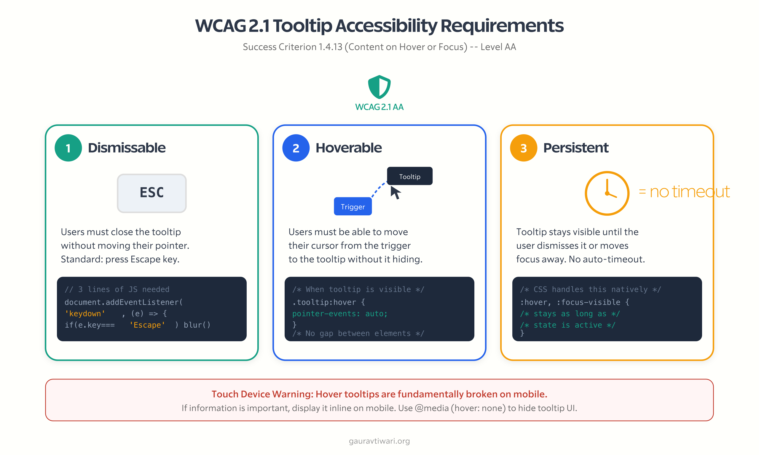
The Touch Device Problem
Hover tooltips are fundamentally broken on touch. There is no hover state, so a tap either fires the button or shows the hint, never both cleanly. This is not a bug you can fix in CSS, it is the platform.
So the honest rule: if the information matters, do not bury it in a hover tooltip on mobile. Show it inline, use a tap-to-toggle toggletip, or surface it some other way. If the hint is genuinely supplementary, like a keyboard shortcut nobody on a phone will use, it is fine to hide it on touch:
@media (hover: none) {
  [data-tooltip]::after,
  [data-tooltip]::before {
    display: none;            /* no hover state to rely on */
  }
}
CSS Tooltip vs JavaScript Tooltip: When to Use Which
Reach for a pure CSS tooltip first and only graduate to JavaScript when CSS genuinely cannot do the job. Here is the decision I actually make on client work:
| Scenario | Best approach | Why |
|---|---|---|
| Simple text hints on static elements | Pure CSS (::after) | Zero JS, zero bundle, instant |
Tooltips inside overflow:hidden or scroll containers | Popover API or Floating UI | CSS tooltips clip; the top layer and JS do not |
| Viewport-aware flipping needed | CSS anchor positioning or Floating UI | Auto-flips when the tooltip hits an edge |
| Interactive content inside (links, buttons) | Dialog or disclosure, not a tooltip | Tooltips must never hold interactive content |
| Thousands of tooltips on one page | Pure CSS (data attribute) | No per-tooltip init cost at all |
| Mobile-first, touch-heavy UI | Toggletip (tap) or inline text | Hover does not exist on touch |
| Must support very old browsers | JavaScript (Tippy.js) | Modern CSS features are missing there |
On the library side, Tippy.js is the most popular option and ships around 6KB gzipped once you include its Popper-based positioning. Floating UI, the successor to Popper, is leaner: the core positioning engine is under 3KB gzipped because you wire up the DOM and events yourself. For most blog and marketing sites you need neither. For app UIs with scroll containers and dynamic content, Floating UI is the one I would add.
If you would rather buy a polished component than build one, CodeCanyon has hundreds of ready-made tooltip and UI kits. For a single text hint, though, that is a lot of weight for something 30 lines of CSS already does.
Modern CSS: Popover API and Anchor Positioning
Two browser features are quietly retiring the JavaScript tooltip library, and neither needs a single line of JavaScript. This is the genuinely new part of the CSS tooltip story in 2026.
CSS Anchor Positioning
CSS anchor positioning reached Baseline in 2026: Chrome 125+, Firefox 147+, and Safari 26+. It tethers a tooltip to its trigger declaratively and flips it automatically when it would overflow the viewport, which is exactly the job Floating UI was doing in JavaScript.
.trigger {
  anchor-name: --my-trigger;
}

.tooltip {
  position: fixed;
  position-anchor: --my-trigger;
  position-area: top;                  /* place above the trigger */
  position-try-fallbacks: flip-block;  /* flip below if no room */
  margin-bottom: 8px;
}
position-area: top puts the tooltip above the trigger. position-try-fallbacks: flip-block tells the browser to flip it below when space runs out up top. That is viewport-aware positioning in four lines of CSS, no measuring, no resize listeners.
Popover API With popover=”hint”
The base Popover API has been Baseline across all major browsers since 2024, and it renders elements in the browser’s top layer so they escape overflow:hidden entirely. The tooltip-specific variant, popover=”hint”, is newer: Chrome and Edge 133+ and Firefox 149+ support it, but Safari does not yet, so it has not reached Baseline. Treat it as progressive enhancement, not a foundation.
<button popovertarget="my-tip">Settings</button>

<div id="my-tip" popover="hint" role="tooltip">
  Configure your preferences
</div>#my-tip {
position: fixed;
position-anchor: --trigger;
position-area: top;
position-try-fallbacks: flip-block;
opacity: 0;
transition: opacity .2s ease,
display .2s ease allow-discrete;
@starting-style { opacity: 0; }
}
#my-tip:popover-open { opacity: 1; }@starting-style gives you a clean fade even though the element starts at display:none, and allow-discrete lets display animate. There is also an experimental interestfor attribute (renamed from the earlier interesttarget) that adds fully declarative hover and focus triggering, but it is still behind a flag in Chrome as of mid-2026. Worth watching, not worth shipping.
My production stance: build with the classic pseudo-element plus the three-line Escape handler today, and layer anchor positioning and the Popover API on top as enhancement for browsers that have them.
@supports (anchor-name: --x) {
  /* upgrade to anchor positioning where supported */
}
CSS Tooltip Browser Support at a Glance
What you can lean on today versus what is still progressive enhancement:
| Feature | Chrome / Edge | Firefox | Safari | Status |
|---|---|---|---|---|
Classic ::after tooltip | Yes | Yes | Yes | Safe everywhere |
:focus-visible | 86+ | 85+ | 15.4+ | Baseline |
| Popover API (base) | 114+ | 125+ | 17+ | Baseline 2024 |
| CSS anchor positioning | 125+ | 147+ | 26+ | Baseline 2026 |
popover="hint" | 133+ | 149+ | Not yet | Progressive enhancement |
The overflow:hidden Trap (And How to Escape It)
The single most common CSS tooltip bug: your tooltip clips inside a parent with overflow: hidden, auto, or scroll. The pseudo-element renders inside the trigger’s box, the clipped parent cuts off anything past its edge, and your tooltip gets sliced or vanishes.
It happens constantly in real layouts. Cards with overflow:hidden for rounded corners, scrollable sidebars, modal bodies, table wrappers… anywhere you place a tooltip inside a clipped box, you hit it. Here is the picture, and the three ways out:
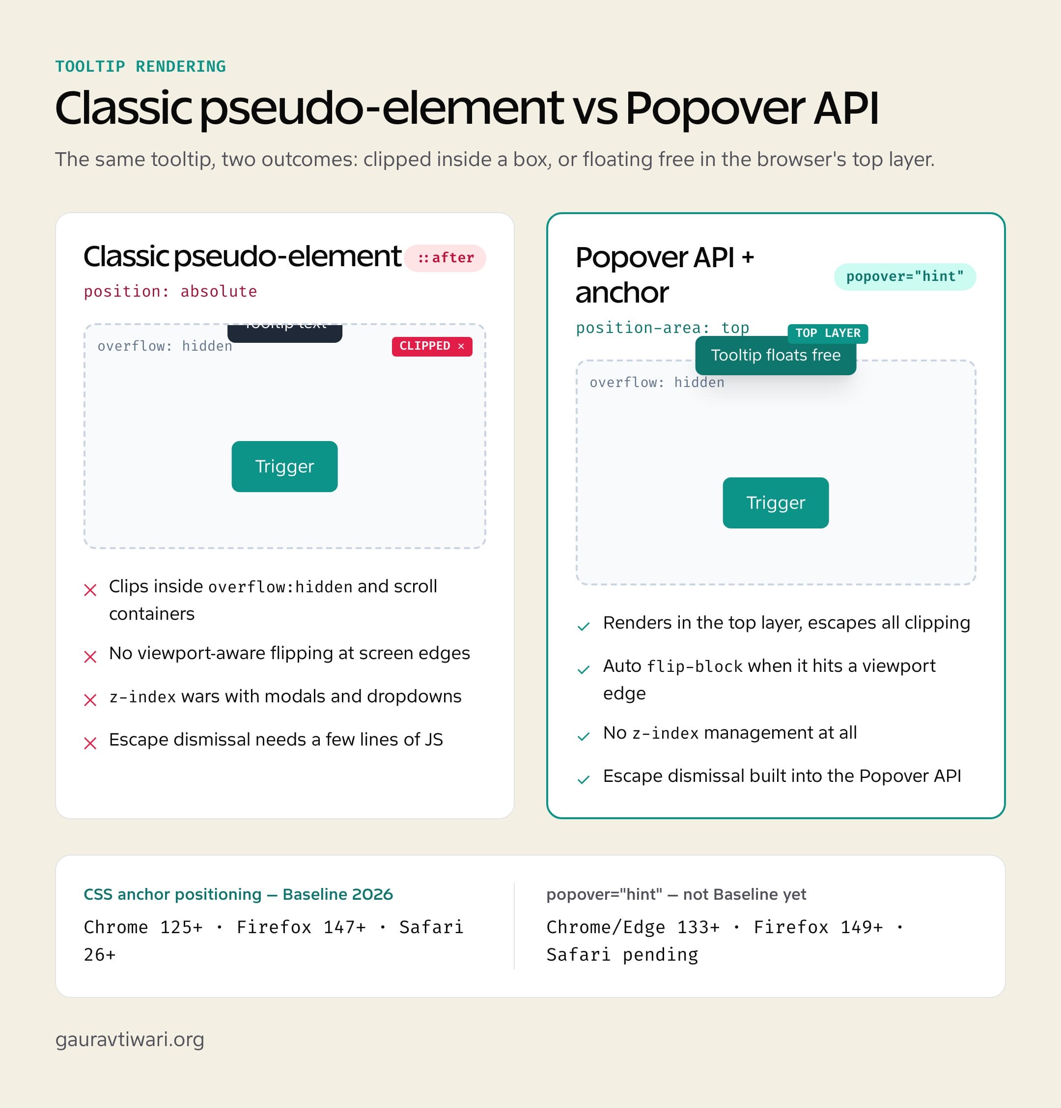
- Popover API. Elements with the
popoverattribute render in the top layer, outside the document flow, so they ignore every ancestor’s overflow. Cleanest fix, available everywhere the base Popover API is (Baseline since 2024). position: fixed. Fixed tooltips position against the viewport, not the clipped parent, so they escape too. The tradeoff is you lose parent-relative placement and have to compute the trigger’s coordinates, which is essentially what Floating UI does for you.- DOM relocation. Move the tooltip up to
<body>and position it from the trigger’sgetBoundingClientRect(). The pre-Popover approach Tippy.js still uses. Works anywhere, needs JavaScript.
For anything new and modern, use the Popover API. For older browsers, Floating UI’s sub-3KB engine is the lightest serious option.
CSS Tooltip Performance vs JavaScript
For ten tooltips, performance is a rounding error. For a data table with 200-plus triggers, it is the whole story.
A pure CSS tooltip costs nothing to initialize. The browser renders ::after natively, with no init loop, no DOM query, no event listener per element. Five hundred rows of table tooltips just work, with zero startup cost.
Tippy.js initializes each instance. On a page with 200 triggers that is measurable work, often 50 to 150ms depending on config, plus an event listener and a fresh DOM node per tooltip. Memory grows linearly with the count. Floating UI is lighter because it is only a positioning engine, but it still runs JavaScript for every placement calculation.
The rule writes itself: CSS by default, JavaScript only when you need a capability CSS lacks. That discipline also keeps your Core Web Vitals clean, because the cheapest script is the one you never ship.
Real CSS Tooltip Use Cases
Where these snippets actually earn their place in a real interface:
- Form field hints. The question-mark icon next to “What is a CVV?” in a checkout. Wire it to the field with
aria-describedby. My walkthrough on accessible forms in WordPress covers the rest of the pattern. - Icon button labels. Icon-only buttons (menu, close, settings) need a visible label on hover and an
aria-labelfor screen readers. You need both, not one. - Truncated text reveal. Text cut with
text-overflow: ellipsisshows its full value in a tooltip. A styled CSS tooltip beats the nativetitleattribute every time. - Data table headers. Compact columns like “MRR” or “ARPU” get a tooltip definition, so the table stays tight and the acronyms stay clear.
- Disabled button reasons. A disabled “Submit” can explain itself (“Complete all required fields”). Add
tabindex="0"so the disabled control can still receive focus and show its hint.
Common CSS Tooltip Mistakes
The five I see most often, and what to do instead:
Using the title attribute. Native title tooltips are inaccessible: no keyboard trigger, inconsistent screen reader support, no styling, hidden on touch, and they appear after an awkward delay. Build the tooltip in CSS instead.
Forgetting pointer-events: none. Leave it off and the tooltip becomes its own hover target, which creates a flicker loop as hovering the tooltip counts as leaving the trigger. The one exception is a hoverable tooltip for WCAG, where you deliberately set pointer-events: auto on the visible state.
Reaching for z-index: 99999. A five-digit z-index is a smell. Tooltips belong around z-index: 10 to 50, under modals and above content. The Popover API removes the question entirely with top-layer rendering.
Hiding required information in a tooltip. If a user cannot finish the task without reading your tooltip, the tooltip is the wrong pattern. Required information goes inline or in always-visible helper text. Tooltips are for nice-to-know, not need-to-know.
Shipping hover-only on mobile. Test on a real phone. If a hint never appears because there is no hover, move it inline or make it a toggletip.
On client dashboards I default to the pure CSS pattern with :focus-visible and the three-line Escape handler, and I only pull in Floating UI when tooltips have to live inside scroll containers. Every snippet here is the version I actually ship, not a spec-sheet demo.
Build the foundation, add :focus-visible, wire up aria-describedby, and handle Escape. That four-step pure CSS tooltip covers the large majority of real interfaces with no library at all. The Popover API and anchor positioning are erasing the last reasons to load JavaScript for a hint, so start with the classic pattern, layer the modern APIs as enhancement, and keep one rule above all the others: if the information matters, do not hide it in a tooltip.
Frequently Asked Questions
How do you create a tooltip using only CSS?
Add a data-tooltip attribute to any element and use the ::after pseudo-element with content: attr(data-tooltip) to show the text. Position it absolutely against the trigger, set opacity: 0 and visibility: hidden by default, then reveal it on :hover and :focus-visible. No JavaScript library like Tippy.js is needed for this basic CSS tooltip.
How do you add an arrow to a CSS tooltip?
Use a ::before pseudo-element with zero width and height and a thick transparent border, then color only the side facing the trigger. For a tooltip above the element, set border-top-color to the tooltip background and keep the other borders transparent. The border-width value is the arrow size, and you flip the colored side to match each direction.
How do you make a CSS tooltip accessible?
Show it on :focus-visible, not just :hover, so keyboard users see it. Add aria-describedby on the trigger pointing to the tooltip and role=tooltip on the tooltip. WCAG 1.4.13 also requires Escape dismissal, which needs a three-line keydown listener, and the tooltip should stay visible with no auto-hide timeout. Keep interactive elements out of tooltips.
Can you build a CSS tooltip with no JavaScript at all?
For showing and hiding, yes. :hover and :focus-visible with a pseudo-element need zero JavaScript. The catch is WCAG 1.4.13, which requires Escape dismissal and needs a tiny script. The newer popover=hint approach (Chrome and Edge 133+, Firefox 149+) gives fully zero-JavaScript hints with built-in Escape, but Safari does not support it yet.
How do you stop a CSS tooltip clipping inside overflow hidden?
Three fixes. The Popover API renders the tooltip in the browser’s top layer so it ignores all ancestor overflow. Switching the tooltip to position: fixed takes it out of the clipped parent’s context. Or relocate the tooltip to the body element and position it with JavaScript, which is what Tippy.js does. For new projects the Popover API is cleanest.
What is the difference between a tooltip and a popover?
A tooltip shows supplementary text on hover or focus and must not contain interactive elements. A popover shows richer content on click and can hold links, buttons, and inputs. In the browser Popover API, popover=hint is built for tooltip behavior while popover=auto handles click-triggered interactive content. Use a tooltip for hints and a popover for actions.
What is CSS anchor positioning and how does it help tooltips?
CSS anchor positioning, Baseline across Chrome 125+, Firefox 147+, and Safari 26+, tethers a tooltip to its trigger declaratively. With position-area and position-try-fallbacks: flip-block, the browser flips the tooltip automatically when it would overflow the viewport. It does in pure CSS what Floating UI needed JavaScript for, with no resize listeners.
Should you use CSS or JavaScript for tooltips?
Use a CSS tooltip for simple text hints on static elements you control. It has zero dependencies, zero bundle size, and zero init time, and it scales to thousands of tooltips with no per-element cost. Switch to JavaScript, Floating UI at under 3KB or Tippy.js around 6KB, when you need viewport-aware flipping, scroll-container escape, interactive content, or solid touch support.
Disclaimer: This site is reader-supported. If you buy through some links, I may earn a small commission at no extra cost to you. I only recommend tools I trust and would use myself. Your support helps keep gauravtiwari.org free and focused on real-world advice. Thanks. - Gaurav Tiwari