How Platforms Market Themselves Without Breaking the Browsing Flow

If you want to reduce bounce rate, stop thinking about it as a content problem and start treating it as an orientation problem. Bounce is what happens when a visitor lands, cannot answer three silent questions fast enough, and clicks back out: what is this, what do I do next, and where do I go if something goes wrong. The fastest way to lower bounce rate is to answer those three questions inside the browsing flow, so the page markets itself through clarity instead of slogans. Most people do not leave because they hate your site. They leave because a faster, clearer page is one back-click away.
This article shows how modern sites market inside the product experience, not just through ads and slogans. You’ll get a simple page structure you can reuse, a set of bounce rate benchmarks so you know what is actually normal, and a practical way to make your content discoverable without slowing down browsing or deterring users.
Key Takeaways
- Treat marketing as part of the user journey, not a separate campaign.
- Build a reassurance layer that is visible but not distracting.
- Standardize your page layouts so teams can keep them consistent over time.
Why trust this: I have shipped and audited more than 800 client sites since 2008, and bounce almost always traces back to two things, a slow first paint and a page that makes the visitor do the interpreting. Across the rebuilds I have run, the pages that recovered the most engagement were not the ones with more copy. They were the ones where the next action and the help route became obvious in the first second.
What changed in 2026: Bounce rate is not the old single-page metric anymore. In Google Analytics 4, a session counts as engaged once it lasts longer than 10 seconds, fires a key event, or reaches a second pageview, and GA4 bounce rate is simply the inverse of engagement rate. A site that reported a 62% bounce in Universal Analytics often reads closer to 52% bounce (48% engaged) in GA4, so read the number against the new definition before you panic.
Marketing Is Now an On-Site Journey
Marketing used to be about “getting the click.” Now, the harder part starts after someone arrives on your site. Most visitors will be silently checking for friction: confusing labels, hidden help, unclear next steps, and pages that feel like they were written for the company, not the reader.
The most reliable fix is not to provide more content. It is better information placement. You want the primary action to stay obvious, and you want your content to be easy to find, without different parts of the website competing for a visitor’s attention.
Marketing Signals That Build Confidence Without Slowing Browsing Down
Casino platforms offer a useful reference for modern marketing teams because they must guide people through lots of choices while keeping the experience quick and uncomplicated. That constraint forces clean navigation, predictable layouts, and copy that does not interrupt browsing.
Let’s use a video poker real money website as a concrete example of how confidence is built through structure, not slogans. The confidence signals here are simple, but they are doing real work. First, the site needs to make orientation easy. Clear top-level navigation and obvious account actions tell a first-time visitor where they are and what the main pathways are, without requiring a long explanation.
Second, it reduces the feeling of “too many options” by grouping the catalog with drop-down filters, such as “All Video Poker,” “1 Hand,” “3 Hand,” and “10 Hand.” That grouping is a reassurance signal because it proves the site has organized the inventory into meaningful buckets, which lowers uncertainty and speeds up decision-making.
Third, it keeps browsing fast by showing the catalog first, then placing explanatory sections below it, with headings like “How to Play Video Poker Machines,” “Rank of Poker Hands,” and “Video Poker Odds, Payouts and Returns.” This sequence matters. It lets confident users keep moving, while giving cautious users an immediate path to clarity without leaving the page. In other words, the page markets through predictability: clear routes, clear grouping, and clear context, delivered exactly when the user asks for it.
If you open a casino website to see how they have chosen to lay out their content, you will see how the information order reduces hesitation. The catalog comes first, then the explanation and links to help pages. Many business sites do the opposite, leading with claims and hiding the actual product paths behind vague buttons. A better approach is to let the structure do the persuading: the user finds the category, sees the scope, and reads the supporting explanation only when they need it.
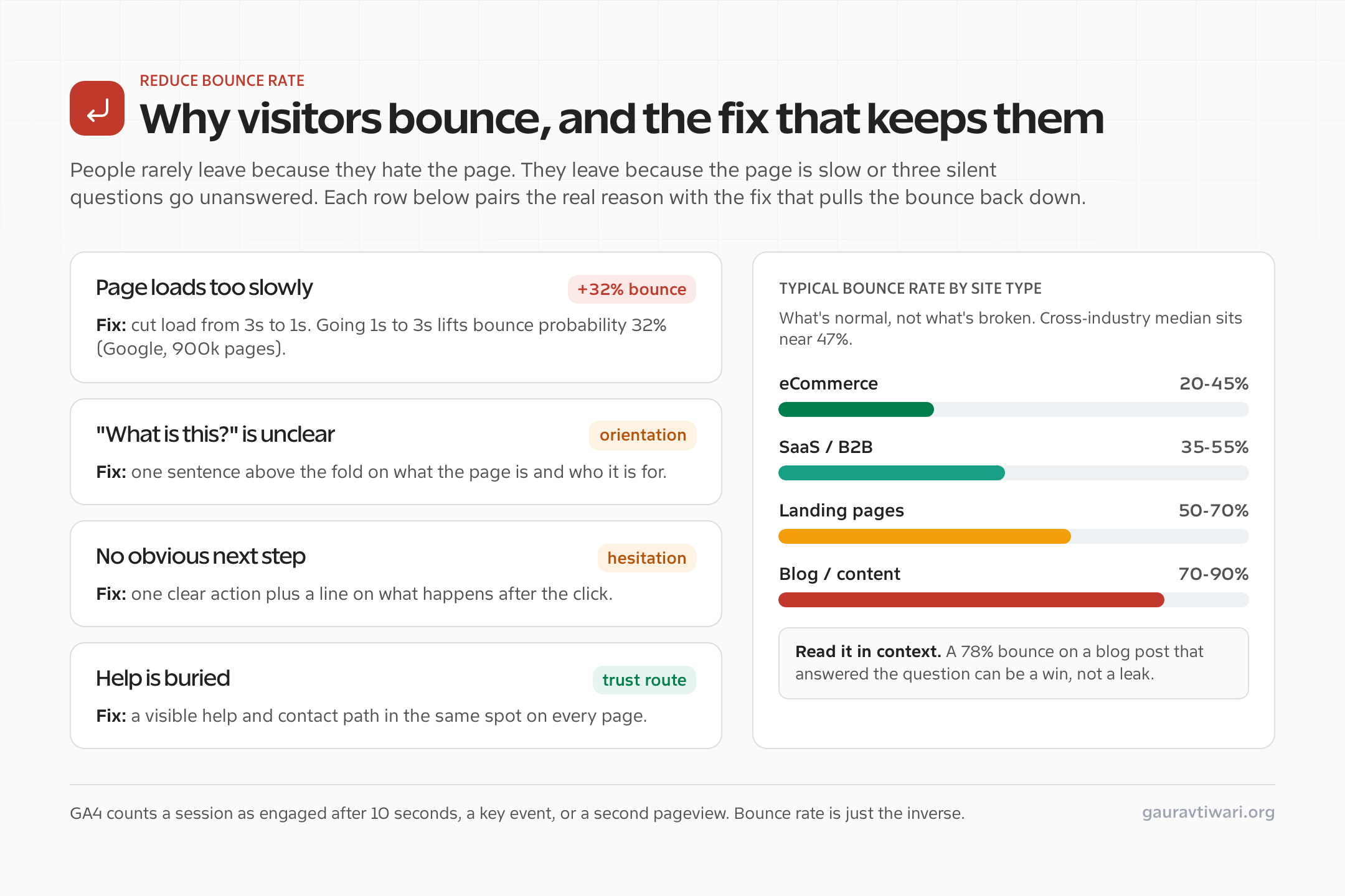
What Counts as a Good Bounce Rate (Benchmarks by Site Type)
Before you try to lower bounce rate, get the baseline right. The cross-industry median bounce rate sits near 47% in 2026, and the top quartile of operators run closer to 36%. But the “good” number swings hard by site type, and mobile sessions bounce roughly 12 points higher than desktop (about 52% versus 40%). Here is what is normal, so you do not waste a week fixing a page that was never broken.
| Site type | Typical bounce rate (2026) | How to read it |
|---|---|---|
| eCommerce / store | 20% to 45% | Low is expected. People browse multiple products, so high bounce here is a real warning sign. |
| SaaS / B2B homepage | 35% to 55% | Mid-range is healthy. Watch the path from homepage to pricing or signup. |
| Landing / campaign page | 50% to 70% | Single-purpose pages bounce more by design. Judge them on conversion, not bounce alone. |
| Blog / content article | 70% to 90% | High is normal and often fine. A reader who got the answer and left is a satisfied reader. |
When a High Bounce Rate Is Actually Fine
This is the part most “lower your bounce rate” advice gets wrong. Bounce rate is one of the most misunderstood metrics in analytics, because a high number is not automatically a problem. If someone searches for a phone number, lands on your contact page, copies the number, and leaves, that is a 100% bounce and a complete success. The same goes for a blog post that fully answers the question, a store-hours page, or a definition. The visitor came, got what they needed, and left satisfied.
The bounce you actually want to fix is the frustrated bounce: a session under 10 seconds, no scroll, no engagement, on a page that was supposed to lead somewhere. That is why pairing bounce rate with engagement rate, average engagement time, and scroll depth in conversion rate optimization work matters more than chasing the raw percentage down. If you only optimize one thing, optimize the experience for the visitor who wanted to go further and could not.
A Reusable Page Structure That Keeps Trust Content Updated
Use this structure for any high-intent page: homepages, product overviews, campaign landing pages, or category hubs.
- Above the fold, you should include:
- One sentence on what this page is for
- One sentence on who it is for
- One clear next action
- Content without fluff:
- Separate lists into bullet points using concrete nouns and verbs
- Avoid broad adjectives that are hard to verify
- Reassurance routes should provide readers with:
- A visible way to reach help pages and FAQs
- Contact information for anyone who might have questions
- A clear path to promotions or updates, if those exist
- Below that, you should provide:
- A “last updated” line
- Information on what changed, so teams stay informed
This structure works because it matches how people scan. They decide fast, then they verify, then they commit to the next step.
Trust Routes That Reduce Bounce Without Adding Clutter
A trust route is a small, consistent path to reassurance that sits inside the browsing flow. It is not a long explanation. It is a clear doorway that a user can reach quickly anytime they feel unsure about something on the site.
The key is consistency. If every page hides help in a different place, people start scanning instead of moving forward. When trust routes live in the same locations across the site, users will be able to find them quickly and efficiently, and the page will start feeling predictable.
If you want a short, ranked list of fixes that move bounce rate the most, this is the order I work in. Speed comes first because it is the one factor that bounces visitors before they read a single word. Google’s analysis of 900,000 pages found that as load time goes from one second to three seconds, the probability of a bounce climbs 32%, and by ten seconds it is up 123%. A slow page does not get the chance to be clear.
| Fix | Why it lowers bounce rate | Effort |
|---|---|---|
| Speed up the page (target under 2.5s LCP) | Removes the bounce that happens before reading. Biggest single lever. | Medium |
| One-line orientation above the fold | Answers “what is this and who is it for” instantly. | Low |
| One obvious next action | Removes the hesitation that sends users back to search. | Low |
| Consistent help and contact route | Keeps visitors on site when doubt creeps in. | Low |
| Catalog or content first, explanation below | Lets confident users keep moving without friction. | Medium |
That first row carries the most weight. If your numbers are stuck no matter how clean the layout is, the page is probably loading too slowly, and the fix is technical, not editorial. I walk through the exact steps in my guide on what to do when your WordPress website is slow and how to make it faster. For the layout side, where the next action and trust routes sit, see my notes on optimizing web design for conversions.
The Trust Route Map For Any High-Intent Page
Use this map when editing a homepage, category page, product overview, or landing page. Your goal is to answer common “silent questions” without interrupting the main action.
1) Information on where to start?
Best placement: Above the fold
What to show: a prompt suggesting the next step, plus a short sentence that explains what will happen afterwards.
Why it works: Users should not have to interpret the page before they can move. A single clear next action removes hesitation.
2) Where do I get help fast?
Best placement: Header or footer, visible on every page
What to show: A help label providing users with a clear path that leads to support options.
Why it works: When help is easy to find, the page feels safer even if the user never needs to visit the help page.
3) Who is behind this?
Best placement: Footer cluster
What to show: About and Contact routes, written plainly.
Why it works: Identity signals reduce doubt. A user can verify credibility without being pushed into a sales pitch.
4) Where are updates or offers?
Best placement: Secondary navigation
What to show: A promotions or updates index, if those exist.
Why it works: It keeps optional exploration out of the primary journey while still making it easy to discover.
Quick FAQ for Marketing and Product Leads
How do I market without sounding salesy?
Swap claims for a well-designed website structure. When a reader can browse, understand what to do next, and find help quickly, the page markets itself through clarity.
Where should reassurance content live?
Keep it in the same place across the site, usually a footer cluster for identity content and a visible help route in the header. Consistency beats clever wording.
What is the fastest fix for a page that feels off?
Rewrite the first screen so it answers what this is and informs users what their next actions should be in a couple of short sentences. Then add an obvious support path nearby, so doubt does not turn into a bounce.
How to Measure Whether It Is Working
You cannot lower bounce rate you cannot see. Set up GA4 first, since it is free and gives you engagement rate, average engagement time, and engaged sessions out of the box. Pair it with Microsoft Clarity for free session recordings and heatmaps, so you can watch where real visitors hesitate or rage-click before they bounce. If you run WordPress and want privacy-friendly numbers that live in your own database, Independent Analytics keeps the data on your site with no cookie banner. And once you spot a page worth improving, test the change instead of guessing. Thrive Optimize makes A/B testing a headline or layout simple. Pulling more of those visitors deeper into the site is the same muscle as learning to attract more visitors to a website in the first place: reduce friction, then measure.
High-performing on-site marketing is not about making your content louder or grabbing attention. It is about making a site feel calmer, clearer, and easier to navigate.
Disclaimer: This site is reader-supported. If you buy through some links, I may earn a small commission at no extra cost to you. I only recommend tools I trust and would use myself. Your support helps keep gauravtiwari.org free and focused on real-world advice. Thanks. - Gaurav Tiwari