Improving Classic Themes with theme.json in WordPress (6.9 Does It Better)
Here’s a scenario you probably know too well. You’re running a classic theme like me (Marketers Delight) that you’ve customized over the years. It works. You love it. Your clients love it (in their case, Bricks). But every time you want to add Block Editor support or define consistent spacing, you’re stuck writing PHP in functions.php and hoping it doesn’t break something.
WordPress 6.9 changes things.
With the theme.json file now fully supported in classic themes, you get a single configuration file that handles colors, typography, spacing, and Block Editor settings. No more scattered add_theme_support() calls. No more guessing which CSS variable does what.
This guide shows you exactly how to leverage theme.json in classic themes. We’ll build a complete design system with custom spacing, colors, and typography. Real code. Practical examples. Everything you need to modernize your battle-tested classic theme without rebuilding from scratch.
theme.json: Why?
Let me take you back a bit. Before theme.json existed, WordPress theme development was a scattered mess of PHP functions, CSS files, and Customizer options all living in different places.
WordPress 5.8: The Beginning (July 2021)
WordPress 5.8 introduced theme.json as part of the Full Site Editing initiative. This was version 1 of the schema, and honestly, it was pretty basic. You could configure color palettes, enable or disable custom colors, and set up font sizes. But it was a start.
The real innovation was the concept itself. Instead of calling add_theme_support('editor-color-palette') in PHP, you could define your colors in a JSON file. WordPress would read that file and generate CSS custom properties automatically. One source of truth. Revolutionary for those of us who had been maintaining themes for years.
Here’s what that first version looked like:
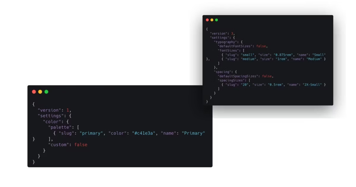
{
  "version": 1,
  "settings": {
    "color": {
      "palette": [
        { "slug": "primary", "color": "#c41e3a", "name": "Primary" }
      ],
      "custom": false
    }
  }
}
Simple. Limited. But the foundation was there.
WordPress 5.9: Version 2 and Full Site Editing (January 2022)
Version 2 arrived with WordPress 5.9, and this is when things got serious. The schema expanded significantly. You could now configure block-level settings, define custom templates, register template parts, and control layout widths.
More importantly, WordPress 5.9 introduced the Global Styles interface in the Site Editor. Your theme.json settings now had a visual counterpart. Users could override your defaults through a proper UI instead of hunting for custom CSS fields.
Version 2 also brought better backward compatibility. If you had a version 1 theme.json, WordPress would transform it at runtime to version 2. No breaking changes. This philosophy of backward compatibility has continued ever since.
The key additions in version 2 included:
customTemplatesandtemplatePartsproperties for FSE themes- Block-level styling with
styles.blocks - Element-level styling for links, headings, and buttons
- Layout settings with
contentSizeandwideSize - Spacing controls with margin and padding options
WordPress 6.6: Version 3 (July 2024)
Version 3 landed with WordPress 6.6, bringing breaking changes that required the version bump. The main change? How default presets work.
In version 2, if you defined font sizes or spacing sizes with the same slugs as WordPress defaults, your values would override them. Version 3 flipped this behavior. Now you need to explicitly set defaultFontSizes: false or defaultSpacingSizes: false to override the defaults.
This might sound annoying, but it actually makes sense. The new behavior is consistent with how other default options like defaultPalette work. And you still have full control. You just need to be explicit about it.
Here’s the migration in practice:
{
  "version": 3,
  "settings": {
    "typography": {
      "defaultFontSizes": false,
      "fontSizes": [
        { "slug": "small", "size": "0.875rem", "name": "Small" },
        { "slug": "medium", "size": "1rem", "name": "Medium" }
      ]
    },
    "spacing": {
      "defaultSpacingSizes": false,
      "spacingSizes": [
        { "slug": "20", "size": "0.5rem", "name": "2X-Small" }
      ]
    }
  }
}
WordPress 6.9: The Classic Theme Revolution (December 2025)
And now we’re here. WordPress 6.9 doesn’t introduce a new theme.json version, but it fundamentally changes what theme.json can do for classic themes.
The headline feature? On-demand CSS loading for classic themes.
Before 6.9, classic themes had to load the entire wp-block-library stylesheet upfront. That’s 120KB of CSS, whether you used those blocks or not. Block themes could load styles on demand, but classic themes were stuck in the past.
WordPress 6.9 introduces a template enhancement that uses an output buffer to hoist late-enqueued block styles into the head. Classic themes now load CSS on demand by default. No code changes required.
This isn’t just an incremental improvement. It’s a paradigm shift for classic theme performance.
Why Classic Theme Developers Should Care
I love classic themes. They’re battle-tested. They’re predictable. They work with every plugin ever made. And until recently, they felt like second-class citizens in the Block Editor era.
Not anymore.
The “Best of Both Worlds” Advantage
Classic themes with theme.json get something unique. You keep your familiar PHP template structure. Your header.php, footer.php, and template hierarchy work exactly as they always have. But you also get:
- Block Editor integration. Your colors and fonts appear in the editor UI.
- CSS custom properties. Change a color in one place, it updates everywhere.
- Consistent spacing. Define a scale once, use it throughout.
- Reduced CSS output. Only load what you actually use.
- Child theme merging. Override parent values without copying entire files.
What theme.json Replaces
Here’s the real win for maintainability. All those add_theme_support() calls in your functions.php? Most of them can move to theme.json.
| functions.php | theme.json equivalent |
|---|---|
add_theme_support('editor-color-palette') | settings.color.palette |
add_theme_support('editor-font-sizes') | settings.typography.fontSizes |
add_theme_support('custom-spacing') | settings.spacing.padding: true |
add_theme_support('align-wide') | settings.layout.wideSize |
add_theme_support('disable-custom-colors') | settings.color.custom: false |
add_theme_support('disable-custom-font-sizes') | settings.typography.customFontSize: false |
One JSON file instead of scattered PHP callbacks. When you need to change your brand colors, you edit one file. When a client asks, “What fonts does our theme support?”, you point them to one file.
Performance Impact
Let me be direct. Performance is why you should upgrade to WordPress 6.9 and add theme.json to your classic theme today.
The 120KB CSS Problem
Classic themes traditionally loaded the entire wp-block-library stylesheet on every page load. This stylesheet contains styles for every core block in WordPress. The Quote block. The Table block. The Code block. Every single one.
The stylesheet weighs in at approximately 120KB minified. Most pages use maybe 10-15 blocks. You were loading styles for 80+ blocks you didn’t need.
How WordPress 6.9 Fixes It
WordPress 6.9 introduces on-demand block CSS loading for classic themes. Here’s how it works:
- WordPress starts rendering your template
- As each block renders, its styles get enqueued
- A new template output buffer captures late-enqueued styles
- WordPress hoists those styles into the
<head>using the HTML Tag Processor - Only the CSS for blocks actually on the page gets loaded
The result? Across default classic themes (Twenty Ten through Twenty Twenty-One), CSS weight dropped by 30% to 65% per page.
Real Performance Improvements
The WordPress Core Performance Team ran extensive benchmarks. Here’s what they found:
- LCP improvement for block themes: 25% average, 18.9% for Twenty Twenty-Five
- CSS reduction for classic themes: 100KB+ shaved off typical pages
- TTFB improvement: Up to 1 second reduction from optimized WP-Cron handling
- RSS caching fix: Feed widget overhead dropped from 266ms to 35ms
These aren’t theoretical numbers. These are real improvements on real sites.
Additional Performance Optimizations
WordPress 6.9 brings several other performance wins:
- Inline CSS limit increased: From 20KB to 40KB, more styles can be inlined
- fetchpriority support: Scripts can be marked as low priority to not block rendering
- Emoji script moved to footer: No longer blocks initial page render
- Cron runs at shutdown: Background tasks don’t slow down page loads
Here’s the thing. You get all these improvements just by updating to WordPress 6.9. But adding theme.json to your classic theme amplifies them. When WordPress knows your design system through theme.json, it can make smarter decisions about what CSS to load and when.
Adding theme.json to Your Classic Theme
Adding theme.json to a classic theme is straightforward. Create the file in your theme’s root directory, right alongside style.css and functions.php. If you are using a child theme, that’s even better.
The Minimum Viable theme.json
Here’s all you need to get started:
{
  "$schema": "https://schemas.wp.org/trunk/theme.json",
  "version": 3
}
Two properties, and you’ve enabled theme.json support. The $schema property gives you autocompletion in VS Code, Cursor, Antigravity and other editors. The version property tells WordPress which API version to use.
The Layout Gotcha
Here’s something that trips people up. When you add an empty theme.json, WordPress applies its default settings. This includes layout widths. Your carefully crafted 720px content width might suddenly change.
Fix it by adding layout settings that match your existing design:
{
  "$schema": "https://schemas.wp.org/trunk/theme.json",
  "version": 3,
  "settings": {
    "layout": {
      "contentSize": "720px",
      "wideSize": "1200px"
    }
  }
}
Check your theme’s existing CSS to find these values. Look for max-width on your content container.
Understanding the File Structure
The theme.json file has several top-level sections:
- $schema: Points to the JSON schema for editor autocompletion and validation
- version: The theme.json API version (use 3 for WordPress 6.6+)
- settings: Configures editor features and defines presets like colors, fonts, and spacing
- styles: Applies CSS styles using your presets or custom values
- customTemplates: Registers custom page and post templates (FSE themes)
- templateParts: Defines reusable template parts (FSE themes)
- patterns: Bundles patterns from the Pattern Directory
For classic themes, you’ll primarily use settings and styles. The template-related sections are for Full Site Editing themes.
Settings vs Styles: The Key Distinction
This is important. Settings generate CSS custom properties and control what options appear in the editor. Styles apply those properties to elements and blocks.
Settings are about options. What colors can users choose from? What font sizes are available?
Styles are about defaults. What color should links be? What’s the default font size for paragraphs?
{
  "settings": {
    "color": {
      "palette": [
        { "slug": "primary", "color": "#c41e3a", "name": "Primary" }
      ]
    }
  },
  "styles": {
    "elements": {
      "link": {
        "color": {
          "text": "var:preset|color|primary"
        }
      }
    }
  }
}
In this example, the setting creates a “Primary” color option. The style makes links use that color by default.
Building a Color System
Colors are usually the first thing developers configure in theme.json. Define a palette, and WordPress generates CSS custom properties and utility classes automatically.
A Practical Color Palette
Here’s a professional color palette structure I use in client projects:
{
  "version": 3,
  "settings": {
    "color": {
      "palette": [
        { "slug": "base", "color": "#ffffff", "name": "Base" },
        { "slug": "contrast", "color": "#1a1a1a", "name": "Contrast" },
        { "slug": "primary", "color": "#c41e3a", "name": "Primary" },
        { "slug": "secondary", "color": "#2563eb", "name": "Secondary" },
        { "slug": "tertiary", "color": "#f3f4f6", "name": "Tertiary" },
        { "slug": "accent", "color": "#059669", "name": "Accent" }
      ],
      "custom": false,
      "defaultPalette": false
    }
  }
}
Notice custom: false. This prevents users from picking arbitrary colors outside your palette. Great for maintaining brand consistency. Set it to true if you want to give users more freedom.
The defaultPalette: false hides WordPress’s default colors. Your palette becomes the only option.
Generated CSS Custom Properties
WordPress converts each color into a CSS custom property following this naming pattern:
--wp--preset--color--{slug}
So your primary color becomes:
--wp--preset--color--primary: #c41e3a;
WordPress also generates utility classes:
.has-primary-color { color: var(--wp--preset--color--primary); }
.has-primary-background-color { background-color: var(--wp--preset--color--primary); }
When users select colors in the Block Editor, WordPress applies these classes automatically. The color value lives in the custom property. Change it in theme.json, and every element using that class updates.
Applying Colors in Styles
To set default colors throughout your theme:
{
  "styles": {
    "color": {
      "background": "var:preset|color|base",
      "text": "var:preset|color|contrast"
    },
    "elements": {
      "link": {
        "color": {
          "text": "var:preset|color|primary"
        },
        ":hover": {
          "color": {
            "text": "var:preset|color|secondary"
          }
        }
      },
      "button": {
        "color": {
          "background": "var:preset|color|primary",
          "text": "var:preset|color|base"
        }
      }
    }
  }
}
Notice the var:preset|color|slug syntax. This is how you reference presets in theme.json. WordPress converts this to the actual CSS variable when generating styles.
Creating a Typography System
Typography in theme.json covers font families, font sizes, and line heights. You can bundle custom fonts or use system fonts for better performance.
Defining Font Families
System fonts load instantly because they’re already on the user’s device. Here’s a professional font stack:
{
  "settings": {
    "typography": {
      "fontFamilies": [
        {
          "slug": "system-sans",
          "name": "System Sans",
          "fontFamily": "-apple-system, BlinkMacSystemFont, 'Segoe UI', Roboto, Oxygen-Sans, Ubuntu, Cantarell, 'Helvetica Neue', sans-serif"
        },
        {
          "slug": "system-serif",
          "name": "System Serif",
          "fontFamily": "Georgia, Cambria, 'Times New Roman', Times, serif"
        },
        {
          "slug": "monospace",
          "name": "Monospace",
          "fontFamily": "Consolas, Monaco, 'Courier New', monospace"
        }
      ]
    }
  }
}
If you want to use Google Fonts or custom web fonts, you can register them with the fontFace property. But for most projects, system fonts are faster and look great.
Setting Up Font Sizes
Font sizes work similarly. Define a scale that makes sense for your design:
{
  "settings": {
    "typography": {
      "fontSizes": [
        { "slug": "small", "size": "0.875rem", "name": "Small" },
        { "slug": "medium", "size": "1rem", "name": "Medium" },
        { "slug": "large", "size": "1.25rem", "name": "Large" },
        { "slug": "x-large", "size": "1.5rem", "name": "Extra Large" },
        { "slug": "xx-large", "size": "2.25rem", "name": "Huge" }
      ],
      "customFontSize": false,
      "defaultFontSizes": false
    }
  }
}
Each size generates a CSS custom property like --wp--preset--font-size--large. These appear in the Block Editor’s font size dropdown, giving content editors a consistent set of options.
Setting customFontSize: false prevents users from entering arbitrary pixel values. This keeps your typography consistent.
Applying Typography to Elements
Use the styles section to set defaults:
{
  "styles": {
    "typography": {
      "fontFamily": "var:preset|font-family|system-sans",
      "fontSize": "var:preset|font-size|medium",
      "lineHeight": "1.6"
    },
    "elements": {
      "h1": {
        "typography": {
          "fontSize": "var:preset|font-size|xx-large",
          "fontWeight": "700",
          "lineHeight": "1.2"
        }
      },
      "h2": {
        "typography": {
          "fontSize": "var:preset|font-size|x-large",
          "fontWeight": "600",
          "lineHeight": "1.3"
        }
      },
      "h3": {
        "typography": {
          "fontSize": "var:preset|font-size|large",
          "fontWeight": "600",
          "lineHeight": "1.4"
        }
      }
    }
  }
}
Building a Spacing System
Spacing is where theme.json really shines. Create a consistent spacing scale that applies throughout your theme and appears in the Block Editor’s padding and margin controls.
Using spacingSizes for Custom Presets
The spacingSizes property gives you complete control:
{
  "settings": {
    "spacing": {
      "spacingSizes": [
        { "slug": "20", "size": "0.5rem", "name": "2X-Small" },
        { "slug": "30", "size": "0.75rem", "name": "X-Small" },
        { "slug": "40", "size": "1rem", "name": "Small" },
        { "slug": "50", "size": "1.5rem", "name": "Medium" },
        { "slug": "60", "size": "2rem", "name": "Large" },
        { "slug": "70", "size": "3rem", "name": "X-Large" },
        { "slug": "80", "size": "4rem", "name": "2X-Large" }
      ],
      "padding": true,
      "margin": true,
      "blockGap": true,
      "defaultSpacingSizes": false
    }
  }
}
This generates CSS custom properties:
--wp--preset--spacing--20: 0.5rem;
--wp--preset--spacing--30: 0.75rem;
--wp--preset--spacing--40: 1rem;
/* ... and so on */
The numeric slugs (20, 30, 40…) might look weird, but they’re the WordPress convention. They give you room to add intermediate values later without renaming everything.
Fluid Spacing with clamp()
For responsive spacing that scales with viewport size, use CSS clamp() or min():
{
  "spacingSizes": [
    { "slug": "40", "size": "clamp(1rem, 2vw, 1.5rem)", "name": "Small" },
    { "slug": "50", "size": "clamp(1.5rem, 4vw, 2.5rem)", "name": "Medium" },
    { "slug": "60", "size": "clamp(2rem, 6vw, 4rem)", "name": "Large" }
  ]
}
This creates spacing that’s smaller on mobile and larger on desktop, all without media queries.
Setting Default Block Gap
The blockGap property controls spacing between blocks:
{
  "styles": {
    "spacing": {
      "blockGap": "var:preset|spacing|50"
    }
  }
}
Now all blocks have consistent vertical spacing by default. Content editors can still override this per-block if needed.
Creating Custom CSS Properties
Beyond presets, theme.json lets you create completely custom CSS properties. Perfect for design tokens that don’t fit standard categories.
The Custom Property
Use settings.custom for arbitrary values:
{
  "settings": {
    "custom": {
      "lineHeight": {
        "tight": "1.2",
        "normal": "1.6",
        "loose": "1.8"
      },
      "borderRadius": {
        "small": "4px",
        "medium": "8px",
        "large": "16px",
        "full": "9999px"
      },
      "boxShadow": {
        "small": "0 1px 2px rgba(0, 0, 0, 0.05)",
        "medium": "0 4px 6px rgba(0, 0, 0, 0.1)",
        "large": "0 10px 15px rgba(0, 0, 0, 0.15)"
      },
      "transition": {
        "fast": "150ms ease",
        "normal": "300ms ease",
        "slow": "500ms ease"
      }
    }
  }
}
WordPress generates these CSS custom properties:
--wp--custom--line-height--tight: 1.2;
--wp--custom--line-height--normal: 1.6;
--wp--custom--border-radius--medium: 8px;
--wp--custom--box-shadow--large: 0 10px 15px rgba(0, 0, 0, 0.15);
--wp--custom--transition--normal: 300ms ease;
Notice the naming convention. CamelCase keys become kebab-case in CSS. Nested objects get separated by double hyphens.
Using Custom Properties in Styles
Reference custom properties with var:custom:
{
  "styles": {
    "blocks": {
      "core/button": {
        "border": {
          "radius": "var:custom|border-radius|medium"
        }
      }
    }
  }
}
Styling Specific Blocks
You can apply styles to specific block types. This creates consistent block designs without writing custom CSS.
Block-Level Styling
{
  "styles": {
    "blocks": {
      "core/quote": {
        "border": {
          "left": {
            "color": "var:preset|color|primary",
            "width": "4px",
            "style": "solid"
          }
        },
        "spacing": {
          "padding": {
            "left": "var:preset|spacing|50"
          }
        },
        "typography": {
          "fontStyle": "italic"
        }
      },
      "core/code": {
        "color": {
          "background": "var:preset|color|tertiary",
          "text": "var:preset|color|contrast"
        },
        "typography": {
          "fontFamily": "var:preset|font-family|monospace",
          "fontSize": "var:preset|font-size|small"
        },
        "spacing": {
          "padding": "var:preset|spacing|40"
        },
        "border": {
          "radius": "var:custom|border-radius|small"
        }
      },
      "core/image": {
        "border": {
          "radius": "var:custom|border-radius|medium"
        }
      },
      "core/separator": {
        "color": {
          "background": "var:preset|color|tertiary"
        },
        "border": {
          "width": "0"
        }
      }
    }
  }
}
Every Quote block now has a left border in your primary color. Every Code block has your monospace font on a light background. Consistency without repetitive CSS.
Block-Level Settings
You can also customize which options appear for specific blocks:
{
  "settings": {
    "blocks": {
      "core/heading": {
        "color": {
          "palette": [
            { "slug": "contrast", "color": "#1a1a1a", "name": "Contrast" },
            { "slug": "primary", "color": "#c41e3a", "name": "Primary" }
          ]
        }
      }
    }
  }
}
Now headings only have access to two colors instead of your full palette. Great for keeping content editors focused on appropriate choices.
Using theme.json in Child Themes
If you’re customizing a parent theme that already has a theme.json, you can add a theme.json file to your child theme to override changes. WordPress merges the two files, with child theme values taking precedence.
The Merge Behavior
This is powerful. You don’t need to copy the entire parent theme.json. Just include the values you want to override.
For example, to change just the color palette in a child theme:
{
  "$schema": "https://schemas.wp.org/trunk/theme.json",
  "version": 3,
  "settings": {
    "color": {
      "palette": [
        { "slug": "primary", "color": "#059669", "name": "Primary" },
        { "slug": "secondary", "color": "#0891b2", "name": "Secondary" }
      ]
    }
  }
}
The child theme inherits all typography, spacing, and other settings from the parent. Only the color palette gets overridden.
Removing Parent Theme Padding
A common request when using Twenty Twenty-Three as a parent theme is removing the default site padding. In your child theme’s theme.json:
{
  "version": 3,
  "styles": {
    "spacing": {
      "padding": {
        "top": "0",
        "bottom": "0"
      }
    }
  }
}
The left and right padding from the parent are preserved. Only top and bottom are changed.
Version Compatibility
Your child theme can use a different theme.json version than the parent. But here’s the catch: WordPress uses the higher version’s behavior. If your parent theme updates to version 3, your child theme inherits that minimum WordPress requirement even if you’re still on version 2.
Complete Example: A Scalable Design System
Let’s put everything together. Here’s a complete theme.json file that creates a professional design system for a classic theme:
{
  "$schema": "https://schemas.wp.org/trunk/theme.json",
  "version": 3,
  "settings": {
    "layout": {
      "contentSize": "720px",
      "wideSize": "1200px"
    },
    "color": {
      "palette": [
        { "slug": "base", "color": "#ffffff", "name": "Base" },
        { "slug": "contrast", "color": "#1a1a1a", "name": "Contrast" },
        { "slug": "primary", "color": "#c41e3a", "name": "Primary" },
        { "slug": "secondary", "color": "#2563eb", "name": "Secondary" },
        { "slug": "tertiary", "color": "#f3f4f6", "name": "Tertiary" },
        { "slug": "accent", "color": "#059669", "name": "Accent" }
      ],
      "custom": false,
      "defaultPalette": false
    },
    "typography": {
      "fontFamilies": [
        {
          "slug": "system-sans",
          "name": "System Sans",
          "fontFamily": "-apple-system, BlinkMacSystemFont, 'Segoe UI', Roboto, sans-serif"
        },
        {
          "slug": "system-serif",
          "name": "System Serif",
          "fontFamily": "Georgia, Cambria, 'Times New Roman', Times, serif"
        },
        {
          "slug": "monospace",
          "name": "Monospace",
          "fontFamily": "Consolas, Monaco, 'Courier New', monospace"
        }
      ],
      "fontSizes": [
        { "slug": "small", "size": "0.875rem", "name": "Small" },
        { "slug": "medium", "size": "1rem", "name": "Medium" },
        { "slug": "large", "size": "1.25rem", "name": "Large" },
        { "slug": "x-large", "size": "1.5rem", "name": "Extra Large" },
        { "slug": "xx-large", "size": "2.25rem", "name": "Huge" }
      ],
      "customFontSize": false,
      "defaultFontSizes": false
    },
    "spacing": {
      "spacingSizes": [
        { "slug": "20", "size": "0.5rem", "name": "2X-Small" },
        { "slug": "30", "size": "0.75rem", "name": "X-Small" },
        { "slug": "40", "size": "1rem", "name": "Small" },
        { "slug": "50", "size": "1.5rem", "name": "Medium" },
        { "slug": "60", "size": "2rem", "name": "Large" },
        { "slug": "70", "size": "3rem", "name": "X-Large" },
        { "slug": "80", "size": "4rem", "name": "2X-Large" }
      ],
      "padding": true,
      "margin": true,
      "blockGap": true,
      "defaultSpacingSizes": false
    },
    "custom": {
      "lineHeight": {
        "tight": "1.2",
        "normal": "1.6",
        "loose": "1.8"
      },
      "borderRadius": {
        "small": "4px",
        "medium": "8px",
        "large": "16px"
      }
    }
  },
  "styles": {
    "color": {
      "background": "var:preset|color|base",
      "text": "var:preset|color|contrast"
    },
    "typography": {
      "fontFamily": "var:preset|font-family|system-sans",
      "fontSize": "var:preset|font-size|medium",
      "lineHeight": "var:custom|line-height|normal"
    },
    "spacing": {
      "blockGap": "var:preset|spacing|50"
    },
    "elements": {
      "link": {
        "color": {
          "text": "var:preset|color|primary"
        },
        ":hover": {
          "color": {
            "text": "var:preset|color|secondary"
          }
        }
      },
      "h1": {
        "typography": {
          "fontSize": "var:preset|font-size|xx-large",
          "fontWeight": "700",
          "lineHeight": "var:custom|line-height|tight"
        }
      },
      "h2": {
        "typography": {
          "fontSize": "var:preset|font-size|x-large",
          "fontWeight": "600",
          "lineHeight": "1.3"
        }
      },
      "h3": {
        "typography": {
          "fontSize": "var:preset|font-size|large",
          "fontWeight": "600",
          "lineHeight": "1.4"
        }
      },
      "button": {
        "color": {
          "background": "var:preset|color|primary",
          "text": "var:preset|color|base"
        },
        "border": {
          "radius": "var:custom|border-radius|medium"
        },
        ":hover": {
          "color": {
            "background": "var:preset|color|secondary"
          }
        }
      }
    },
    "blocks": {
      "core/quote": {
        "border": {
          "left": {
            "color": "var:preset|color|primary",
            "width": "4px",
            "style": "solid"
          }
        },
        "spacing": {
          "padding": {
            "left": "var:preset|spacing|50"
          }
        },
        "typography": {
          "fontStyle": "italic"
        }
      },
      "core/code": {
        "color": {
          "background": "var:preset|color|tertiary"
        },
        "typography": {
          "fontFamily": "var:preset|font-family|monospace",
          "fontSize": "var:preset|font-size|small"
        },
        "spacing": {
          "padding": "var:preset|spacing|40"
        },
        "border": {
          "radius": "var:custom|border-radius|small"
        }
      },
      "core/separator": {
        "color": {
          "background": "var:preset|color|tertiary"
        }
      }
    }
  }
}
Copy this file into your theme’s root directory. Adjust the colors and sizes to match your existing design. That’s it. You now have a complete design system.
Here is my theme.json file. See if you can find some inspiration.
{
"$schema": "https://schemas.wp.org/trunk/theme.json",
"version": 3,
"settings": {
"appearanceTools": true,
"border": {
"color": true,
"radius": true,
"style": true,
"width": true
},
"color": {
"custom": false,
"customGradient": false,
"defaultDuotone": false,
"defaultGradients": false,
"defaultPalette": false,
"palette": [
{ "name": "Primary", "slug": "primary", "color": "#C0392B" },
{ "name": "Secondary", "slug": "secondary", "color": "#262A5D" },
{ "name": "Tertiary", "slug": "tertiary", "color": "#001e12" },
{ "name": "Action", "slug": "action", "color": "#1944a8" },
{ "name": "Accent", "slug": "accent", "color": "#F7B500" },
{ "name": "Accent New", "slug": "accent-new", "color": "#ffd700" },
{ "name": "White", "slug": "white", "color": "#ffffff" },
{ "name": "Text Secondary", "slug": "text-sec", "color": "#555555" },
{ "name": "Button Secondary", "slug": "button-sec", "color": "#001947" },
{ "name": "Almond", "slug": "almond", "color": "#fcf9f5" },
{ "name": "Bodified", "slug": "bodified", "color": "#faf8f6" },
{ "name": "BlueAlice", "slug": "aliceblue", "color": "#f0f8ff" },
{ "name": "Peach", "slug": "peach", "color": "#ffdab9" },
{ "name": "Thistle", "slug": "thistle", "color": "#d8bfd8" },
{ "name": "Yellow Green", "slug": "yellow-green", "color": "#9acd32" },
{ "name": "Bordered", "slug": "bordered", "color": "#dddddd" },
{ "name": "BG Highlight", "slug": "bg-highlight", "color": "#111827" },
{ "name": "Off White", "slug": "offwhite", "color": "#F6F6F6" },
{ "name": "Subtle Green", "slug": "subtle-green", "color": "#117c68" },
{ "name": "Green Card", "slug": "green-card", "color": "#f1fdf8" },
{ "name": "Orange Card", "slug": "orange-card", "color": "#fef1f0" },
{ "name": "Red Card", "slug": "red-card", "color": "#ffe7e7" },
{ "name": "My Yellow", "slug": "my-yellow", "color": "#ffd700" },
{ "name": "Latest Green", "slug": "latest-green", "color": "#6fa11e" },
{ "name": "Shade Yellow", "slug": "shade-yellow", "color": "#ffdf88" },
{ "name": "Latest Red", "slug": "latest-red", "color": "#c0392b" },
{ "name": "TextShade", "slug": "textshade", "color": "#080808" },
{ "name": "Blue", "slug": "blue", "color": "#3533cd" }
],
"gradients": [
{
"slug": "subtle-green-to-light",
"gradient": "linear-gradient(180deg, #f1fdf8, #ffffff)",
"name": "Subtle Green to Light"
},
{
"slug": "button",
"gradient": "linear-gradient(to bottom, #F7B500, #C0392B)",
"name": "Button"
},
{
"slug": "brand-blue",
"gradient": "linear-gradient(135deg, #262A5D, #3533cd)",
"name": "Brand Blue"
},
{
"slug": "brand-blue-alt",
"gradient": "linear-gradient(135deg, #262A5D, #1b1a91, #46097c)",
"name": "Brand Blue Alt"
},
{
"slug": "primary-to-accent",
"gradient": "linear-gradient(135deg, #C0392B, #F7B500)",
"name": "Primary to Accent"
},
{
"slug": "secondary-to-blue",
"gradient": "linear-gradient(45deg, #262A5D, #3533cd)",
"name": "Secondary to Blue"
},
{
"slug": "accent-to-offwhite",
"gradient": "linear-gradient(90deg, #F7B500, #F6F6F6)",
"name": "Accent to Off White"
},
{
"slug": "light-peach-to-white",
"gradient": "linear-gradient(180deg, #ffdab9, #ffffff)",
"name": "Light Peach to White"
},
{
"slug": "yellow-green-to-latest-green",
"gradient": "linear-gradient(135deg, #9acd32, #6fa11e)",
"name": "Yellow Green to Latest Green"
},
{
"slug": "dark-mode-bg",
"gradient": "linear-gradient(180deg, #111827, #080808)",
"name": "Dark Mode Background"
},
{
"slug": "sr",
"gradient": "linear-gradient(135deg, #FF8C00, #FF0080)",
"name": "Sunset Rays"
},
{
"slug": "od",
"gradient": "linear-gradient(135deg, #0093E9, #001E66)",
"name": "Ocean Depths"
},
{
"slug": "fb",
"gradient": "linear-gradient(135deg, #FC466B, #3F5EFB)",
"name": "Fusion Blast"
},
{
"slug": "nl",
"gradient": "linear-gradient(135deg, #4158D0, #C850C0, #FFCC70)",
"name": "Northern Lights"
},
{
"slug": "mc",
"gradient": "linear-gradient(135deg, #08AEEA, #2AF598)",
"name": "Mint Condition"
},
{
"slug": "fp",
"gradient": "linear-gradient(135deg, #F83600, #F9D423)",
"name": "Fire Passion"
},
{
"slug": "cd",
"gradient": "linear-gradient(135deg, #0F2027, #203A43, #2C5364)",
"name": "Cool Dusk"
},
{
"slug": "mv",
"gradient": "linear-gradient(90deg, #FF61D2, #FE9090, #7BABF9)",
"name": "Miami Vibes"
}
]
},
"layout": {
"contentSize": "850px",
"wideSize": "1024px"
},
"shadow": {
"defaultPresets": false,
"presets": [
{
"name": "Small",
"slug": "sm",
"shadow": "0 1px 2px 0 rgba(0, 0, 0, 0.05)"
},
{
"name": "Medium",
"slug": "md",
"shadow": "0 4px 6px -1px rgba(0, 0, 0, 0.1), 0 2px 4px -2px rgba(0, 0, 0, 0.1)"
},
{
"name": "Large",
"slug": "lg",
"shadow": "0 10px 15px -3px rgba(0, 0, 0, 0.1), 0 4px 6px -4px rgba(0, 0, 0, 0.1)"
},
{
"name": "Extra Large",
"slug": "xl",
"shadow": "0 20px 25px -5px rgba(0, 0, 0, 0.1), 0 8px 10px -6px rgba(0, 0, 0, 0.1)"
},
{
"name": "Soft",
"slug": "soft",
"shadow": "0 2px 15px -3px rgba(0, 0, 0, 0.07), 0 10px 20px -2px rgba(0, 0, 0, 0.04)"
},
{
"name": "Card",
"slug": "card",
"shadow": "0 1px 3px rgba(0, 0, 0, 0.12), 0 1px 2px rgba(0, 0, 0, 0.08)"
},
{
"name": "Elevated",
"slug": "elevated",
"shadow": "0 25px 50px -12px rgba(0, 0, 0, 0.25)"
}
]
},
"spacing": {
"defaultSpacingSizes": false,
"blockGap": true,
"margin": true,
"padding": true,
"units": ["%", "px", "em", "rem", "vh", "vw"],
"spacingSizes": [
{ "name": "3xs", "size": "clamp(0.41rem, calc(0.04vw + 0.4rem), 0.44rem)", "slug": "3xs" },
{ "name": "2xs", "size": "clamp(0.51rem, calc(0.16vw + 0.48rem), 0.62rem)", "slug": "2xs" },
{ "name": "xs", "size": "clamp(0.64rem, calc(0.36vw + 0.57rem), 0.88rem)", "slug": "xs" },
{ "name": "s", "size": "clamp(0.875rem, calc(0.1vw + 0.85rem), 1rem)", "slug": "s" },
{ "name": "base", "size": "clamp(1rem, calc(0.25vw + 0.9rem), 1.1rem)", "slug": "base" },
{ "name": "m", "size": "clamp(1.0625rem, calc(0.35vw + 1rem), 1.35rem)", "slug": "m" },
{ "name": "l", "size": "clamp(1.175rem, calc(0.5vw + 1.1rem), 1.55rem)", "slug": "l" },
{ "name": "xl", "size": "clamp(1.35rem, calc(0.85vw + 1.2rem), 2rem)", "slug": "xl" },
{ "name": "2xl", "size": "clamp(1.55rem, calc(1.5vw + 1.35rem), 2.65rem)", "slug": "2xl" },
{ "name": "3xl", "size": "clamp(2rem, calc(2.25vw + 1.6rem), 3.5rem)", "slug": "3xl" },
{ "name": "4xl", "size": "clamp(2.5rem, calc(3.5vw + 1.85rem), 4.75rem)", "slug": "4xl" }
]
},
"typography": {
"customFontSize": true,
"lineHeight": true,
"defaultFontSizes": false,
"fluid": true,
"fontFamilies": [
{
"fontFamily": "var(--font-sans), -apple-system, BlinkMacSystemFont, 'Segoe UI', Roboto, sans-serif",
"slug": "sans",
"name": "Sans (Mona Sans)"
},
{
"fontFamily": "'Georgia', 'Times New Roman', serif",
"slug": "serif",
"name": "Serif"
},
{
"fontFamily": "'SF Mono', 'Fira Code', 'Consolas', monospace",
"slug": "mono",
"name": "Monospace"
}
],
"fontSizes": [
{ "size": "clamp(0.75rem, calc(0.75rem + 0vw), 0.75rem)", "slug": "extra-small", "name": "Extra Small" },
{ "size": "clamp(0.875rem, calc(0.1vw + 0.85rem), 1rem)", "slug": "small", "name": "Small" },
{ "size": "clamp(1rem, calc(0.25vw + 0.9rem), 1.1rem)", "slug": "base", "name": "Base" },
{ "size": "clamp(1.0625rem, calc(0.35vw + 1rem), 1.35rem)", "slug": "medium", "name": "Medium" },
{ "size": "clamp(1.175rem, calc(0.5vw + 1.1rem), 1.55rem)", "slug": "large", "name": "Large" },
{ "size": "clamp(1.35rem, calc(0.85vw + 1.2rem), 2rem)", "slug": "x-large", "name": "Extra Large" },
{ "size": "clamp(1.55rem, calc(1.5vw + 1.35rem), 2.65rem)", "slug": "xx-large", "name": "Super Large" },
{ "size": "clamp(2rem, calc(2.25vw + 1.6rem), 3.5rem)", "slug": "xxx-large", "name": "Triple Large" },
{ "size": "clamp(2.5rem, calc(3.5vw + 1.85rem), 4.75rem)", "slug": "gigantic", "name": "Gigantic" }
]
},
"useRootPaddingAwareAlignments": true
},
"styles": {
"color": {
"background": "var:preset|color|white",
"text": "var:preset|color|textshade"
},
"spacing": {
"blockGap": "1.2rem",
"padding": {
"top": "1rem",
"right": "1rem",
"bottom": "1rem",
"left": "1rem"
}
},
"elements": {
"link": {
"color": {
"text": "var:preset|color|primary"
},
":hover": {
"color": {
"text": "var:preset|color|secondary"
}
},
":focus": {
"outline": {
"color": "var:preset|color|primary",
"offset": "2px",
"style": "solid",
"width": "2px"
}
}
},
"caption": {
"typography": {
"fontSize": "var:preset|font-size|small",
"lineHeight": "1.4"
},
"color": {
"text": "var:preset|color|text-sec"
}
}
},
"blocks": {
"core/paragraph": {
"typography": {
"lineHeight": "1.7"
}
},
"core/heading": {
"typography": {
"lineHeight": "1.2"
}
},
"core/list": {
"spacing": {
"margin": {
"left": "1rem"
},
"padding": {
"left": "0.5rem"
}
},
"typography": {
"lineHeight": "1.7"
}
},
"core/button": {
"color": {
"background": "var:preset|color|primary",
"text": "var:preset|color|white"
},
"border": {
"radius": "0.5rem"
},
"typography": {
"fontWeight": "600",
"fontSize": "var:preset|font-size|small"
},
"spacing": {
"padding": {
"top": "0.75rem",
"bottom": "0.75rem",
"left": "1.5rem",
"right": "1.5rem"
}
}
},
"core/group": {
"spacing": {
"padding": {
"left": "1rem",
"right": "1rem",
"bottom": "1rem",
"top": "1rem"
}
}
},
"core/image": {
"spacing": {
"margin": {
"bottom": "1.5rem"
}
},
"border": {
"radius": "0.5rem"
}
},
"core/featured-image": {
"spacing": {
"margin": {
"bottom": "var:preset|spacing|l"
}
},
"border": {
"radius": "0.5rem"
}
},
"core/media-text": {
"spacing": {
"margin": {
"bottom": "var:preset|spacing|l"
}
}
},
"core/quote": {
"border": {
"left": {
"color": "var:preset|color|primary",
"width": "4px",
"style": "solid"
}
},
"spacing": {
"padding": {
"left": "1.5rem",
"top": "0.5rem",
"bottom": "0.5rem"
},
"margin": {
"top": "1.5rem",
"bottom": "1.5rem"
}
},
"typography": {
"fontStyle": "italic",
"fontSize": "var:preset|font-size|medium",
"lineHeight": "1.6"
},
"color": {
"text": "var:preset|color|text-sec"
}
},
"core/pullquote": {
"border": {
"top": {
"color": "var:preset|color|primary",
"width": "4px",
"style": "solid"
},
"bottom": {
"color": "var:preset|color|primary",
"width": "4px",
"style": "solid"
}
},
"spacing": {
"padding": {
"top": "1.5rem",
"bottom": "1.5rem"
}
},
"typography": {
"fontSize": "var:preset|font-size|large",
"fontStyle": "italic",
"lineHeight": "1.5"
}
},
"core/code": {
"color": {
"background": "var:preset|color|offwhite",
"text": "var:preset|color|textshade"
},
"typography": {
"fontFamily": "var:preset|font-family|mono",
"fontSize": "var:preset|font-size|small",
"lineHeight": "1.6"
},
"spacing": {
"padding": {
"top": "1rem",
"bottom": "1rem",
"left": "1.25rem",
"right": "1.25rem"
}
},
"border": {
"radius": "0.5rem",
"color": "var:preset|color|bordered",
"width": "1px",
"style": "solid"
}
},
"core/preformatted": {
"color": {
"background": "var:preset|color|offwhite",
"text": "var:preset|color|textshade"
},
"typography": {
"fontFamily": "var:preset|font-family|mono",
"fontSize": "var:preset|font-size|small"
},
"spacing": {
"padding": {
"top": "1rem",
"bottom": "1rem",
"left": "1.25rem",
"right": "1.25rem"
}
},
"border": {
"radius": "0.5rem"
}
},
"core/table": {
"border": {
"color": "#e5e7eb",
"width": "1px",
"style": "solid",
"radius": "0.5rem"
},
"typography": {
"fontSize": "var:preset|font-size|small",
"lineHeight": "1.5"
},
"spacing": {
"padding": {
"top": "0px",
"right": "0px",
"bottom": "0px",
"left": "0px"
}
}
},
"core/separator": {
"color": {
"background": "transparent"
},
"border": {
"width": "0",
"top": {
"width": "2px",
"style": "dashed",
"color": "#ddd"
}
},
"spacing": {
"margin": {
"top": "var:preset|spacing|l",
"bottom": "var:preset|spacing|l"
}
}
},
"core/columns": {
"spacing": {
"margin": {
"bottom": "var:preset|spacing|m"
}
}
},
"core/cover": {
"spacing": {
"padding": {
"top": "var:preset|spacing|xl",
"bottom": "var:preset|spacing|xl",
"left": "var:preset|spacing|m",
"right": "var:preset|spacing|m"
}
}
},
"core/details": {
"border": {
"color": "var:preset|color|bordered",
"width": "1px",
"style": "solid",
"radius": "0.5rem"
},
"spacing": {
"padding": {
"top": "1rem",
"bottom": "1rem",
"left": "1.25rem",
"right": "1.25rem"
},
"margin": {
"bottom": "0.75rem"
}
}
},
"core/post-title": {
"typography": {
"fontSize": "var:preset|font-size|xxx-large",
"fontWeight": "700",
"lineHeight": "1.2"
},
"spacing": {
"margin": {
"bottom": "var:preset|spacing|m"
}
}
},
"core/post-excerpt": {
"typography": {
"fontSize": "var:preset|font-size|medium",
"lineHeight": "1.6"
},
"color": {
"text": "var:preset|color|text-sec"
}
},
"core/post-date": {
"typography": {
"fontSize": "var:preset|font-size|small"
},
"color": {
"text": "var:preset|color|text-sec"
}
},
"core/post-author": {
"typography": {
"fontSize": "var:preset|font-size|small"
}
},
"core/post-terms": {
"typography": {
"fontSize": "var:preset|font-size|small"
}
},
"core/navigation": {
"typography": {
"fontSize": "var:preset|font-size|small",
"fontWeight": "500"
}
},
"core/site-title": {
"typography": {
"fontSize": "var:preset|font-size|large",
"fontWeight": "700"
}
},
"core/site-tagline": {
"typography": {
"fontSize": "var:preset|font-size|small"
},
"color": {
"text": "var:preset|color|text-sec"
}
},
"core/search": {
"border": {
"radius": "0.5rem",
"width": "1px",
"color": "var:preset|color|bordered"
},
"typography": {
"fontSize": "var:preset|font-size|small"
}
}
}
}
}Classic Themes in the Modern WordPress Era
Let me address something directly. There’s been a lot of noise about block themes being the future and classic themes being obsolete. I don’t buy it. To be honest, FSE themes may be great and all, but I could never get hold of those due to heavy markups.
Why Classic Themes Still Win
Classic themes have advantages that block themes can’t match:
- Compatibility. Every WordPress plugin ever made works with classic themes. Full Site Editing themes sometimes have compatibility issues with older plugins.
- Predictability. PHP template hierarchy is well-documented and predictable. You know exactly which file controls which page.
- Performance control. With classic themes, you control exactly what gets loaded. Block themes load the block library whether you want it or not.
- Developer familiarity. Most WordPress developers learned on classic themes. The knowledge transfers perfectly.
- Client expectations. Many clients don’t want Full Site Editing. They want a theme that works, with limited options for them to break things.
The Hybrid Approach
The smartest strategy for 2025 and beyond? Build classic themes that embrace Block Editor features through theme.json.
You get:
- Full Block Editor integration
- CSS custom properties and design tokens
- On-demand CSS loading (WordPress 6.9+)
- Child theme inheritance
- Editor and front-end consistency
Without giving up:
- PHP template control
- Plugin compatibility
- Performance predictability
- Developer familiarity
This isn’t settling for less. It’s getting the best of both worlds.
Key Takeaways
Let me summarize what actually matters:
- theme.json works in classic themes. You don’t need to rebuild your theme. Add the file and start configuring.
- Use version 3 for new projects. If you’re targeting WordPress 6.6+, use the latest schema version.
- WordPress 6.9 brings major performance gains. Classic themes now get on-demand CSS loading, reducing page weight by 30-65%.
- CSS custom properties are generated automatically. Define your design tokens once, use them everywhere.
- Child themes merge theme.json files. Override only what you need. The parent theme handles the rest.
- Replace scattered PHP with centralized JSON. Cleaner code, easier maintenance, fewer bugs.
- Classic themes aren’t going anywhere. They’re getting better.
theme.jsonis proof.
Your Next Steps
Start small. Add a theme.json with your layout settings and color palette. Test it. Make sure your existing styles don’t break.
Then, gradually move your typography and spacing configuration. Before you know it, you’ll have a modern design system powering your battle-tested classic theme.
The Block Editor isn’t going anywhere. But that doesn’t mean you need to abandon what works. With theme.json, classic themes get modern tooling without the migration pain.
Your themes have survived every WordPress update for years. With theme.json, they’ll keep thriving for years to come.