Learn How to Make Scatter Plot In Microsoft Excel
Scatter plots are one of the most useful chart types in Microsoft Excel, and they’re criminally underused. While most people default to bar charts and pie charts, a well-built scatter plot can reveal relationships in your data that other chart types simply can’t show. I use scatter plots regularly when analyzing website performance metrics, advertising spend vs. revenue, and client project data. Once you learn how to build one, you’ll wonder why you didn’t start sooner.
Excel remains one of the most popular spreadsheet tools in the world, handling everything from simple calculations to complex data analysis. The scatter plot (also called an XY chart) is your go-to tool when you need to understand the correlation between two variables. Whether you’re tracking employee productivity vs. compensation, marketing spend vs. leads generated, or study hours vs. test scores, scatter plots make those relationships visual and obvious.
What Is a Scatter Plot?
A scatter plot is an XY chart that plots data points on two axes to show the relationship between two numeric variables. Each data point represents one observation, with the X-axis showing one variable and the Y-axis showing the other. The pattern these dots create tells you everything about the relationship between those variables.
Here’s how to read a scatter plot:
- Positive correlation: Dots trend from lower-left to upper-right. As one variable increases, so does the other. Example: more advertising spend leads to more revenue.
- Negative correlation: Dots trend from upper-left to lower-right. As one variable increases, the other decreases. Example: higher product price leads to fewer units sold.
- Strong correlation: Dots cluster tightly around an imaginary line. The relationship is consistent and predictable.
- Weak correlation: Dots are loosely scattered with a vague directional trend. The relationship exists but isn’t very reliable.
- No correlation: Dots are randomly distributed with no visible pattern. The two variables don’t have a meaningful relationship.
Understanding these patterns is the first step toward making data-driven decisions. When you can see the correlation (or lack of it) between two variables, you can stop guessing and start acting on evidence.
When to Use a Scatter Plot (and When Not To)
Scatter plots are powerful, but they’re not the right choice for every situation. Use a scatter plot when you want to show the relationship between two numerical variables. The key word is “relationship.” If you’re just displaying values over time, a line chart works better. If you’re comparing categories, use a bar chart.
Here are the best use cases for scatter plots:
- Comparing advertising budget vs. sales revenue
- Analyzing employee experience vs. performance ratings
- Plotting temperature vs. ice cream sales
- Examining page load time vs. bounce rate for a website
- Correlating study hours vs. exam scores
Don’t confuse scatter plots with line charts. A line chart connects data points in order (usually chronological) and emphasizes trends over time. A scatter plot shows individual data points without connecting them, emphasizing the relationship between two variables. Both axes in a scatter plot display numerical values. In a line chart, the horizontal axis typically shows categories (like months or dates).
If your scatter plot looks like a random cloud of dots with no pattern, that’s actually useful information. It tells you the two variables aren’t related, which can save you from wasting time and money optimizing the wrong thing.
How to Create a Scatter Plot in Microsoft Excel
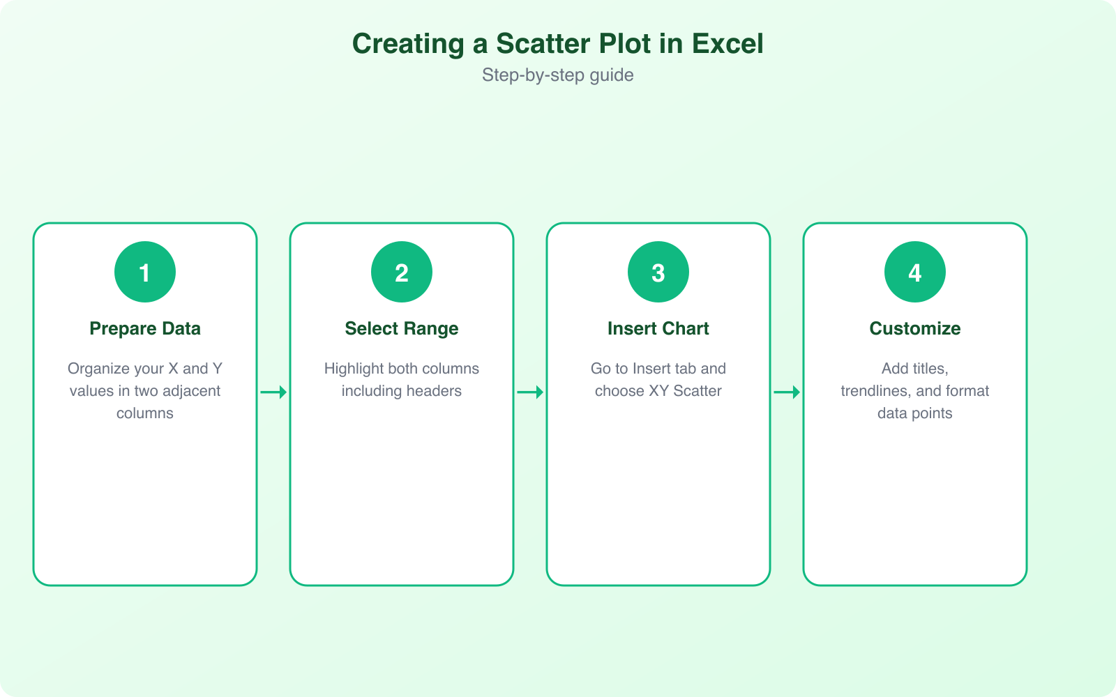
Creating a scatter plot in Excel is straightforward. Here’s the step-by-step process that works in Excel 2016, 2019, 2021, and Microsoft 365.
Step 1: Organize Your Data
Your data needs to be in two columns, with each column representing one variable. The first column (left) becomes the X-axis, and the second column (right) becomes the Y-axis. Each row represents one data point. Make sure both columns contain numerical values only. Categories or text won’t work in scatter plots.
For example, if you’re plotting marketing spend vs. revenue, column A would contain your monthly marketing spend figures and column B would contain your corresponding monthly revenue numbers.
Step 2: Select Your Data
Click and drag to select both columns of data, including the column headers. The headers will automatically become axis labels. If you have other columns in your spreadsheet, make sure you only select the two columns you want to plot.
Step 3: Insert the Scatter Chart
Go to the Insert tab in the ribbon, find the Charts section, and click the scatter chart icon (it looks like dots scattered on a graph). You’ll see several scatter plot options:
- Scatter (dots only): The classic scatter plot. Best for showing the raw distribution of your data points.
- Scatter with smooth lines and markers: Connects dots with curved lines. Useful for spotting trends but can be misleading with irregular data.
- Scatter with smooth lines: Same as above but without the individual dots showing.
- Scatter with straight lines and markers: Connects dots with straight lines. Good for showing a clear progression.
- Scatter with straight lines: Straight lines without individual data point markers.
For most analysis purposes, stick with the basic scatter plot (dots only). It gives you the clearest picture of your data distribution without artificial connections between points.
Step 4: Customize Your Chart
Once the chart appears, click on it to access customization options. Click the “+” icon (Chart Elements) next to the chart to add:
- Axis Titles: Label your X and Y axes so anyone reading the chart knows what the variables are.
- Chart Title: Give your chart a descriptive title that explains what relationship you’re showing.
- Trendline: This is one of the most powerful features. A trendline shows the best-fit line through your data, making the correlation immediately obvious.
- Data Labels: Show the exact values for each data point. Useful for small datasets but can get cluttered with large ones.
- R-squared value: When you add a trendline, check the “Display R-squared value” option. This number (between 0 and 1) tells you how strong the correlation is. Above 0.7 is strong, 0.4 to 0.7 is moderate, below 0.4 is weak.
Other Essential Chart Types in Excel
While scatter plots are excellent for correlation analysis, Excel offers several other chart types that serve different purposes. Knowing which chart to use when is a critical skill for anyone working with data.
Bar and Column Charts
Best for comparing values across categories. Use column charts when you have fewer than 10 categories and bar charts when you have more (horizontal bars are easier to read with many categories). I use these constantly for comparing performance metrics across different tools or platforms.
Line Charts
Perfect for showing trends over time. Monthly website traffic, quarterly revenue, daily temperatures. Line charts connect data points chronologically, making it easy to spot upward trends, downward trends, and seasonal patterns.
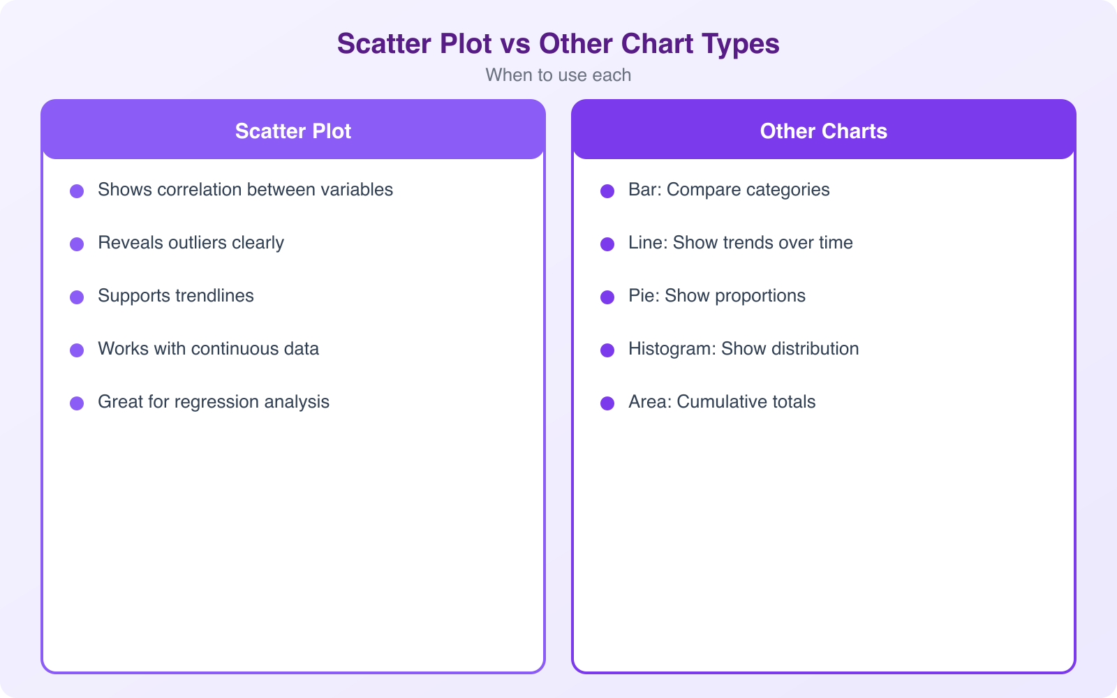
Pie Charts
Use pie charts only when showing parts of a whole, like market share or budget allocation. Limit them to 5 to 7 slices maximum. Beyond that, pie charts become unreadable. Honestly, I think pie charts are overused. In most cases, a bar chart communicates the same information more clearly.
Combo Charts
Combo charts let you plot two different chart types on the same graph, like a bar chart with a line overlay. These are great for comparing metrics measured on different scales, like revenue (bars) vs. conversion rate (line).
How to Create a Scatter Plot in Google Sheets
If you don’t have Microsoft Excel, Google Sheets is a free alternative that handles scatter plots just as well. The process is almost identical.
- Enter your data in two columns, just like in Excel. Column A for X-axis values, Column B for Y-axis values.
- Select your data range including headers.
- Go to Insert > Chart. Google Sheets will automatically suggest a chart type. If it doesn’t pick scatter, click on the Chart Type dropdown in the Chart Editor sidebar and select “Scatter chart.”
- Customize in the Chart Editor. Click on the “Customize” tab to modify colors, add trendlines, adjust axis labels, and change the chart title.
- Add a trendline by going to Customize > Series > Trendline. Google Sheets supports linear, exponential, polynomial, and other trendline types.
The main advantage of Google Sheets is that it’s free and collaborative. Multiple people can view and edit the same spreadsheet simultaneously. For quick scatter plots that need to be shared with a team, Google Sheets is often the better choice.
Data Visualization Best Practices
Creating a scatter plot is easy. Creating one that actually communicates your message clearly takes a bit more thought. Here are the best practices I follow for all my data visualizations:
- Label everything. Axis titles, chart title, data labels when appropriate. Someone should be able to understand your chart without you explaining it verbally.
- Remove chart junk. Delete unnecessary gridlines, borders, and decorative elements. Clean charts communicate better than cluttered ones.
- Use consistent scales. Don’t truncate your axes in ways that exaggerate relationships. Start your axes at zero unless there’s a compelling reason not to.
- Choose colors intentionally. Use contrasting colors for different data series. Avoid red-green combinations (colorblind users can’t distinguish them). Stick to 2 to 3 colors maximum.
- Include context. Add reference lines, benchmarks, or annotations that help readers interpret the data. A dot on a chart means nothing without context.
- Size matters. Make your chart large enough to read. Tiny charts squeezed into a corner of a slide defeat the entire purpose of visualization.
Correlation doesn’t equal causation. Just because two variables move together in a scatter plot doesn’t mean one causes the other. Ice cream sales and drowning deaths both increase in summer, but ice cream doesn’t cause drowning. Always think critically about what your scatter plots actually show.
Advanced Scatter Plot Techniques
Once you’ve mastered basic scatter plots, these advanced techniques will level up your data analysis:
Bubble Charts
A bubble chart is a scatter plot where each data point’s size represents a third variable. This lets you visualize three dimensions of data on a 2D chart. For example, you could plot advertising spend (X) vs. revenue (Y) with bubble size representing the number of employees in each department.
Multiple Data Series
You can plot multiple data series on the same scatter chart to compare relationships across groups. For instance, plot marketing spend vs. revenue for three different product lines, each in a different color. This makes it easy to see which product has the strongest return on marketing investment.
Trendline Analysis
Excel supports several trendline types: linear, exponential, logarithmic, polynomial, power, and moving average. Each type fits different data patterns. Linear trendlines work for straight-line relationships. Polynomial trendlines (degree 2 or 3) capture curved relationships. The R-squared value tells you how well the trendline fits your data.
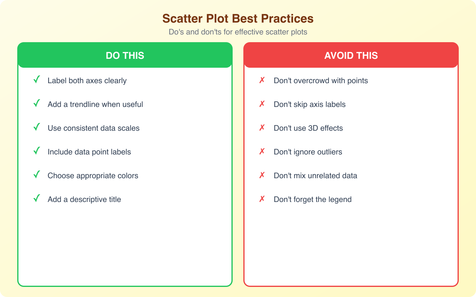
Common Scatter Plot Mistakes to Avoid
I see these mistakes constantly, even from people who work with data regularly:
- Using scatter plots for categorical data. If your X-axis is categories (like product names or months), use a bar or line chart instead.
- Too many data points. Hundreds of overlapping dots create an unreadable blob. Use transparency or hexbin plots for large datasets.
- Ignoring outliers. That one dot way off in the corner might be a data entry error, or it might be your most important insight. Investigate outliers before removing them.
- Forcing trendlines. Adding a linear trendline to clearly non-linear data gives a false impression. Match your trendline type to the actual pattern in your data.
- Missing axis labels. A chart without labeled axes is useless. Always include clear, descriptive axis titles.
Frequently Asked Questions
What’s the difference between a scatter plot and a line chart?
A scatter plot shows individual data points without connecting them, emphasizing the relationship between two variables. Both axes display numerical values. A line chart connects data points in order (usually chronological) and shows trends over time. The horizontal axis in a line chart typically shows categories or dates, while the vertical axis shows numerical values.
Can I create a scatter plot with more than two variables?
Yes. Use a bubble chart to add a third variable represented by the size of each data point. You can also use color coding to represent a fourth variable. In Excel, go to Insert > Charts > Bubble Chart. This lets you visualize three or four dimensions of data on a single 2D chart.
What is a good R-squared value for a scatter plot trendline?
An R-squared value above 0.7 indicates a strong correlation, meaning the trendline fits the data well. Values between 0.4 and 0.7 suggest a moderate correlation, and below 0.4 indicates a weak correlation. An R-squared of 1.0 would mean the trendline perfectly fits every data point (which rarely happens with real-world data).
Is Google Sheets as good as Excel for scatter plots?
For basic scatter plots, Google Sheets and Excel produce nearly identical results. Google Sheets has the advantage of being free, browser-based, and collaborative. Excel has more advanced customization options, handles larger datasets better, and supports more trendline types. For most users, Google Sheets is perfectly adequate for scatter plot creation.
How many data points do I need for a meaningful scatter plot?
You need a minimum of 10 to 15 data points for a scatter plot to show a meaningful pattern. With fewer points, apparent correlations might just be coincidence. For reliable analysis, aim for 30 or more data points. However, too many points (500+) can create an unreadable chart. In those cases, use sampling, transparency settings, or heatmap-style visualization.