How to Get More Sales with Conversion Ready Pages?
You planned everything. Optimized every aspect of your web design and SEO. Launched the page. And then checked the conversion rate. It was nothing compared to what you expected. Sound familiar? I’ve been there more times than I’d like to admit. The problem usually isn’t your product or even your traffic. It’s the page itself. It’s not designed to convert.
Go to your site stats right now. Check how many pages a unique visitor views on average. If it’s less than 2, your site has a conversion problem. Visitors enter and leave. That means your pages aren’t giving them a reason to stay, click, or buy. This guide will fix that.
What Makes a Page Conversion-Ready
There isn’t a single answer. Several elements affect clicks and engagement. Reports show that if properly designed, 45% of readers landing on an internal page of your website will return to your homepage. That homepage, often called a landing page in marketing terminology, can convert your reader into a subscriber or buyer if it’s built right.
Most business owners focus on social media marketing and SEO but invest little effort in their web design. Your design is the first thing prospective customers notice. They use it to judge your credibility. A good user experience encourages them to take the desired action.
Leverage White Space
There’s no need to fill every empty pixel with text and graphics. That’s distracting and makes your pages look cluttered. Leaving space around graphical elements is the key to readable content. Negative space allows visitors to focus on your CTA, which is essential for conversion.
Simplicity Wins
Maintain simplicity in your web design to drive more conversions. The best websites follow this principle. Web visitors rarely want to be distracted while searching for information. They’ll choose a site with a clean interface every time. Eliminate irrelevant elements and use minimal text.
Powerful CTA Buttons
Powerful CTA buttons are essential elements that can’t be underestimated. They increase the conversion rate by making the next step obvious. Users visit your site because they believe you can meet their needs. The process of finding information and taking action should be fast and straightforward. Make the area around your CTA buttons clutter-free.
Use the Right Colors
The colors you choose can make or break your website design. They influence how visitors perceive your brand and their purchasing decisions. Choose an appealing color scheme that suits the image you want to project. I’ve seen CTA button color changes alone lift conversion rates by 5-8% when the new color creates strong contrast against the page background.
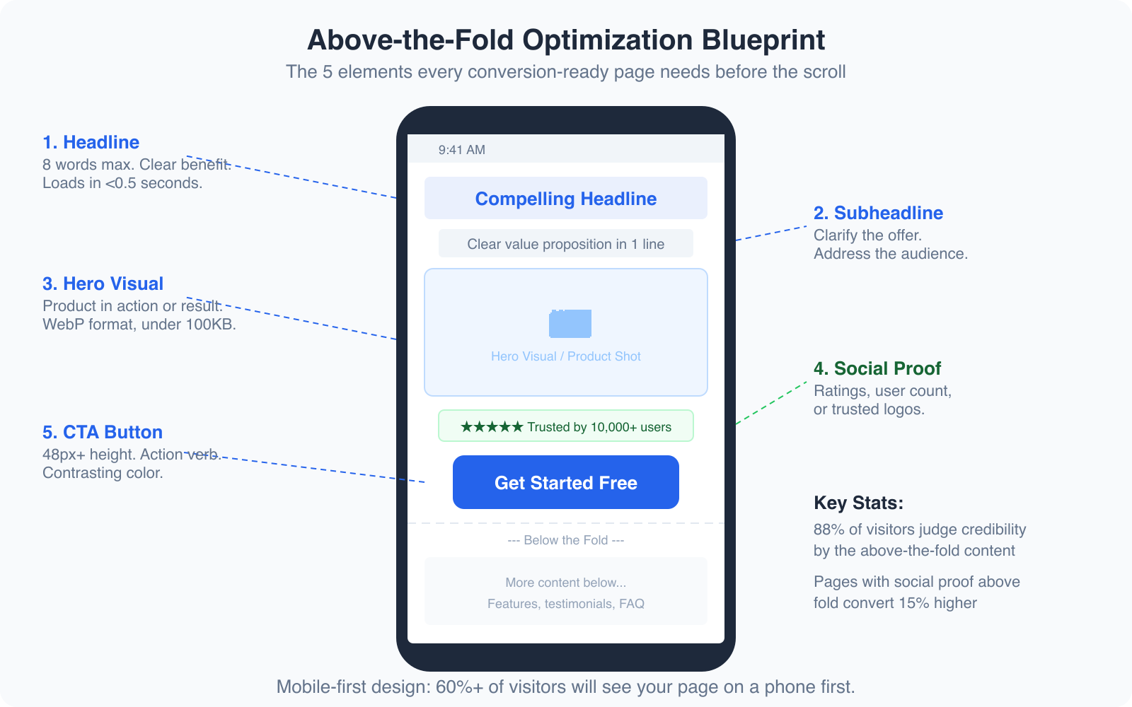
Above-the-Fold Optimization for Mobile
Here’s the reality most businesses still haven’t internalized: over 60% of your visitors are seeing your page on a mobile device first. And on mobile, “above the fold” is a very small space, roughly 600 x 380 pixels. You need to make every pixel count.
The five elements that must appear above the fold on mobile are:
- Headline (8 words max, clear benefit)
- Subheadline (clarify the offer in one line)
- Hero visual (product in action or result achieved)
- Social proof (star rating, user count, or trust logos)
- CTA button (48px+ height, action verb, contrasting color)
Pages that include social proof above the fold convert 15% higher than those that bury it below. And 88% of visitors judge your credibility based on what they see before scrolling. If your above-the-fold content doesn’t instantly communicate value, you’ve lost most of your visitors before they even gave you a chance.
Test your pages on an actual phone, not just a browser resize tool. The experience is different. Tap targets feel different. Loading speed feels different. I always review conversion-critical pages on my phone before launching. If anything feels clunky, slow, or confusing on a 6-inch screen, it needs fixing.
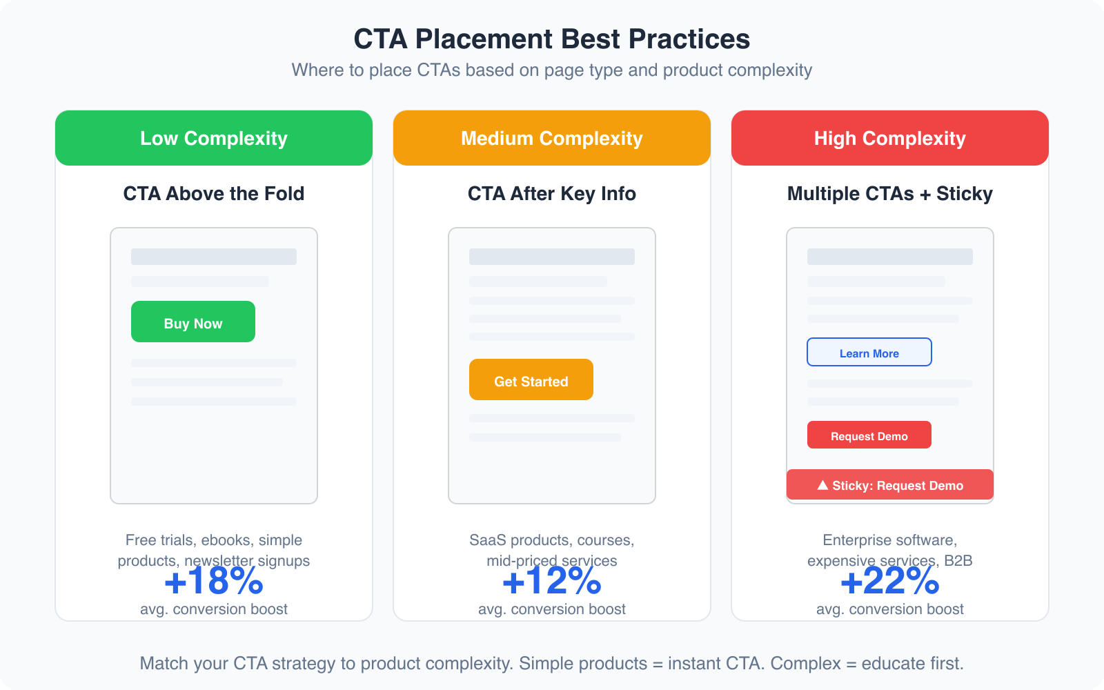
CTA Placement Best Practices
Where you put your CTA matters as much as how it looks. The right placement depends on your product’s complexity and price point.
Low complexity products (free trials, ebooks, newsletter signups): Place the CTA above the fold. Visitors don’t need much convincing. The sooner they see the action button, the sooner they convert. I’ve seen this lift conversions by 18% on simple offer pages.
Medium complexity products (SaaS tools, online courses, mid-priced services): Place the CTA after your key value proposition and social proof. Give visitors enough context to understand the offer before asking them to act. A CTA that appears right after a strong testimonial section typically converts 12% better than one placed randomly.
High complexity products (enterprise software, expensive services, B2B solutions): Use multiple CTAs throughout the page, plus a sticky CTA that follows the visitor as they scroll. Some visitors are ready to buy at the top. Others need to read every testimonial and case study. Giving both types an easy way to convert increases overall conversion by 22%.
AI Landing Page Builders That Actually Work
Building conversion-ready pages used to require a designer, a developer, and a copywriter working together for weeks. AI has compressed that timeline. Here are the tools I recommend in 2026.
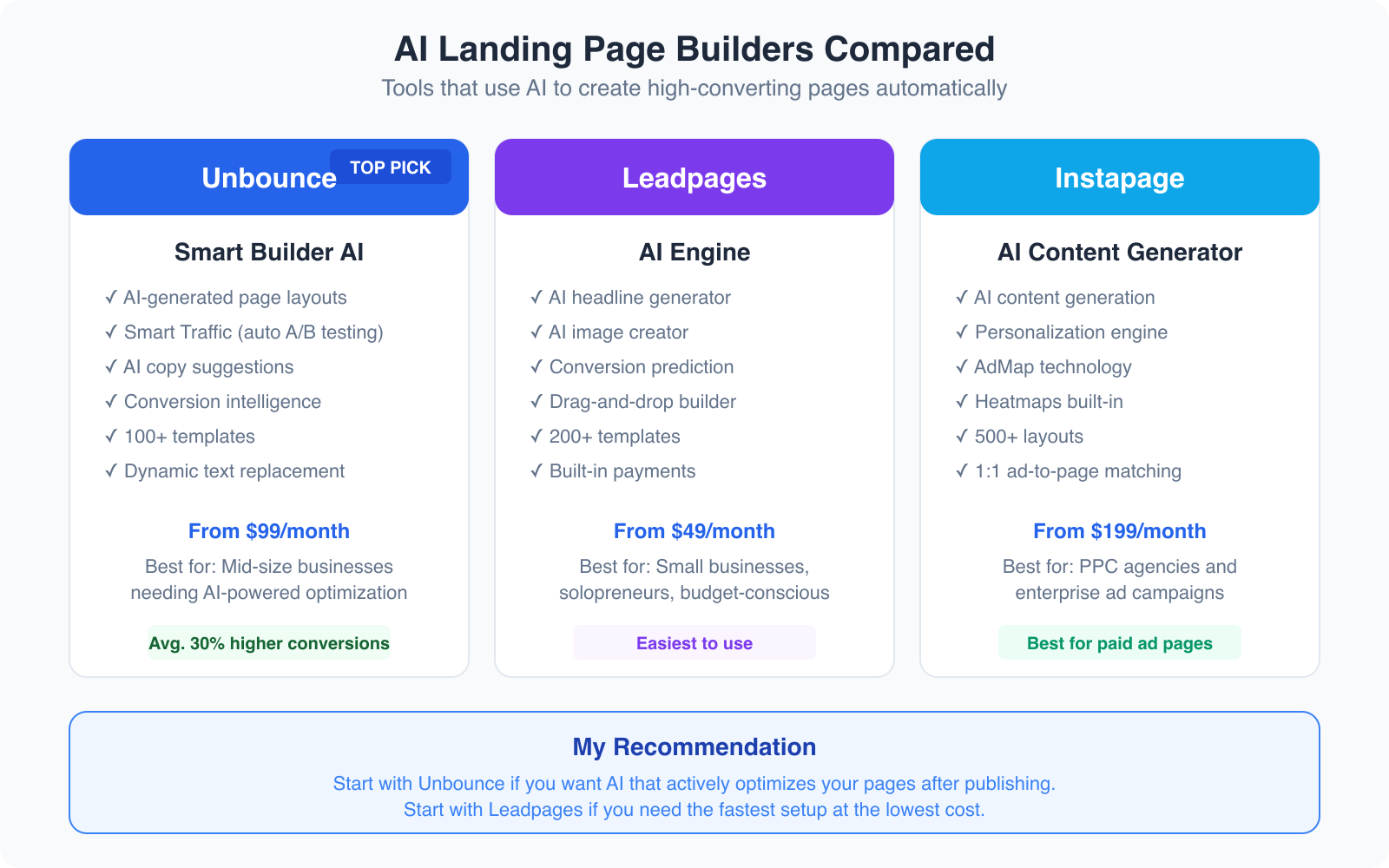
Unbounce Smart Builder
Unbounce is my top pick for AI-powered landing pages. The Smart Builder creates page layouts based on your industry and conversion goals. You tell it what you’re selling and who you’re selling to, and it generates a page structure optimized for conversion.
But the real power is Smart Traffic. After your page goes live, Unbounce’s AI automatically routes each visitor to the page variant most likely to convert them, based on their attributes and behavior. It’s like running an A/B test that optimizes itself in real-time. I’ve built landing pages with Unbounce that converted at 12.4% straight out of the box, before any manual optimization.
Plans start at $99/month, which includes the AI builder, Smart Traffic, and unlimited landing pages. It’s not cheap for solopreneurs, but the conversion lift typically pays for itself within the first month for businesses with decent traffic.
Leadpages for Budget-Friendly AI
Leadpages is the best option if you want AI assistance at a lower price point. Starting at $49/month, it includes an AI headline generator, AI image creation, and conversion prediction scores for your pages. The drag-and-drop builder is the easiest I’ve used. It also includes built-in payment processing, which is great for selling digital products directly from your landing page.
Leadpages doesn’t have the same level of AI optimization as Unbounce’s Smart Traffic, but for small businesses and solopreneurs who need to launch pages quickly without a big budget, it’s the right choice.
How to Tackle Decreasing Conversion Rates
Nothing feels worse than watching your conversion rate drop. If it’s happening to you, don’t panic. There are proven methods to turn things around.
First Impressions Matter
You can never repeat a first impression. Think about your presentation carefully and consider every detail. Make your web page look welcoming. The structure should be clear and easy to navigate. Colors should feel intentional, not random.
One effective technique is using a welcome popup (used sparingly and tastefully). Include a welcoming message, maybe a discount code for first-time visitors. Time-limited offers shown to new visitors can increase first-visit conversions by 10-15%.
Know Your Audience
Website owners lose their position when they don’t understand their audience. Use analytics for each page category. If your ladies’ summer collection gets more traffic than other categories, create targeted offers for that specific audience segment. Segment your visitors by behavior, demographics, and interests, then serve them personalized content.
Run a conversion rate audit on your highest-traffic pages first. Use Microsoft Clarity (free) to see where visitors drop off, what they click, and where they get stuck. Fix the biggest leak first, not the smallest. A 2% improvement on a page with 10,000 monthly visitors is worth more than a 10% improvement on a page with 200 visitors.
Mobile Responsiveness
Your site must fit every screen size without losing its look or functionality. On mobile, the site should be easy to navigate and clear to read. When using popups on mobile devices, keep them small (no more than 50% of the screen), add opening delays, and make the close button large and easy to tap. Mobile users have zero patience for intrusive elements.
Use Quality Images
High-quality images add credibility to your content. Low-grade images decrease trust immediately. Pay attention to the colors and resolution of images on your site. They should be sharp, relevant, and optimized for fast loading. Use WebP format and compress aggressively. A beautiful image that takes 5 seconds to load is worse than an average image that loads instantly.
Clear CTA Buttons
Clarity in your CTAs is non-negotiable. If someone sees a button and can’t immediately understand what happens when they click it, that’s a conversion killer. Button text should be specific: “Start My Free Trial” beats “Submit.” “Download the Guide” beats “Click Here.” Make sure the text is easy to read and directly communicates the benefit of clicking.
The Conversion-Ready Page Framework
After building hundreds of landing pages, I’ve settled on a framework that consistently converts. Here’s the structure from top to bottom:
- Headline + Subheadline (above the fold, benefit-driven)
- Hero visual (product screenshot, video, or result image)
- Social proof strip (logos, review count, or user count)
- Primary CTA (contrasting color, action verb)
- 3-4 benefit sections (icon + headline + one paragraph each)
- Testimonials or case studies (real names, photos, specific results)
- Secondary CTA (same action, different context)
- FAQ section (address top 5 objections)
- Final CTA (urgency element if appropriate)
This framework works for SaaS landing pages, service pages, lead generation pages, and even e-commerce category pages. Adjust the emphasis based on your product complexity and audience awareness level.
The conversion rate is the essential metric of any web page. You can have a beautifully designed page, but if you don’t address the essential points of SEO friendliness, mobile responsiveness, and clear user experience, your work will be in vain. Focus on the fundamentals, use the right tools, and test continuously. Your conversions will improve.
For more on creating pages that sell, check out my guides on conversion rate optimization, high-converting product pages, and AI in landing page design.
Frequently Asked Questions
What is a conversion-ready page?
A conversion-ready page is a web page specifically designed to turn visitors into customers, subscribers, or leads. It includes optimized elements like a clear value proposition, compelling headlines, strategic CTA placement, social proof, trust badges, and mobile-responsive design. Every element on the page serves the single goal of moving the visitor toward the desired action.
What is a good landing page conversion rate?
The average landing page conversion rate across industries is 2.35%. The top 25% of landing pages convert at 5.31% or higher, and the top 10% convert at 11.45% or higher. Your target depends on your industry and traffic quality. E-commerce pages typically convert at 2-4%, while lead generation pages for services can convert at 5-15%. Focus on improving your own baseline rather than chasing benchmarks.
Do AI landing page builders actually improve conversions?
Yes, AI landing page builders can significantly improve conversions when used correctly. Tools like Unbounce’s Smart Builder and Smart Traffic have been shown to increase conversions by 30% on average compared to manually built pages. The AI handles layout optimization, traffic routing, and copy suggestions based on data from thousands of similar pages. However, AI is a starting point, not a replacement for understanding your audience and testing.
How many CTAs should a landing page have?
A landing page should have one primary CTA action repeated 2-3 times throughout the page. The first CTA should appear above the fold. The second after your benefits or testimonials section. The third at the bottom of the page. All CTAs should drive the same action (like signing up or buying) but can use slightly different copy. For complex products, adding a secondary softer CTA like ‘Watch Demo’ alongside the primary ‘Get Started’ CTA can increase total conversions.
Should I optimize my landing page for mobile or desktop first?
Always optimize for mobile first. Over 60% of web traffic comes from mobile devices, and Google uses mobile-first indexing. Design your page for a 375px wide screen first, then expand the layout for desktop. Key mobile optimizations include fast load times (under 2.5 seconds), thumb-friendly CTA buttons (48px minimum height), minimal form fields, and collapsible content sections. Test on actual devices, not just browser resize tools.
Disclaimer: This site is reader-supported. If you buy through some links, I may earn a small commission at no extra cost to you. I only recommend tools I trust and would use myself. Your support helps keep gauravtiwari.org free and focused on real-world advice. Thanks. - Gaurav Tiwari