Building Design Systems That Actually Get Used
Here’s the thing. Most design systems die slow. They get born with good intentions, documented in long Notion pages, then ignored. Developers patch UI on the fly. Designers invent new colors. Things fragment, the site feels like a Frankenstein brand. You can avoid that. You build a design system that gets used. That means it has to earn its place. Code-first. Practical. Trustworthy.
This is about doing design systems the right way. Not for show. For use.
Table of Contents
1. Start with what won’t change: design tokens as source of truth
Design tokens are the smallest shared bits. Colors, spacing, font sizes, shadows, border radii, motion timings. Store them in code. Not in screenshots. Not only in Figma. Put them in a format that can be consumed by any platform: CSS variables, JSON, JS, Swift, Kotlin.
Example token file: tokens.json
{
  "color": {
    "primary": "#2563EB",
    "primary-variant": "#1D4ED8",
    "background": "#FFFFFF",
    "surface": "#F5F7FA",
    "text": {
      "default": "#1F2937",
      "muted": "#6B7280"
    }
  },
  "radius": {
    "small": "4px",
    "default": "8px",
    "large": "16px"
  },
  "space": {
    "1": "4px",
    "2": "8px",
    "3": "16px",
    "4": "24px",
    "5": "32px"
  },
  "font": {
    "base": "Inter, system-ui, -apple-system",
    "size": {
      "body": "16px",
      "small": "14px",
      "large": "20px"
    }
  }
}
Then generate CSS variables automatically. Simple Node script or build step:
// token-to-css.js
const fs = require("fs");
const tokens = JSON.parse(fs.readFileSync("tokens.json", "utf-8"));

function flatten(obj, prefix = "") {
  return Object.entries(obj).flatMap(([key, value]) => {
    const name = prefix ? `${prefix}-${key}` : key;
    if (typeof value === "object") {
      return flatten(value, name);
    } else {
      return [[name, value]];
    }
  });
}

const flat = flatten(tokens);
const cssVars = flat
  .map(([k, v]) => `  --${k}: ${v};`)
  .join("\n");

const output = `:root {\n${cssVars}\n}\n`;

fs.writeFileSync("dist/design-tokens.css", output);
That file becomes the truth. Use it in vanilla CSS, React, Vue, and native apps. If you need other formats (Swift, Android), generate from the same JSON. No duplication. That alone prevents the designer-developer drift that kills reuse.
2. Build components around those tokens, not the other way
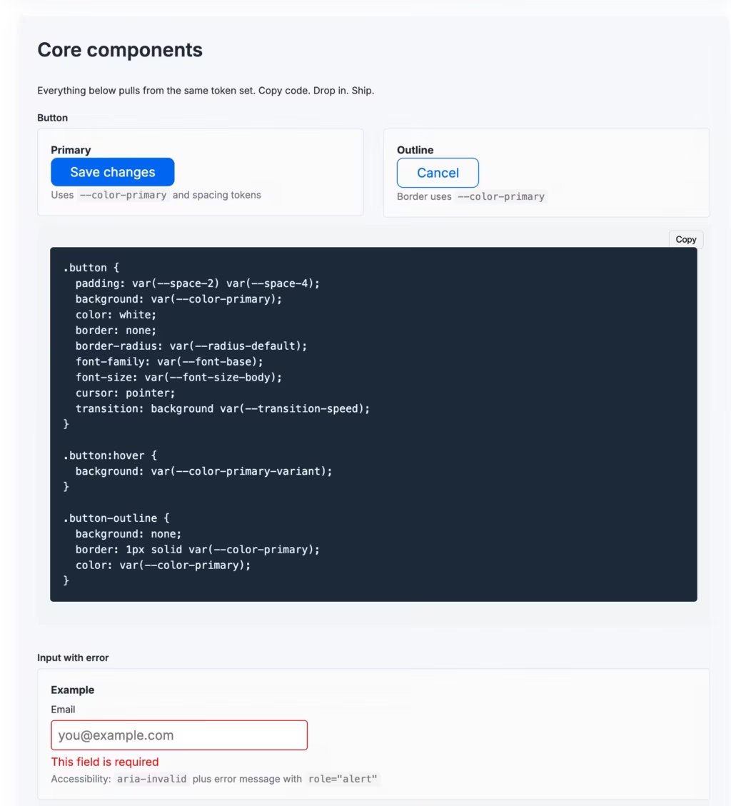
A button is not a random list of colors and padding. It is a system of intent mapped to tokens. Example in plain HTML/CSS:
.button {
  padding: var(--space-3) var(--space-4);
  background: var(--color-primary);
  color: white;
  border: none;
  border-radius: var(--radius-default);
  font-family: var(--font-base);
  font-size: var(--font-size-body);
  cursor: pointer;
  transition: background 0.2s ease;
}

.button:hover {
  background: var(--color-primary-variant);
}
Then wrap it in any framework. In React:
type ButtonProps = React.ButtonHTMLAttributes<HTMLButtonElement> & {
  variant?: "primary" | "outline";
};

export function Button({ variant = "primary", children, ...rest }: ButtonProps) {
  const className = variant === "primary" ? "button" : "button outline";
  return (
    <button className={className} {...rest}>
      {children}
    </button>
  );
}
Make accessibility default. Always. aria-label when needed. Focus ring that’s visible. Don’t ship components that rely solely on color to convey meaning.
Real design systems that do this well:
- Shopify Polaris uses a tight set of tokens and React components wired to those tokens. Every variation is intentional, and there’s a clear path from token to component to page.
- IBM Carbon ties its Sass tokens to React/Vue/web components with consistent theming.
You don’t need their scale to copy the pattern. You need the discipline.
3. Version, release, and consume the system like a real library
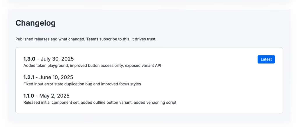
If your design system lives as a zip file in a shared drive, no one will update their code. Version it semantically. Give it a package. Publish it internally or via a CDN. Example package.json:
{
  "name": "@yourorg/design-system",
  "version": "1.3.0",
  "files": ["dist/", "components/", "tokens.json"],
  "scripts": {
    "build": "node token-to-css.js && tsc",
    "release": "standard-version"
  }
}
Use standard-version or similar to bump patch/minor/major based on changes. Have a changelog. If you changed a token that affects spacing globally, that’s a breaking change. Call it out.
Teams that skip this step get stuck with multiple forks of the system, each with tweaks. That’s what kills reuse. If I, as a developer, have to guess which version includes the latest button fix, I skip the system. I build my own. That’s the wedge. Close it.
4. Make onboarding friction-free
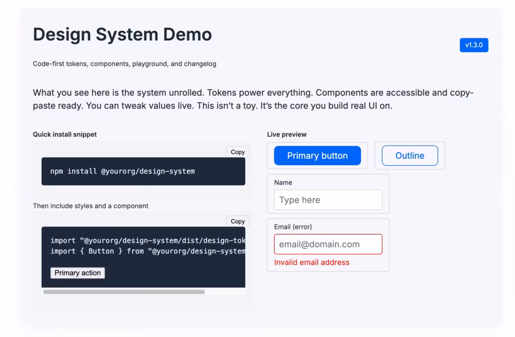
If using the system requires digging through 40 pages of docs and a 15-minute setup, adoption stalls. Make the quick path obvious.
Example minimal onboarding:
- Install package
npm install @yourorg/design-system - Import tokens and base styles
import "@yourorg/design-system/dist/design-tokens.css"; import { Button } from "@yourorg/design-system"; - Copy a code snippet to show a working UI.
Provide a live playground like CodeSandbox or equivalent internal sandbox.
Give teams a “starter component” file they can drop in. Provide a tiny example app that shows typography scale, button, form input, error state. If they can launch a page in 2 minutes that looks decent and uses the system, they’re sold. Make them feel smart for using it. Don’t make them wade through philosophy.
5. Let the system flex, but constrain where it matters
Fix the things that matter: spacing scale, typography hierarchy, color usage. Let other things vary. Too rigid systems get ignored because teams have real constraints. You want a system that guides, not a prison.
Pattern: expose extension points clearly.
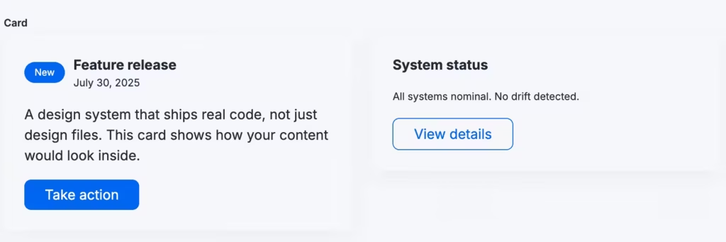
CSS for this:
.card {
  background: var(--color-surface);
  border-radius: var(--radius-default);
  padding: var(--space-4);
  box-shadow: 0 4px 16px rgba(0,0,0,0.05);
}

.card.large {
  padding: calc(var(--space-4) * 1.5);
}
Let teams add modifier classes or slot in their own content. If something is needed often and someone overrides it manually in 10 places, promote that pattern into the system. Iterate based on how people are already using it.
6. Build a feedback loop and make the system evolve in public
People resist systems that feel imposed. Systems that grow from usage gain trust. Track usage. Ask: which components are copied manually? Which tokens are overridden constantly? Those are signals.
Example process:
- Monthly review of overrides from analytics or code scanning
- Triage common customizations into official variants
- Publish a tiny “what’s new” note to teams: “We added a small button variant because Product Team needed it, here’s how to use it.”
This is what Atlassian does. They surface “recent updates” in their internal docs. Teams feel involved instead of dictated to. You get buy-in. You don’t need fancy tools. A shared changelog and a lightweight internal Slack channel #design-system-updates works.
7. Ship real code, not just design files
Figma is great. But if the system stops at the Figma component with no matching HTML/CSS/JS, developers still reverse engineer. That gap kills consistency. For each UI element in the library, ship:
- The design spec (in Figma or equivalent)
- The code implementation (React/Vue/web components or vanilla)
- A plain HTML fallback example
- A usage doc with do’s and don’ts
Example: input field with error state.
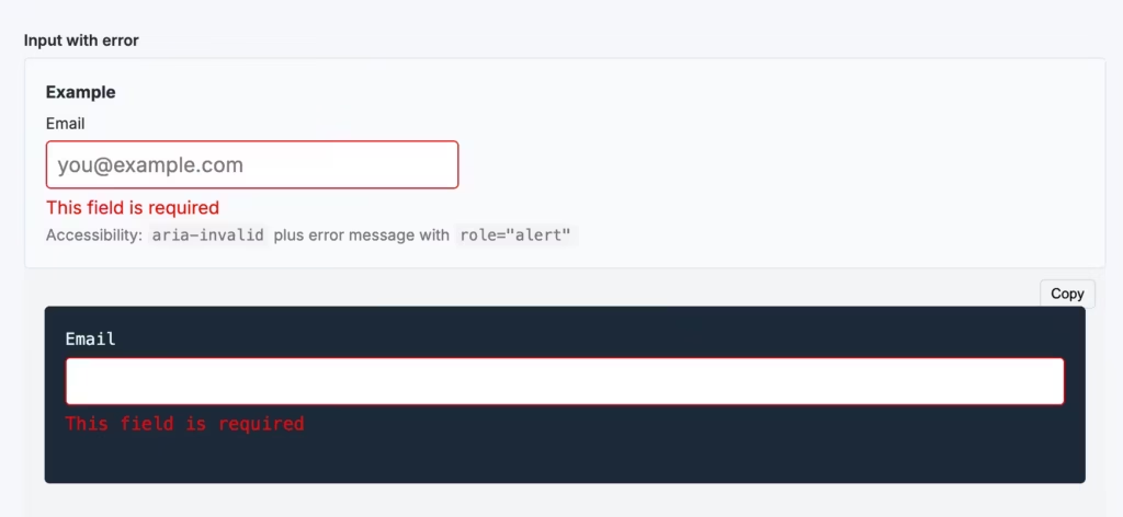
type InputProps = React.InputHTMLAttributes<HTMLInputElement> & {
  error?: string;
};

export function Input({ error, ...rest }: InputProps) {
  return (
    <div className="input-wrapper">
      <input aria-invalid={!!error} className="input" {...rest} />
      {error && <div role="alert" className="input-error">{error}</div>}
    </div>
  );
}
CSS uses tokens:
.input {
  padding: var(--space-2);
  border: 1px solid var(--color-text-muted);
  border-radius: var(--radius-small);
  font-size: var(--font-size-body);
  width: 100%;
}

.input[aria-invalid="true"] {
  border-color: #D92D20;
}

.input-error {
  margin-top: var(--space-1);
  font-size: var(--font-size-small);
  color: #D92D20;
}
This is code the team can drop in. No guessing. No recreating. That’s how usage scales.
8. Include tooling that catches drift early
You don’t need full-blown design linting to start. Begin with small automation:
- Visual regression tests for core pages using tools like Playwright or Percy. If the button’s padding drifts, it flags before release.
- Storybook for isolated component browsing. Embed interactive examples and knobs so devs can tweak variants and see real props.
- A simple CLI check that warns if someone adds a new color outside the token set or uses hardcoded values in new components.
Example Git hook script:
# pre-commit: fail if color hex appears outside allowed tokens
if grep -R --include="*.css" "#[0-9A-Fa-f]\{6\}" src/ | grep -v "design-tokens.css"; then
  echo "Found hardcoded color. Use token instead."
  exit 1
fi
You don’t need perfect coverage day one. Start catching the easy anti-patterns. Then adapt.
9. Make the system easy to experiment with
If teams feel locked in, they stop using it. Provide a “playground” or “lab” copy. Let people fork a variant, test tweaks, and propose improvements.
Pattern:
- Feature branch of the design system called “experimental”
- A living style sandbox that shows what happens if you tweak a token (light/dark theme toggle, spacing scale adjuster)
- A “proposal” process: small PR plus description “We need a compact card for mobile that shrinks vertical space because marketing wants more content above the fold.”
This makes contribution low friction. It flips the dynamic from top-down to collaborative.
10. Real examples and what they teach
Shopify Polaris
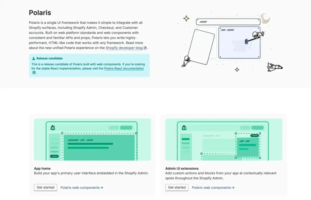
They built React components tied to tokens. Their documentation is living. They enforce accessibility. Team members can copy paste and feel confident it scales. The big win: designers and engineers share the same vocabulary, because the code is part of the docs.
Atlassian’s design system
They merged their internal usage data into what they surfaced publicly. Overrides weren’t hidden. When something was customized often, it became a supported variant. That reduced the “shadow UI” problem where teams go rogue and create inconsistent widgets.
Material Design
It is opinionated. That’s the point. It gives you a system of motion, color, typography. But the API also allows theming. If you want to diverge, you still understand the foundation. Its longevity is partly because it balances strict core with flexible theming layers.
Your own playbook (if you follow it)
You already work in the intersection of performance and design. A lean design system that ships as a tiny npm/zip package, with tokens, a minimal set of components, a sandbox, and a changelog could outcompete bloated internal libraries that nobody uses. Start small. Let usage drive expansion. Promote the system by making it feel like a productivity win, not an extra task.
11. Common traps and how to avoid them
- Building the system in isolation
People design components in a vacuum. Then hand off and expect adoption. Instead, build with the first team that will use it. Ship the initial version inside a real product. Iterate from there. - Over-documenting instead of over-delivering
Walls of theory don’t sell usage. Ship working examples. Show working pages. Give copy-paste starter code. Let people reverse-engineer by playing rather than reading an essay. - Not measuring drift
If developers are reimplementing components silently, you lose control. Measure duplication. Code search. Ask why a new button got added outside the system. - Letting theme/brand changes break everything
Version tokens separately from component behavior. If the brand color changes, you should be able to swap the token value and have the UI adapt predictably. Don’t hardcode brand color in ten component instances.
12. How to get started in the next 48 hours
- Extract your current colors, spacing, typography into a JSON token file.
- Write the script to emit CSS variables and a minimal JS export.
- Build one core component (button) in production code, with accessible states and a documented variant.
- Publish that as a small internal package or CDN link.
- Create a sample “Getting started” page that shows how to drop in the package and use the button.
- Open a feedback channel (Slack, issue board) and invite one team to start using it.
- Track if they copy/paste or if they override. If they override, promote the pattern.
Conclusion
Design systems live or die on usage. The ones that survive are code-first, token-driven, versioned, easy to onboard, flexible where needed, rigid where it counts, and evolving with real feedback. You don’t need a giant team or six months to start. You need discipline, a few components, and a tiny loop between design and developer.
Make it easy to start. Make it clear when it changes. Make it worth using. Then watch the fragmentation fade and consistency show up.
Disclaimer: This site is reader-supported. If you buy through some links, I may earn a small commission at no extra cost to you. I only recommend tools I trust and would use myself. Your support helps keep gauravtiwari.org free and focused on real-world advice. Thanks. - Gaurav Tiwari