How to use Product Pages to Convert Visitors into Customers?
Trying to convert visitors into customers? How’s that been working for you? As online marketers, we struggle with conversions. People land on our well-made pages and bounce. They don’t convert or click, most of the time. While a great conversion-ready landing page helps, there’s another way to do it: using catchy, high-converting product pages.
I’ve built product pages for e-commerce stores, SaaS companies, and digital product creators. The difference between a product page that converts at 1.5% and one that converts at 6% usually comes down to a handful of elements that most businesses get wrong. Let’s fix that.
Why Landing Pages Don’t Convert
Is your product not good enough? No. That can’t be a reason. The visitor hasn’t tried your product yet. The reason is simpler than you think.
Your page lacks good copywriting, better visuals, and above all, persuasion. If you’re really trying to make your pages sales-ready, you need to solve these three problems. And the best way to do it is through product pages designed specifically to convert.
Product Pages 101
A product page showcases a product: a book, software, service, or even a freebie. If you want the quick summary, the whole game is to create a beautiful product page, show what you can offer, make them buy your product, and persuade them to sign up for email alerts.
But there are more things involved than what appears on the surface. Great product pages require attention to detail. First impressions are everything, and you have only a matter of seconds to entice visitors into taking your offer. Product pages form that first impression and can be the sole difference between a visitor buying your product and closing the tab.
The Way You Sell Matters
Selling a product is the obvious goal, but it only happens when a visitor is dedicated enough to follow through. A long list of features under a fancy design with a flashy “buy now” button will only confuse the visitor’s brain.
You need to subtly get your message across without causing information overload. Being able to convey sufficient information about your product without writing a novel is the real skill. Online marketplaces are nothing like physical stores. In-person shopping lets customers touch and feel products, creating an immersive experience. You can’t fully replicate that online, but you can come close.
Presenting too little information is ineffective. Presenting too much creates overload. You want to find the perfect balance, and that means maintaining a simple, clean design with just enough information to build confidence.
Know Your Audience
If you want your marketplace to get the attention it needs to increase sales, you have to understand your visitors. There are two types of potential customers: the experienced one who knows exactly what they want and has deep product knowledge, and the inexperienced one who can’t differentiate between wants and needs.
Your goal as a marketer should be to target the entire sales funnel, which includes both types.
Tools to Understand Your Audience
There are ways to monitor visitors beyond basic demographics. Two tools have been invaluable in my work:
Heatmaps let you see where users click most. Microsoft Clarity provides free heatmaps that show you exactly which areas of your product page attract attention and which get ignored. I install Clarity on every e-commerce project.
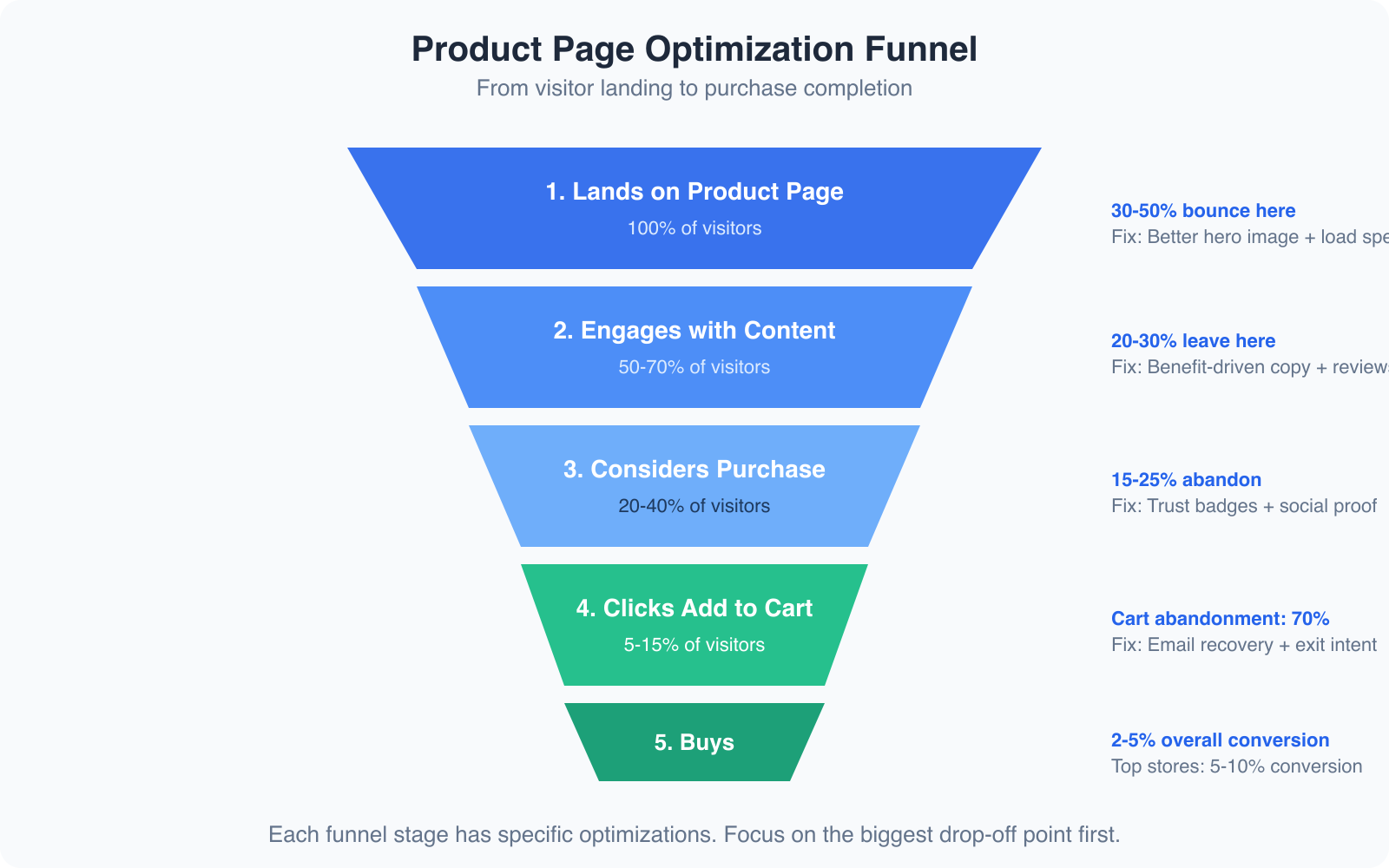
Scroll maps show where users start and stop scrolling. If 70% of visitors never scroll past your product images, you know your description below isn’t compelling enough, or your CTA needs to be higher on the page.
AI-Generated Product Descriptions
Writing product descriptions at scale used to be painful. If you have 50+ products, crafting unique, benefit-driven copy for each one takes weeks. AI has changed this completely.
I use AI writing tools to generate first drafts of product descriptions, then edit them for brand voice and accuracy. The key is to give the AI specific inputs: product features, target audience, key benefits, and tone. A generic prompt gives you generic copy. A specific prompt gives you copy that’s 80% ready to publish.
Never publish AI-generated product descriptions without editing. AI tends to write generic, feature-heavy copy. Your job is to inject specific benefits, customer language, and sensory details. “Lightweight design” becomes “Weighs less than your phone, so you’ll forget you’re wearing it.” That’s the difference between a 2% and a 5% conversion rate.
The best AI-assisted product descriptions follow this formula: lead with the primary benefit, support with 2-3 specific features, include a use case or scenario, and end with a subtle urgency element. Keep it under 150 words for the main description, with expandable detail sections for buyers who want more information.
How to Make Product Pages Perfect
There are specific elements that separate a mediocre product page from one that converts consistently. Here are the ones that make the biggest difference.
Implementing CTA Buttons
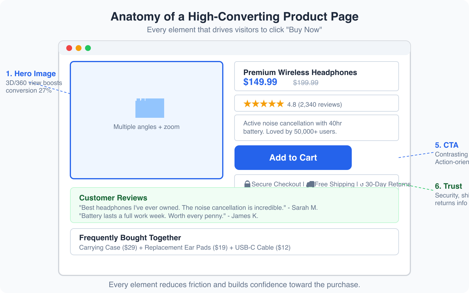
The call-to-action button is your best friend and the most compelling asset you have as an online marketer. In simple terms, a CTA button sends visitors to the checkout section. Design it to stand out without overwhelming the product images or description.
Size and color: Make the button larger and more noticeable than other elements. Use a contrasting color against the background. I’ve seen consistent results with buttons that are at least 48px tall on mobile and use action verbs like “Add to Cart,” “Get Started,” or “Buy Now.”
Placement: The common rule is to place the button “above the fold,” parallel to the product. Most visitors don’t scroll down in the few seconds they stay. But for complex or expensive products, placing the button below the fold can work. Let visitors digest the information first, then present the CTA. Use heatmaps and scroll maps to determine the best placement for your specific audience.

Displaying the Product
Images are powerful. They can persuade, inspire, and help you sell products. One of the downsides of online marketing is that customers can’t physically interact with products. But you can compensate with smart photography.
Background: Clean, white backgrounds put focus on the product. Lifestyle shots showing the product in use build emotional connection. Use both.
Multiple angles: Show the product from at least 4-5 angles. Include close-ups of important details. If possible, add 360-degree views or short video demos. Products with 3D/360 views see up to 27% higher conversion rates compared to static images alone.
Product Schema Markup
Product schema markup is the technical element most e-commerce sites skip, and it’s costing them traffic and sales. When you add structured data (schema.org/Product) to your product pages, Google can display rich results with prices, ratings, availability, and review counts directly in search results.
Pages with rich product snippets see up to 30% higher click-through rates from Google search. The implementation is straightforward: include your product name, description, price, currency, availability, rating, and review count in JSON-LD format. Most e-commerce platforms like Shopify and WooCommerce have plugins that handle this automatically.
Making Use of Customer Reviews
Over 60% of visitors check customer reviews before making a purchase. Not only do reviews increase social proof, they directly impact your conversion rate. Products with reviews convert up to 270% more than products without them.
Don’t just collect reviews. Display them strategically. Show the aggregate rating above the fold, near the product title. Feature 2-3 highlighted reviews mid-page. Include photo reviews from real customers when possible. And don’t hide negative reviews. A product with all 5-star reviews looks suspicious. A mix of 4 and 5-star reviews with a few 3-star ones builds more trust.
Cross-Selling and Subscription Strategies
A trendy and effective way of selling is product subscription. Give visitors the chance to subscribe at a lower per-unit price for multiple months. What customers overlook is that you’re creating guaranteed month-over-month revenue.
Cross-selling and upselling are also powerful tools. Attach similar products or different offers on the same product page. This gives visitors more options and increases your average order value (AOV) by 10-30%. Amazon attributes 35% of its revenue to cross-selling. “Frequently bought together” and “customers also viewed” sections are simple to implement and remarkably effective.
Comparison tables on product pages work remarkably well for SaaS and tech products. Show your product alongside 1-2 competitors with an honest feature comparison. If your product genuinely wins on the features that matter most, the comparison table becomes your most powerful selling tool. Just make sure it’s honest, because customers will fact-check you.
Mobile Product Page Optimization
Over 60% of e-commerce traffic comes from mobile devices, but mobile conversion rates are still 50% lower than desktop. That gap is your biggest opportunity. Here’s what I focus on when optimizing product pages for mobile:
Image loading: Compress images aggressively. Use WebP format. A product page that takes 4+ seconds to load on mobile loses half its visitors before they see anything.
Sticky CTA: Add a sticky “Add to Cart” button at the bottom of the mobile screen. As visitors scroll through descriptions and reviews, the CTA is always one tap away. I’ve seen this single change increase mobile conversions by 8-12%.
Thumb-friendly design: All interactive elements need to be at least 48px tall with adequate spacing. Nothing kills mobile conversions faster than tiny buttons that are hard to tap.
Collapsible sections: Use accordion-style sections for product details, specifications, shipping info, and reviews. This keeps the page scannable without hiding information. Visitors can expand only the sections they care about.
Split Testing Product Pages Through A/B Testing
Comparing and analyzing 2 or more versions of your product page enhances its performance. A/B testing detects which variables win and which lose, then recommends a custom-built setup that yields the best results.
You could test different variations individually if you want more control. But be careful and only test one aspect at a time: the product description, then the images, then the CTA, then the layout. Testing multiple elements simultaneously makes it impossible to know what caused the change.
Start with the biggest potential impact areas: your headline and value proposition, your CTA button (text, color, placement), your product images, and your social proof placement. These four elements account for 80% of the conversion difference between an average product page and a great one.
Conclusion
Converting traffic into revenue isn’t easy, but you can achieve great results through careful planning and executing your product page strategy. There’s no magic equation. But the elements I’ve covered, from benefit-driven copy and strategic CTA placement to product schema markup and customer reviews, have consistently produced results across every product page I’ve built.
Start with the checklist: clear images, compelling copy, visible reviews, a contrasting CTA, trust badges, and proper schema markup. Then test, measure, and iterate. Every product page I’ve optimized has improved after implementing even half of these changes. For more on creating pages that convert, check out my guides on conversion rate optimization and landing page design.
Frequently Asked Questions
What is a good conversion rate for product pages?
The average e-commerce product page converts at 2-3%. Good product pages convert at 4-5%. Top-performing product pages, especially for digital products and SaaS, can convert at 8-12%. Your target depends on your industry, price point, and traffic quality. Focus on beating your own baseline rather than chasing industry averages.
How many product images should I include?
Include a minimum of 4-5 images per product: a main hero shot on white background, 2-3 angle shots showing different views, at least 1 lifestyle image showing the product in use, and close-up detail shots for important features. Products with 5+ images convert significantly better than those with 1-2. Adding video or 360-degree views can boost conversion by an additional 20-30%.
Should I use AI to write product descriptions?
AI is excellent for generating first drafts of product descriptions, especially when you have dozens or hundreds of products to write for. However, you should always edit AI-generated descriptions to add your brand voice, specific customer language, and sensory details that generic AI copy lacks. The best approach is AI for the initial draft, then human editing for personality and accuracy.
What is product schema markup and why is it important?
Product schema markup is structured data code (JSON-LD format) that tells search engines about your product’s name, price, availability, rating, and reviews. When implemented correctly, Google displays this information as rich snippets in search results, showing star ratings, prices, and availability directly on the results page. Pages with product schema see up to 30% higher click-through rates from search results.
How do I reduce cart abandonment on product pages?
Cart abandonment averages around 70% across e-commerce. To reduce it, display shipping costs and return policies directly on the product page so there are no surprises at checkout. Add trust badges for secure payment. Use exit-intent popups offering a discount code. Set up abandoned cart email sequences that trigger within 1 hour. And make your checkout process as short as possible, ideally 1-2 pages with guest checkout available.
Disclaimer: This site is reader-supported. If you buy through some links, I may earn a small commission at no extra cost to you. I only recommend tools I trust and would use myself. Your support helps keep gauravtiwari.org free and focused on real-world advice. Thanks. - Gaurav Tiwari