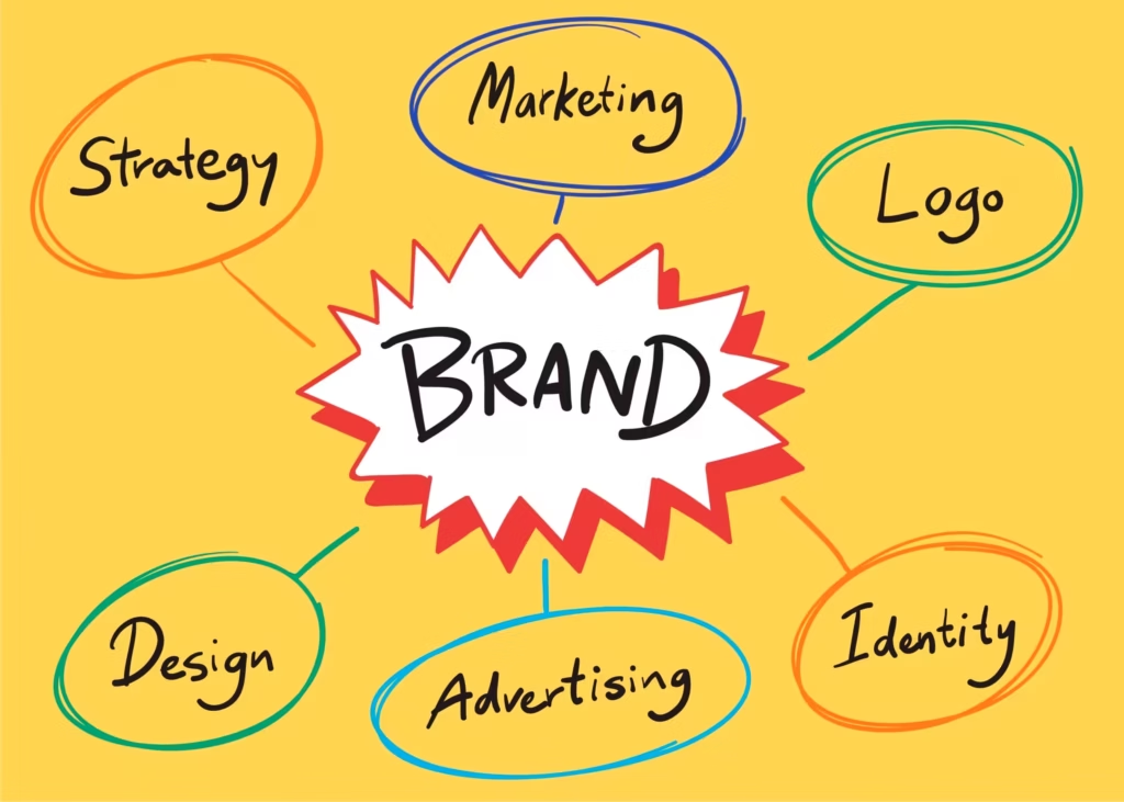
Creating a Visual Identity: A Step-by-Step Guide for Startups
First impressions aren’t Just Visual. They’re Emotional. You never get a second chance to make a first impression. Especially when you’re a startup. The second someone lands on your website, sees your social post, or holds your business card, your visual identity is doing all the talking before your pitch even begins.
Your logo. Your color palette. Your typography. Your vibe.
That’s what visual identity is, it’s not just how your brand looks. It’s how it feels. It’s the emotion you evoke before you say a single word. And trust me, it matters more than you think.
If you’re launching a product, bootstrapping a SaaS, or pitching to angels, your visual identity isn’t a “nice-to-have.” It’s your armor. It’s your silent cofounder. It builds trust, creates consistency, and makes your brand stick in a world that’s already too noisy.
Let’s break down how to craft a powerful visual identity from scratch. One that feels premium, practical, and you.
Table of Contents
Step 1: Define the Brand Core (Don’t Skip This)

Startups love to jump straight to logo design. I get it. That adrenaline is real. But without a strong core, you’re just slapping pretty pixels on a ghost.
Ask yourself:
- What’s your mission? (Not the corporate fluff. The why behind your “why.”)
- Who are you speaking to? (What do they care about, fear, dream of?)
- How do you want them to feel? (Confident? Rebellious? Calm?)
Create your brand keywords:
These are adjectives that define your visual language. Choose 3 to 5. For example:
- Innovative, Minimal, Confident
- Friendly, Playful, Disruptive
This informs every design decision moving forward. If your startup is a fintech product aiming to be “bold and trustworthy,” your palette and typography should reflect that. (Spoiler: pastel pink and Comic Sans won’t cut it.)
Step 2: Build a Moodboard (This Is More Than Just Aesthetic)
You need visual direction, not just “something that looks cool.” A moodboard gives you clarity, and keeps you from going down Pinterest rabbit holes.
Here’s what to collect:
- Logos from brands you admire (or want to avoid)
- Color palettes that evoke your keywords
- Typography samples (serif for elegance, monospace for techy feel, etc.)
- UI screenshots, packaging, merch, even textures or patterns
Use tools like Milanote, Figma, or even a Notion page.
Pro tip:
Do this collaboratively. Founders, designers, and even early customers should vibe-check the direction. You’re not building for just yourself, you’re building for people who’ll wear your brand like a badge.
Step 3: Design the Logo (Not Just a Pretty Symbol)
This is where most startups either overthink or underthink.
Some blow $5,000 on a fancy studio; others slap initials in a circle and call it a day. Truth is, your logo should be functional, recognizable, and timeless, not trendy. It needs to work on a 16px favicon and a 16-foot banner. Period.
Here’s how to approach it:
- Start with the logotype: That’s just your brand name in type. Test it in different fonts. See how it looks with varying weights and spacing. This alone can stand in for a logo, think Google, Facebook, or Airbnb.
- Add a logomark only if needed: This is your symbol/icon. It can be abstract (like Nike) or literal (like Dropbox’s box). Just make sure it holds meaning and scales well.
- Keep it minimal: No gradients, no 6-color schemes. Start in black-and-white. If it looks good there, it’ll look good anywhere.
- Make variations: Full logo, icon only, stacked, horizontal, wordmark only. You’ll need all of them in your brand kit.
Pro tip:
Run a blur test. Shrink it down, blur the image. Can you still feel the brand? If yes, that’s a good logo.
And please, avoid stock icons with your initials unless your startup is ironically poking fun at branding clichés.
Step 4: Choose Typography Like a Designer (Even If You Aren’t One)
Typography is your startup’s voice, in visual form. It defines whether your product feels fun, technical, editorial, luxurious, or grounded.
And it’s not about choosing a “cool font.” It’s about choosing a system.
Pick 2 fonts, max:
- Primary Font: For headlines and key messages (this should carry the most personality).
- Secondary Font: For body text, this should be readable, subtle, supportive.
Popular pairings:
- Sans + Sans: (e.g., Inter for headlines, Roboto for body) → clean and modern.
- Serif + Sans: (e.g., Playfair Display + Lato) → sophisticated and approachable.
- Monospace: (like IBM Plex Mono) → perfect for dev tools and technical startups.
Make it accessible:
- Use variable fonts if possible (saves load time, gives flexibility).
- Avoid fancy ligatures and ultra-light weights, especially on mobile.
Pro tip:
If you’re on a tight budget, self-host Google Fonts and tweak spacing using CSS. You’d be surprised how much difference proper letter-spacing and line-height makes.
Step 5: Build a Color System (Not Just a Palette)
Colors aren’t just decoration. They’re signals. They influence how people feel, behave, and remember you. Choosing the right color system can make your brand feel premium, playful, grounded, or rebellious.
Here’s how you do it:
1. Start with the Base Color
This is the main character. The one that’ll show up in your logo, buttons, website backgrounds, and headers.
Ask yourself: does it align with your brand keywords?
- Blue = trust, tech, calm
- Red = urgency, energy, power
- Yellow = optimism, youth, energy
- Black = luxury, authority, sophistication
- Green = growth, eco, health
Choose one that fits, and build from there.
2. Add Support Colors
Think secondary and tertiary tones, these are used in illustrations, cards, or CTAs to support the base.
- Use analogous colors if you want harmony.
- Use complementary colors if you want tension or energy.
3. Don’t forget neutrals
Every startup needs grays, off-whites, and a solid dark (not just black). These make your UI breathable and clean.
4. Build shades and tints
You need at least 3–4 variations of each color for UI flexibility: hover states, backgrounds, highlights, etc.
Example for a primary blue:
blue-900: for headingsblue-700: primary buttonsblue-500: accentsblue-100: background tints
Use tools like Coolors, Khroma, or Tailwind Palette Generator to do this efficiently.
Pro tip:
Test your palette in dark mode and under accessibility tools like Stark or Color Oracle. If your brand color fails WCAG contrast checks, it’s not a brand, it’s a liability.
Step 6: Design for Real Use (Not Just Dribbble Shots)
Your visual identity isn’t made for Behance. It’s made for pitch decks, onboarding flows, landing pages, and social posts. If it doesn’t work in context, it doesn’t work. Period.
Create a Flexible UI System
You’re not just designing a logo and leaving. You need reusable brand components:
- Button styles (primary, secondary, ghost)
- Form elements (inputs, selects, checkboxes)
- Card layouts
- Alert banners
- Illustration style (3D? Flat? Line?)
- Iconography (sharp? rounded? filled?)
Think in Tokens
Design tokens are your startup’s design variables. These define your core visual DNA in code:
- Colors (primary, secondary, background)
- Typography sizes (
font-lg,font-xs) - Spacing units (
spacing-4,spacing-8) - Border radius (
rounded-sm,rounded-xl)
Tokens help developers and designers stay aligned and scale fast. Tools like Figma Tokens, Style Dictionary, or Tailwind CSS are a godsend here.
Pro tip:
Start creating your Design System Lite™. A shared Google Doc or Notion page with all your brand elements, CSS snippets, hex codes, and fonts goes a long way, especially if you plan to scale or hire.
Step 7: Create Branded Assets That Actually Get Used
Now that you’ve built a solid visual system, it’s time to roll it out into real-world assets. This is where startups either look legit, or like a half-finished Figma board.
You need brand application, not just documentation.
Core Assets Every Startup Should Have:
- Pitch deck template (with logo, color system, and typography baked in)
- Business card design (yes, still useful at events)
- Social media templates (LinkedIn, X, Insta, you’ll need all sizes)
- Email signature design (small but high-touch)
- Blog and header visuals (for consistency across content marketing)
- Favicon and app icons (if you’re building product-first)
Bonus: Create a Web Style Kit
If you’re using WordPress, Webflow, or any modern stack, prep reusable CSS variables or Tailwind tokens for devs. Sync your Figma or design tool with your codebase as closely as possible.
Design ≠ Dribble shots. Design = behavior in action.
Step 8: Package It All Into a Brand Style Guide
This is your startup’s visual playbook.
Even if it’s a single-page doc, you need a source of truth, something to send to new hires, designers, marketers, and even investors.
Include:
- Brand purpose, tone, and mission
- Logo variations and usage rules
- Typography and spacing rules
- Color codes and usage examples
- UI patterns (buttons, inputs, grids)
- Imagery and illustration guidelines
Use Notion, Google Docs, or Figma to create it. Keep it live, shareable, and editable. Make it easy to follow, not an art museum piece.
Final Words: Your Visual Identity Will Evolve, But It Needs a Core
Here’s the thing most founders overlook: your brand isn’t frozen in time. It’ll grow, pivot, and mature as you do. That’s healthy.
But you can’t rebrand every month just because you saw a nice gradient on Twitter. Startups that win build recognition, not just aesthetic flexes.
So here’s the advice I always give:
- Be consistent before you try to be creative.
- Build for scalability, not perfection.
- Document early, even if it’s rough.
- Involve your team. Visual identity isn’t a solo mission.
- And most importantly, test it in the wild.
If your customers feel connected, your team feels aligned, and your investors don’t need a PDF to understand your vision, congrats, you’ve nailed it.
TL;DR: How to Create a Visual Identity for Your Startup
- Start with your brand core, mission, audience, emotion.
- Build a moodboard to visualize the tone.
- Design a flexible, scalable logo.
- Choose fonts that reflect your voice.
- Build a practical color system, not just trendy hues.
- Create real-world UI and marketing assets.
- Package everything in a shareable brand guide.
- Stay consistent, but leave room to grow.
Need help crafting your visual identity or branding system? Let’s chat. I’ve worked with 800+ startups and brands to design high-converting, unforgettable visual strategies, and I’d love to help you, too.