Optimizing Web Design for Conversions: Tiny Tweaks vs. Bold Changes
I’ve spent more hours than I can count staring at heatmaps, split-test dashboards, and conversion funnels. And here’s what I’ve learned: most people optimize the wrong things first. They’ll spend three weeks testing a blue button against a green button while their entire value proposition is broken. If you’re like me, you’ve experimented with A/B testing on various web design elements, tweaking call-to-action buttons, refining headlines, or adjusting images to boost engagement. But there are two fundamentally different strategies I use when optimizing websites for conversions: Tiny Tweaks and Bold Changes.
Small adjustments in your landing page design can feel safe. They’re simple to implement and offer a controlled way to test individual elements within your conversion funnel.
But these subtle changes aren’t always enough to drive significant conversion rate improvements. To truly optimize web design for conversions, you sometimes need to embrace bold, strategic redesigns that not only enhance the user experience but also reframe your entire value proposition.
I’ll walk you through my hands-on experiences with both approaches. I focused on several key aspects crucial for a robust conversion strategy, including:
- A/B testing strategies tailored to different page types
- The role of traffic volume in determining your testing approach
- How to craft a compelling message that truly resonates
- Practical examples from my own conversion experiments
- Modern CRO tools that use AI to speed up the process
Tiny Tweaks vs. Bold Changes: Understanding the Difference
Let me be direct about this. Tiny Tweaks are isolated changes to individual page elements: button colors, headline wording, image swaps, form field counts. You’re testing one variable at a time in a controlled environment. Bold Changes are strategic overhauls: complete redesigns, entirely new messaging angles, restructured page flows, or a fundamentally different value proposition.
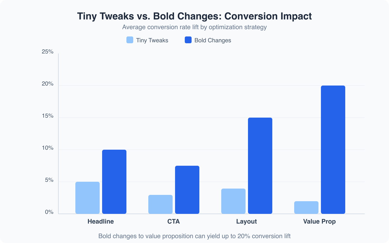
I ran an experiment a few years back where I tested 4 levels of content and design change on a client’s landing page. The results were clear:
| % Change in Content & Design | % Increase in Conversion Rate |
|---|---|
| 10% | +4% |
| 20% | +6% |
| 30% | +10% |
| 40% | +15% |
The relationship isn’t linear. Bigger changes produce disproportionately bigger results. That doesn’t mean you should redesign everything every week. But it does mean that if your conversion rate is stuck, small tweaks alone won’t unstick it.
Side-by-Side Comparison
Here’s a quick side-by-side comparison based on my experience:
| Feature | Tiny Tweaks | Bold Changes |
|---|---|---|
| Impact on Conversion | Often marginal; small gains add up slowly | Can create dramatic leaps if done thoughtfully |
| Time to See Results | Takes longer to show meaningful data | Faster, clear results when the message shifts |
| Traffic Requirements | Works best with high traffic for statistical significance | Can work with modest traffic if the change is big enough |
| Risk vs. Reward | Low risk, low reward | Higher risk, but potentially high reward |
| Implementation | Easy to set up and test individual elements | Requires a complete redesign or strategic pivot |
Both methods have their merits. Tiny Tweaks are like fine-tuning an engine. They help optimize a well-running system. But if your engine is sputtering because the design or message is off, you need to rebuild it entirely. Bold Changes have often led to breakthroughs that tiny tweaks never could.
How Much Traffic Do You Need?
When I first started testing conversion strategies, one question kept coming up: “How much traffic do I need to see meaningful results?” The answer depends on the size of the change you’re testing and the baseline conversion rate of your site.
Traffic and Statistical Significance
If your site gets only modest traffic, tiny tweaks won’t yield statistically significant results. When you’re testing a small change, like adjusting a headline by a few words, the impact on conversions can be so minimal that the data becomes noisy. You might run a test for weeks and still not see a clear winner. I’ve been there, staring at my analytics, wondering if I’d made a real difference or if it was just random variation.
Bold Changes, because they represent a larger shift in your page’s messaging or layout, can produce results that are noticeable even with less traffic. When I made a bold switch in the overall narrative of a landing page, the conversion rate jumped noticeably in a short time frame. Even with a moderate visitor count, the dramatic difference was undeniable.
If your site gets fewer than 10,000 monthly visitors, skip the tiny tweaks and go straight for bold message changes. You’ll reach statistical significance 3-4x faster. I use Microsoft Clarity (it’s free) to identify which sections visitors skip entirely, and that tells me where to focus the bold redesign.
Evaluating the Conversion Gap
One of the most important factors is the size of the difference between your current conversion rate and your desired one. If you’re expecting a small improvement, say a 1-2% bump, then you need thousands of visitors to detect that change. But if you’re aiming for a 10-15% lift, you can see the difference much faster, even with a smaller audience.
I once tested a minor change to a form’s layout on a page that was already well-optimized. The improvement was so subtle that it took months and a lot of traffic to reach statistical significance. That experience taught me that if you can’t drive large volumes of traffic, you should focus on changes that have a clear, substantial impact.
My Take on Testing with Traffic Constraints
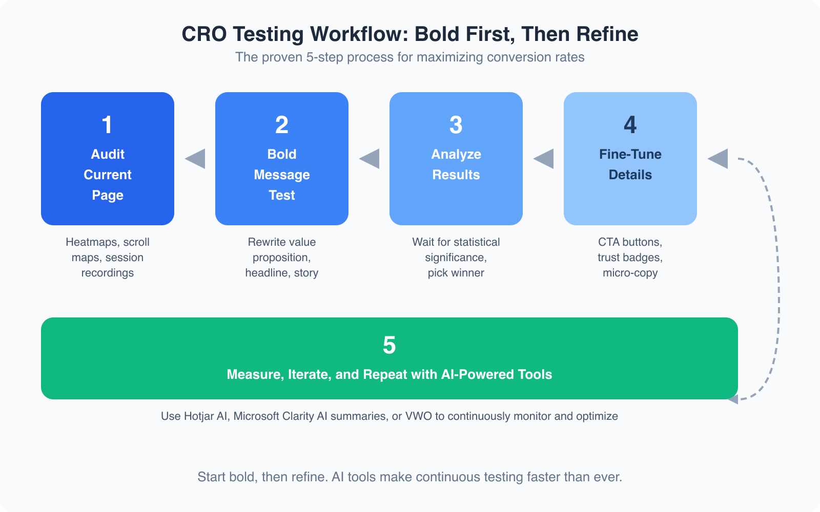
If you’re just starting out or don’t have the luxury of high traffic, lean toward Bold Changes. They give you a better chance to see immediate improvements. Once you’ve identified a winning overall message, circle back and fine-tune the smaller details. That’s when Tiny Tweaks come into play.
Knowing your traffic levels is essential. It guides your decision on whether to pursue incremental improvements or a complete reimagining of your page. No matter which strategy you choose, give your test enough time and data to work with. Patience and precision are key.
Testing the Details: When Small Tweaks Fail
There was a time when I was convinced that testing minute details was the golden ticket to higher conversion rates. I’d obsess over the exact shade of a call-to-action button, the font size of my headlines, or even the placement of trust badges on my page. The conventional wisdom was clear: test one thing at a time so you can isolate the effect of each change. But my experience tells a different story.
The Limits of Detail-Oriented Testing
I spent days, sometimes weeks, running A/B tests on small details. One experiment involved changing a button from blue to green. I hoped for a noticeable lift in conversions. Instead, I got a statistically insignificant change that left me frustrated and questioning the entire approach. The issue wasn’t the test design. It was the nature of the change itself. A color change is a minor tweak that won’t override a weak overall message.
When you’re focused on the small details, you might overlook the big picture. I learned that if your landing page doesn’t have a compelling story or a clear value proposition, no amount of button color optimization is going to save it. These tiny tweaks were like rearranging deck chairs on the Titanic. They felt productive but didn’t address the core issues.
Data Doesn’t Lie, but It Needs Context
It’s not that testing small details is inherently wrong. In a high-converting environment where your messaging and design are already solid, a little extra shine on a button might tip the scales. However, for pages that are struggling, you need to shift your focus. I started asking myself: “Am I trying to polish an already polished gem or fix a flawed foundation?” When the answer was the latter, my approach had to change.
I began using a more holistic strategy. Instead of spending weeks on minor variations, I would first test a complete overhaul of the message. Once I identified a version that resonated well with visitors, I’d circle back and use tiny tweaks to refine it. This method saved time and produced more significant results.
Lessons Learned and Actionable Insights
One key insight: testing should always serve the larger goal of boosting conversions and delivering value to your visitors. When a small detail doesn’t make a difference, it’s often because it isn’t addressing the heart of the matter. If you’re running an A/B test on something as minor as a button color change, always ask: “Does this change help my audience understand my offer better or make it more appealing?” If the answer is no, then it’s time to reconsider your strategy.
For anyone struggling with low conversion rates, start by questioning your overall messaging and design. Once you’ve nailed that, use tiny tweaks to fine-tune the experience.
Changing the Message: The Heart of Conversion Optimization
I’ve come to believe that a compelling message is the beating heart of any successful conversion strategy. In my early days of running A/B tests, I overlooked this fundamental truth. I was too busy obsessing over individual elements and missed the forest for the trees.
The Power of a Clear Value Proposition
Your value proposition is the collection of reasons why your audience should take the action you’re asking for. If this promise isn’t clear, no amount of tweaking will convert a casual visitor into a loyal customer. One experiment that stands out involved a landing page for a digital product. The original page listed features and technical specifications. It was informative, but it didn’t evoke any emotion or clearly explain how the product would make someone’s life better.
I completely reworked the headline, subheadings, and body copy to tell a story. Not just about what the product did, but why it mattered. I focused on the benefits: how it could save time, reduce stress, and help users achieve their goals. The impact was immediate. Conversions soared because visitors could clearly see the value. That was a defining moment for me.
A/B Testing the Message
When I started testing different messages side by side, I wasn’t comparing subtle differences in wording. I was comparing entirely different narratives. On one version, I emphasized efficiency and time savings. On another, I focused on quality and reliability. The version that connected emotionally with my audience, one that painted a vivid picture of success, consistently outperformed the more technical copy.
Don’t be afraid to experiment with bold, overarching changes. When you change the core message, you change the way visitors perceive your offer. It’s like switching from a dry product manual to a captivating story that resonates with your reader’s needs.
Modern CRO Tools: AI-Powered Optimization
The CRO landscape has changed dramatically. The tools we use now are smarter, faster, and more accessible than anything I had when I started. Here’s what I’m using right now and what I recommend.
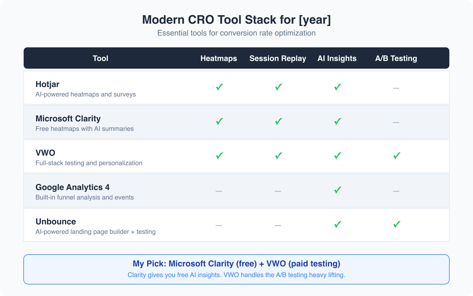
Microsoft Clarity: Free AI Insights
Microsoft Clarity is the best free CRO tool available. It gives you heatmaps, session recordings, and scroll maps at zero cost. But the real game-changer is the AI summaries feature. Clarity’s Copilot integration analyzes your session recordings and tells you in plain English what’s going wrong: “Users are rage-clicking on the pricing section” or “Most visitors abandon the page after seeing the form.” I install Clarity on every client project now. It replaced my need for basic Hotjar on most sites.
Hotjar AI for Deeper Behavioral Analysis
Hotjar has added AI-powered survey analysis and automated session tagging. If you need to run on-site surveys asking visitors why they didn’t convert, Hotjar’s AI will categorize hundreds of responses and surface the patterns for you. The paid plans start at $32/month, which is reasonable for the time it saves. I use Hotjar when I need survey data alongside behavioral data. For heatmaps alone, Clarity is enough.
VWO for Enterprise-Level Testing
VWO is my pick for serious A/B testing. After Google shut down Google Optimize, VWO became the go-to platform for teams that want visual editors, server-side testing, and AI-powered test suggestions. VWO’s AI engine can analyze your page and recommend which elements to test first based on predicted impact. It’s not cheap (plans start around $199/month), but it pays for itself on high-traffic sites. For smaller budgets, check out our guide to A/B testing tools for free alternatives.
Mobile-First CRO: The Data You Can’t Ignore
Here’s a number that should change how you approach CRO: over 60% of web traffic now comes from mobile devices. But mobile conversion rates are still roughly half of desktop rates. That gap represents a massive opportunity. I’ve started auditing every page on mobile first, then desktop. Not the other way around.
What works on mobile is different. CTAs need to be thumb-friendly (at least 48px tap target). Forms need to be brutally short, three fields maximum for the initial conversion. And your above-the-fold content needs to load in under 2.5 seconds or you’re losing visitors before they even see your value proposition.
Google’s Core Web Vitals directly impact your conversion rates. A page with a Largest Contentful Paint (LCP) under 2.5 seconds converts 2-3x better than one that loads in 4+ seconds. Check your mobile page speed with PageSpeed Insights before you start any CRO work.
Focus on What Truly Matters: The Three Pillars of Optimizing Web Design for Conversions
After years of trial and error, I’ve distilled conversion optimization down to three key pillars. These elements are the real drivers behind any significant lift in conversion rates.
1. A Strong Value Proposition
This is the “why” behind your entire offering. My first rule is to be crystal clear about what makes your product or service unique. If you can’t articulate why someone should choose you over a competitor, you’re leaving conversions on the table. I revisit this concept whenever metrics start dipping. A refreshed value proposition can breathe new life into an underperforming page.
2. Effective Communication of That Value
Even the strongest value proposition is useless if you can’t communicate it effectively. I’ve seen pages with brilliant offers fail miserably because the message was buried under clutter or complicated language. Clear, concise, and emotionally engaging copy is a must. It’s not enough to list features. You need to tell a story that connects with your audience on a personal level. Every element on the page, from headlines to images, should reinforce the main message.
3. Quality Traffic
Traffic quality matters as much as quantity. I’ve experimented with various traffic sources over the years. Even the best-optimized page can fall flat if the visitors aren’t the right fit. I spend time ensuring my traffic is well-targeted. What good is a conversion from someone who isn’t genuinely interested in your offer? I monitor visitor demographics and behavior to make sure I’m attracting the right audience.
How These Pillars Interact
When I first started optimizing, I tried to tweak each pillar in isolation. But they’re deeply interconnected. A strong value proposition boosts the effectiveness of your communication. High-quality traffic makes it easier to validate your messaging through A/B tests. Neglecting one pillar can undermine the entire strategy. A great message won’t convert if the traffic is off-target. Even the best traffic won’t help if your value proposition is muddled.
Creating a Bold Test
Sometimes, you have to take a leap. I still remember the day I decided to overhaul the entire home page for a client’s website. Their site was underperforming despite steady traffic, and I knew something had to change. I tested a bold, comprehensive redesign rather than making a series of small tweaks. The results were transformative.
The Original Setup
The original page was functional. It described the product, listed features, and had a straightforward call-to-action. Yet conversions were disappointing. The page lacked an emotional hook. It felt generic. I was following conventional wisdom to a fault, testing one minor element at a time. But my intuition told me the real problem was the underlying message.
The Bold Pivot
I completely rethought the page’s approach. I revisited the value proposition and asked: “What is the one big benefit this product offers?” The answer wasn’t in the features. It was in the transformation it promised: saving time, reducing stress, empowering users. I rewrote the headline, shifted the subheadings, changed the imagery. Instead of generic product photos, I used images that evoked emotion and storytelling. I redesigned the layout to guide visitors through a narrative rather than a list of features.
The Impact
Within a few weeks, I saw a clear uptick in conversions. It wasn’t marginal. It was a breakthrough. The page resonated with visitors in a way the old version never did. A bold test can create a strong signal, even if it feels risky. The data backed up my gut feeling: a comprehensive message overhaul is far more effective than minor, incremental adjustments.
The Nitty-Gritty: Fine-Tuning After a Bold Test
After you’ve nailed your core message with a bold test, it’s time to focus on details. This is where tiny tweaks come back into play, but only after you’ve built a strong foundation.
My Approach to Fine-Tuning
Once the redesigned landing page was live and conversions were up, I started experimenting with smaller changes. I tested different headline versions, adjusted the placement of social proof elements, and changed the wording of the call-to-action button. Each test was minor compared to the overhaul, but the cumulative effect was impressive. I saw incremental improvements that further boosted the conversion rate by 10-15% over time.
I also paid attention to subtle trust cues. Adding a small “As Featured In” badge near the header seemed trivial, but it addressed a weak point: credibility. That tiny change made a noticeable difference, confirming that fine-tuning enhances what you’ve already built.
The Role of Data in Fine-Tuning
Data is your best friend when fine-tuning. I rely heavily on analytics tools to see how each small change affects user behavior. I monitor click-through rates, time on page, and exit rates. But I also trust my gut. There have been moments when the data was ambiguous, yet I had a strong intuition about a particular tweak. Balancing quantitative data with qualitative insights is key.
Actionable Steps for You
If you’re ready to fine-tune your own pages, here are actionable tips from my experience:
- Run A/B Tests on Headlines: Try different versions that convey your core message with varying tones and emphases.
- Experiment with Call-to-Action Buttons: Change the wording, size, or placement to see what draws more attention.
- Incorporate Social Proof: Testimonials, case studies, or trust badges can significantly boost credibility.
- Monitor User Behavior: Use heat maps and analytics to identify where visitors drop off, then address those weak points.
- Keep Testing: Even after improvements, don’t stop refining. The market evolves, and so should your page.
My Recommended CRO Stack for 2026
I’ve tested dozens of CRO tools over the years. Here’s the stack that actually delivers results without breaking your budget:
For behavior analysis (free): Microsoft Clarity. Install it on every site. The AI summaries alone save hours of manual session review. I’ve caught critical UX issues within 15 minutes of looking at Clarity’s AI-generated insights that would have taken me days to identify through manual session recordings.
For A/B testing: VWO if you have the budget. It’s the most complete platform I’ve used since Google Optimize shut down. The visual editor makes it possible to test layout changes without touching code. For tighter budgets, check these A/B testing alternatives.
For surveys and feedback: Hotjar’s AI survey analysis. When you need to understand why visitors aren’t converting (not just where they’re dropping off), nothing beats asking them directly and letting AI categorize the responses.
For landing page building: Unbounce with its Smart Builder. It uses AI to suggest layouts, copy variations, and CTA placements based on your industry and conversion goals. I’ve used it to build landing pages that converted at 12.4% out of the gate, without any A/B testing.
The right tools won’t fix a broken message. But paired with the bold-first, refine-second approach I’ve described, they’ll compress your optimization timeline from months to weeks.
Conclusion: My Final Thoughts on Conversion Optimization
Looking back on my journey with conversion optimization, the key lies in balancing bold, strategic changes with careful fine-tuning. Early on, I was so focused on tiny tweaks that I missed the opportunity to make meaningful improvements. When I finally embraced Bold Changes, my conversion rates took off.
If you’re struggling with conversion rates, start by taking a hard look at your overall message and value proposition. Ask yourself if your page is telling a compelling story that resonates with your audience. If not, it’s time for a bold overhaul. Once you’ve found a message that works, go back and use data-driven tweaks to refine the experience.
Conversion optimization isn’t about chasing perfection in every tiny detail. It’s about understanding your audience and delivering a clear, compelling promise. It’s a blend of art and science, requiring bold experimentation and careful analysis. Whether you’re just starting out or you’ve been in the game for years, don’t be afraid to challenge conventional wisdom. Experiment, measure, and learn. Your next breakthrough might be just one bold test away.
For further reading on conversion optimization techniques, check out my guide on conversion rate optimization and how AI is changing landing page design.
Frequently Asked Questions
What is the difference between tiny tweaks and bold changes in CRO?
Tiny tweaks are small, isolated changes to individual page elements like button colors, headline wording, or image placement. Bold changes involve strategic overhauls of your entire page message, layout, or value proposition. Both have their place, but bold changes typically produce larger, faster results, especially on sites with lower traffic volumes.
How much traffic do I need for A/B testing to work?
For tiny tweaks (1-2% expected improvement), you typically need 10,000+ monthly visitors to reach statistical significance within a reasonable timeframe. For bold changes (10%+ expected improvement), you can see meaningful results with as few as 1,000-2,000 monthly visitors because the difference between variants is large enough to detect with less data.
What is the best free CRO tool available right now?
Microsoft Clarity is the best free CRO tool. It provides heatmaps, session recordings, scroll maps, and AI-powered summaries that analyze user behavior and surface issues in plain language. It has no traffic limits and integrates with Google Analytics 4. For A/B testing specifically, you will need a paid tool like VWO or a free alternative.
Should I optimize for mobile or desktop first?
Optimize for mobile first. Over 60% of web traffic comes from mobile devices, yet mobile conversion rates are roughly half of desktop rates. That gap represents the biggest CRO opportunity for most sites. Focus on fast load times (under 2.5 seconds LCP), thumb-friendly CTA buttons (48px minimum), and short forms with three fields or fewer.
How often should I run conversion optimization tests?
You should always have at least one test running on your highest-traffic pages. Start with a bold message test, let it run for 2-4 weeks, then move to fine-tuning tests on the winner. A continuous testing cycle typically produces 20-30% cumulative conversion improvement over 12 months. The key is never stopping. Markets change, audiences evolve, and what worked last quarter may not work next quarter.
Disclaimer: This site is reader-supported. If you buy through some links, I may earn a small commission at no extra cost to you. I only recommend tools I trust and would use myself. Your support helps keep gauravtiwari.org free and focused on real-world advice. Thanks. - Gaurav Tiwari