How to Use Dropcaps in WordPress Posts and Pages (One Click + CSS)
Dropcaps in WordPress take exactly one click: select the opening paragraph, open the block sidebar, toggle “Drop cap” on. Done. The oversized first letter that magazines have used for centuries is a built-in feature of the block editor, no plugin required.
So why does this article exist? Because the toggle is only half the story. Some themes ignore the drop cap class entirely, some make it ugly, and styling it well (or applying it to every post automatically) takes a few lines of CSS that most tutorials get wrong. Here’s the complete picture, including the honest advice on when dropcaps belong in your posts at all.
Like this. A drop cap is the first letter of a paragraph, enlarged to span two or three lines of text. Used once, on the opening paragraph of a long-form piece, it signals “settle in, this is an essay.” Used everywhere, it signals that you just discovered the toggle.
The One-Click Method: Gutenberg’s Drop Cap Toggle
In the block editor, click into the paragraph that should open with a dropcap. In the settings sidebar (the gear icon), look under Typography for the Drop cap toggle and switch it on. If you don’t see it, click the three-dot options inside the Typography panel; some themes tuck it away there.
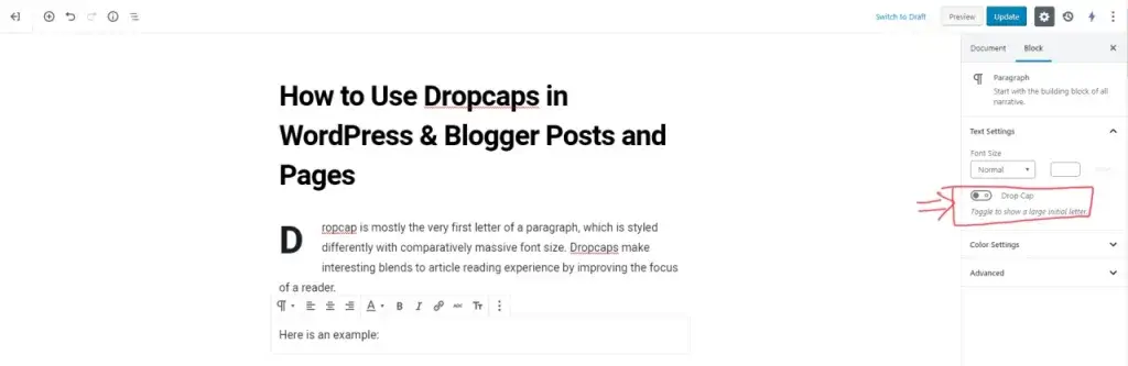
WordPress adds a has-drop-cap class to that paragraph and applies default styling. Two catches: classic themes sometimes ship no styling for that class (your “drop cap” looks like a normal letter), and the default look in many themes is oversized and awkward. Both problems have the same fix, which is the next section.
Styling Dropcaps with Modern CSS
Add this to Appearance → Customize → Additional CSS (or your child theme’s stylesheet). It targets exactly the paragraphs where you toggled the drop cap on, and nothing else:
.has-drop-cap:first-child::first-letter {
	float: left;
	font-size: 4.5em;
	font-weight: 700;
	line-height: 1;
	margin: 0.05em 0.1em 0 0;
	font-family: Georgia, serif;
	color: inherit;
}
Two knobs worth turning: font-size (4.5em spans about three lines; drop to 3em for a two-line cap) and font-family. Serif faces like Georgia, Lora, or Playfair Display give the traditional editorial feel; your body sans-serif keeps it modern. Resist the urge to color it your brand orange. The restrained version always reads better.
CSS also has a purpose-built property now, initial-letter, which sizes the cap in lines instead of em guesswork:
.has-drop-cap:first-child::first-letter {
	initial-letter: 3;
	font-weight: 700;
	margin-right: 0.1em;
	font-family: Georgia, serif;
}
It’s cleaner and aligns the cap to your text’s baselines automatically. Browser support is good in Chrome, Edge and Safari but still inconsistent elsewhere, so I ship the float version as the default and treat initial-letter as the enhancement. Either way, no JavaScript, no layout shift, no plugin.
Auto-Dropcaps on Every Post (No Toggling)
Running an editorial site where every article should open with a dropcap? Skip the per-post toggle and target the first paragraph of your content area directly. First find your theme’s content class with the browser inspector; on most themes it’s entry-content:
Then add:
.entry-content > p:first-of-type::first-letter {
	float: left;
	font-size: 60px;
	font-weight: 700;
	line-height: 1;
	padding: 10px 6px 10px 0;
}
Every post’s first letter gets the treatment automatically, and editors never have to remember anything. One caution from experience: this also hits posts that open with a one-line hook, where a three-line dropcap looks ridiculous. If your openings vary a lot, stay with the per-paragraph toggle.
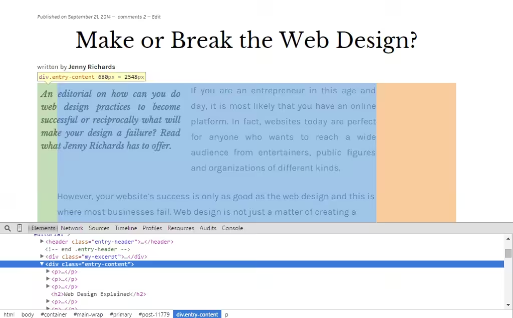
Custom Designs with the Span Method
For decorative dropcaps (boxed, colored, with hover effects) wrap the first letter manually and style the class. This is the dropcap I used on this site for years, a dark letter in a yellow rounded box:
.entry-content p span.dropcap {
	float: left;
	border-radius: 30px;
	font-size: 60px;
	padding: 10px 20px;
	background: #f2ea50;
	color: #161616;
	font-weight: 700;
	font-family: Lora, serif;
	line-height: 1;
}
Then in the editor (code view), wrap the first letter: <span class="dropcap">E</span>. One accessibility note before you commit to this method: some screen readers announce a wrapped single letter as its own word, splitting “Every” into “E” and “very.” The CSS ::first-letter methods above don’t have that problem, which is why they’re my default and the span stays reserved for special designs.
Do You Need a Dropcap Plugin?
No. This is one of those rare WordPress questions with a clean answer. The dropcap plugins you’ll find in the repository (Drop Caps, Drop Cap Shortcode, Initial Letter) have been abandoned for years, and the feature they sold is now one toggle and seven lines of CSS. Installing unmaintained code to avoid seven lines of CSS is a bad trade; it’s the same plugin-bloat tax I covered in why WordPress sites slow down.
What About Blogger?
The CSS method works on Blogger too, since it’s just CSS. In your Blogger dashboard, head to Theme → Customize → Advanced → Add CSS and paste:
.post p:first-of-type::first-letter {
	float: left;
	font-size: 60px;
	font-weight: 700;
	line-height: 1;
	padding: 10px 6px 10px 0;
}
.post is the content wrapper on most Blogspot templates. Everything said above about restraint applies double on Blogger, where typography control is already limited.
When Dropcaps Work (and When They Don’t)
A dropcap is a tone-setter, and the tone is “long-form editorial.” Personal essays, feature stories, longform reviews: yes, on the opening paragraph only. Technical tutorials, listicles, documentation: no. A dropcap on step three of a how-to guide is a tuxedo at a standup meeting. Themes built for writers and long-form publishing often ship tasteful dropcap styling out of the box, which tells you exactly the genre where this detail belongs.
One per page. Opening paragraph only. Style it once in CSS and let the toggle do the rest. That’s the whole craft.
FAQs: Dropcaps in WordPress
How do I add a drop cap in WordPress?
Select the paragraph in the block editor, open the settings sidebar, and switch on the Drop cap toggle under Typography. WordPress adds the has-drop-cap class and styles the first letter. If nothing changes visually, your theme lacks drop cap styling; add the CSS from this guide.
Why is my WordPress drop cap not showing?
Your theme doesn’t style the has-drop-cap class, which the toggle relies on. Add the ::first-letter CSS from this article to Appearance → Customize → Additional CSS. If the toggle itself is missing, check the three-dot menu inside the paragraph block’s Typography panel.
Can I add drop caps to all WordPress posts automatically?
Yes, with one CSS rule targeting your theme’s content class: .entry-content > p:first-of-type::first-letter with float, size, and weight properties. Every post’s opening letter gets the treatment without touching the editor. Just confirm your openings are long enough to wrap around a three-line letter.
Do drop caps affect SEO or accessibility?
CSS-based dropcaps (::first-letter or initial-letter) are invisible to search engines and screen readers, so they’re safe. The span-wrapping method can make some screen readers split the first word; reserve it for decorative designs and prefer the pure-CSS methods by default.
What is the best drop cap plugin for WordPress?
None; skip the plugin. The dropcap plugins in the WordPress repository have been unmaintained for years, and the block editor’s built-in toggle plus a few lines of CSS covers everything they did, without adding abandoned code to your site.
TY for the article worked out great for me. I searched all over for this today and this article helped me with great success. Any articles on using images as dropcaps? Seen some nice ones around but no tutorials.