10 Best Types of CTAs to Drive Conversions
You’re getting traffic. People land on your pages, scroll around, and leave. No clicks, no signups, no sales. The page looks fine. The content reads well. But nothing happens because visitors don’t know what you want them to do next.
That silence is expensive. 70% of small B2B websites don’t have a single call-to-action on their homepage. Not one. Every day without clear CTAs is revenue bleeding out of your site while you wonder why traffic isn’t converting. And the longer you wait to fix it, the more you train visitors to treat your site like a library: browse and leave.
The fix isn’t complicated. You need the right CTA types in the right places. After testing CTAs across dozens of client sites, I’ve seen personalized CTAs convert 42% more visitors than generic ones (HubSpot data from millions of CTAs). The difference between a lazy “Click Here” button and a well-crafted CTA can mean 2-3x more conversions. Here are the 10 types that consistently work, with real examples and the psychology behind each one. If you’re working on your broader content marketing strategy, getting CTAs right is one of the highest-leverage moves you can make.
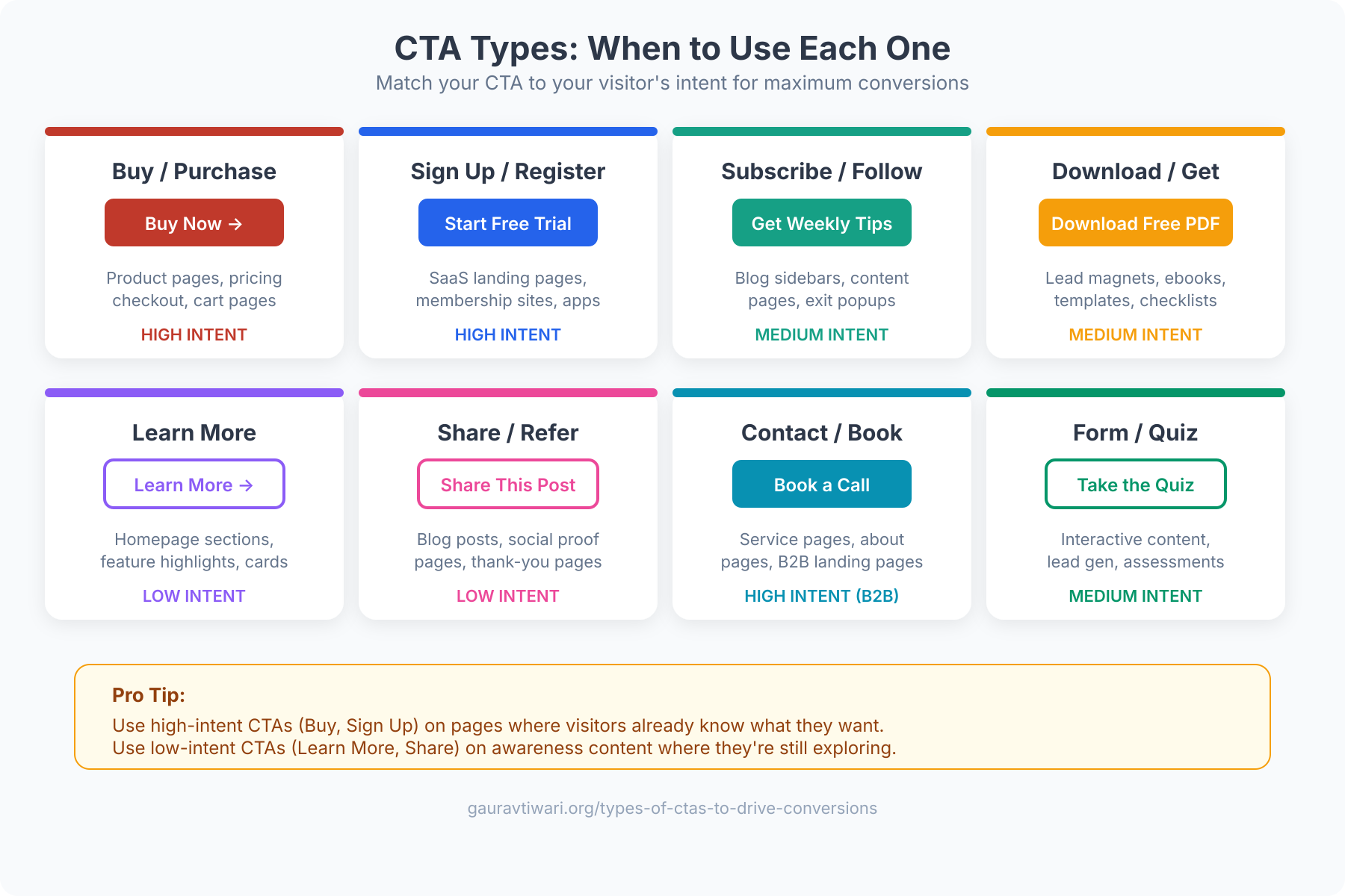
Types of CTAs That Drive Conversions
- Buy Now, Subscribe, or Download CTAs: Direct-action buttons that eliminate ambiguity and trigger micro-commitments.
- Form-Based CTAs: Data-collection CTAs that enable personalization and progressive profiling.
- Read More and Learn More CTAs: Top-of-funnel CTAs that increase time on site and move visitors deeper.
- Social Sharing CTAs: Underutilized CTAs that turn readers into free distribution channels.
- Sign Up CTAs: Account-creation CTAs amplified by social proof and single-focus landing pages.
- Free Demo or Free Trial CTAs: Loss-aversion CTAs that let prospects experience value before paying.
- Lead Generation CTAs: Value-exchange CTAs powered by specific, high-quality lead magnets.
- Product or Service Discovery CTAs: Navigation CTAs that guide visitors to the right product or plan.
- Newsletter Subscription CTAs: List-building CTAs that create owned audiences and potential revenue streams.
- No-Risk and Guarantee CTAs: Risk-reversal CTAs that remove the fear of making a bad decision.
Buy Now, Subscribe, or Download CTAs
These are the most direct CTAs on your site. “Buy Now,” “Subscribe Today,” “Download Free Guide.” They work because there’s zero ambiguity about what happens when someone clicks. The visitor knows exactly what they’re getting and what it costs (even if the cost is just an email address).
The psychology here is commitment. Once someone clicks “Buy Now,” they’ve made a micro-decision. Each subsequent step (adding payment info, confirming the order) feels like following through rather than making a new decision. This is why Amazon’s one-click purchase button prints money. It removes every friction point between intention and action.
Best practices for direct CTAs:
- Use action verbs that describe the outcome, not the action. “Get My Free Guide” outperforms “Download” by 14-30% in most tests.
- Add urgency when genuine. “Start Your Free Trial (No Credit Card)” removes risk and creates momentum.
- Place them above the fold AND at the end of your value proposition. Repeat, don’t just hope people scroll back up.

Form-Based CTAs
Forms are CTAs disguised as conversations. Instead of a single button, you’re asking visitors to provide information, their name, email, phone number, company size, or preferences, in exchange for something valuable.
The data backs this up: personalized CTAs convert 42% more visitors than untargeted ones, according to HubSpot’s analysis of over 330,000 CTAs. Forms enable that personalization because they collect the data you need to tailor the next interaction.
Every additional form field reduces conversion rates by about 11%. If you’re asking for more than name and email, you need to justify each extra field with a clear benefit to the visitor. Progressive profiling (collecting more data over multiple interactions) consistently outperforms long forms.
Multi-step forms have been outperforming single-page forms in 2026. Breaking a 6-field form into two 3-field steps can increase completion rates by 86%. Tools like Unbounce and Typeform make this easy to implement without coding. If you’re building landing pages, check out these top WordPress page builders that support form integrations natively.
Read More and Learn More CTAs
These CTAs exist to keep visitors on your site longer. “Read More,” “Learn More,” “See How It Works.” They’re not asking for a commitment. They’re offering more value. And that’s precisely why they work so well at the top of the funnel.
The average website visit lasts 52 seconds. Every additional page a visitor views increases the probability of conversion by roughly 25-30%. Read More CTAs are the mechanism that turns a casual visitor into an engaged prospect by guiding them deeper into your content.
Where they work best: blog post teasers, product feature highlights, case study previews, and FAQ sections. The key is making the teaser compelling enough that clicking feels like a natural next step, not a chore.
Social Sharing CTAs
Social sharing buttons are the most underutilized CTAs on most websites. When a visitor shares your content, they’re giving you free advertising to their entire network. One share can generate 10-50 new visitors, depending on the sharer’s audience size.
The trick is placement and timing. Don’t just slap share buttons at the top of every page. Place them after your most valuable content sections, after a key statistic, a compelling insight, or a useful framework. That’s when readers feel the urge to share. Content with social sharing CTAs positioned after high-value sections gets 7x more shares than content with buttons only at the top or bottom.
In 2026, the platforms that matter most for sharing: LinkedIn (B2B content), Twitter/X (thought leadership), Pinterest (visual content), and WhatsApp (increasingly important for direct sharing). Facebook sharing has declined significantly for business content.
If you’re looking for CTA inspiration on social platforms, check out these 100+ Instagram caption CTA ideas.

Sign Up CTAs
Sign up CTAs are the gateway to your product or service. “Create Your Free Account,” “Sign Up in 30 Seconds,” “Join 50,000+ Users.” They’re asking for a bigger commitment than a download but offering a bigger payoff.
Landing pages with a single CTA generate 220% more leads than pages with multiple competing calls-to-action. That stat alone should shape your sign-up page design. Remove navigation menus, sidebar widgets, and footer links. Give visitors exactly one thing to do: sign up.
Social proof is the multiplier here. “Join 50,000+ marketers” or “Trusted by teams at Google, Shopify, and HubSpot” directly addresses the “is this legit?” question that runs through every visitor’s mind. Place testimonials or user counts immediately adjacent to your sign-up button.
Before spending time optimizing your CTA copy, check if your sign-up flow itself is the problem. Can users sign up with Google/Apple SSO? Is the form mobile-friendly? Does it load in under 2 seconds? Fixing these friction points often produces bigger gains than any copywriting change.
Free Demo or Free Trial CTAs
Free trials and demos are the most powerful CTAs for SaaS and service businesses. They flip the sales conversation from “trust me, it works” to “try it yourself.” The conversion psychology is loss aversion: once someone has used your product for 14 days, giving it up feels like losing something they already own.
The “no credit card required” modifier is worth its weight in gold. SaaS companies that offer no-credit-card trials see 50-100% higher trial sign-up rates compared to those requiring payment upfront. Yes, free trial conversion to paid is lower (typically 15-25% vs 40-60% for credit-card trials), but the total number of paying customers is often higher because of the dramatically larger trial pool.
For high-ticket products, “Book a Free Demo” works better than self-serve trials. A 30-minute demo call lets you qualify leads, address objections in real-time, and build relationships that close deals. Tools like Calendly embedded directly in your CTA button eliminate the scheduling friction.

Lead Generation CTAs
Lead generation CTAs offer something valuable in exchange for contact information. “Get Your Free SEO Audit,” “Download the 2026 Marketing Report,” “Take the Free Assessment.” The exchange is clear: you give me your email, I give you something worth having.
The quality of your lead magnet directly determines your conversion rate. Generic “Subscribe to our newsletter” CTAs convert at 1-3%. Specific, high-value offers like “Get our 47-page guide to doubling your conversion rate” convert at 5-15%. The more specific and immediately useful the offer, the higher the conversion.
In 2026, AI-powered lead magnets are outperforming static ones. Interactive calculators, personalized assessments, and AI-generated recommendations convert 2-3x higher than PDF downloads. If you’re still offering the same ebook from 2022, it’s time to upgrade. Having the right blogging tools in your stack makes building these lead magnets much faster.
Product or Service Discovery CTAs
These CTAs guide visitors through your product catalog. “Explore Our Plans,” “See All Features,” “Compare Products,” “Find Your Perfect Plan.” They’re designed for visitors who are interested but not yet sure which specific product or plan is right for them.
The most effective product discovery CTAs use visual cues, arrows, icons, or even animated elements, to signal that there’s more to explore. Comparison tables with a highlighted “Most Popular” or “Best Value” option guide decisions without overwhelming visitors with choices.
Smart product discovery in 2026 increasingly uses AI-powered recommendations. “Based on your browsing history, we recommend…” CTAs can increase average order value by 15-30%. Shopify stores with AI-powered product recommendations see measurably higher conversion rates than those with static category pages.
Too many options kill conversions. Research consistently shows that 3-4 pricing tiers outperform 6-8 options. If you have a large product catalog, use filters and AI recommendations to narrow choices before presenting them. Guide, don’t overwhelm.

Newsletter Subscription CTAs
Email remains the highest-ROI marketing channel, generating $36-$42 for every $1 spent. Newsletter CTAs build your most valuable asset: an owned audience that no algorithm change can take away from you.
The old “Subscribe to our newsletter” CTA is dead. It converted when email was novel. Now it competes with 300+ emails in the average inbox. You need to sell the value of subscribing. “Join 25,000 marketers who get our weekly growth tactics” tells me what I’m getting and that other smart people trust it.
Tools like ConvertKit, Beehiiv, and Substack have made newsletter businesses viable on their own. The paid newsletter market jumped 138% between 2024 and 2025, from $8 million to $19 million. Your newsletter CTA isn’t just building a list. It’s potentially building a revenue stream. If you want to monetize your blog, a strong newsletter is one of the best foundations.
No-Risk and Guarantee CTAs
Risk reversal is the single most underused conversion tactic I see on client websites. “30-Day Money-Back Guarantee,” “Cancel Anytime,” “No Questions Asked Refund,” “Free Returns.” These CTAs don’t just encourage action. They remove the reason not to act.
The psychology is straightforward: people fear loss more than they desire gain. A money-back guarantee reframes the decision from “am I willing to risk $99?” to “am I willing to try something risk-free?” The conversion impact is typically 20-30% improvement, and refund rates rarely exceed 5-8% for quality products.
Place guarantee badges directly next to your purchase button, not buried in your terms of service. Visibility is everything. E-commerce stores that display trust badges (SSL, money-back guarantee, secure checkout) near the buy button see 17% higher conversion rates on average.
Fake countdown timers that reset when you refresh the page destroy trust. If your “limited time offer” has been running for six months, visitors will notice. Use real urgency (seasonal sales, limited inventory, enrollment deadlines) or don’t use urgency at all. Authenticity converts better than manipulation in the long run.

How to Optimize Your CTAs for Maximum Conversions
Knowing the 10 CTA types isn’t enough. You need to test them. A/B testing is non-negotiable if you’re serious about conversion optimization. Here’s the testing hierarchy I use with clients:
- Test placement first. Where your CTA appears on the page matters more than what it says. Above the fold vs. below the fold, inline vs. sidebar, sticky vs. static.
- Test the offer second. “Get Free Guide” vs. “Start Free Trial” vs. “Book a Demo.” The type of CTA determines who responds.
- Test the copy third. “Start Free Trial” vs. “Try It Free” vs. “Get Started.” Smaller lift, but it compounds.
- Test design last. Button color, size, and surrounding whitespace. These matter less than most people think.
Tools like Unbounce, Optimizely, VWO, and even built-in A/B testing in email platforms like ConvertKit make testing accessible. Run each test for at least 2 weeks and 1,000 impressions before drawing conclusions.
The most overlooked optimization: mobile CTAs. Over 60% of web traffic is mobile, but most CTAs are designed on desktop. Thumb-friendly button sizes (minimum 44×44 pixels), adequate tap targets, and full-width mobile buttons are table stakes in 2026.

Make Every Page Work Harder
CTAs aren’t decoration. They’re the difference between a website that generates revenue and one that just generates pageviews. The 10 types I’ve covered, from direct purchase buttons to risk-reversal guarantees, each serve a specific purpose at a specific stage of the buyer’s journey.
Start with an audit. Open your top 10 pages by traffic and check: does each page have a clear, visible CTA? Does the CTA type match the visitor’s intent? Is the copy specific enough to trigger action? If you can’t answer yes to all three, you’ve found your next optimization project.
Test one thing at a time. Placement first, offer second, copy third, design last. Track results for at least two weeks. And remember, personalized CTAs convert 42% better than generic ones, so the more you know about your visitors, the better your CTAs will perform.
The best CTA is the one your visitors actually click. Stop guessing, start testing.
Frequently Asked Questions
What is a CTA and why does it matter for conversions?
A CTA (Call to Action) is any element on a webpage that tells visitors what to do next, whether it’s a button, form, link, or banner. CTAs matter because they bridge the gap between visitor interest and action. Without clear CTAs, even high-traffic pages produce zero conversions. Pages with a single, focused CTA generate 220% more leads than pages with multiple competing calls-to-action.
What is the best color for a CTA button?
There’s no universally best CTA button color. The most effective color is one that contrasts strongly with your page’s background and surrounding elements. Red and green buttons often test well, but orange, blue, and black can work equally well depending on your color scheme. The key principle is visual contrast, not a specific color. A/B test your button colors against your specific page design.
How many CTAs should a landing page have?
One primary CTA per landing page is the rule. You can repeat the same CTA multiple times (above the fold, mid-page, and at the bottom), but they should all point to the same action. Pages with a single CTA focus convert 220% better than those with multiple different CTAs competing for attention. Blog posts and content pages can have secondary CTAs (like newsletter signups), but there should always be one clear primary action.
What CTA copy converts the best?
First-person CTA copy (‘Start My Free Trial’ vs ‘Start Your Free Trial’) converts 90% better in some tests. Action-oriented copy that describes the benefit (‘Get My Free Guide’ vs ‘Download’) outperforms generic verbs by 14-30%. The most effective approach is to describe what the visitor receives, not what they have to do. Always include specificity: ‘Get 47 Growth Tactics’ beats ‘Learn More’ every time.
Where should I place CTAs on my website?
Place your primary CTA above the fold for visitors who are ready to act immediately. Repeat it after your value proposition (feature sections, benefit lists, or social proof sections) and at the bottom of the page. For long-form content, inline CTAs within the text perform 3-5x better than sidebar CTAs. Sticky headers or floating buttons work well for mobile, where scrolling behavior makes static buttons easy to miss.
How do I A/B test my CTAs effectively?
Test one variable at a time (placement, offer, copy, or design) and run each test for at least 2 weeks with a minimum of 1,000 impressions per variation. Use tools like Unbounce, VWO, or Optimizely for proper statistical testing. Test placement first (biggest impact), then the offer type, then copy, and finally design elements like color and size. Always reach statistical significance (95% confidence) before declaring a winner.
Do personalized CTAs really perform better than generic ones?
Yes. HubSpot’s analysis of over 330,000 CTAs found that personalized CTAs convert 42% more visitors than untargeted, generic versions. Personalization can be as simple as showing different CTAs based on whether someone is a first-time visitor or returning user, or as sophisticated as AI-powered dynamic content that adapts to browsing behavior, location, and referral source in real time.
What’s the difference between a soft CTA and a hard CTA?
A hard CTA asks for a direct commitment: ‘Buy Now,’ ‘Sign Up,’ ‘Start Free Trial.’ A soft CTA asks for a smaller step: ‘Learn More,’ ‘Read the Case Study,’ ‘Watch the Demo.’ Hard CTAs work best for bottom-of-funnel visitors who are ready to act. Soft CTAs work best for top-of-funnel visitors who are still researching. Match the CTA intensity to the visitor’s awareness level for the best conversion rates.
Disclaimer: This site is reader-supported. If you buy through some links, I may earn a small commission at no extra cost to you. I only recommend tools I trust and would use myself. Your support helps keep gauravtiwari.org free and focused on real-world advice. Thanks. - Gaurav Tiwari