When Can You Break the Rules in Website Design?
You spent three weeks following every design best practice, and your bounce rate is still 68%. The site looks clean, professional, and exactly like every other website in your industry. That’s the problem.
I’ve built over 400 websites since 2009, and the ones that actually convert, the ones clients email me about months later, all share one trait: they broke at least one “sacred” design rule on purpose. Not recklessly. Not because they didn’t know the rule existed. Because they understood the rule well enough to know when it was holding them back.
The gap between design rules that protect users and design rules that are just leftover habits from 2012 is wider than most designers realize. I intend to show you exactly which rules you can safely break in 2026, which ones will destroy your conversion rate if you touch them, and how to tell the difference using real before/after data from sites I’ve worked on.
Why Most Website Design Rules Exist (And Why Some Are Outdated)
Most web design rules were invented to solve problems that no longer exist. The three-click rule came from an era when navigation was clunky and sites had no search. “Keep it above the fold” mattered when users literally didn’t know they could scroll. “Use only two fonts” was advice for designers who couldn’t tell Papyrus from Playfair Display.
These rules were training wheels. They helped beginners avoid catastrophic mistakes. But if you’re still using training wheels after years of riding, you’re holding yourself back.
The distinction that matters: rules based on human cognition (contrast ratios, reading patterns, cognitive load) are permanent. Rules based on technology limitations (avoid animations, keep pages short, use system fonts) are temporary. CSS Grid, variable fonts, the View Transitions API, container queries, and 5G connections have made half the old rulebook irrelevant.
Before you break anything, you need to categorize the rule. Is it protecting a user? Or is it protecting a designer from making a decision?

3 Design Rules You Should Break in 2026
These three rules get repeated in every beginner design course. They sound logical. They’re backed by studies from 2006. And they’re actively hurting your site’s performance right now.
The Three-Click Rule
The three-click rule says users should reach any page within three clicks from the homepage. A study from the Nielsen Norman Group debunked this years ago. Users don’t abandon tasks based on click count. They abandon tasks when they get confused.
Amazon breaks this rule on every product page. You might click through 5-6 levels of categories before reaching a product, and nobody cares because the navigation is clear. Each click makes logical sense and moves you closer to your goal. Wikipedia does the same thing. So does every government website with thousands of pages.
What actually matters is information scent. Users keep clicking as long as each step gives them confidence they’re heading in the right direction. Clear labels, breadcrumbs, and logical hierarchy matter far more than counting clicks. I restructured a client’s 2,000-page documentation site from 3 levels to 6 levels. Support tickets dropped 34% because users could actually find what they needed.
The Above-the-Fold Obsession
The “above the fold” obsession comes from newspapers, where content literally folded and the top half needed to sell copies. On the web, people scroll. Hotjar and Microsoft Clarity data consistently shows that 70-80% of engaged users scroll past the fold.
Long-scroll websites outperform short ones in nearly every metric I’ve tracked. Apple’s iPhone product page scrolls for 20+ viewport heights with scroll-triggered animations at every position. Tesla’s Model S page is even longer. Notion‘s homepage unfolds like a story as you scroll, and their conversion rate is the envy of the SaaS industry.
The real concern isn’t fold position. It’s scroll motivation. Your above-the-fold content needs to give users a reason to scroll: a compelling headline, a striking visual, and a hint that more valuable content exists below. I tested this on an e-commerce client. Moving their CTA below the fold (after a product story section) increased conversions by 22% because users had more context before making a decision.
The F-Pattern Assumption
The F-pattern eye-tracking study from 2006 showed users scan web pages in an F-shape: across the top, then down the left side. Designers have been treating this as gospel for nearly two decades. The problem? That study measured behavior on text-heavy pages with zero visual hierarchy. Of course people read in an F-pattern when there’s nothing to guide their eye.
Modern layouts with strong visual hierarchy, intentional whitespace, and varied section designs create completely different scanning patterns. Z-patterns, gutenberg diagrams, and center-focused patterns all work when the design supports them. Stripe’s homepage doesn’t follow an F-pattern. Linear’s site doesn’t. Neither does any award-winning SaaS site from the past three years.
Asymmetric layouts create visual tension and guide the eye in intentional ways. CSS Grid makes them trivially easy to build. I’ve tested this on client projects: pages with varied section layouts consistently outperform pages with repetitive layouts in scroll depth and time on page. Users don’t get bored because every scroll reveals something visually different.
The sites winning design awards and converting the best aren’t following a rulebook from 2010. They’re breaking rules intentionally, with purpose, and with accessibility as the guardrail that never bends.
4 Rules You Should NEVER Break
Not all rules are outdated. Some are rooted in how human brains work, and no amount of technology will change that. Break these at your own risk.
Color Contrast and Readability
WCAG 2.2 requires a 4.5:1 contrast ratio for normal text and 3:1 for large text. This isn’t a design preference. It’s a cognitive requirement. Around 8% of men and 0.5% of women have some form of color vision deficiency. Low-contrast text is physically unreadable for them.
Dark backgrounds work beautifully, and I use them on client sites constantly for hero areas, feature showcases, and portfolios. But the text on those dark backgrounds must pass contrast checks. Use tools like the WebAIM contrast checker to verify your color combinations. Light gray text on a medium gray background might look “sophisticated” in Figma. It’s unreadable on a phone in sunlight.
Mobile Responsiveness
Over 60% of web traffic is mobile in 2026. A site that breaks on small screens isn’t edgy or bold. It’s broken. Every creative layout decision you make on desktop needs a mobile equivalent that works on a 375px screen. No exceptions.
Container queries (supported in all major browsers since 2023) make responsive components much easier to build. But the fundamental principle remains: your site must work on every screen size. I’ve seen beautiful desktop designs with 0.4% mobile conversion rates because nobody tested below 1024px.
Page Speed
Google’s Core Web Vitals directly impact search rankings. A Largest Contentful Paint above 2.5 seconds, a Cumulative Layout Shift above 0.1, or an Interaction to Next Paint above 200ms will hurt you. Fancy animations, large hero images, and custom fonts all add weight. Every creative choice has a performance cost.
I ran a test on a client’s portfolio site: adding scroll-triggered GSAP animations increased LCP from 1.8s to 3.4s. We optimized by lazy-loading the animation library and using CSS animations for above-the-fold content. Final LCP: 1.9s. You can have creative motion design without tanking your Core Web Vitals, but it takes deliberate optimization.
Clear CTAs and Navigation
Users need to know what to do next. Always. A “creative” navigation that hides behind three nested menus is just bad UX. A CTA that blends into the page because you wanted a “minimal” aesthetic is a conversion killer.
You can style your CTAs however you want: oversized buttons, text-only links, animated hover states, sticky bars. But the user must always be able to identify the primary action within 2 seconds of looking at any section. If you need a website that converts, don’t sacrifice clarity for creativity.
Before/After Case Studies: When Rule-Breaking Paid Off
Theory is nice. Data is better. Here are three real redesigns where breaking conventional rules improved measurable outcomes.

SaaS Landing Page: Dark Background + Long Scroll
A B2B analytics tool had a standard white-background, above-the-fold hero with a signup button. Bounce rate: 72%. Average time on page: 38 seconds. We redesigned it with a dark gradient background, scroll-triggered product demos, and moved the CTA to three positions throughout a long-scroll page.
Results after 90 days: bounce rate dropped to 51%, average time on page jumped to 2 minutes 14 seconds, and demo requests increased by 41%. The dark background made the product screenshots pop. The long scroll gave users context. The multiple CTAs caught users at different decision points.
E-Commerce Store: Asymmetric Grid + 5 Fonts
A luxury skincare brand was using a standard symmetrical grid with two fonts. The site looked like every other Shopify store in the space. We redesigned with an asymmetric masonry layout, variable font weights for the primary typeface, a serif for product names, a handwritten font for pull quotes, and a monospace for pricing. Five distinct typographic voices, each with a clear purpose.
Average order value increased 18%. Product page scroll depth went from 45% to 78%. The site felt premium and editorial instead of generic. Every font earned its place. Performance stayed fast because three of the five “fonts” were weight variations of a single variable font file (Inter, 98KB total).
Portfolio Site: Breaking Navigation Conventions
A creative agency ditched the traditional hamburger menu for a full-screen overlay navigation with project thumbnails. Sounds risky. The navigation was still keyboard-accessible, had clear focus states, and included a visible “Menu” label (not just the hamburger icon).
Project page visits increased 62% because the navigation itself became a browsing experience. Users could preview work before clicking through. Contact form submissions went up 28%. The lesson: you can break navigation conventions as long as you solve the same problem (helping users find content) in a better way.
The designers who break rules successfully do it with intention. They can explain exactly why they made each unconventional choice and what benefit it provides to the user experience.
Dark Patterns vs. Bold Design: Where the Line Is
Breaking design rules for user benefit is bold design. Breaking design rules to trick users is a dark pattern. The line between them is intent, and it matters more than ever in 2026.
Bold design moves: unconventional navigation that’s still intuitive, dark backgrounds with excellent contrast, oversized typography that creates hierarchy, scroll-triggered content that tells a story, asymmetric layouts that guide attention purposefully.
Dark patterns: hiding the unsubscribe button, making the “decline” option look like it’s disabled, using confusing double negatives on cookie banners (“Don’t not opt out of sharing”), adding items to carts without consent, disguising ads as content. The EU’s Digital Services Act and California’s CPRA are cracking down on these. Beyond legal risk, dark patterns destroy trust. A site that tricks users into clicking gets traffic. It doesn’t get customers.
2026 Web Design Trends That Break Old Rules
The most interesting design work in 2026 comes from designers who understand the rules deeply enough to break them on purpose. Here are the trends reshaping what “good” web design looks like.

Bento Grid Layouts
Apple popularized this with their product feature pages, and now it’s everywhere. Instead of uniform rows and columns, bento grids use varied cell sizes to create visual hierarchy within a single grid. Large cells for hero features, smaller cells for secondary details. It breaks the “consistent grid” rule while still feeling organized because there IS a grid underneath. CSS Grid makes these straightforward to build and responsive to adapt.
Oversized Typography
Headlines at 120px+, sometimes filling the entire viewport. This breaks the “readable font sizes” advice from every typography guide. But when used for hero headlines with minimal supporting text, oversized type creates immediate impact. The key: it works for display text, not body copy. Your paragraphs should still be 16-20px. Your headlines can be as large as your design requires.
Maximalism and Visual Density
The minimalism pendulum is swinging back. Dense layouts with layered elements, gradient meshes, 3D objects, and rich textures are replacing the clean-white-space-everywhere approach. Brands like Gumroad, Lemon Squeezy, and several Awwwards winners use maximalist designs that feel energetic rather than cluttered. The difference between maximalism and mess? Intentional visual hierarchy. Every element is placed deliberately, even if there are many of them.
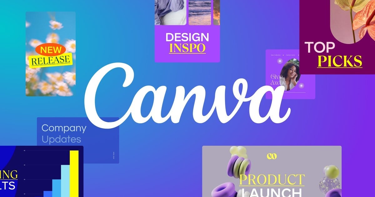
AI-Generated Graphics and Custom Illustrations
Stock photos are dying. The sites that stand out in 2026 use custom illustrations, AI-generated hero images, and branded graphic styles that no competitor can replicate. Tools like Midjourney, DALL-E 3, and Canva‘s Magic Studio make custom graphics accessible to teams without illustrators. This breaks the “use professional photography” rule in favor of something more important: visual uniqueness.
Scrollytelling
Scroll-driven narratives where content transforms as you scroll have gone from experimental to mainstream. The CSS Scroll-Driven Animations API (shipped in Chrome and Edge, coming to Safari and Firefox) means you can build these without JavaScript libraries. Product pages, case studies, and annual reports all benefit from this approach. It breaks the “keep it simple” rule but rewards users with a more engaging, memorable experience.
Which web design ‘rule’ do you think is outdated?
Tools for Modern Rule-Breaking Design
You don’t need a massive budget to experiment with creative design. These three tools cover prototyping, testing, and project management for design-forward websites.
- Magic Studio for AI-generated graphics and illustrations
- Brand Kit keeps custom design tokens consistent
- Real-time collaboration for design teams
- Website builder with custom domain support
- Free plan covers most individual needs

- Site Audit checks Core Web Vitals and accessibility
- A/B testing data integration for design decisions
- Competitor analysis shows what design patterns rank
- Position tracking for before/after redesign impact
- Content optimization scores for on-page SEO

- Design system documentation in linked databases
- A/B test tracking with custom properties
- Client feedback boards with inline comments
- Project timelines for redesign sprints
- Free for personal use, $10/mo per seat for teams
The A/B Testing Framework for Design Experiments
Breaking a design rule without testing it is just guessing. Here’s the 5-step framework I use on every unconventional design decision.
- Understand the rule first. Know why it exists and what problem it solves. You can’t intentionally break what you don’t understand.
- Identify the underlying principle. “Use white backgrounds” is the rule. “Ensure readability” is the principle. Break the rule, keep the principle.
- Build both versions. Create the conventional version and the rule-breaking version. Run them simultaneously, not sequentially. Use Google Optimize, VWO, or Convert.com with a minimum 2-week test period and 1,000 visitors per variation.
- Measure what matters. Don’t just track clicks. Track scroll depth (Microsoft Clarity, free), time on page, conversion rate, and return visits. A page with higher engagement but lower conversions isn’t a win. A page with lower bounce rate but the same revenue isn’t either.
- Check accessibility post-test. Run your winning design through axe DevTools and manual keyboard testing. A design that converts well but fails WCAG AA isn’t shippable. Fix the accessibility gaps, then retest to confirm the fix doesn’t kill the improvement.
I’ve run over 50 A/B tests on design conventions in the past four years. The rule-breaking version wins about 60% of the time. The other 40%? The conventional approach was conventional for a reason. That’s why you test instead of assume.
Designing for AI: Featured Snippets and Generative Search
Here’s a rule most designers don’t even know exists yet: your site design affects how AI search engines cite your content. Google’s AI Overviews, Perplexity, ChatGPT search, and other generative engines pull structured information from pages that make content easy to extract.
Clean heading hierarchy (H2 > H3 > H4, never skipping levels), definition-style paragraphs that answer questions directly, and structured data markup (FAQ schema, HowTo schema, Article schema) all increase your chances of being cited. Accordion sections with question-answer pairs are featured snippet gold.
This is one area where you should follow the rules strictly. Creative design choices should enhance your content’s visual presentation without breaking its semantic structure. A beautiful hero section with oversized text? Fine. But your H2s should still follow your H1 in logical order, and your content should still be parseable by screen readers and AI crawlers alike.
I use Semrush‘s Site Audit to check heading hierarchy and structured data on every site I build. The online marketing strategies that work in 2026 treat AI search as a first-class channel alongside traditional SEO.
Mobile-First Rule-Breaking
Most design experimentation happens on desktop. That’s backwards. If 60%+ of your traffic is mobile, your creative decisions should start on a 375px screen and scale up.
Some rule-breaking works better on mobile than desktop. Oversized typography? Even more impactful on a small screen where a single word can fill the viewport. Dark backgrounds? Easier on the eyes for users browsing in bed. Long-scroll storytelling? Mobile users are already in a scrolling mindset from social media.
Other experiments need careful mobile adaptation. Asymmetric grids usually need to collapse to a single column. Bento layouts need to reorder so the most important cells appear first. Hover-triggered animations need tap equivalents. Full-screen navigation overlays work great on mobile (arguably better than on desktop).
The prefers-reduced-motion media query is especially important on mobile. Users with vestibular disorders often experience more discomfort with motion on handheld devices because the phone itself is already close to their face and moving with their body. Always respect this setting. Always.
If you’re building a site from scratch, the business budget should account for mobile testing devices. Emulators catch layout bugs. Real devices catch performance and interaction problems that emulators miss.
How to Break Rules Without Breaking Your Website
After years of experimenting with unconventional design, I’ve landed on a framework that keeps the creativity high and the risk low.
Break one rule at a time. Don’t launch a redesign that simultaneously uses a dark background, asymmetric layout, five fonts, heavy animation, and unconventional navigation. If something breaks, you won’t know which change caused it. Introduce one rule-breaking element per sprint, test it, validate it, then move on.
Keep the underlying principle. “Use white backgrounds” protects readability. Break the background color, keep the readability. “Follow the three-click rule” protects findability. Break the click count, keep the findability. Every design rule has a principle underneath it. The principle is what matters.
Accessibility is your safety net. If your creative design passes WCAG 2.2 AA, keyboard navigation works, screen readers can parse it, and prefers-reduced-motion is respected, you’ve covered 90% of the risk. Making your website ADA compliant isn’t a constraint. It’s a creative challenge that makes your work better.
Get a second opinion from real users. What feels edgy to you might feel confusing to your users. Run a 5-second test: show someone the design for 5 seconds, then ask what the page is about and what they’d click first. If they can answer both correctly, your rule-breaking works. If they can’t, iterate.
The designers who break rules successfully aren’t rebels. They’re experts who understand conventions deeply enough to know which ones serve the user and which ones just serve tradition.
Frequently Asked Questions
Is it okay to use dark backgrounds on a business website?
Yes. Dark backgrounds work well for technology, creative, and luxury brands. The key is maintaining WCAG 2.2 contrast ratios (4.5:1 for normal text, 3:1 for large text) and using dark sections strategically rather than making the entire site dark. Apple, Stripe, Linear, and Vercel all use dark backgrounds extensively with strong conversion rates.
What website design rules should you never break?
Accessibility rules are non-negotiable. This includes color contrast ratios, keyboard navigation, screen reader compatibility, respecting the prefers-reduced-motion setting, and visible focus indicators. Beyond accessibility, always maintain clear navigation structure, readable body typography (16-20px), and fast page load times (LCP under 2.5 seconds).
Does breaking the three-click rule hurt user experience?
No. Nielsen Norman Group research shows users don’t abandon tasks based on click count. They leave when they’re confused or can’t find what they need. Amazon, Wikipedia, and most large websites regularly require 5+ clicks to reach specific content. Focus on information scent (each click clearly brings users closer to their goal) rather than counting clicks.
How many fonts can you safely use on a website?
There’s no hard limit, but every font must earn its place. A single variable font like Inter or Satoshi can produce dozens of distinct weights and widths from one 98KB file. If you use multiple font families, each should serve a distinct purpose (headlines, body, code, accents). Performance matters: each additional font file adds 15-50KB. Most professional sites use 2-4 font families effectively.
What’s the difference between bold design and dark patterns?
Bold design breaks conventions to improve the user experience (unconventional navigation that’s more intuitive, dark backgrounds with excellent contrast, creative layouts that guide attention). Dark patterns break conventions to trick users (hidden unsubscribe buttons, confusing double negatives, disguised ads). The test: if the user fully understood what the design choice does, would they still be happy? Bold design passes this test. Dark patterns don’t.
Should I follow the F-pattern for all my web pages?
The F-pattern was observed on text-heavy pages with zero visual hierarchy. Modern layouts with strong typography, intentional whitespace, and varied section designs create different scanning patterns. Z-patterns, center-focused patterns, and bento grid scanning are all valid when supported by the design. Use the F-pattern as one option, not the only option.
How do I test whether breaking a design rule actually works?
Run an A/B test with minimum 1,000 unique visitors per variation over at least 2 weeks. Create a conventional version and a rule-breaking version. Measure scroll depth (Microsoft Clarity, free), time on page, conversion rate, and return visits. The rule-breaking version wins about 60% of the time in my experience. Always check accessibility on the winning variation before shipping.
Is web brutalism a good design choice for business websites?
For most business websites, full brutalism isn’t recommended. It works for creative agencies, art portfolios, and countercultural brands where the raw aesthetic matches the brand identity. For SaaS, e-commerce, or professional services, borrow brutalist elements (bold typography, exposed grid structure, raw textures) without going fully anti-aesthetic. A measured approach to unconventional design converts better than shock value.
Website design rules were created to prevent bad decisions. But following every rule blindly leads to websites that look and feel identical to everything else in your industry. The best designs in 2026 come from understanding rules deeply enough to know which ones still serve your users, and which ones hold you back.
Start small. Pick one rule to break on your next project. Test it with real users and real data. Measure the results against your current baseline. You’ll quickly learn that the “rules” were guidelines all along, and the only real rule is this: design for your users, not for a checklist.
Disclaimer: This site is reader-supported. If you buy through some links, I may earn a small commission at no extra cost to you. I only recommend tools I trust and would use myself. Your support helps keep gauravtiwari.org free and focused on real-world advice. Thanks. - Gaurav Tiwari