
 by
byConversion-ready pages don’t win because they use red buttons, countdowns, or a CTA every few scrolls. They win because the page makes the right decision easier for the right visitor.
That sounds obvious. It is also where many pages go wrong. The design gets polished before the offer is clear, social proof is added without answering an objection, and analytics records the final form submission without showing where people gave up.
A useful page aligns six jobs: visitor intent, promise, proof, friction, action, and measurement. When one job fails, adding more design usually makes the failure prettier rather than fixing it.
A conversion-ready page makes one decision easier
A conversion-ready page is a focused decision environment. It helps a specific visitor understand an offer, judge whether it fits, reduce the risk of acting, and take one meaningful next step.
That next step depends on the page. It could be a purchase, form submission, consultation request, trial signup, or qualified click to another page. A homepage can support conversion, but it often serves several audiences. A landing page is usually narrower. A product or service page sits somewhere between those two.
The label matters less than the alignment. A page is ready when these parts reinforce one another:
- Intent: the visitor recognizes that the page is meant for their problem.
- Promise: the outcome is specific enough to understand and believable enough to consider.
- Proof: evidence answers the risk or objection holding the decision back.
- Friction: the copy, interface, form, and page experience do not make the action unnecessarily difficult.
- Action: the next step is clear and proportionate to the commitment being requested.
- Measurement: the important interactions are recorded so you can locate the leak.
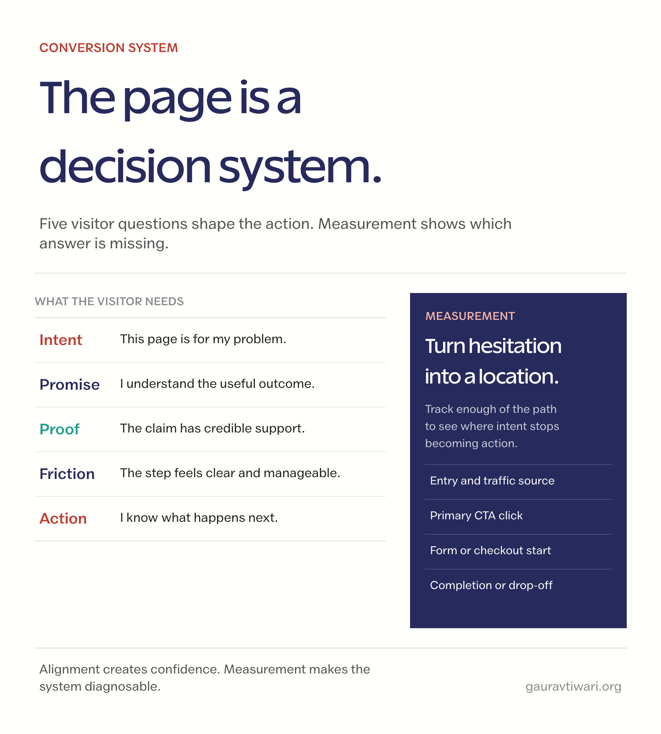
This is the practical difference between decoration and conversion rate optimization. Decoration changes how a page looks. Optimization changes how well its parts help the visitor decide.
Start with the conversion event. The layout comes later.
Before rewriting a headline or moving a button, define what a successful visit should produce. “More engagement” is too vague. Name the event: purchase completed, form submitted, call booked, account created, or pricing request sent.
Then work backward from that event:
- What must the visitor believe before taking it?
- What information would remove the largest uncertainty?
- What proof would make the promise credible?
- What is the smallest sensible commitment at this stage?
- Which earlier interactions would reveal where hesitation begins?
Google Analytics 4 records interactions as events, and the important ones can be treated as key events or conversions. Use that structure to record the path, not only the finish. If a page gets CTA clicks but few form submissions, the problem is probably not the headline. If almost nobody clicks, form-field optimization will not rescue it.
Use the conversion rate calculator to establish a baseline, then compare the same page, traffic source, device group, and time window after a meaningful change. A blended site-wide percentage can hide more than it reveals.
Match the page to the visitor's question
People do not arrive with equal awareness or intent. A returning visitor searching your brand needs a different page from someone encountering the problem for the first time. The message, proof, and action should reflect that difference.
| Visitor state | Question in their head | Useful evidence | Sensible action |
|---|---|---|---|
| Problem-aware | “Is this really the issue?” | Symptoms, mechanism, diagnostic example | Read the method or run a check |
| Comparing options | “Why this approach?” | Differences, limitations, use-case fit | Compare, view a demo, or see details |
| Evaluating a provider | “Can I trust you with this?” | Relevant work, process, scope, testimonial | Request a consultation or proposal |
| Ready to act | “What happens next?” | Price, terms, delivery, guarantee, support | Buy, book, or submit the form |
A page often underperforms because it asks for a ready-to-buy action while the copy is still speaking to a problem-aware visitor. The reverse also happens: high-intent traffic lands on a long educational page that hides the buying path.
The first screen should orient the visitor, not finish the sale
The first visible screen has a modest job: confirm relevance and make the next move obvious. It does not have to contain every benefit, testimonial, trust badge, price, FAQ, and button.
For most conversion pages, it should make four things easy to identify:
- what the offer is
- who it helps
- what useful outcome it creates
- what the visitor can do next
Add proof near the top when the claim needs immediate support. Move detail lower when understanding depends on explanation. The right first screen for a simple template download will be different from the right one for a high-value consulting engagement.
Mobile matters here because narrow screens expose weak hierarchy quickly. If the visitor sees a vague headline, a large decorative image, and half a button, the page has spent its best space without resolving a question.
Proof works when it answers the next objection
Social proof is not a decorative strip of logos. It should reduce a specific risk. Use the proof that fits the claim and place it close to the decision it supports.
- Outcome claim: show a relevant result with scope, context, and a credible source.
- Quality claim: show the work, product detail, process, or technical standard.
- Fit claim: use a testimonial from a recognizably similar customer.
- Reliability claim: explain support, delivery, availability, or recovery.
- Low-risk claim: state the trial, cancellation, refund, or guarantee terms plainly.
Weak proof borrows authority without transferring understanding. A row of unfamiliar logos, a testimonial saying “Great service,” or a counter with no context creates visual weight but little confidence.
Friction hides in copy, forms, speed, and accessibility
Friction is anything that makes the visitor spend effort without improving the decision. Some friction is necessary. A mortgage application should not feel like a newsletter signup. The goal is to remove unnecessary effort, not every step.
Check the page in four places:
- Copy: use concrete labels, answer the expensive objection, and remove sections that repeat the same promise.
- Forms: ask only for information needed at that stage, pair every input with a visible label, explain errors, and preserve entered data after a mistake.
- Interaction: keep tap targets usable, keyboard focus visible, and actions understandable without relying on color alone.
- Page experience: keep the main content obvious, avoid intrusive interstitials, and prevent layout shifts that move controls while someone is trying to act.
Useful technical baselines include:
- WCAG 2.2 sets a minimum target size of 24 by 24 CSS pixels, with defined exceptions.
- The W3C forms guidance recommends explicit labels and requesting only the information the task requires.
- Good Core Web Vitals thresholds are LCP at or below 2.5 seconds, INP at or below 200 milliseconds, and CLS at or below 0.1 at the 75th percentile.
Read the W3C form guidance, WCAG 2.2 target-size guidance, and Core Web Vitals thresholds for the exact requirements. These are accessibility and experience baselines, not promises that a page will convert.
One action can appear more than once without becoming several actions
A long page may need the same primary action at more than one decision point. That is repetition, not competition. The problem begins when the page asks visitors to start a trial, book a call, download a guide, join a newsletter, read a case study, and follow a social account with equal visual priority.
Keep the primary action consistent. Change the supporting sentence when the context changes, but do not make the visitor decode a new destination each time. A secondary action is useful only when it helps a real segment move forward without stealing attention from the main goal.
The action itself should also match the commitment. “Get started” is weak when it hides whether the next step is a payment screen, a signup form, or a calendar. CTA copy and format should tell people what they are choosing.
Measure the leak, not only the final conversion rate
A final conversion rate tells you that a problem exists. It does not tell you where. Build a short measurement chain around the actual decision:
- page view
- meaningful scroll or key section view, only when it helps diagnose the page
- primary CTA click
- form or checkout start
- validation error or abandonment point
- completed lead, booking, signup, or purchase
GA4 events can record those interactions. Microsoft Clarity heatmaps and session recordings can help explain why a pattern appears, especially when clicks land on non-interactive elements or visitors repeatedly miss a section. Treat recordings carefully because a few memorable sessions are not a representative sample.
Use conversion optimization tools to answer a defined question. Installing more analytics without a decision model produces more dashboards, not better pages.
AI can draft a page. It cannot decide what deserves trust
AI page builders can help produce a rough layout, alternate headline, or first-pass copy. They are useful when the blank page is the bottleneck. They are less useful when the real problem is a weak offer, missing proof, mixed traffic, or an unclear conversion event.
Give the tool the audience, problem, outcome, proof, objections, action, and constraints before asking it for a page. Then remove generic claims and verify every fact. AI-assisted landing page design is strongest as an iteration aid, not an evidence generator.
If you need the software rather than the strategy, compare the best landing page builders separately. Choosing a builder is an implementation decision. It should not dominate the conversion argument.
Run this pre-publish check before buying more traffic
Do not send more paid or promotional traffic to a page until its basic decision path works. More traffic makes a weak page more expensive.
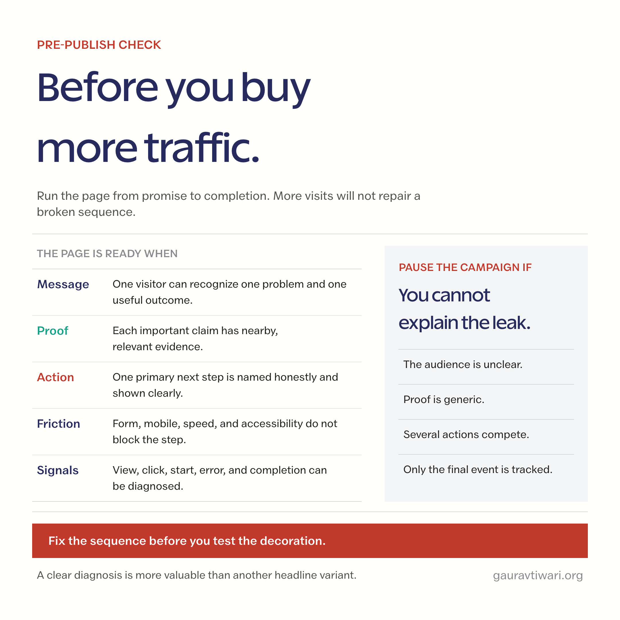
Read the page once from the visitor’s position and answer these questions:
- Can the intended visitor recognize the page within a few seconds?
- Does the promise name an outcome without exaggerating certainty?
- Is the most important objection answered before the main commitment?
- Does each proof element support a nearby claim?
- Is there one visually dominant next action?
- Are the form fields, labels, errors, and success state understandable?
- Do the page and interaction remain stable on a narrow screen?
- Are the important steps recorded as events?
- Can you state what you will change if a specific step underperforms?
If several answers are “no,” pause the campaign. Fix the sequence before adjusting button color or writing another headline variant.
What quietly ruins conversion-ready pages
The obvious conversion killers are broken forms and missing buttons. The quieter ones are more common: traffic that does not match the offer, vague benefits, borrowed credibility, hidden costs, fake urgency, competing actions, forms that ask for tomorrow’s information today, and design flourishes that slow down or obscure the page.
Popups deserve special restraint. Google recommends avoiding intrusive interstitials that make the main content difficult to access. A prompt can support an action, but it should not ambush the visitor before the page has delivered any value.
Before increasing a campaign budget, run a broader marketing audit. A page cannot repair weak positioning, the wrong audience, or an offer that nobody wants.
If the page gets traffic but not action, fix the system
When the leak is hard to locate, I can audit the message, proof, interaction, and measurement path through my conversion rate optimization services. If the page needs a complete rebuild rather than another patch, see my landing page design services.
The useful deliverable is not a prettier screen. It is a page with a clearer decision path and a measurement plan that tells you what to improve next.
The page is a decision environment
A conversion-ready page does not pressure every visitor into acting. It helps the right visitor reach a confident decision, including the decision to leave when the offer is not a fit.
Start with the event, work backward through the questions and proof, remove unnecessary friction, and measure the steps between arrival and action. That approach is less exciting than copying a “high-converting” template. It is also far more useful because it gives you a page you can diagnose instead of one you can only decorate.
Frequently asked questions
What is a conversion-ready page?
A conversion-ready page helps a specific visitor understand an offer, trust its claims, complete the next step without avoidable friction, and gives the owner enough event data to diagnose drop-off. It can be a landing page, product page, service page, or a focused part of a homepage.
Is every landing page conversion-ready?
No. A landing page is simply the first page a visitor reaches in a session or campaign. It becomes conversion-ready only when its message, proof, interaction, action, and measurement match that visitor and the intended outcome.
How many CTAs should a conversion page have?
Use one primary action, but repeat it when a longer page earns another decision point. There is no reliable universal CTA count. Avoid giving several unrelated actions equal visual priority.
What is a good conversion rate?
There is no useful universal rate for every page. Establish the page’s own baseline, segment it by traffic source, device, offer, and intent, then compare the same conditions after a meaningful change. A low-commitment signup and a high-value consultation should not be judged by the same number.
Should I optimize for mobile or desktop first?
Start with your actual audience and device data, then make the page usable on both. Narrow screens expose weak hierarchy quickly, but desktop visitors still need clear actions, accessible interaction, stable layout, and fast performance.
Can AI build a conversion-ready page?
AI can draft a layout, headline, or copy variant. It cannot decide whether the offer is strong, supply trustworthy proof, understand every audience objection, or define the measurement plan for you. Use it to accelerate iteration, not to invent the strategy or evidence.
Tell Google you want more of this.
Add Gaurav Tiwari as a preferred sourceOne tap, and this site shows up more often in your own Top Stories, AI Overviews and AI Mode. Remove it any time.